Pantone announced its very first color of the year (a Cerulean Blue, to be specific) back in 2000 as a way to celebrate the new millennium. The buzz around the announcement skyrocketed, however, and it was quickly decided to carry on the tradition every year. Since then, paint and design brands have joined in, revealing their own predictions of what 'color of the year' means, as a way to engage, inspire, and predict the palettes that will shape the following 12 months.
As such, these announcements are a great way to gauge the color trends of years past and question how those design habits will translate moving forward. So, as 2025 draws to a close, what do we have in store? Livingetc's Design Lab interior stylist, Iokasti Sotirakopoulou, says, "I see this year's color choices as a shift toward richness, depth, and tactility, with a warmth that runs through the entire palette, from earthy minerals and ripe fruit tones to those tailored, suiting-inspired neutrals."
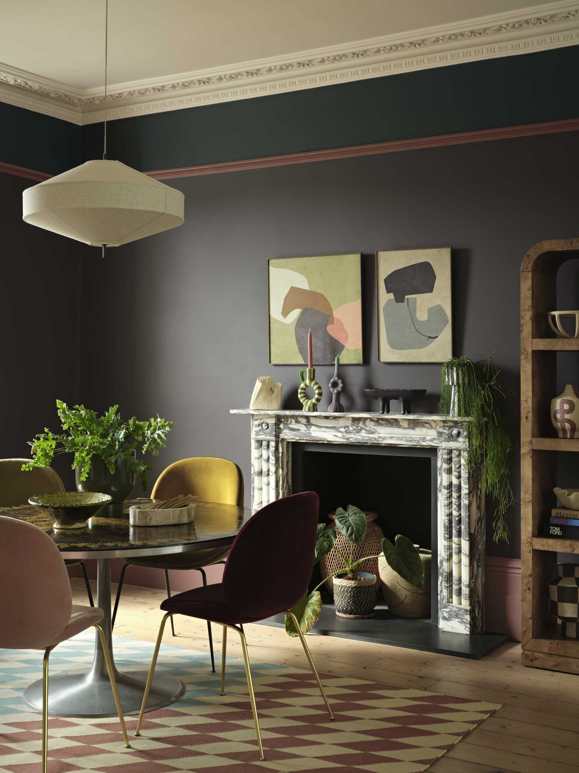
They're expressive but not loud; dramatic, but still comforting, adding atmosphere rather than noise when translated into interiors. On the one hand, rich, oxblood (almost brown) burgundies have found their footing in contemporary interiors, as well as aubergines and moody, dark teals. But there is also space being made for warmer caramel browns that lean into ochre yellows and oranges. Livingetc's Design Lab interior stylist, Miaad Latoof, adds, "There's a craving for spaces that offer warmth and stability, especially in our fast-paced lives. These colors create a more immersive atmosphere, giving a home a real sense of intention and coherence."
We're decorating with colors that have soul, says Iokasti. "Shades that make a room feel dressed, collected, and just a little more emotionally charged." To prove the point, here are all the important color of the year announcements that have been made for 2026 so far.
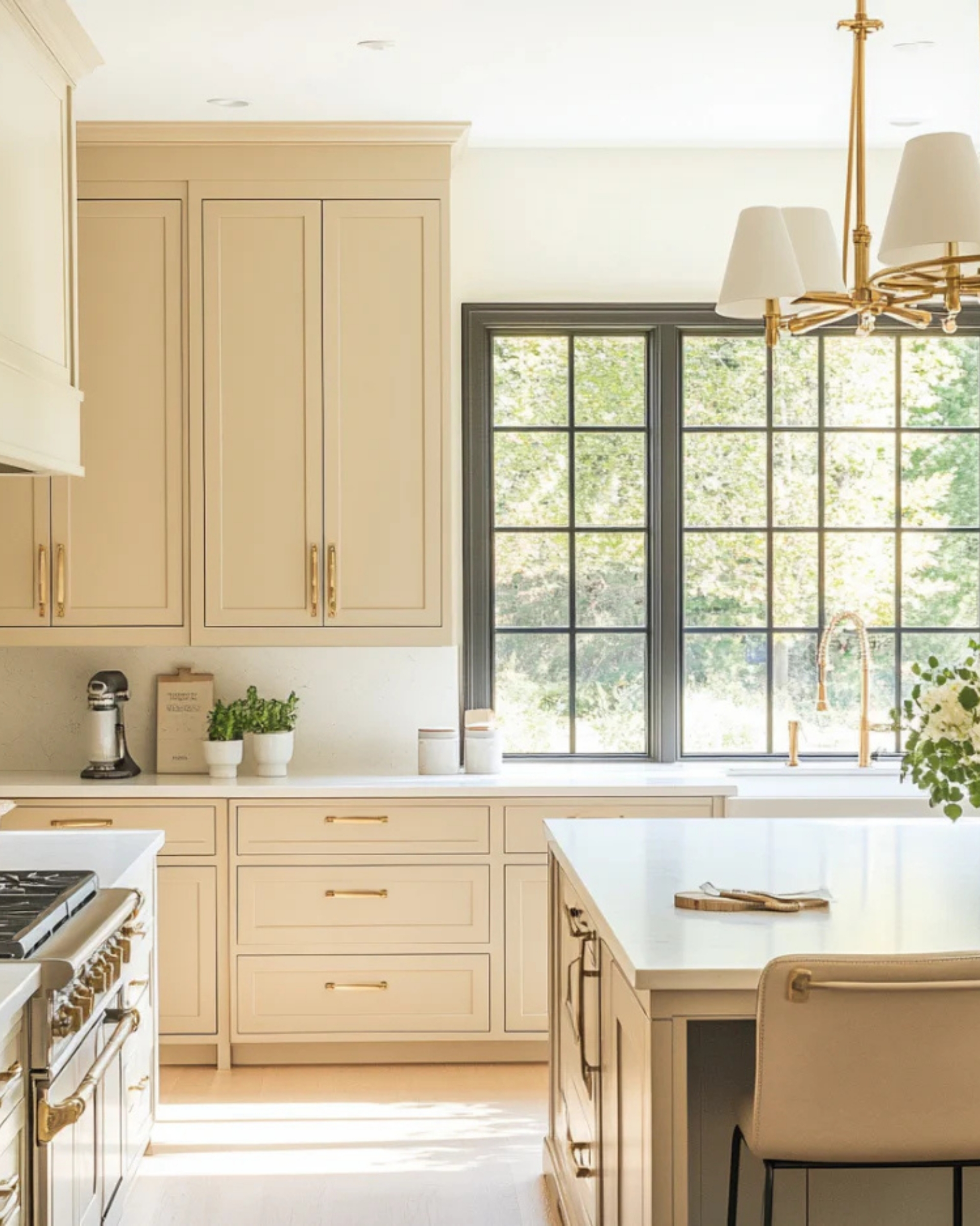
Pantone: Cloud Dancer
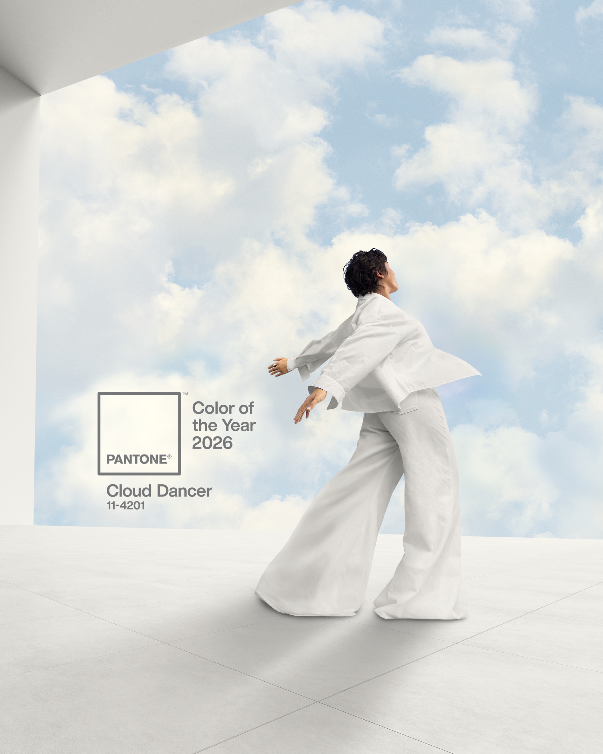
I know, I know, after all of that talk of deep, rich colors, Pantone has announced Cloud Dancer as its color of the year for 2026. While shocking, it actually works really well with the mood of the upcoming year.
Pantone describes Cloud Dancer as an ethereal hue, serving as a symbol of "calming influence in a frenetic society rediscovering the value of measured consideration and quiet reflection." In a world filled with color, chaos, and creativity, having a blank (yet dependable) canvas to work from is essential.
"Cloud Dancer quiets the mind, encouraging true relaxation and focus that allows the mind to wander, and creativity to breathe, making room for innovation," says the Pantone team.
It's far from the saturated reds we've come to love in 2025, but there's a solid defence for Pantone's Cloud Dancer — we always need a color that lets those around it breathe.
Little Greene: Adventurer
Little Greene's color of the year was one of the first claims of aubergine-burgundy. Adventurer is rich, yet muted; striking, yet familiar. It's exactly the kind of color we are all reaching for in our interiors right now.
"People are leaning towards low-chroma and saturated tones because they instantly make a space feel grounded and personal, Miaad Latoof explains. "It has become a design tool — they have a naturally cocooning quality, allowing them to define volume and atmosphere rather than act as a backdrop."
Benjamin Moore: Silhouette
Benjamin Moore's color of the year leaned toward the neutral side with Silhouette — a dark gray color that has strong brown undertones. The charcoal gray base add depth to a neutral that can pair with a plethora of colors, and the brown tones bring a warmth that is perfectly in stride with 2026 interior design trends.
Silhouette shows you shouldn't be afraid of darker, relaxed colors in your interiors. "The depth of darker, yet subtle hues also enhances architectural features, absorbing light in a controlled way and creating spaces with clear intent," says Miaad.
Graham & Brown: Divine Damson
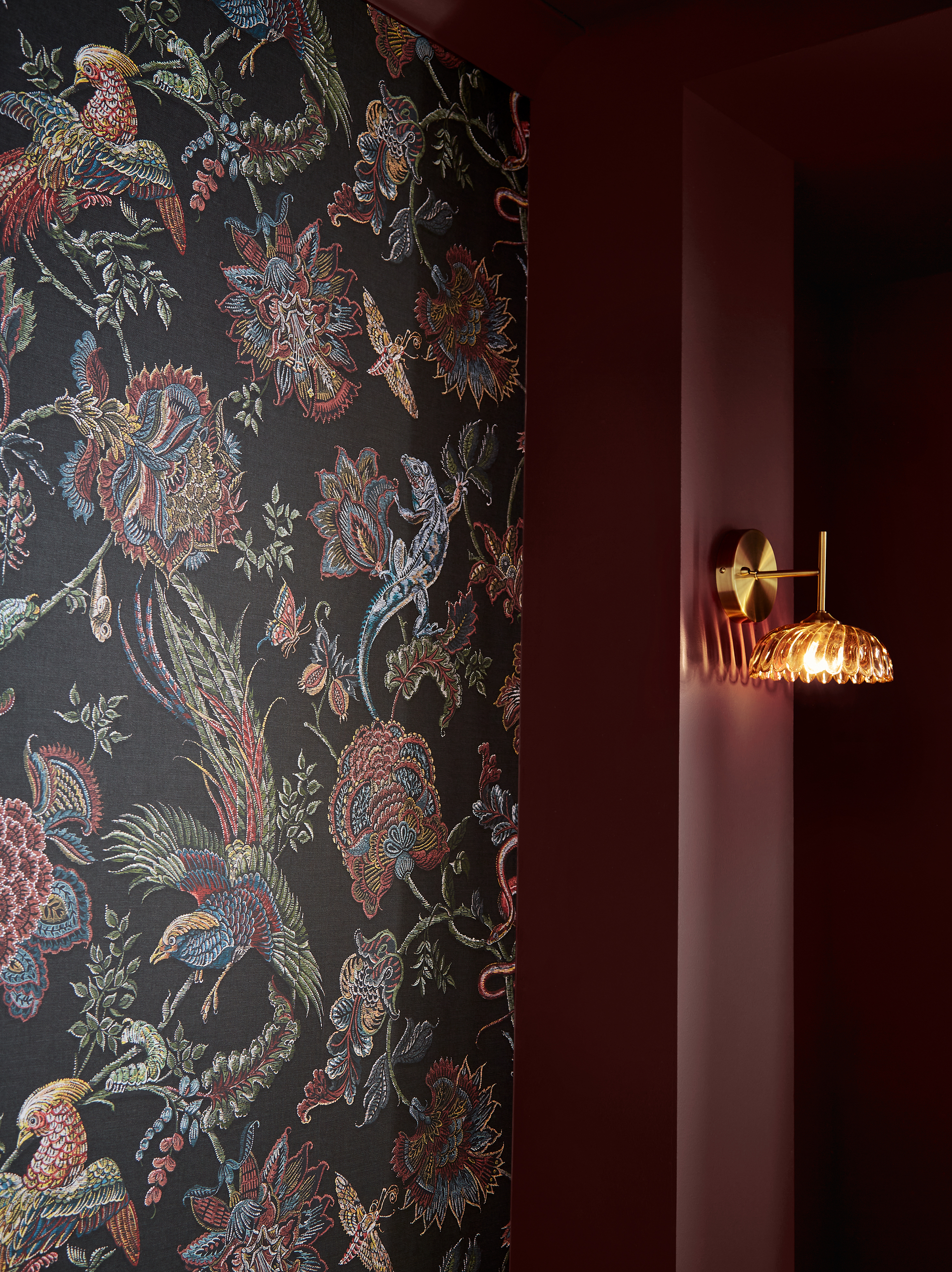
Graham & Brown's Diving Damson has become one of my favorite colors of this year. It takes the popular aubergine-burgundy color but gives it slightly more depth.
In certain lights, this shade can come across as a warm, inviting red, while in darker rooms, the dark undertones really stand out. Plus, Graham & Brown have created a wallpaper and design of the year to pair alongside Divine Damson.
Glidden: Warm Mahogany
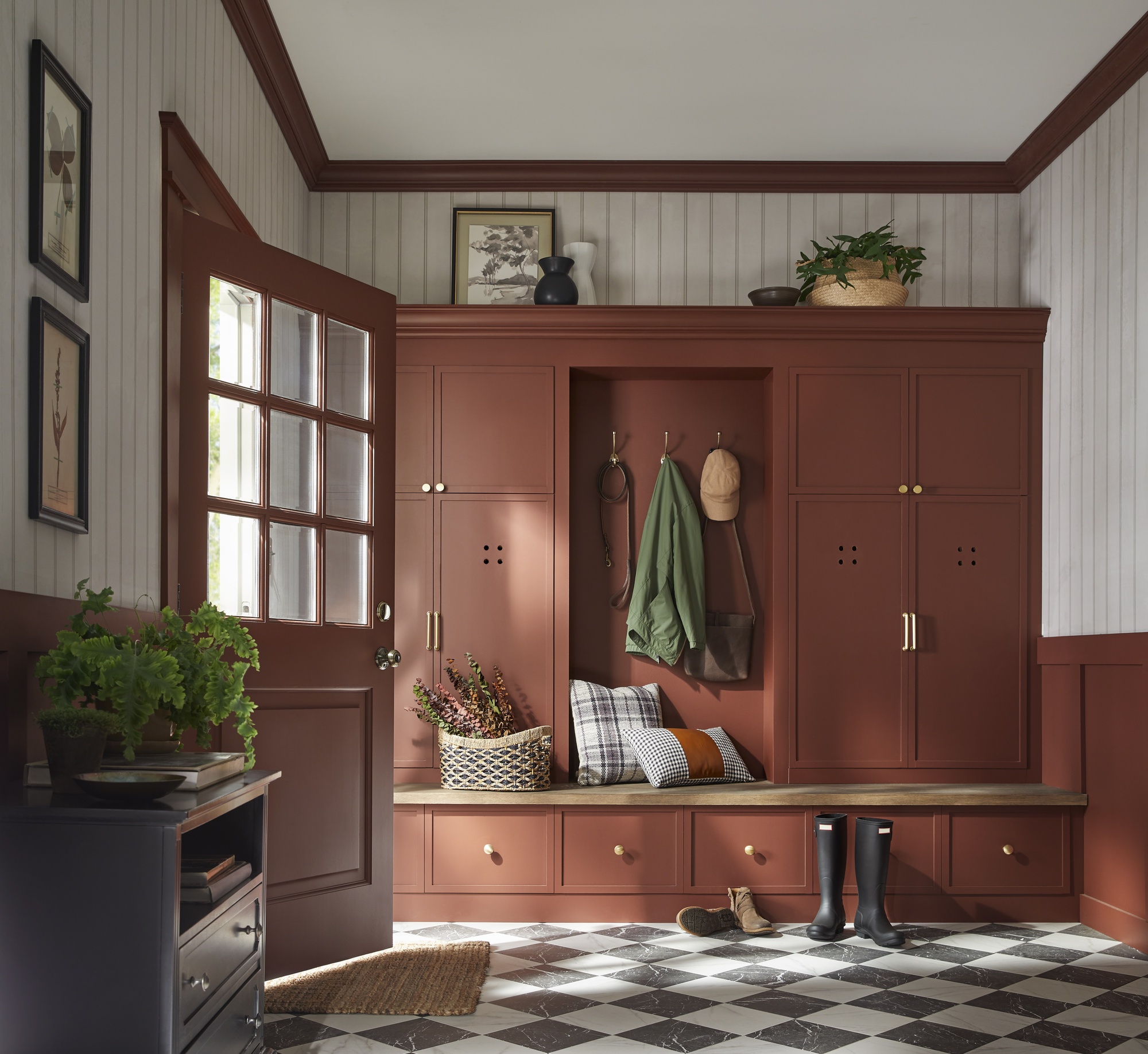
Though not available in the UK, there's still a lot to learn from Glidden's color of the year for 2026: a cozy, timeless red called Warm Mahogany that "adapts to the purpose and mood of any space," proving that bolder reds work in the world of neutrals. A mix of both statement-making and subtlety, the 2026 color of the year from Glidden is as functional as it is fashionable.
The USA-based brand describes Warm Mahogany as a color with "heritage that takes the role of main character or supporting star in places that crave connection, rest, and play." The brand recommends pairing Warm Mahogany with earthy, natural materials and deep, bold colors for a space that's both relaxed and modern.
BlueStar: Purple Violet
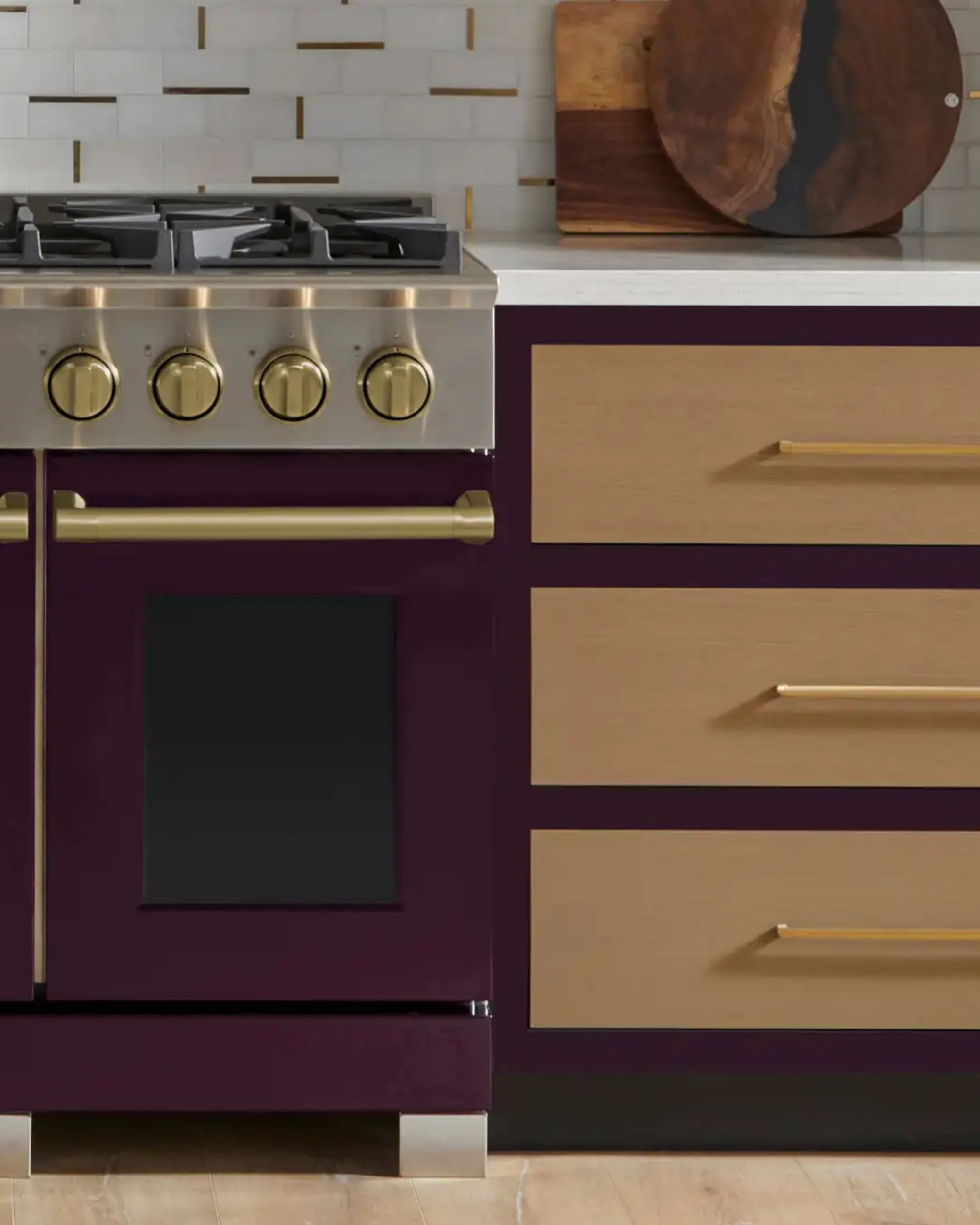
Even appliance brands have jumped in on the announcements. Bluestar Cooking's color of the year is one of today's most surprisingly popular colors: purple. I recently spoke to interior designers who shared that purple was one of the best colors to paint your dining room, but now it looks like this can be translated to cooking spaces as well.
'Purple Violet' was selected by Shumaker Design Associates for Bluestar, and
this choice reflects a growing shift toward richness, warmth, and grounded bold design in the home.
Mylands: Burlington Arcade
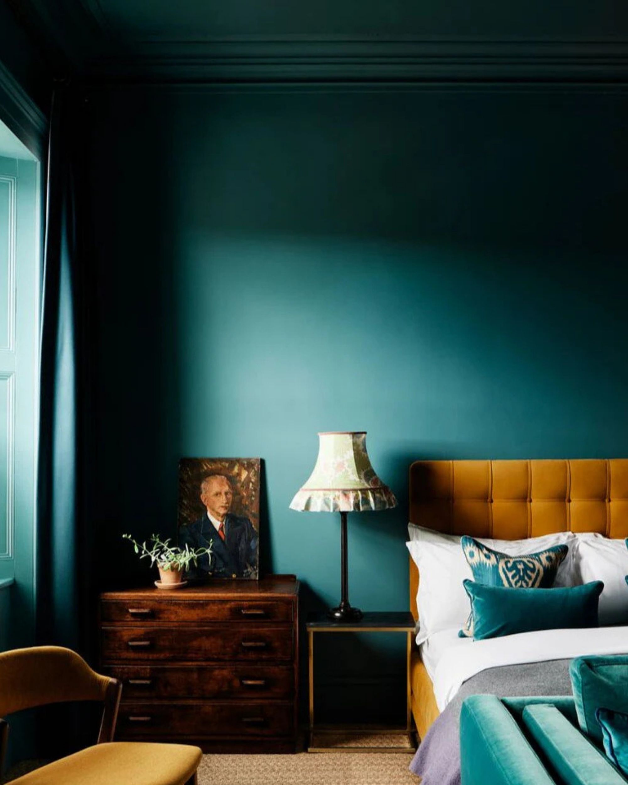
I must admit, teal was one of Livingetc's most popular predictions when we discussed it in-house. Though reds and purples took the lead, Mylands, House of Color, announced Burlington Arcade as its color of the year, and I'm obsessed.
Interestingly, Burlington Arcade is originally influenced by the historic shopping arcade in Central London, and it sits somewhere between green and blue on the color wheel. The brand says they chose this dark teal for its cocooning nature and sense of balance in design — inviting an opportunity to slow down and welcome more calming colors into our homes.
Although Burlington Arcade sits in the cool color spectrum, its complexity of undertones ensures a warm and inviting effect. Rather than cooling a space, it brings an enveloping richness. Mylands says, "It is particularly effective in living rooms, studies, or bedrooms where a sense of comfort is key."
IKEA: Rebel Pink
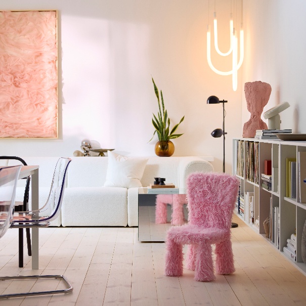
With the drop of IKEA's new GREJSIMOJS collection, the brand also announced its 2026 Color of the Year — Rebel Pink. Admittedly, it's a bit unexpected, and quite different than the other color of the year announcements so far, but exciting nonetheless.
Rebel Pink is powerful, playful, and brings a bold splash of color into the home, whether used on the wall, as an accent, or in the form of this unique fluffy pink accent chair. This is definitely a color for the maximalists.
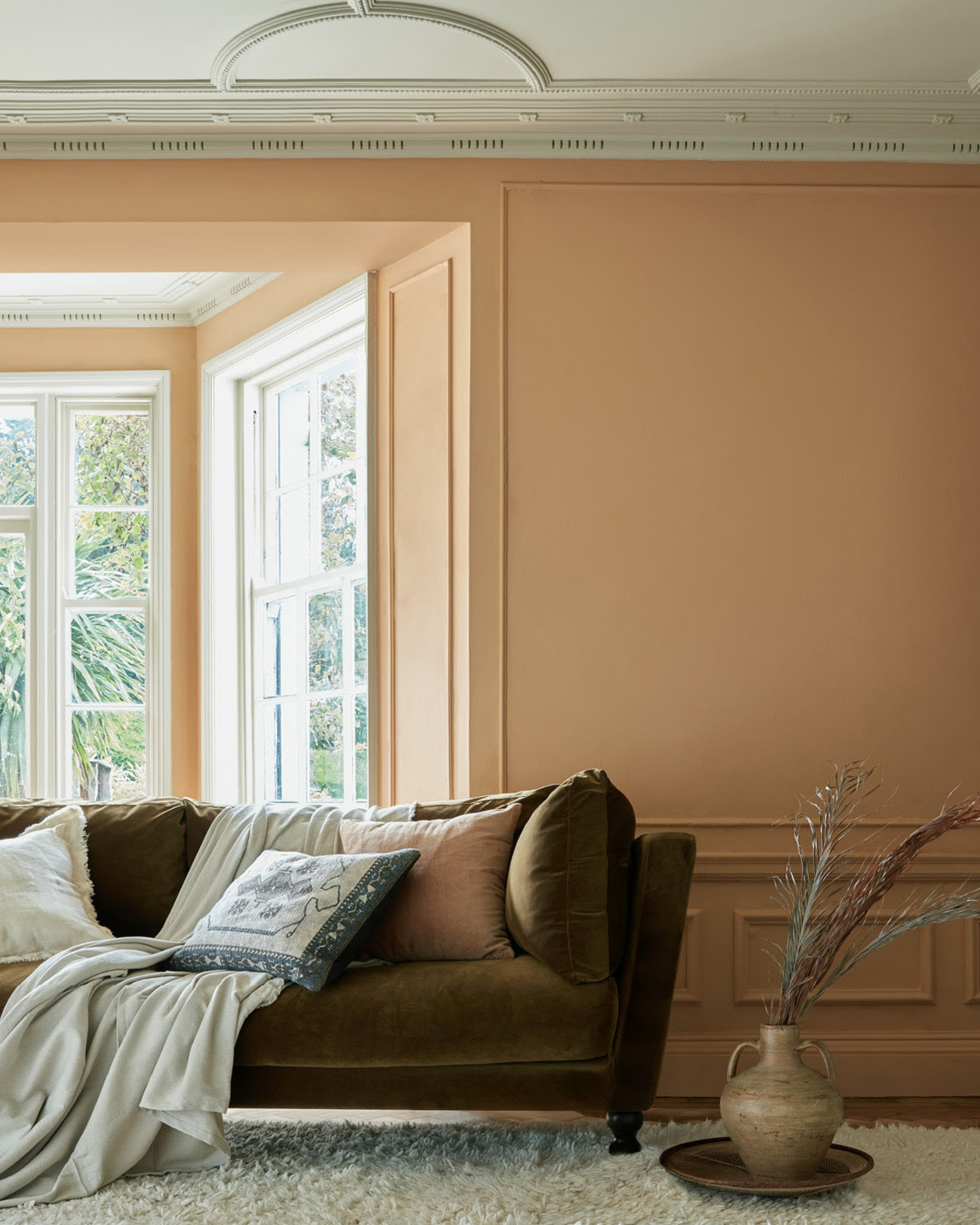
Neptune: Saddle
As for Neptune paint, here's where things take a turn for the warmer, orange-brown-beige tones. Neptune announced its Saddle paint color as the color of the year. It's a shade that sits between russet and chocolate; "this medium-toned, rich brown carries a mellow warmth that captures the essence of autumn with quiet confidence," says the brand.
It's a very similar shade to Livingetc's December color crush, Sugar Nut Brown. Basically, this caramel color is the perfect twist on the brown obsession that has taken over interiors in the past couple of years, offering something a little warmer and just as timeless.
Earthborn: Freckle
Eco-friendly paint brand, Earthborn, announced a soft, yet bright and peachy orange as its color of the year for 2026. Again, this isn't the most expected color for the upcoming year, but upon closer review, Freckle reads as an earthy and inviting shade that can be extremely versatile.
Freckle was chosen not only for its visual warmth, but also for its sustainable simplicity, says the brand. Freckle in Earthborn's signature clay paint finish is a naturally occurring clay color and completely free from colorants. So, you can be confident in the fact that this hue will bring a natural-feeling mood to any space, as well as being a trusted eco-paint.
C2: Epernay
For 2026, another US-based brand, C2 Paints, looked to honor the traditional elements of design that shape how we live today. From the intricate architectural ornamentation to the allure of natural materials, Philippa Radon, interior designer and C2 color specialist, says, "we're inspired by a return to design that nourishes the soul — rich with depth, purpose, and beauty." Enter C2's color of the year, Epernay.
Named after the French village known for its rolling vineyards and limestone architecture, Epernay "channels the warmth of sunlit stone"; it's a refined, earthy soft ochre with hushed, beige undertones.
Epernay has ties to European influences, and "This historic hue helps us retell the wondrous stories woven through history via the inseparable threads of color, art, furnishings, and nature. It reminds us to appreciate the personal touches that make a home uniquely ours — and to live with reverence for the stories we’re creating every day," says Philipa.
Hopefully, this list has offered some guidance on what paint color trends and palettes to plan as we enter into an exciting new year of color, style, and design.