Get all your news in one place.
100's of premium titles.
One app.
Start reading
Livingetc
Livingetc
James Cunningham

Ever Heard of the ‘Wrong Color’ Theory? Here's Why Every Room Needs One 'Ugly' Hue

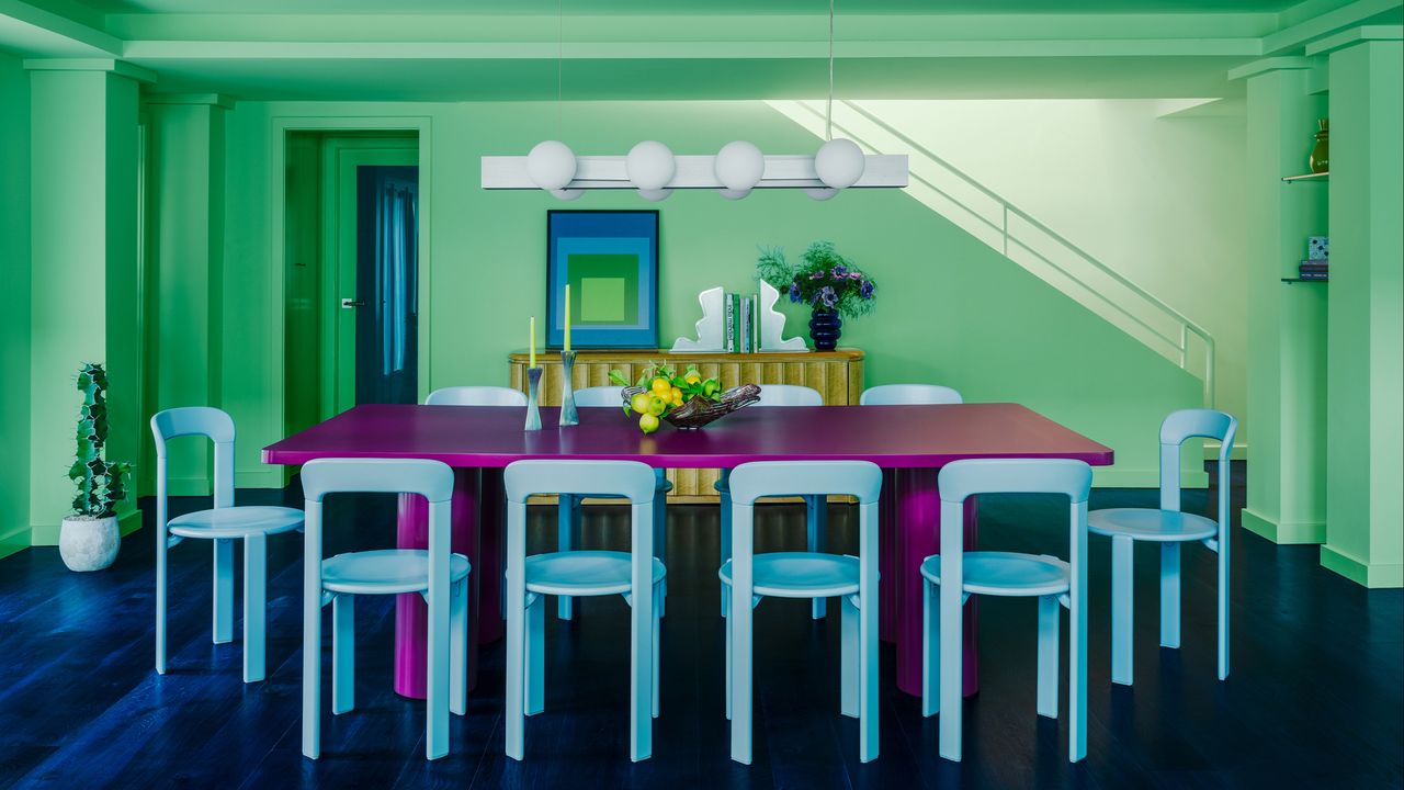
A contemporary dining room in pastel green and blue with a bright purple dining table.

Have you ever seen a color that just makes you go, huh? It might be a slightly lurid shade that you can’t quite place or a hue that seems to border on the medicinal rather than anything like beautiful. Interior designers, however, are increasingly reaching for these tones to create spaces that feel dynamic.

In our pick of this year’s color trends, shades that spark an emotional reaction are top of the list. These ‘wrong’ colors are having a moment — from saturated pops in an otherwise neutral room to surprising combinations that make you think twice (say hello to yellow and brown). “These awkward colors are what everyone remembers most,” explains Chelsey Cox. “Increasingly, perfectly harmonious palettes are falling flat because everything simply agrees.”

So, what is the 'wrong color' theory — and why does every room need a slightly unorthodox hue that might at first look a little bit, well, ugly? Here's what designers say.

What Is the 'Wrong Color' Theory?

A bold shade of green can work well beside rose pink, peach, and plaster. (Image credit: Yannick Labrousse, Design: Atelier HA)

No shade works in a vacuum, so the idea of a ‘wrong’ hue is all about context: what it’s placed beside and how it’s used. “Color never exists on its own,” says interior designer Annie Downing. “Rather than coordinating everything perfectly, which feels boring, this concept means using shades that make you pause, just for a second, because you’ve placed them in curious company.”

The 'wrong color' theory works on this kind of contrast in design — a medicinal green, for example, can suddenly feel energetic beside a neutral or tonal palette. “Avoid making your interior feel too uniform,” say Hugo Vince and Adèle Nourry, co-founders of Atelier HA and the designers of the Paris apartment above. “Adding a lively, unusual color or even one that feels slightly retro can end up feeling surprisingly natural if the overall composition makes it work.”

Opposites attract: don’t instinctively choose shades from the same part of the color wheel. (Image credit: Frazier Springfield, Design: Chinotto House)

Looking at shades in isolation can lead to them being dismissed before they’ve even been given a chance. “Color is an exploration, but if you’re narrow-minded, you’ll end up with a very limited palette,” explains interior designer Ghislaine Viñas, who believes in allowing bold shades to bounce off each other. “Strange tones like deep chartreuse, mustard, or gray-ish purple can be very intriguing.”

Chartreuse is a trending shade often described as ‘ugly’, but it can warm up neutral spaces and create contrast against blue and purple tones.

Why Do Rooms Benefit From a ‘Wrong’ Color?

A single bright ‘pop’ enlivens this tonal dressing room. (Image credit: Garrett Rowland, Design: Ghislaine Viñas)

Decorating with a ‘wrong’ color brings a sense of personality. The visual tension helps a space avoid the trap of becoming too ‘matchy-matchy’ or, even worse, predictable.

“It’s all about the push and pull between the colors in a room,” says Ghislaine Viñas. “There’s an attitude, a chicness that comes from doing something you don’t see very often. It’s daring.”

When you reach for an unconventional shade, you’re giving your room permission to be different. “This makes an interior much more interesting, even if it requires a measure of bravery and trust,” explains Leah Ring, founder of the Los Angeles-based studio Another Human. “Surprising color pairings make a space feel much more considered and collected, rather than like somewhere that’s been copied and pasted from a Pinterest board.”

If you want a room that feels unique, this individuality matters. “These awkward colors make a space feel like it’s evolved naturally, rather than designed to fit a certain trend,” agrees Chelsey Cox, co-founder of Chinotto House. “When you walk in, they give your eye somewhere to land and make everything else you’ve got in that space appear richer.”

A slightly lurid version of purple, this paint offers a bolder take on the color.

How Can You Make a ‘Wrong’ Color Look Right?

For extra impact, go big: this eggplant-hued dining table is the bright spot of this pastel space. (Image credit: Lance Gerber, Design: Another Human)

Balance may be an interior design buzzword, but it matters — ‘wrong’ colors only end up becoming meaningful when they’re a focal point, rather than carried across a whole scheme.

“I usually think of every palette as needing a little bit of sweet, salty, and acid,” says Annie Downing. “When you use comforting colors to ground your space, the unexpected color gets to wake everything up.”

Using an unconventional or more confusing color with real confidence helps it to look harmonious, so this is the time to be brave. “Don’t bring in these shades on lots of tiny objects,” instructs Ghislaine Viñas. “If you do, they’ll end up seeming like tiny whispers at an opera!”

Using your hue on a curtain allows it to take on a more flexible role. (Image credit: Kozy Studio Berlin, Design: Fabian Freitag)

“You need to scale the color correctly for it to have the right effect,” the designer explains. “Try a table that doesn’t match your overall palette, and then add in a lamp or a piece of art to echo the wild card effect. I love using a bright, warning-sign red in this way.”

Of course, a wrong color can only ever seem ‘right’ if the other shades, patterns, and materials within the space are working too. “If it starts to dominate, balance it with more understated tones and lighter materials,” advise the Atelier HA design duo. “Pay close attention to how natural light changes the appearance of your space throughout the day, and don’t be afraid to test a wide range of options before making any final decisions.”

This acid green side table will transform any corner into a focal point.

Ironically, you may have already ruled out the very color that turns out to be right for your next decorating project. Embracing a shade that might, at first, seem too acidic or even ‘ugly’ is a shortcut to creating a unique space — so maybe there is no wrong color after all.

Keen on the unexpected? There are plenty of obscure colors that work wonderfully in interiors. Plus, sign up to the Livingetc newsletter for even more innovative ideas.

Ligne Roset Gavrinis Rug Benjamin Moore Charmed Violet Hem Hide Side Table in Pure Green Textured
Sign up to read this article
Read news from 100's of titles, curated specifically for you.
Already a member? Sign in here
Related Stories
Top stories on inkl right now
One subscription that gives you access to news from hundreds of sites
Already a member? Sign in here
Our Picks
Fourteen days free
Download the app
One app. One membership.
100+ trusted global sources.