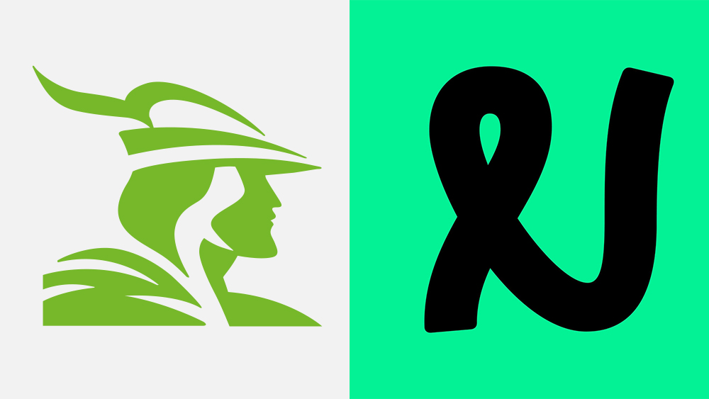
For decades, Nottingham Building Society had maintained a strong visual connection to its home city in the form of a logo design featuring the iconic image of Robin Hood, identifiable by his bycocket. The legendary prince of thieves remains part of the identity of the city in the Midlands, and a big tourist attraction.
But times have changed. The building society (a bit like a credit union for US readers) no longer operates in Nottinghamshire alone, boasting several branches in neighbouring counties. Nor, I presume, does it rob from its richer clients to give to the poor. As a result, it's decided it was time to drop Robin Hood from its brand identity and replace him with... a squiggle. Unsurprisingly, there's an almighty outcry (One of the best logos, it is not).