2024 is on the horizon and with it comes the usual swathe of colour predictions for the new year. However, Etsy has surprised us this year by announcing a rich and festive shade as the colour it's earmarking as big news in the New Year.
We love to hear about a new colour trend for our home. Paint is after all one of the most affordable ways to update your house. We've already seen blues and greens named as part of the colour palette for 2024, but Etsy announced their prediction for the 2024 Colour of the Year, and it is – *drum roll* - Berry!
Etsy’s Colour of the Year 2024
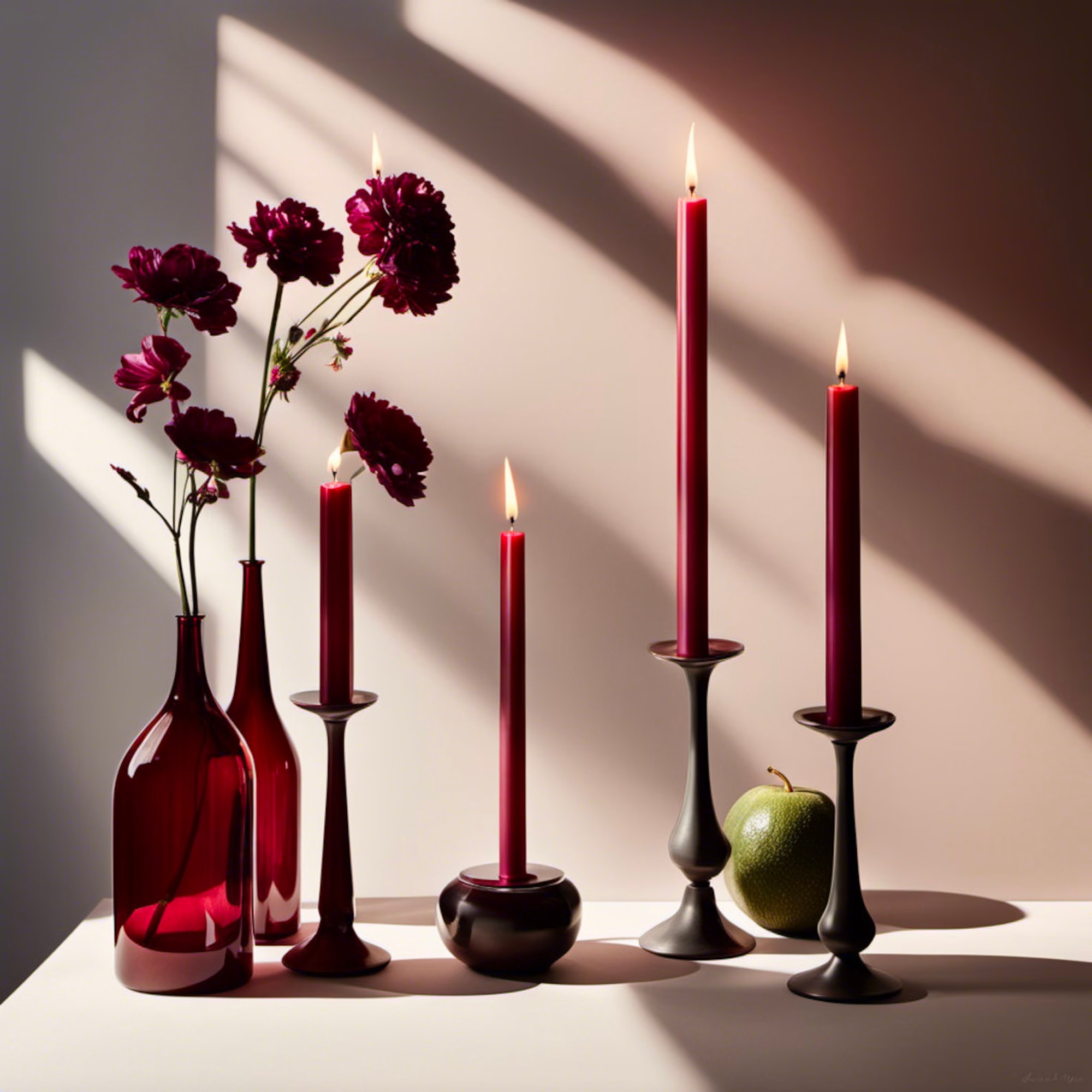
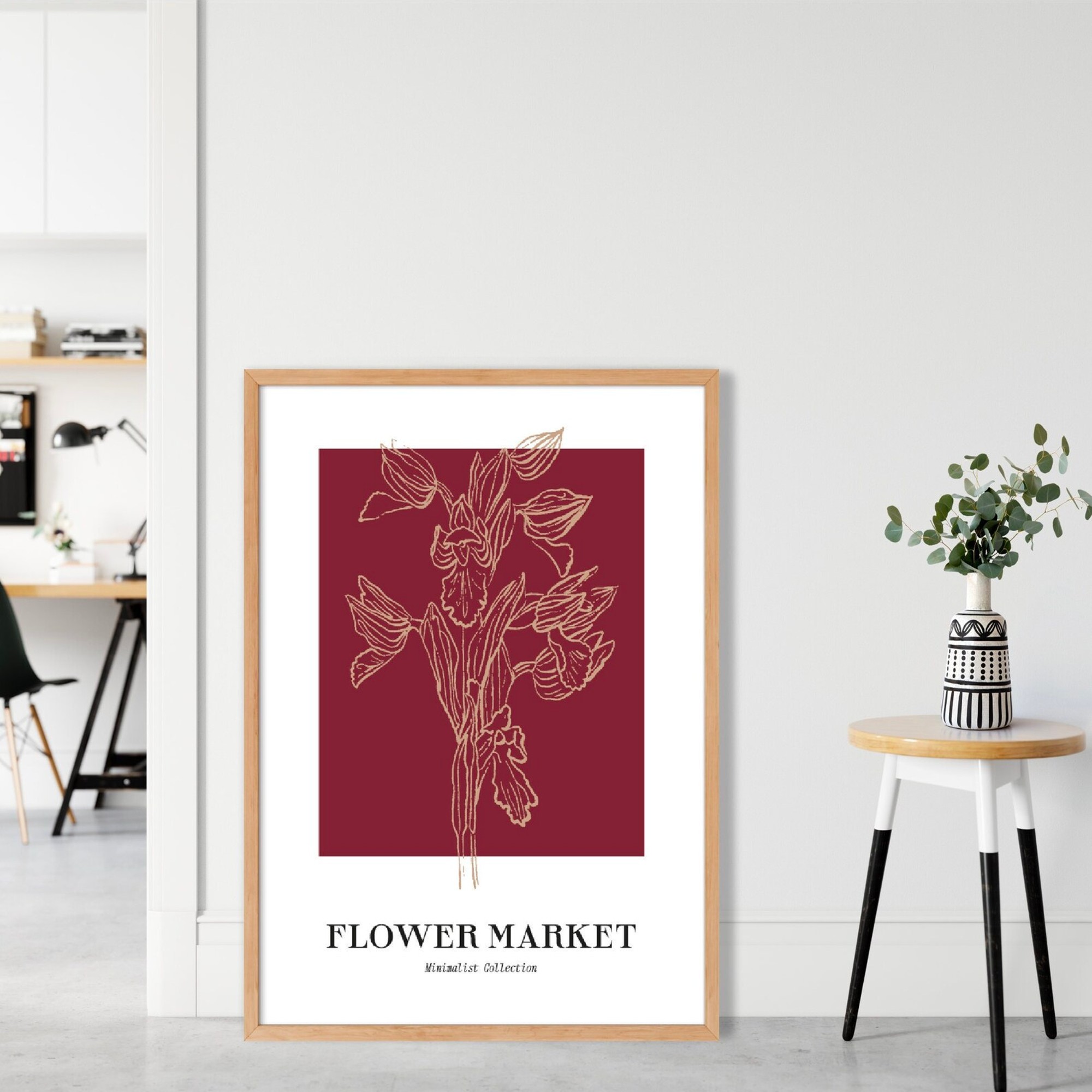
Berry is Etsy’s Colour of the Year, and it is best described as a mix of deep red, pinks and purples - think deep red frozen raspberries, or purple/red sweets.
Etsy’s Trend Expert, Dayna Isom Johnson explains that the trend towards berry hues in our interiors is likely borne from our growing desire to lean into all things pretty and romantic when we're relaxing at home.
'As we look to the new year ahead, we’re captivated by the theme of romance and the growing trend of “romanticising” life that is emerging, perhaps in response to the unpredictable state of the world we live in,' she said.
'And Etsy’s 2024 Colour of the Year perfectly complements the theme of romance.'

Dayna explains that, following the obsession with pinks following the ‘Barbiecore’ trend, Berry has followed as a natural progression.
'Berry – a shade that blends rich reds and blue tones – can be thought of as a grown-up version of the popular pinks of 2023,' Dayna said. 'In fact, we’ve seen hot pink items trending down on Etsy, making room for this more relaxed and undeniably romantic shade.'
We also love how festive the Berry shade feels; reminiscent of the berries in winter foliage, it's a great choice for decorating your home this December.
Interior designer and stylist Francesca Harris, of Francesca Harris Design, explains that using this bold colour in your home may seem overwhelming, but that it’s actually far easier to incorporate into your space than the pinks of the Barbiecore trend.
'It’s a mature, relaxed colour that I think is a lot easier to use than the brighter pinks,' she says. 'It is a romantic and indulgent colour, so will add a lovely element of warmth and depth to a space.'

However, both Francesca and Interiors therapist Suzanne Roynon stress that you shouldn’t over-do Berry in your home.
'It packs a punch so you don’t need very much of it, so think of using it in accessories or soft furnishings, for example in cushions, candles or smaller décor items,' Francesca says. 'It works really well with other bold colours like deep blues and greens, and really pops with a gold or brass accent.'
Suzanne also warns, 'Although it's bright, breezy and beautiful, use Berry with care. It is a vibrant fire colour, and too much fire energy in a home can be exhausting, leading to burn out and the associated tensions and irritations.
'So if you redecorate with Berry and you find things aren't going well, it might be time to tone it down with a balancing, earthier shade.'


