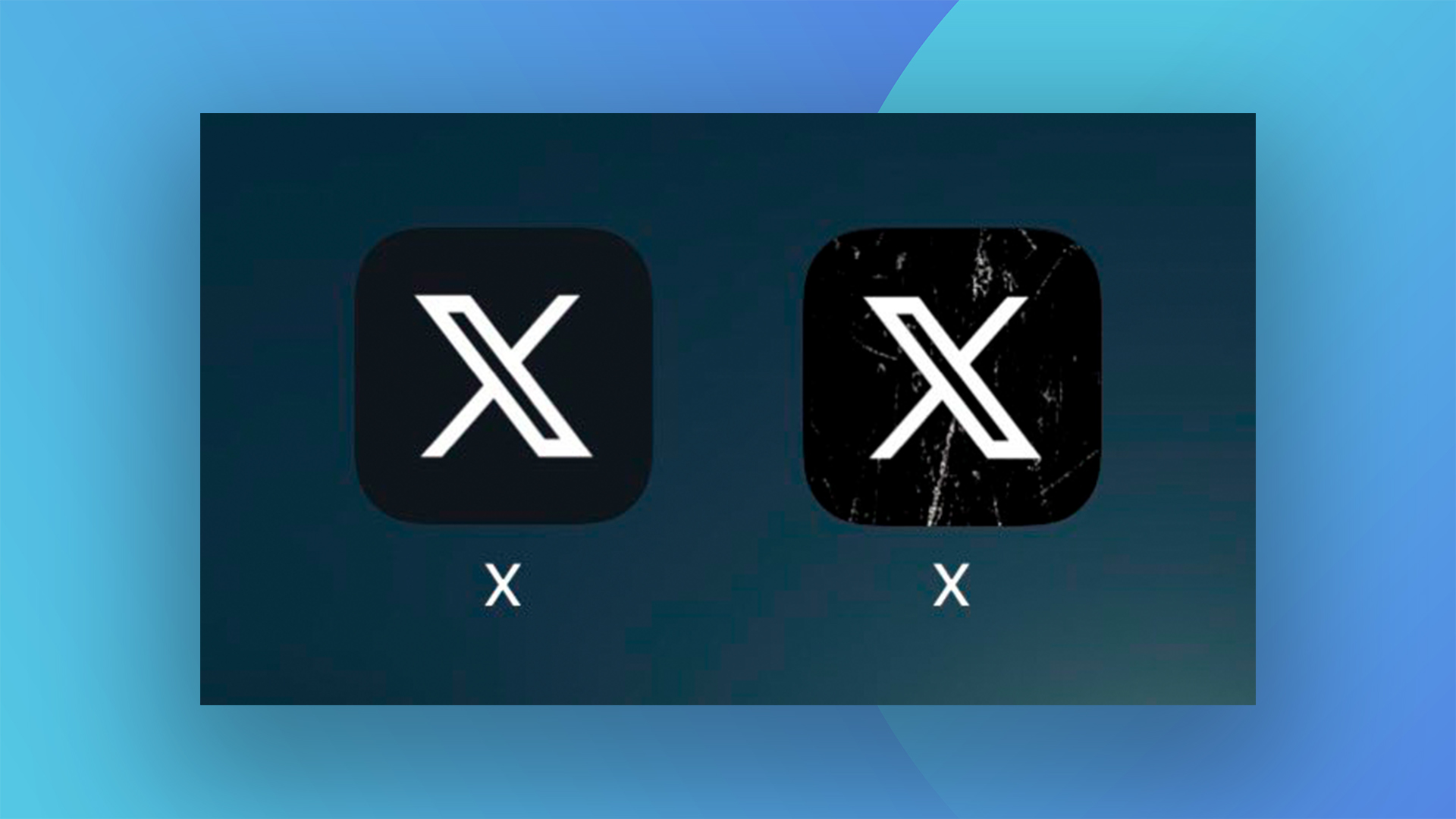
Pity the poor art and design journalist tasked with seeking out new and exciting stories about branding over the last month. Since 24 July, a single chaotic rebrand has hogged the headlines – and here we are, writing about it again. Elon, if you could just leave the 'X' logo alone for a second, that would be great. Cheers.
So what's new? One word: grunge. The app icon on users' home screens has changed again, with the addition of 'distressed' white marks atop the black background. And if you're thinking it all looks a bit 'How do you do, fellow kids?' You're not alone. One of the best logos of all time, this ain't.