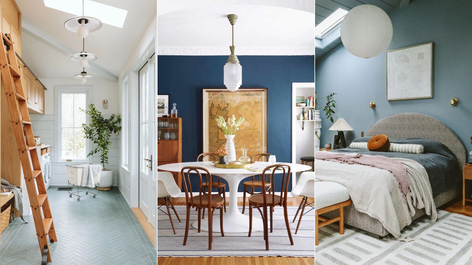
Picking out paint colors is an exciting stage of any renovation, but it can't be overstated how big of an impact a single shade can have on a space. Even the experts agree that it's a difficult choice. Aside from opting for swatches, it's nearly impossible to know what a room will feel like when it's swathed with your first-choice shade.
Luckily, interior designer Emily Henderson just took to Instagram to share her go-tos when decorating with blue – and we have to agree, they're stunning. Here are the tried-and-true hues she picked out, and why she finds them so inspiring.
'Choosing the right paint color is so challenging. If you get the wrong one, then you either have to live with it, or you have to repaint – both of which suck. So I'm doing a new series where I'm going to show you my favorite paint colors that I've used, that I've lived inside of, that I've experienced myself that are kind of no-fails for me, starting with blue,' says Emily.
Emily Henderson's all-time favorite shades of blue
Blue can be a tricky color to decorate with, as it's difficult to strike a balance between too much and not enough pigment. Just because you know you'd like a blue room, there's an endless line-up of options, from deep navy to airy eggshell. With even more options listed on her blog, these are the best blue paints that Emily stands by, even after living with them on her walls.
1. Slate Tile by Sherwin-Williams
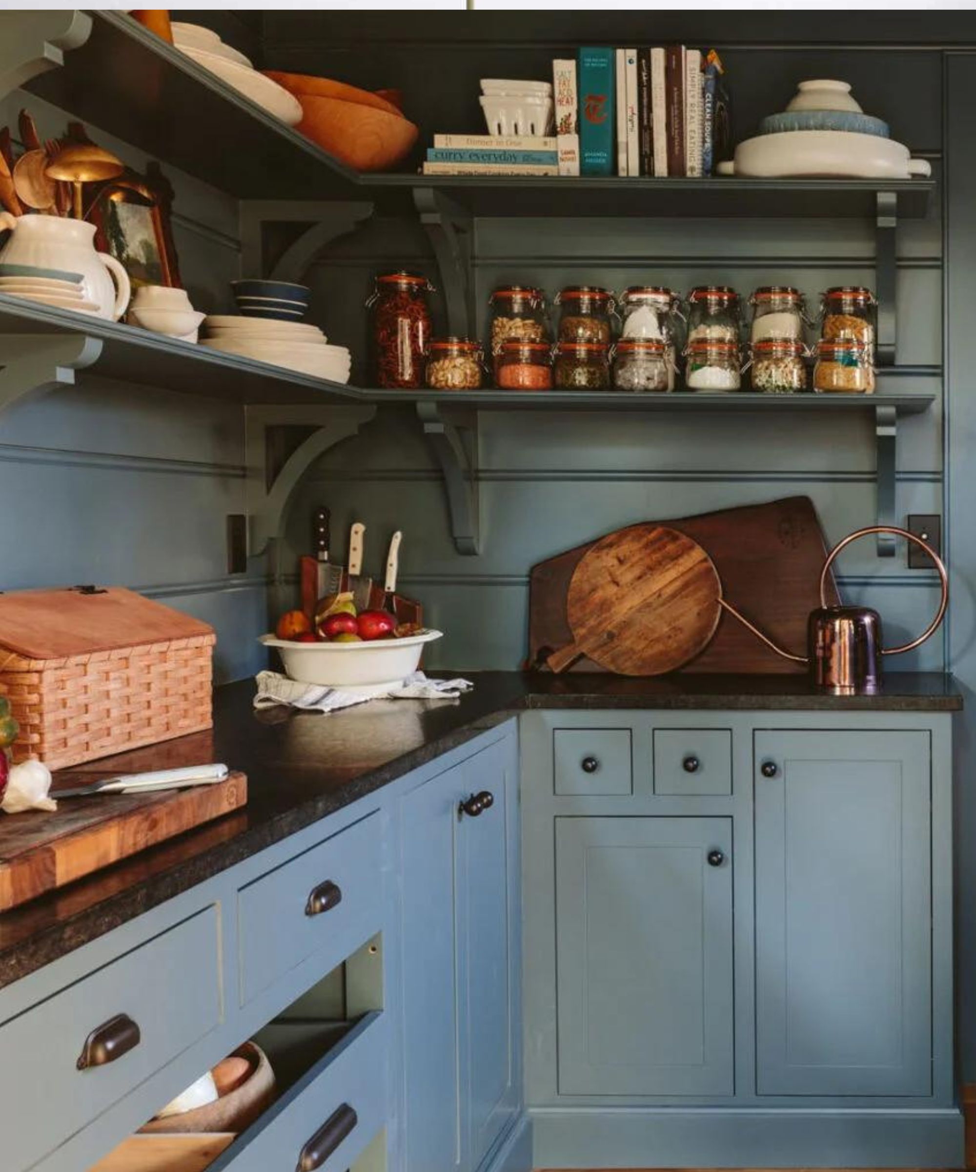
The first shade on Emily's list is Slate Tile from Sherwin-Williams, a blue-gray hue that lives just between statement and neutral. She suggests using this pick for rooms that don't get a lot of sun.
'We used this in our pantry – I love it. It's really great for a low light situation because it has enough pigment that it still feels like blue,' Emily says in the video.
In the designer's pantry, she opted to paint the walls, shelves and cabinetry in Slate Tile, making a stylish statement and contrasting with the dark kitchen countertop.
2. Stiffkey Blue by Farrow & Ball
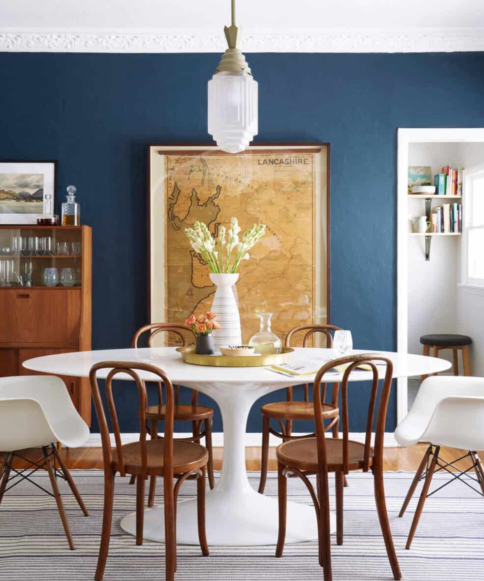
If you're looking for something a bit more bold, Emily recommends Stiffkey Blue from Farrow & Ball. The designer says she's used this shade in multiple projects because despite its darker undertones, 'it doesn't feel royal.'
'It doesn't feel too bright and annoying. It's just a really excellent blue that draws you in and makes a statement,' she says.
In this dining room, in the home of and designed by interior designer Ginny MacDonald, the shade pairs beautifully with bright whites and light wood tones.
3. Dew Drop by Sherwin-Williams
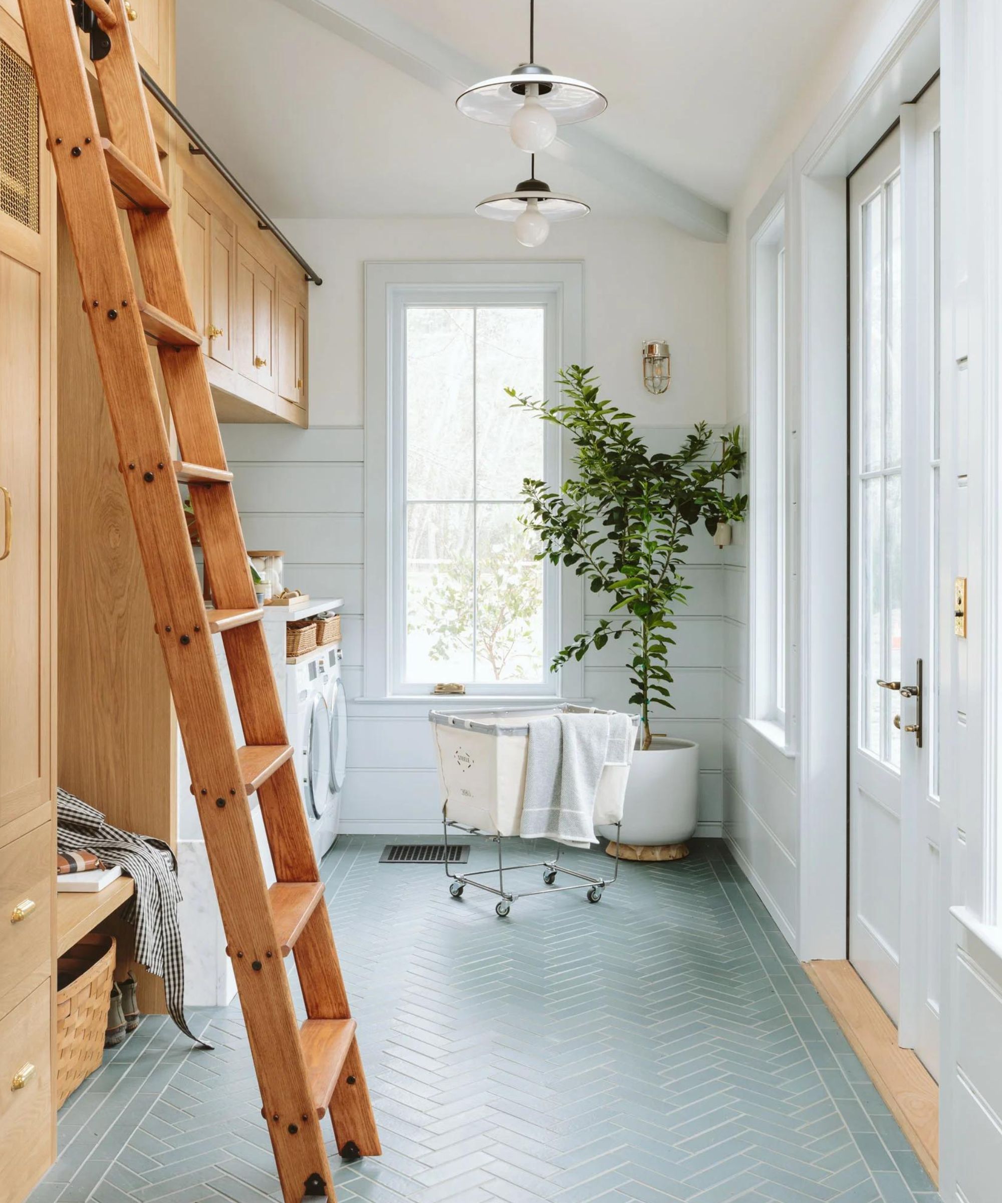
'Lastly, coming from my own personal mudroom, is Dew Drop – also by Sherwin-Williams. This is a light blue, and it is calm, it is airy, it feels really refreshing. Every time I'm in that room, I'm like, "Oh this is the perfect paint color for a really soothing, soothing vibe"' says Emily.
A departure from the other bold, deep blues on the list, Dew Drop stuns with serene simplicity. The perfect choice for a bathroom, bedroom, or mudroom like Emily's, this shade transports you to a calmer place.
4. Debonair by Sherwin-Williams
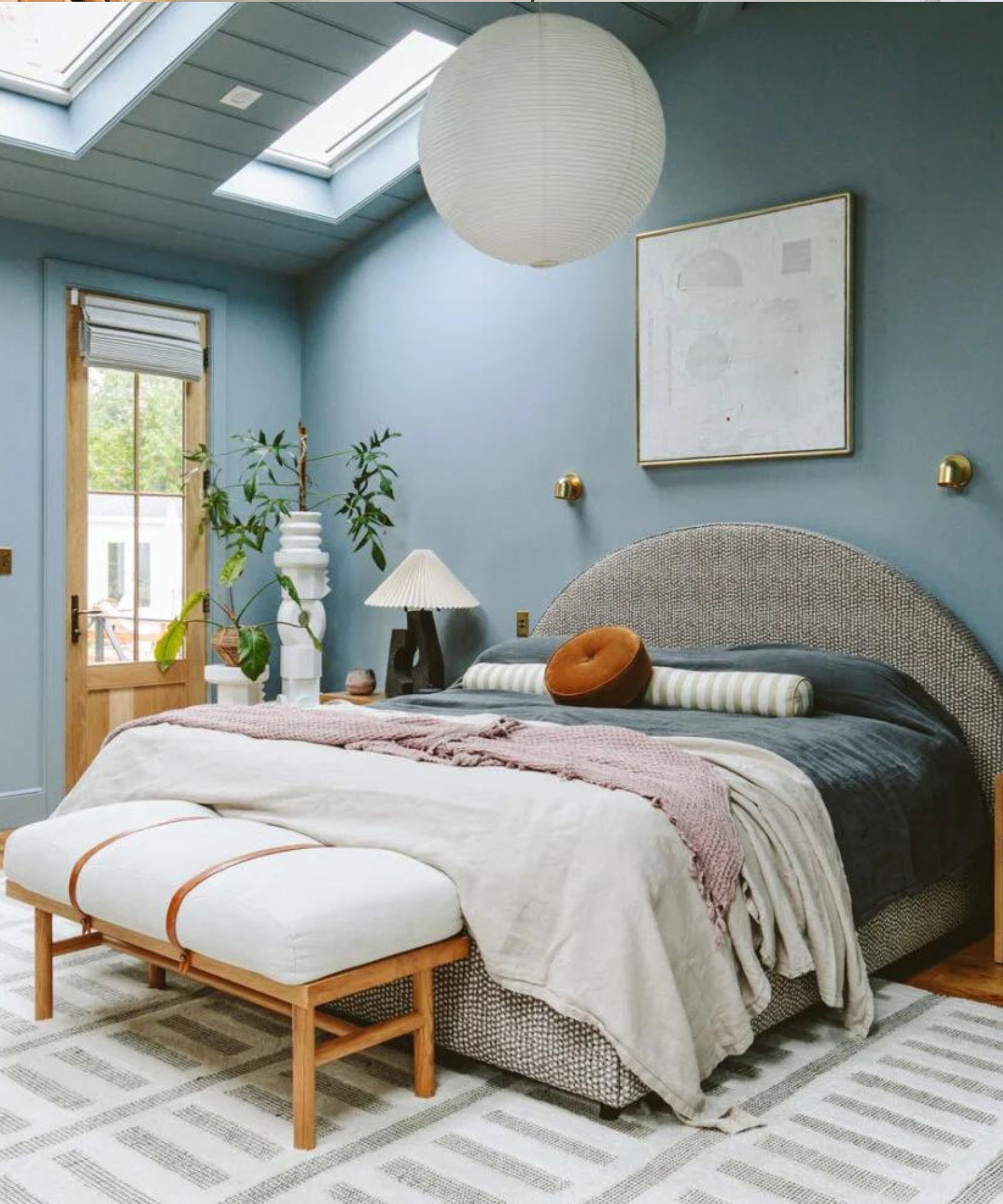
As a bonus favorite, Emily adds Debonair from Sherwin Williams – the shade she chose to finish off her recent bedroom renovation.
'It is so good, especially for a lower light situation. At night, it is so soothing and moody,' she says in the video.
Emily's other favorites include Sleepy Blue from Sherwin-Williams, Good Jeans from Clare Paint, Waterloo from Sherwin-Williams, Grays Harbor from Sherwin-Williams, Blue Note from Benjamin Moore, Cyberspace from Sherwin-Williams, Hague Blue from Farrow & Ball, Inchyra Blue from Farrow & Ball, Still Water from Sherwin-Williams and French Beret from Benjamin Moore. She shares more information on each shade in her blog post, including styling tips and how each shade makes her feel.
Emily is taking the hard part out of paint shopping. Whether you're looking for something soothing or want to make a statement, there's a blue shade fit for every home. We can't wait to see which color list she shares next.

