A Japanese army infantry logo has been subject to criticism for its "inappropriate" AI-generated design. It was so poorly received that Japan's military, the SDF, had no choice but to release a statement claiming they had misjudged how the public would react to the logo design, and that it would be promptly scrapped.
Created as a symbol to unify the 1st Infantry Regiment, the patch possessed all the charm of typical AI slop, with bizarre visuals that came across as meagre, rather than menacing. Despite its lacklustre appeal, the logo's strong response from critics demonstrates that emblems are much more than empty design.
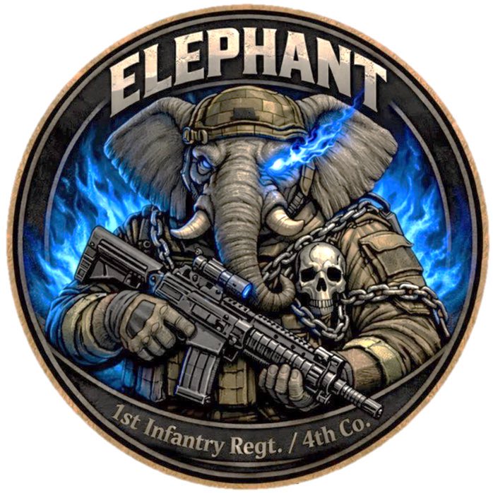
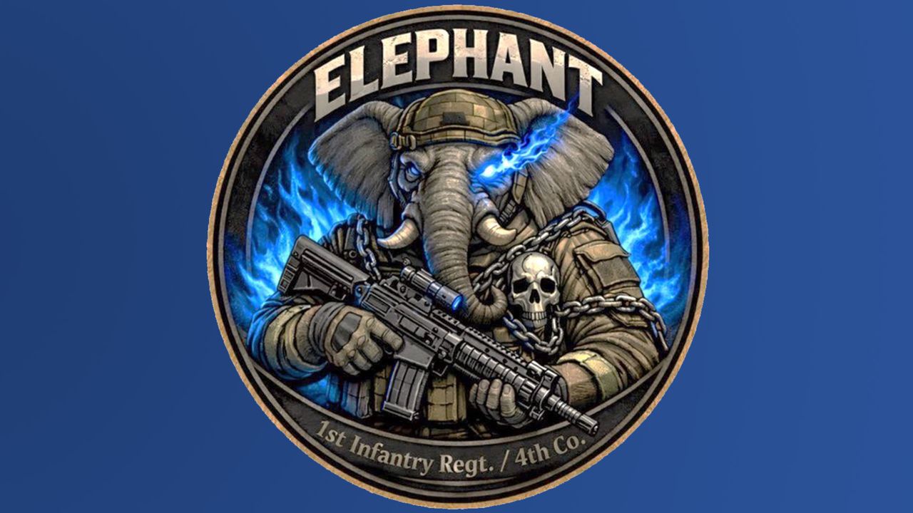
The design in question features a gun-slinging elephant with blue flame eyes (yes, really). Chained to its chest is what appears to be a human skull, while its threatening glare and military regalia give the design an oppressive feel. The regiment claimed the design was created to boost morale and bring a sense of unity, with the design set to appear on T-shirts, badges and other accessories.
Whether it's the unashamed use of AI or the choice of visuals, critics weren't happy with the design, calling it "shameless", "embarrassing" and "pathetic". "The problem is more than just a lack of design sense," one X user claimed, adding, "Isn't it that the Self-Defence Forces are an organisation that's utterly insensitive about generating plagiarised images?" Another critic demanded, "If you're going to make it an official logo for the Self-Defence Forces, then pay the money properly and have a designer make it."
When criticism didn't cease, the Ground SDF released the following statement: "After comprehensively reviewing the design, we realised that we did not accurately anticipate how the public would perceive the image and it has therefore been decided that it is not something that should be actively disseminated externally.”
While it's arguably positive news that the controversial logo has been retired, the apology feels a little underwhelming given that much of the backlash surrounded the design's AI origins. Instead of apologising for its mishap, the SDF seemingly scrapped the design due to public backlash, rather than feeling remorse for its actions.
For more controversial design news, check out why this otter logo caused online outrage or take a look at why NFL fans can't decide if the new Washington Commanders logo makes physical sense.