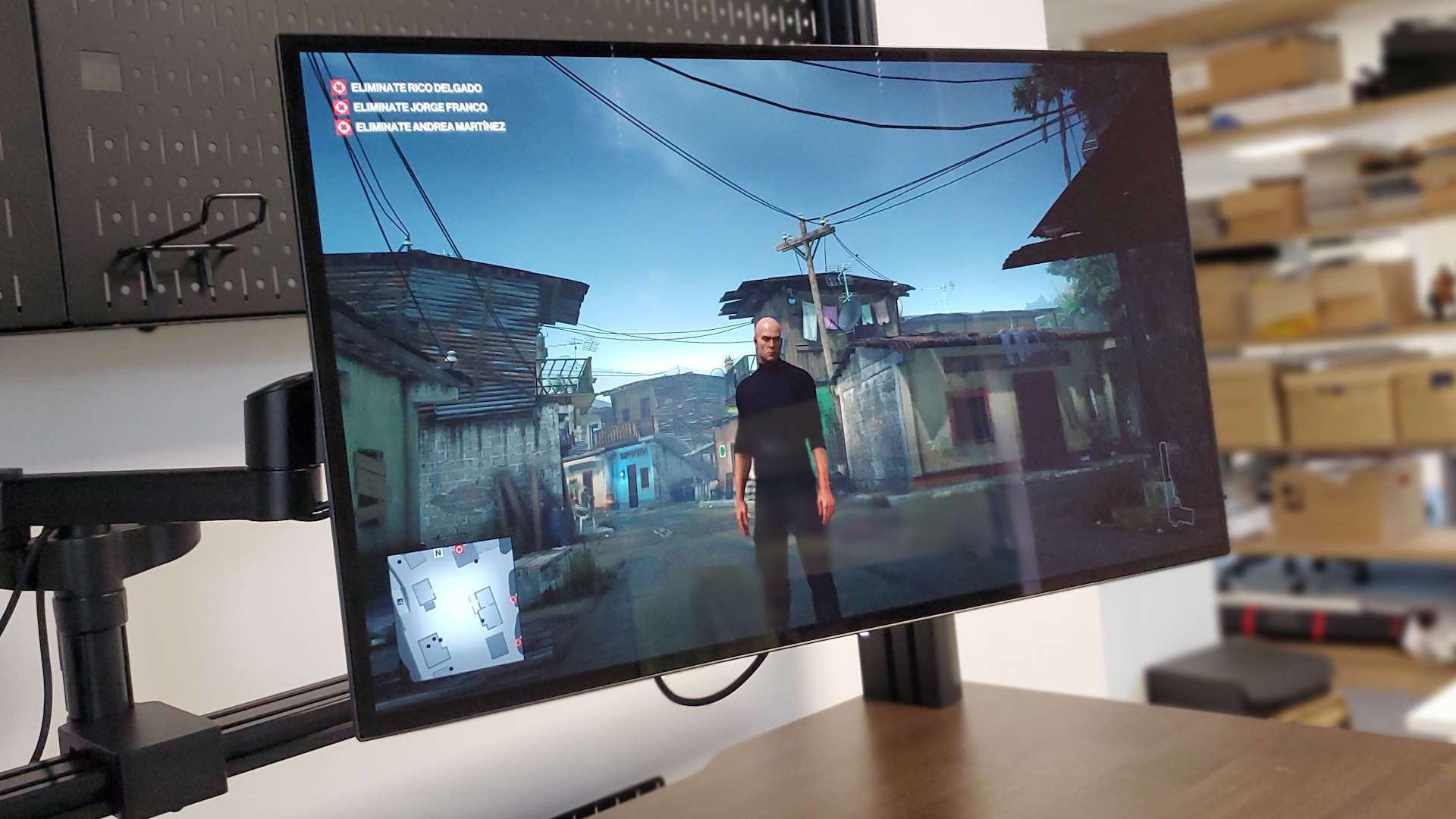
It feels weird when you've got a shiny new gaming screen sitting on your desktop, with all the rich OLED-ness we've been wanting from our monitors, to find yourself pining for the old-school IPS screen it's just displaced. But that's where I am with the new Dough Spectrum Black screen.
If you were to just casually glance over the specs of Dough's long-planned OLED monitor you'd maybe be forgiven for wondering just what my issue is. It is, after all, a 27-inch 1440p OLED panel with a 240 Hz refresh rate, a response time so low you might as well just say it's effectively instant, and it all comes under a lovely glossy Gorilla Glass cover.
What's not to like, as my dear ol' dad is wont to say? A surprising amount, actually. Mostly because I don't think any 27-inch 1440p display should ever be priced over $1,100. That would be the case even if it was the best example of a 1440p panel I'd ever seen, but with the pricing and the additional drawbacks of OLED as a monitor technology, that makes this far from the sweet spot of gaming monitor perfection.
Yes, you can pick it up for less if you opt for the cheaper matte coating, or if you already have an existing monitor arm and can eschew the need for the $99 stand which doesn't come as standard and otherwise bumps the price up to $1,200. But that's still a lot to spend on a mid-res display when you can buy subjectively superior 4K IPS screens for less. From the same company should you so desire.
Screen size: 27-inch
Native resolution: 2560 x 1440
Panel technology: LG W-OLED
Coating: Gorilla Glass DXC or Matte
Brightness: 150 cd/m² typical
450 cd/m² peak
1,000 cd/m² peak (HDR)
Refresh rate: 240 Hz
Response time: 0.03 ms (GtG)
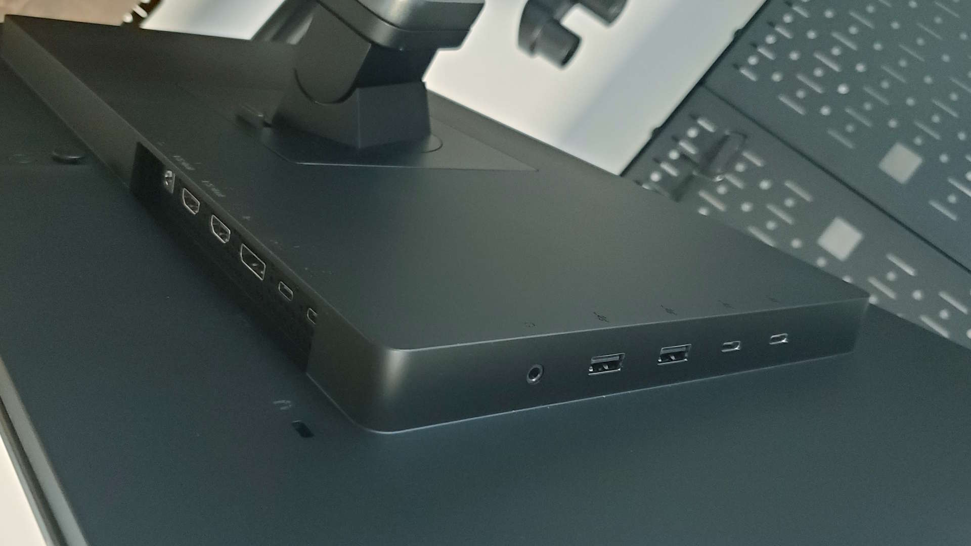
Inputs: 2x HDMI 2.1a, 1x DisplayPort 1.4, 1x USB Type-C DisplayPort, 1x USB Type-C upstream connection
Output: 2x USB Type-C 3.1 Gen2, 2x USB Type-A 3.1 Gen2, 1x 3.5mm audio
Price: $1,100 (Gorilla Glass) | $899 (Matte) | With stand + $99
Before plugging it in I actually thought it was going to be the brightness, or lack thereof, which would be my biggest issue using the Spectrum Black. It's sporting LG's first-gen OLED monitor panel, which means you're getting a typical 150 cd/m² brightness level, with a peak of 450 cd/m². You can get up to 1,000 cd/m² of peak luminance in HDR mode, but only on 3% of the screen. So, you will get some pin-prick peaks of super HDR brightness, though the overall scene can remain pretty dull, especially on outside scenes.
But after an initial ick over the comparatively dull image—having swapped from a crisp 750 cd/m² display—I got used to it far quicker than I expected. Sure, in a brightly lit office it can look a bit dim, but even using it here in PCG Towers it's got enough about it that I've not been concerned about it. And in the poorly lit confines of my home gaming space, it really isn't a problem at all.
Honestly, I don't want retina-searing full screen brightness for every moment I'm sitting in front of my gaming monitor, so I'm actually going to let it off on the brightness count. It still looks quite lovely in games, with that colour and contrast really making scenes look rich, especially when you can indulge in a little light HDR funtimes, too. Mostly. I would still prefer to have the slightly higher QD-OLED brightness Samsung's panels offer on the whole, but that's not the real kicker here.
My biggest issue, it turns out, is the lack of clarity in the panel during general PC use. That isn't just a factor of my switching from a panel of the same size but with a much higher density of pixels—owing to its 4K resolution IPS panel—but also because there is a real issue with fonts at this 1440p scale on an OLED monitor.

On the Windows desktop, there's a certain fuzz, a sometimes extra colouring around the fonts. And look at anything on your Windows desktop and it's likely you're going to be eyeballing a fair amount of text if you're not already deeply embedded in a game.
You can see the issue in the image above. Yes, it's zoomed in which makes it more noticeable, but it's this that lends the indistinct feeling to the LG panel's text reproduction.
The problem is TVs and kinda Microsoft, but mostly the people making TV panels. In this case, it's LG, but the font fringing problem is an issue with Samsung's QD-OLED displays, too, maybe even to a greater extent.
It's all because of the subpixel structure. On a standard LCD panel, each pixel is made up of an RGB subpixel, with the colours represented in that order. And, over the years, Microsoft has built its font rendering around that design with things like ClearType helping sharpen things up. Now we're starting to use panels essentially designed to go into TVs, and they don't care about such things as Windows' fonts. So, we have the Samsung QD-OLED subpixel which is arranged in some horrendous triangular formation, and LG using a W-OLED design, which adds a white subpixel into the traditional red, green, and blue arrangement.
Except it's not an RGB arrangement, for reasons best known to LG it went with a red, white, blue, green subpixel layout. And yeah, Windows is most definitely not ready for that sort of cavalier attitude towards how you build your pixels.
I've tried disabling ClearType, tuning ClearType, and running MacType profiles, but none of it has made a huge difference. More importantly, on a $1,200 screen, I don't want to have to go off trying to find ways to make my expensive new PC monitor work effectively as a PC monitor.
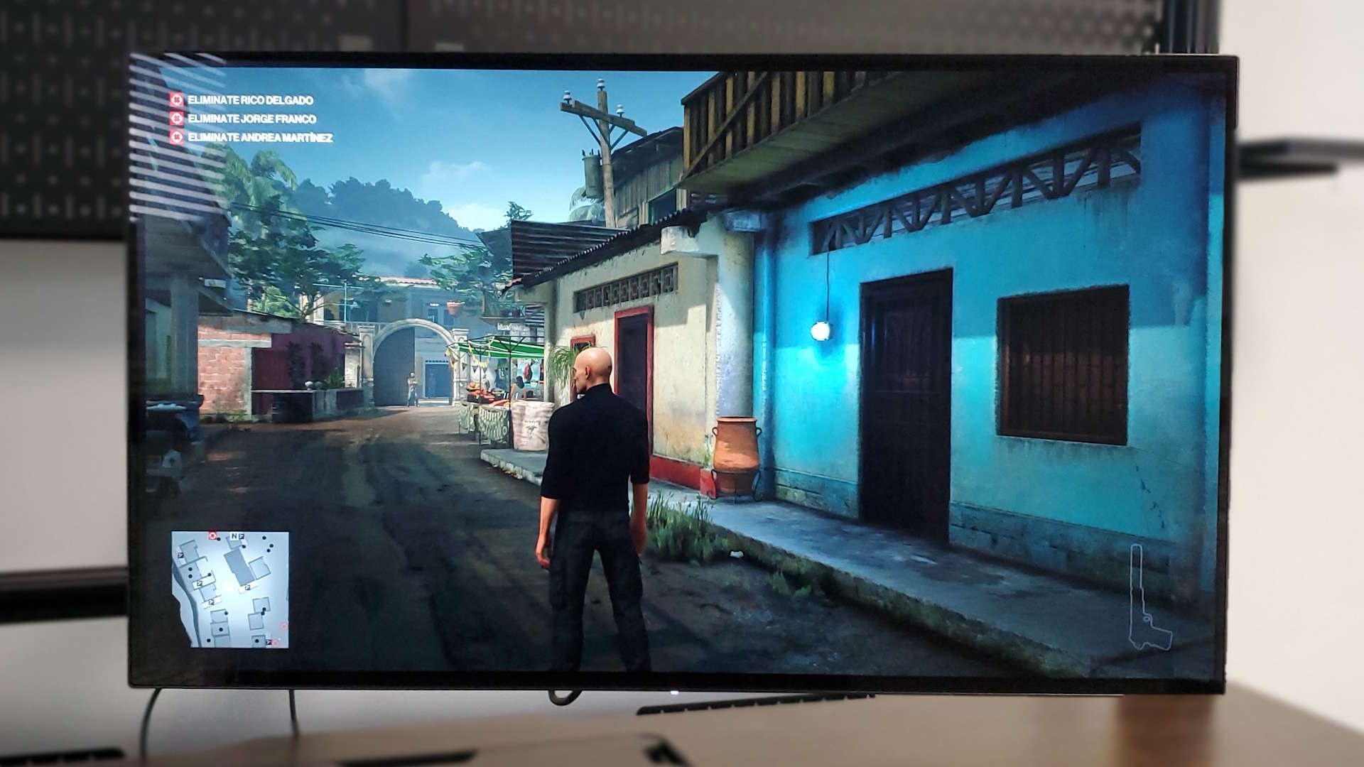
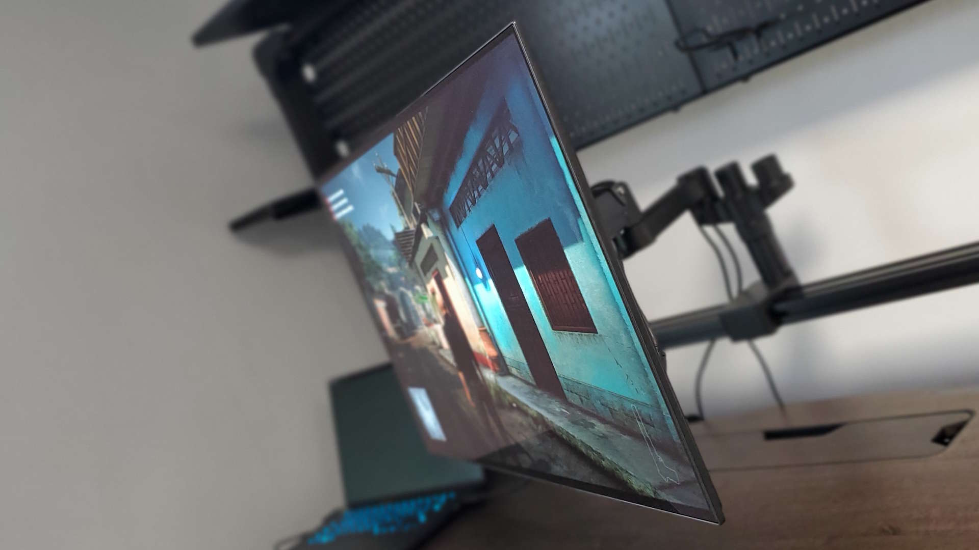
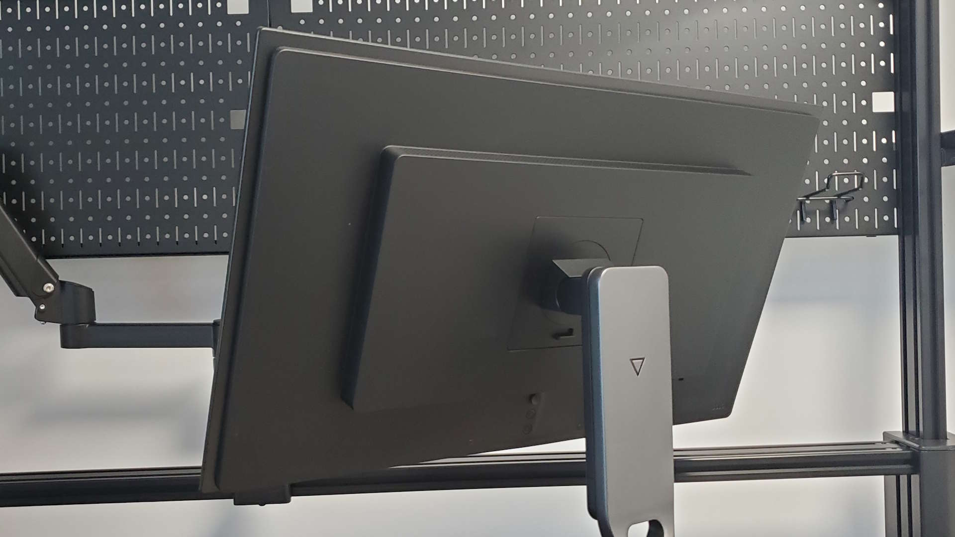
The thing is, I could probably live with it. If this was my only display, and I was primarily gaming on it, too. I'd enjoy schlepping around a neon-lit Night City, and double-tapping randos in Hitman, and I'd probably forget all about the slightly indistinct nature of the text and grow used to the slight nagging headache from staring at it all day long.
Because there are still a lot of good points about this screen. The classic OLED blacks and deeply and truly inky, the contrast is crisp and the response speedy. The 240 Hz refresh is welcome, too, and offers a frame rate match more attainable thanks to the 1440p resolution. In-game that slightly lower brightness isn't a problem because the deeper contrast offers genuine HDR, especially when it can show off those pin-prick 1,000 cd/m2 peaks of luminance.
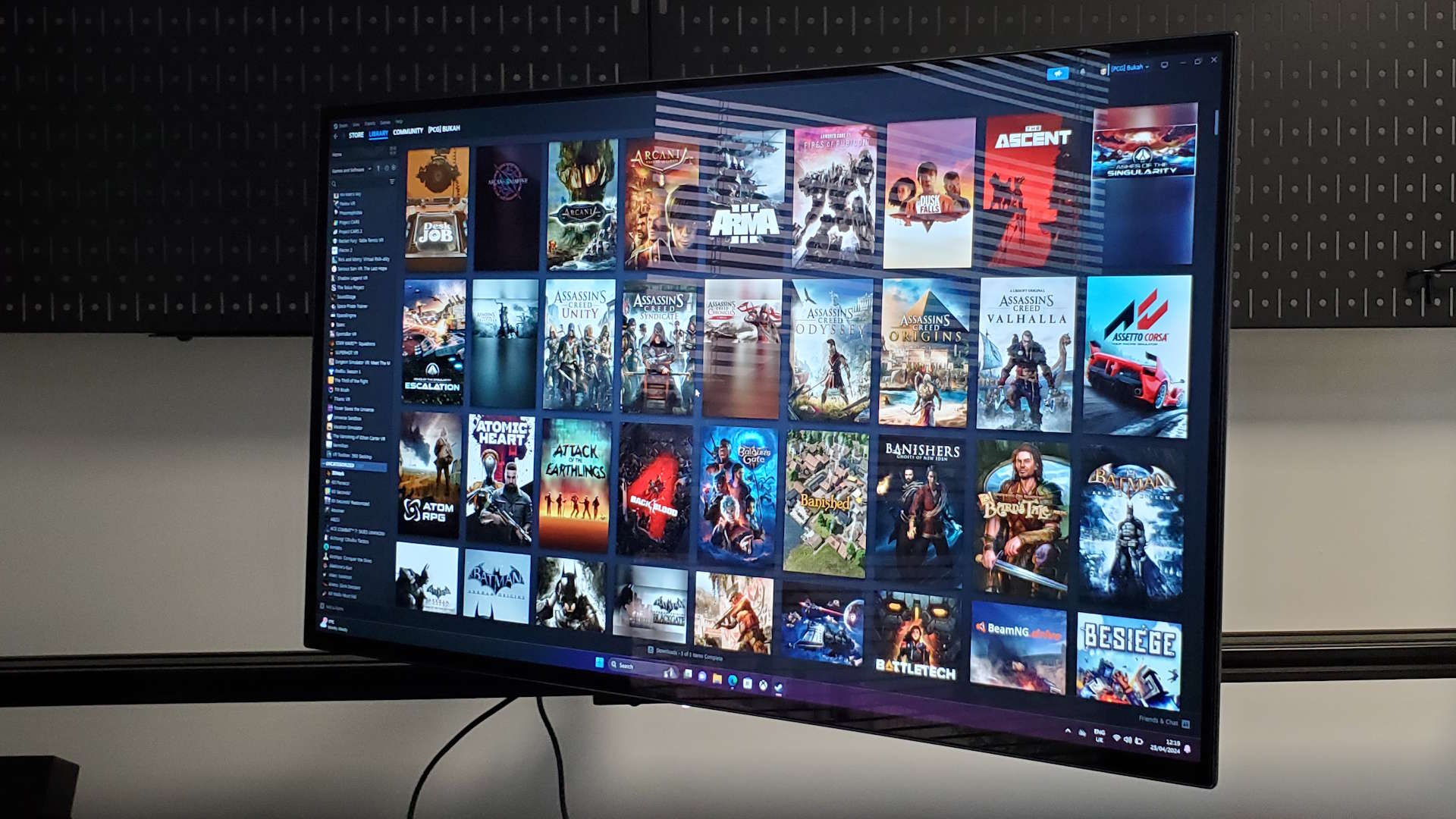
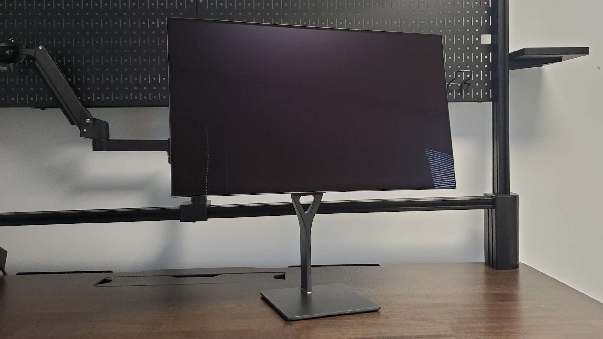
I also like Dough's attention to the style of the screen, and, were it not for larger bezels because of the over-provisioning of pixels so it can pixel-shift the screen to accommodate the potential of OLED-based burn-in, I'd say it was one of the best-looking OLED monitors I've seen. It's thinner on the rear of the screen than most and still comes with a huge number of connectivity options.
I dig the USB Type-C hub, the 100 W power delivery over the alt DisplayPort protocol, and the fact you get a KVM switch built in. There are also a pair of HDMI 2.1 ports to go along with the DisplayPort 1.4 option for those console folk.

But there is still some other weirdness about the screen, too, beyond even the font fringing and general dimness. I'm a Football Manager obsessive, and that's my go-to gaming fallback. So any screen-o-mine is going to have to love FM as much as I do—and the Dough Spectrum Black has real issues with it. The game is not really demanding, but there is something going on with the prevalent grey tones of the interface (it's not a boring spreadsheet manager, I swear) that really pains this panel.
The mere act of moving the mouse cursor one pixel affects the brightness of the display until you take your hand away from the offending peripheral. This happens in both HDR and SDR modes, and I cannot find an explanation for it, as I don't see the effect in any other game or application, and not on any other screen.
Then there's the weirdness of Display Stream Compression (DSC) as used here. It means the system will offer you the option to actually output in 3840 x 2160, but I don't really see why you would. It makes the display even more dull, makes text even harder to parse, and limits your refresh to 60 Hz. It feels like a 🤷♂️ "could be worse" setting designed to make you feel better about the screen when it's inevitably disabled.
I am obviously missing something here because I thought DSC was primarily designed to allow higher resolutions to be supported over specific cables to allow different devices to output to native 4K screens without needing multiple cables to hit high refresh rates. This is not that.

Hopefully by now, you're getting the sense that spending $1,200 on this screen isn't in your best interests. It's not even like this is your best shot at getting a sensibly sized OLED gaming monitor on your desktop, either. For a whole lot less cash you can pick up the ultrawide Alienware 34 AW3423DWF. And if you really, absolutely, positively must have a straight 16:9 1440p OLED then the MSI MPG 271QRX, with its QD-OLED panel is a far better bet for less money than this. But when essentially the same money will net you one of the latest Samsung QD-OLED based 32-inch 4K screens I really don't see why you'd buy anything else.
Any of those would be where the smart money goes. All the clarity issues of OLED panels disappear as soon as the pixel density goes up, and the Samsung panels are a little bit brighter than LG's. But only a little. The 32-inchers though are still far more desirable, and when they're the same sort of price as this disappointing 1440p display, I cannot see why anyone willing to spend $1,000+ on a screen that wouldn't prefer a crystal clear 4K panel.
✅ Maybe you want a really expensive 1440p OLED for your Xbox or PS5: I'm clutching at straws here, people.
❌ You want the best gaming monitor tech: OLED has a lot going for it, but the upsides of the technology in this pricey 1440p panel cannot outweigh all the downsides.
❌ You want a clean, crisp monitor for general use: The slight clarity issues make it a less than ideal display for Windows-based work.
But there are still more general OLED problems and that surrounds the burn-in issues inherent in the technology. And generally surrounds the amount of management and mitigation features that are built into modern OLED displays. Pixel shift is an annoyance more than anything, and I constantly find it jarring every time I see my screen move the slightest amount as if my machine is about to bluescreen on me.
The sheer number of other features dedicated to making sure burn-in isn't a problem is a problem in itself. More than anything, it serves to remind me that burn-in is an issue. And now I've got to figure out what all the different features do, what they affect, whether I need all of them, or which I can just ignore for the sake of my new monitor and my own sanity.
I don't want to have to manage all this, to fear what might happen if I get it wrong. I also don't really want to have to deal with the dullness of LG's OG OLEDs, nor do I want the indistinct fuzzy fringing of the display and the weird subpixels. And, probably more than anything, I don't want to spend $1,200 on this 1440p monitor.
So, back to my ol' 4K LCD I go…


