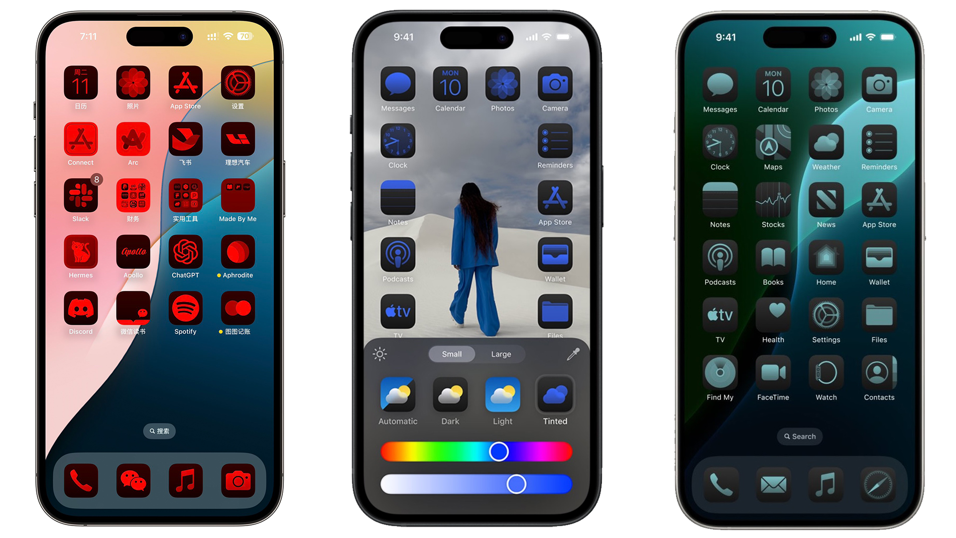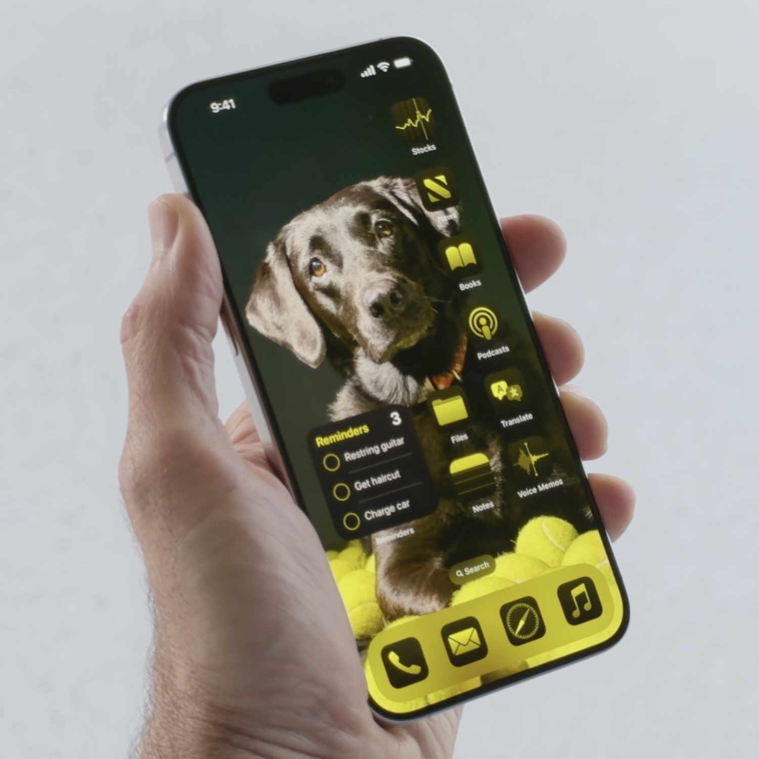
For all the fruitful AI announcements during yesterday's WWDC conference, some of the loudest cheers were reserved for the most basic features. Most notable perhaps was the new Calculator app for the iPad, but another "it's about time" addition is the ability to customise the iPhone homescreen by placing icons anywhere. Oh, and you can also change the colour of them.
The latter change is already proving to open up countless possibilities for the overall appearance of the iPhone – arguably the biggest step for customisability since iOS 14's custom icons. But judging by the response on Twitter (sorry, X), that might not necessarily be a good thing.

People have been calling iOS a 'walled garden' for years, partly thanks to the lack of design customisability. Colourful and asymmetrical homescreens were limited to jailbroken devices. But now, bright, clashing neon colours and random icon placements are being made available to the masses.
And almost straight after iOS 18 beta users began sharing their creations, people started bemoaning their ugliness on X, with some even calling Apple's entire aesthetic sensibilities into question.
the thing that made Apple so successful, and what Steve Jobs deeply understood, is that the masses have terrible taste and therefore must be strictly guard-railed from making their own aesthetic and design choices pic.twitter.com/oekPkQI2WcJune 11, 2024
Up until this moment, everyone's homescreens looked the same. Now they've given you the ability to ruin your homescreens... and you absolutely will. Welcome 😅 https://t.co/oBZ9u3mT3GJune 11, 2024
Is it just me, or has Apple lost its aesthetics plot?- Tinted home screen icons.- The ugly Siri icon.- The `I just learned CSS` Siri halo gradient. pic.twitter.com/rs2ZdiAyT9June 10, 2024
actually can’t believe that apple is shipping tinted icons… not a vibe pic.twitter.com/jk19VIU59kJune 10, 2024
Which is, of course, kind of ridiculous. Nobody is forcing users to change the colour of their icons. Sure, it did feel a little like Apple was trolling us with that neon yellow example in the keynote (and yeah, Steve Jobs probably wouldn't have loved that one), but more choice can only be a good thing.
Icons and wallpapers were hardly the headline of the keynote, though. That falls to AI – no, not artificial intelligence. Apple Intelligence. The comapny's new on-device machine learning was revealed to much fanfare, and could spell the end for a few plucky new gadgets released this year.


