Q: I’m starting to get on board with the trend for chrome-colored metals, but it still scares me a bit. How best to use it in a space so that the room still feels warm?
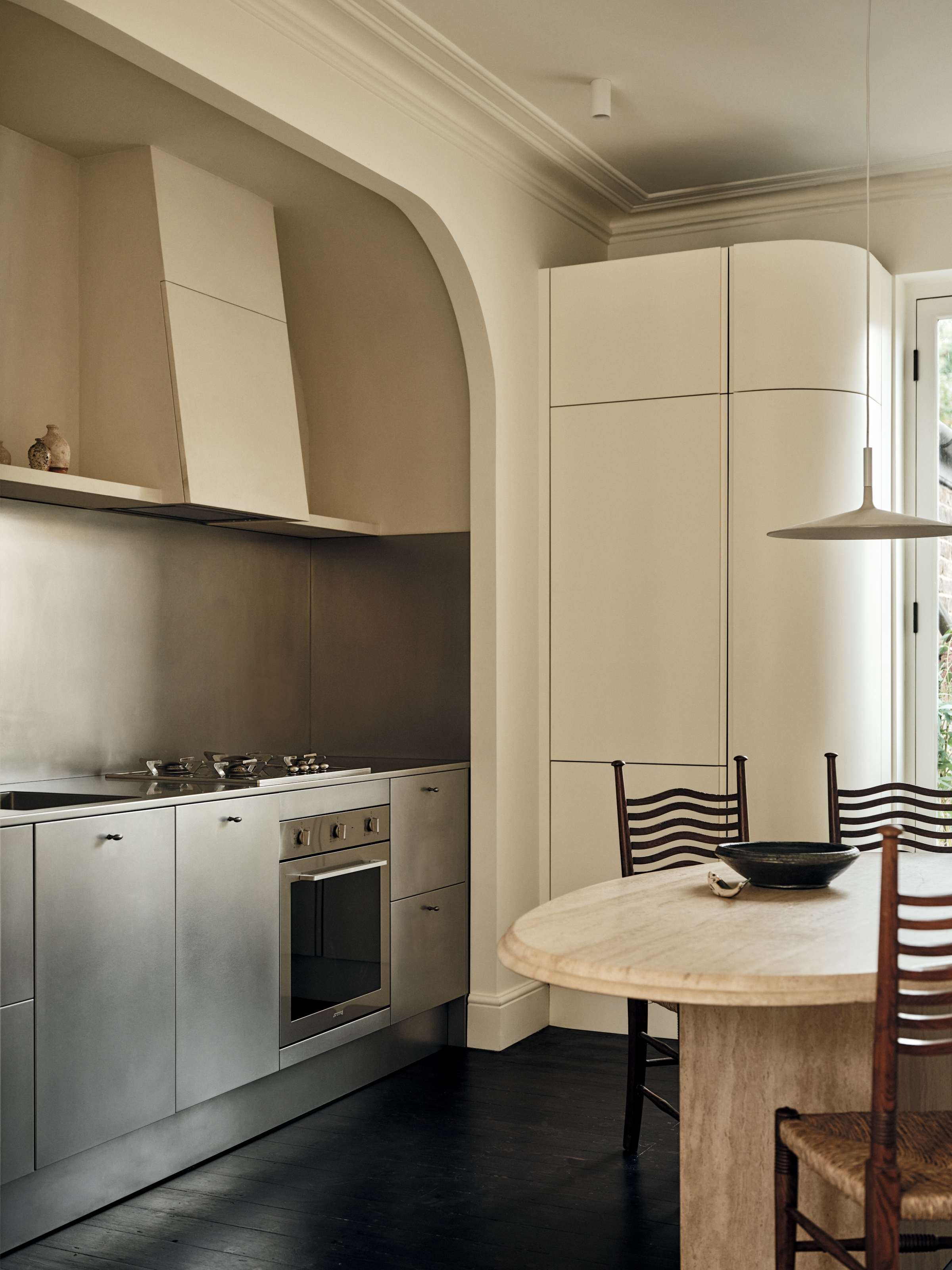
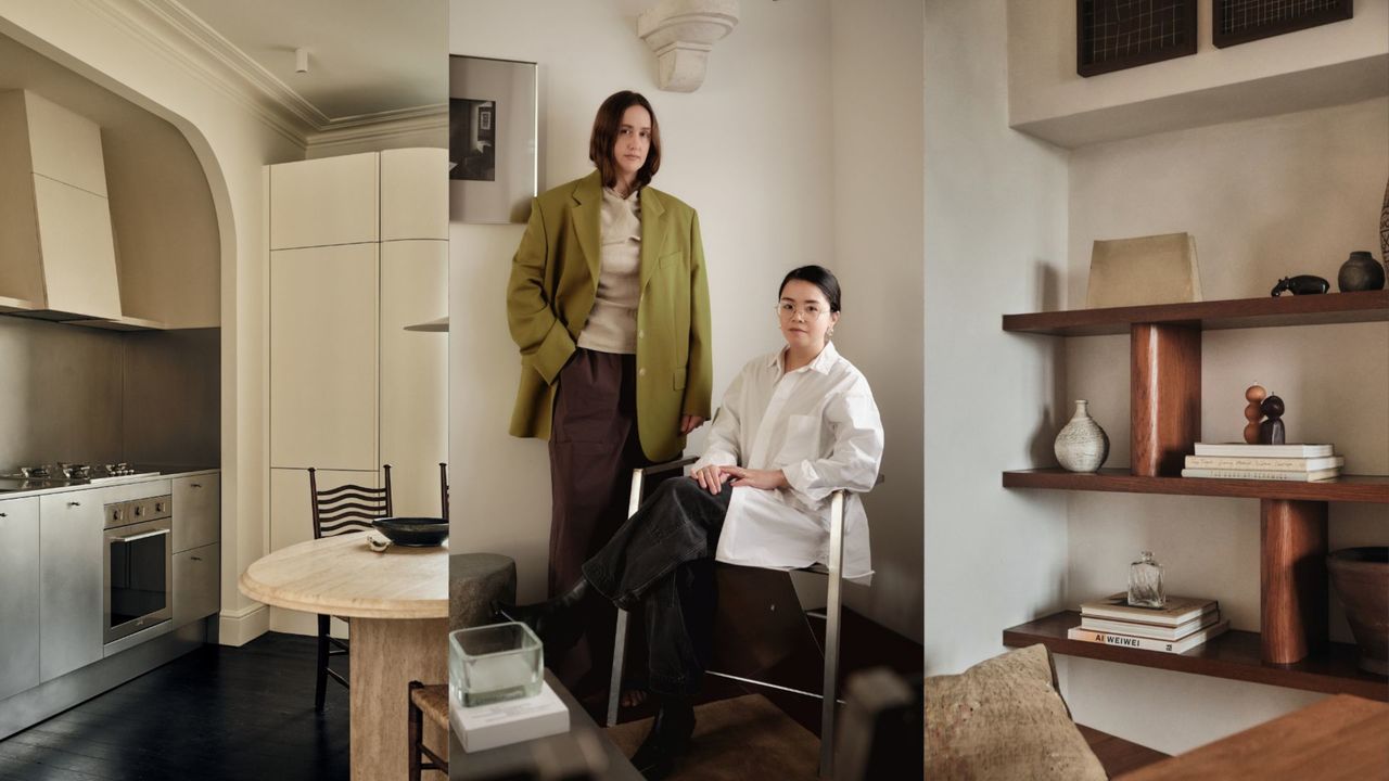
We just love decorating with metal in general, but do tend to use a lot of stainless steel. It has a rawness to it, and part of its appeal to us is that it doesn’t look new for very long. It ages fast and patinas, softening as it does.
We actually use an orbital brush on every stainless steel kitchen surface as we install it, to hasten the process. This gives the metal a more velvety appearance, which stops it from having that commercial kitchen vibe we all associate with it. Instead of being scared, think of the silver shine as a way to balance warmer textures and shapes around it.
We love the contrast of hyper-cool stainless steel with the hyper-warmth of anything that is a bit chalky, or a wood finish, or both. In a recent kitchen project, the metallic cabinets were softened by the curve of the alcove the kitchen was tucked into, the creamy wall color, and the texture of the joinery.
There weren’t any other 90-degree angles, which would possibly have felt too harsh against silvered metal. And happily, it works with any wood — even blonde oak can look warm in comparison when used next to it.
Q: I’m sampling every warm white and can’t decide — any advice?
We use a lot of ultra matte chalky finishes with a 2% sheen. We love that for walls and ceilings — Farrow & Ball’s fairly new Dead Flat finish can be used over woodwork, architraves, and cornicing, and has such a wonderful matte-ness. To use it is both a very efficient way of decorating and very calming.
Little Greene offers a similar finish, and we used its Joanna paint for our office, which has made our north-facing space seem more comfortable. We also love Bauwerk Colour’s limewash finish — and it’s easier to do a limewash in a paler color than a darker pigment, where you notice the brushwork more.
Q: I want to get some open fitted shelves made for my living room — what might I need to know beforehand?
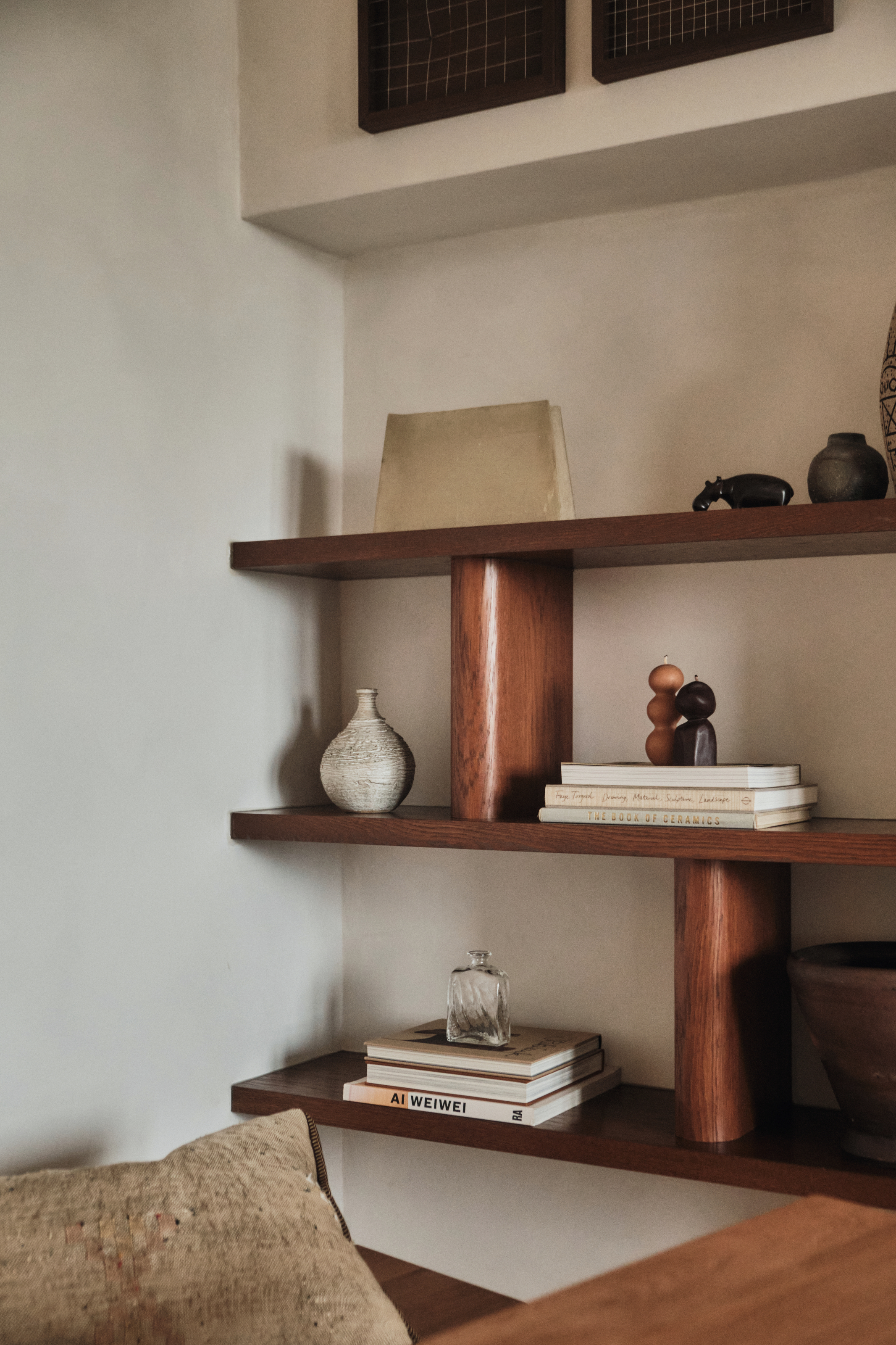
Firstly, go for a chunky shelf width — the thickness has a big impact, and open shelves that are too slim can look a little… un-elevated. We had some made for alcoves on either side of a fireplace and opted for a chunky profile of about 40 millimeters, which really helped to give them presence.
It also meant there was more chance to see the grain and personality of the wood, upping how luxe they felt. In fact, we used an oak veneer (stained to look more like walnut), which allowed us to get the partitions to curve more easily — an extra design element. We had the veneer crown cut, which is how you get the grain to be more expressive.
In terms of the shelf design, don’t be tempted to go for symmetry or regularity. It’s more modern if you take inspiration from the likes of Charlotte Perriand, who loves to break the harsh lines of a space with some asymmetry. Plus, differently-sized partitions allow for a better visual flow, with some sections large enough for a stack of books, others for only a single objet and some delicious negative space.