Q: I Believe in the Unexpected Red Theory, but Pillar-box Red is Too Bright for the Vibe I’m Going for. How Can I Work With Reds to Create a Sophisticated, Calming and Warming Scheme?
If you’re scared of decorating with red, it doesn’t have to be anything permanent. I also subscribe to the Unexpected Red Theory — the idea that a little dash of it can elevate a room. In my own home, I have a red Burmese bowl on a shelf, and it draws the eye to that area. You can try the theory out with a bunch of flowers, because I do think you need to be careful with reds.
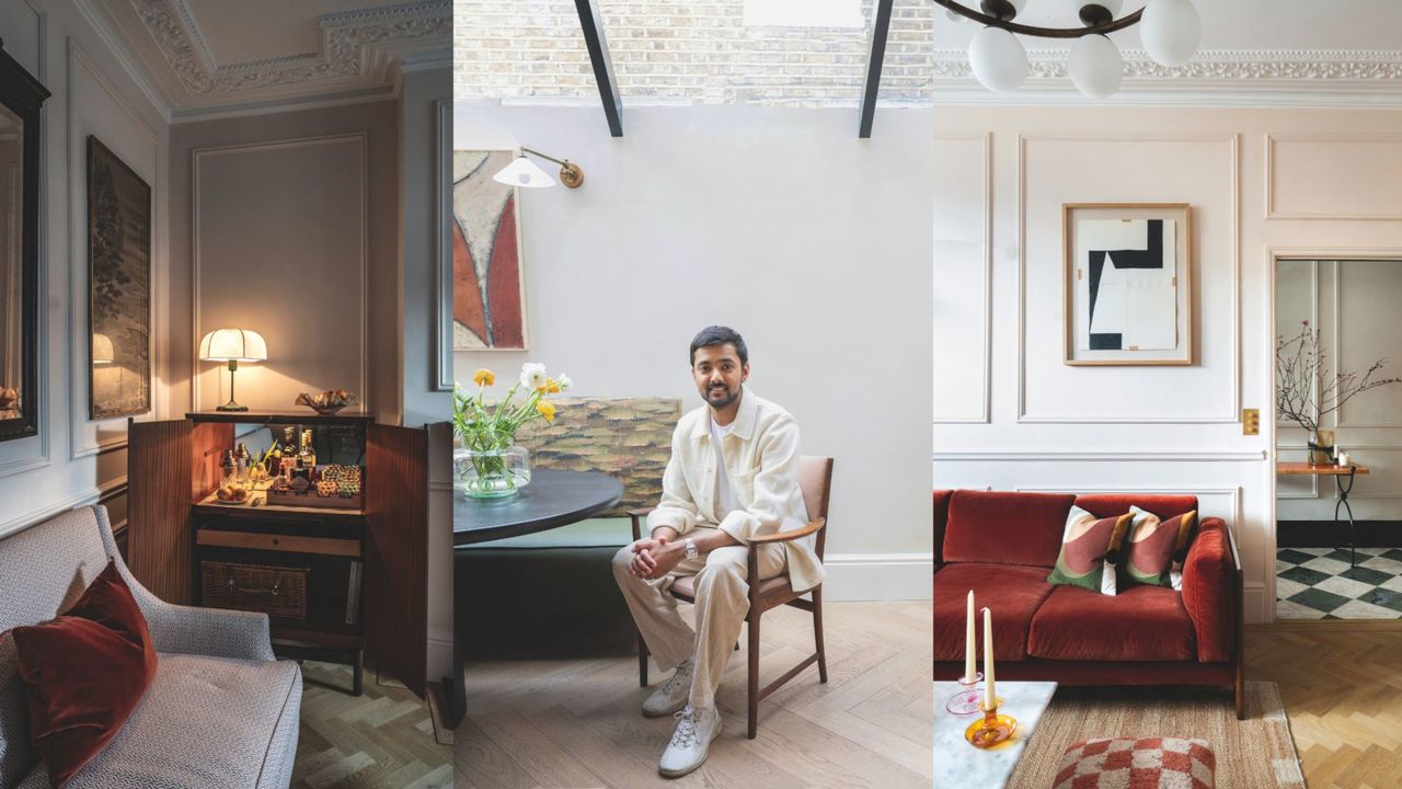
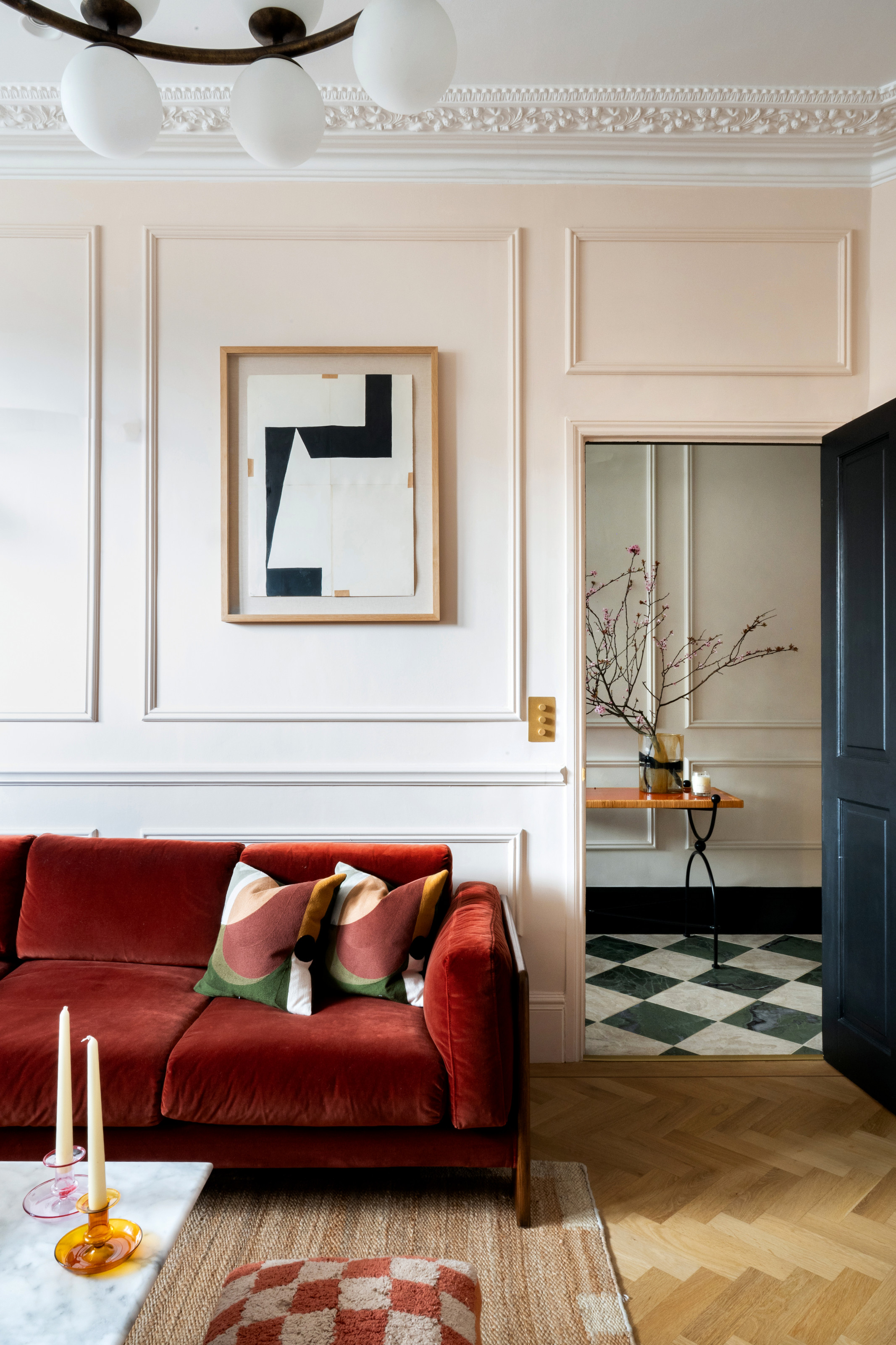
They can be over-stimulating, which is why I stay away from crimson and vermilion, favoring terracotta and brick reds instead. In the evening, when you turn the lights down, those colors are so atmospheric, creating the mood I’d want in winter.
I chose a terracotta velvet sofa from Soho Home for a recent project, pairing it with Julie’s Dream by Little Greene on the walls. Neutrals work well with red, and to answer the question, I’d look for warm grays, whites, pinks, subtle yellows, and just a few black accents. It just works so well with red — especially if you go with a more rusty one; a time-tested, subtler version of the classic pillar box.
Q: My Plan for Next Year is to Reupholster My Sofa — What Would You Suggest?
The best sofas require the best fabrics. I love to use small jacquards — little prints that go with anything — and bring in bigger prints on the cushions. Being a weave, they have a bit of movement to them, which makes them more forgiving when it comes to any marks.
I often turn to Élitis or Rubelli for wonderfully tactile tweeds, while if I’m feeling bold, I’ll head to Schumacher, which is known for its playful stripes.
Q: Winter Should Be All About Cozy Corners — How Do I Create Them in Rooms I Want to Look Light and Fresh the Rest of the Year?
Any wall color can be made to feel cozy — each hue you might be drawn to exists on a gradient, so even the palest shade that is chosen to look fresh in spring and summer can be given a cosseting feel come winter. The key is to pick something that has either yellow or red pigments in it — even grays and whites can be found on this end of the spectrum.
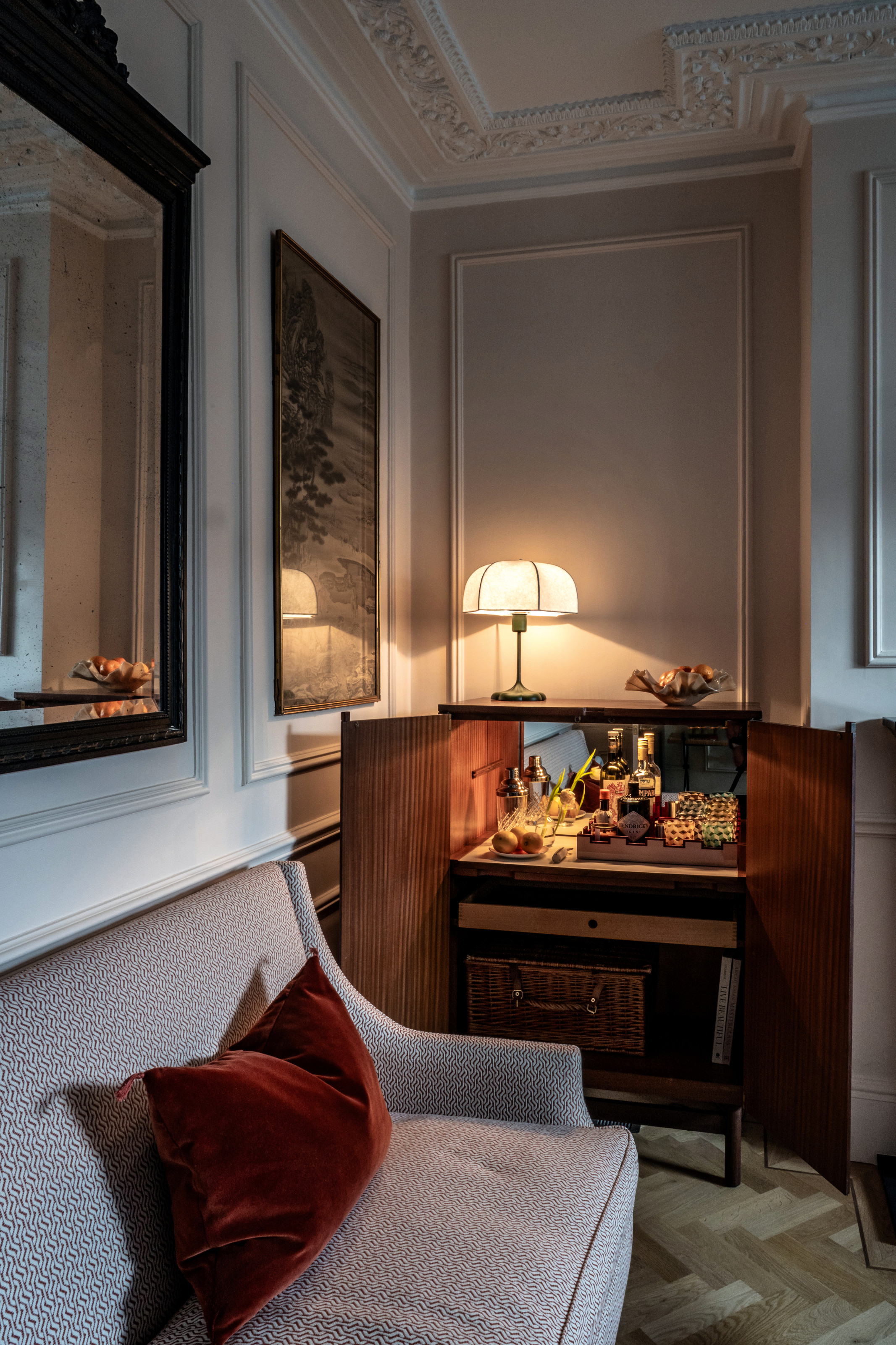
It’s then down to the temperature of the bulbs you choose when planning your home's lighting — you need to go really for warm light instead of cool light, such as 2400K or 2200K, which is amber in its gleam. Coziness always comes down to the lighting as the most important factor — that’s how you create intimacy and warmth.
Low-level lighting is what you want during this season, with plenty of articulated floor lamps, table lights in each corner, and everything on the ceiling turned off. The only overhead light I might suggest is if something is spotlighting art or a coffee table, but even then, you want to turn it low so that it doesn’t bleed light into the rest of the space.
As for more decorative touches, while you can’t design your house solely for the festive period, you can bring out a few pieces like a burnt orange cushion, a soft, tactile velvet throw, or a lovely woollen textile draped over the arm of the sofa — anything that makes you want to hunker down and settle in for the season.