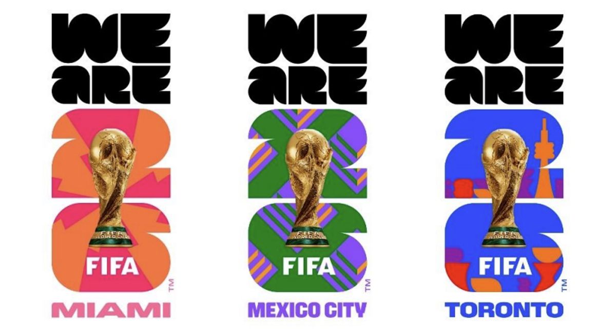
With the FIFA World Cup 2026 well underway in Canada, Mexico and the US, you might have noticed that this year's tournament looks quite different from previous editions. As well as the structural differences like the so-called hydration breaks and, still to come, the half-time show during the final, the World Cup branding looks sleeker and more polished than ever.
There's the World Cup 2026 logo, which introduces a new standardised design approach that FIFA intends to use as the basis for a permanent brand identity, mirroring the move we've seen in the Super Bowls logos in the US in an effort to create a more consistently recognisable brand from one tournament to the next.