As the season of new life and rejuvenation, spring is the perfect time to give your home a refresh, and, being an instant mood enhancer, there’s no better way to transform a space with a fresh pop of color. Of course, redecorating from season to season is not always practical, but switching up a few accessories may be all you need to give your space a lift.
When it comes to spring decor, pastel shades have always been the go-to, with soft pinks, blues, mint greens, and butter yellows ever popular. However, this season we’re noticing some unexpected spring color trends replacing the classics.
From vibrant coral and captivating ocean shades, perfect for banishing winter blues, to mellow yellows and earthy terracotta tones that will endure throughout the year, these are the colors designers are decorating with this spring.
‘A spring refresh should feel full of character, breathing new energy into the spaces we love,’ says renowned interior designer Kit Kemp. ‘Choose fabrics that feel light and inviting, replacing heavier layers with linens and cottons in happy, uplifting tones. Introduce unexpected color, perhaps a vivid trim on a cushion, a painted side table, or a bright, energetic lampshade tucked into a quieter corner. These small, surprising moments bring a room to life and create a sense of character.’
‘For spring, I love taking cues from nature. Marigold yellow, fuchsia, violet, and chartreuse are perfect go-to colors if you want to inject a spring-like mood after a long, sunlight-deprived winter,’ adds R. Jane Morgan, owner and founder at R. Jane Morgan Interior + Design. ‘Replacing your pillows and pottery are easy and cost-effective ways to create a change in a room. Contemporary art in strong colors like periwinkle, bright lime, and kelly green instantly kicks a room up a notch.’
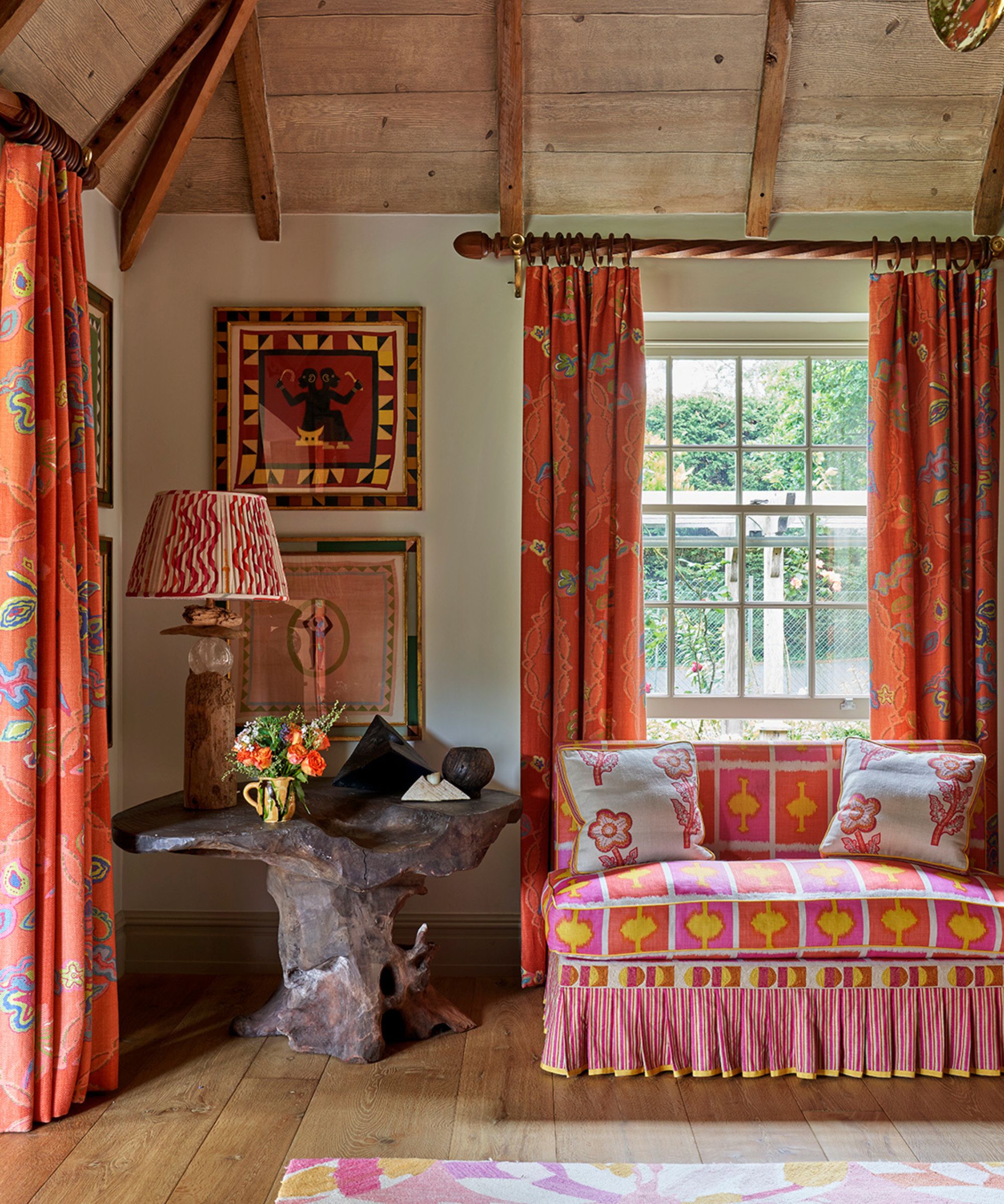
1. Coral
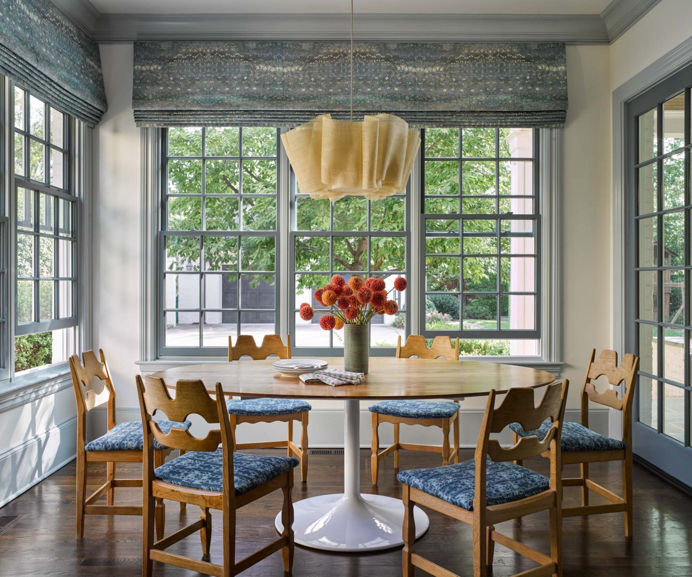
Soft pinks are a staple of the classic spring palette, but for something with more energy and vibrancy, why not introduce accents of coral? A lover of bold, playful room accents, interior designer Sean Symington has set coral pieces against a neutral backdrop in this dining space to make them really stand out. A few branches of spring foliage in an equally vibrant spring green are a simple but effective way to style the space.
‘This coral sits on the punchier side, injecting real energy into a space and brightening it in a way that feels entirely at home with the spirit of spring,’ explains Sean. ‘There’s a warmth and vibrancy to this tone that speaks to that sense of renewal and freshness, which makes a room feel genuinely optimistic and inviting.’
The warmth of coral and orange tones is particularly effective for bringing life back into a room after the colder months, agrees Cait Barker, co-founder at the online vintage store Bessette. However, there’s no need to splash out on brand-new accessories; sometimes, simple vintage finds will do the trick. ‘One trick we love when styling is using vintage books to introduce a little color. Stacking a few with coral or orange spines on a coffee table or bookshelf is such an effortless way to work the color into a space. It’s a small detail, but it can make a big difference and add depth and dimension to a room. These tones look especially beautiful paired with darker woods.’
Featuring vibrant coral and a folksy suzani design, this cushion is bang on trend and ideal for warming up neutral interiors for spring and summer.
Switching up lampshades is a wonderful way to give your home a spring refresh. We love this coral Ikat design from Pooky.
Perfect for spring and summer, these vibrant coral napkins couldn't help but catch our eye. 100 percent cotton, they are easy to wash and have pretty fringed detailing.
2. Indigo
Reminiscent of Mediterranean seas, saturated indigo and teal blues are instantly soothing and uplifting, whatever the weather. The beauty of ocean blues is that they are versatile and timeless, plus they pair beautifully with neutrals. It’s a fabulous choice for spring accents due to its vibrancy and energy, but as it pairs effortlessly with neutrals, it also makes a great shade for enduring schemes.
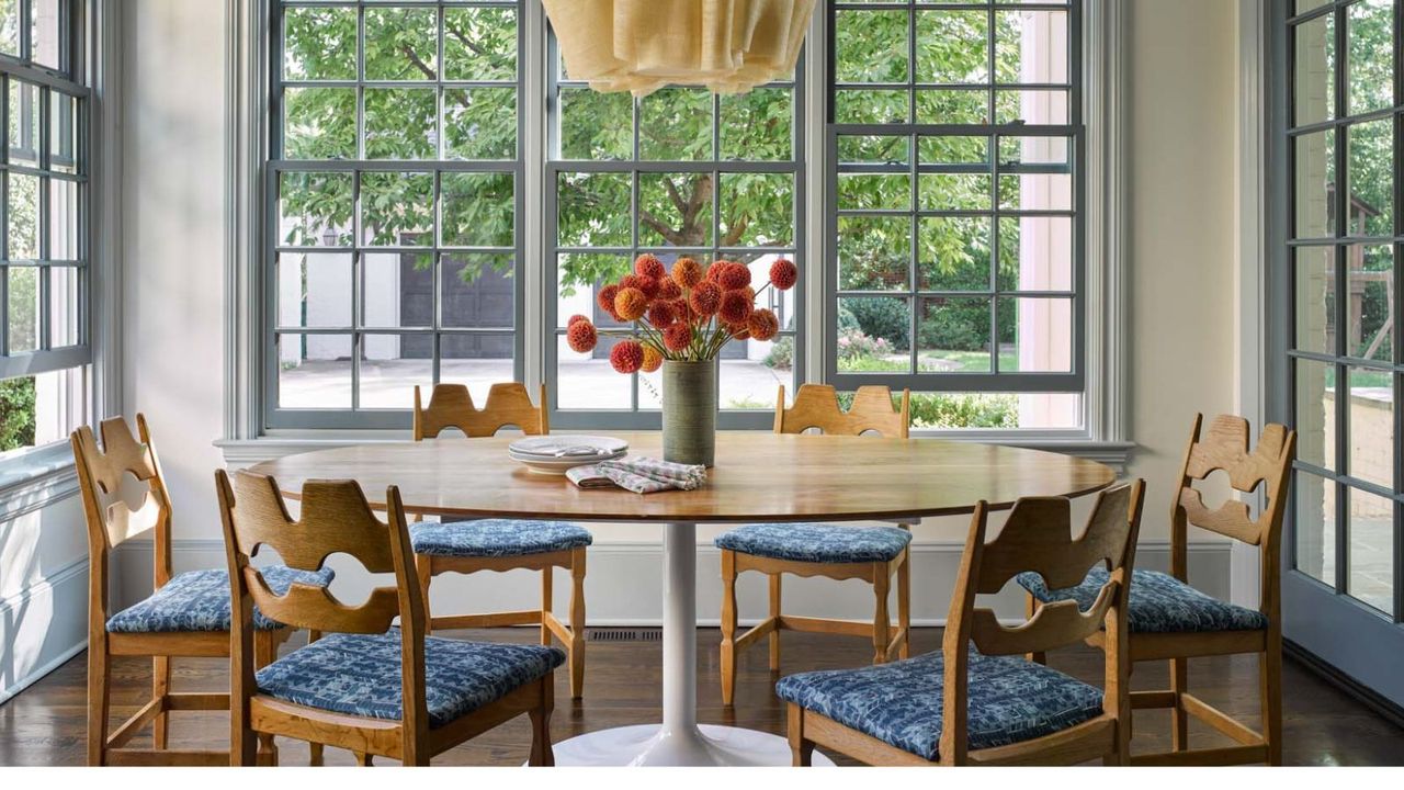
In this sunshine-filled dining room, Louise Copeland, founder of L.B Copeland, chose layered soft blues to create a tranquil feel, adding indigo seat covers to bring a punch of color and pattern.
‘An unexpected accent color can feel especially uplifting in spring, and here the brighter blue on the chair cushions brings that energy while still feeling connected to the rest of the palette,’ explains Louise Copeland. ‘The yellow pendant overhead adds warmth and keeps the room from feeling too cool. I also love a kitchen chair with a wooden or woven back to keep the space from feeling too fabric-heavy and to add a bit of natural texture.’
3. Teal
‘Teal is another color taking the design world by storm this spring. Using it on custom furniture and millwork adds a level of hopeful optimism,’ says Lindsay Thornton, interior designer and founder of Cornerstone Design Build. ‘Teal pairs well with sunny yellow, orange, pinks, or reds, which all find their way into your tulip garden, and so they naturally give off spring vibes.’
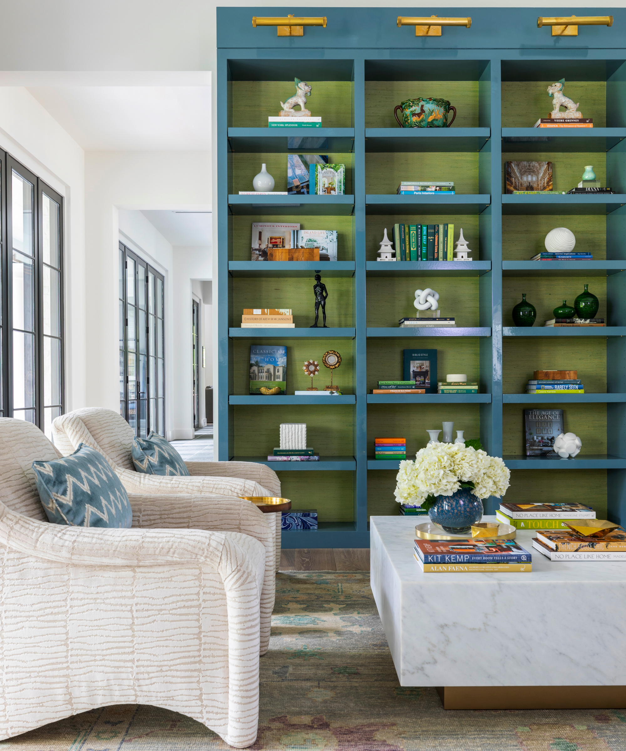
The beauty of decorating with jewel-toned teal blue is that a little can go a long way. Simply painting some bookshelves or adding a vase is enough to enliven a neutral space. Sitting opposite orange on the color wheel, zesty shades make a natural match for teal, but as it has green undertones, it also works surprisingly well with verdant shades, as demonstrated in this scheme by Courtnay Tartt Elias, founder of Creative Tonic Design.
‘Teal blues work as a counter-neutral, especially when you want to add a little pop or call attention to an architectural detail or a specific area of a room. I love a color pop on a bookcase, kitchen island, or even in a small area like a bar. It’s fun to draw attention or highlight with a color rather than just accessories.’
For those who love to decorate with vintage, there are plenty of unique pieces featuring teal and deep ocean blues to pick up at affordable prices, says Cait Barker of Bessette. ‘Teal shows up often in vintage decor, especially in dining sets or artwork with layered blues and greens. One trend we’ve been seeing with our customers lately is a growing interest in vintage nautical books, artwork, and home decor. Oil paintings of sailboats, maritime signal flags, seascapes, and old harbor scenes all tend to carry those beautiful teal, blue, and green tones.’
New from Greenrow, this beautiful cushion is reminiscent of captivating Japanese indigo-dyed textiles combined with pretty floral details.
Stripes are a styling staple, as is the blue and white palette, so if you're after a versatile vase that which is both playful and will last then this one's for you.
Furniture is a fun way to introduce teal accents, and they don't come more stylish than this Livia storage hutch. We love the shape and the contrasting wood interior.
4. Terracotta
Warm, earthy colors show no sign of abating this spring. With moods leaning toward nostalgic, comforting interiors, many homeowners are avoiding intense, punchy shades and instead opting for more muted tones to create schemes that feel more soothing and grounding.
‘Terracotta is one of the easiest ways to bring warmth into a space, especially as we transition into spring. It instantly gives a room that relaxed, European feel without trying too hard,’ explains Cait Barker. ‘Decorating with terracotta or rust accents, like pottery, lamps, or small homewares, instantly brings a room to life.’
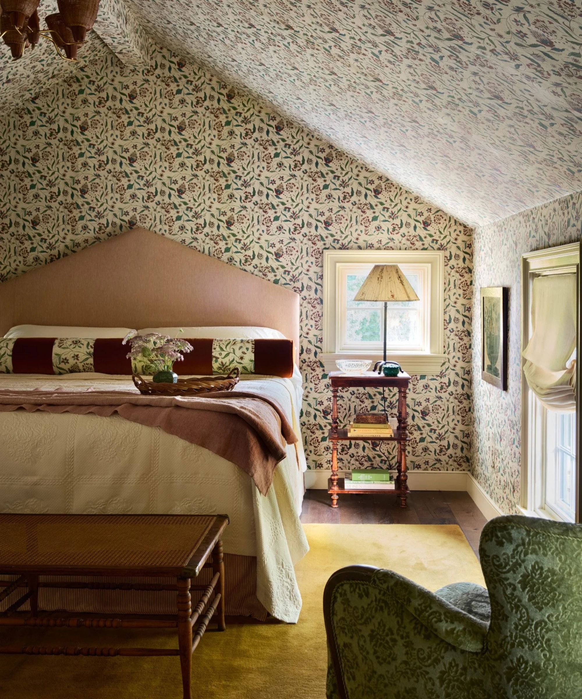
When decorating bedrooms, these shades can make an elegant alternative to pastels, which are no less romantic, as this space proves. ‘For this main bedroom, we wrapped the walls in Antoinette Poisson’s Mignonette wallpaper, and from there, the room bloomed! We didn’t go the obvious spring route with bright pastels; we were more drawn to ochre, dusty rose, layered greens, and sienna, inspired by the wallpaper and the French or English countryside garden,’ explains Blair Moore, founder of Moore House Design. ‘The custom Roweam bed is wrapped in pink pinstripe upholstery for pattern blocking, yet it stays within the same color palette to blend seamlessly. The bolster cushions in the bedroom are custom Roweam in a burnt sienna, a warm, earthy reddish-brown.’
Wonderfully versatile, this soft terracotta pillow boasts fabulous texture, which will lift any living room scheme. Pair it with browns, warm whites for a layered look.
This rich sienna throw will instantly anchor a neutral bedroom or living room and will work wonderfully layered with natural materials and textures.
With its sleek contours, velvet finish, and warm brass detail, this lamp is a chic way to style with terracotta. Use it to bring warmth to bedrooms and living spaces.
5. Chartreuse
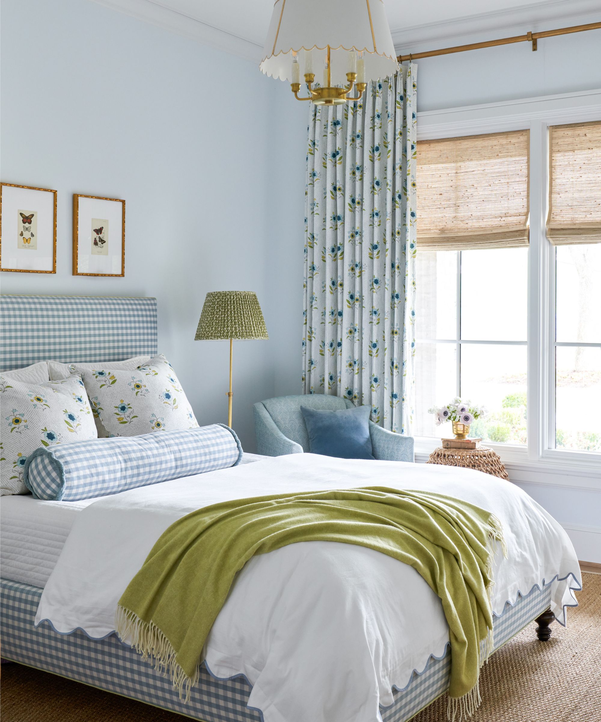
Chartreuse and vibrant yellow-toned greens are shades we’re spotting everywhere this season. Whether added through cushions, tableware, fresh bedding, or a simple candle on the coffee table, this punchy shade will instantly breathe vitality into a space and pairs particularly well with blues.
‘I love working in those brighter greens and yellows because they just make a room feel more alive,’ says Katie Davis, founder of the Houston-based interior design studio Katie Davis Design. ‘They’re a little unexpected, but still classic enough that they don’t feel trendy or overdone. It’s an easy way to bring energy into a space without it feeling loud. In the bedroom, adding a touch of chartreuse through textiles keeps everything from feeling too soft or one-note. It adds just enough contrast to make the space feel layered.’
‘The color that most embodies spring for me is green, especially if you live in the North, where you are dominated by white for many months of the year. Blades of grass popping out of the ground in their bright, hopeful shade signal that a change is coming and the world will once again be awash in color,’agrees Lindsay Thornton, an interior designer and founder of Toronto-based Cornerstone Design Build. ‘Green, as so commonly found in the outdoor world, pairs so well with browns, creams, and blues and carries a sense of calmness, even when in a brighter shade.’
There are many shades to work with, and layering them can help bring a room together, explains Autumn Pochiro, founder and principal designer at Autumn Dawn Design. ‘Picking the right green is a personal choice. If you want an energetic feel, go for greens that are closer to yellow, like chartreuse or lime. If you prefer a more natural, calming look, try deeper shades like olive or moss.’
Covered in green velvet mohair, this dining chair will make an eye-catching, luxurious feature in a dining room or even a bedroom corner. Comfortable and contemporary, it comes in additional colors and with a range of leg finishes.
Infuse interiors with vibrant color and uplifting spring scents with this floral jasmine candle. Why not reuse the beautiful handblown lime glass holder as a decorative dish after its life as a candle has come to an end.
This beautiful vase is ideal for creating eye-catching spring table centerpieces and styled displays. Full of artisan charm, it features a hand-painted botanical motif and a reactive green glaze
6. Ochre
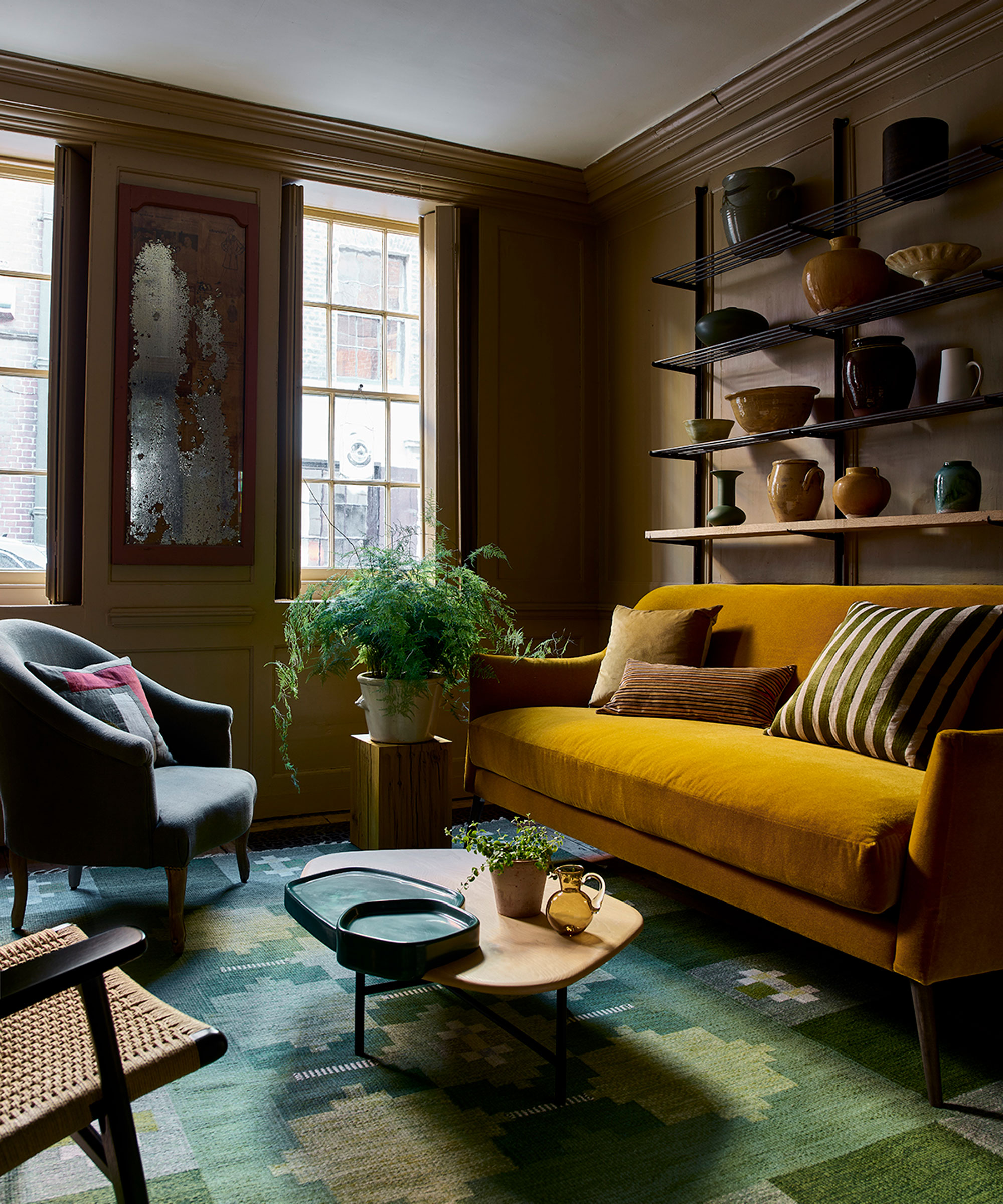
Buttermilk, sunshine, and lemon yellows are often associated with spring decor, but if you’re after something more sophisticated with greater longevity, try leaning into ochre and honey shades. Perhaps fueled by our desire for comforting, grounding interiors, this year we’re noticing plenty of accessories in earthier yellows, which are perfect for layering with natural materials.
‘What’s exciting is that people are becoming more comfortable with color, but in a way that still feels livable – shades that mimic what you’d find in nature rather than anything overly saturated or synthetic are proving popular,’ says Amy Burstyn Fritz, founder of the online home store Misette. ‘There’s growing interest in warmer tones like amber and ochre this spring. At Misette, we use a signature amber tone that sits somewhere between a burnt orange and a neutral – it’s incredibly versatile and transforms depending on what it’s paired with, especially against wood, where it takes on a more grounded, almost neutral quality.’
Liven up a neutral dining table with this rustic glazed stoneware dinner set featuring four plates, four salad plates and four pasta bowls.
Featuring a beautiful ochre glaze, this lamp is reminiscent of vintage French confit pots.
Featuring stripes, scallops, and vibrant amber yellow, these placemats are guaranteed to raise a smile at spring dinners.
There’s no denying pretty pastel shades are a wonderful way to welcome spring into the home, but if you’re looking for a change – or if decorating with pastels isn’t your thing – it needn’t limit your seasonal decorating. For those looking to make spring decor a little less predictable, there are plenty of joyful colors to turn to that can make your home feel just as uplifting and vibrant.