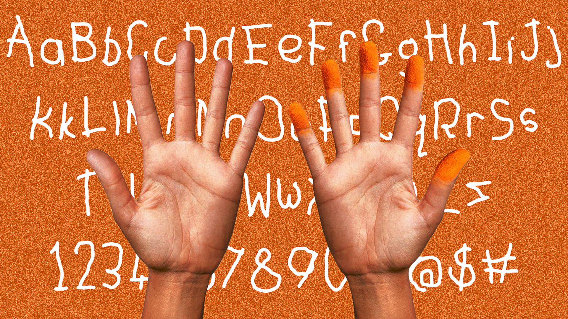
In a world obsessed with sleek aesthetics and pixel-perfect precision, Cheetos has thrown a deliciously cheesy wrench into the works. Its ‘new font’, a deliberately messy, hand-drawn creation, has got people looking up from their snacks. Surely a marketing gimmick? A design disaster? Or maybe, this delightfully human mess is actually a cheesy stroke of playful genius.
Ask any type designer, and they'll tell you: custom fonts are powerful tools for shaping brand identity. They imbue every word, every message, with the brand's unique personality. Cheetos has taken this concept and run with it, or rather, smudged it with cheesy fingers. The font, created by designers drawing with their non-dominant (and presumably non-cheesy) hand, captures the very essence of the Cheetos experience: messy, playful, and very human. (For more typographical inspiration, take a look at the best free fonts.)