Zesty, refreshing, and full of life — few colors can boast the vibrancy and energy that orange brings into the room. Over the last few years, we’ve seen moodier iterations of this cozy hue permeate our Pinterest boards and magazine covers — think terracotta, russet, and copper. But brighter versions of colors like tangerine, pumpkin, and coral continue to capture hearts, praised for their ability to imbibe schemes with joy.
It may not be your first choice, but we've explored the number of colors that go with orange to offer inspiration on how to seamlessly pair your perfect shade with its complementary hues.
Now, to help you further master the art of decorating with orange, we’ve spoken to interior designers and color experts to help you make the most of this distinctive shade in your interior schemes. Here's how to do it.
1. EXPLORE ORANGE THROUGH AN ARCHITECTURAL LENS

Although orange may seem jovial or even superficial in its impact, in reality, it presents a formidable energy that works especially well to emphasize architectural features and create conversation-creating spaces as demonstrated in this minimal and memorable bathroom created by the team at Berenice Curt Architecture.
“Incorporating orange into a design introduces energy and warmth, particularly through elements like accent walls, terracotta tiles, and metallic finishes," explains French architect and interior designer, Berenice Curt. "As an architect, I find orange enhances both contemporary and mid-century modern designs, adding vibrancy to the space while amplifying natural light and highlighting bold architectural features."
It’s essential to contemplate how your orange finishes can elevate your interior and draw eyes to the best parts of the room.
2. LEAN INTO THE ORGANIC BEAUTY OF ORANGE
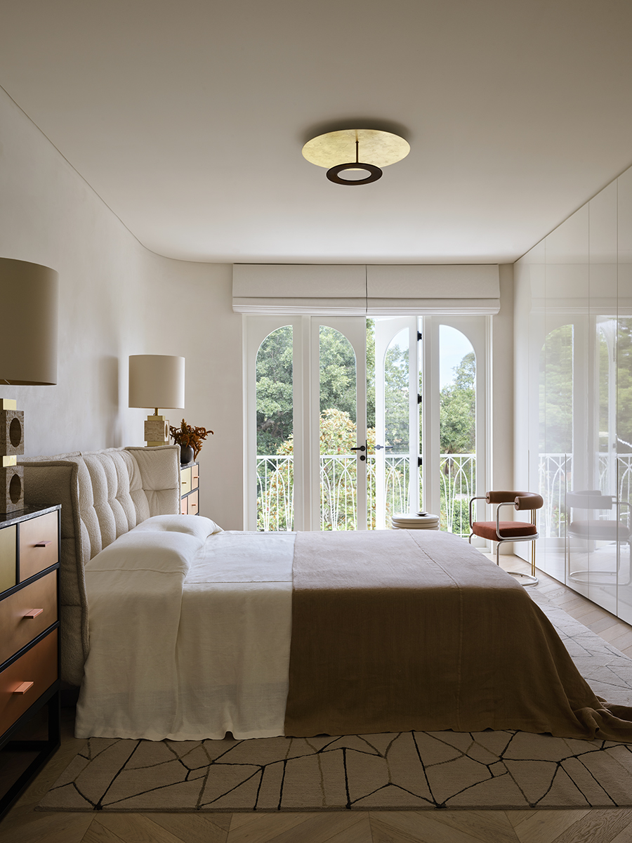
“Orange is a great color to be introduced into a room as it is bright and energetic but still feels earthy," says Australian interior designer Greg Natale. "Naturally, this will depend on the orange, but many beautiful shades, like clay and harvest, feel warm and grounding. In the primary bedroom (shown above), various shades of orange, from burnt to brick, bring pops of color to the design without upsetting the considered palette of earthy neutrals."
As the designer suggests, orange shares a deep connection with earthy tones that allow it to tread the line between organic and energizing so easily. Decorating with various tones and textures of orange offers your scheme a natural sense of rhythm but also drives cohesion between each of these mesmerizing tones. From the copper-clad chest of drawers to the upholstered russet armchair, each element in this scheme celebrates the other.
3. PERFECT THE PLACEMENT OF YOUR ORANGE TONES.

This inviting scheme designed by Austin-based studio Cuppett Kilpatrick Architecture + Interior Design softens bright tangerine-like tones by strategically placing them at the top and bottom of the room. With a colorful ceiling and soft orange rug, it creates a wonderful contrast that is effortlessly balanced by the darkness of the navy walls and the sofa.
“The orange which appears in this room started with the natural fir ceiling joists; selected to add warmth and coziness to this remote retreat,” says Tim Cuppett, the firm's founding partner. When designing your own space, consider how the placement of your preferred shade of orange can impact its overall effect.
Price: from $129
When used in its more earthy and natural hues, decorating with orange can help to ground a space. This rust-colored rug is predominantly orange, but still feels calming and soothing.
4. BRING ENERGY AND LIGHT INTO SMALLER SPACES WITH ORANGE
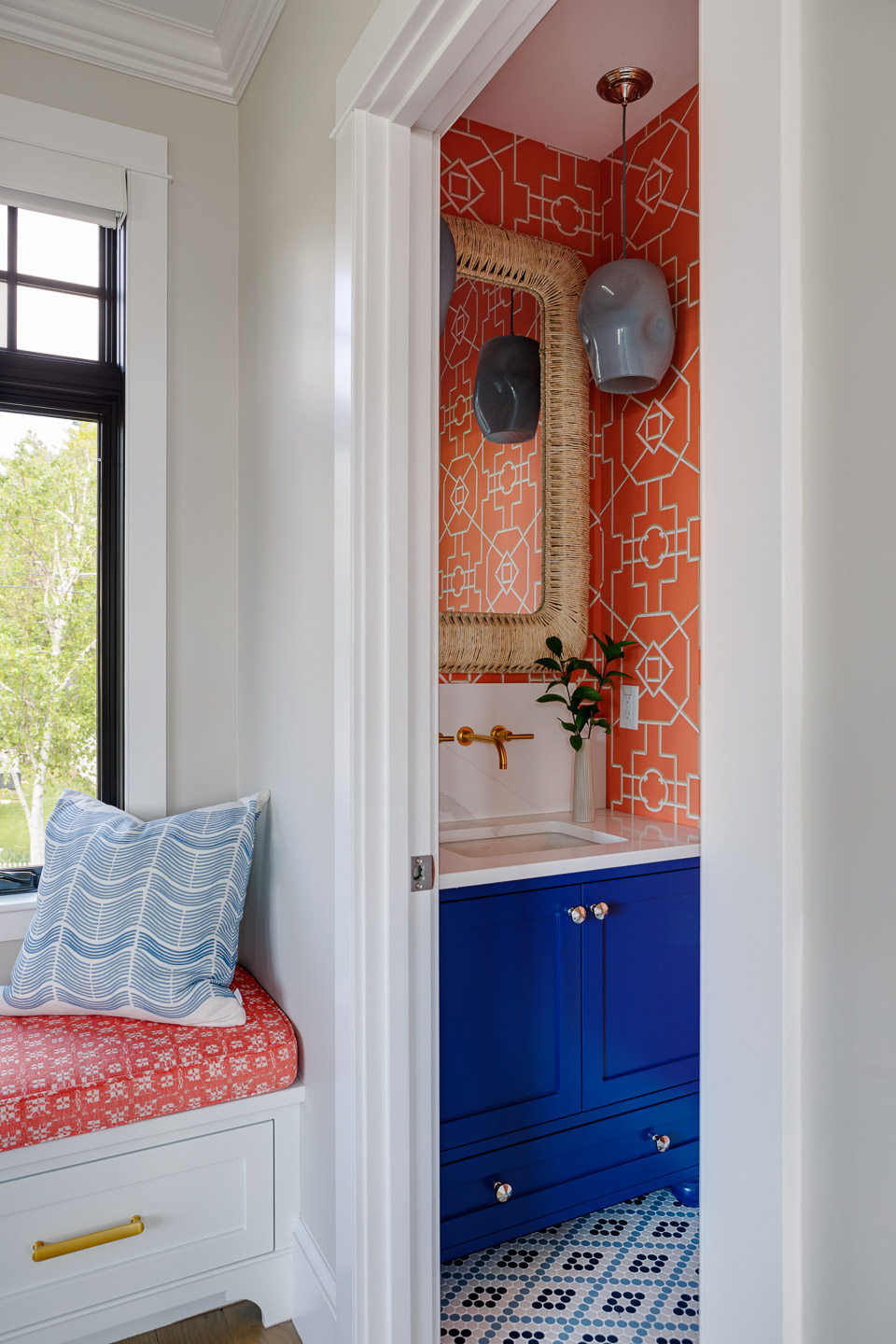
For Blakely Interior Design’s Riverbank project in Maine, the Rhode Island design studio celebrates the child-like joy of orange in the project’s powder room. This example perfectly illustrates how smaller spaces can be great canvases for those who seek all of the warmth and energy of orange but are scared to implement it on a larger scale.
“We love the opportunity to incorporate an unexpected color in a powder room," says Janelle B. Photopoulos, the studio's owner and principal designer. "We chose a vibrant orangey-coral wallpaper for the powder room in this beachside summer home to create an energetic and playful vibe that complements the coastal setting. This bold color brings a fresh sense of warmth and sunshine, complementing the bright blue vanity and adding personality to the smaller space.”
Price: $6/sample
Wallpaper, especially in smaller rooms like powder rooms, is always a wonderful opportunity to experiment with a bold color and pattern, like this geometric print from Chasing Paper.
5. TAKE A MAXIMALIST APPROACH TO ORANGE

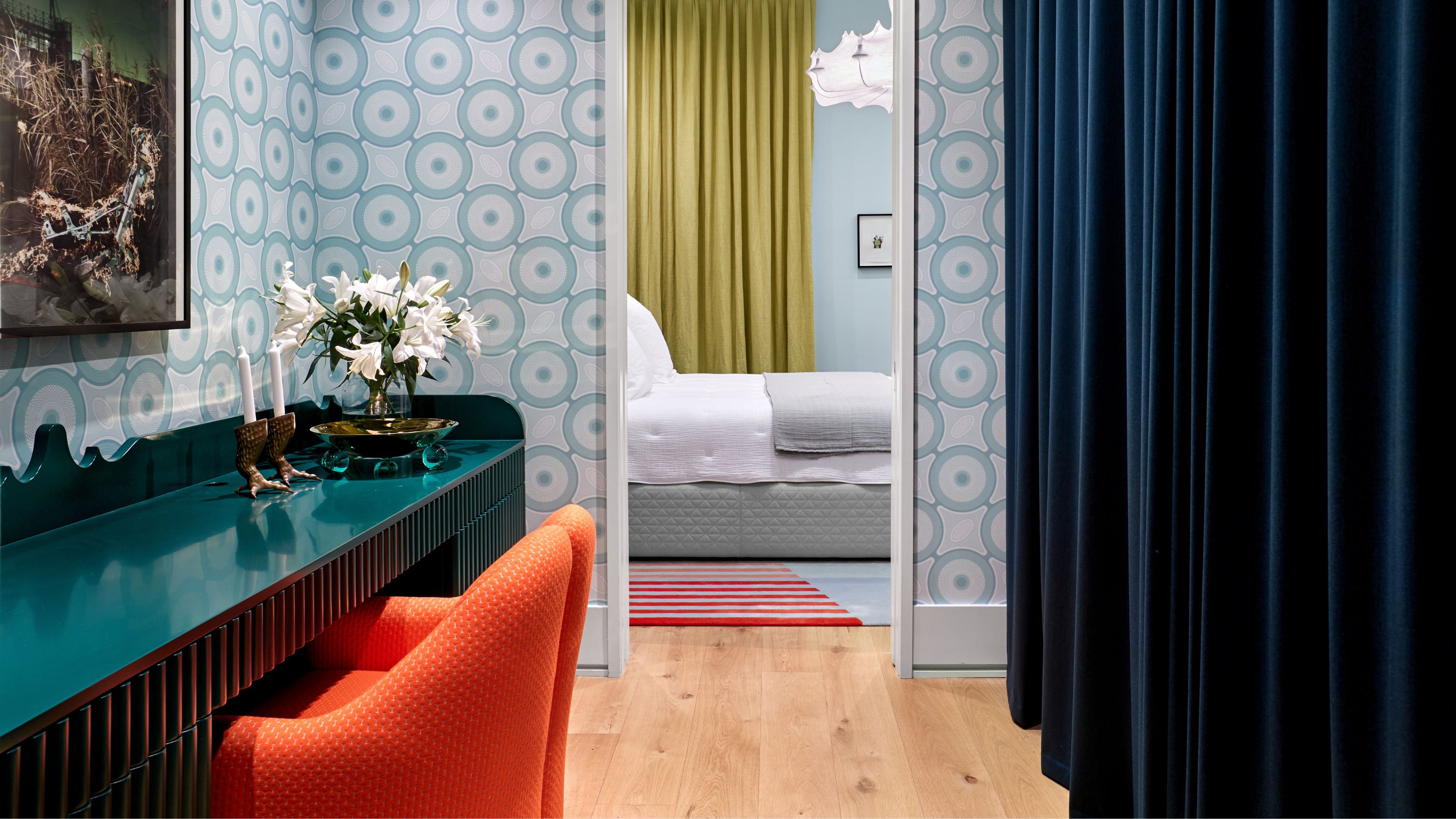
Interior designer Ghislaine Viñas is no stranger to bold prints and expressive interiors and her dressing room design featuring an electric orange armchair is no exception to the rule. She advocates for a braver and bolder approach to orange.
“You’ll often find me using a fluorescent orange in unexpected ways," she says. "It’s no surprise that my Dutch heritage plays a role — orange being the country’s official color makes it a go-to for me.”
In this project, the orange thrives in contrast, paired with a rich natural sapphire, lacquered teal, and soft powder pale blue. For those embracing a touch of maximalism or expressive interiors, you may find that in orange lies the answer.
Price: $259.99
Opting for a furniture piece in a bold orange color invites you to go all-out and make a true statement, like this zesty accent barrel chair, that's big enough for two people.
6. ADD ENERGY TO FORMAL SPACES WITH ORANGE
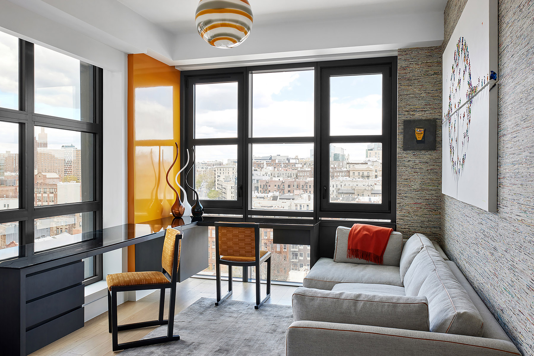
Balance is an integral factor when introducing orange into your design. Ask yourself how your space will benefit from your preferred orange — will it be more joyous, more cozy or more energized? The role of the room plays a key part in your decision.
This question is wonderfully answered in this home office created by Manhattan-based studio Method + Moxie in their Harlem Penthouse project. The orange not only works as a visual accent to complement the gray and black tones, but it also uplifts the atmosphere of this interior, offering its clients vibrance and energy.
“Orange is a bold color, so be bold with it and mix in other shades of orange with your larger statement color," says Rebecca Roberts, founder and principal designer of Method + Moxie. "We used bright orange in the office to ensure the mood remained energetic and inspired.”
7. OFFER A WARM WELCOME WITH ORANGE
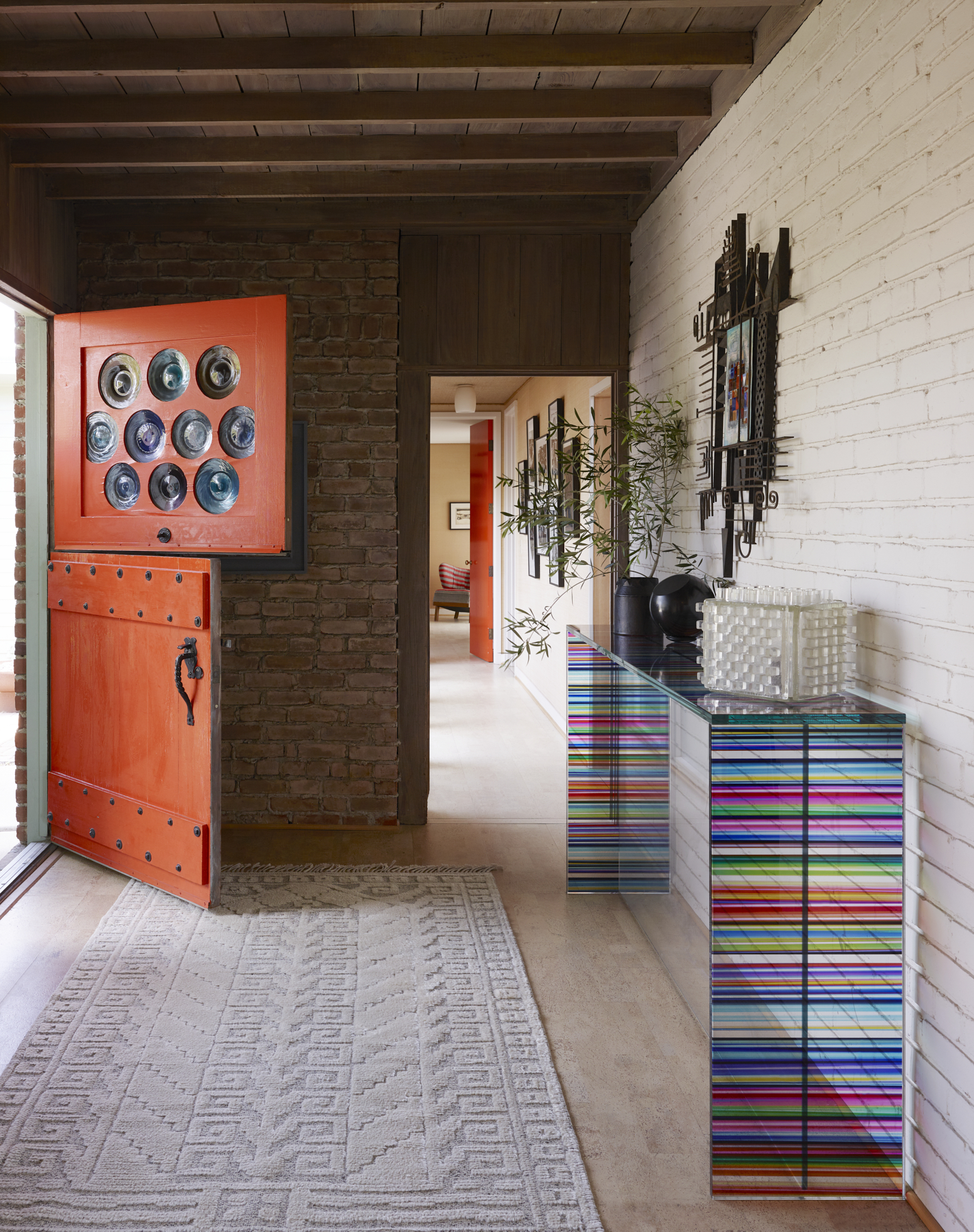
We continue to see homeowners and designers being braver with their front door colors and orange is the perfect complement for this trend. You can set the tone for your entire home with a warm and inviting hue like this shade painted on interior designer John Ike's San Diego home.
“I chose to paint my door Sherwin Williams International Orange SW4082, a vermillion-esque shade of bright orange. It’s the perfect “warm welcome” into the 1940s modernist bungalow!” says John Ike, partner at Ike Baker Velten.
Note that the choice of orange must be a personal one, lean into the tones that you like best in the color family — be they bright and vibrant or more muted and earthy. The result must be an orange that excites you as you leave home each day.
What shade of orange is most on-trend for decorating?
The consensus is unclear on orange in that the flexibility of this unique shade has meant that designers the world over are leaning into its brightest iterations as well as its darkest ones.
“The beauty of orange is its versatility; it can be used organically and paired with a variety of colors to achieve different moods," says Ghislaine Viñas. "A pale blue against a soft salmon creates a totally different effect compared to a soft orange paired with Yves Klein blue. Orange really is a color with endless possibilities.”
The stand-out shades of the moment do share a thread of vivacious energy, as designers and homeowners seek to instill schemes with a palpable sense of joy. “We have been using Farrow and Ball’s Dutch Orange a lot," says Jess Nahon, co-principal of Sugarhouse. "Clients seem to want to go bright or not at all.”
It's a sentiment that is echoed by nostalgia as expert John Ike shares. “When I think of 'on-trend' shades of orange, the iconic Golden Gate Bridge comes to mind, incidentally nicknamed “International Orange.”
