Home decorator Lara Winter is one of Ideal Home's new Open House contributors, sharing her thoughts on revamping a 200 year old cottage to make it right for modern family life. See the rest of her articles here.
Designing a room for your own child sounds like it should be easy, doesn’t it? I mean – this is my thing. Give me an awkward corner or a tired bit of furniture and I’m happy. But designing a room for my almost eight-year-old son? Surprisingly tricky.
Is eight pre-teen? I’m not entirely sure. But it’s definitely that in-between stage where they’re not little anymore… yet not quite ready for anything too grown up either. Which basically means one thing: opinions. Very clear ones.
Letting them lead (slightly)
My son’s brief was simple and very firm: dark blue walls. Not a suggestion – a decision. And while part of me hesitated (because dark colours in smaller rooms can be a bit risky), I also really wanted him to feel like this was his space.
So instead of steering him away from it, I worked with it – just with a few tweaks to keep things balanced.
Paint colours that do the work
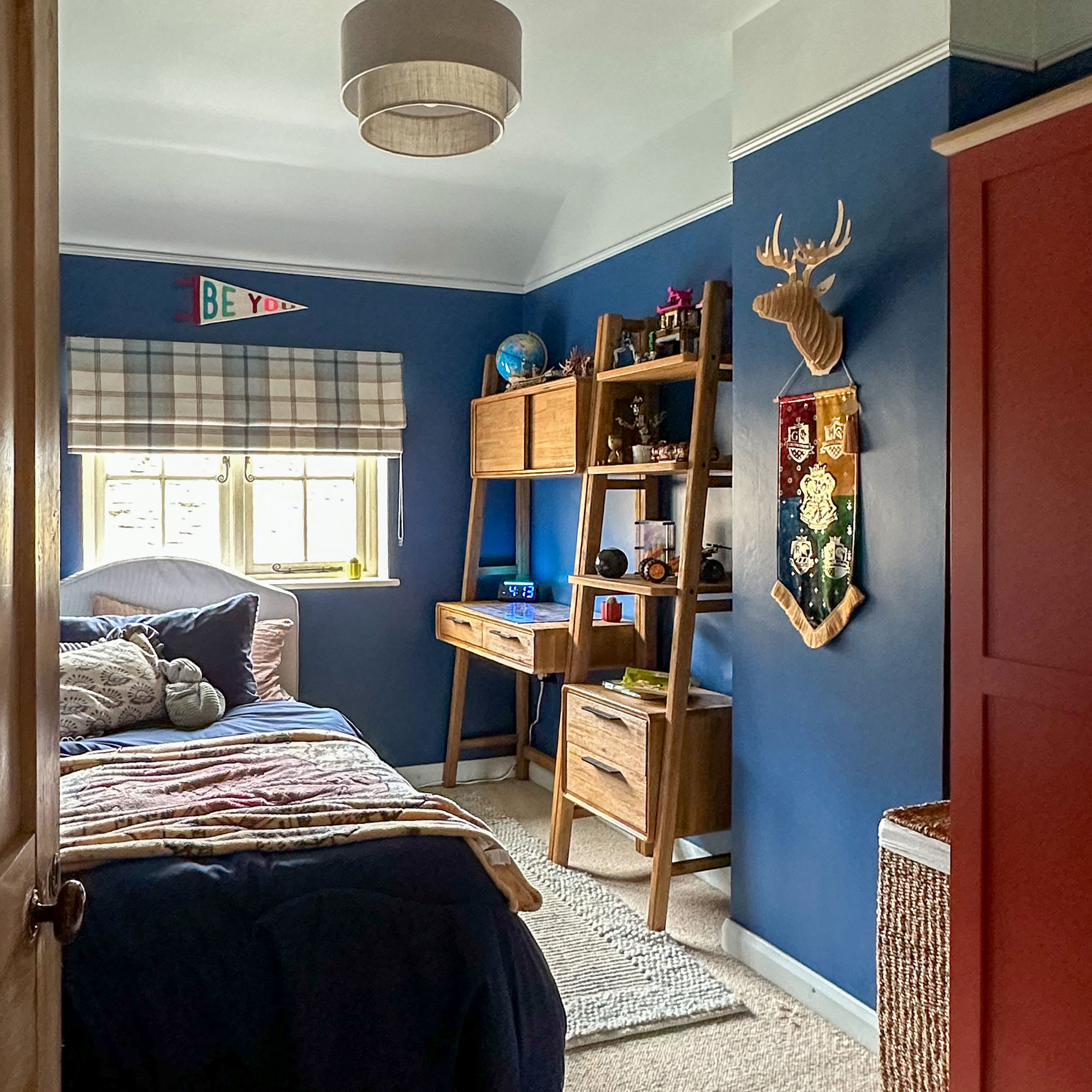
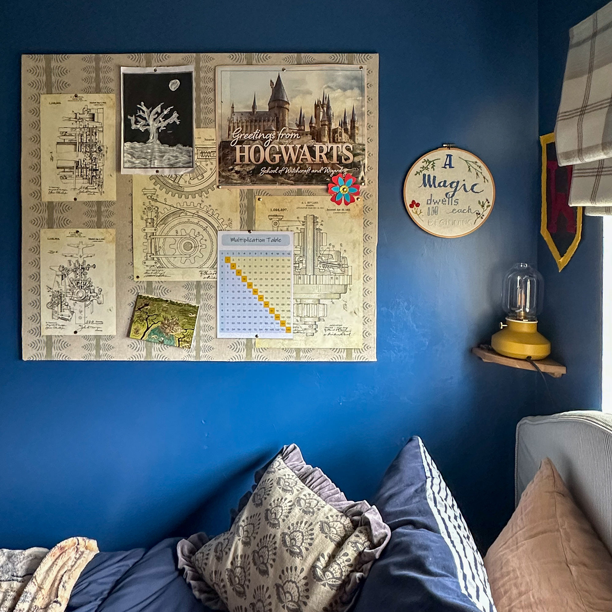
We chose a beautiful mid-to-dark blue called Woad by Little Greene, which has a really vibrant undertone so it doesn’t feel flat or heavy. It’s bold, but still playful enough for a child’s room.
To stop it from closing the space in, I painted the ceiling in a very soft, light blue and brought that same shade down onto the top section of the walls – roughly 40cm. It’s such a simple trick, but it really helps lift the room and make it feel bigger.
At the join, I added moulding strips painted in the lighter blue, which just gives it that slightly more finished, considered feel without overcomplicating things.
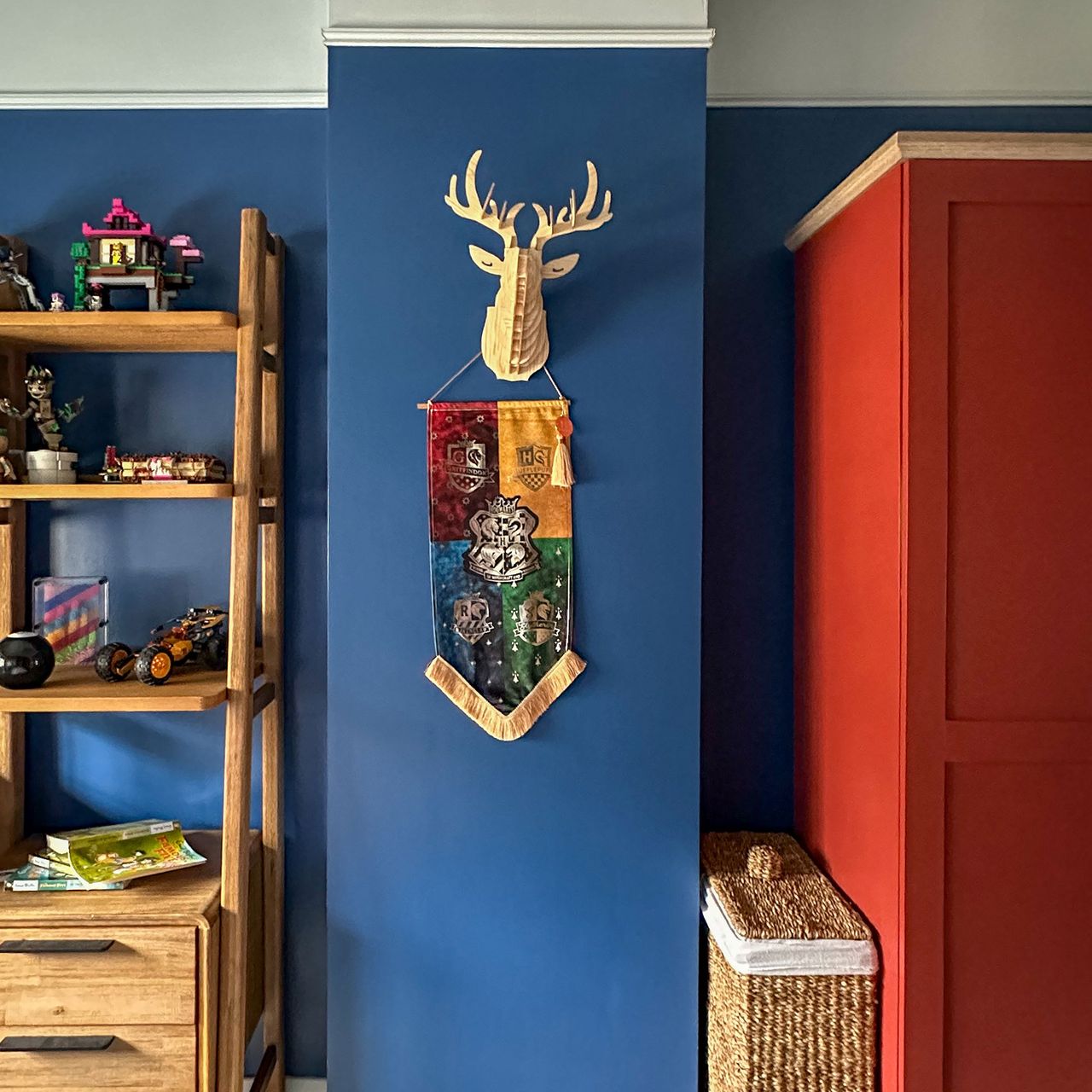
Then, for a bit of contrast, I painted the existing wardrobe in a rich Firebrick Red by Rustoleum. It completely changes the look of the room and adds a bit of personality – proof that kids’ rooms don’t have to stick to the obvious.
Mixing patterns without the chaos
I didn’t want the room to feel too “themed”, but I also didn’t want it to be flat. So I leaned into mixing patterns – just in a way that still feels cohesive.
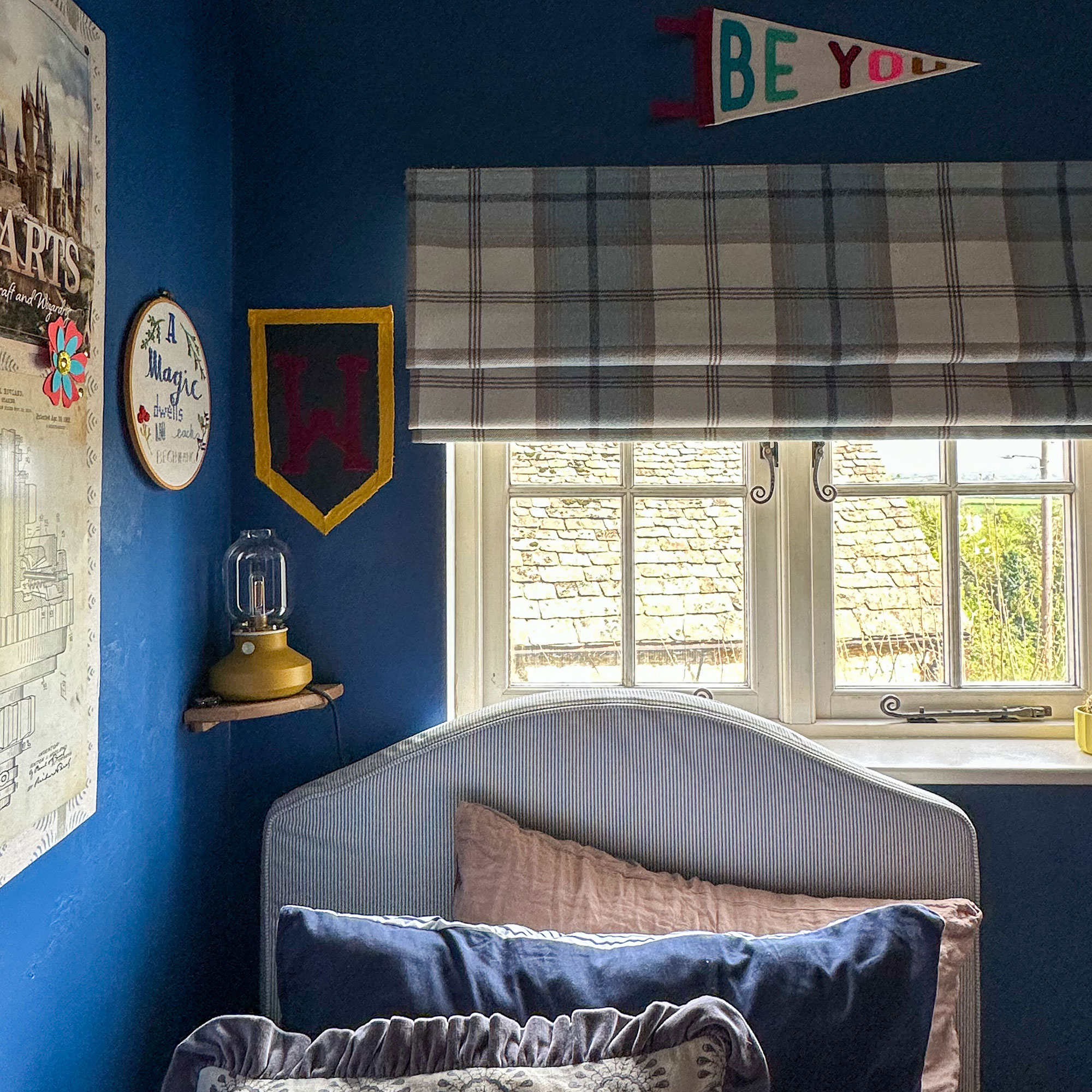
We’ve got a grey and white pinstripe bed, a slightly muted blue-green fabric on the pinboard, and a checkered blind in blue, cream and brown. It sounds like a lot, but because the colours all sit nicely together, it works without feeling overwhelming.
A soft cream and blue rug pulls everything together and adds a bit of warmth.
Decor that can grow with him
This was probably the biggest challenge – creating a space that feels like him now, but won’t need redoing in a year or two.
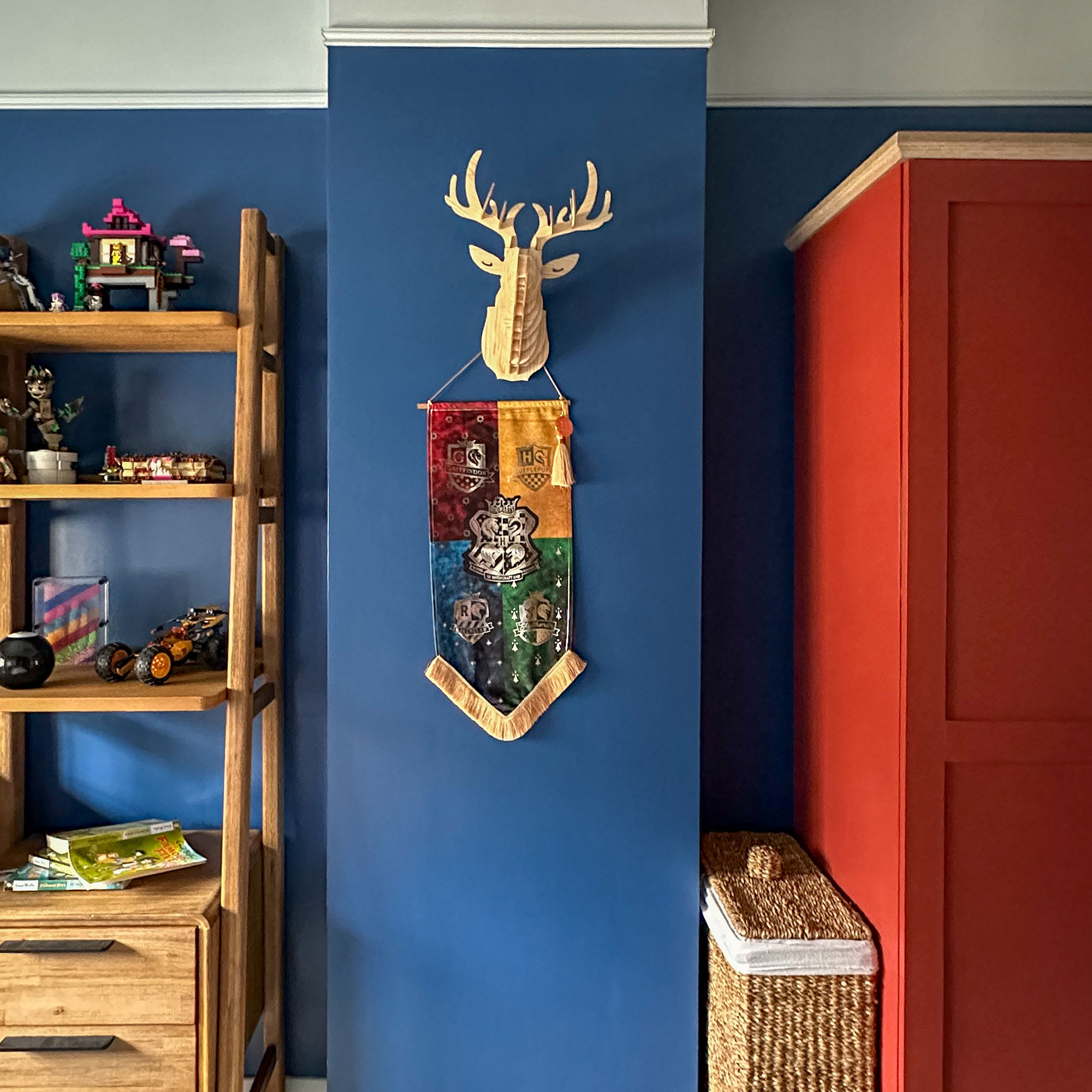
We kept things quite flexible. There’s a Harry Potter wall hanging, a “Be You” flag, and a build-your-own wooden stag head (he’s very into anything he can make himself at the moment).
My favourite addition, though, is the oversized pinboard. I made it using five cork boards from Ikea, glued together and covered in fabric. It gives him a space to pin up whatever he likes – drawings, tickets, photos, badges – and it can evolve as he does.
Making the most of the space
Like most kids’ rooms, space is tight, so everything needed to earn its place.
Instead of a bedside table, I added a small shelf next to the bed with a soft yellow night light. It keeps the floor clear but still gives him somewhere for his bits and pieces.
Inside the wardrobe, we added a small chest of drawers, which makes much more sense for his clothes at this stage – there’s not a lot that actually needs hanging.
We also chose a simple upholstered single bed from Ikea and paired it with a good-quality desk and shelving unit that should last him well into his teenage years.
This room definitely challenged me more than I expected. Designing for your own child is a different kind of brief – especially when they have strong ideas of their own.
But that’s also what makes it work.
It feels personal, a bit playful, and most importantly, like a space he actually wants to spend time in. And if it lasts us a few years without a full rethink, I’ll consider that a win.