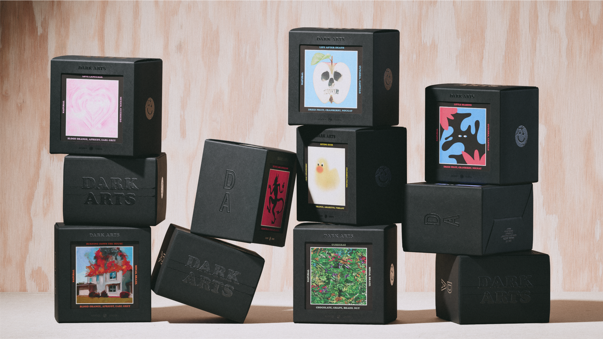
Coffee brand Dark Arts Coffee has released a new visual identity to commemorate its 10th anniversary. Based on the concept of 'Joyful Nihilism' the brand's new look and packaging take inspiration from its quirky personality, recentering Dark Arts as a playful brand without losing its signature edge.
While there are no hard and fast rules to packaging design, standing out on the shelf is no mean feat in the coffee sphere. With slick visuals and playful collectable cards, each box of Dark Arts Coffee is its own art piece, putting style and creativity at its core.
Created by branding and design agency NOT Wieden+Kennedy, the new visual identity centred around remoulding Dark Arts' old identity to create a wider appeal for consumers. "As a brand born out of biker and heavy music subcultures, previous iterations of the brand had relied heavily on the occult and devil iconography, but as the brand voice had shifted over the years, it didn’t reflect who they were anymore," Justin Hallström, creative director at NOT Wieden+Kennedy tells Creative Bloq.
While Dark Arts' social channels gained a passionate following with its irreverent tone and meme-driven content the brand had an eclectic feel due to merch drops featuring everything from "cowboys to care bears." Justin explains "This jarred with how they started, when their signature edge came from the use of occult visuals and themes, now, it was more from their tone of voice, which was irreverent and playful, with a healthy dose of cynicism, far removed from their original visual identity."
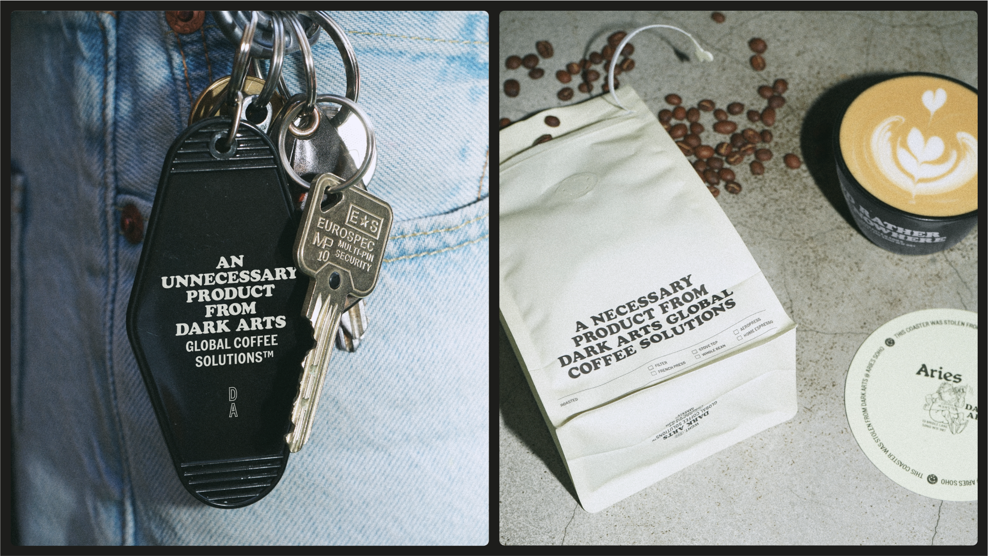
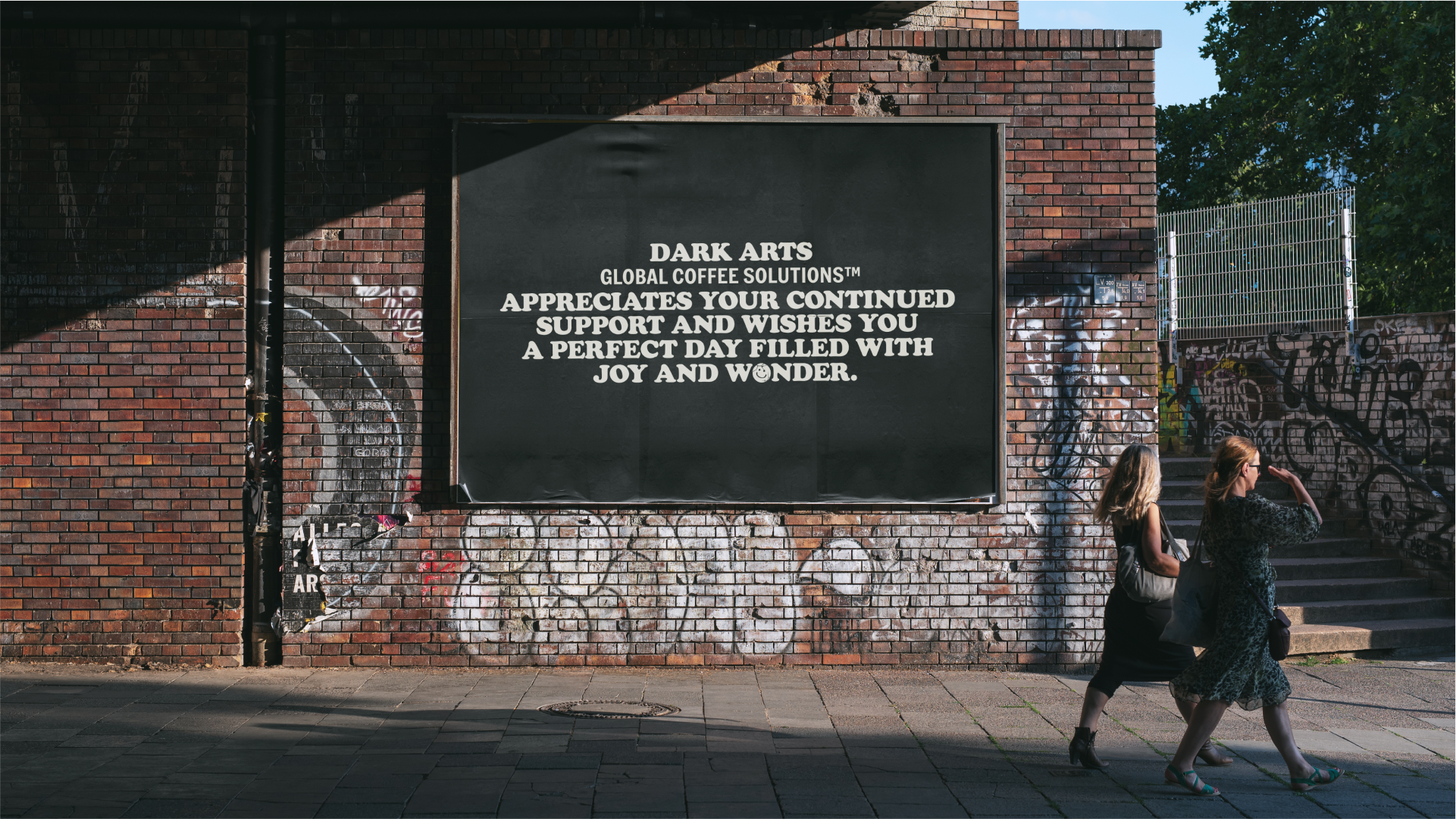
Working closely alongside Dark Arts' founder Brad Morrison, the creative team explored ways to broaden the brand's direction. "The term Joyful Nihilism came up as an expression of how they talked and approached projects. We instantly felt it was the perfect articulation of the brand, capturing their irreverent, playful cynicism in a single expression and something only they could say," Justin says.
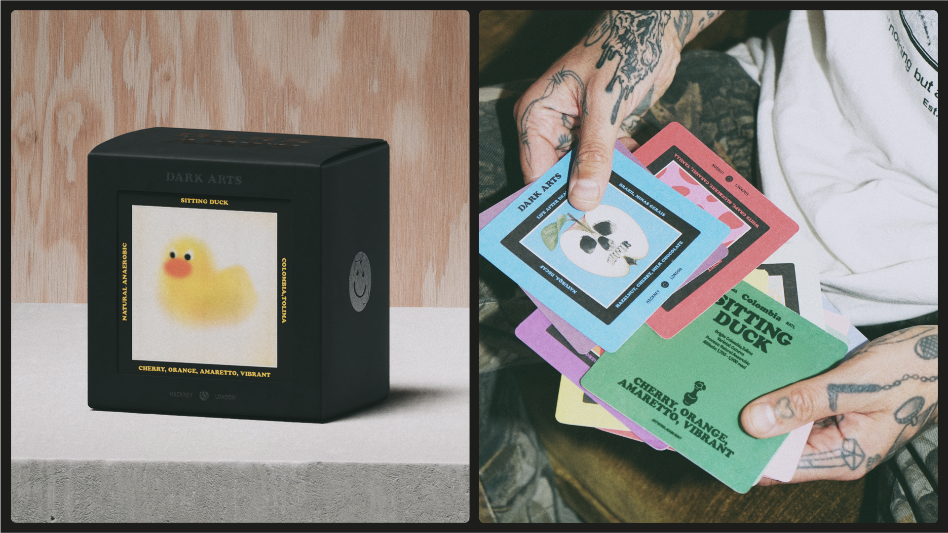
Building on this concept, the new packaging was a "key testing ground for the new brand," Justin explains. "The idea of cards became the perfect solution. It allowed them to express themselves through an ever-evolving approach to artwork. They also served a very practical need, allowing customers to keep the cards with coffee information on provenance and tasting notes—important for coffee connoisseurs. Further to that, it allowed them to tap into the fandom of the brand; with merch drops consistently selling out, it gave their fans a new way to engage with the brand, and embrace collectability – gotta catch em all!"
"Once we’d landed on the windowed box/card approach, we let our whole team run free on designing those cards. Seeing the range of art coming out of our team was so exciting. In the space of a week, they produced over 50 unique artworks with a ridiculous variety of styles. The combination of all these really brought to life the concept and proved how powerful it could be," Justin adds.
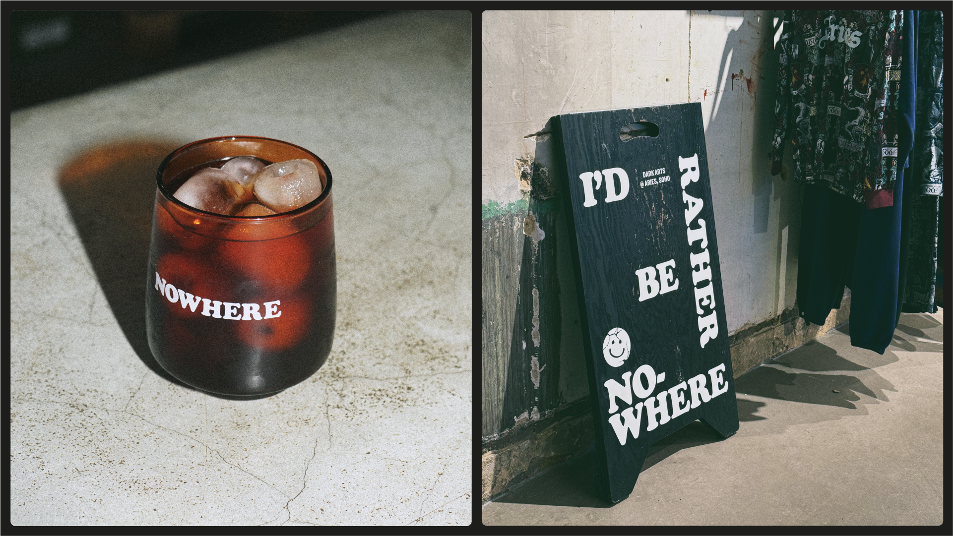
While art is the focal point of the new packaging, it's underpinned by a refined colour palette, refreshed iconography and a bold typeface, brining a sense of sleek authority to the design. "The solution was a simple typographic approach that let their tone of voice shine through. Using the typeface Cooper Black felt natural. Inspired by its use in 70s biker t-shirts, it became the perfect vehicle to capture their irreverent tone of voice," Justin explains.
When asked what was most challenging about the creative process, Justin says: "It was definitely striking the balance between doing something new, but not losing their personality and alienating their existing fan base, as they are a brand with a very loyal following. And at the same time, we needed to balance introducing more consistency whilst being sure not to put a ‘creative straight jacket’ around their eclectic personality."
Looking ahead, Justin adds "While we have set up the foundations for the next era of Dark Arts, we’re genuinely excited to see what they do with the new brand and the constant stream of new packaging artworks. There’s already talk of a book to collect your cards in… which would be epic."
For more branding inspiration check out the adorable illustrations in this dairy brand's new identity. If you're after more design news, take a look at the Guggenheim’s new logo that's a modern masterpiece.
