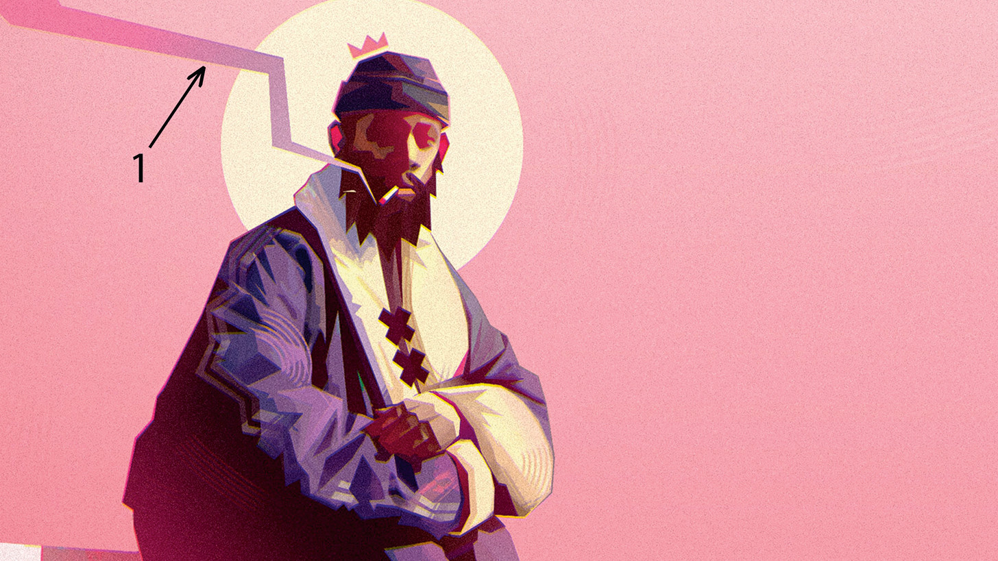
Achieving the right shapes in your characters is essential to getting messages across to the viewer effectively. In this digital art tutorial I’ll show you how to create effective character designs with strong, simple shapes. I use Photoshop here, but the advice can translate to the best digital art software of your choice.
If you like my tutorial below, then read our collection of Photoshop tutorials, and take a look at the recommended best drawing tablets for all artists.
To do this, I work with a lot of reference photos to find and build solid poses that match the spirit of my characters. I’ll then compose a colour palette that will match up with my character’s personality. I love to mix pastel shades with neon hues in particular. I’ll start with my base colours for clothes and skin, then shadows and highlights, and finally background colours and graphic touches. My backgrounds are often simple colour gradients with a few simplified elements.
Once I’ve completed these steps, I start sketching. As soon as I’ve found the right shape, I’ll use the Polygonal Lasso tool, which is also utilised at each subsequent stage. I love this tool because it allows me to create angular shapes that add intensity to the character. I then apply colours, followed by shadows and either warm or cool coloured lights depending on the mood I want to set in the illustration. Finally, I’ll add in graphical elements to make my character stand out.
01. Pick your colour palette
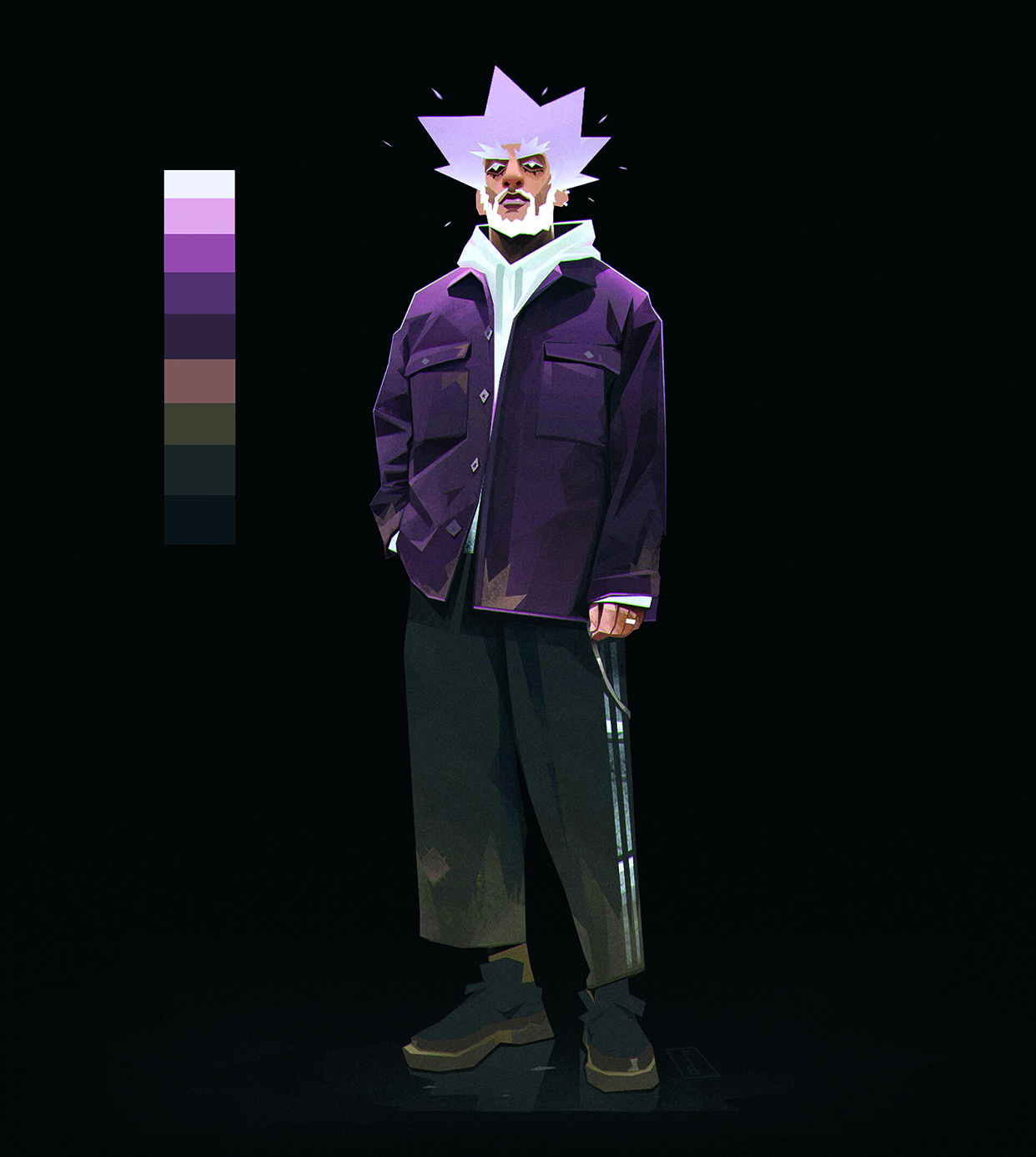
It’s important to choose a primary colour palette that matches your character’s personality. Don’t hesitate to draw on existing colour palettes; there are millions of them on the internet, so why deprive yourself? They’re a great basis for developing colours that work well together in your designs.
02. Add a touch of madness
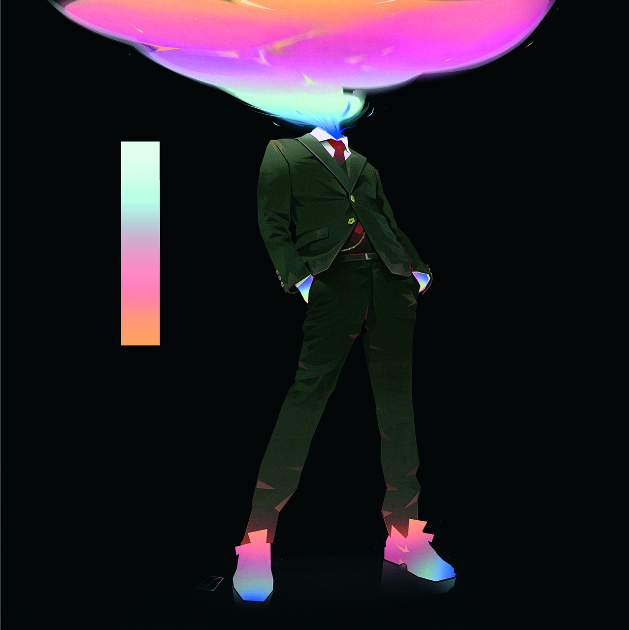
Once you’ve found the basic colour scheme, it’s important to find a complementary, more intense palette to highlight the character’s main elements. In this case that meant the head, hands and shoes. These colours direct the eye straight to the most important elements.
03. Separate different parts
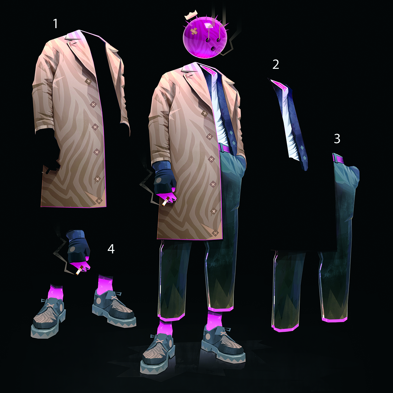
To avoid getting lost in the hundreds of different layers, it’s important to segment parts of the character. Here, I’ve split the clothing up into four groups: the coat, the jacket and shirt, the trousers, and then everything else. The head is separate.
04. Match stylised elements
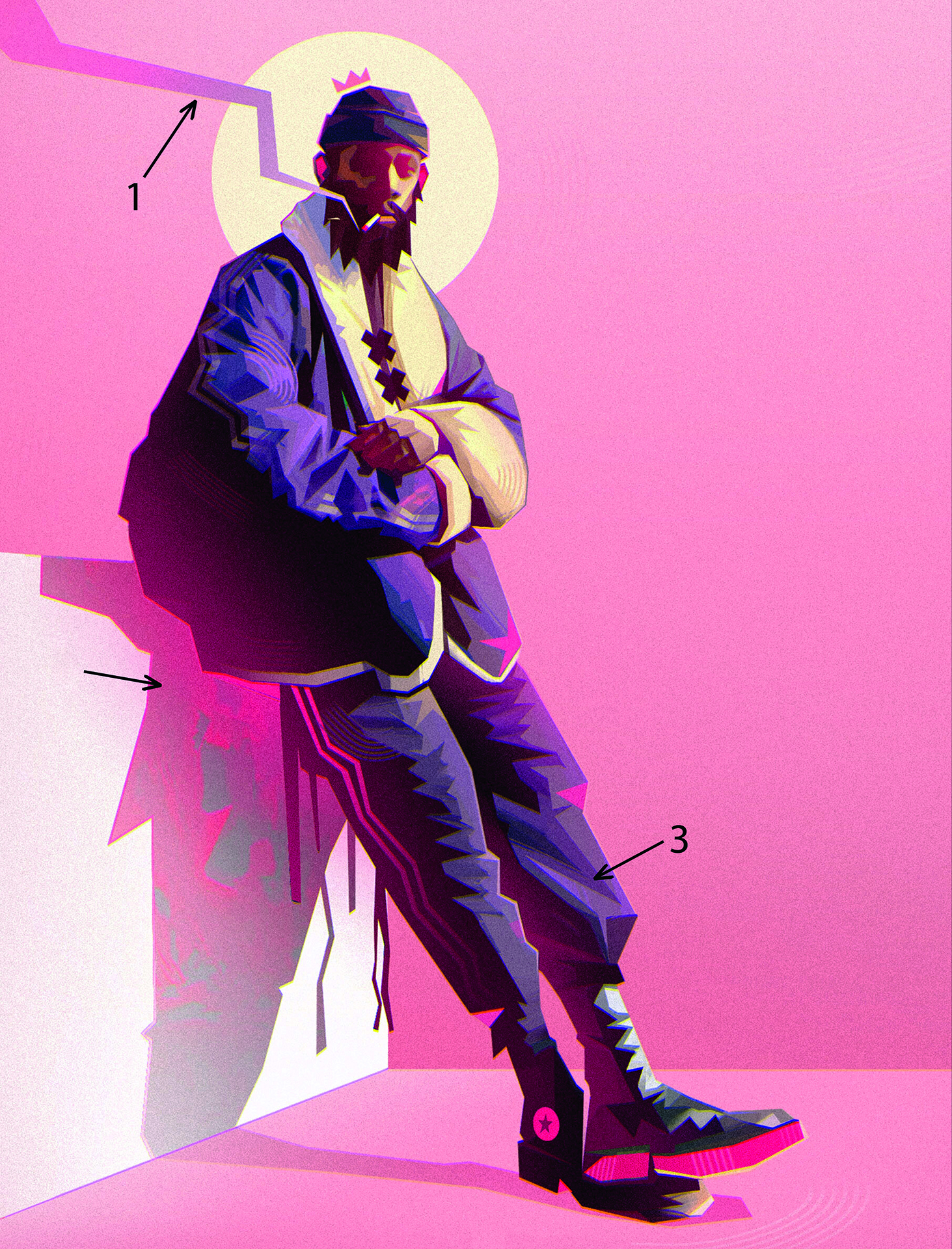
For the character to fully function, surrounding elements such as smoke, light and the ground must be stylised in the same manner as the character. For this chap, the design is semi-realistic with sharp shapes, so I worked the smoke and shadows in the same way using a textured brush.
05. Create the Shapes
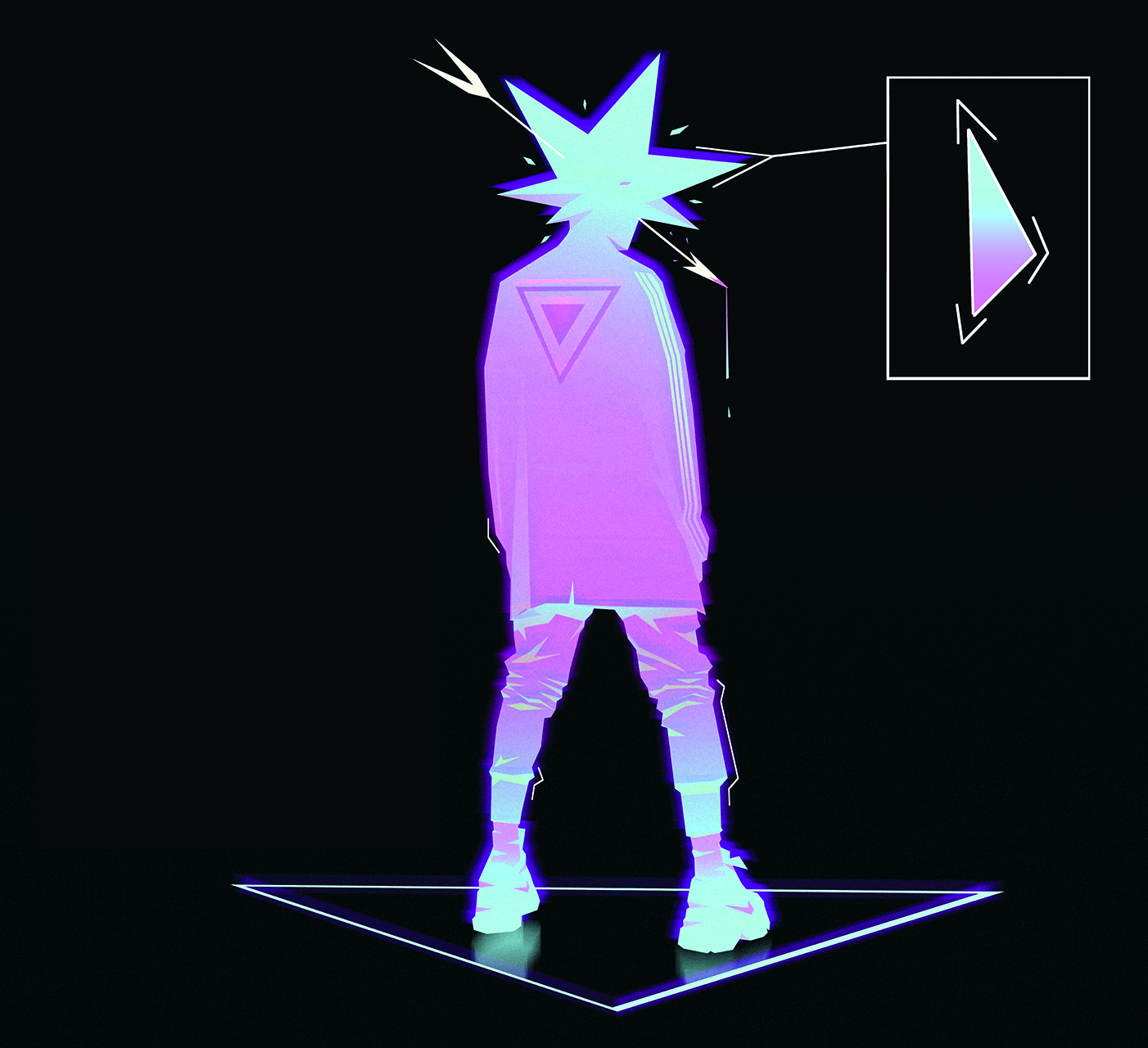
For me, the character’s silhouette is the most important element, so I spend a lot of time creating it. Once I’ve finished my pose, I start to develop the character’s general shape with the Polygonal Lasso tool, using a solid shape and then a fairly coarse gradient to create their shadows.
06. Build up shadows on the character
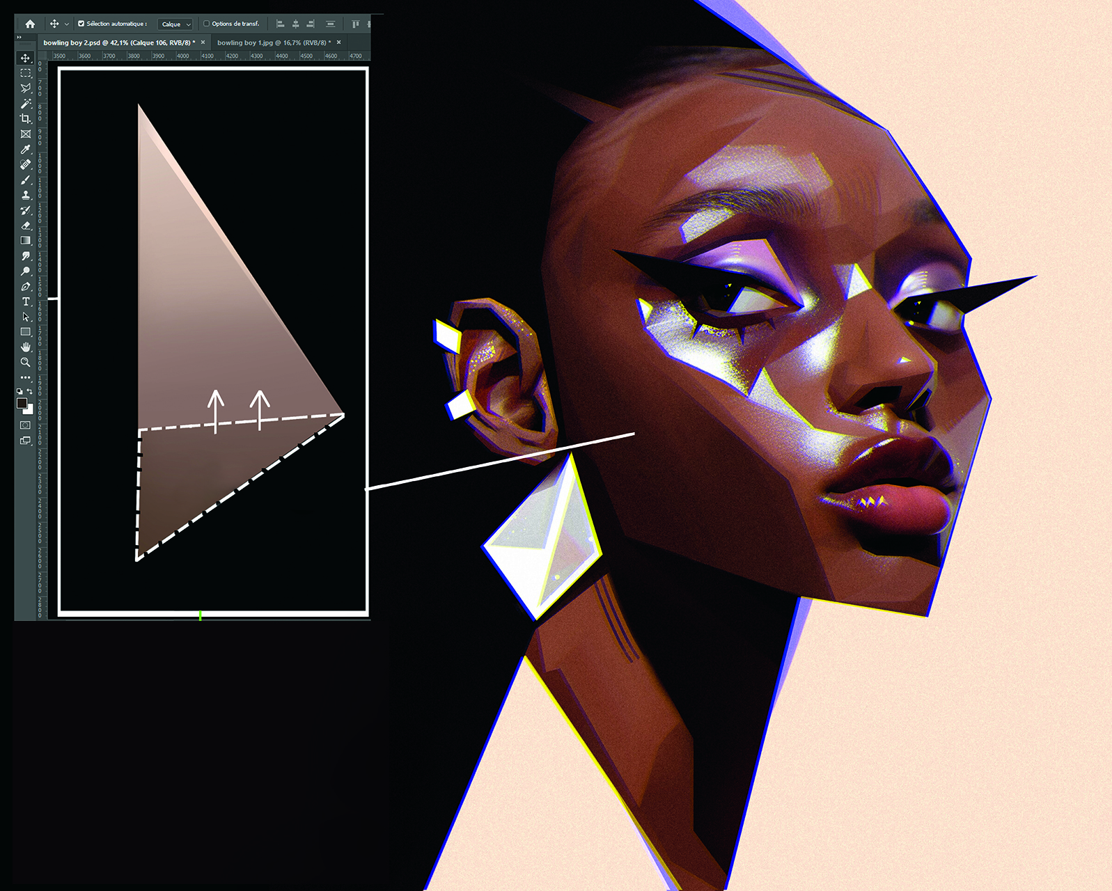
In general, I choose to develop a contrast between the semi-realistic style of the proportions and colours by making realistic shadows that will bring life and realism to the character. I like to play with styles. To do this, select an area with the Polygonal Lasso, then within the selection make a gradient using the Gradient tool.
Next, use the Multiply blend mode to make the effect as natural as possible. The advantage of Multiply is that it adds to the colour of the drawing by fading. I often use warm colours for creating my shadows.
07. Develop the lighting
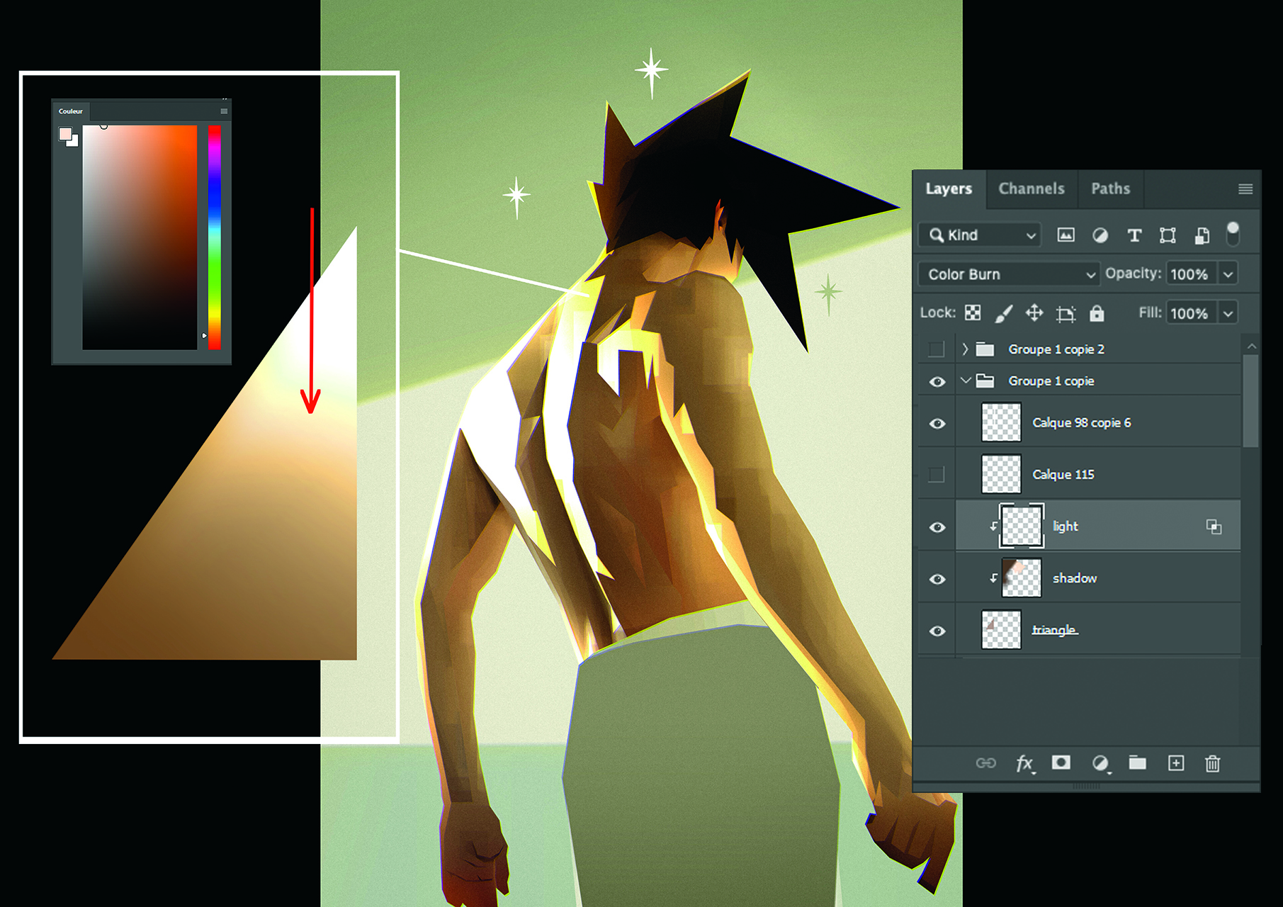
Adding light is one of my favourite parts of creating. It’s usually the last step in my working method. To begin with, choose a colour that stands out more than those of the clothes or skin so it works well.
Once picked, create a special layer over the elements that will be lit. Set it to the Color Burn blend mode, which brings out the natural look of the shadows. In general, work over all the other layers to apply the light evenly.
08. Be sparing with Texture
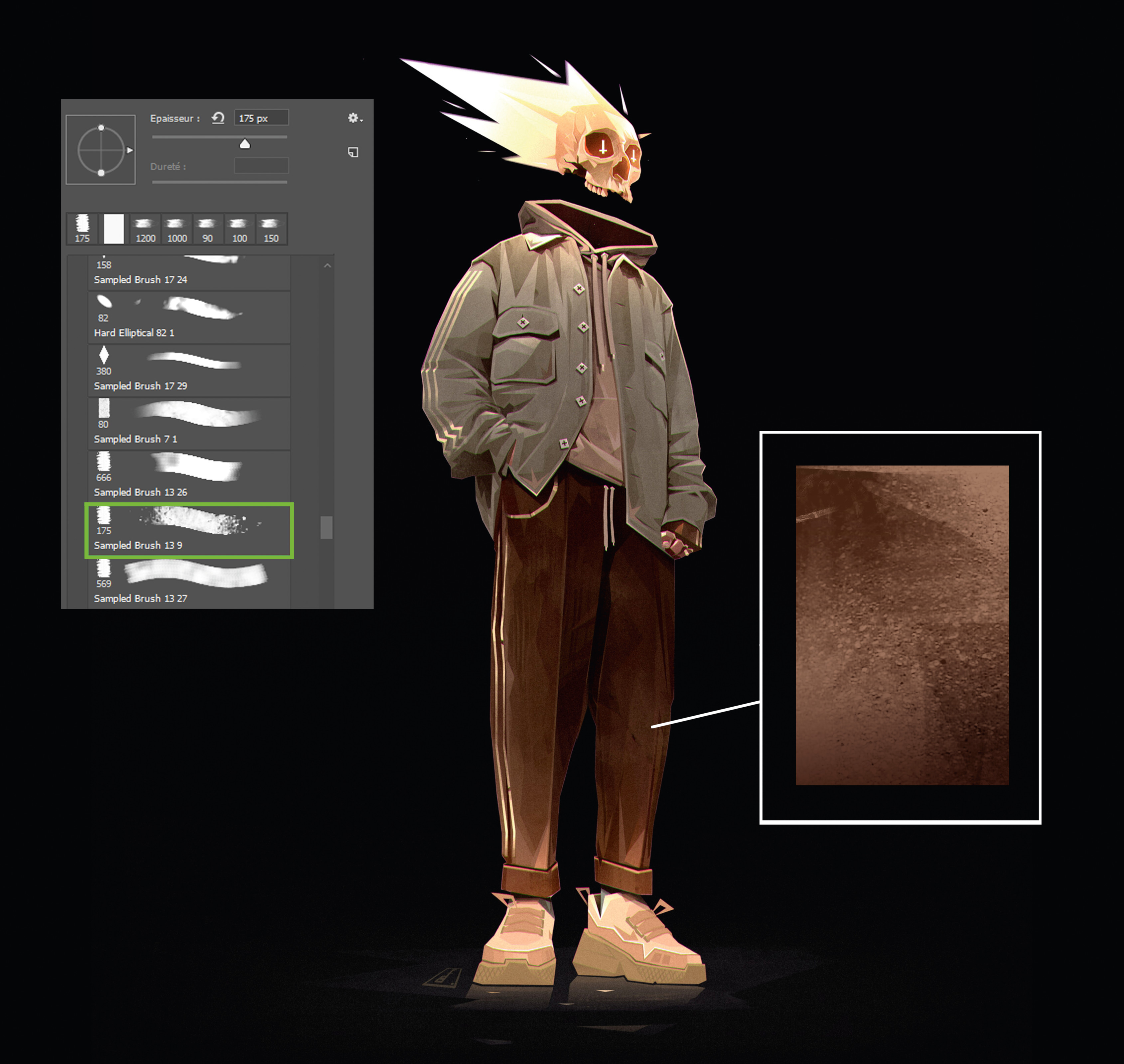
In any image, texture is always important to add vibrancy and realism. I use a few textured brushes to add relief and life to the clothes. My advice is to try out a variety of brushes, but once you’ve found the right ones, it’s best stick with a maximum of two or three. Using too many textured brushes can detract from the image’s clarity, in turn making it distracting for the audience.
09. Bring personality with graphics
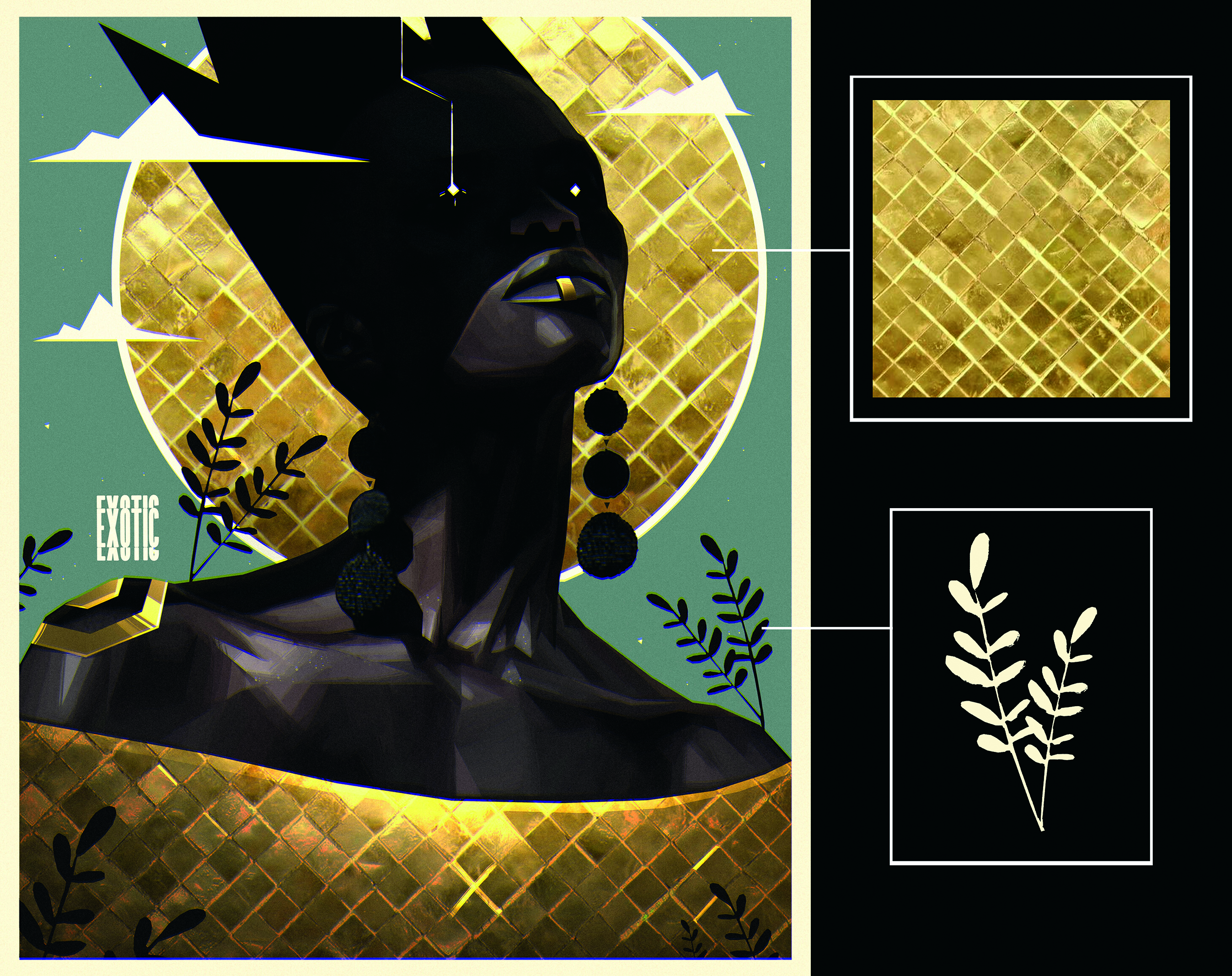
Introducing patterns and other graphical elements is a major plus when you’re creating a character, as they help to make the design that little more unique. A good motif is important for adding charisma to a character and supporting their personality.
10. Consider the background
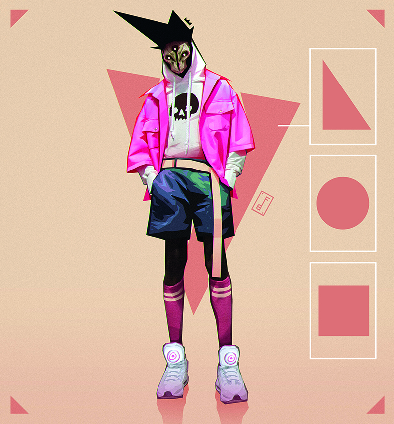
I very rarely do elaborate backgrounds, as I find it creates a lot of unnecessary information around the character. Instead, I often use a few simple geometric shapes that highlight the most important and interesting parts of the character, such as circles, triangles or squares behind them to draw in the viewer’s attention.
11. Show off the materials
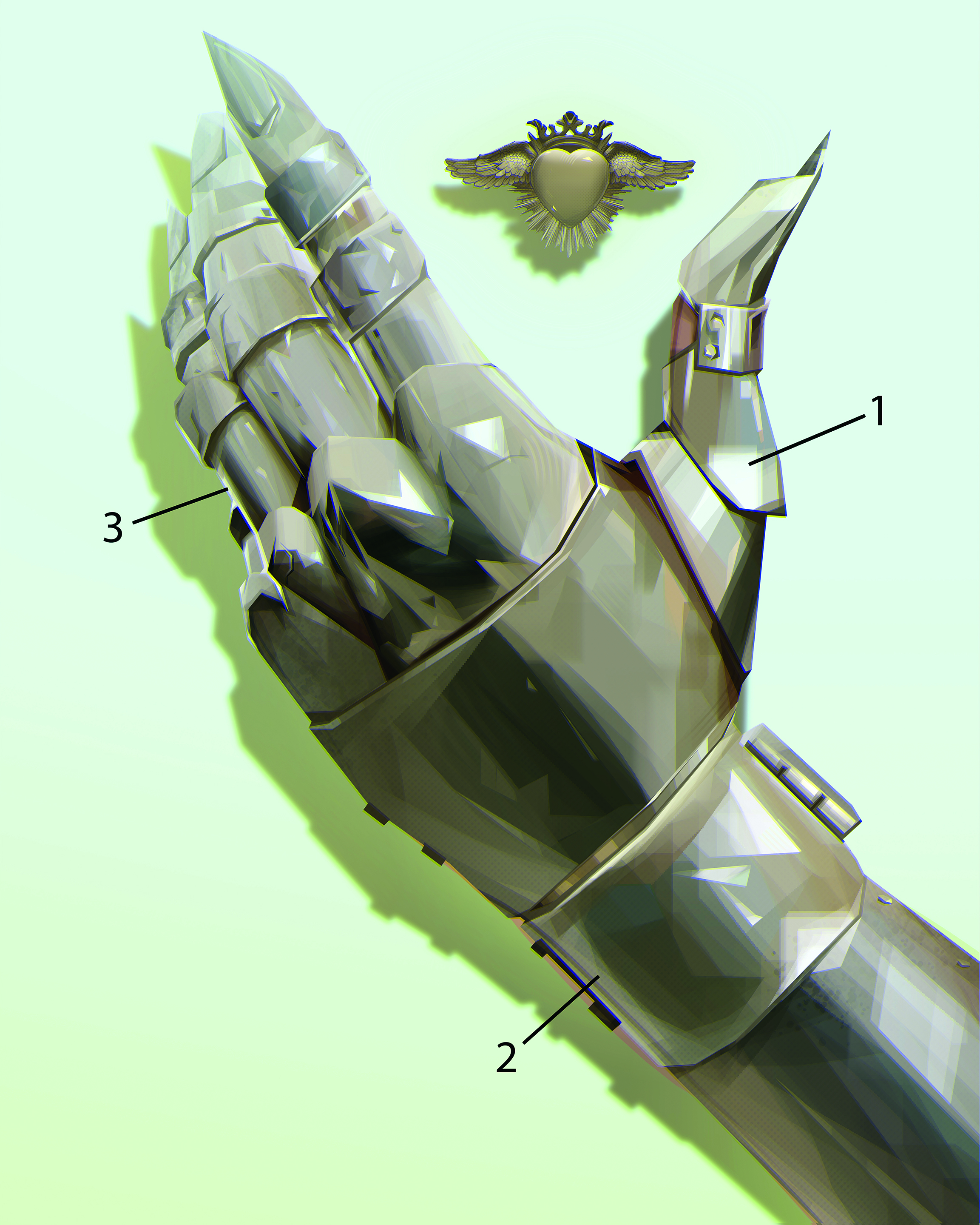
It’s important to be able to simplify the various subjects using easy, effective tricks. For example, with glossy materials, a simple white highlight will immediately give an impression of volume, seen here in the edge light (A) that gives volume to the glove, and in the highlight (B) and bounce light (C) that reflects the light onto the metal.
12. Divert expectations
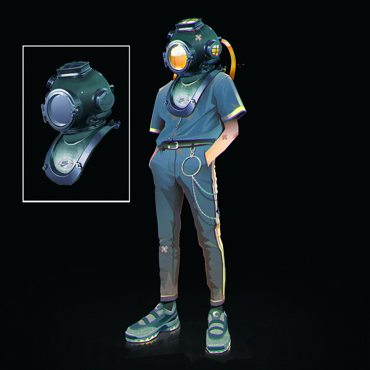
Here I’ve taken an old diving helmet and turned it into a machine that fills with beer, which swills around the character’s head. To accentuate the goofiness, I also attached beer bottles to the back of the device, as I think it’s important to add a touch of fun to my character designs.
13. Create a sense of composition
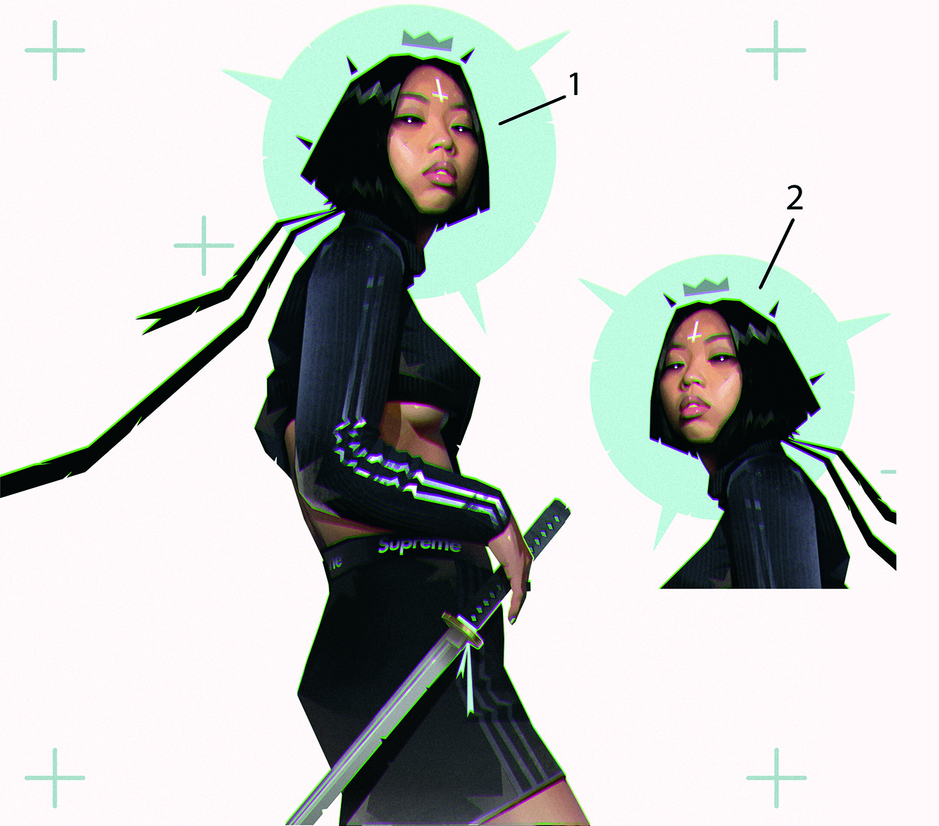
Where the character looks is crucial, as it gives the viewer a sense of how to read the image. In general, to avoid blocking the composition, I’d advise having the character looking or turned towards the right (A) to let the drawing breathe. Conversely, if the character is looking to the left (B) then the atmosphere feels more closed off and less conducive to that sense of the image breathing that we’re looking to create.
14. Find a focus
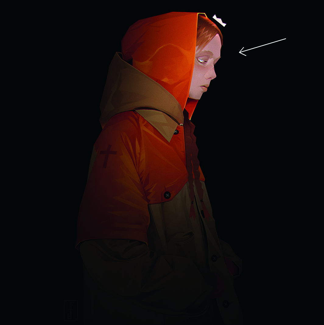
Focusing on the element you want to emphasise most is important to give meaning to the character and the image. Here, the focus is on the character’s face and eyes. The lower part of the body is hidden and therefore more mysterious.
15. Pose the character
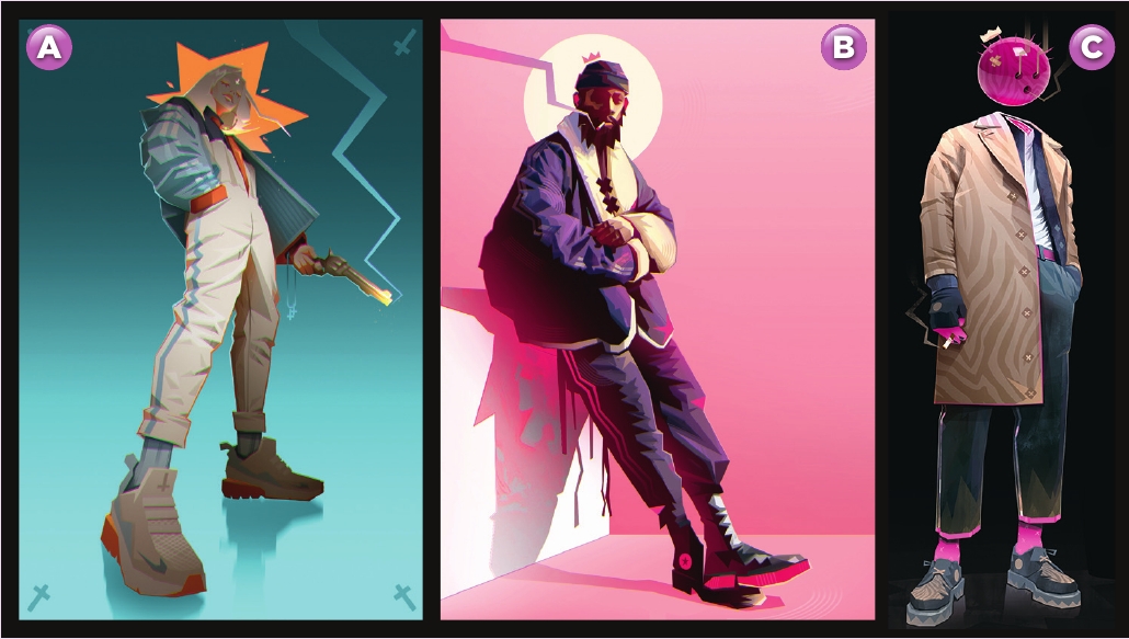
The pose and direction of the character’s gaze is important for the atmosphere. The character seen from a low angle and looking at us (A), gives the impression of being threatening. The next character (B) is contemplative, posed and looking towards the viewer, so the feeling is calmer. The final character (C) is just standing stoic, looking into the distance at something that we can only imagine.
Get more Procreate tutorials in ImagineFX
This content originally appeared in ImagineFX magazine, the world's leading digital art and fantasy art magazine. ImagineFX is on sale in the UK, Europe, United States, Canada, Australia and more. Limited numbers of ImagineFX print editions are available for delivery from our online store (the shipping costs are included in all prices)
Alternatively, you can access us instantly through our digital options:
• Apple app (for iPad or iPhone)
• Pocket mags (multi-platform app, great for Android users)
• Zinio (multi-platform app for desktop or smartphone)


