Developer Heart Machine
Publisher Arc Games
Release Late summer
Platform Unreal Engine 4
Formats PC (Steam), consoles TBC
Upcoming co-op rogue-lite game Hyper Light Breaker is a follow-up to 2016's Hyper Light Drifter, a video game inspired by creator Alx Preston's medical conditions related to congenital heart disease and delivered in a beautiful pixel art style.
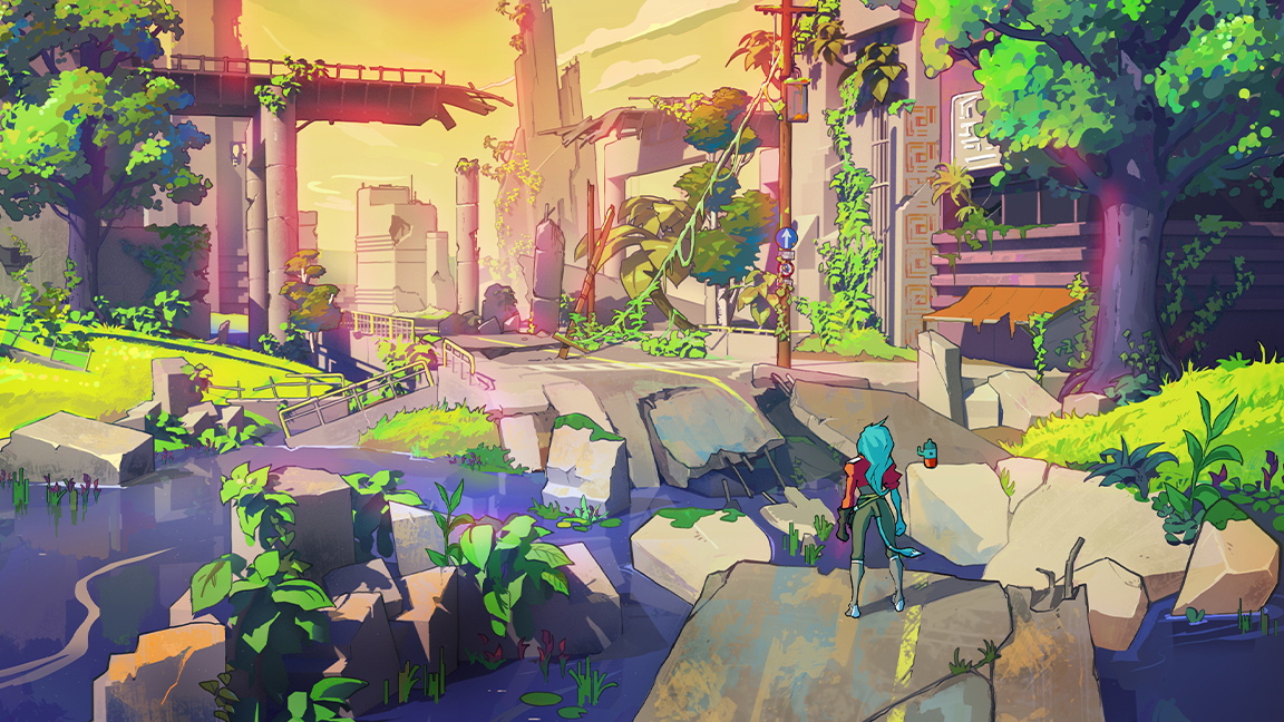
Drifter's world design was colourful and impressionistic, creative and layered. Follow-up Breaker translates the Hyper Light universe into an open 3D world, built using Unreal Engine instead of Game Maker, but imbued with the same sense of nostalgia for 1980's anime and Saturday morning cartoons as the original.
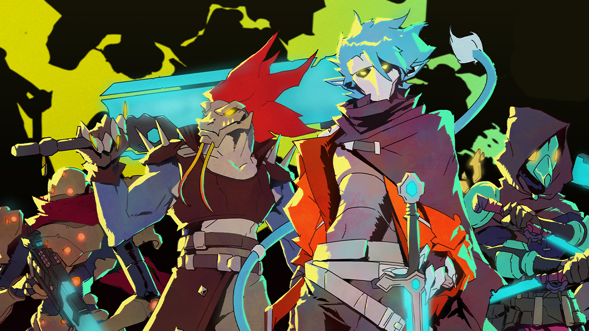
In my recent sit down with Heart Machine's art team I discovered how the cel-shaded characters are being created for Hyper Light Breaker, now art director and lead concept artist Daniel 'Danny' Moll reveals how the world itself is being crafted, and how Drifter's original designs are being interpreted from pixels to polygons.
Danny begins by explaining the team is "explicitly avoiding pixel art, or callbacks to pixel art". He tells me studio founder and Hyper Light creator Alx Preston thought it important to view pixel art as the medium of Drifter, and Breaker is something altogether new.
He reflects, however, and shares there is a place, artistically, to draw from Drifter's use of pixel art. "I think the power of pixel art is that it is impressionistic, and your mind is filling in all of those details. So when you first start looking at it, and playing it, your brain takes a while to start processing it, and then you learn to read that visual language. And the looser and more abstract it is, the more fulfilling it is when you feel at home in that world. That impressionistic identity was a lot more important than the pixel art itself."
Bringing the Hyper Light universe to life in 3D is about interpreting and translating the world that went before, capturing the impressionistic appeal of pixel art, as well as creating new designs and environments. This new game feels like Hyper Light Drifter, but is altogether something new and interesting.
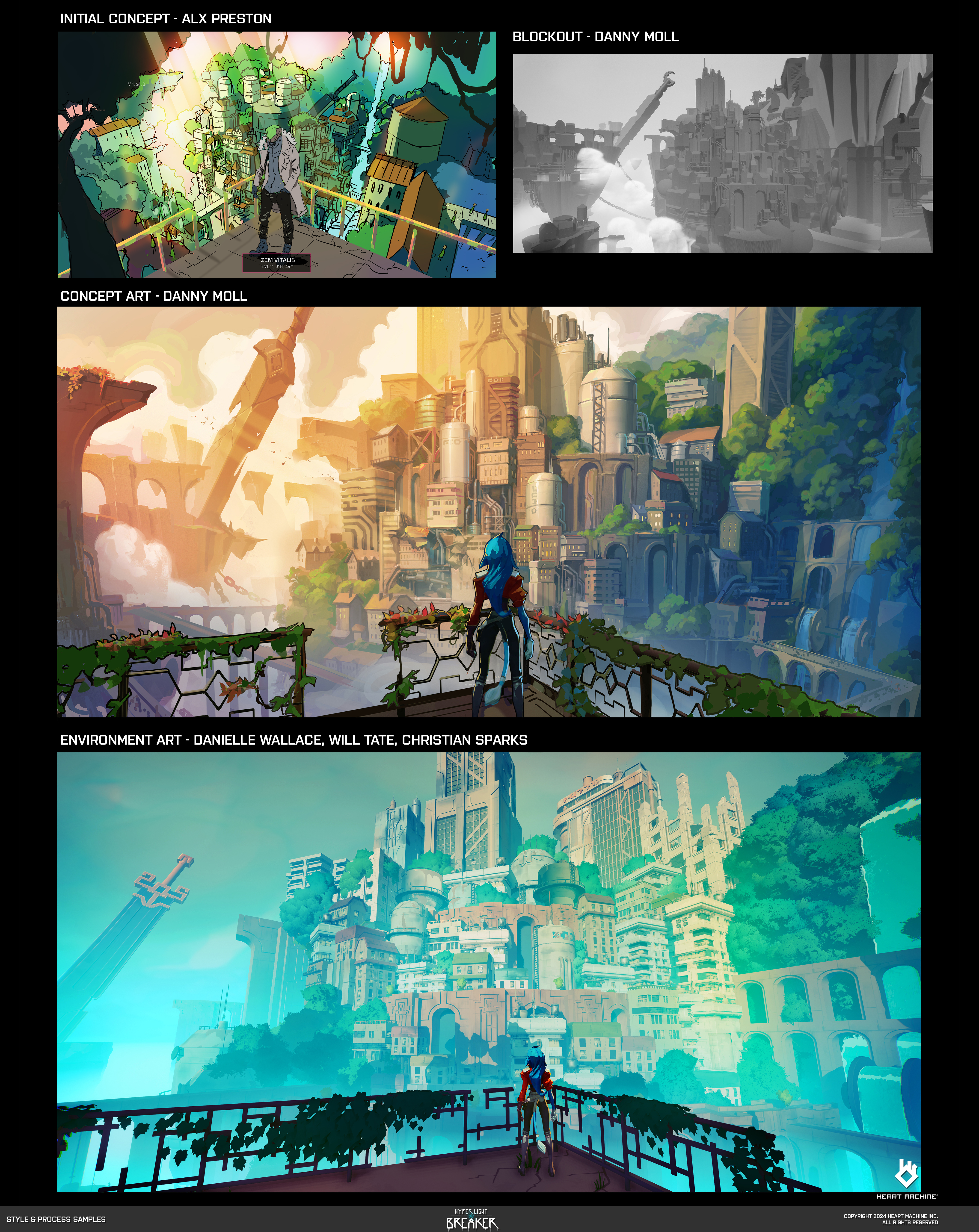
Danny tells me the look of Hyper Light Breaker's world was defined by one hero image, an environment design that delivered a Hong Kong architecture meets Cyberpunk aesthetic married to Hyper Light Drifter's motifs, its ancient arches and layered city structure.
The images above show this concept seen in progress from Alx Preston's original design (top left) to Danny Moll's 3D blockout and detailed model, painting and texturing detail created by Danielle Wallace, Will Tate and Christian Sparks.
It's a concept that was worked up by various team members to achieve the game's "ambiguously old and new" design, including 3D artist Danielle Wallace who turned 2D paint blobs into specific details and motifs, laughs Danny, who says: "When you're doing visual development, you're always searching for something that is going to give you a clear direction on the road as things are uncertain," says Danny.

The creative process begins with the same approach the team had to Hyper Light Breaker's character design and modelling, with a focus on a style that uses hard, straight lines and reduced detail, "really simplifying and abstracting shapes into these like hard straights and building curves out of straights, and contrasting them against curves," says Danny, who laughs and jokes, "Our trees in the game are basically a sphere on a stick".
He adds: "There's obviously a lot of nuance and difficult and complex work and details in there that matter, but they're secondary to the overall read."
Danny has a background in animation as well as games, having worked on Netflix's Castlevania animated series, he reflects how that has informed his approach, and overall Hyper Light Breaker's art style is informed by 2D animation.
"Coming from animation, when you do backgrounds, you're always thinking about creating a stage for the characters. So that's something that we thought about with animation a lot, which was the characters were going to receive this outline and the cel-shading, which are both animation techniques, so it made sense to try to look at and emulate 2D background painting from Studio Ghibli."
While working on Castlevania Danny "became passionate about 3D" after shunning the tools for years. After discovering a 3D pipeline for set building he brought that workflow to Hyper Light Breaker.
He explains: "Most of the concepts I do, I do as concept blockouts in 3D first, and then I'll throw them into a context and see how they're working in the game. I'll run around them and concept them as a game asset rather than something that exists purely in the 2D realm."
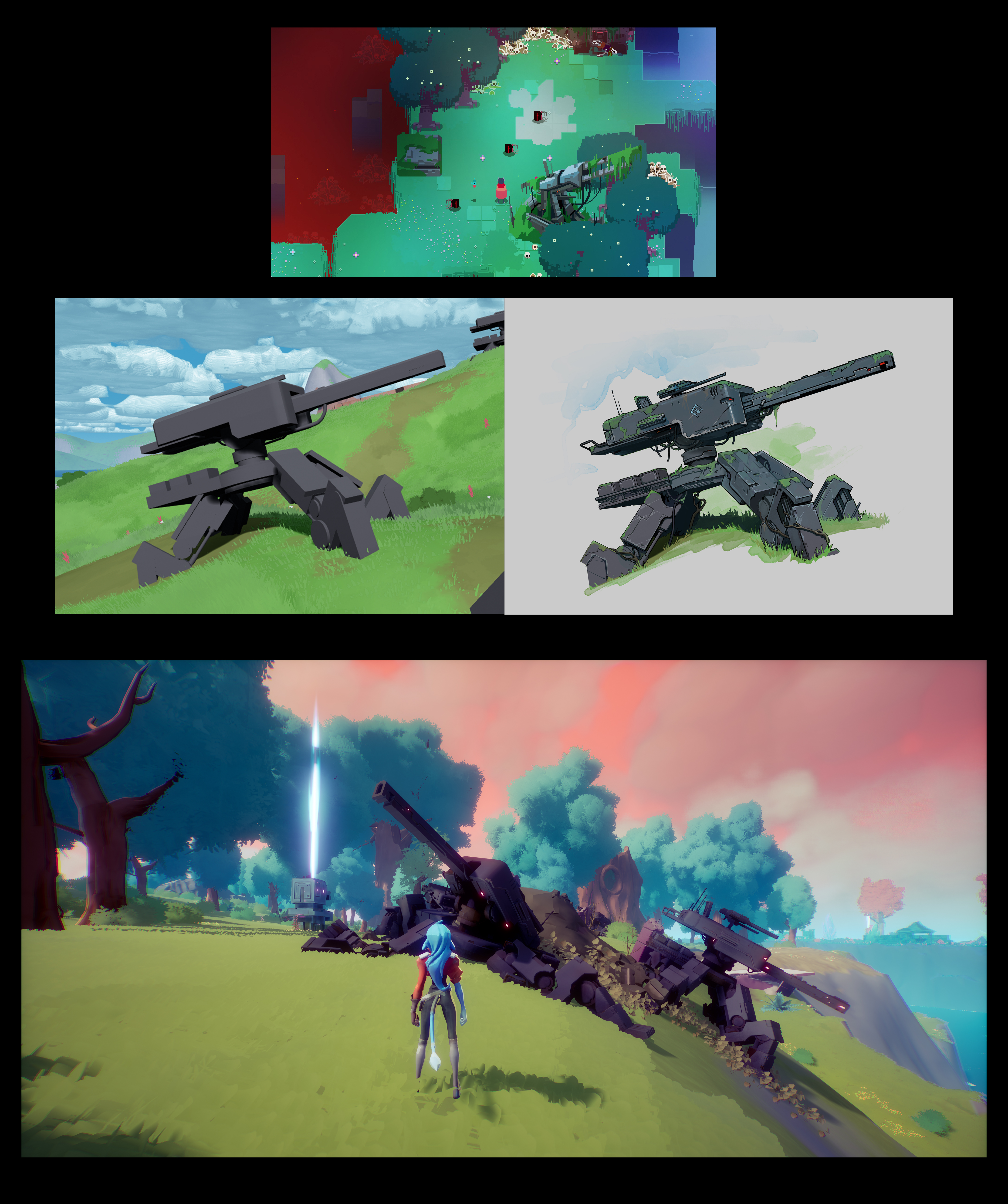
Danny shows me some in-progress art and game scenes to explain the process, revealing how an environment and detail from the original game, Drifter, was translated into a new 3D space for Hyper Light Breaker. The landscape in Drifter is littered with the "story of war" as players run past derelict and broken tanks and war machines that represent a post apocalyptic environment.
"These remnants of broken weapons and tech were a key ingredient, a visual and thematic ingredient, for the world," says Danny. He shows me an initial concept blockout from a version of the game from 2021 (aove). It's intentionally simplified and geometric by design but it feels like the same artefact I ran past in 2D during Hyper Light Drifter.
From here Danny gets to do the "fun and quick parts," the "sloppy blocking-out and artistic rendering, then our really talented 3D environment folks interpret that". The interesting aspect to this process is how the art team are focusing on capturing the spirit of the original game's world design and not a one-to-one replica of it.
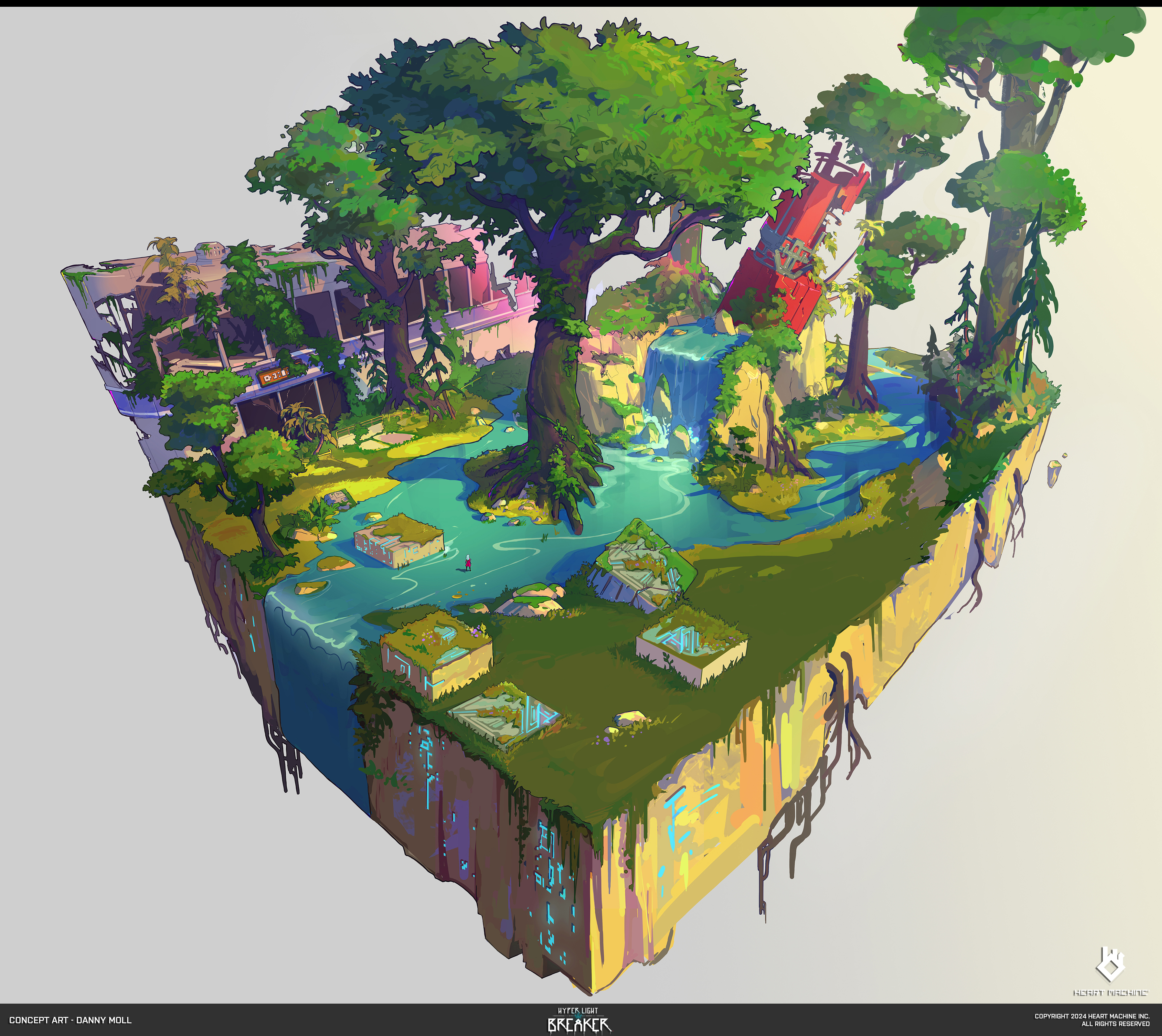
As we discuss designing and building Hyper Light Breaker's world it's clear the the team treads a fine line between adding enough detail to ignite our imaginations, but not so much as to break the aesthetic.
"The power of specificity is that you can create something that's much more textural and rich, something that implies a history. If you go too simple you lose those details, and then you lose that texture," says Danny.
The power of specificity is that you can create something that's much more textural and rich, something that implies a history
Danny Moll, art director and lead concept artist, Heart Machine
Danny tells me the idea of "intentionally simplifying" the design of the game's world has been a "really fun limitation to work with" because the instinct is that higher complexity looks better, but that's not always strictly true. At this point Danny laughs and tells he could rant all day out his pet hate of modern car design for this exact reason.
"I think, working on this game and working with Alx's tastes and preferences, I've come to really appreciate 1980's vehicle design," says Danny. We're off piste a little but there's a through-line of thought here. As 3D modelling tools have improved it's now possible to create near anything, meaning modern design can become a race to render the most "showy" and "complex" a design. Danny reflects, "there's something nice about things that are simplified back to the core geometry".
Given this love of retro design and car concepts, it's little surprise the team looked to, and were inspired by, the art of Sid Mead and Ralph McQuarrie. "The retro Sid Mead flavour comes through in some of the vehicle designs," adds Danny.
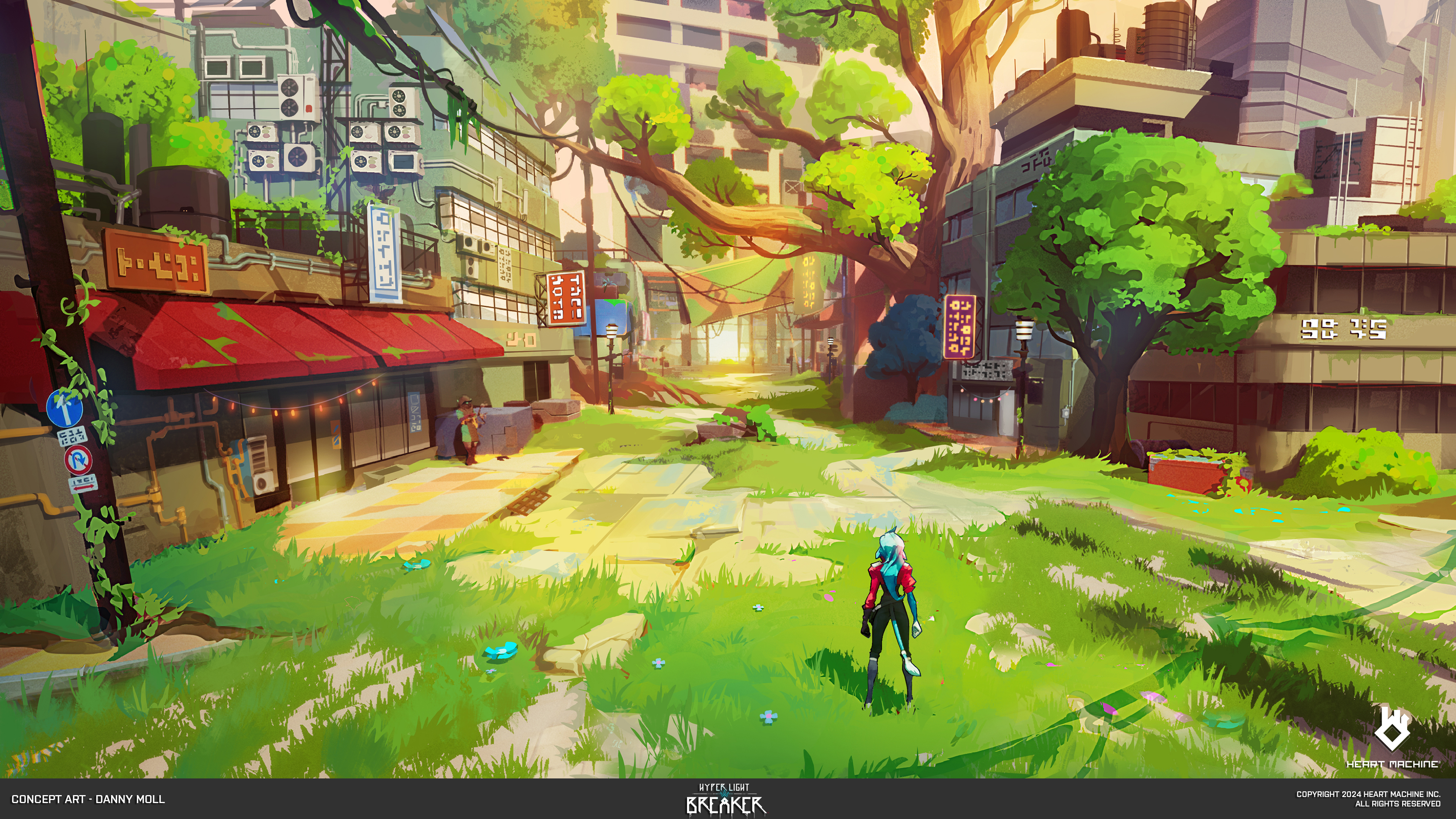
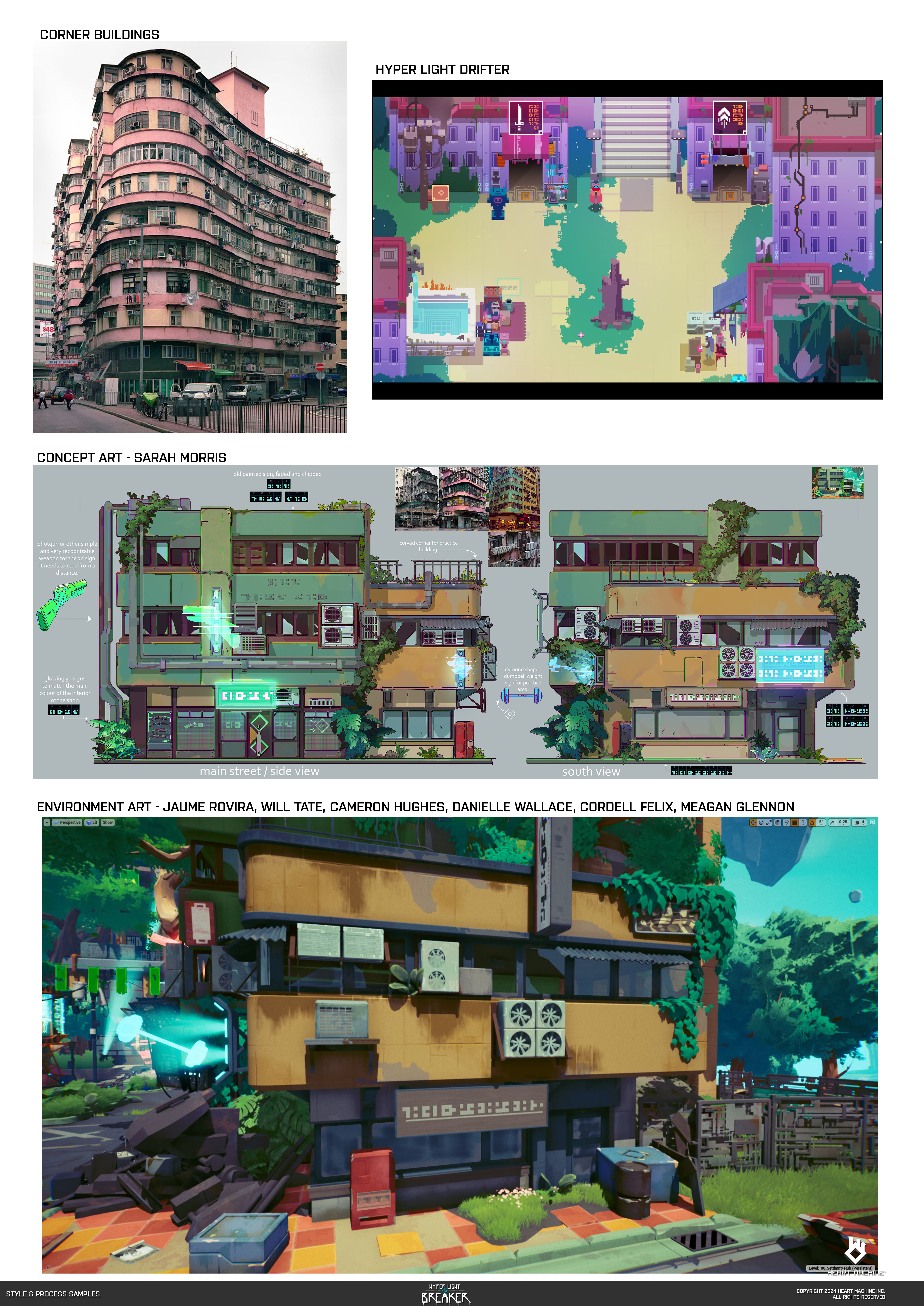
A good example, which Danny shows me (above), is the game's Hub World. This features buildings that were in Hyper Light Drifter but while the original designs featured the suggestion of detail, a mix of wiring, cables and control panels that sit together in a routine mix of undefined technology.
"The real world analog for this are Hong Kong corner buildings, and that was something that I just got very attached to," says Danny as he looked for references to add detail the older game's world.
Concept artist Sarah Morris worked on the designs for this area of the game's world, adding in just enough descriptive detail to bring the scene to life. The building design was process was boosted by environment lead Will Tate, who created a vertex painting shader that allowed the artists to paint directly on the model.
"That gave us a lot of those like painterly and restrained painted details," says Danny before adding: "It's like just a touch of discolouration from wear and tear, or flaked paint, or those little details that push things higher in fidelity than previously in Solar Ash, [it's the] implied detail in the splotchy impressionistic nicks and chunks taken out of things."
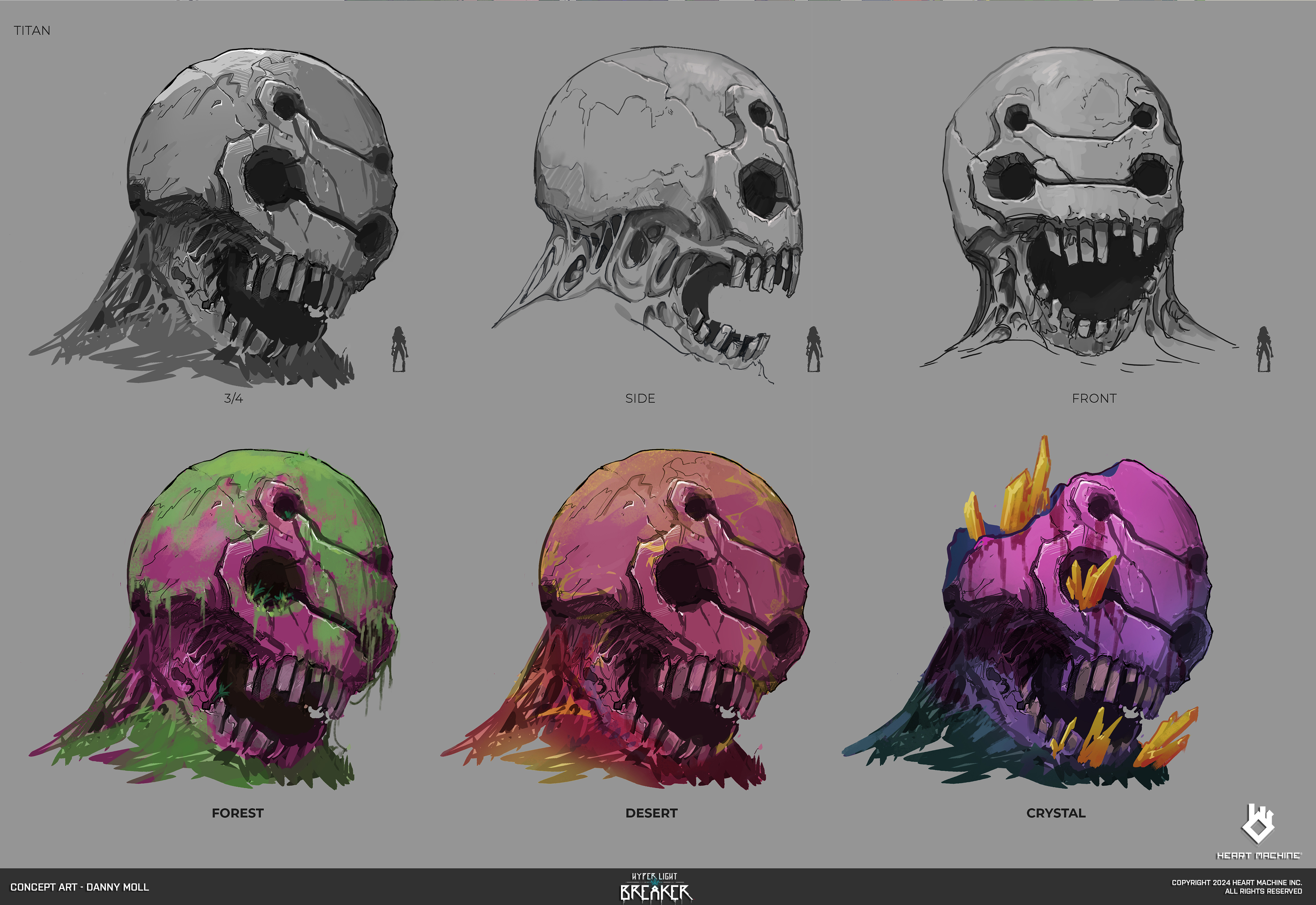
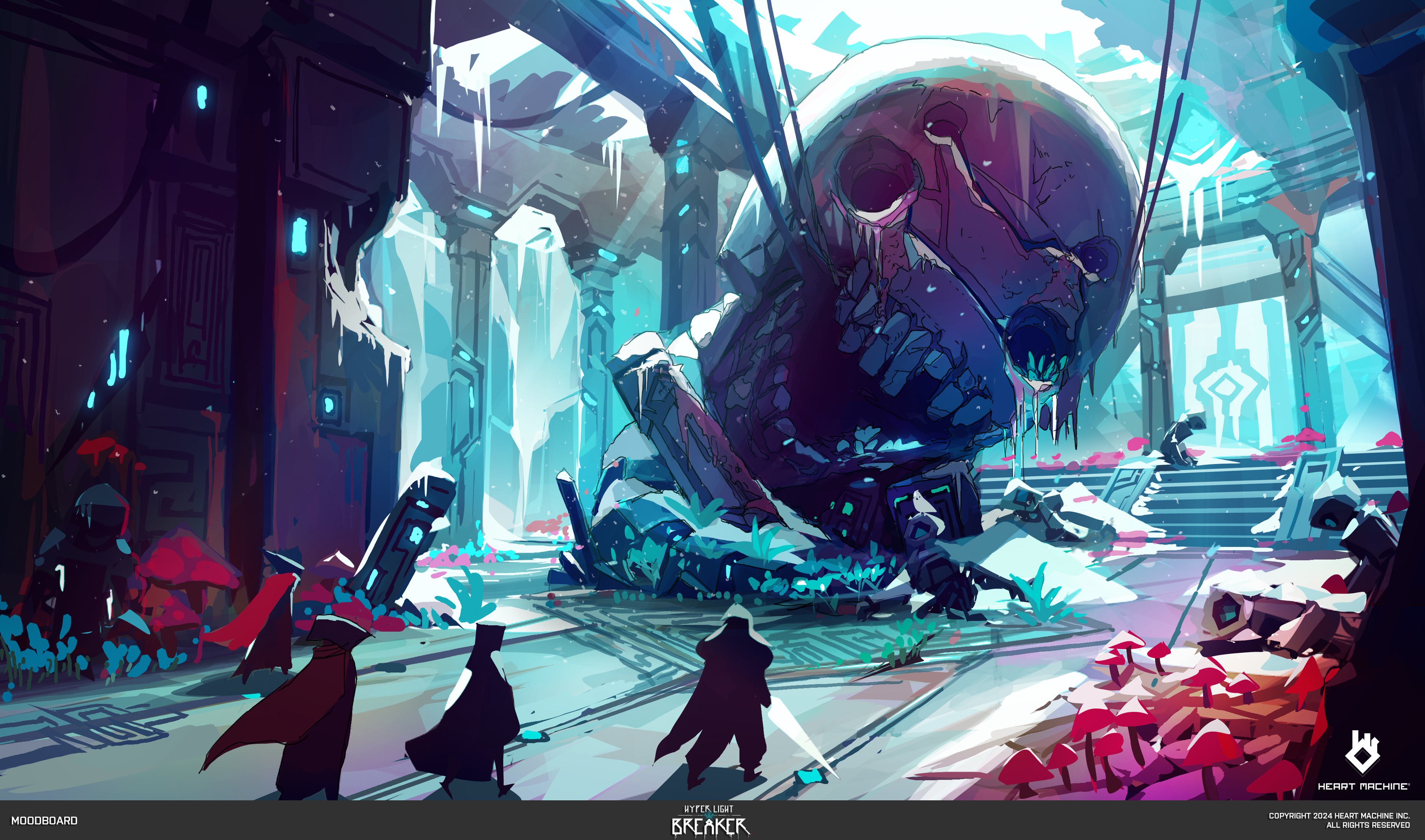
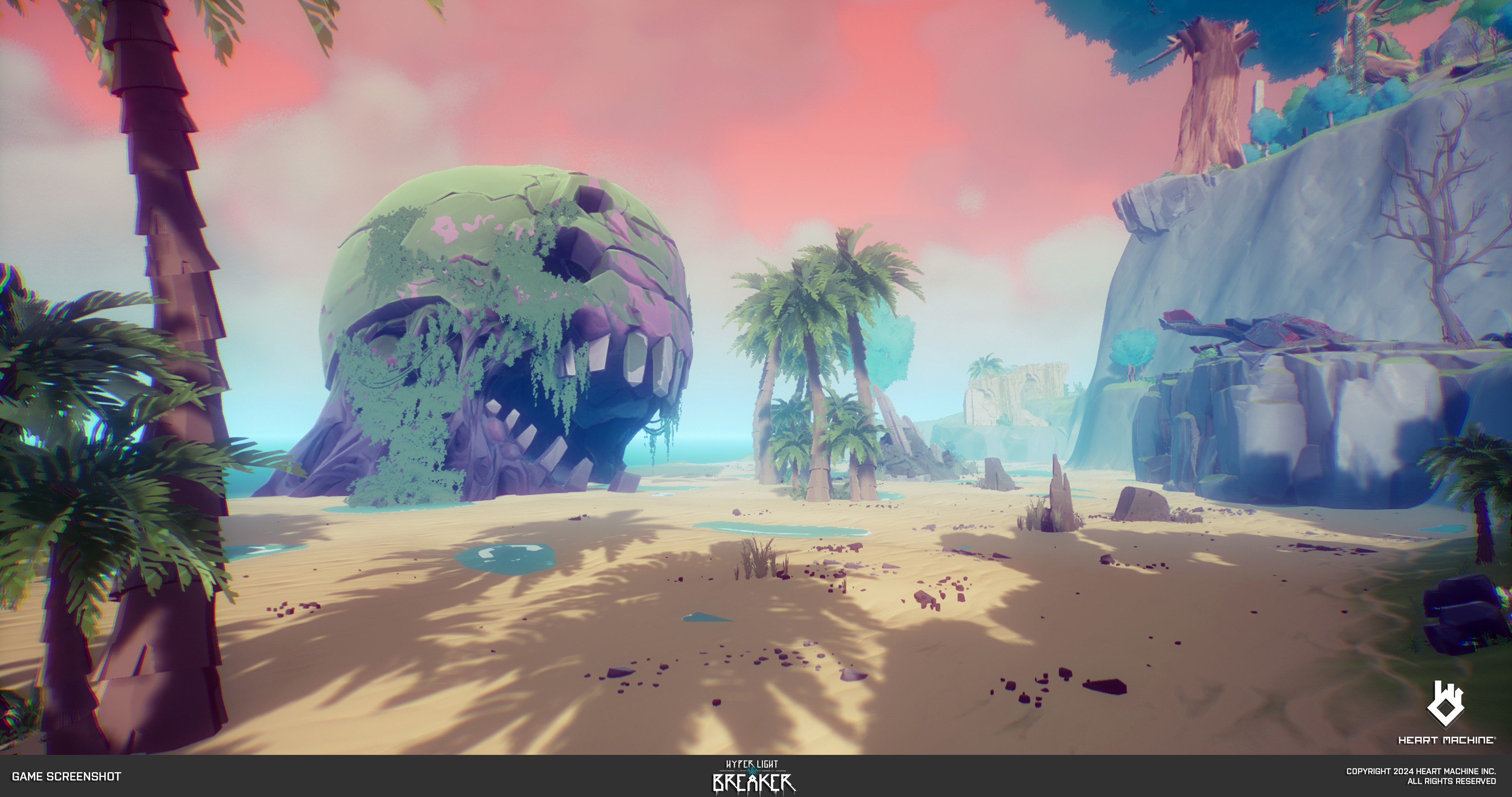
The vertex paint shader was only used in the Hub World due to technical limitations (the game features procedurally generated worlds with large open biomes and labyrinths), but there's a workaround the team devised that using paint masks. "So instead of using vertex colours, those masks were generated, are created by the artists and Substance Painter," explains Danny.
The direct painting technique, while not used throughout, helped the team establish the impressionistic style, inspired by artists such as Monet, Xi Zhang and Tokyo Genso. An optimised version of the hand-painting approach was made and rolled out to artists creating gameplay levels.
"So everything is sort of hand-touched," explains Danny. "The thing about this method is that it's not a zero-to-one, like a one-to-one texturing method, it's all driven by these masks. I think the temptation with zero-to-one texturing is to go too detailed and to take things a little bit too far that this method avoided."
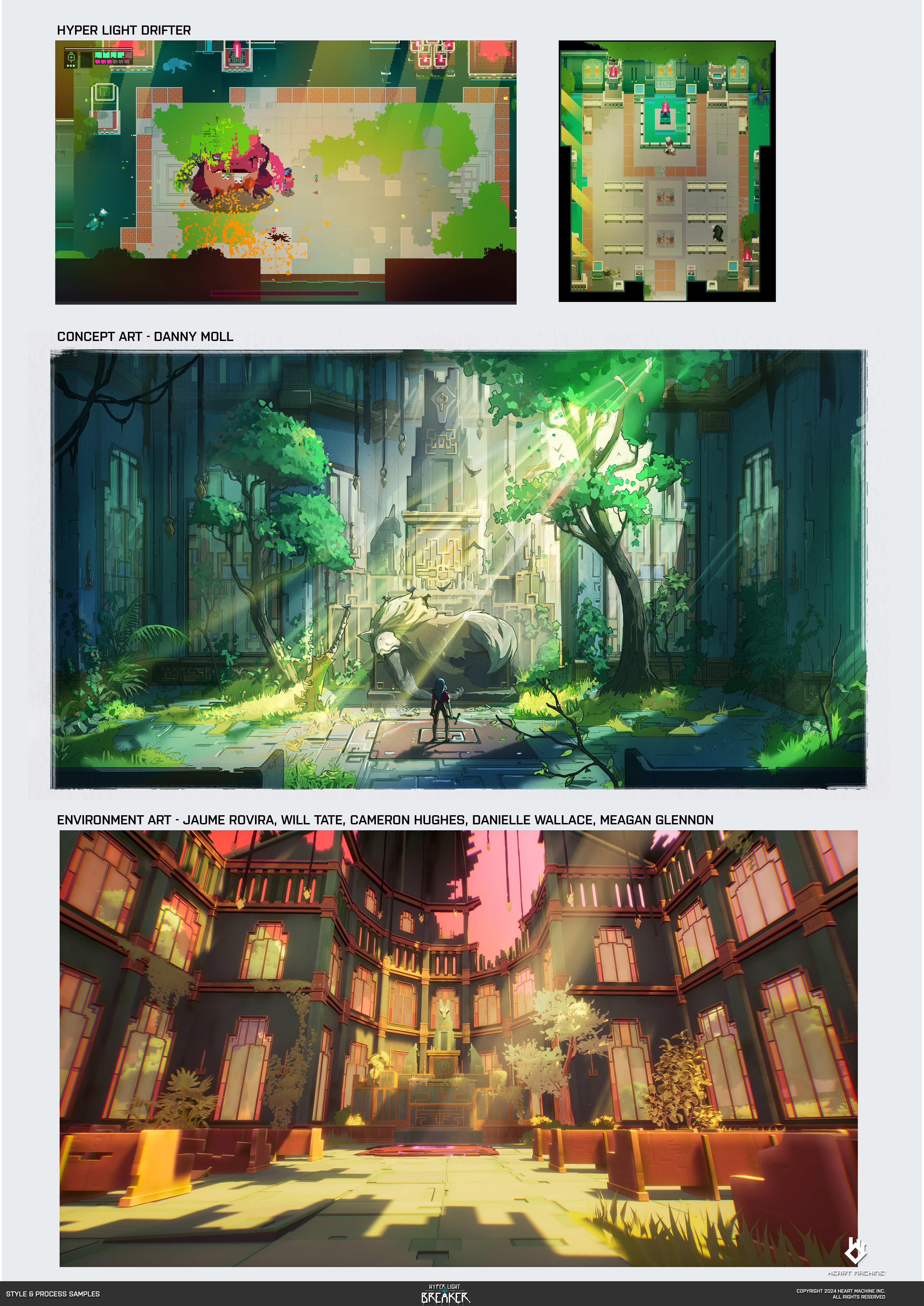
The aim is to always translate from the Hyper Light Drifter and build upon it, without over-specifying details, to "create a visual continuity" between the two games, from 2D to 3D.
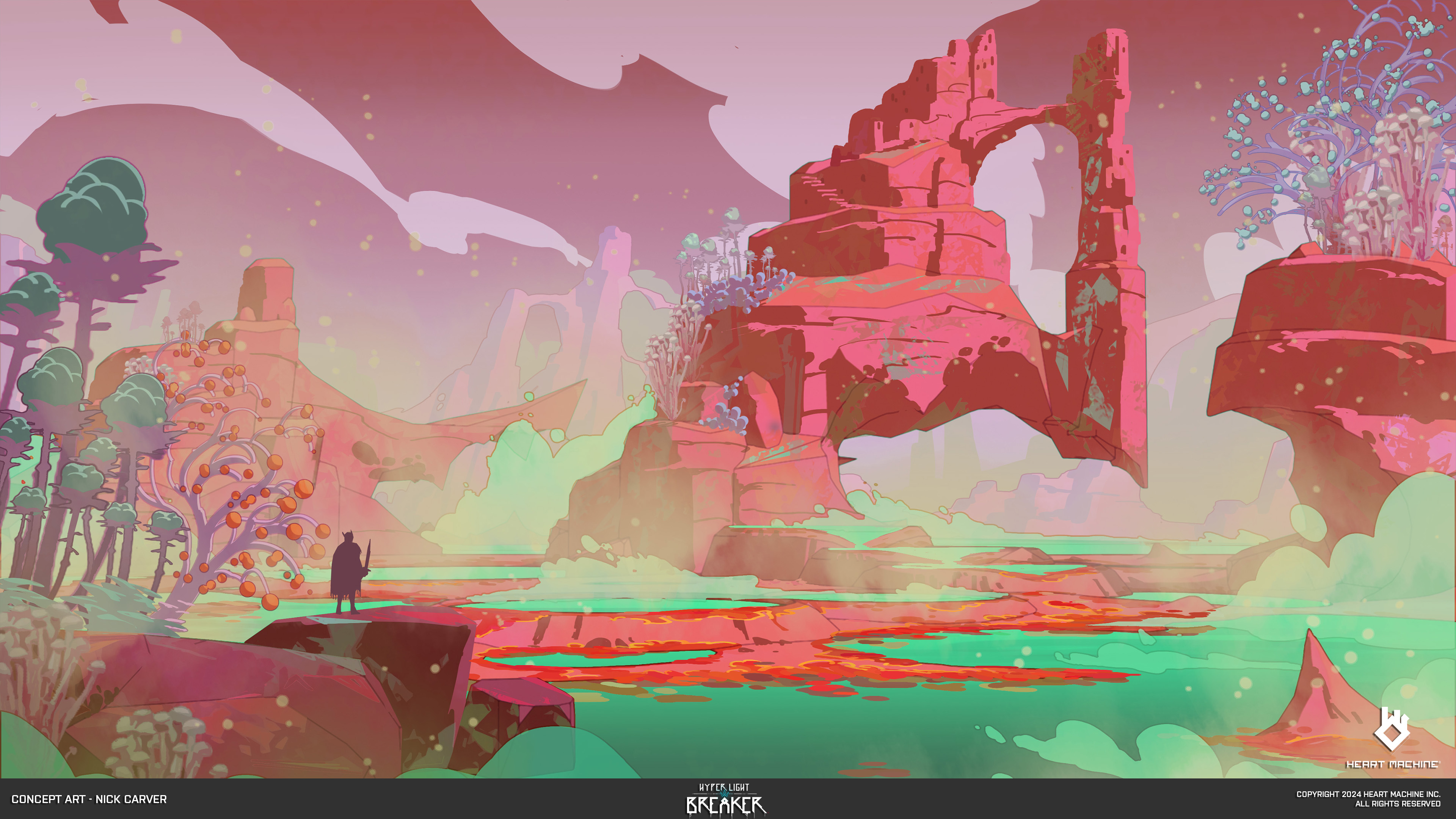
This approach can be seen in the first boss stage and the church environment, which references Hyper Light Drifter. The idea is to "go extreme and pull back," says Danny. The colours in this early concept art (above) are a little more vivid and intense than in the game.
"That's something I admire about Alx and his working process, and I try to remind myself, as an artist, to hold onto that feeling of being unrestrained," says Danny, adding: "Of letting yourself push beyond what you're comfortable with, because you can always dial it back and refine".
Crafting the visual design for Hyper Light Breaker is a unique and interesting challenge that needs to balance the nostalgia for a 2D pixel art world gamer's adore with a new 3D approach. The aim of 'visual continuity' is one that's hard to achieve as there's always the tease to push things just a little further, but Danny Moll and team have harnessed restraint, and Hyper Light Breaker looks like one of the year's most visually exciting games.
Hyper Light Breaker releases on PC via Steam later this summer. Read more on the Heart Machine website and wishlist on Steam.


.jpg?w=600)


