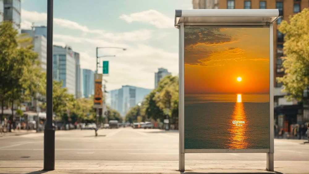
We love a good optical illusion here at Creative Bloq, and so does Corona Extra, it seems. The beer brand has used a simple illusion to personalise cheap stock photos and turn them into a minimalist but very effective billboard advertising campaign.
The series of ads features stock images of sunsets over the sea in which the reflection of light on the water happens to vaguely form the shape of a beer bottle. All it took was the addition of the Corona logo to complete the illusion.
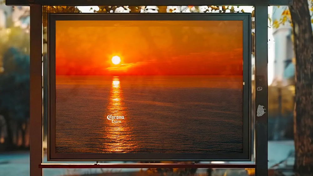
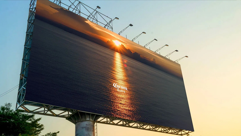
We've seen some attempts from Corona to go minimalist before. A previous campaign generated quite a debate about accessibility due to the size of the text used, while others argued that the pieces could be promoting any beer brand.
For the latest endeavour, the agency We Believers says it simply put the Corona logo on a series of $100 stock images. Knowing this kind of makes it even more effective, since we know the scenes weren't staged or captured on purpose for the campaign. I'm glad that they did is with real images rather than resorting to using an AI image generator to try to force an illusion. The internet is already far too full of AI optical illusions.
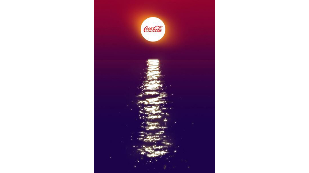
This isn't the first time we've seen an idea like this. Coca-Cola is one of the kings of minimalist advertising, and the image above of a Coca-Cola bottle illusion has been knocking around online for years, although I don't know if it was used in a real campaign. As they say, there's nothing new under the sun, even when it's setting.
Still the Corona campaign is wonderfully effective for its simplicity and how it associates the brand with relaxation and summer vibes. And it shows that while placing out of home ads is expensive, you don't necessarily need to spend a fortune to create them.
For more advertising inspiration, see the best adverts of the 2020s and Ikea's cutest ad campaign yet.


