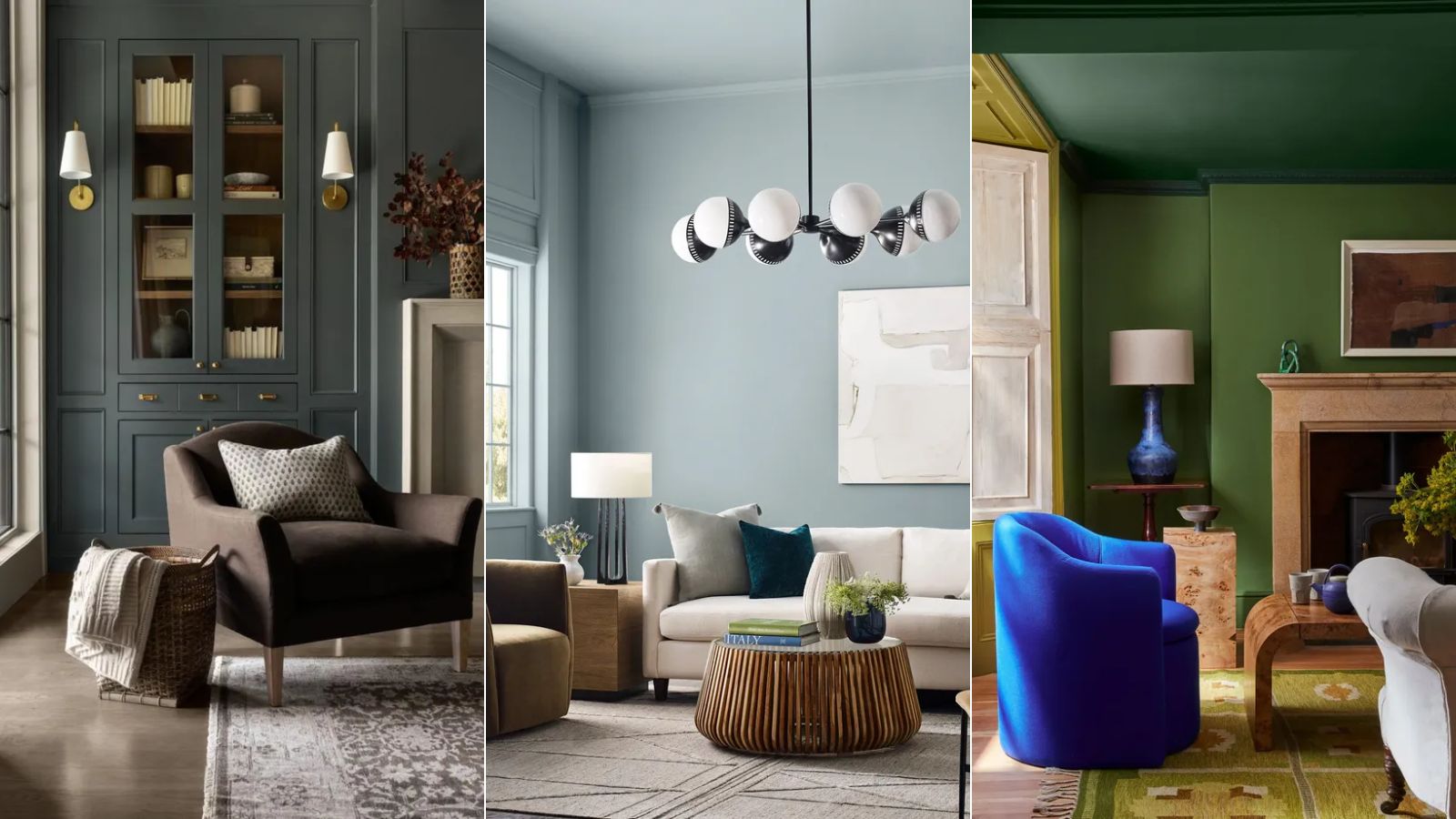
It may often feel like warm colors are the only way to go in interiors, but we'd say that may be finally shifting. Recently, we've been seeing cooler hues used in interior spaces, and the result is both calming and stylish.
The risk with cool color schemes (and why it seems more forgiving to stick to warm tones) is that they can make spaces feel cold and drab if they're not balanced properly. And so, the key to nailing cool hues is to consider the color scheme as a whole, ensuring your space is welcoming and full of depth.
That said, color schemes can often be a minefield with many things to consider. To help make things slightly easier, we asked designers and color experts for their go-to cool color rules to ensure a well-balanced space.
'Cool tones, such as blues, greens, and grays, can bring a sense of calm and serenity to a space, making them perfect for evoking a sense of peace in your space,' explains London-based interior designer Natalia Miyar. 'However, they can also make a room feel stark and cold if not balanced carefully.'
8 rules to follow when decorating with cool colors
'Cool colors, such as blues and greens, create a relaxing and serene atmosphere, making them ideal for small rooms or spaces designed for relaxation,' explains Hannah Yeo, Senior Color Marketing Manager at Benjamin Moore. 'Lighter shades can help make a room feel larger, while darker hues add a touch of sophistication and drama.'
Before deciding on how to add balance to your cool color scheme, you should begin by understanding how the coolness varies between certain hues within the same color family, suggests Hannah:
'Not all greens and blues are classified as cool. Color is relative, and each hue has nuances that can lean either warm or cool. For example, olive green has a warm undertone, while a fresh, minty green feels distinctly cool. Understanding these undertones can help you achieve balance and add depth and dimension to your space.'
Read on to learn how the experts balance cool colors to make the most out of them for a harmonized and cohesive space.
Gain inspiration for your color schemes with this book by Farrow & Ball, filled with colorful ideas covering a range of styles.
1. Opt for warm-toned lighting and hardware
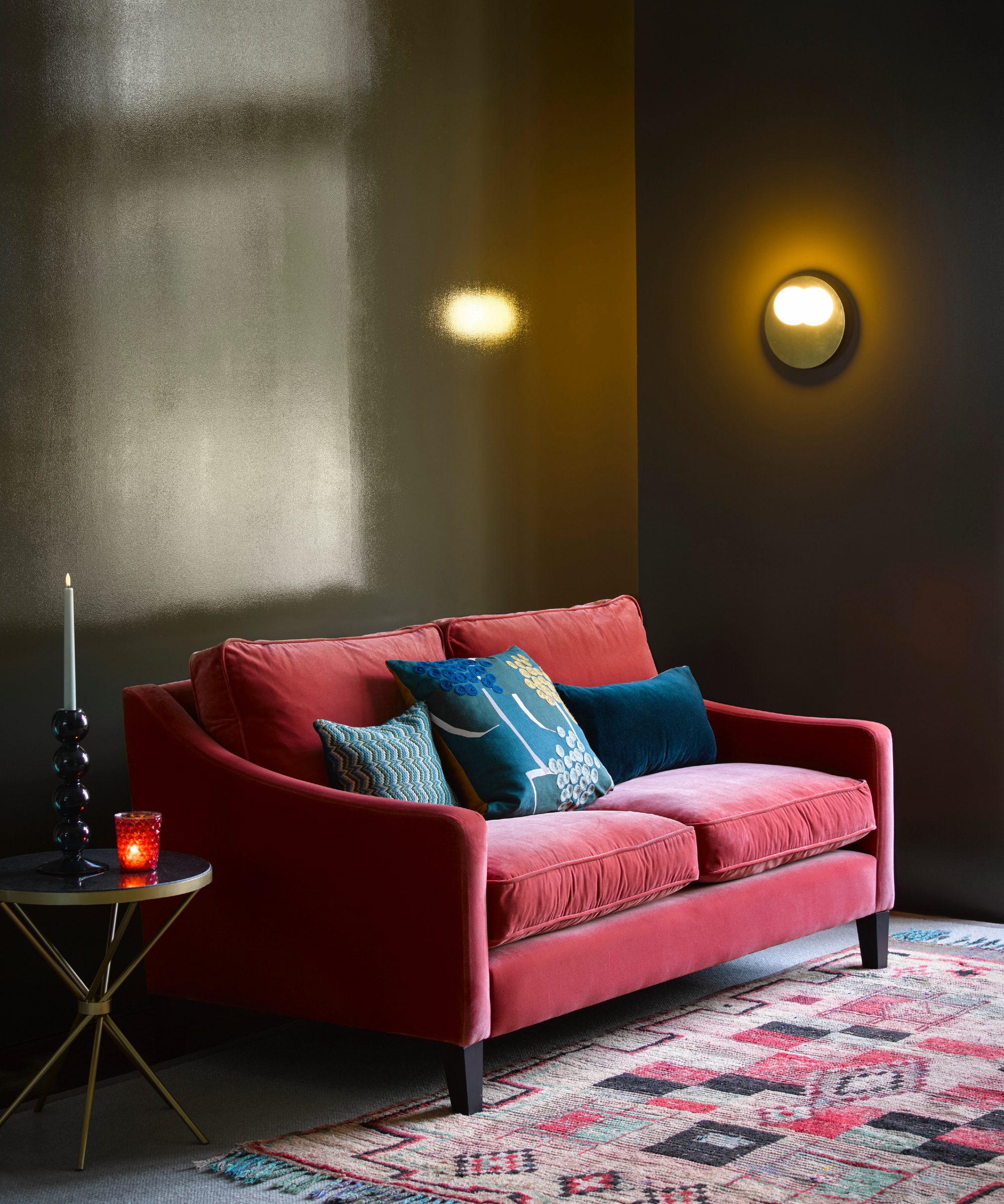
You should pay close attention to lighting ideas in a cool color scheme since they provide a subtle way to warm up the space.
'We generally warm up lighting and hardware selections in rooms that are decorated in cool color tones,' explain designers Jordan Winston and Tate Casper of Oxford Design. 'Brass and bronze add a much-needed layer of warmth to cool hues.'
From warm-toned fittings and fixtures to the tone of the lighting itself, sticking to warm tones when designing lighting will ensure the room's dominant cool colors don't make the space feel drab.
2. Stick to subtle cool tones
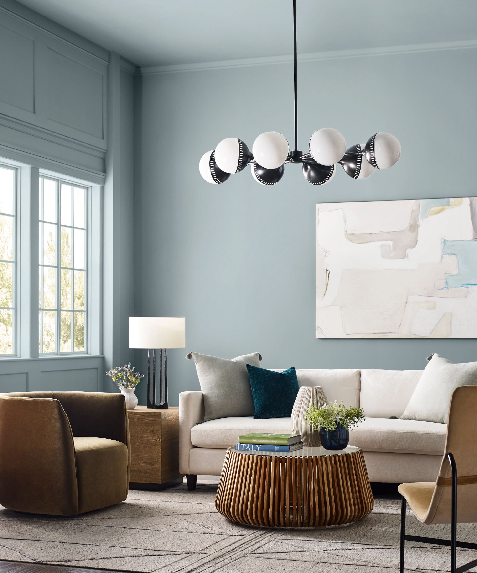
If you want to embrace cool tones in your home but maintain a neutral feel, stick to subtle cool tones when it comes to your paint ideas. Instead of reaching for saturated blues and greens, turn toward softer variations of these typically cool hues. This will ensure a comfortable environment that isn't so obviously 'cool'.
'One of my favorite 'rules' when using cool colors is to use subtle tones in your design,' shares interior stylist Alexis Woodbury Earman of The Woodbury Home. 'A great example is using more of a pale blue versus the traditional primary blue on the color wheel. This method allows you to use multiple colors in a space without losing the light and airy feel that tends to be associated with cooler tones.'
3. Create an analogous color scheme
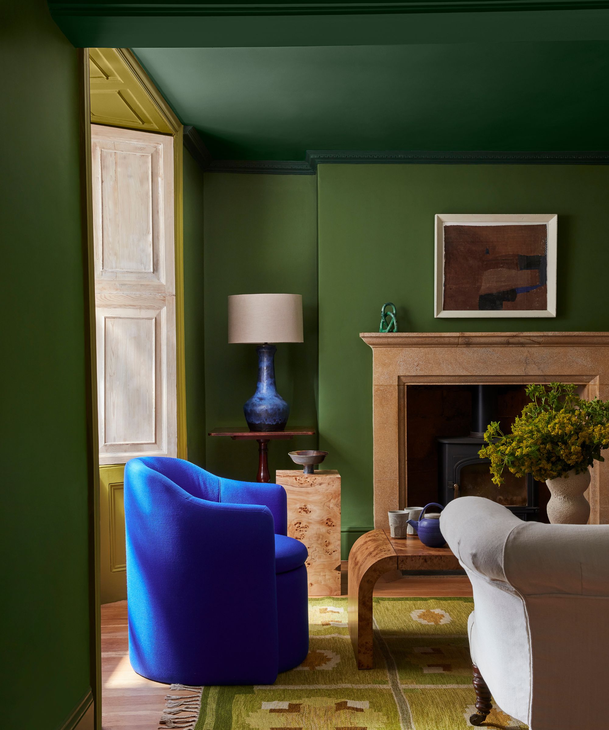
Sticking with the color wheel, another rule designers turn to is the theory of analogous color schemes. In other words, this is where colors that sit beside one another on the color wheel are used in a room, so in the case of cool colors it could be shades such as purple, blue, and green.
'When working with cool colors, I always ensure that the room has an analogous color scheme, meaning that I use at least three cool colors in a room to work with each other to create interest,' explains designer Gabrielle Bove of Opaline Interiors Studio. 'I always use wood and natural woven textures to balance out and warm up a cool color scheme.'
4. Add warmth through texture
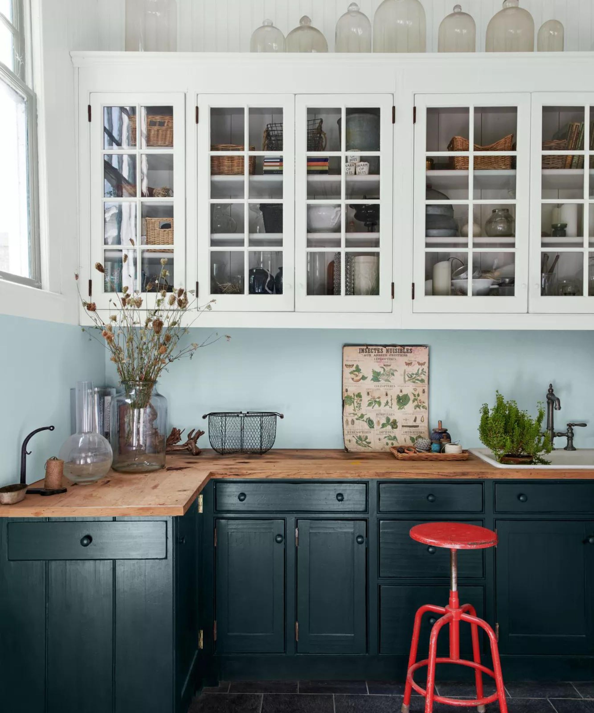
When designing a room around cool colors, it's equally important to consider the textures within the space. Textures like wood, rattan, and wool can boost warmth and add a cozy feel to the space.
'To prevent a space from feeling too cold, I like to add warmth through textures, accents, or materials like wood, brass, or warm lighting,' says designer Natalia Miyar. 'Layering different shades can also help to add depth and keep the space from feeling sterile.'
Designer Courtney Hill Utt of Chu Interiors also recommends this approach, adding: 'Always mix in warmer tones and accents to offset the predominantly cool palette so that the space will feel grounded and timeless. It could be small touches like a warm wood side table.'
'Materials such as matte finishes, soft linens, and organic textiles play a significant role in adding warmth and depth to a space,' agrees Karolina Wierzbicka, Head of Design at August. 'A cool-toned room might feature velvet cushions, woven throws, or textured wallpaper'.
5. Incorporate natural elements
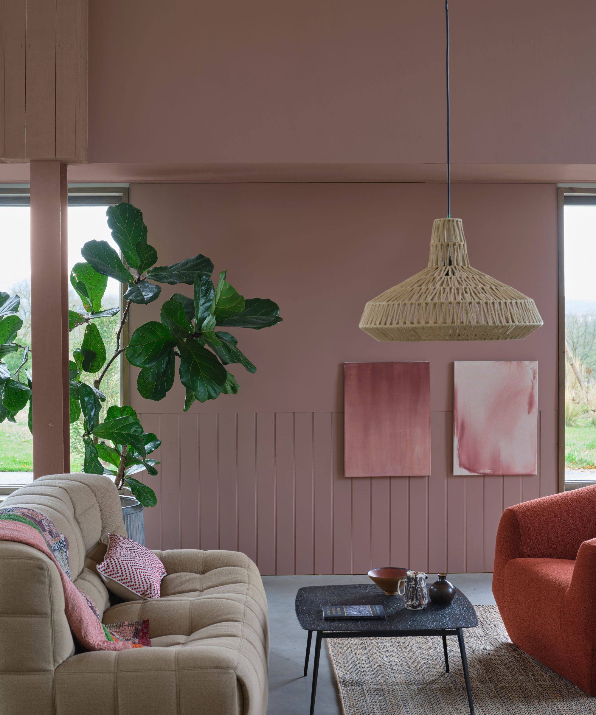
Another cool color rule to consider is to introduce natural materials. This can create a soothing atmosphere that enhances the restful feeling of cool hues.
'Bringing in elements of nature is a fundamental neuroaesthetic strategy, and cool colors work especially well with biophilic design principles,' explains designer Erica McLain, founder of McLain by Design Interiors.
'The use of greens, for instance, connects us with nature’s soothing influence,' adds Erica. 'To enhance this, incorporate live plants or natural stone to tie the color scheme to organic patterns. This not only enhances the visual appeal but also fosters a deep sense of well-being, rooted in our innate connection to nature.'
6. Use the 60-30-10 rule
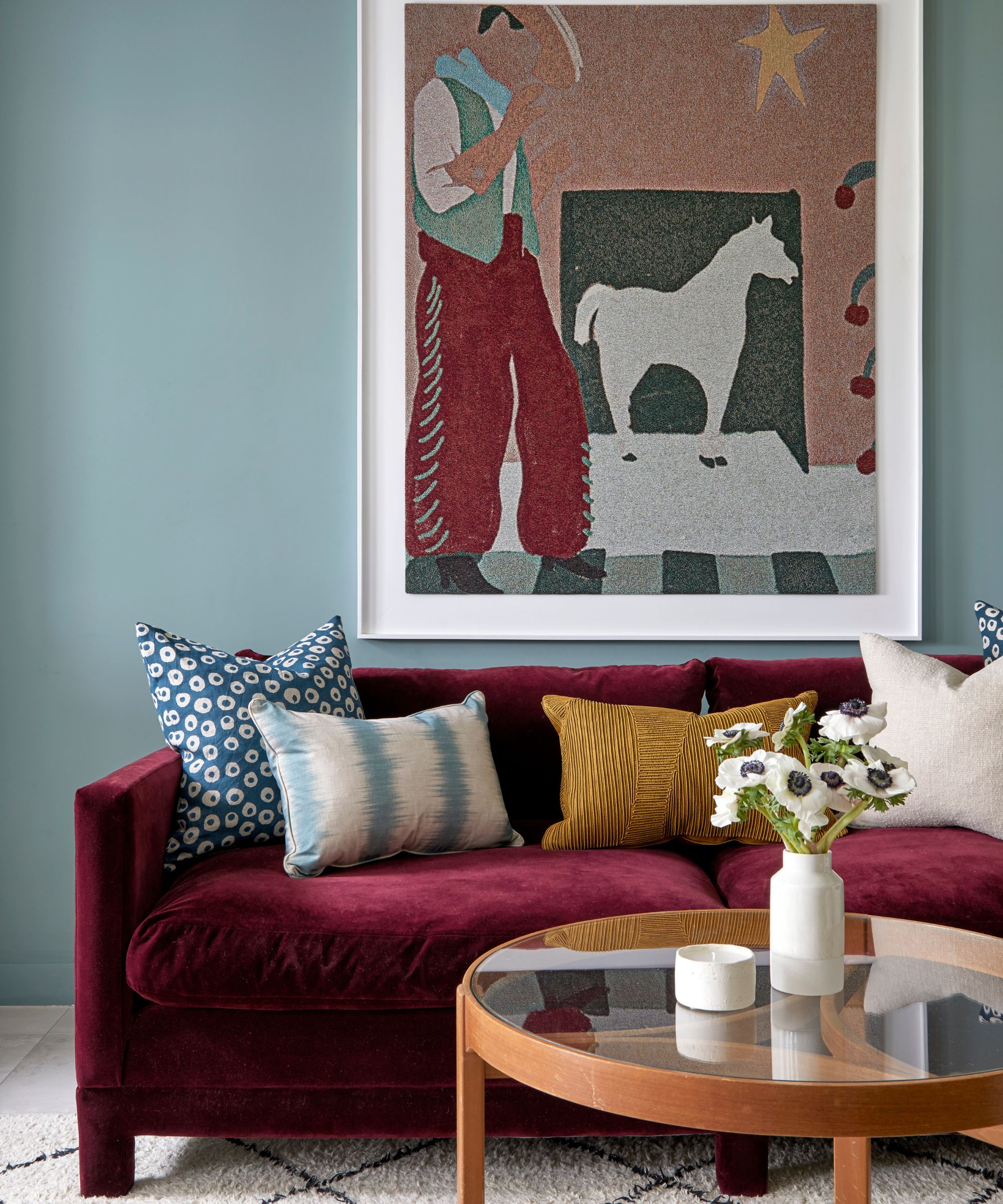
The 60-30-10 color rule is a well-known color rule, and it's one that Tash Bradley, Director of Interior Design and Color Psychologist at Lick, recommends when working with cool hues.
'The general rule is, if you are decorating with a cool color such as blue, green, or purple, break it down into your 60-30-10 rule,' says Tash. 'So if the dominant color is cool, which is your 60%, I would add a warm color for the 30%. That could be a complementary color – I always look at the opposite side of the color wheel. If you've gone for a blue, go for an orange for your 30%.'
Your remaining 10% can be a slightly more vibrant hue used as an accent color, which can add a colorful, unexpected moment to complete the scheme.
'Just balance it out with a little injection of a warm color,' adds Tash. 'That could be through your sofa, your bed, or your flooring.'
Interior designer Katie Schroder, principal designer and founder of Atelier Interior Design also follows this rule when working with cool colors: 'When decorating with cool tones you have to be careful not to only use cool tones. Rust and mustard are great colors to balance out cool tones, or if you want to incorporate neutrals, do ivory, camel, and brown tones to warm it up.'
7. Consider the direction of your room
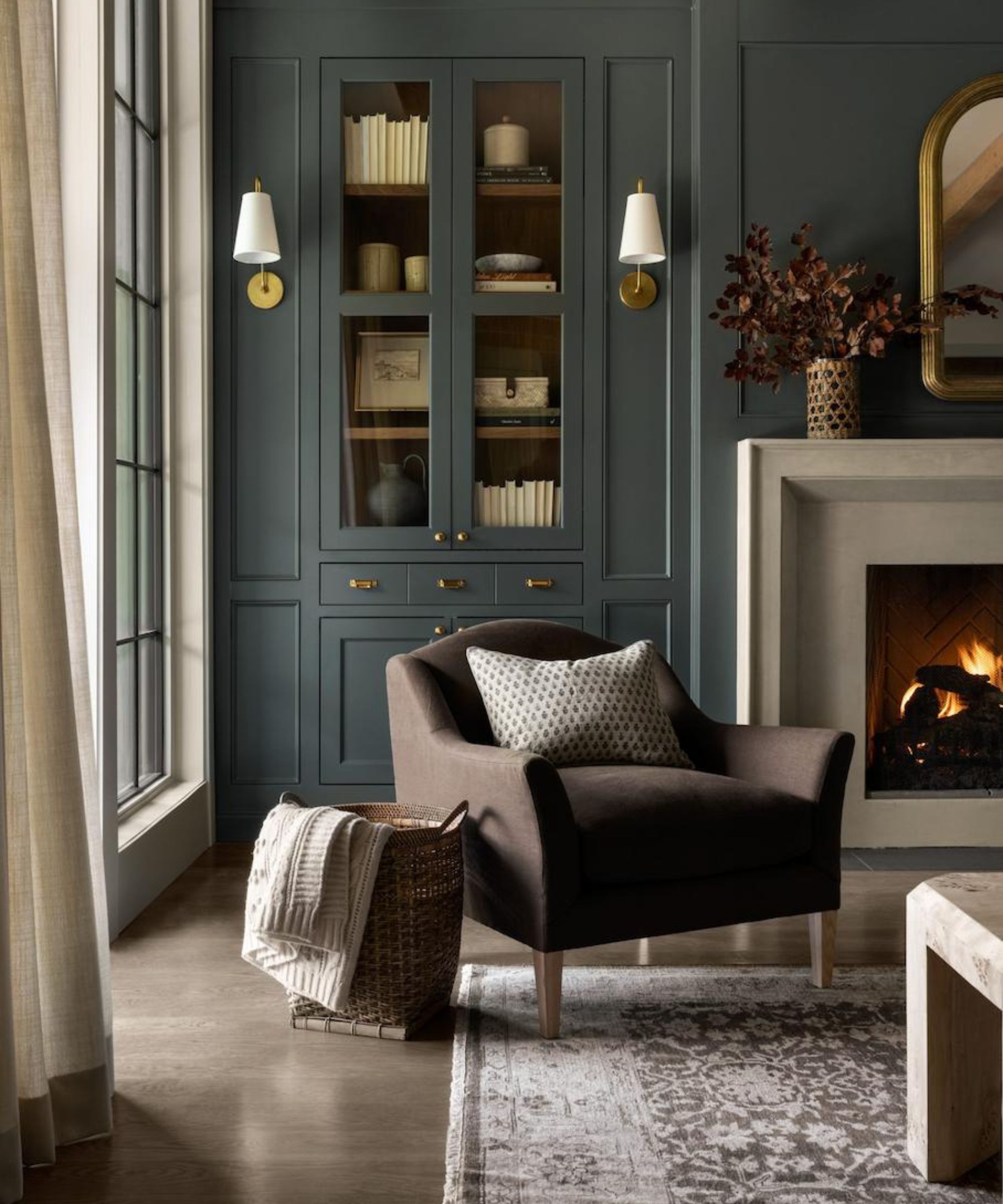
It's widely known that the direction a room faces (north, south, east, or west) will impact how much sunlight it receives and therefore how paint colors appear in the space. While this can make the paint selection process one that involves much deliberation, Tash Bradley's rule makes it easier to navigate: use cool colors with warm undertones in north-facing rooms (in the northern hemisphere).
'Just think of the room that you're decorating,' begins Tash. 'So if it is a north-facing room and you want to go for a cooler color, go for a cooler color with a warm undertone. Go for a blue, green, or purple with either a red, pink, or yellow undertone. If you've got an east, south, or west-facing room, don't worry about the undertone.'
8. Create a tonal color scheme
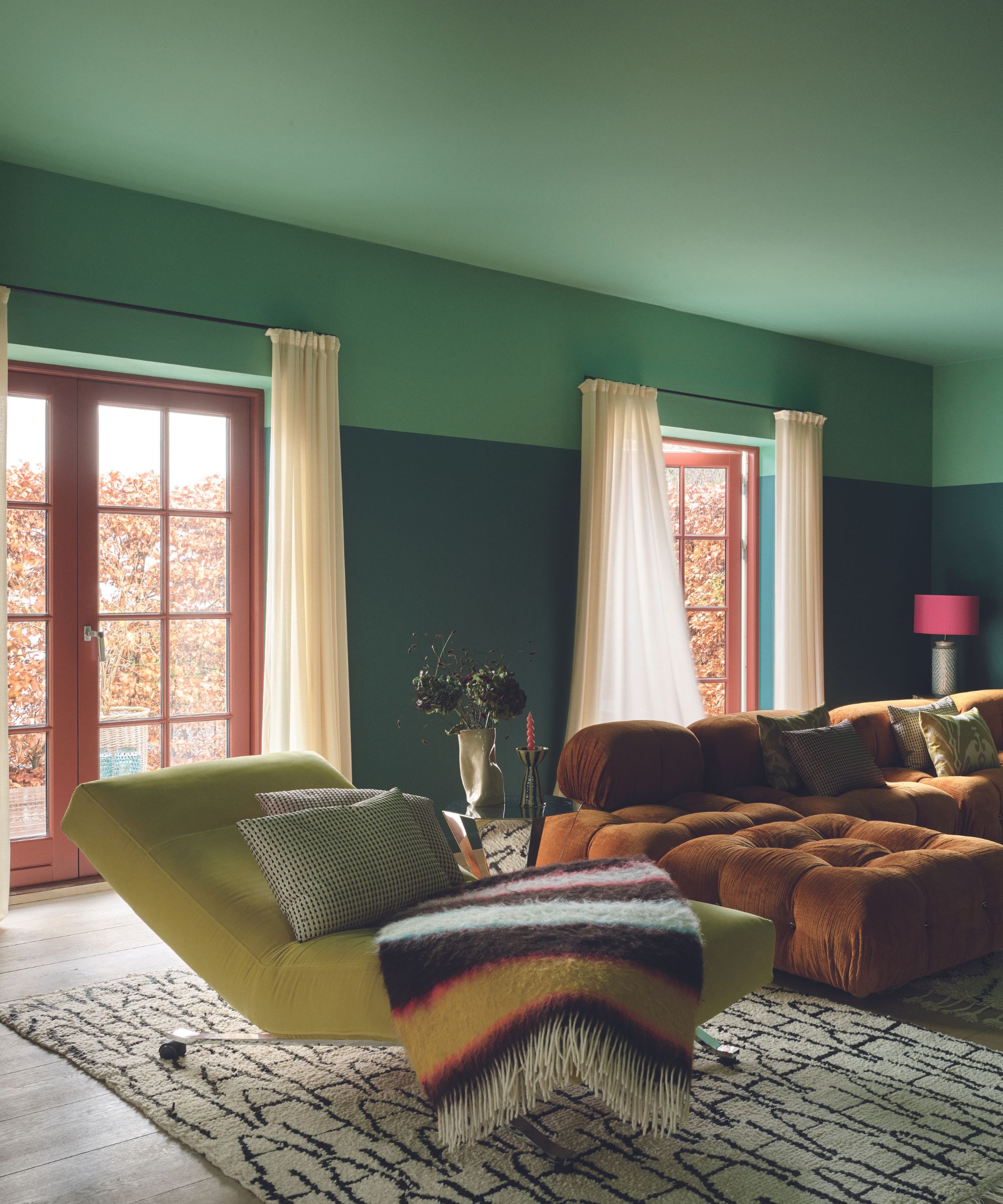
Lastly, designers recommend embracing a tonal color scheme when working with cool colors.
'Cool colors don’t have to be monotone – layering different shades of cool hues within the same color family is another contemporary approach,' adds Karolina Wierzbicka. 'For instance, mixing light and dark blues or playing with different tones of grays can create a sophisticated yet dynamic space. This subtle variation keeps the design visually engaging.'
'Consider layering different shades of the same cool color family,' agrees designer Erica McLain. 'Pairing a pale blue wall with deeper blue or teal furnishings creates a gradient that adds dimension and intrigue.'
Each of these cool color rules will ensure your scheme feels balanced and comfortable and crucially avoids feeling cold. Of course, you need to think about the specific space you're working with, as some rules will work better in certain rooms. Whichever rule works for you, we expect to see lots more love for cool color trends in 2025.


