You may have come across the concept of certain colours or colour schemes being perceived as ‘angry’, often being referred to as a ‘hostile colour palette’. It usually involves bold and bright shades of colours like red, orange and yellow. But if you naturally gravitate towards these colours, that doesn’t mean you can’t use them – you just need to know how, according to a colour expert.
The messaging around using certain colours in interiors can often be confusing – especially when some of these traditionally ‘hostile’ colours are among the biggest colour trends. But according to Marianne Shillingford, creative director and colour expert at Dulux, you don’t need to avoid these shades as long as you know what colours to pair with them and how much of them to use in a room.
‘In interiors, the term “hostile colour palette” is usually used to describe colour combinations that feel visually intense, jarring or a little overwhelming to spend time in. It’s not really about a single colour being “angry”, but about lots of strong shades competing with each other, which can make a space feel restless rather than relaxing.’
Making your home personal to you and a reflection of your style and taste is the biggest home decor trend of 2026 – and it’s an approach to decorating that’s always relevant and timeless.
‘I’m always a little cautious about giving colours negative labels, because it’s really us who bring the emotion to colour, not the other way around,’ Marianne continues. ‘Reds and oranges are often called “angry”, but they’re also the colours of warmth, energy, sunsets, spices and celebration. Your home should reflect what you love, not what you think you’re supposed to choose. If bold, fiery shades make you feel happy and energised, they absolutely belong in your space.’
How to avoid a hostile colour palette when using bold shades
The biggest piece of advice that Marianne offers to avoid creating a hostile colour scheme in your space is pairing the bold shades with more calming colours.
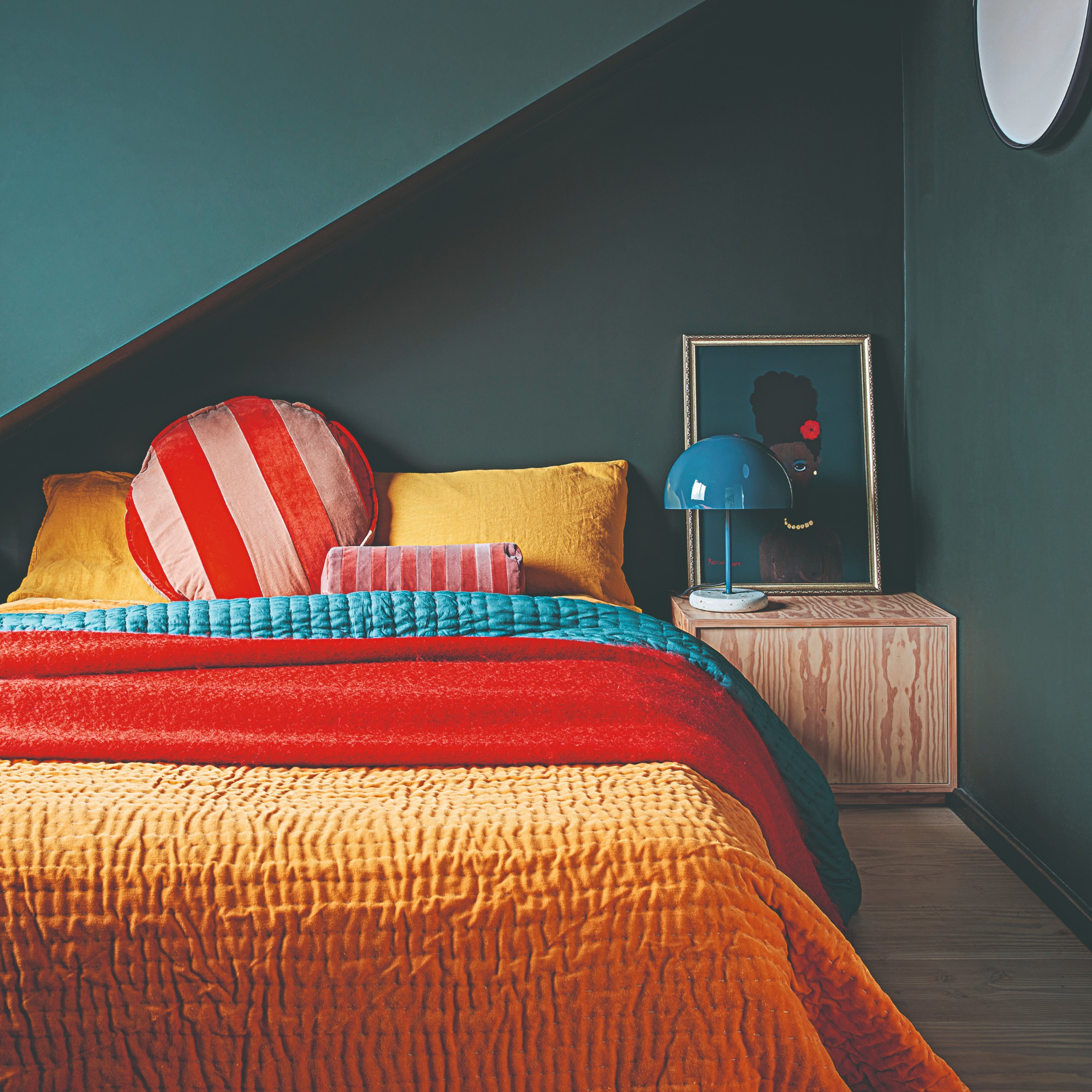
‘What really matters is how much of them you use, where you use them and what you pair them with. The trick is to use them thoughtfully, so they lift a room rather than dominate it. When strong colours are balanced with calmer tones, they become exciting and expressive, not overwhelming. Think of bold colours as highlights rather than the whole story. Use them on a feature wall, on painted furniture, inside shelves, or through accessories, and let softer neutrals give the room breathing space,’ she explains.
As well as turning to some of the best colour combinations to make your space work, incorporating natural materials and textures will also help to balance out the statement shades. ‘Matt finishes and layered textures also help bold colours feel richer and more welcoming. That way, you get all the personality and warmth, without the room feeling like it’s shouting at you,’ Marianne says.
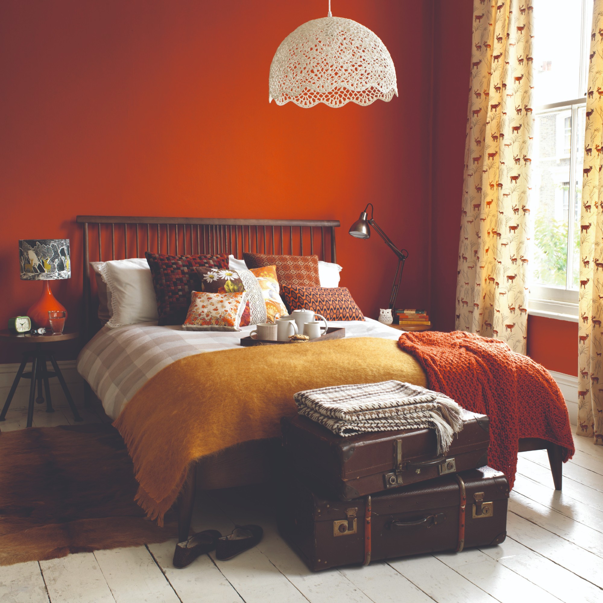
There’s also something to be said for the shade of the said colour you choose – if you opt for a deeper, darker tone or a more earthy hue of red or orange, they don’t come across as intense as the bold primary version of the colours.
Colour combination inspiration
The Togo by Ligne Roset is a design classic which is currently on offer at Heal's - a rare occasion indeed. It comes in many different colourways including this fiery orange velvet.
To balance out the bold orange of the Togo chair, this soft, calming blue from Lick will work perfectly. It's no coincidence that blue pairs amazingly well with orange - as well as with red and yellow by the way.
True Joy was the sunny Dulux colour of the year for 2025. But its bright and happy will look just as great in 2026 as long as you pair with something soothing like neutral shades or blues.
It's not just the off-white shade of this La Redoute bed linen that will help to soften a bright colour like Dulux's True Joy. It's also the natural texture of the washed linen material.
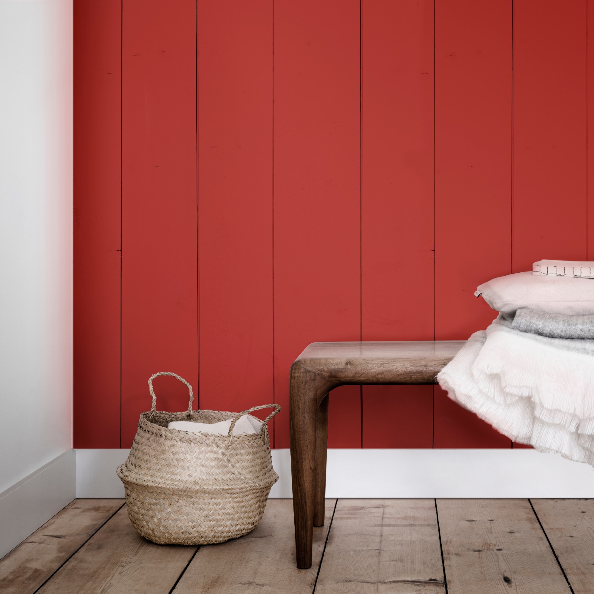
Going for a bold shade like poppy red on a piece of furniture like this Mustard Made storage unit is a great way to use it in moderation.
A soft and earthy pink like Farrow & Ball's Setting Plaster is not only the perfect shade to balance out the bright red of the locker-style TV unit, it's also going to create the most stylish colour combination.
So whether you’re looking for fresh paint ideas to give your home a refresh in the new year or you’re worried a statement sofa colour that you like will be ‘too much’ for your home to handle, as long as you follow these simple guidelines then you can go all out. Make your home your own!