Picking the right colors that go with dark green can really elevate this on-trend shade. These pairings can bring balance, drama, or even tranquility to a space.
Dark green is color whose star is on the rise in interior design, and we're seeing it used almost like a neutral in modern, atmospheric room schemes. And the right partners in a color scheme can really push the boundaries of what you can do with this moody hue.
To help you choose colors that go with green in darker shades, we've rounded up 5 clever combos suggested by experts to add elegance and sophistication to your home.
1. Brown
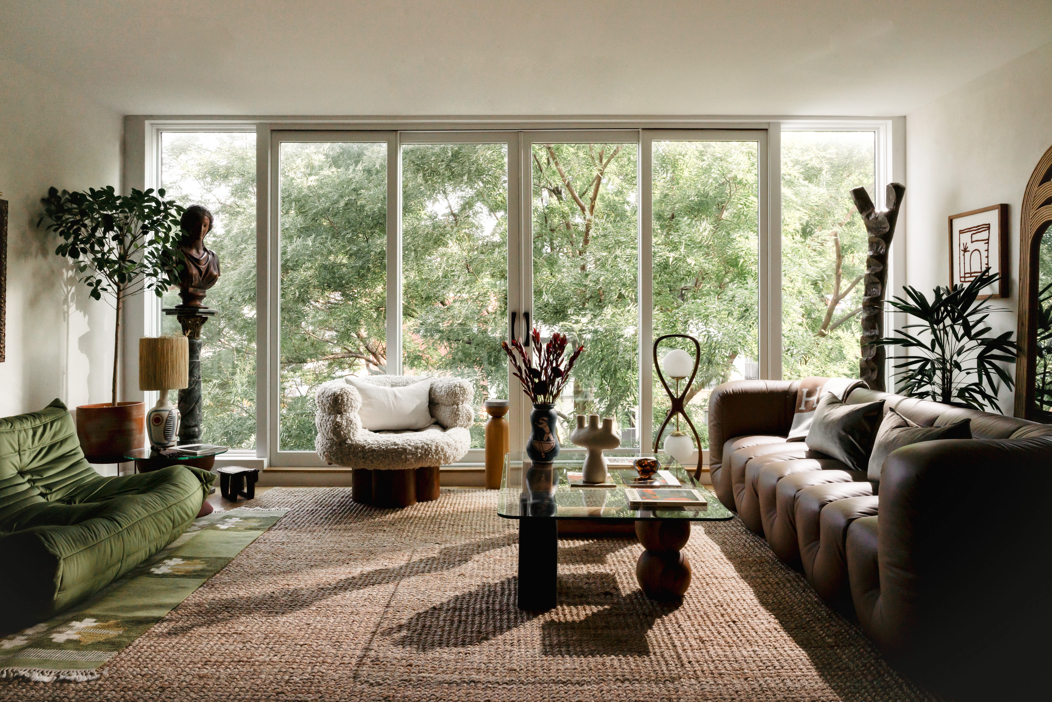
When it comes to colors that go with brown, green is an easy match, and the two in combination can create the most soothing, relaxing, and nature-inspired palette. If you're choosing the darker incarnations of both colors, experts recommend adding a bit of visual relief with white or cream tones, like in this modern living room.
'The living room of the penthouse is situated at eye level with the treetops through an expansive set of windows,' says Jean Parker, founder and principal designer at Le Jean Design. 'We prioritized the homeowners’ desire to maintain a feeling of continuity with nature and derived an earth-toned color palette of greens and browns. We visually differentiated the tones by playing with texture and drew from a diverse range of materials including terracotta, lava stone, nappa leather, Guanacaste, and a heavy patinated shea wood.'
2. Blue
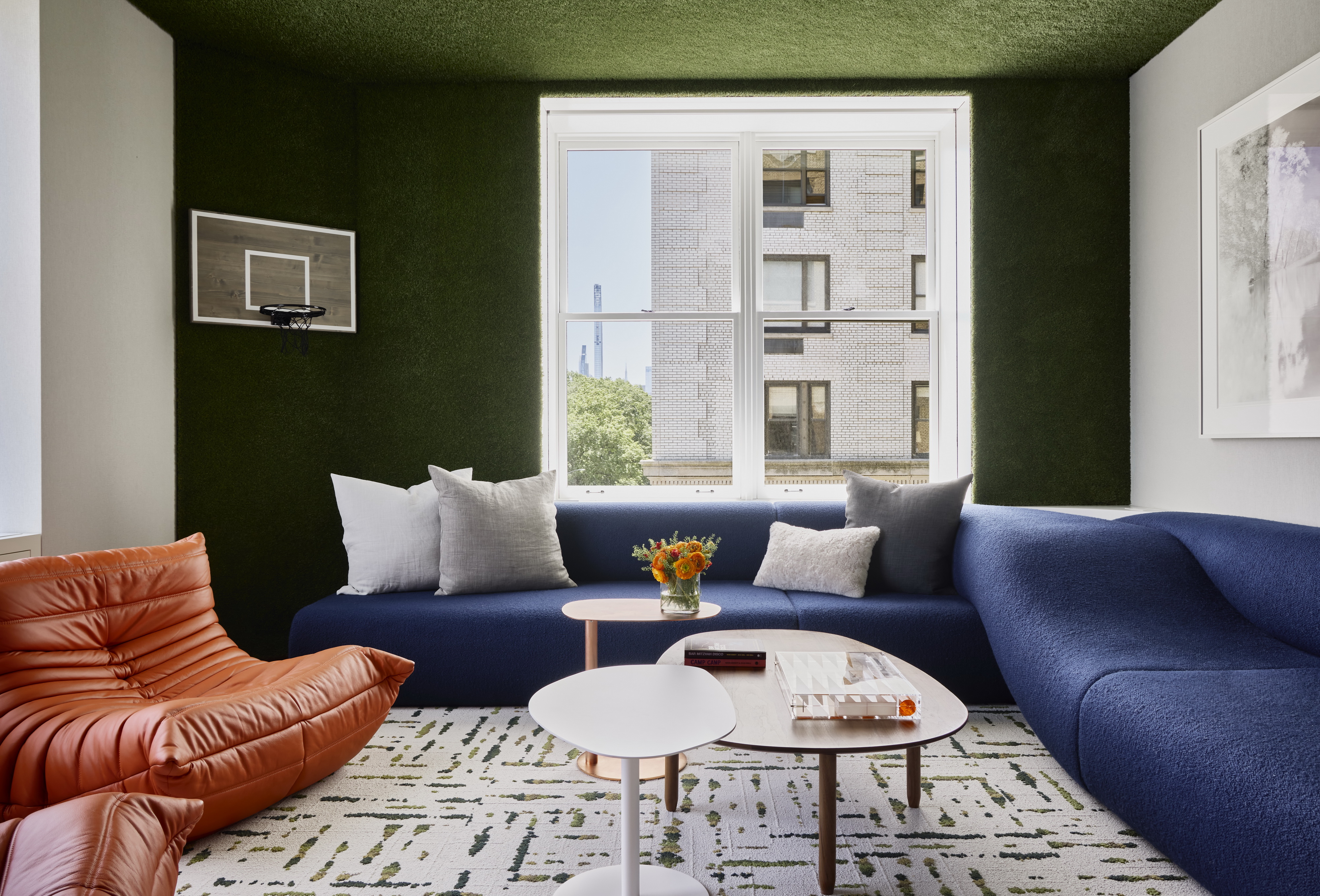
The color wheel is a good place to look at for settling on colors that go with blue, and combining these colors will make for an easy analogous color scheme. For a striking interior, blue works best when paired with tones that are found directly opposite like yellows or oranges. Alternatively, you could also choose tones that are next to it, for a calm interior. Green and blue make a natural pairing as the two tones signify life, growth, and vitality. In interiors, they can conjure up a refreshing visual.
'The room was intended as the kid's hangout lounge - and it was all about bringing the nearby Central Park into the space,' says Tyler Chavers, managing director at Workshop APD. 'The family is into sports and so we did varsity colors – think sports uniforms – a basketball hoop in the corner, orange Togo loungers, and a blue custom Dune sofa. The interior of the millwork was painted navy, and then green turf and the carpet tiles brought in both blue and green.'
3. Pink
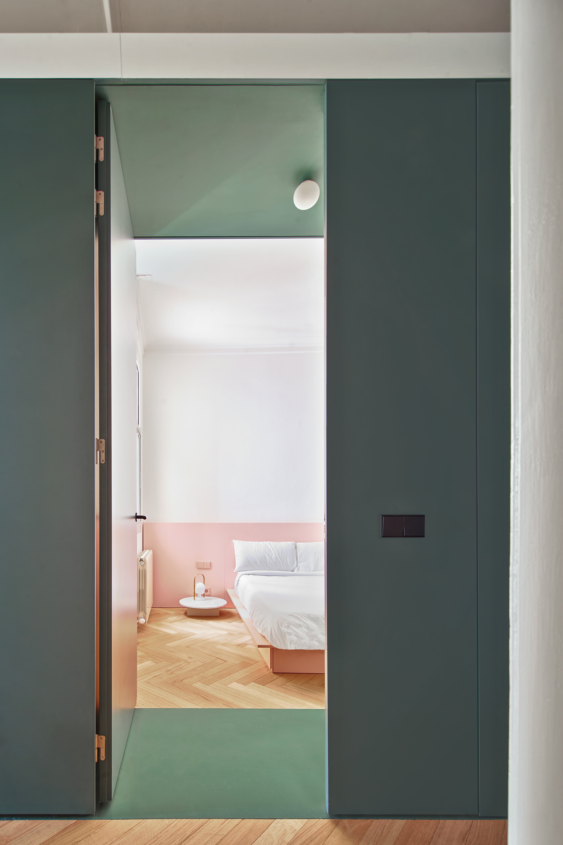
Among the colors that go with pink, dark green can look quite charming.
'It actually doesn't take much skill to pair pink with green successfully as they exist together in nature in so many flowers,' says Amy Krane, architectural color consultant and founder of Amy Krane Color. 'Both warmer yellow-pinks and cooler blue-pinks work with greens well. Pinks work well with olive, sage, mint, and hunter.'
'In this home, a functional green stripe links the flat from end to end,' say Aureli Mora and Omar Ornaque, founders of AMOO. 'It begins with the furniture in the hall, to the main rooms and the bathrooms. The green stripes chromatically divide the areas.'
4. Black

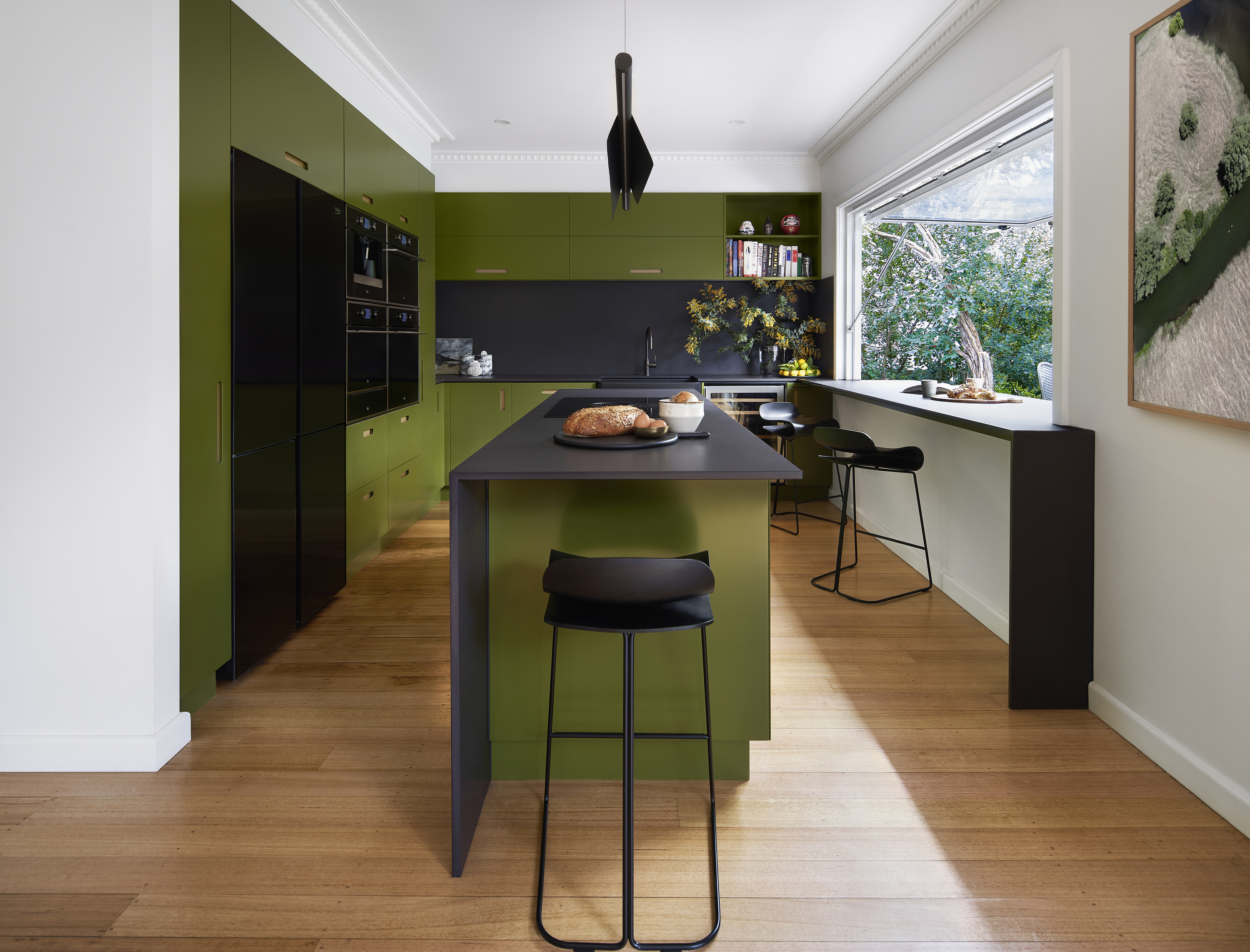
Dark green can be a great choice for those who prefer neutral schemes or Scandinavian designs but with more personality. Consider dark green as a color that goes with black, for a splendidly muted yet modern interior.
'This home was designed for a creative that works in films, and the house has a strong use of color throughout the living zones,' says Richard Misso, creative director at The Stylesmiths. 'The green kitchen joinery was inspired by the wild garden foliage that beckons at the window seat creating a strong connection between the interior and garden surrounds.'
Do ensure that when you're experimenting with two dark tones, the room is always well-lit otherwise it can feel very dingy. Natural light is the best way to add a breezy vibe to a room and also allow the colors to shine.
5. Red
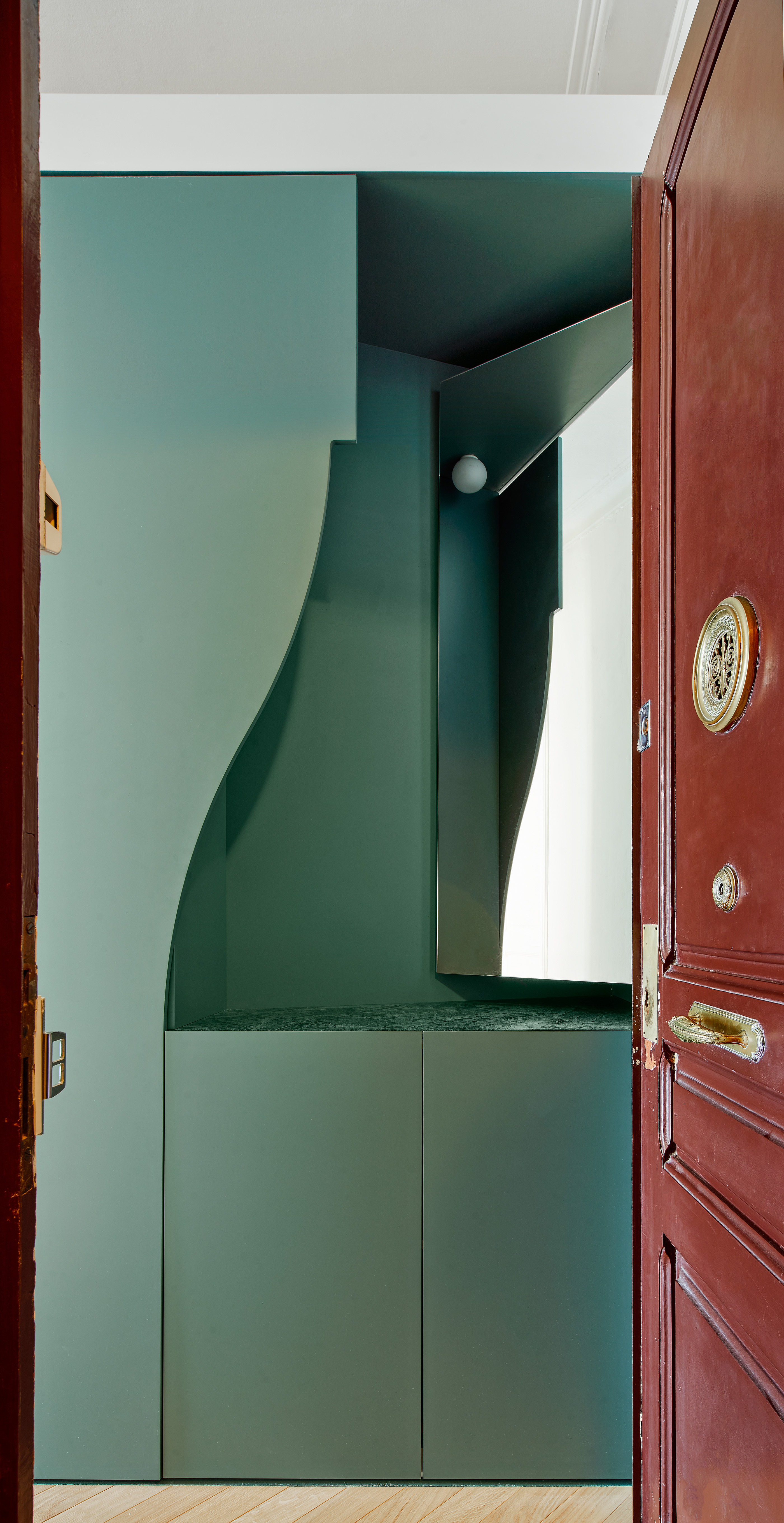
Red and green can feel a bit Christmassy and festive when used in combination, but when done right, green can be a great color that goes with red, creating a modern, retro, mid-century vibe.
'Teal and orange (all shades) or red (again, all shades) will create a dynamic balance in the room,' says Amy. 'The more saturated the compliment, the more sizzle.'
You need to ensure you choose the best green and red shades that go very well together. When using brighter colors, consider them as accent hues, while primary colors are best kept mute. For example, you can consider calm teal green walls and accentuate them with red artwork. And if the deep palette feels too one-dimensional, introduce patterns to break up the solid tones. This will give the design a bit more dynamism and movement.


