Once the sole realm of unsightly school uniforms, burgundy has managed to successfully segue its way into interiors — and is now a go-to hue for designers. And colors that go with burgundy are more varied than you might think, making this a versatile choice for your home.
So what do you pair with this deep, rich color? Along with colors that go with red, burgundy is a hue that will work well with neutrals or bolder color-pop shades, so you can choose whether you want to go for a more minimalist or maximalist approach, and both can work equally well.
To find the best options, dive into the color theory of this color. It's dark, rich, and warm, so think about how you choose colors that complement those qualities. In some instances, you might want to try cool colors that bring a balancing contrast; in others, something bright and acidic that cuts through that richness. On the other hand, we're seeing emerging palettes use almost-clashing near tones, like terracotta, purples, and browns, that only add to the existing sense of richness and warmth of burgundy as a color.
Burgundy lives or dies by the lighting of the room, too. In darker rooms, it can read near brown, black, or purple, while in brighter rooms, those red undertones come alive and bring more saturation — something also worth considering during your choice of color pairing.
It's an emerging color for 2025, and the palettes we're seeing this year feel different from how burgundy was styled the last time it was in vogue. Here's how we think you should use it this year.
1. Burgundy and Caramel
Toffee tones are ideal for pairing with burgundy for a scheme that feels opulent yet earthy. "This elegant hue works particularly well with earthy tones such as beige, taupe or caramel to create a feeling of rustic warmth," says Helen Shaw, a color expert from Benjamin Moore.
"Opt for a matte finish to provide an almost chalky appearance, which in turn will help to soften the bold color, making it supremely livable."
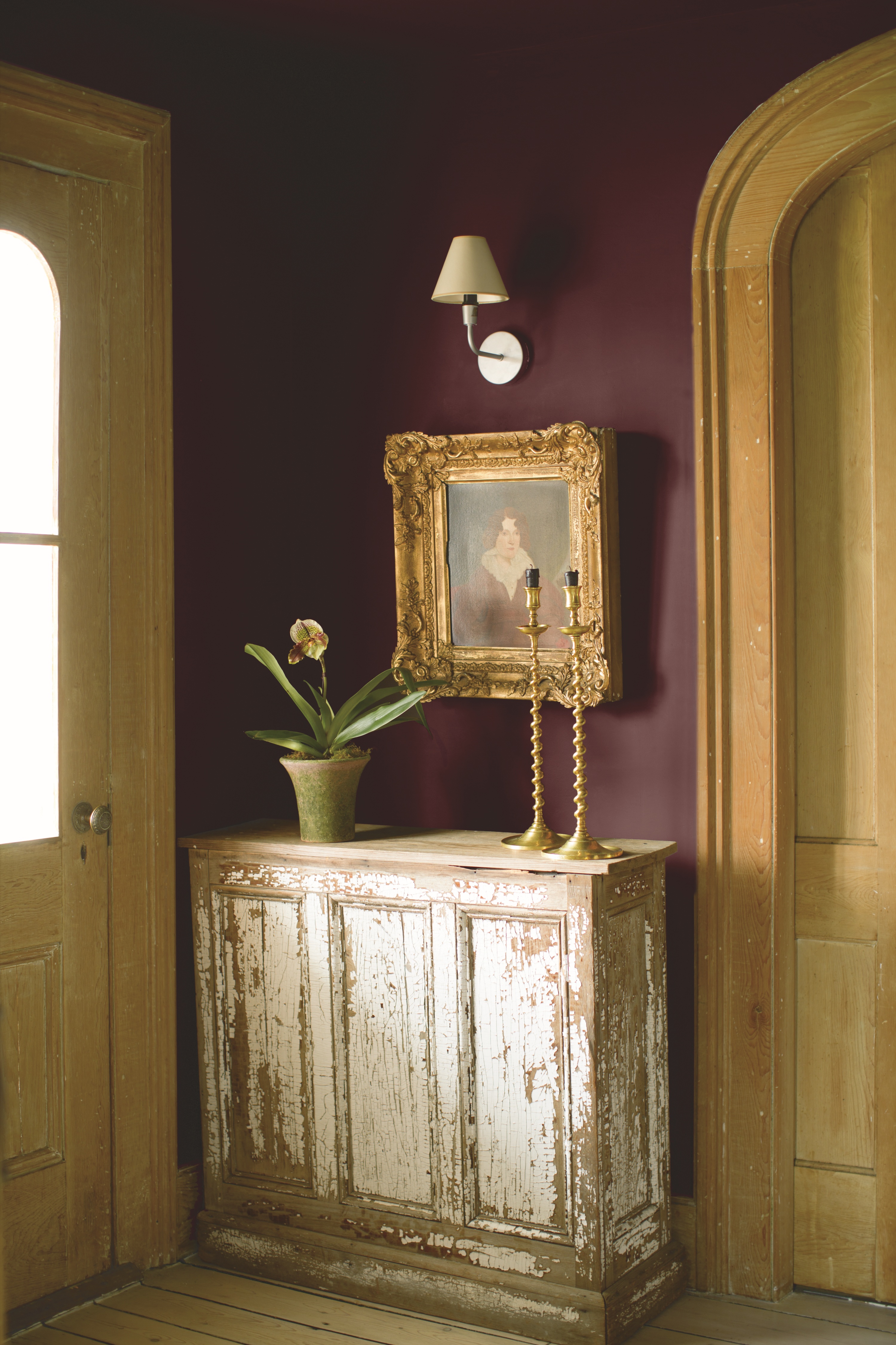
And if you're looking for a good tertiary or accent color, throw in a little metallic to add extra verve to the space, as seen in the entryway idea above. "Pair with accents of brushed brass to elevate this timeless look," adds Helen. Burgundy works as a color that goes with gold just as well as this non-metallic take on the hue.
Price: £5.95 per sample pot.
This stunning rich burgundy colour adds a sophisticated warmth to any interior, thanks to its red and brown undertones.
2. Burgundy and Light Blue

Light blue makes a lovely contrast to burgundy that's not as stark as white.
Sitting opposite each other on the color wheel, the contrast works as light blue is a cool, airy color, while burgundy is a deep, rich shade, so a pleasing balance is created when paired together.
Speaking about the beautiful light blue bedroom above, Beth Dadswell, of Imperfect Interiors, says: "Blue can feel cold, particularly in bedrooms, so we try to limit it to rooms with plenty of south-facing, warm daylight. The burgundy patterned bedspread adds warmth, as did the choice of teal linen curtains."
Beth adds: "This bedroom had a lovely original marble fire surround and large sash windows, so we contrasted those with dark antique furniture, black cast iron radiators, and dark elements on the table lamp and chandelier."
Price: £5.50 per sample pot.
This stunning blue shade brings a calming feel to any space and complements darker tones seamlessly.
3. Burgundy and Lime
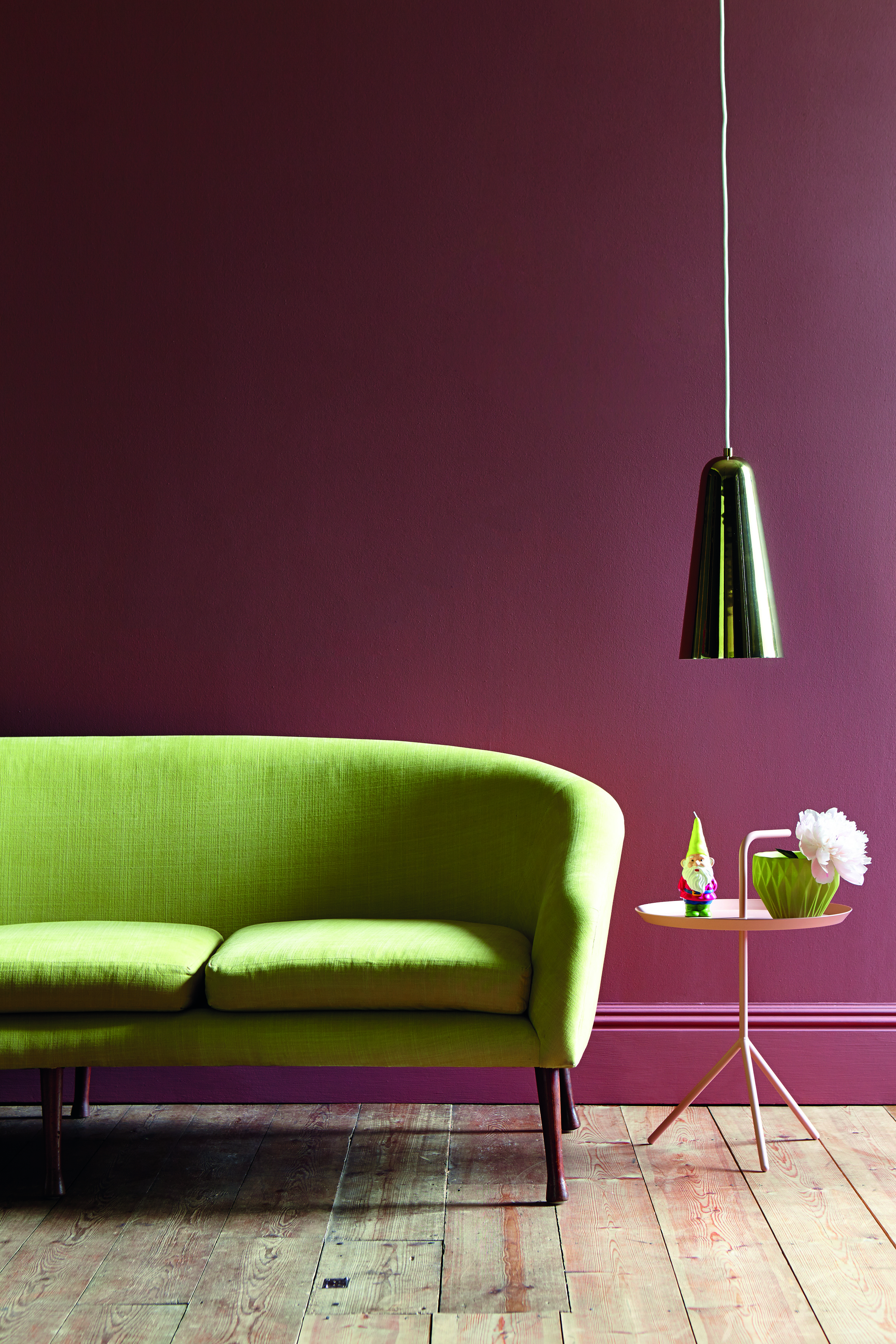
This color combo might surprise you, but the clash between lime and burgundy creates a dynamic aesthetic that will liven up any room.
"Lime green delivers an unexpected yet exciting pairing with rich burgundy colors such as ‘Ashes of Roses', creating a bold contrast that injects energy and liveliness into a space," explains Little Greene's Ruth Mottershead. "Burgundy’s deep and luxurious tone is beautifully offset by the vibrant, fresh, and dynamic feel of lime green. This clash strikes a modern and adventurous balance, where the boldness of lime green complements burgundy’s sophistication, adding a touch of playfulness and surprise."
The result of burgundy as a color that goes with green in this shade? A "daring and memorable combination", says Ruth.
Price: £5.75 per sample pot.
This fun, bright lime green adds a fun pop of colour and is a unique accent colour to pair with darker shades.
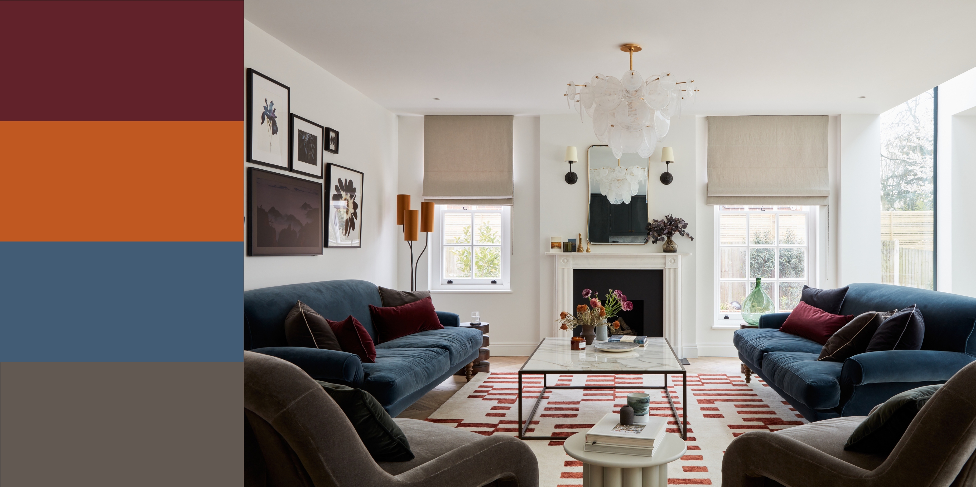
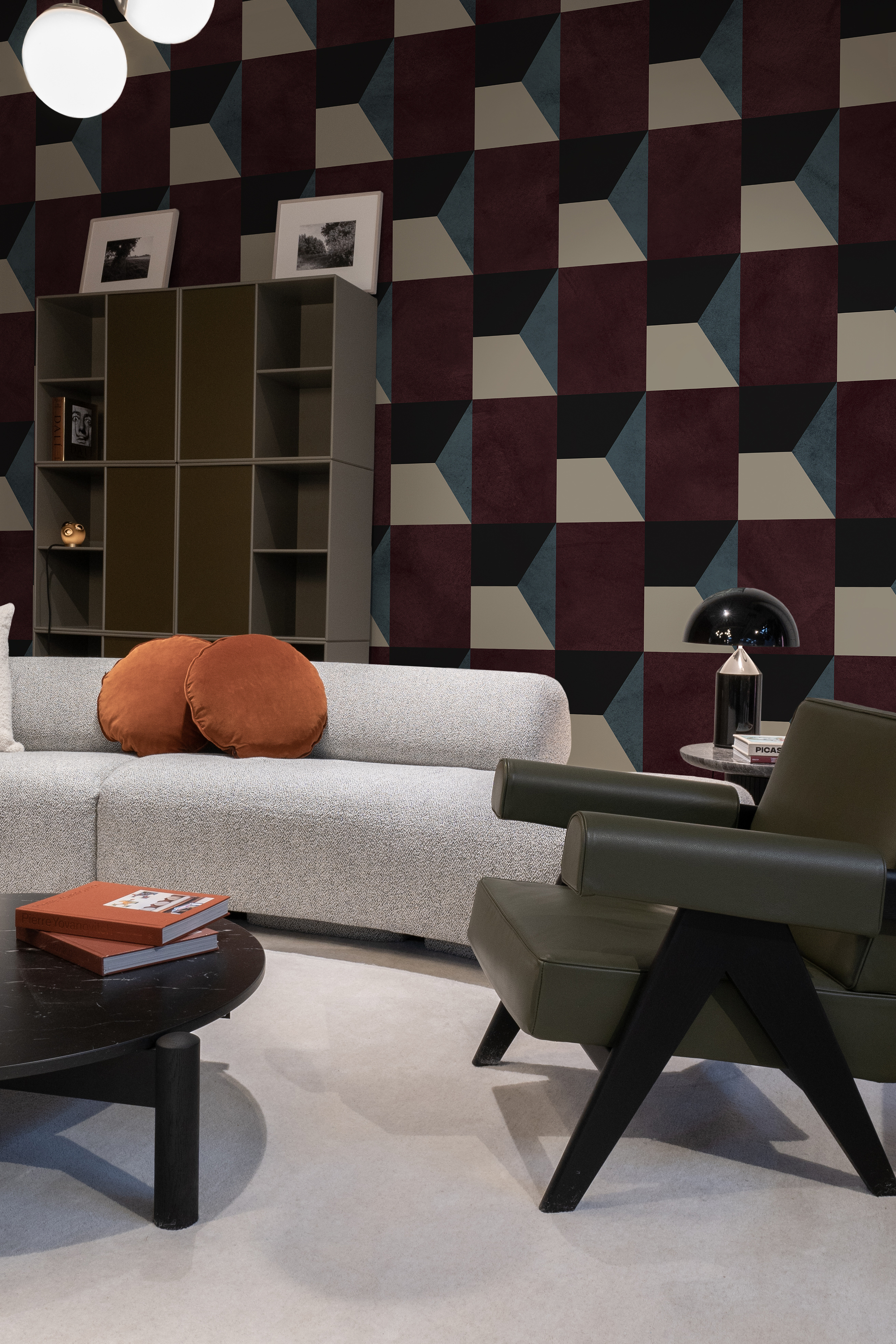
4. Burgundy and Navy
While both bold and saturated tones, burgundy is a color that goes with blue, particularly in its most royal shade. The two tones can wonderfully offset each other and create a vibrant interior.
"Burgundy and blue work nicely if both colors are of the same value, so when pairing the two, consider a dark burgundy with a dark blue or navy, especially if the goal is to have the color scheme balance, with neither taking the spotlight away from the other," says interior designer Julia Mack.
Ruth Mottershead, Creative Director, Little Greene, agrees it's a winning combination.
"Dark burgundy and aubergine tones, such as the richly pigmented ‘Adventurer’, offer an enveloping warmth and understated opulence, instantly transforming interiors into spaces that feel both intimate and luxurious
"When combined with cooler hues such as deep, inky blues and navy, such as 'Hicks Blue’, it creates a balanced scheme that marries richness with tranquillity.
So what's the interplay at work here? "Burgundy’s wine-soaked depth brings drama and elegance, while blue introduces a sense of calm and clarity," explains Ruth.
"When used together, these colors form a refined pairing: the warmth of burgundy tempers the crispness of blue, while blue offers a fresh counterpoint to burgundy’s intensity. The result is a richly layered, sophisticated palette that feels bold yet harmonious - perfect for interiors that blend contemporary style with timeless depth."
Price: £6.00 per sample pot.
Plimsoll is a versatile deep navy that works for both modern and traditional spaces and complements many colours.
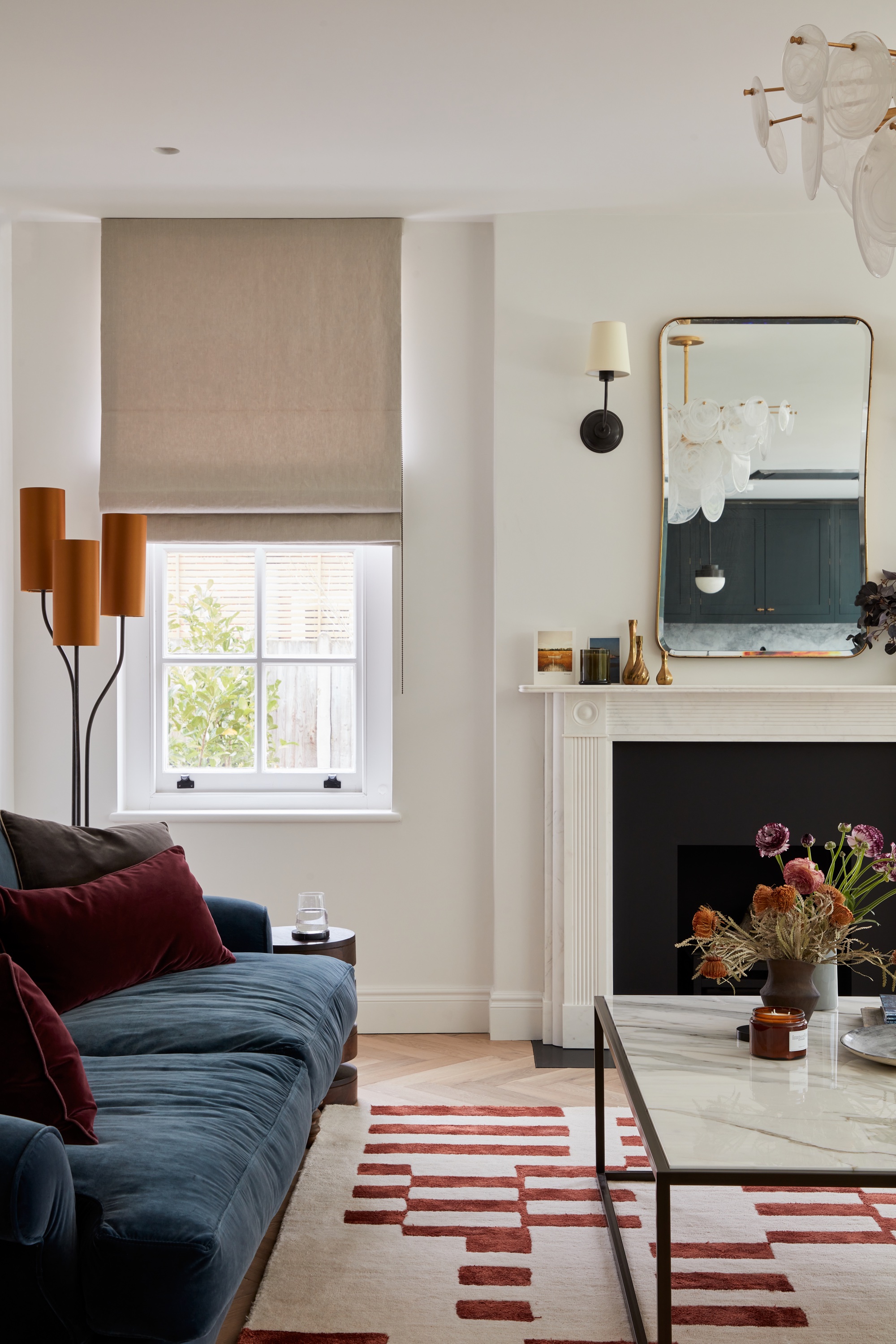
5. Burgundy and Cream
"Burgundy and cream is a timeless and elegant pairing that brings a sense of warmth and sophistication to interiors," says Ruth Mottershead.
Pairing burgundy with a neutral is a soft and simple way of decorating with red in your interior design scheme.
"Deep, luxurious shades of burgundy add richness and drama, while cream introduces softness and light, creating a beautifully balanced contrast." The secret to the success of the pairing is that "cream allows burgundy to take center stage without overwhelming the space", says Ruth.
It's a palette that works particularly well in period properties where you may want to highlight architectural details. Ruth suggests: "Use burgundy on walls or woodwork and offset with creamy tones on ceilings or trims.
"Alternatively, in more contemporary spaces, layering rich burgundy furnishings against soft cream walls adds depth without feeling heavy. It’s a combination that feels both grounded and uplifting.”
Price: £2.00 per peel and stick sample.
The warm, yellow undertones of this cream makes it an interior design staple for all homes, perfect to pair with any colour.
6. Burgundy and Dusty Pink
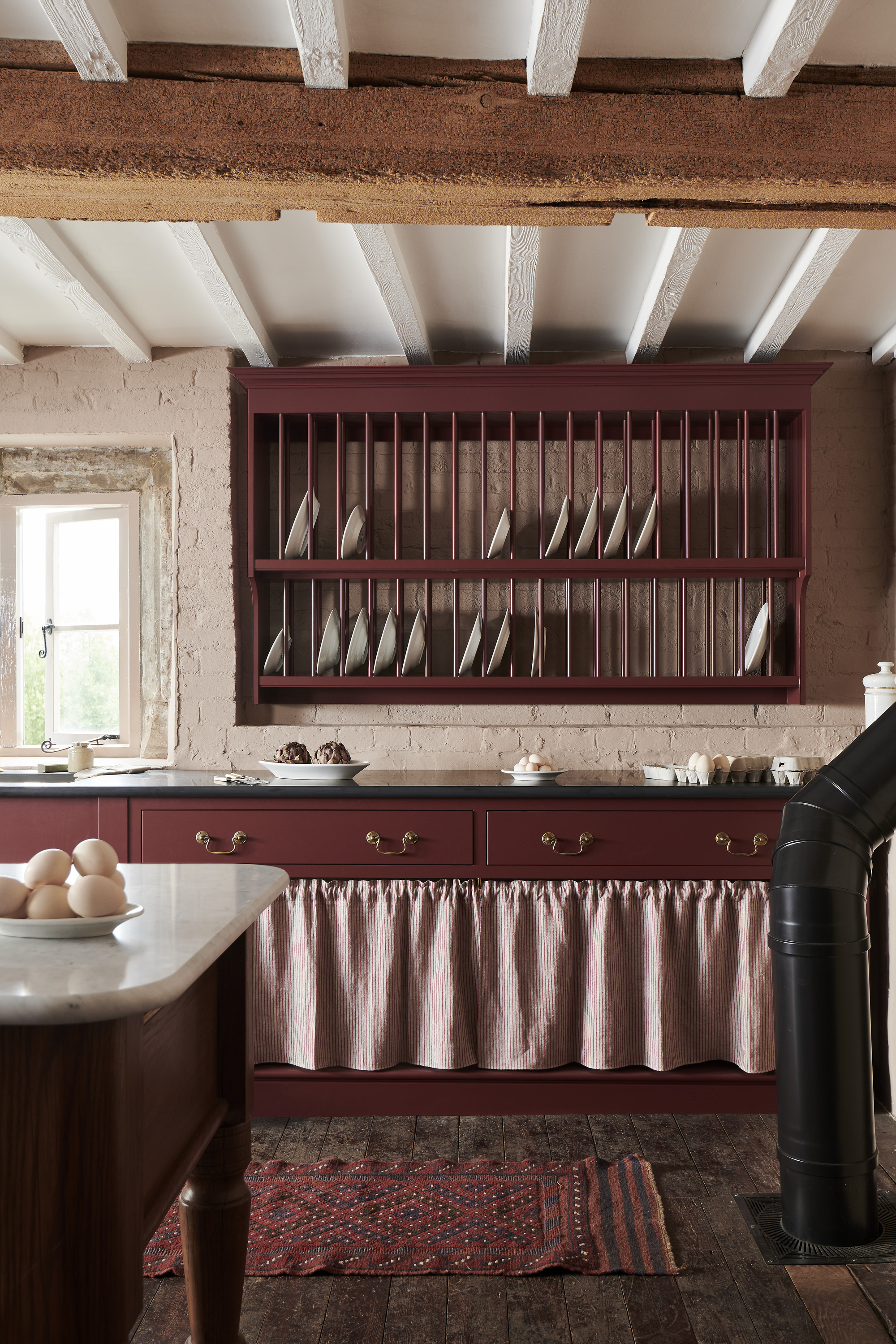
If you're decorating with pastels like soft, dusty pinks, a good way to ensure your scheme still feels grown-up is to bring in grounding colors to balance it.
In this kitchen — part of deVOL's Heirloom Kitchen Collection — an earthy burgundy shade (the brand's own 'Refectory Red' paint color) picks up the same undertones of the subtle pink walls, while anchoring the room and giving it a level of sophistication and composure.
Price: £2.50 per sample card.
Fresco Pink is a beautiful soft pink that adds a gentle wash of colour to a space, regardless of natural light exposure.
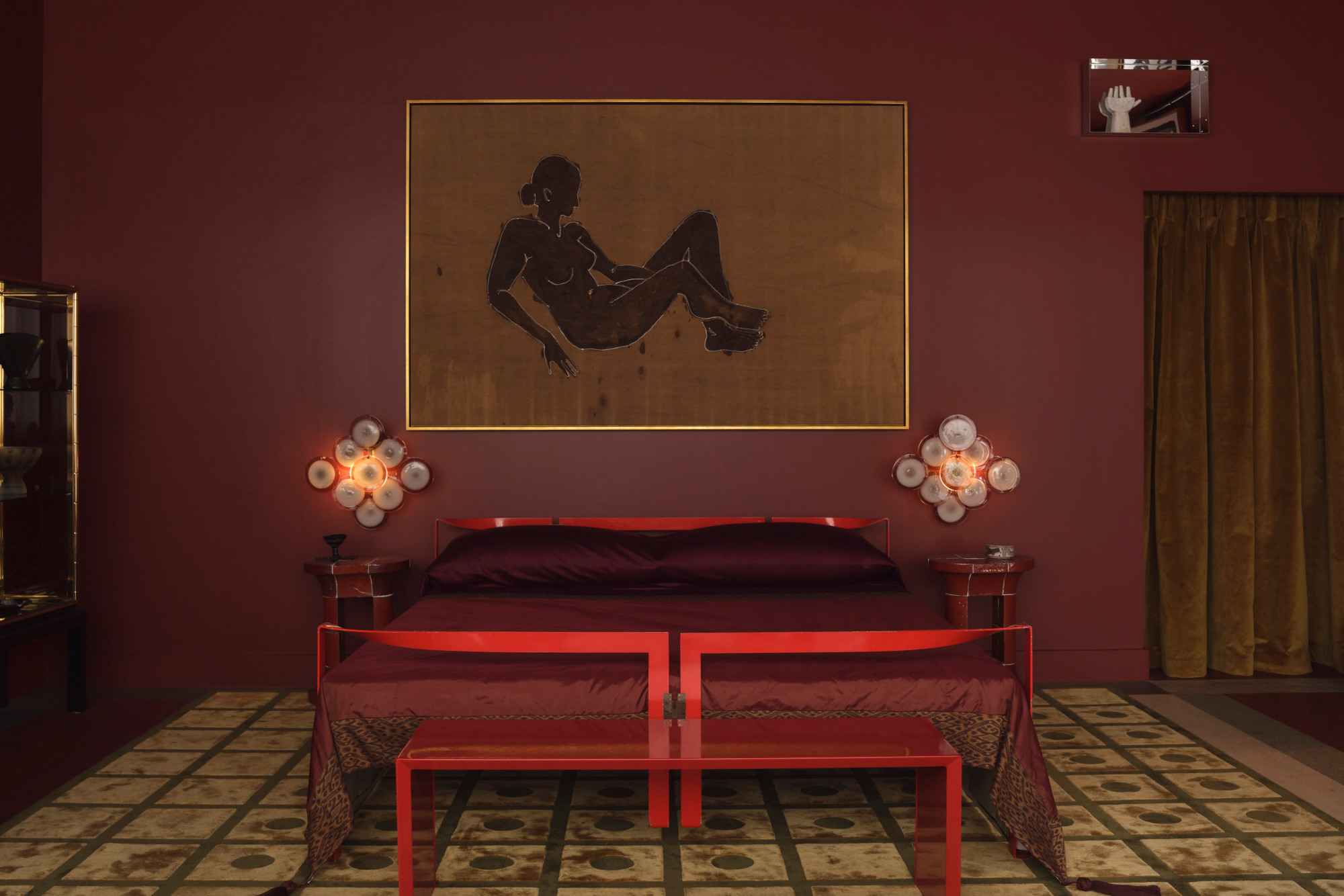
7. Burgundy and Black
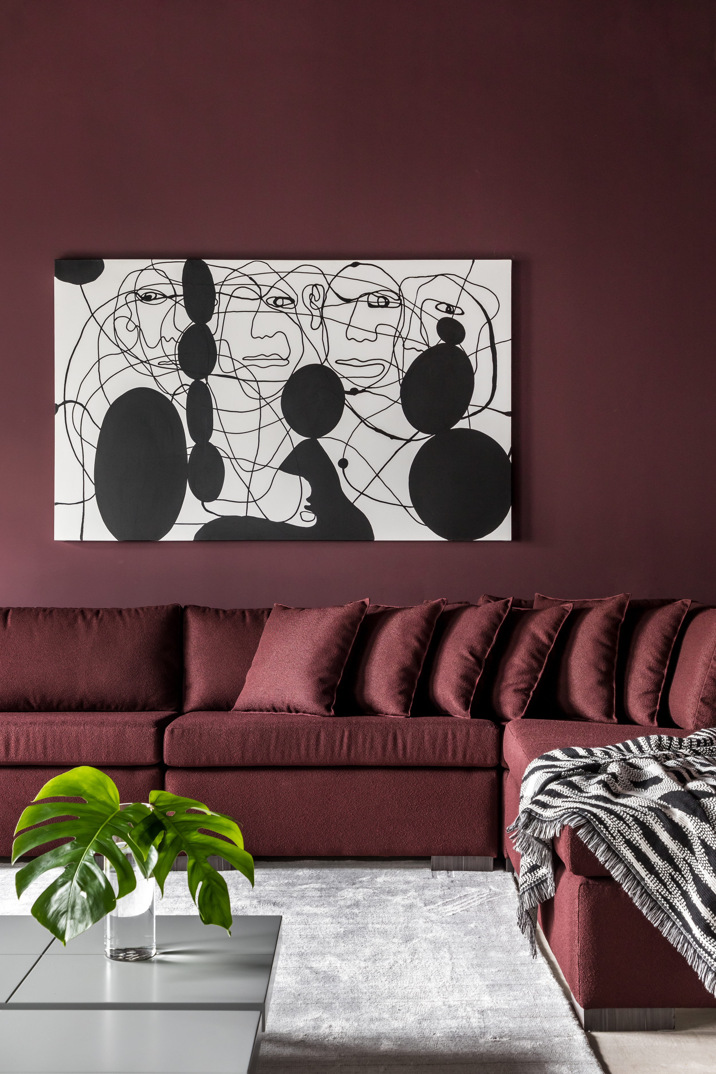
A black and burgundy palette is an easy way to up the drama in a space. Amongst the many colors that go with black, burgundy creates a moody and glamorous cave-like feel. Two dark tones create a layering like no other.
"The beauty of burgundy is it has a very interesting range of variations — from brown undertones to plums with more of a rosy purple feel to it," says Canadian-based interior designer Jane Lockhart, founder of Jane Lockhart Design. "There is also a 'blackened' burgundy where the color is super saturated with black, which can make an excellent alternative to blue-based blacks and gives a warmer, more luxurious feel. Burgundy is a color that almost always has a feel of luxury and history to it, given its naturally deep color value."
Price: £5.50 per sample pot.
This luxurious, tasteful black is an ideal accent colour for bannisters or skirting, or for a statement, colour drenching a room.
8. Burgundy and Terracotta
You can really highlight the red undertones of burgundy by pairing it with a subdued orange like terracotta, creating a real sense of warmth in a space. The reason burgundy works so well as a color that complements terracotta is because the two are so similar, and therefore create a monochromatic look.
"This is a dynamic color combo, and one that speaks of intensity and drama in a space," says Jane Lockhart. "A blue or pinkish-toned burgundy paired with a bright orange will help make the color hum when side by side. To lower the intensity of these colors together, select a burgundy with a deeper brown undertone so it blends more with the terracotta."
Price: £5.00 per sample pot.
The earthy, warm undertones of this terracotta red is a perfect transition shade for other red tones colours.
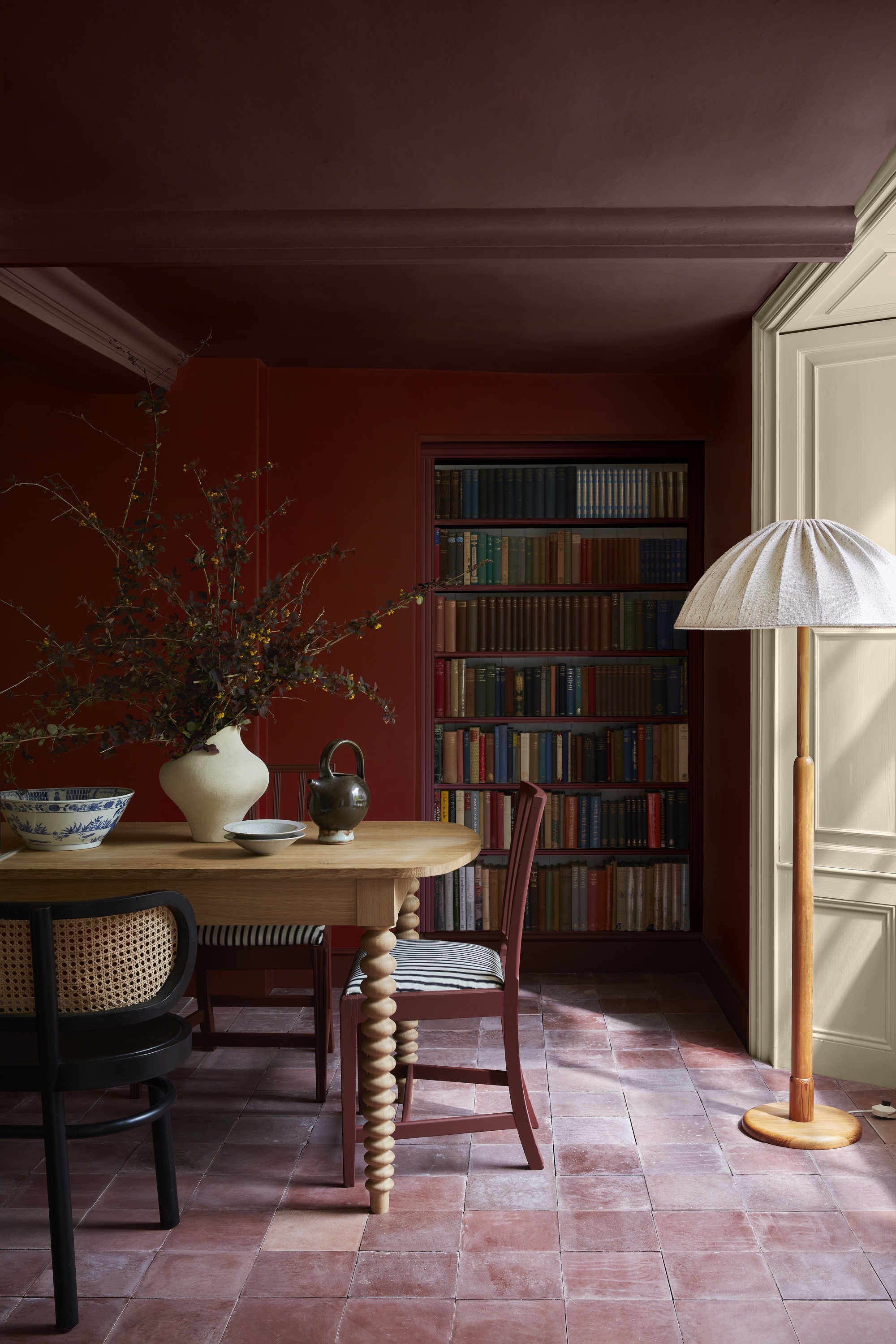
9. Burgundy and Brown
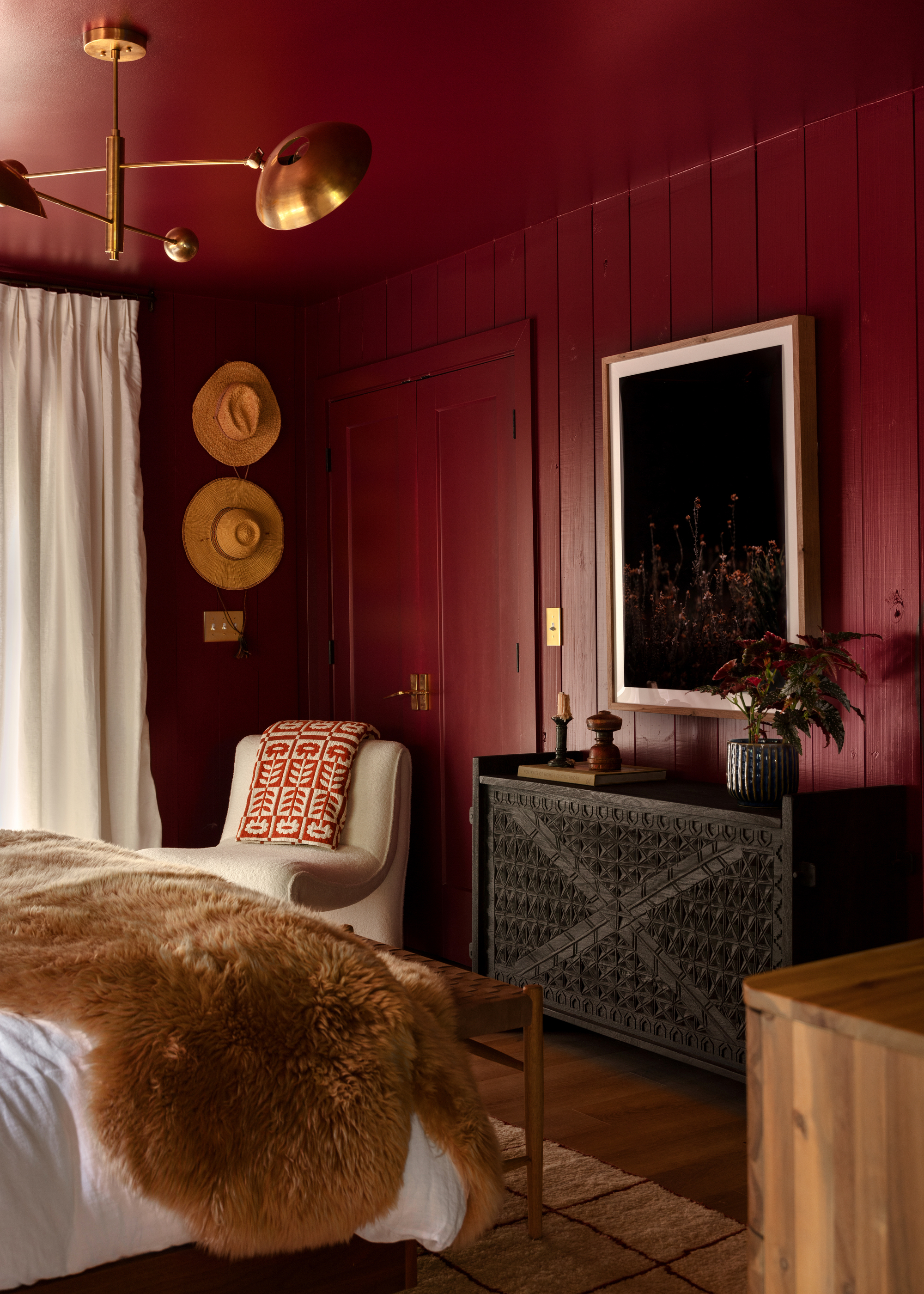
And that's all the browns, from caramels to tans, deep timber tones and even brassy bronzes. It forms the perfect backdrop in this bedroom by Northwest Arkansas-based design studio Meet West, making burgundy feel like you're decorating with earth tones.
"Burgundy complements traditional architectural homes where it harmonizes beautifully with warm wood tones, like oak and walnut, creating a sense of warmth and coziness," adds Benjamin Moore's Hannah Yeo.
Price: £7.50 per sample pot.
The subtle grey undertones of this brown shade makes it a gentle, yet dark wash of colour for both modern or traditional spaces.
10. Burgundy and Beige
"Being a deep jewel tone, burgundy can be quite a moody color by itself," says Fanny Abbes, creative director and founder of NYC-based firm The New Design Project. And while white can be quite a start contrast, light, dusty tones like beige provide a nice balance.
"When paired with a lighter color or with brighter patterns, especially in a fairly bright room, it takes on another life whilst still keeping its intrinsic strong character, making it a focal point without being overpowering," adds Fanny.
Price: £6.00 per sample pot.
Canvas II is a versatile beige/stone shade that is a staple for any interior space as well as pairing with other colours.
11. Burgundy and Bright Pink
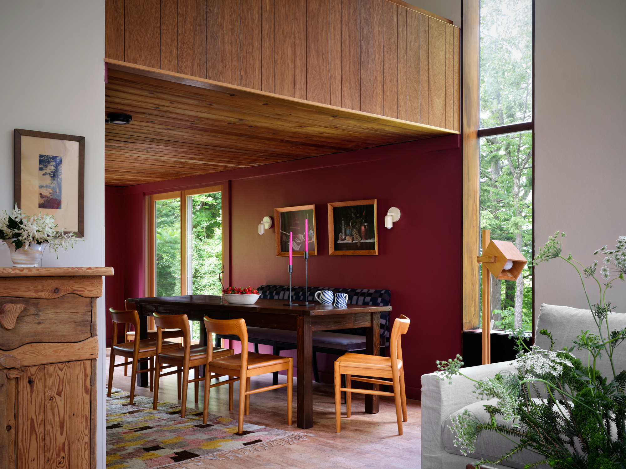
While we've already established that burgundy is a color that goes with soft pinks, it also has the intrinsic energy to balance more out-there shades, like hot pink. So, if you're looking for modern ways to decorate with pink, take this dining room scheme by Texas-based studio Avery Cox Design for example. The bright pink candles pop against the burgundy backdrop, complementing its red undertones and giving it a new sense of warmth and character.
Price: £5.50 per sample pot.
This fun, 'Shocking Pink' lives up to its name and is a unique way to brighten up darker spaces.
12. Burgundy and Red
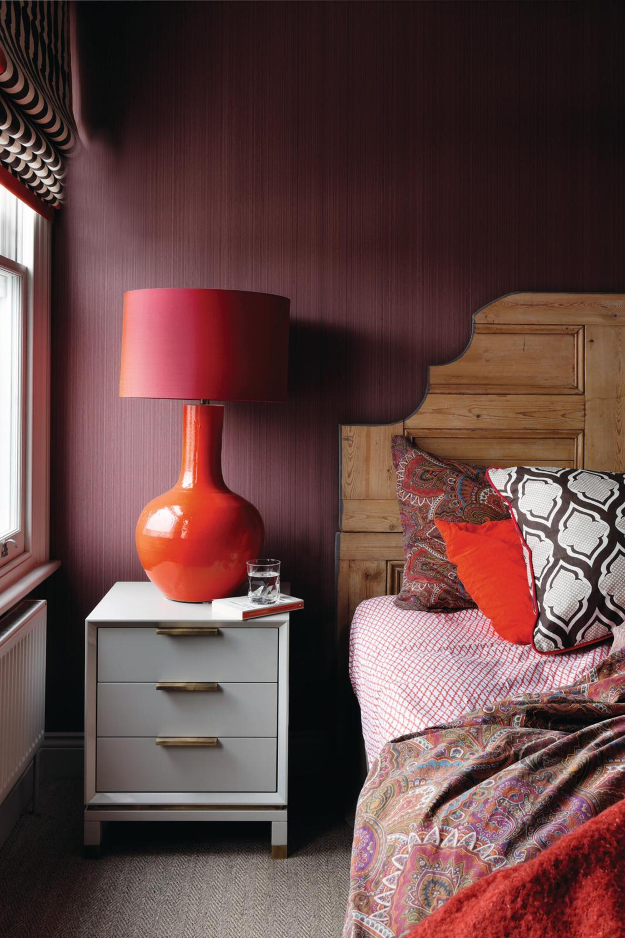
Sitting somewhere in the realm of a deep red on the color wheel, it should come as no surprise that it's one of the colors that go with red in all its shades. By pairing burgundy with other hues from the same color family, it can work to blend the color scheme, and keep your interiors feeling warm. In the bedroom above, a dark burgundy provides the perfect backdrop for the brighter red accents in the room.
"If you're looking for a big 'wow' factor for your room, consider a deep, dark burgundy for your walls, and pair it with red accents, keeping in mind that it's all in the balance, not the clash of warm colors," says interior designer Julia Mack. "The key is to add enough of a creamy white to the palette."
Price: £2.50 per sample card.
This stunning red has a fiery undertone whilst also paring well with pinks, creams and other red shades.
13. Burgundy and Green
When thinking about what colors go with green, according to color theory and the color wheel, burgundy is one of the best. Opting for a dark tone of green — like a deep, muddy olive green — can work well as a combination, reminding us of nature and grounding the space.
"Burgundy with green is a timeless combination, seen in tartans, plaids, paisley, and floral prints from bygone eras," adds Jane Mack. "Burgundy and green naturally complement each other because they sit opposite one another on the color wheel. This means they intensify each other, which ultimately results in more visual energy within a room."
Price: £2.00 per peel and stick sample.
This gorgeous olive green is an ideal colour for bringing a wash of colour, without overpowering other shades in the same space.
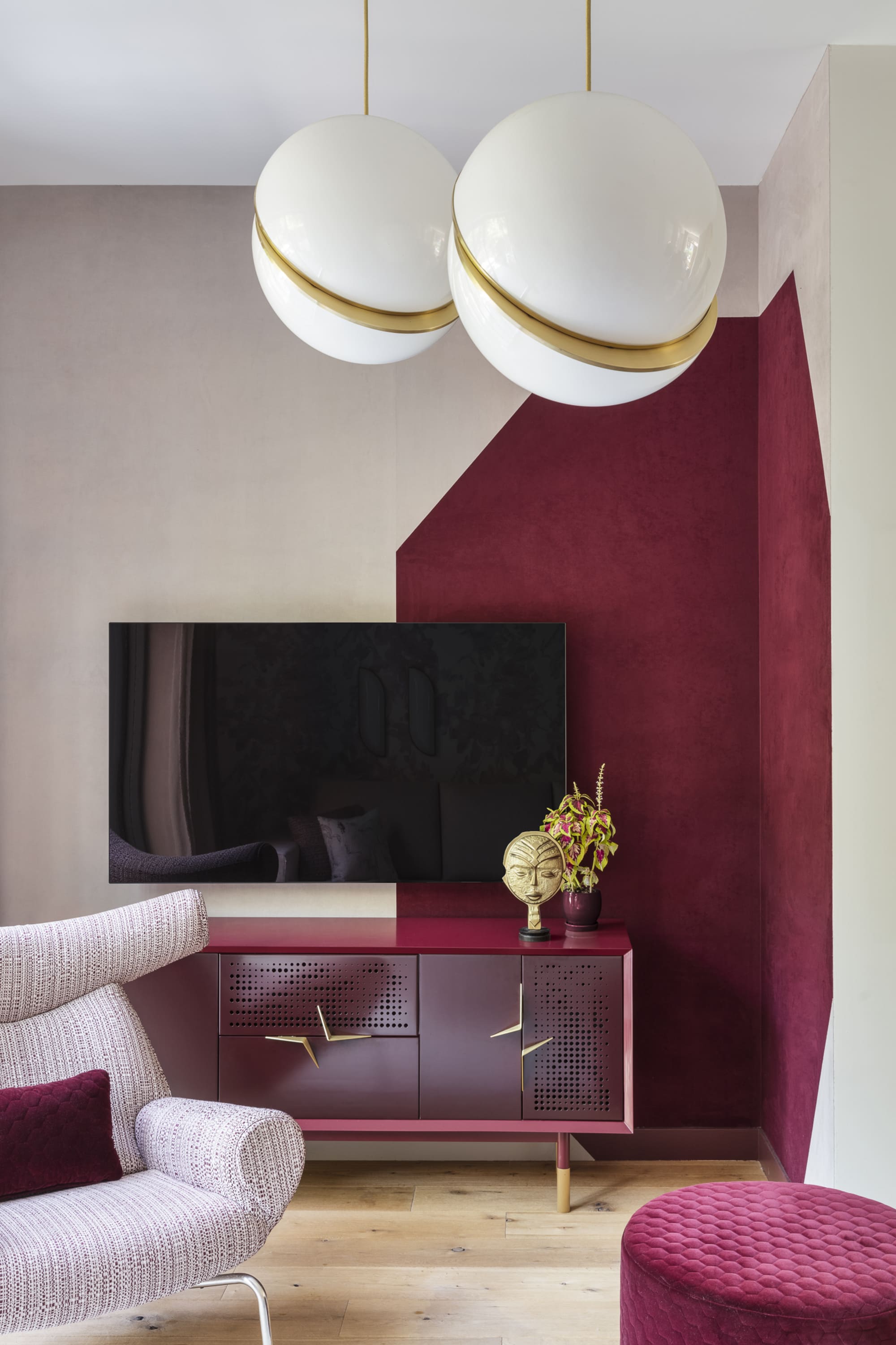
14. Burgundy and Gold
A deep-toned burgundy has an inherent royal, rich, and sophisticated sensibility. An easy way to amp this up is to add to its charm by complementing the tone with metallic accents, like silver and gold. Tying in with its warm undertones, burgundy goes with gold beautifully, or glittering copper touches that add a little bit of oomph. Just take a look at the bedroom above, by The House by M.A.H, that oozes luxury.
Price: £55.00 per 1L sample pot.
Pale Gold is the epitome of luxury and adds a sophisticated detail to any space.
15. Burgundy and Yellow
For an interior that is immediately striking and color-rich, consider a triadic scheme (or the 60-30-10 rule). This means combining three colors on the color wheel, for example: burgundy, navy blue and mustard yellow. Together, these tones can give life to a staid space and inject a fun energy.
"Our client wanted a bold and fun use of color in this living room," says Jacqueline Gonzalez Touzet, principal of Miami-based architectural firm Touzet Studio. "Her favorite colors were plum and burgundy, which are used throughout the house. For this particular assemble, we added chartreuse for another pop of color."
Price: £5.57 per sample pot.
This fun, soft, butter yellow pairs with darker shades really well and adds a brightness to smaller space.
FAQs
Which Shade of Blue Goes Best With Burgundy?
For a more contemporary feel, you'll want to select a shade from the lighter end of the spectrum. "Pale blues, such as Benjamin Moore's 'Silver Mist' or 'Yarmouth Blue', introduce a light and airy contrast to deep burgundy tones, adding balance and sophistication," says the paint brand's senior manager of color marketing, Hannah Yeo.
"On the other hand, an inky blue like 'Midnight Blue' creates a dark, moody atmosphere that feels both formal and impactful, adding depth and drama to any room," she adds.
How Do You Make a Burgundy Color Scheme Feel Cozy?
While the size of your space should be a consideration, the mood you are looking to create and the level of natural light are far more important to consider when creating cozy schemes. Dark hues like burgundy are ideal for introducing a real sense of opulence and warmth to a space.
To emphasize the coziness, consider adding a palette of richer colors to create a more cocooning feel. You could even try color-drenching the room, painting all the walls and ceiling in burgundy, or using a lighter shade on the woodwork and trims for some contrast.
How Do You Style a Burgundy Color Palette?
It's safe to say, the burgundy color trend has been a designer favorite since 2024. Once I started looking, I found it everywhere: drenching dining room walls, bathroom cabinets, on furniture upholstery and as an accent color in all the most aesthetic schemes.
"With the shift towards warmer tones and more personalized color choices, burgundy and red-browns have seen a resurgence," says Benjamin Moore's senior manager for color marketing, Hannah Yeo. "While these moody hues might seem like a daring choice, they are surprisingly versatile, pairing effortlessly with a wide range of colors and materials."
Here are a few quick tips and tricks for decorating with burgundy.
- Experiment with paint finishes — "High-gloss burgundy cabinets contrasted with crisp off-white trim not only elevates the space, but also exudes a sense of luxury," says Hannah.
- Use it as an accent on trims — "This deep hue also works wonderfully in highlighting millwork and built-ins giving them a more contemporary feel," adds Hannah.
- Pair it with an off-white — "It is imperative to select a white that is more of a tonal cream color to avoid a sterile, clinical look," says interior designer Julia Mack.
- Add glamour to the space — "When combined with an ornate marble fireplace, a jute rug and gold accents, the room gains rich texture and a touch of glamour," says Hannah.
- Layer it with lots of texture — "Think of burgundy on tweed, houndstooth, or a textural shag rug," says Julia.