Take a look at the trendiest paint colors of 2024, and you'll find a trove of rich shades, breezy tones, and warm hues. Together, they represent exactly how we're decorating this year: bold and brave, but with comfort as a prevailing priority.
The best part? These 2024 paint color ideas are all actually liveable. From sumptuous earthy tones to zesty blues and greens, they feel fresh, invigorating, and grounding. And, they can be woven into virtually any space and interior design style. For example, you might not have considered a chocolate brown for your walls until now, but the result is so enveloping that you'll wonder why you didn't use it sooner.
"We all need to feel a bit more cared for in 2024, and being nurtured by your house is a main theme for the year ahead," says Livingetc's executive editor, Pip Rich. And now that we're halfway through, that rings even more true. We're spending more time in our homes than ever before, and not only should they act as convivial spaces for hosting friends and family, but relaxing ones that offer a moment's respite from the world's chaos.
Put simply, our homes have to be more versatile than ever, and these 2024 paint colors are perfect for the job. Here are 12 shades chosen by paint experts and designers that are not only setting the interior design trends this year but inspiring our decorating decisions, too.
1. Upward by Sherwin-Williams
Blue is a perennial favorite, and the list of 2024 color trends proves it's still a popular choice. When our favorite paint brands announced their colors of the year, blue hues dominated and, unsurprisingly, they've cemented their places in our spaces already.
One of those shades was Upward by Sherwin-Williams. This breezy blue feels light, airy, and so youthful, and it marks a move toward cooler tones that we're seeing in homes this year. It's both delicate and zingy, with enough punch to freshen a room but still subdued enough to have a calming effect. Think of it as the new sage green.
Sue Wadden, brand ambassador and color expert at Sherwin-Williams, describes Upward as a shade that brings clarity to communal spaces. "It clears the way for lightweight open-mindedness," she says. When it comes to decorating with this oceanic color, she recommends pairing it with other cool shades for a cohesive paint idea. "Warmed-up blues might lead to hues that appear muddled and lackluster, which is why preserving the crisp edge and magnetic allure of cool blues is vital," Sue notes. "It's these subtle nuances that create timeless spaces."
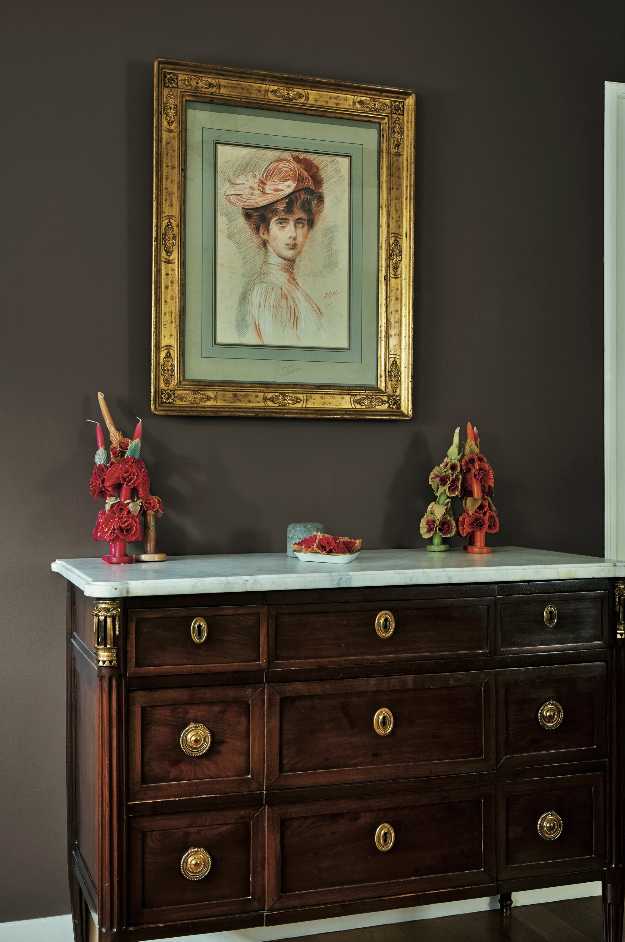
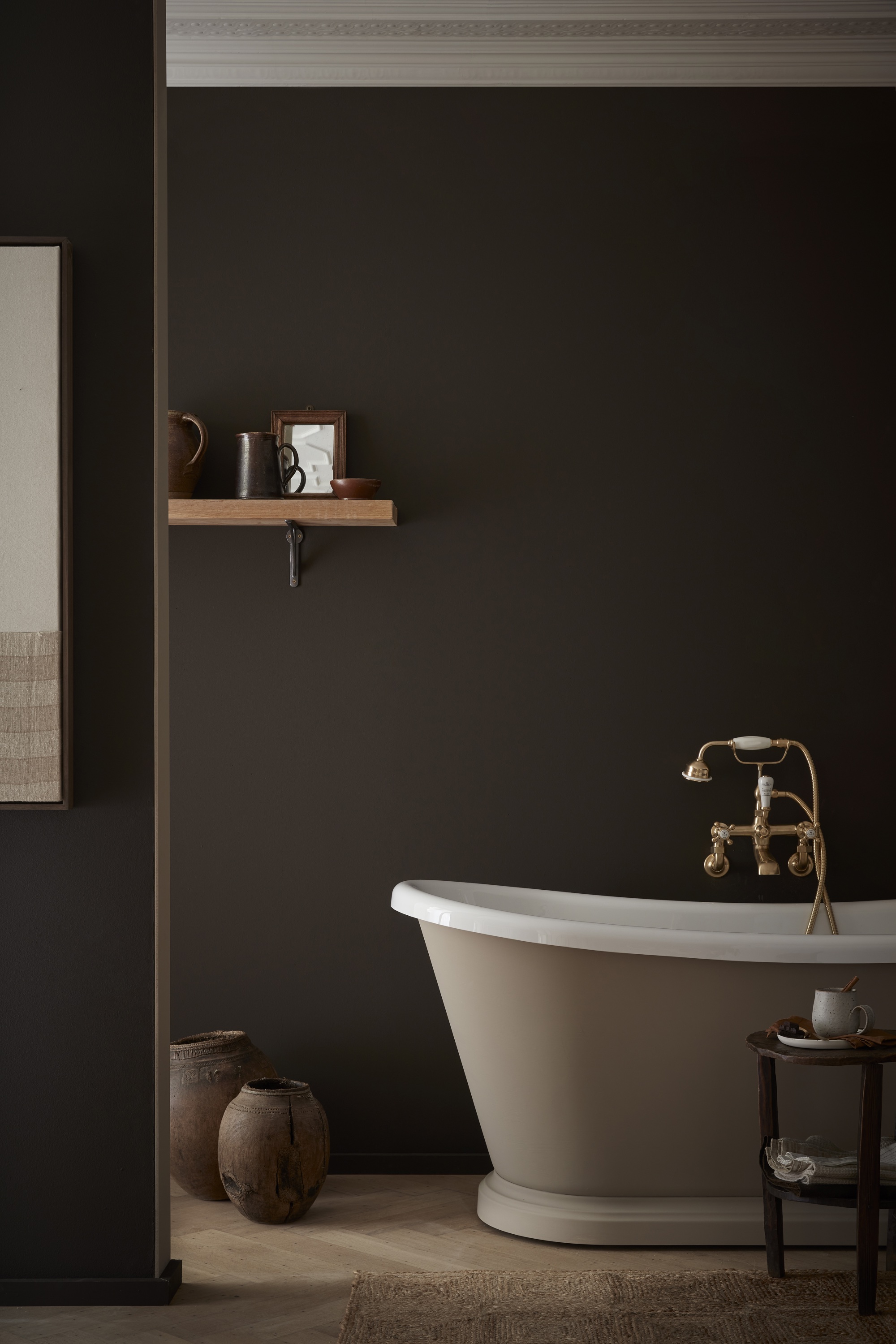
2. Deep Reddish Brown by Farrow & Ball
If you're looking for the best Farrow & Ball colors, this earthy red is a worthy runner. Alongside an increasing number of cool tones finding their way into our homes this year, earthy hues and rich reds are still favored by designers for their rich, relaxing qualities, and Farrow & Ball's Deep Reddish Brown is one of the best paint colors if that's the vibe you're looking for.
"I've been drawn to oxblood red colors like Farrow & Ball's Deep Reddish Brown in 2024," explains interior designer Cristina Cleveland. "For clients who want their room to feel cozy and moody, this paint color delivers a rich warmth that feels welcoming rather than intimidating. It also pairs easily with various brown wood tones in your furniture and floors. I particularly like this color-drenched on the ceilings, doors, and trims to be fully enveloped, like a warm hug."
3. English Green by Stainmaster
This year, designers are choosing darker, richer greens that feel more dynamic. "The most popular color for 2024 is a deep emerald-like green," says interior designer Amy Youngblood. "I love its elegance while evoking a sense of the lush outdoors."
That idea of elegance and sophistication is exactly what these jewel tones bring to a room. Paired with brass accents, they feel opulent, or they can be paired with natural materials — like a rattan shade overhead and jute rug underfoot — for a curated rustic feel. It's this versatility that makes mid-tone greens some of the best colors to use right now.
If you're looking for a green shade that holds up in any room, Lowes' brand Stainmaster announced English Green as the color of the year for 2024. Monica Reese, director of private brands style at Lowe's, calls it the perfect shade for everyday living. "It's a very livable color that brings that outdoor in," she says. "The thing I love about it from a style perspective is I can pair warm colors like terracottas and golden tones, or I can go in a completely different direction and put it with cool tones like blues and greys. It's still fantastic with either one."
4. Blue Nova by Benjamin Moore
Pale blues may be a favorite paint option this year, but mid-tone blues are also having a moment. Benjamin Moore's Blue Nova is an inky shade with an enveloping feel, making it an ideal choice for color-drenching bedrooms, living rooms, and smaller spaces like powder rooms where it can make a room feel larger.
Andrea Magno, a color expert at Benjamin Moore, says it's all about bringing "eye-catching color into the home while expressing personality and a willingness to explore color. Blue Nova speaks to a year where we're seeing a yearning for adventure and new experiences while balancing the need for comfort at home," she says. "Blue Nova has an intriguing, cosmic appeal, as well as a reassuring quality, making this color an ideal choice to reflect the dualities of our world."
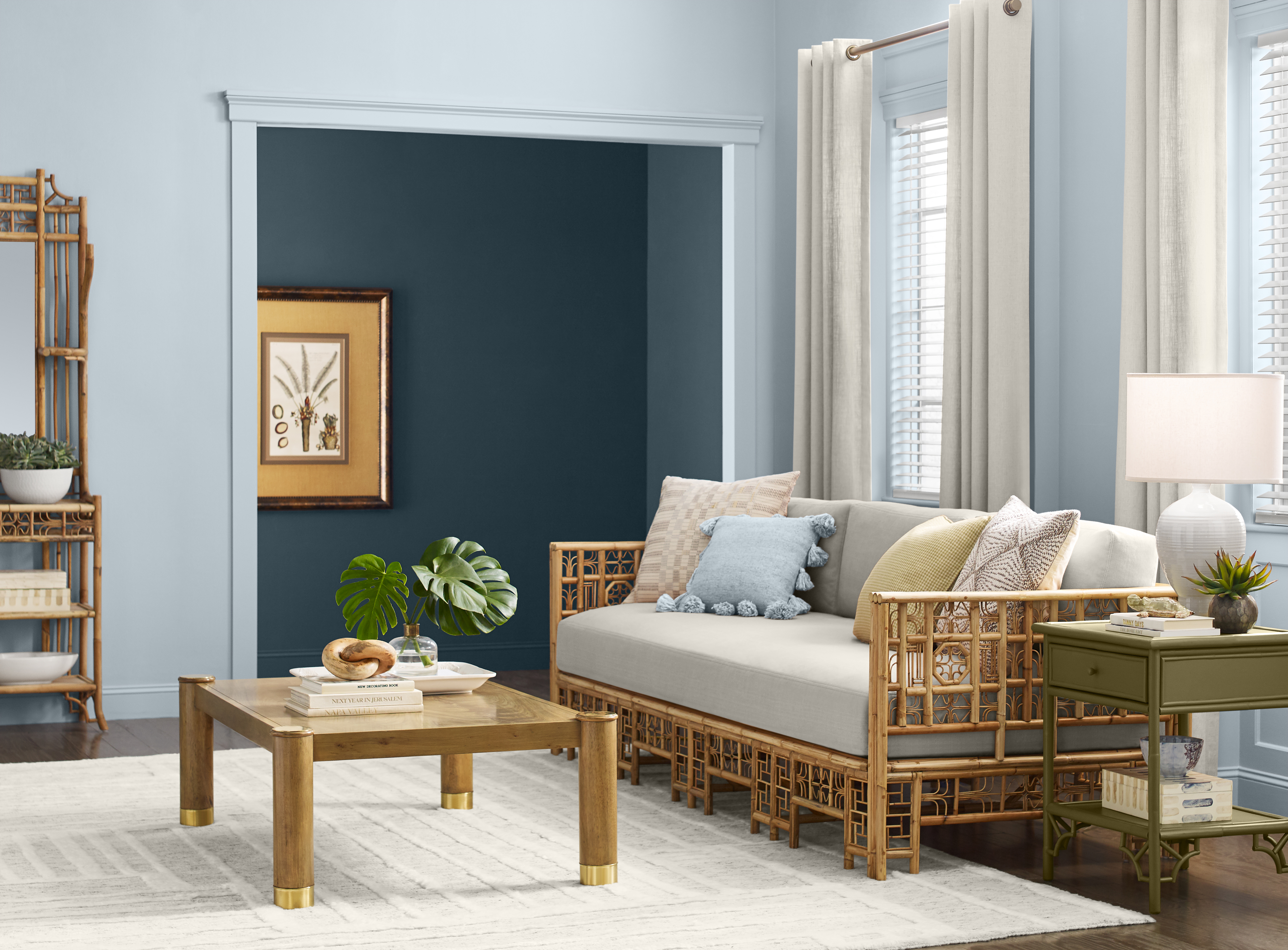
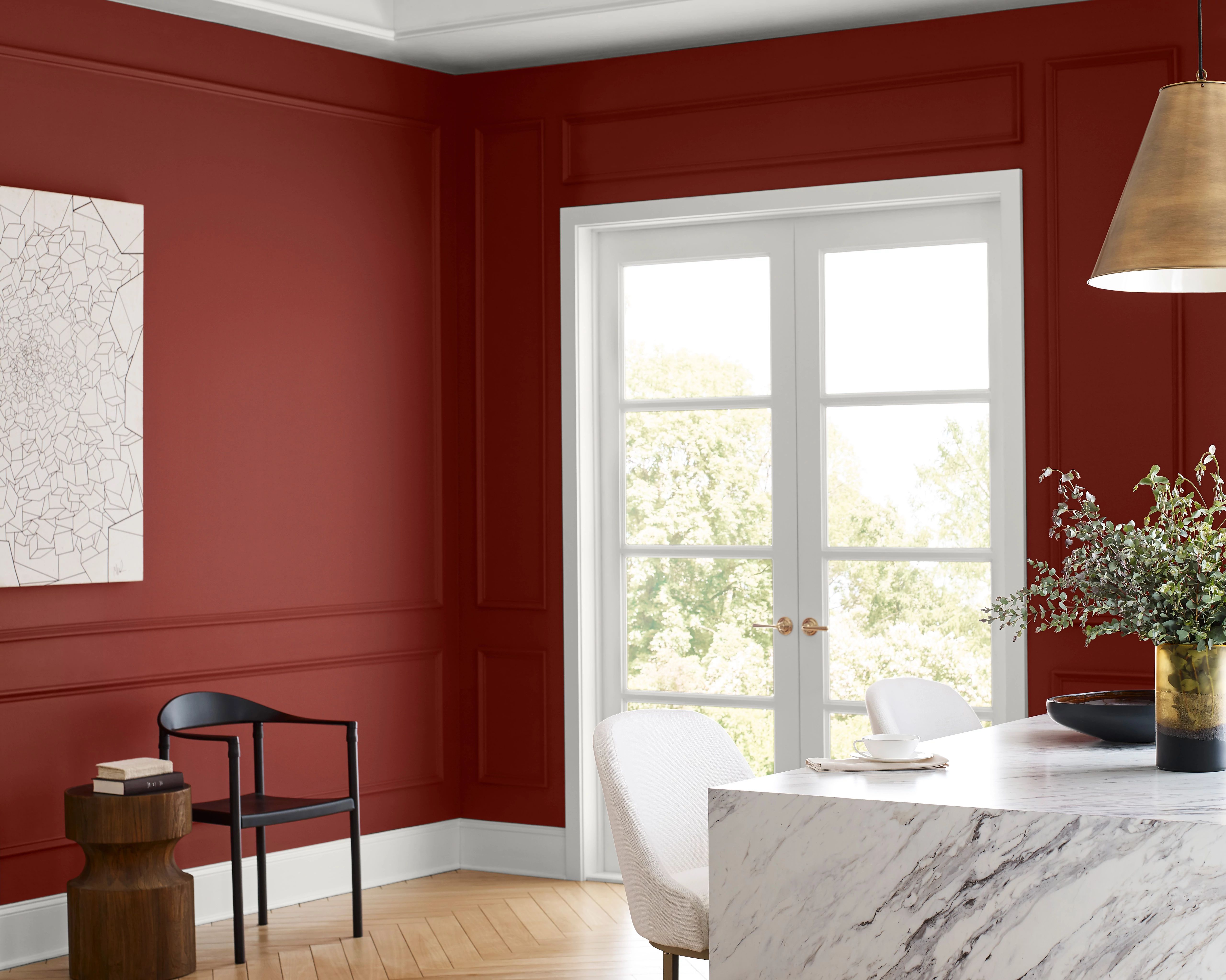
5. Chinese Blue by Farrow & Ball
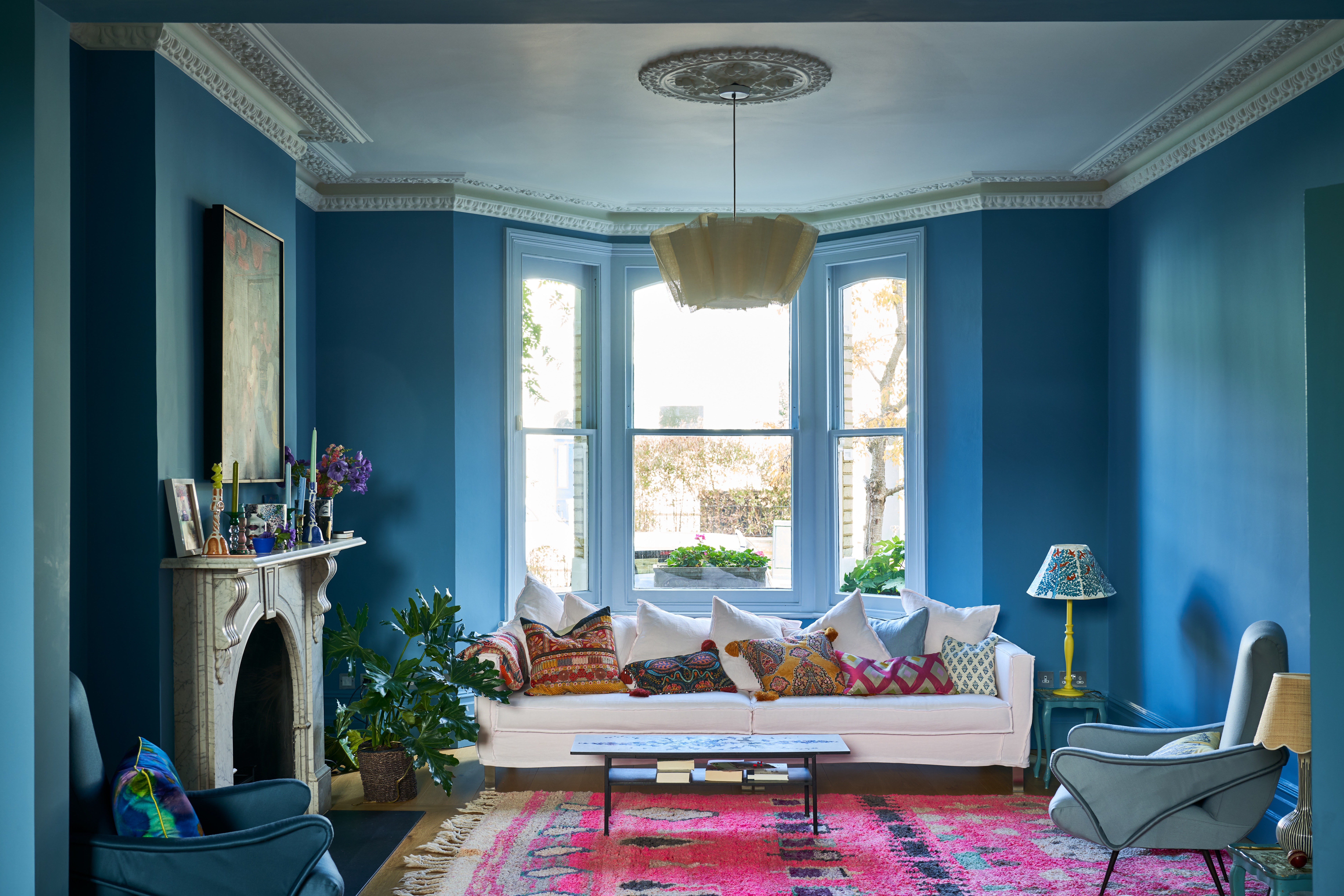
A bolder take on the blue trend, Farrow & Ball's Chinese Blue is an exciting, electric color that fits the mood of 2024. It's a shade that the brand has archived, meaning that it's no longer on the main color card, but still available to buy on request. And it's all the more desirable because it's one that not everyone knows about.
"Cleaner and brighter rich blues bring a wonderful vitality to a space," says Patrick O’Donnell, color expert at Farrow & Ball. "Chinese Blue delivers a great punch of joyful exuberance whether your tastes hover towards traditional or contemporary. Try it on walls in a light-filled bathroom, or introduce it to your dining room where it will transition to something very grown up for those more formal celebrations."
It also makes an inviting choice for a blue living room (as seen above), creating a rich surrounding that can be paired with neutral hues, but can also take a color contrast well, like hot pink.
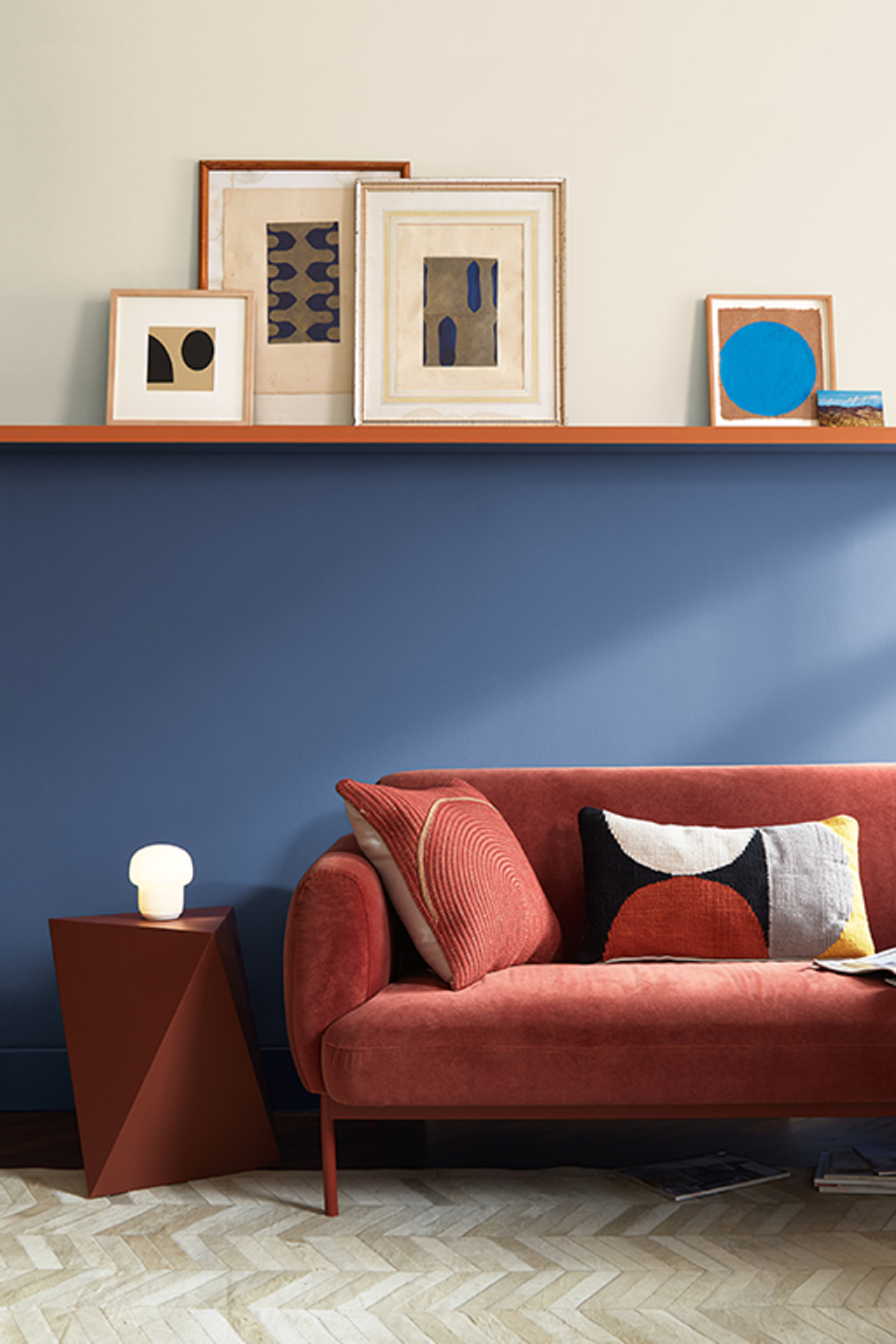
6. London Clay by Farrow & Ball
Sumptuous browns are also a key player when it comes to the best paint colors for 2024. Rich, moody, and cocooning, they're a great way to play into the quiet luxury trend. It works especially well when paired with gold accents and off-white trim for an old-timey, heritage feel.
"Where blue and greens can err towards the cooler side, browns can add warmth, especially the elegant London Clay from Farrow & Ball with its subtle dose of magenta," says Patrick. "This color will give you great flexibility and will work effortlessly with a multitude of other colors, including pinks, greens, blues, and earthy neutrals, and is a great option for poorly lit spaces, like a narrow hallway, giving you drama and warmth in equal measure."
7. Ganache by Little Greene

The color masters at Little Greene also confirm that brown is the go-to paint hue for 2024. "The trend for rich, cocooning interiors has continued into 2024, with a move toward the soothing power of darker and mid-tone caramels and rich and indulgent browns that deliver comforting schemes," says Ruth Mottershead, creative director at Little Greene.
Ganache (seen above) is likely to be the darkest shade in your room, but consider pairing it with Little Greene's even darker Chocolate Color for a deeply committed interior design statement. "These earthy shades are often dismissed as being dated or dull," says Ruth. "However, rich warm colors based on umber and ochre deliver cocooning, restful, and charming spaces."
For a brown living room idea that feels expertly balanced, use plenty of natural materials like wicker, rattan, warm woods, and stone finishes. These will offset darker brown walls for a harmonious tonal scheme.
8. Stardew by Sherwin-Williams
A delicate sky-blue paint color, Stardew from Sherwin-Williams is a hue that defines the mood of the moment for 2024. Designers are embracing these cool, airy tones to create spaces that feel equal parts relaxing and uplifting. Lighter and breezier than Upward, this shade works like a neutral, and with so many colors that go with blue, the possibilities for pairing are endless.
"This distinctive and dreamy slate blue holds a trace of magic in its bewitching balance of warm and cool undertones," says Sue Wadden. "Blues and greens, especially lighter ones like Stardew, are great to use in respite rooms like bedrooms or living rooms, for their association with calmness and resting." This refreshing tone also lends itself excellently to more modern spaces thanks to its youthful feel.
9. Chocolate Color by Little Greene
The antithesis of Stardew is Chocolate Color, a velvety hue from Little Greene. "Perfect for use in 'all-over' schemes in both contemporary and traditional settings, rich chocolate brown tones work really well as an alternative to white, grey, or stone," says Ruth Mottershead. "They are the perfect choice for bedrooms, bathrooms, and living rooms, or any space where you wish to create a restful and indulgent feel."
If you want to create a more lively, dynamic room, use this dark shade with pops of color. We think it's a great tone to use alongside more playful hues in a stripe pattern, and the good news is there are plenty of colors that go with dark brown. "Brighter accents such as Marigold or Orange Aurora will leap off a Chocolate Colour background," notes Ruth. '"Or, use it as an exquisite trim color to frame a wall of Arras or Tuscan Red." You can also try using it as a warmer, less severe alternative where you might previously have considered black, charcoal, or dark blue.
10. Fireweed by Sherwin-Williams
The unexpected red color theory was the first major color trend of 2024, and Sherwin-Williams' shade Fireweed is the perfect tone to harness the idea. The theory goes that small doses of bright, almost primary reds woven through your decor can instantly elevate a space and help tie a scheme together. Fireweed offers just the right burst of drama and energy to drive the concept home.
Red is sometimes a color that can be a little intimidating when it comes to interior design and decorating choices, as it has an association with being too aggressive, or too stimulating, but using it in this way makes it far more liveable. Fireweed, in particular—a rusty-infused tone—has a much-needed warmth to it that makes it easier to work with.
"I recommend using deep reds in spaces where people gather together, like a dining room or kitchen, due to their high energy," suggests Sue. In these spaces, its convivial qualities bring a zestiness. Don't limit it to the walls alone, either. This color works brilliantly on woodwork or furniture where the boldness really packs a punch.
11. Cracked Pepper by Behr

In 2024, designers want us to know that black is nothing to be afraid of and is, in fact, a hue to be celebrated and embraced in modern interior design. "The design world is experiencing a seismic shift towards more sophisticated, understated color palettes that convey a message of modernity and timeless elegance," says Dan Mazzarini, creative director of BHDM Design and ARCHIVE by Dan Mazzarini. "Leading the charge is Behr's 2024 Color of the Year, Cracked Pepper, a captivating hue that’s proving to be much more than just a fleeting trend."
Use this dark tone to make a real statement or as a subtle addition to your existing scheme. "Where you can put white, you too can put black," Dan says. "Pair it with rich browns, burgundies, or forest green to layer an interesting vibration into your space. Also, consider it in a matte finish which is a bit more subtle." Dark color trends are on everyone's radar right now, and this shade represents the epitome.
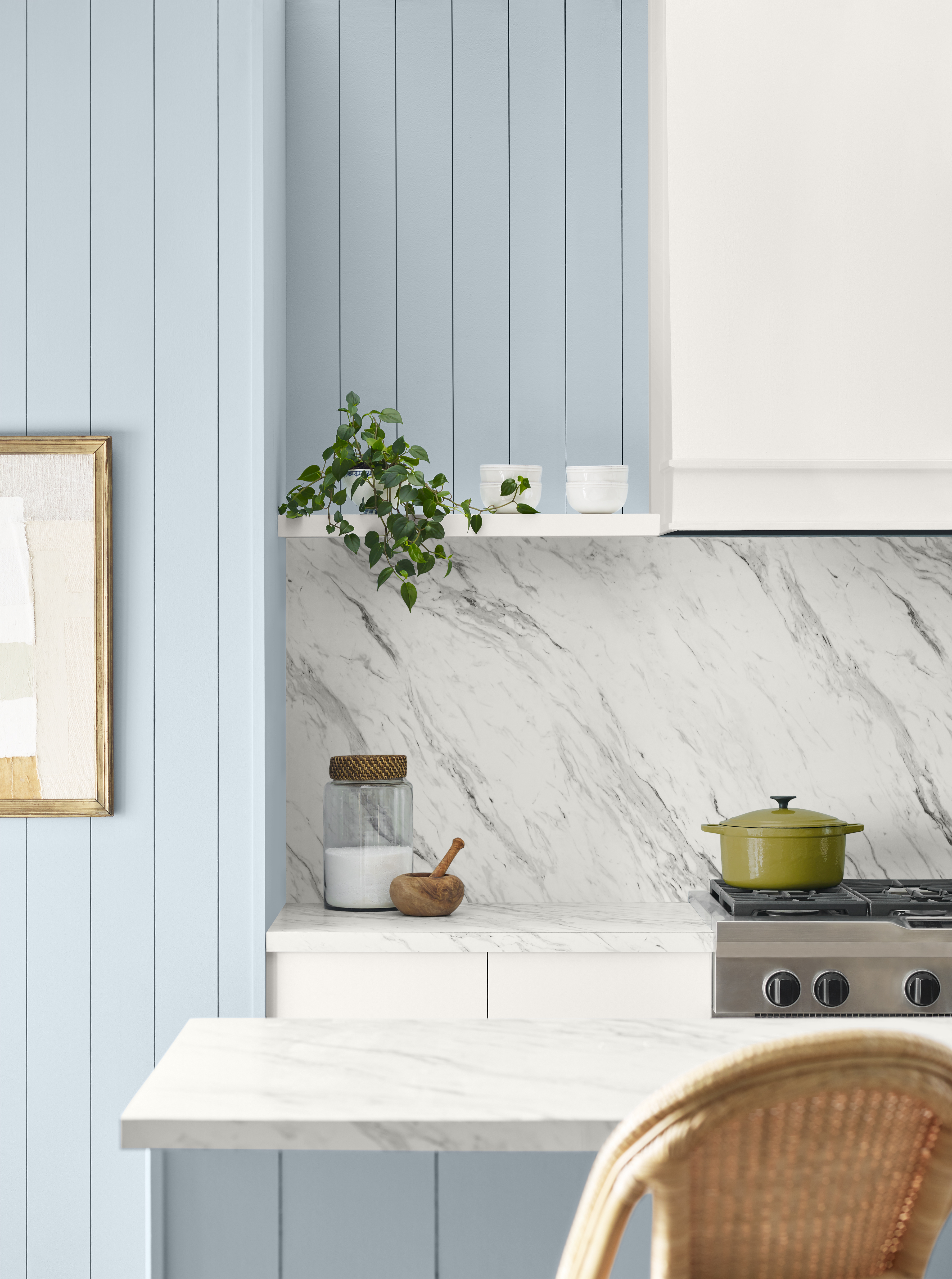
12. Crystalline by Benjamin Moore
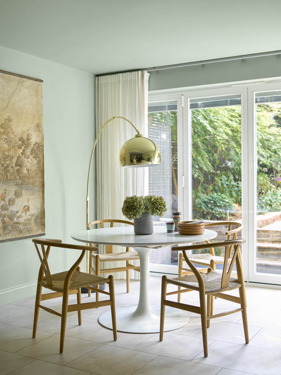
For a more delicate touch that still offers a splash of color, opt for Benjamin Moore's Crystalline. This soft, pastel-like shade sits somewhere between green and blue, bridging the gap between cool and warm, and relaxing and invigorating. It captures that essence of versatility that's so vital to decorating in 2024.
In fact, in south-facing spaces, this pale green can even be used as a neutral. "It will still reflect plenty of light while providing a softer look than a bright white, which can feel cold in the wrong space," suggests Helen Shaw, Director of Benjamin Moore. For a fresh kitchen color idea or a bright and airy breakfast room, this is one of the best paint colors you can choose.
FAQs
What is the most popular paint color for 2024?
The most popular paint color for 2024 is shaping up to be a buttery neutral. At the start of the year, this was being dubbed as the 'Magnolia 2.0', but as our circle around the sun has progressed, this has inched even closer to a pale yellow.
"I'm seeing clients yearn for buttery, creamy whites like Farrow & Ball School House White in 2024, as opposed to bright gallery whites like Benjamin Moore Decorator's White," notes Cristina. And true yellows are also coming to the fore, too. As 2025 edges ever close, we're excited to see how this sunny color trend might develop.
How do I choose the right color for my walls?
"When picking a color for the walls of your home, consider first the most solidified, expensive items like furniture that you can't live without," suggests Amy. "Is your furniture neutral or more colorful? This will set the direction for your walls. Remember paint is probably the least expensive change you can make to your space, so decide on your major items first and pick your paint/wall color last."
Of course, there's also the purpose of the room to consider. Paint colors are key to creating the right vibe and ambiance, so think about what your room will predominantly be used for. Is it for relaxing, socializing, or productivity? Christina says the right decision always starts with self-reflection.
"I'd start by asking yourself, 'What will I do in this room? What daily habits or routines will take place here?' And then I'd ask, "How do I want to feel while doing that?'," she suggests. "Finally, ask yourself 'What colors make me feel that way?' The answers to those questions will be completely unique to you."
With this guidance, and equipped with the best paint colors for 2024, your decorating journey can finally get underway. These colors don't only capture the zeitgeist either, all of them are timeless enough to endure in your home for years to come.