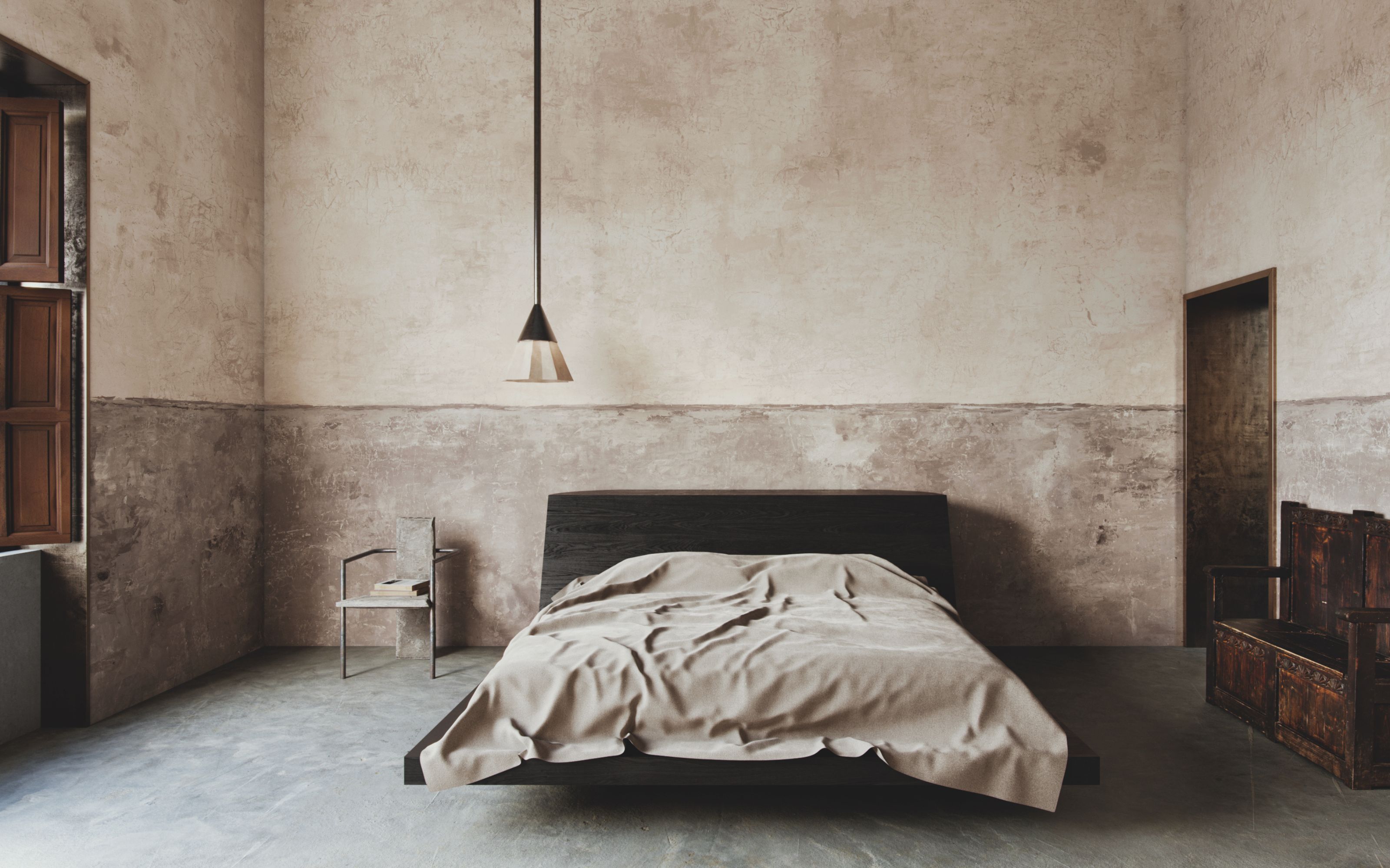
Some matches are made in heaven, they say, and right now I can’t think of a better example than the collaboration between stylist Colin King and bespoke wallpaper designer Calico. The result, two exquisite collections of wall coverings, Nuance and Perception, explore the subtle traces of the past, revealing themselves to be both timeless, and very relevant for now.
King, who is frequently inspired by the past, looked to generations of color that span centuries, evoking frescos, and texture for influence that can be seen in the new designs. His romantic aesthetic stems from a background in dance, applying a dancer's sense of movement and stillness to all that he does, and creating arresting imagery and emotions through the power of artful arrangement. King’s aesthetic was harmonised seamlessly with Calico’s process that is known to combine artisanal methods from the decorative arts, such as traditional marbling and dip-dyeing techniques, with innovative technologies.
The two resulting collections offer a rediscovered sensibility for the romantic and classically beautiful in a monumental installation at this year’s Milan Design Week, and as we turn our attention to the home of design with our Italian Issue for Spring 24, we can’t think of a better showcase of artistry.
Perception exemplifies the weathered charm of the past
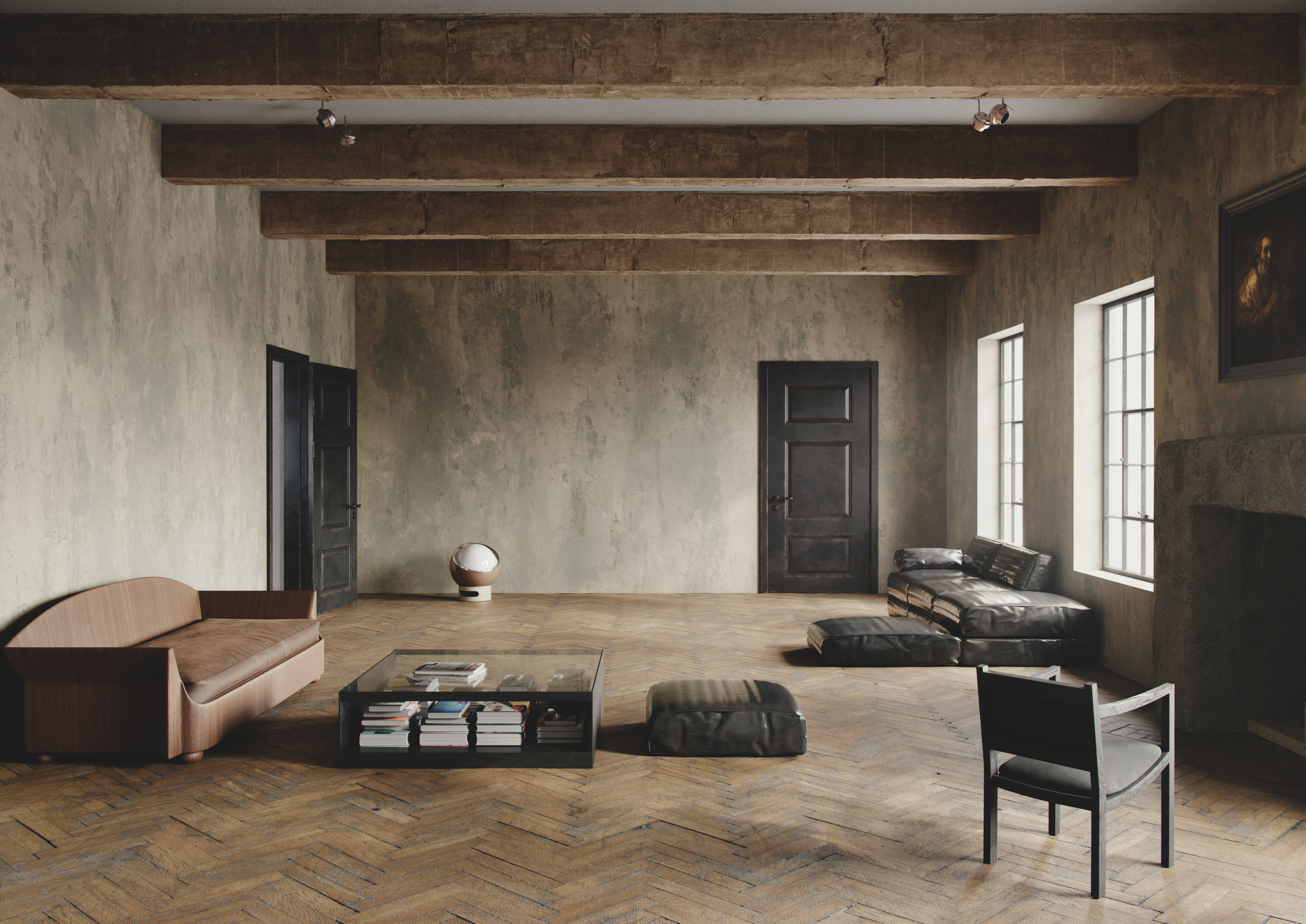
The first collection, Perception, which can be seen at this year's Milan Design Week, is rooted in a muted but grounded palette borrowing inspiration from the past, while staying relevant and utterly charming for now. Imagine faded plasters, subtly torn edges in historical homes, graceful yet salvaged surfaces with stories to tell and a nod to what came before.
‘I've always been captivated by the beauty of patina, the transformation that unfolds as objects age and decay. It’s as if objects reveal their inner truth. It’s a unique quality seen in works of art and architecture affected by the passage of time,’ says King about the collection.
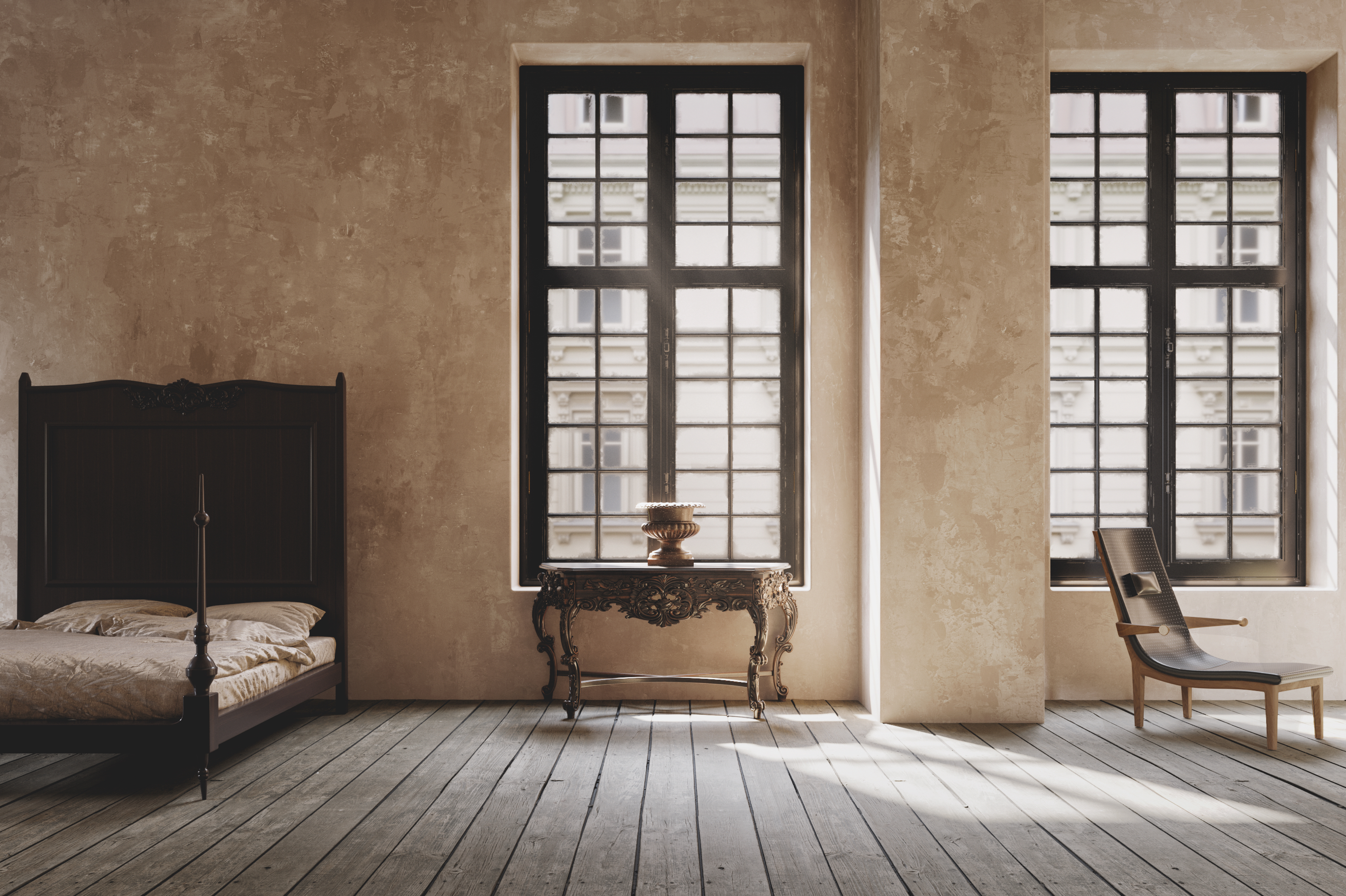
Perception is a romantic celebration of the new pretty trend that we’re seeing gain momentum, where interiors are meant to make us feel enveloped, welcomed, and comfortable, but also special. The wallpaper colorways in this collection (Anecdote, Granulate, Intrinsic, Patina, Sift, Stripped, Unfinished, and Untouched) feel both grounding and dreamlike and strike the right balance of old-time charm and modern home.
Nuance is an expression of balance between texture and hue
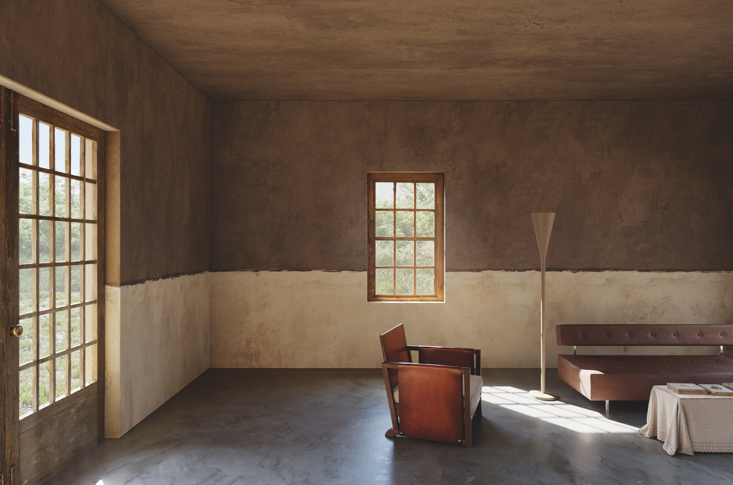
Subtly reminiscent of Rothko paintings, the wallpaper in the Nuance collection hints to the effect in time of benign neglect that has worked its subtle magic. ‘The untouched and unrestored have character and warmth, an effect that feels deliberately incomplete—magnificently imperfect. At the heart of it all are subtleties and nuances that bring depth and richness to the design,’ explains the stylist.
King was inspired by his past as a dancer and expressed this through a visual waltz between texture and hue that create a divided yet harmonious interplay. Soft, grounding tones, ‘imperfectly’ separated by a subtle horizontal line play upon a duality of interventions in time, of stripped away material, where more and more details are both removed and added on, leaving the marks of a story of the past that brings us slowly to the present. A testament to years of occupation and the ravages of time, the Nuance collection is available in eight colorways (Memory, Reminiscence, Restore, Resurface, Threads, Unravel, Compel, and Duet).
A monumental installation at Milan Design Week is an ode to the passing of time
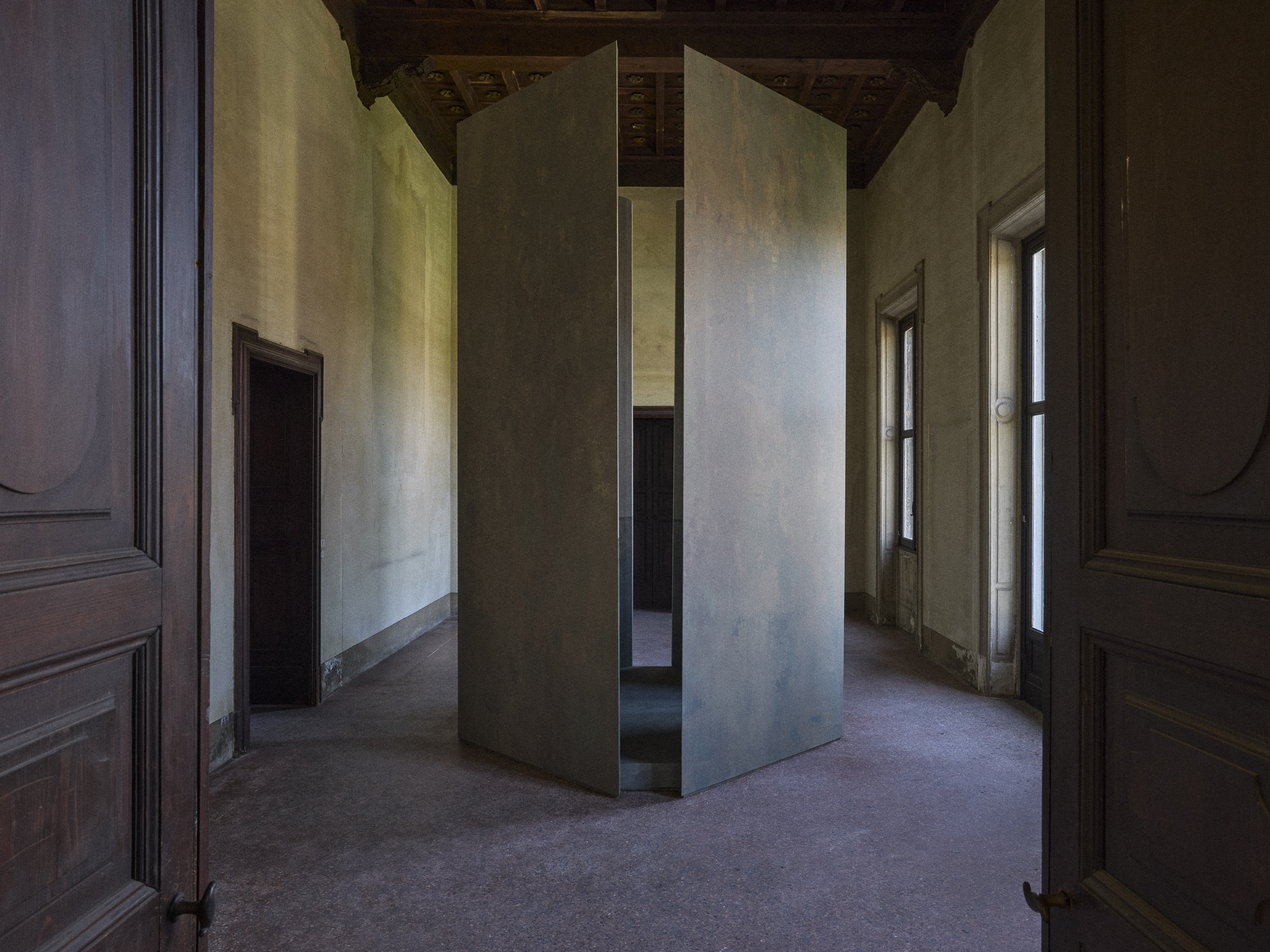
As part of Colin King and Calico's Monument installation at Milan Design Week, an impressive 14 feet tall structure inspired by the works of artist Richard Serra, you can see Perception and Nuance presented together in a historical setting of utmost beauty, like two sides of the same coin.
'Perception was inspired by the textures and layers of paint and plasters, and you can see it on the outside of the structure. Around 8 layers of paint were done and then digitised and printed on wallpaper,' King explains about the intricate development process. 'On the inside of the structure you can see the Nuance collection, with a nice organic midline in two different colors,' he adds.
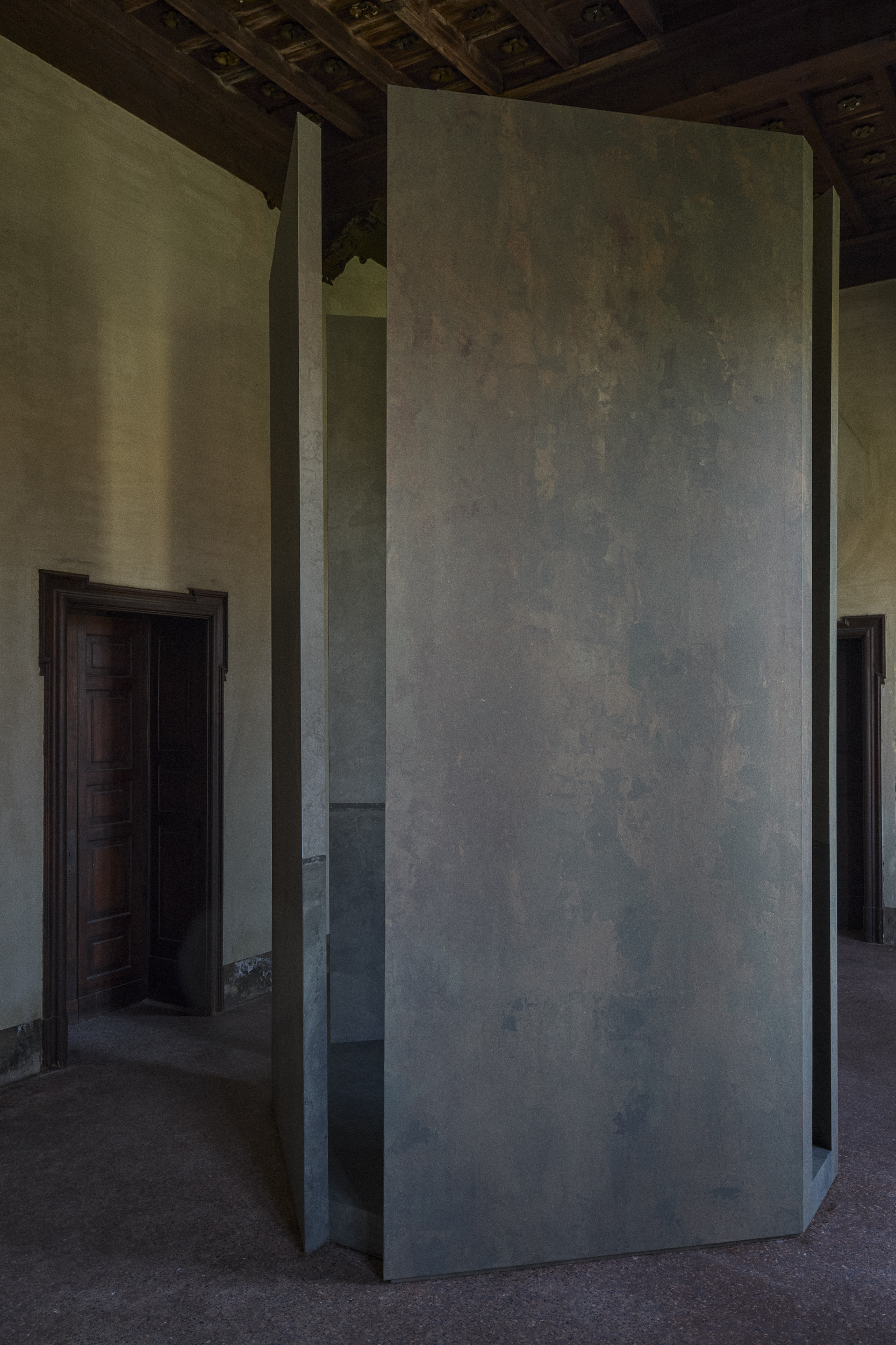
'We weren’t allowed to interfere with the walls, ceiling or floors of this beautiful historic space, so we built this freestanding structure and played with scale to showcase the collection,' adds King. 'I would expect people to pick one of the bolder colorways in a huge living room, or in a hallway or powder room as well,’ advises the stylist.
Discover more Calico Wallpaper collections.


