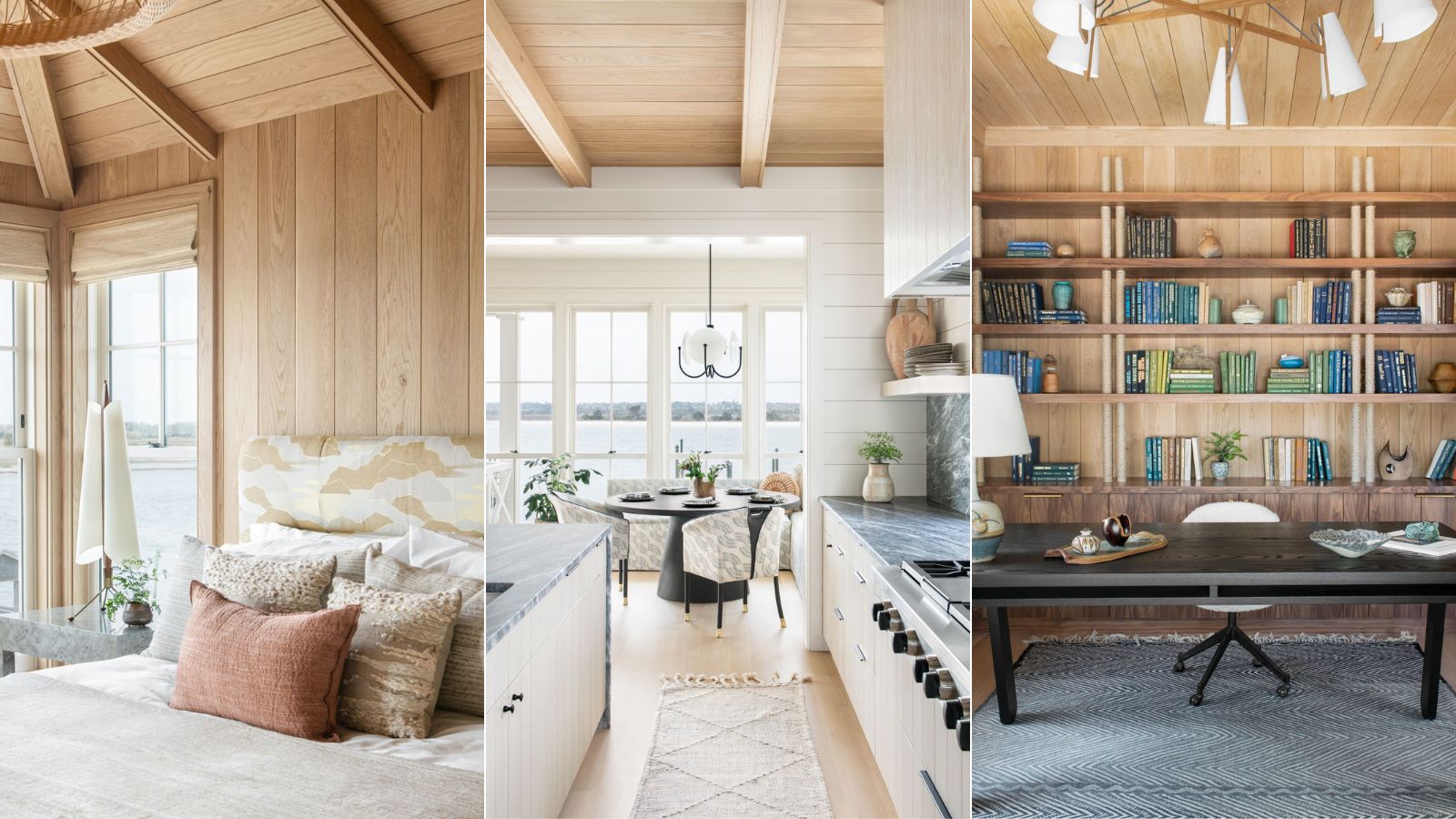
Lindsey and Wes Carter dreamt of building a vacation home for themselves and their young family in the beach town – Wrightsville Beach – where they grew up.
The look? Relaxed, coastal, modern. 'They hoped to achieve a relaxed atmosphere with a touch of sophistication, maintaining an approachable and kid-friendly environment,' says interior designer and Homes & Gardens contributor Cortney Bishop. 'They preferred a foundational palette of black and cream, complemented by subtle pops of color and organic textures.'
The catch? The house has an upside down floorplan.
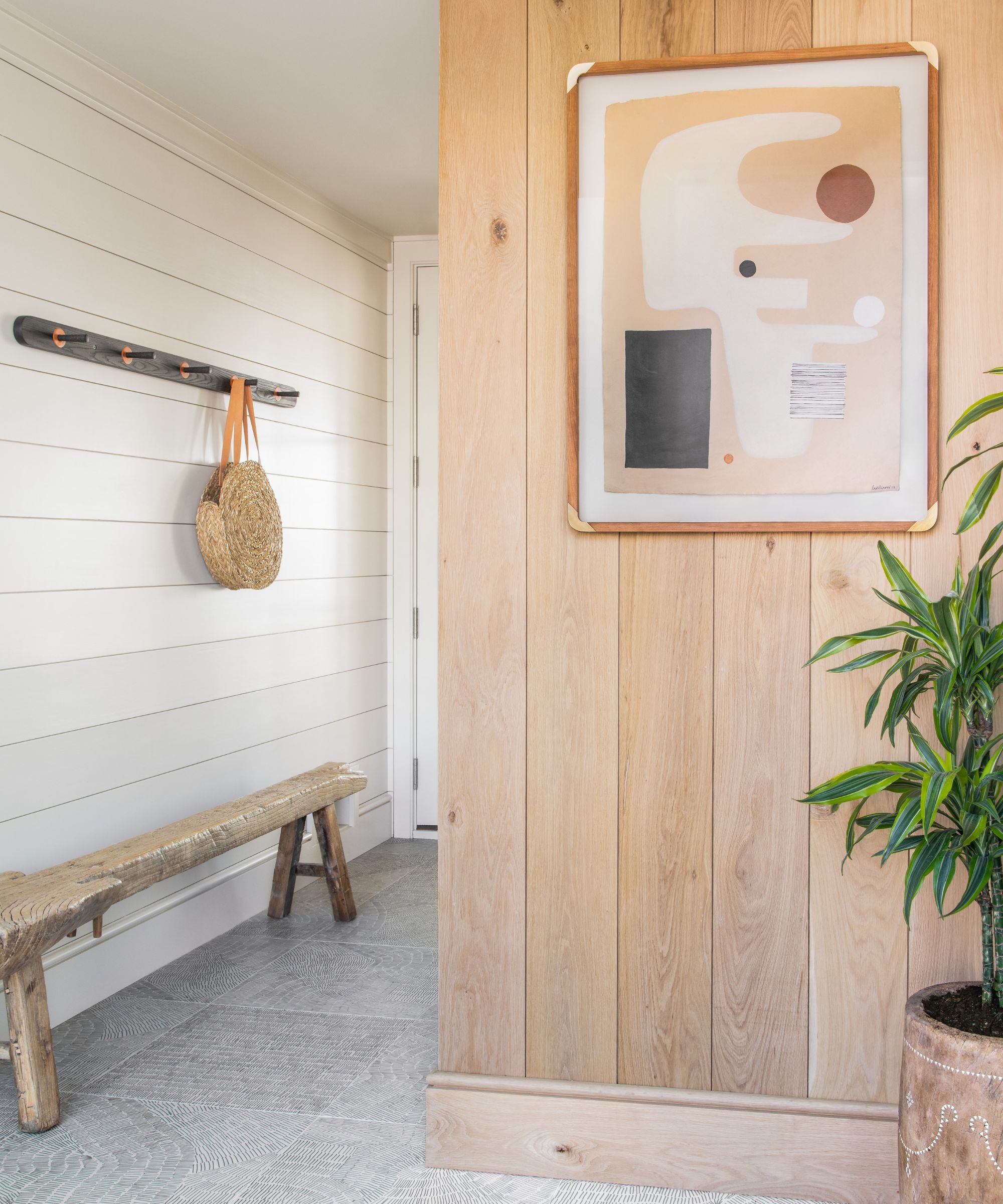
'Due to the narrow lot, we knew we had to work with a three-story reversed floor plan,' continues Cortney.
'The entrance (above) was on the ground floor, with a winding staircase at its center leading up to the kitchen, living area, and bedrooms (below).
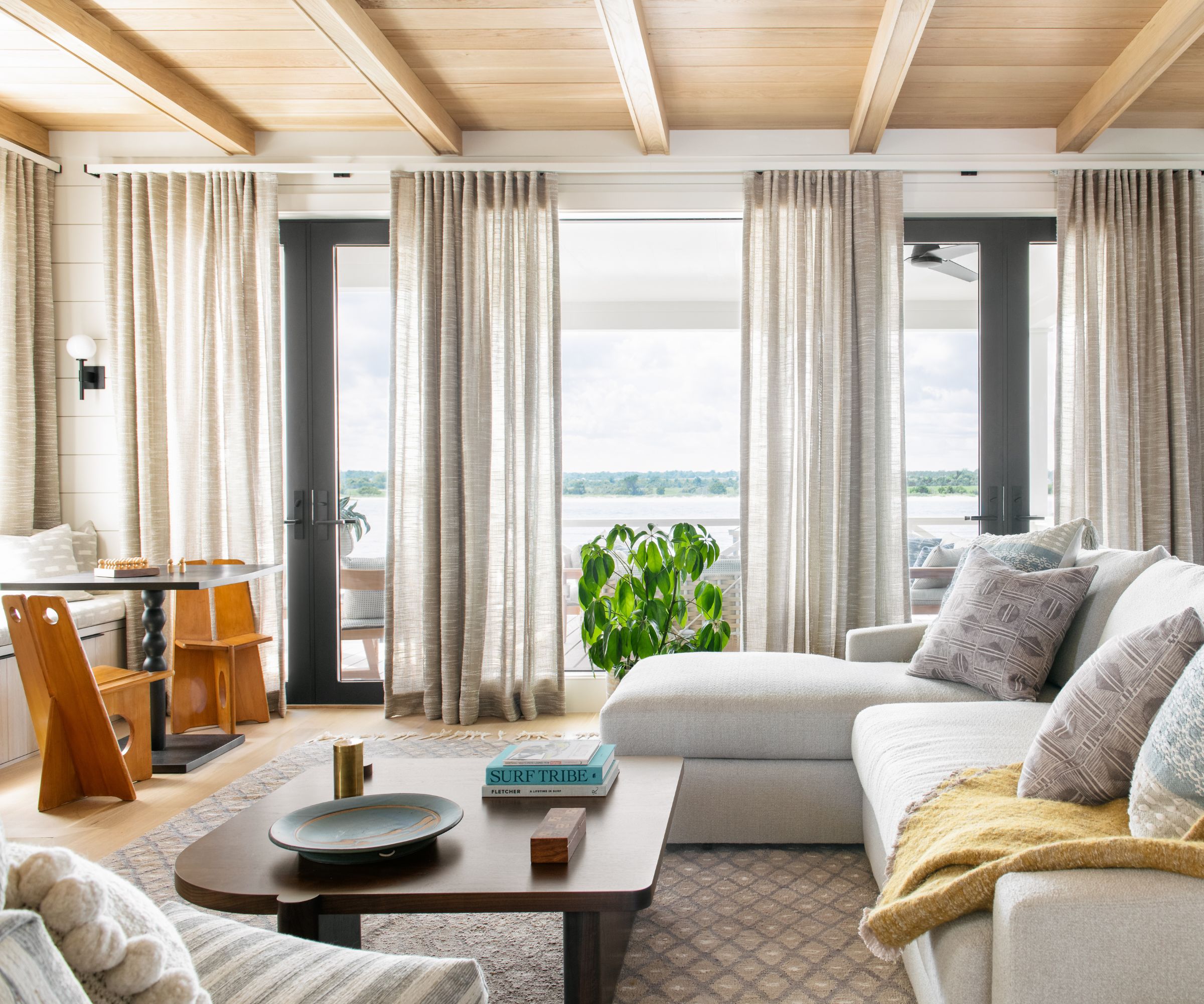
'This type of layout can be tricky to create a clear sense of space and direction upon entry. We were well aware of this challenge and aimed to incorporate visual interest and texture that would guide gracefully and without confusion to the second-floor living spaces.'
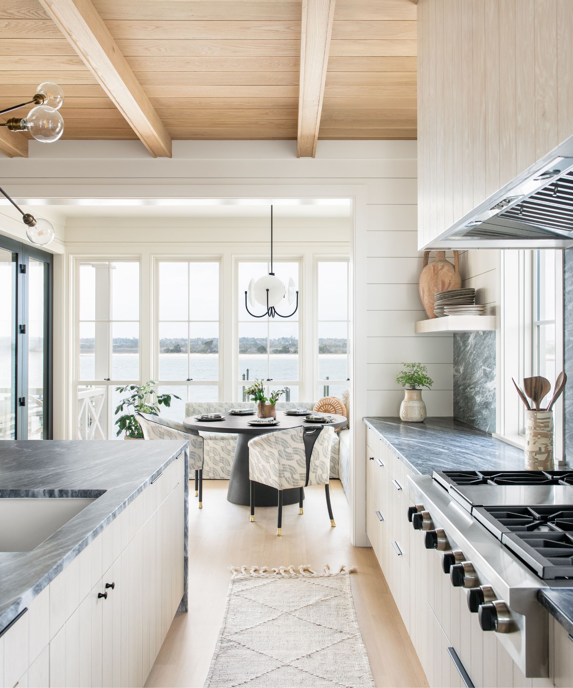
'Our choice of materials and the intentional placement of their directions resulted in a delightful experience that drew you towards the kitchen and living area, where the home felt more connected to its surroundings.'
'We opted for a soft white paint color on the horizontal shiplap along the outer wall of the staircase, complemented by vertical white oak accents on the inside of the stairs. To top it off, we added a brilliant touch – an architect's idea of a glass window from the second floor of the staircase into the living area (above) – all of which eliminated any sense of perplexity.
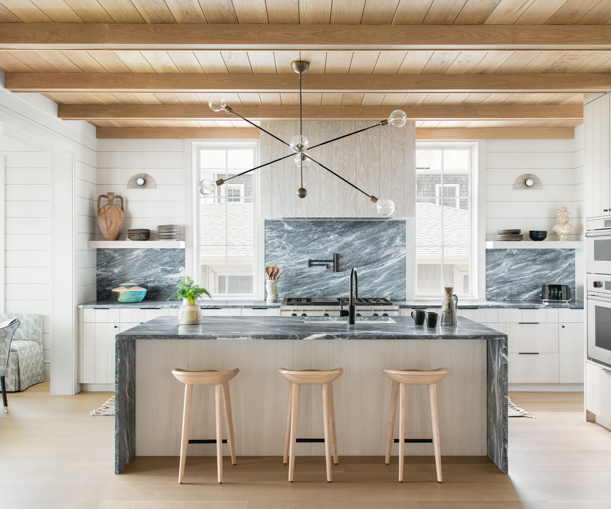
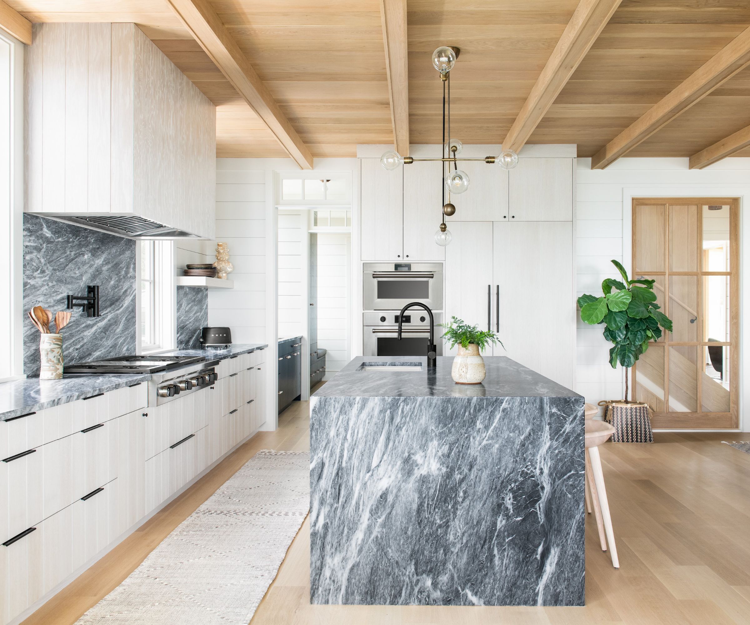
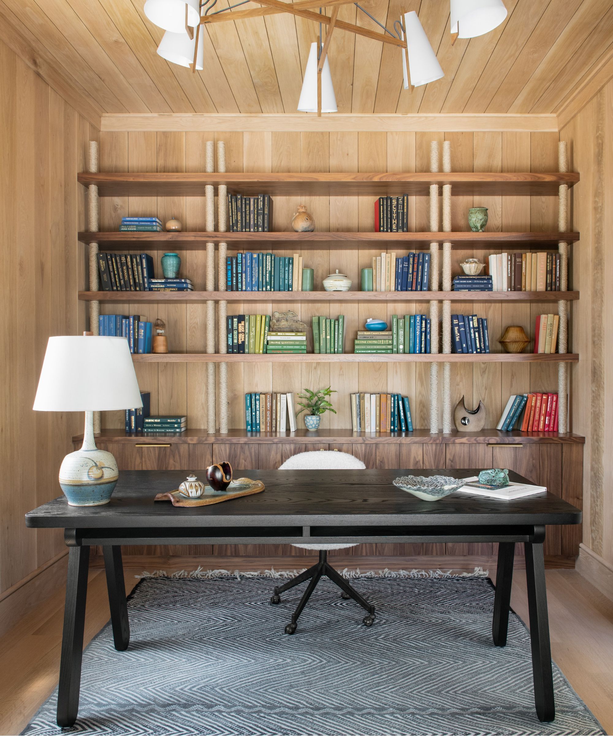
'The kitchen and living space are absolute showstoppers, thanks to the incredible materials we used in the construction. We added so much character to the project with wide plank shiplap running horizontally, complemented by vertical oak accent panels on accent walls and in the office.'
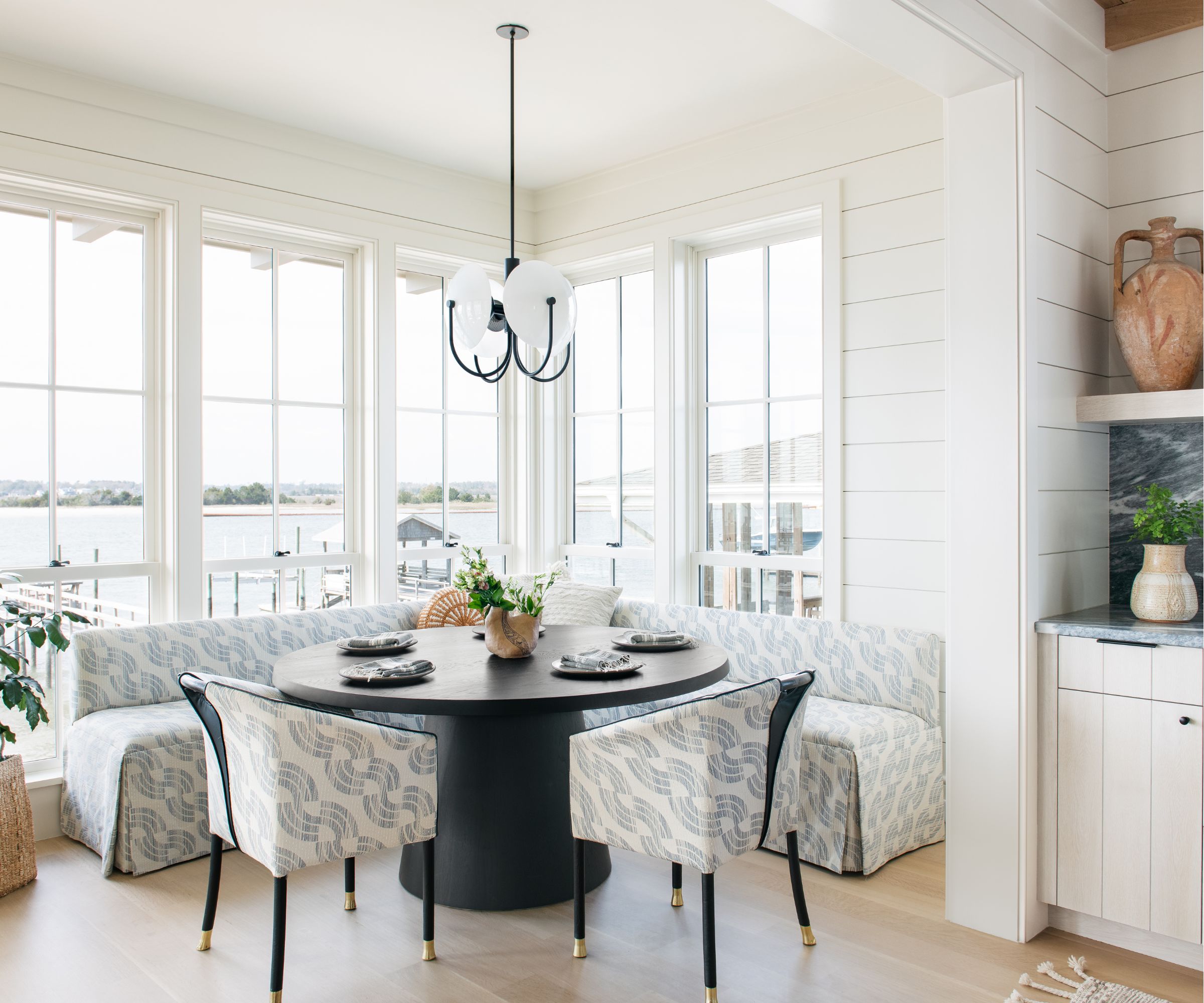
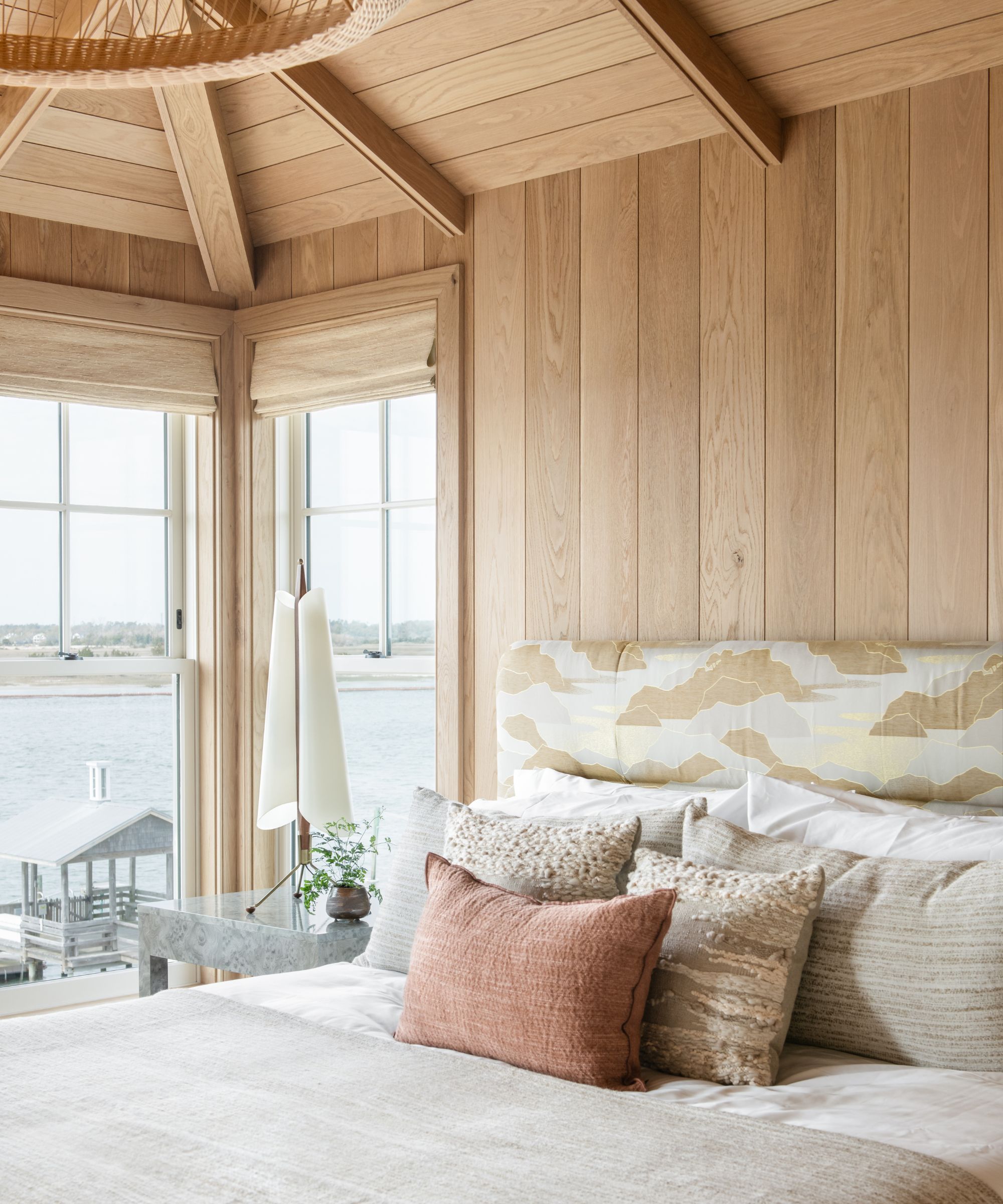
'The bedrooms got a fun touch with wallpapered coverings, while the primary bedroom was wrapped in oak, creating a captivating narrative as you explore the house.'
'In the primary bedroom, vintage lamps added a special touch of character and style,' continues Cortney.
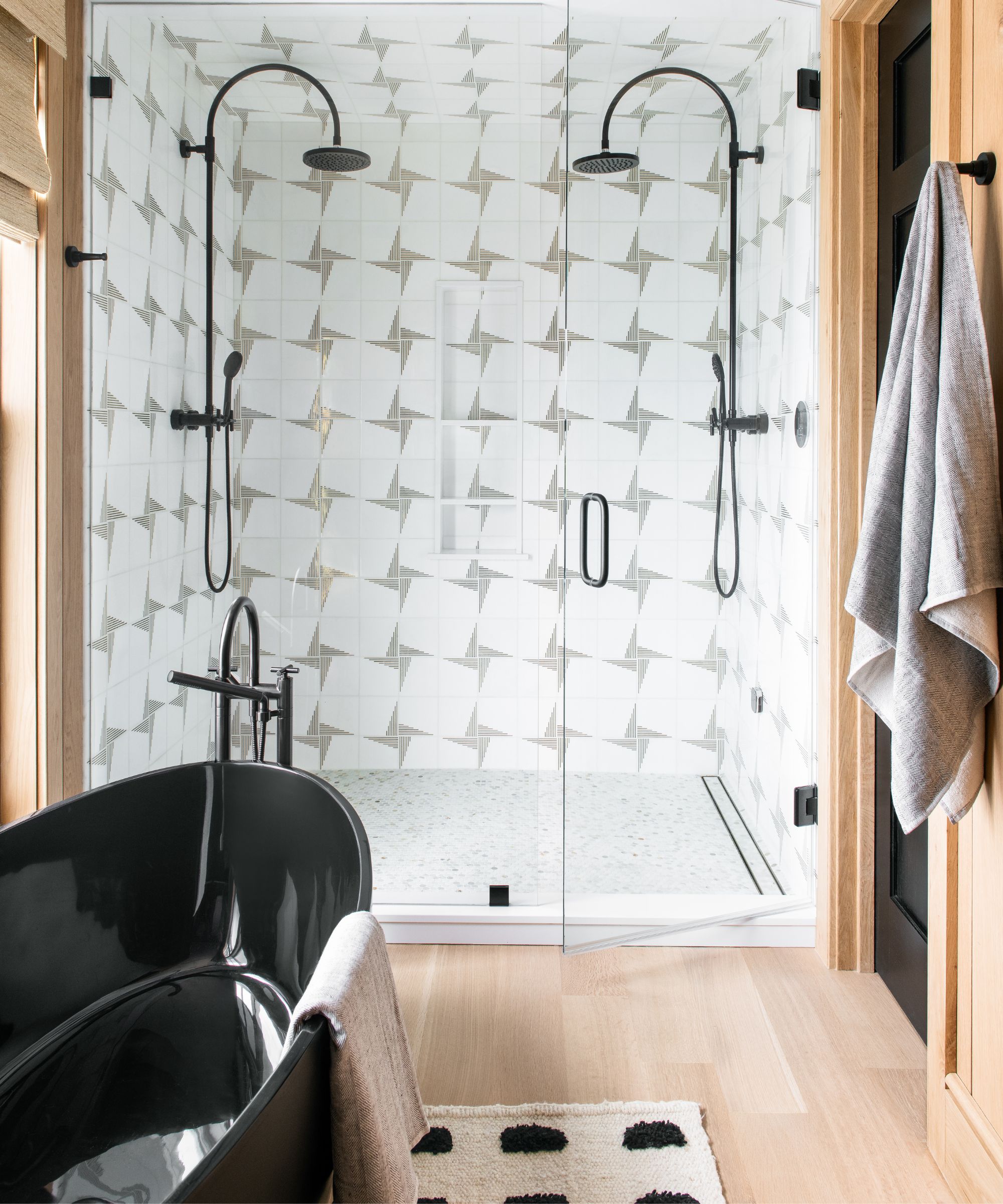
'The space exudes a captivating blend of organic elements and sophistication, with a touch of black elegance carried into the bathroom (below).'
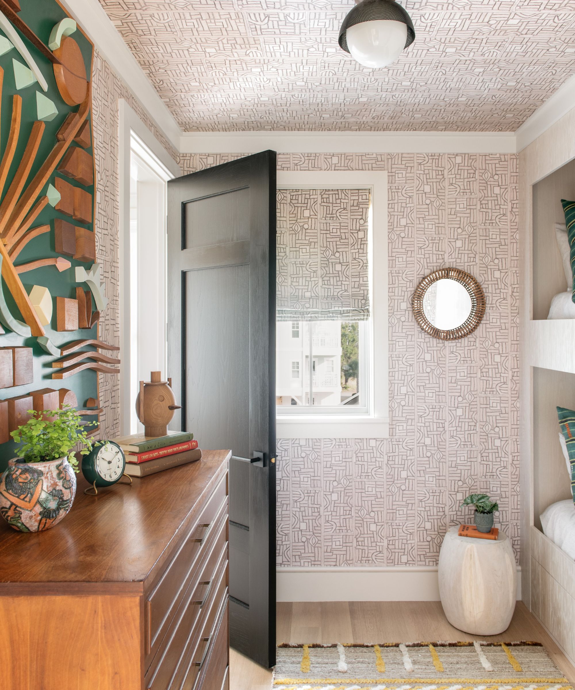
'The boys' room (below) had a fun tribal surf vibe, complete with bunk beds for friends to enjoy. The girls' room had a fresh and fun atmosphere, with matching cabinet accents throughout the house featuring bleached white oak Kerfing.'
From beginning, to concept, to installation, the project took two and a half years.
'I am thrilled with the house!' says Cortney. 'It speaks to both Lindsay and Wes’ characters and personalities – it’s very much a vibe. I believe they were thrilled with the result as well. They were gracious enough to wait for the big reveal which is always so much fun!'
Interior Design / Cortney Bishop Design


