There's no approach to interior design quite as daring as maximalism, but its social media-approved cousin has just arrived on the scene, and it's one of the most fearless crazes to date. Cluttercore — the daughter of Cottagecore — is a bold celebration of our interests and quirks by spotlighting mismatched belongings that fill our homes, and its staunch anti-minimalist stance has divided designers.
When pulled off properly, this "more is more" mentality turns homes into fascinating museum exhibits that tell a different story at every turn. This curated approach to "organized chaos" encourages us to embrace sentimentality and self-expression in a thoughtful, considered way that still looks aesthetically beautiful. It encapsulates the mood of the moment perfectly, giving us a free card to display that trinket or heirloom while mixing different genres and styles together in an alluring interior design soup.
Despite the label holding negative connotations, cluttercore is, in many ways, one of the chicest interior design trends of recent years. It allows us to indulge in pieces that spark nostalgic memories and showcase our personalities throughout our homes but, as you may expect, it's not a trend for everybody.
What is cluttercore?

As the name suggests, cluttercore falls within the camp of maximalism in interior design. It's all about embracing a busy aesthetic that goes heavy on the decor and leaves little room for empty space. Like maximalism, it's also a far cry from minimalism, but it's a more curated, elevated take on your typical maximalist interior.
"Cluttercore is a design trend that embraces and celebrates the accumulation of personal objects and knick-knacks, creating a space that feels lived-in and vibrant," explains interior design Isy Jackson, owner of Cheltenham Interiors. "It's the antithesis of minimalist aesthetics, which focuses on clean lines and open spaces. Instead of curated simplicity, cluttercore invites a sense of organized chaos where items are displayed with intention but in abundance."
How does it differ from maximalism, then? Well, the thought process behind a curated cluttercore aesthetic is more considered and intentional, as alluded to by Isy. The result is a home that's full of unique character and charm where everything within it looks like it's been put there for a reason (even if there's a lot that draws the eye). "It speaks to spaces that are realistic and perhaps a little rough around the edges, the sorts of spaces celebrated in the iconic world of interiors," says Isy.

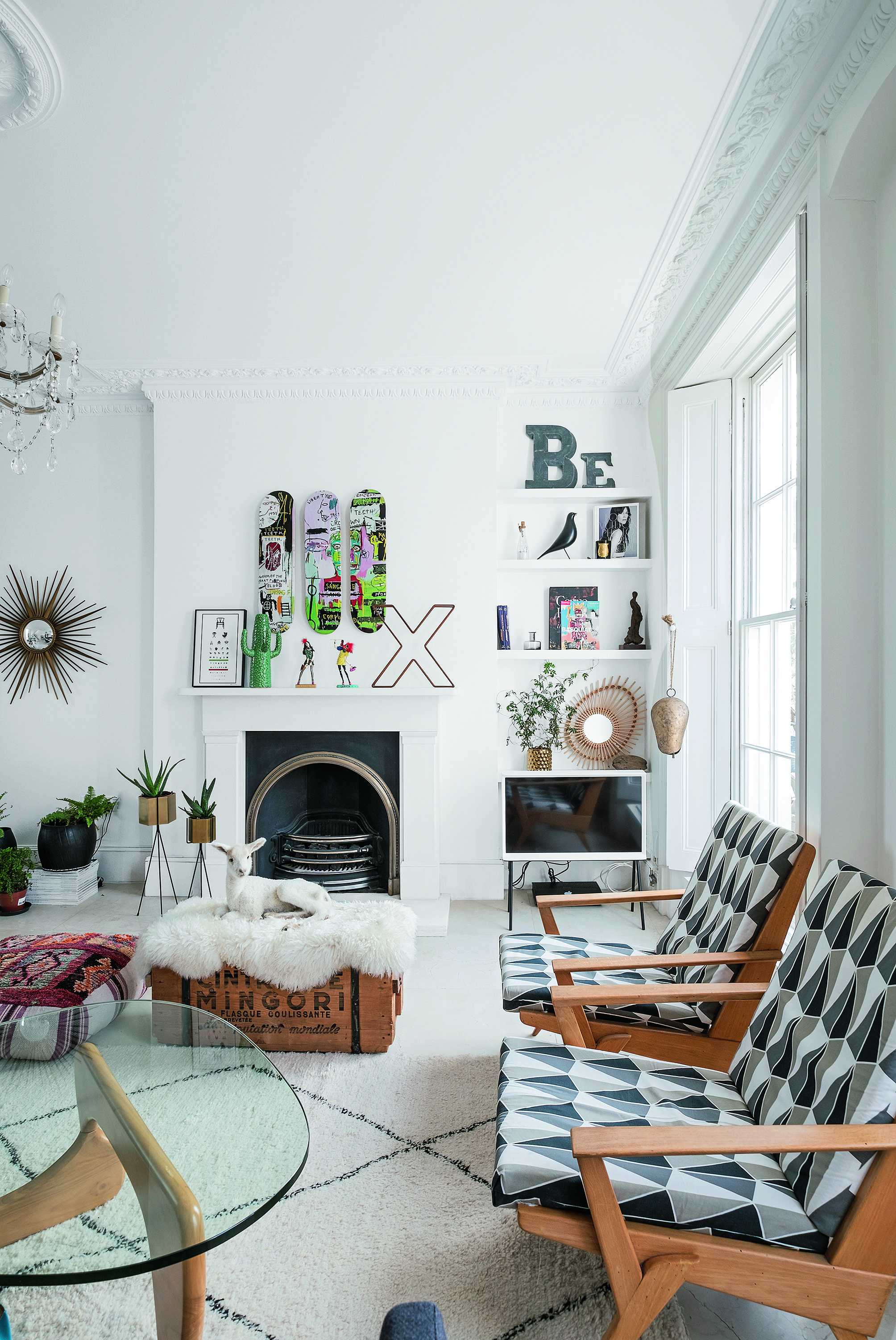
This eclectic style first came to the fore on TikTok during the pandemic. You can think of it as Gen Z's answer to maximalism, borrowing on the whimsical and characterful details of cottagecore such as vintage gallery walls and decorative open shelving but with a slightly more elevated approach. "After the pandemic, where people were stuck indoors, they have found their home needed meaning," Isy says. "Cluttercore is a rebellion against the boring beige and emotionless neutrals of prior years."
Why is cluttercore so divisive?

Many designers — and typically those that are higher end — have strong opinions when it comes to a busy aesthetic like cluttercore. You don't need to be a minimalist to understand the "less is more" ethos. A less crowded interior offers standout pieces of furniture or decor a chance to really sing without becoming "lost" among surrounding decor that competes at drawing the eye.
That said, it's more than possible to get playful with cluttercore without sacrificing style — especially if we're following Michelle Nussbaumer's lead. The Dallas-based interior designer epitomizes the trend in all its glory by filling her kaleidoscopic home with unique decor and trinkets that exhibit her passions, without tainting her interior aesthetic.
The designer describes this audacious cocktail of style as "old-world elegance with a touch of the exotic". "My goal is to create eye-filling, eccentric, beautiful assemblages — a merging of the precious and the playful," she says — and we're rushing to mirror its ambiance throughout our home.
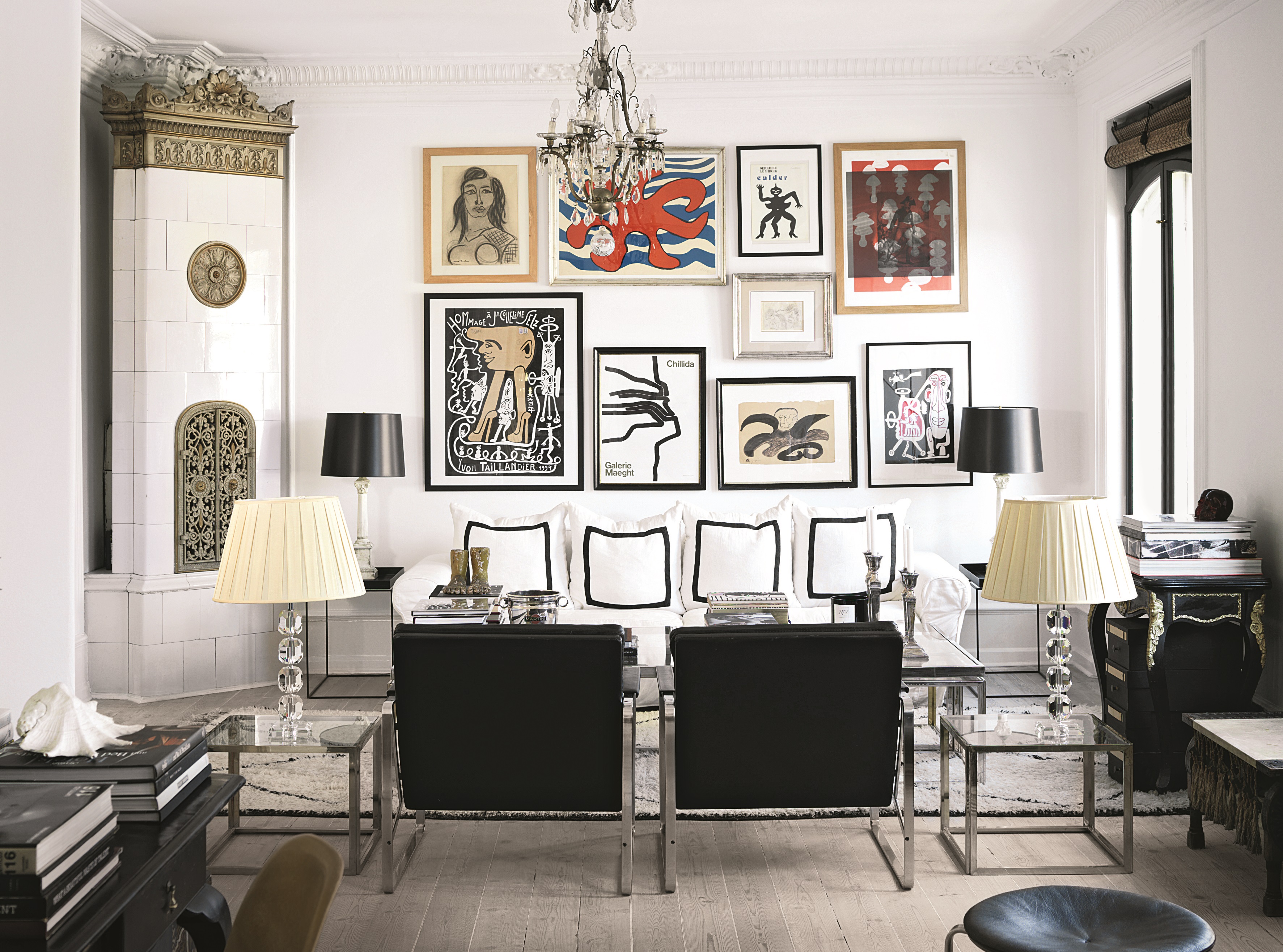
Just take gallery wall ideas, for example. A painting or print can have a huge impact on its own, but a carefully curated selection can have an even bigger impact without detracting from that first piece of wall art, especially when the style, frames, and color palettes all vary.
Esteemed British designer Matthew Williamson encourages us to mismatch our interior accessories in this way, urging us to indulge in "beautiful things," including antiques and vintage pieces. "I'm a firm believer that interior design is a life-long process," he says. "It's about the journey and the thrill of finding something you love and that never has to stop because you feel your home is done once the pictures are hung, and you've chosen your furniture."
But cluttercore isn't for everyone, and that includes the designer duo at Ophelia Blake, who are less convinced by the craze, despite their admiration for maximalism. "At first glance, maximalism design can be seen to encourage 'cluttering of objects' as its over-the-top style can be too much for some people," shares co-founder Scarlett Blake. "It's far from this; the strong color palettes, repetition, intricate detailing, and thorough choice of décor items ensure that every detail in this trend has been carefully selected." She claims that cluttercore, on the other hand, is more "randomly selected, which can become unappealing to the eye and appear messy."
How should you decorate with cluttercore?

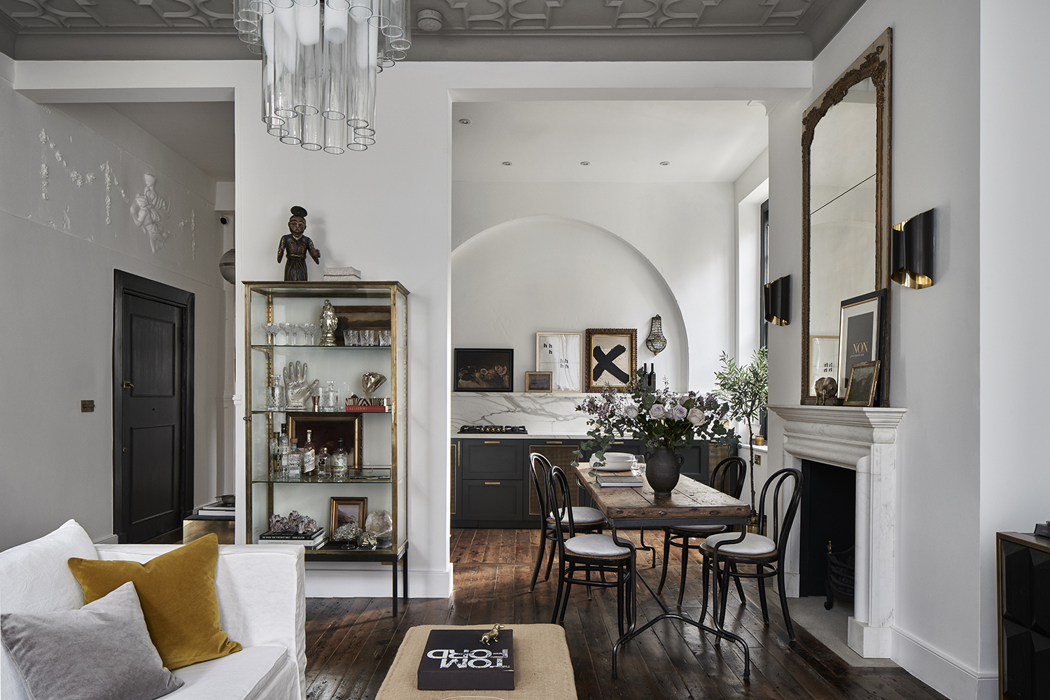
If you want to embrace the cluttercore trend in a way that still makes for a harmonious, cohesive interior, Isy encourages us to think about "collections". "Instead of random accumulations, curate your items into cohesive collections based on colour, theme, or era," she says. "This approach allows you to showcase your personality while maintaining a sense of purpose and unity." When displaying these items, she also recommends using dedicated shelves, cabinets, or display cases to organize your items.
It's also important to remember that negative space isn't your enemy, even if you prefer to embrace this busy design style. "Layer items on surfaces like coffee tables and mantels but balance them with negative space," Isy urges. "Use different heights and groupings to create visual interest without cluttering the eye and opt for items that are both decorative and functional. For example, stylish storage boxes or elegant baskets can organize miscellaneous items whilst adding to the aesthetic."
Finally, commit to regular reviews and remember to declutter the items that no longer serve you. "While cluttercore celebrates abundance, a well-edited space remains appealing and functional," Isy adds. "Approach it as if you are a photographer or stylist and, if in doubt, take it out." No one is exempt from auditing their belongings, and there are plenty of tricks on decluttering if you're a maximalist if you prefer to go heavy on your decor.
So, are you ready to embrace the curated and creative appeal of cluttercore, or do you prefer a more pared-back style? We wait with bated breath to see what's next to emerge from social media, but in the meantime, we'll be admiring these characterful cluttercore interiors (even if it's only from afar).


