Remember the BlackBerry? In middle school, only the coolest kids had access to one and everyone else wanted to know what people were talking about on BlackBerry Messenger (BBM). There was even a period where iPhone users felt left out, dreaming of a world where BBM was available on iOS. Then things changed, the iPhone took over and iMessage became the go-to messaging service — BlackBerry was left in the dust and just like Jessie in Toy Story 2 thrown away to the tune of “When She Loved Me” by Sarah McLachlan.
Fast forward to 2024, and over 58% of the US smartphone market is dominated by iPhone according to Statcounter. BlackBerry, on the other hand, is now defunct with the last device to sport the name released in 2018: The BlackBerry Key2.
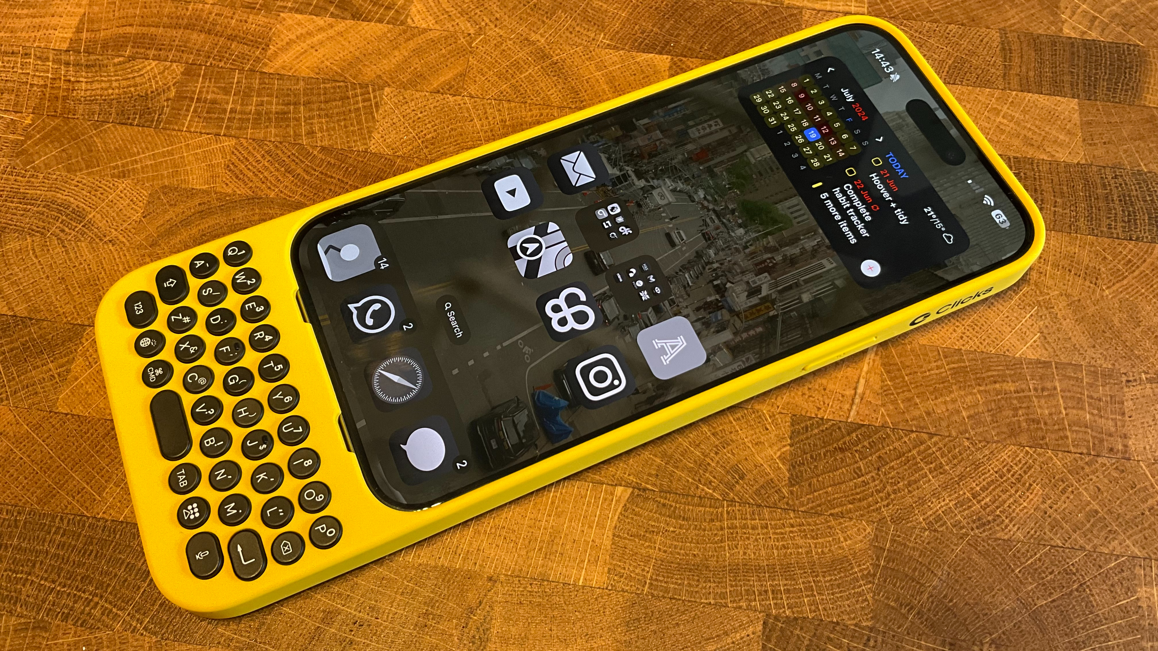
But why am I talking about BlackBerry? Enter Clicks, a case for iPhone with a BlackBerryesque keyboard attached. I’ve been using the Clicks keyboard for my iPhone 15 Pro Max over the last few weeks and while it hasn’t clicked with me it might click for you.
Clicks for iPhone

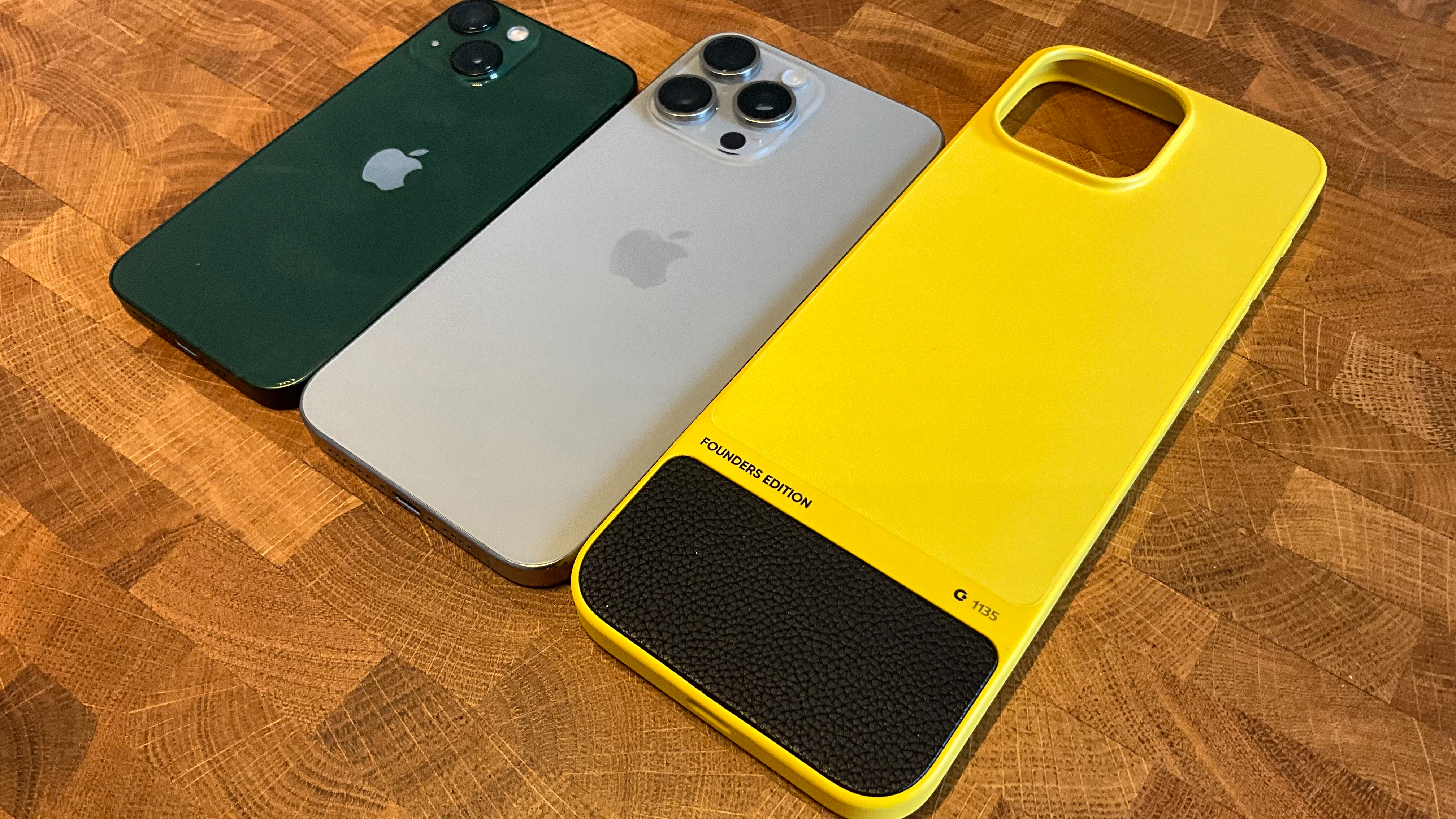
If you’ve read any of my articles in the past you may have heard that I’m a huge fan of the color yellow. When Michael Fisher (MrMobile on YouTube) revealed his passion project that hoped to bring back the heyday of physical keyboards on smartphones, my first thought was “I need that black and yellow iPhone case.” In the midst of my excitement for yellow, I overlooked the form factor of the product itself. There’s no beating around the bush, Clicks for iPhone 15 Pro Max is long and I mean looooong. It adds about 25% extra length to the iPhone 15 Pro Max, completely changing the weight balance of an already huge device. At first, I found the weight distribution all wrong, if you don’t hold the case exactly as advertised it’s like a seesaw in your hand. After using the case for a few weeks, I definitely got used to the imbalance but it never felt comfortable to use.
I never really adjusted to the new form factor of my iPhone, I’ll go into detail about the keyboard itself a little later because that aspect of the case is genuinely great. As a whole, however, using Clicks never stopped feeling like a chore and it pains me to say that considering how cool it is to have an extra 50% screen for my favorite apps.
The case is a hard shell with soft silicone covering the iPhone’s buttons on both sides. The keyboard connects via USB-C and while the keys are lovely to type on I can’t help but feel like Clicks should put some weight inside to try and counter-balance the top-heavy smartphone above it. There’s USB-C charging passthrough too so if you want to you can use Clicks indefinitely without removing the case.
Clicks for iPhone 15 Pro Max retails for $159 which is a price point that turns me off this fun gimmick. If there was a way to make the Clicks keyboard work with future models the price would feel more justified but considering a lot of people like to switch up their device every year this feels like an extortionate price for a case without MagSafe.
I’ve spoken in the past about hand cramps and how much I hate using uncomfortable tech. Well, it’s safe to say Clicks had my hands cramping continuously and after using the keyboard case on my iPhone for around 10 days I had to give up. It just never seemed to click for me (I know I’ve used this pun already in the intro) and ultimately I don’t feel like this product can be recommended to any iPhone 15 Pro Max user unless they’ve been having BlackBerry withdrawal symptoms for the last decade (in which case I say get with the times).
Another aspect I need to flag is the fact that we’ve evolved away from tiny keys and iOS 18 is just not made for a physical keyboard. Even after using Clicks relentlessly and refusing to give up, I found that it never felt natural like my iPhone’s on-screen keyboard. I tried so hard to like this product, but there’s just no way I could see myself using it long-term.
I do see a future for Clicks on iPhone

Now, I’ve been pretty scathing with my experience so far but there are positives here. For starters, I love niche technology like this and there will 100% be people out there who fall in love with Clicks for iPhone. Writing an email with a full-screen experience rules, as does using notetaking apps. The keyboard is also very similar to the experience we once had on BlackBerry, it feels as nice to type on as the now discontinued smartphone of every suit from 2004.
For me, the main issue with Clicks is the size of the biggest iPhone out there. It’s just cumbersome and absolutely exhausting to use a large case on an already large smartphone. Clicks doesn’t make a keyboard case for the iPhone 13 mini but if they did I could see a real future for the product. I own an iPhone 13 mini and side by side combined with Clicks, the device would be the size of a 15 Pro Max — in other words, ideal.
Combine a smaller form factor with Clicks’ endless shortcut customization allowing you to launch apps with the tap of a key or run automations whenever you want at the press of a button and Clicks starts to make sense. Instead, the version I’ve tried just doesn’t feel right with the modern 6.7-inch smartphone, and with rumors that Apple is set to make the iPhone 16 Pro models even larger, Clicks for iPhone is set for an even bigger identity crisis in the near future.


