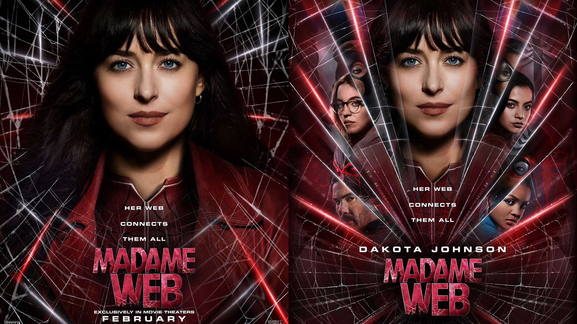
Sony has released two official posters for the upcoming Madame Web movie and to put it lightly, fans are a little disappointed. After the official trailer was met with a generally negative consensus, it looked like Sony had some making up to do, but since the poster's release, the scathing reviews have only intensified.
From the dull colour palette to the cringey tagline, the poster certainly isn't reinstating any faith in the fandom. The best print ads show us that design doesn't have to be maximalist to be effective, but with Marvel movie posters getting increasingly formulaic, it seems that we're due a much-needed refresh.

At a glance, Madame Web's poster continues the cardinal design sin of Marvel's 'floating head' trend, which has quickly become outdated and oversaturated. Fans were quick to call the poster lazy and "cheap", with some going so far as to say it looked "fan made" and even "high school graphic arts level."
Others criticised the images on the poster, saying that leading lady (and central floating head) Dakota Johnson looked particularly vacant and "apathetic". With the comic depiction of Madame Web being a more mature woman, Johnson has already been criticised as a miscast and her characterless expression gives little hope that she might defy expectations in the role.
This looks like a terrible fan made posterDecember 12, 2023
What a terrible poster, high school graphic arts level 😒December 12, 2023
The overall design is underwhelming, and at best entirely forgettable. The dark colour scheme with dashes of neon red could have been utilised in a more thoughtful and stylised way, but in its current state gives the poster a muddied effect. Paired with the spider web design, the poster takes on a messy and fragmented feel that is ornamental but lacks substance.
It's disappointing that Marvel has chosen to stick to convention yet again in its poster design. With recent popular releases like 'Across the Spider-Verse' proving that there's still a demand for stylised design, I hope that the curse of floating heads will finally be put to rest soon.
"her web connects them all" did AI made this ?December 12, 2023
why did they use such an apathetic image of Dakota Johnson 💀 she looks like she's getting her drivers license photo taken lol https://t.co/J3Xav5FcfyDecember 12, 2023
Believe it or not, there are still beautiful movie posters, like these delightfully minimalist posters that are fiendishly cryptic.


