The trade group that puts on CES has long faced a publicity problem — its own convention has overshadowed it. That may change this week.
In the world of consumer tech, everybody knows about CES. It’s the convention, now held each January in Las Vegas, where the latest laptops, TVs, artificial intelligence-powered wearables, B2B tech, and myriad other gadgets debut to curious members of the tech industry, the gathered media, and the public.
Even as the biggest names in tech — Google, Samsung, Apple — hold their own branded events to debut their products and services, CES is a giant.
And it's arguably more important to throngs of tech companies and consumers than Craig Federighi introducing a new Apple product between jokes about his salt-and-pepper coif.
In 2024, 138,000 people attended CES in person. Before the pandemic, more than 170,000 would swirl around various locations throughout Vegas. Celebs show up randomly, sending organizers scrambling. Dozens of new laptops debut. It's still a tech cornucopia.

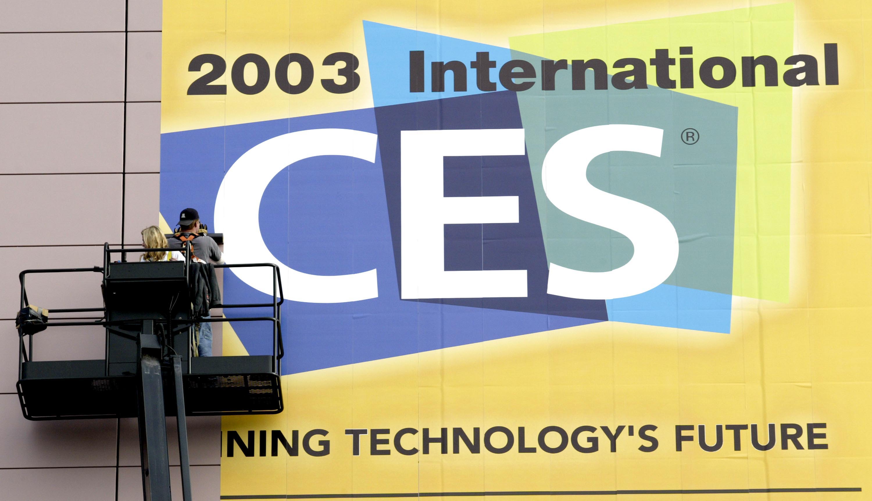
On late Tuesday night, the Consumer Technology Association, a trade organization representing the US tech industry that puts on CES, unveiled on its website a new logo for itself and CES (which formerly stood for “Consumer Electronics Show” but now goes by just the acronym). It's part of a larger rebrand to put the CTA under the spotlight nearly as much as CES.
“Everyone knows CES. Fewer people know that CTA is the organization behind CES."
CTA President Kinsey Fabrizio
Crucially, the new logo — which you can see below — pairs “CES” with “Powered by The Consumer Technology Association,” the first time the CTA has been mentioned anywhere near the CES logo.
The old logo — which dates back more than 40 years — was omnipresent for decades at the convention and in all materials online, on badges, on signage, on everything.
When CES 2025 kicks off in January, the old logo will be replaced with this new visual and, maybe just as importantly for the future of the CTA, a new story the Washington, D.C.-based group will tell about itself as it enters its second century of existence.
According to the group's own data, it represents the "$505 billion U.S. consumer technology industry, which supports more than 18 million U.S. jobs." It also has a lobbying arm that supports "the innovation economy and [fights] laws and rules that delay, restrict or ban the development of consumer technologies."
Kinsey Fabrizio, promoted to president of the CTA in February and serving under CTA’s long-running leader CEO Gary Shapiro, tells Laptop Mag that strengthening the connection between CTA and CES was critical for the trade group.
“Everyone knows CES,” Fabrizio tells Laptop. “Fewer people know that CTA is the organization behind CES, but it's so important that the relationship between the two is understood. CTA represents the entire tech industry, and what we do for the industry stems from what we learn and what we see at CES.
"CES is a look into the future.”
Melissa Harrison, Vice President of Marketing and Communications for CTA, confirmed to Laptop that the organization marked its 100th birthday on April 16, 2024. The anniversary partially spurred the CES rebrand, which had been in the works since before the 2024 convention got underway.


The logo also features something new: A parallelogram resembling a laptop monitor intersects with a sphere resembling a globe, creating a triptych.

Nate Dwyer, Head of Strategy for North America at Triptk, a global branding agency with offices in New York, explains to Laptop the thinking behind the mark, a new addition to the logo.
“The logo represents the role that CTA plays in the world, facilitating that connection between technology and humanity,” Dwyer said in an interview this week.
“When we brought it to [CTA CEO Gary Shapiro], he said, ‘You know, the specific intersection that we represent is technology and humanity,’ and that's when the lightbulb went off."
"It ticks all the boxes of good logo design."
James Barnard, a logo designer and educator who is unaffiliated with the rebrand.
With this new visual addition to the CES logo and brand, you might wonder if the famous acronym “CES” is disappearing. Fabrizio says that’s unlikely.
“Whenever I go anywhere, and anyone sees those three letters, CES, I get somebody who knows the show who wants to talk about it,” Fabrizio says, adding that “internationally, the letters are important,” noting that a lot of people in Europe are accustomed to calling CES “sess,” using the phonetic pronunciation.
While the public has yet to weigh in on this new logo, which replaces one that might be older than many CES attendees, it has pleased at least one design thought leader so far.
James Barnard, a logo designer and educator with 543,000 followers on his design-focused Instagram account, was largely positive about the images Laptop Mag shared with him.
"It ticks all the boxes of good logo design,” Barnard tells Laptop over email. “Over time, people will come to recognize this symbol as the brand, and it provides more versatility.”
Barnard wasn’t without a critique, though, as you might expect from any designer: “That being said, at first glance, the new design loses a bit of... personality, doesn't it? It's definitely more corporate, and maybe that's what they were going for."
More corporate or not, it’s clear that CTA is more closely associated with CES on the new logo, and we’ll be seeing a lot of it in January and beyond.
It could outlive its aged predecessor and last longer than 40 years.


