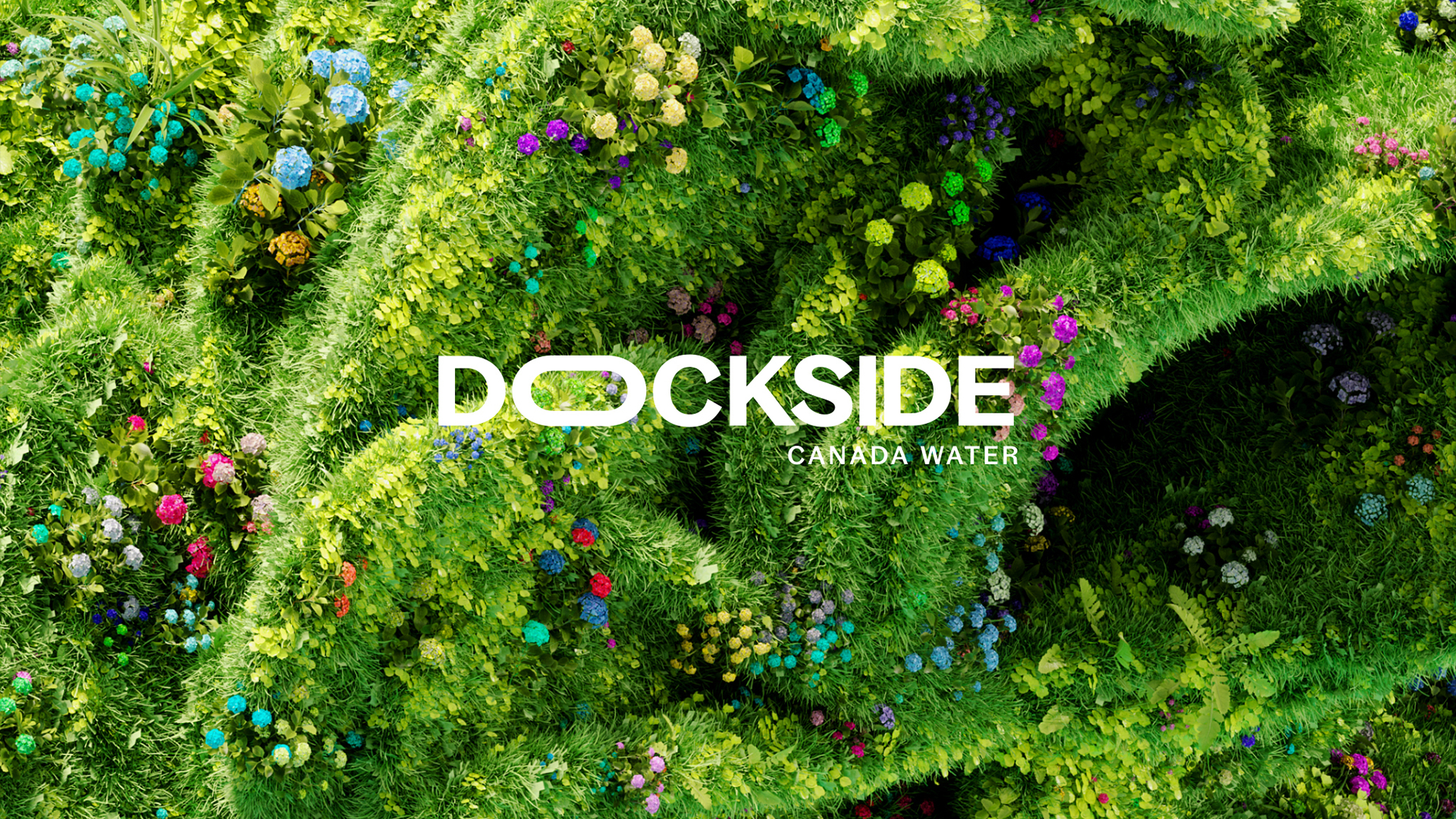
Canada Water Dockside has unveiled a stunning feast for the eyes in the form of its brand new visual identity. As one of London's newest districts, Dockside's refreshing design embodies a sense of optimism and playfulness, combining stunning organic visuals with sleek and contemporary iconography.
Design trends are constantly in flux, but Dockside's visual identity expertly captures the creative climate of London's latest generation. With nature at its core, the design is not only a visualisation of Dockside's current contemporary status, but an illustration of its future – flexible, diverse and bursting with life.

Created by design agency SomeOne, Dockside's stylish new identity focuses on the concept of flourishing. Collaborating with 3D designer Liam Pitchford SomeOne created a "Botanical Playground" of Wild, Architectonic and Liquid Botanics. Each represents an element of Dockside's diverse offerings from the 5.2 acres of green space to the dock's waterside and abundant wildlife.
A sleek and fluid logotype accompanies the Botanical Playground, adapting to Dockside's evolving identity. With a characterful functionality, Bagoss by Displaay Type Foundry was a perfect fit, providing a graphic and modern look that's adaptable and bold against the natural imagery.
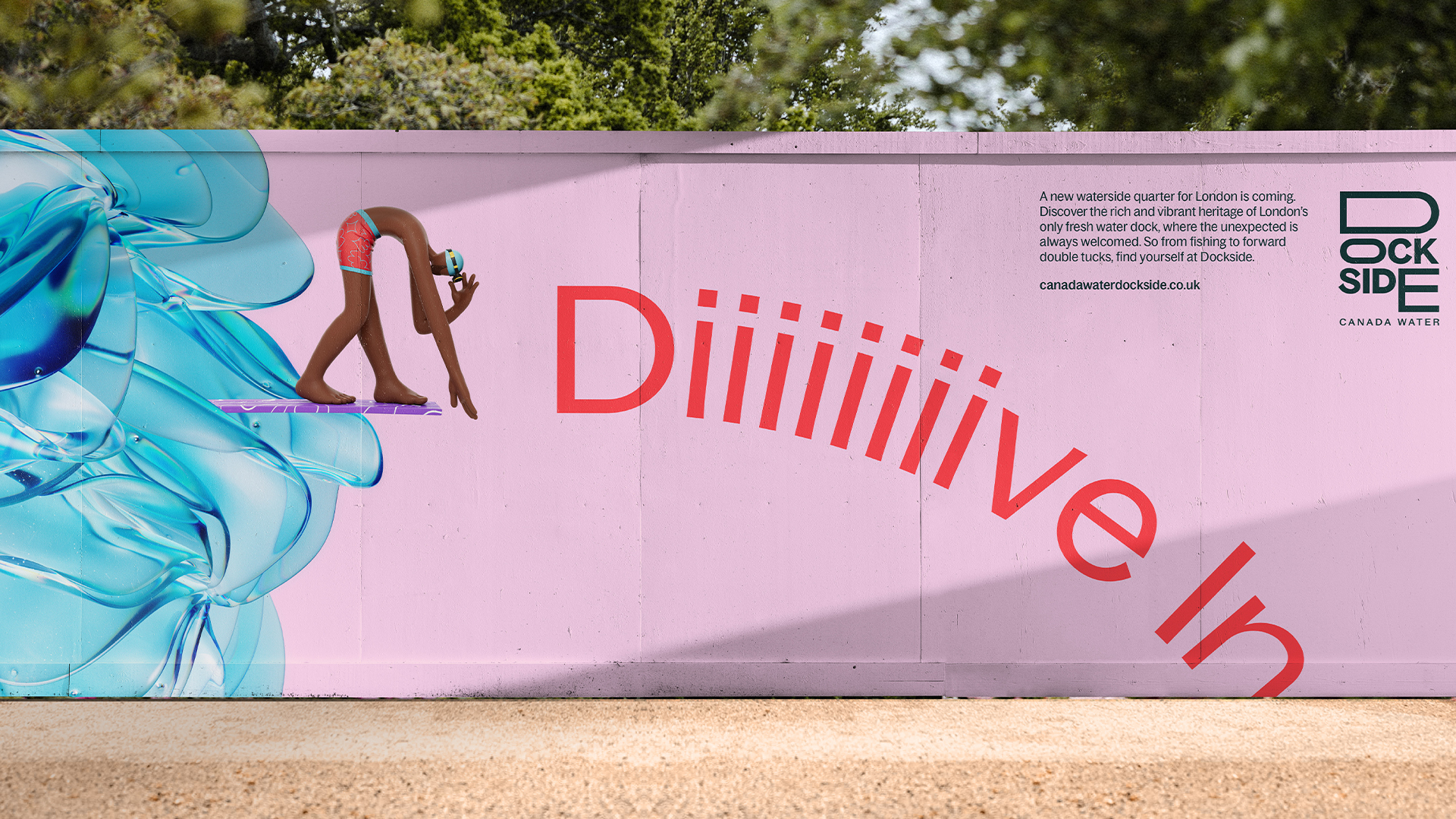


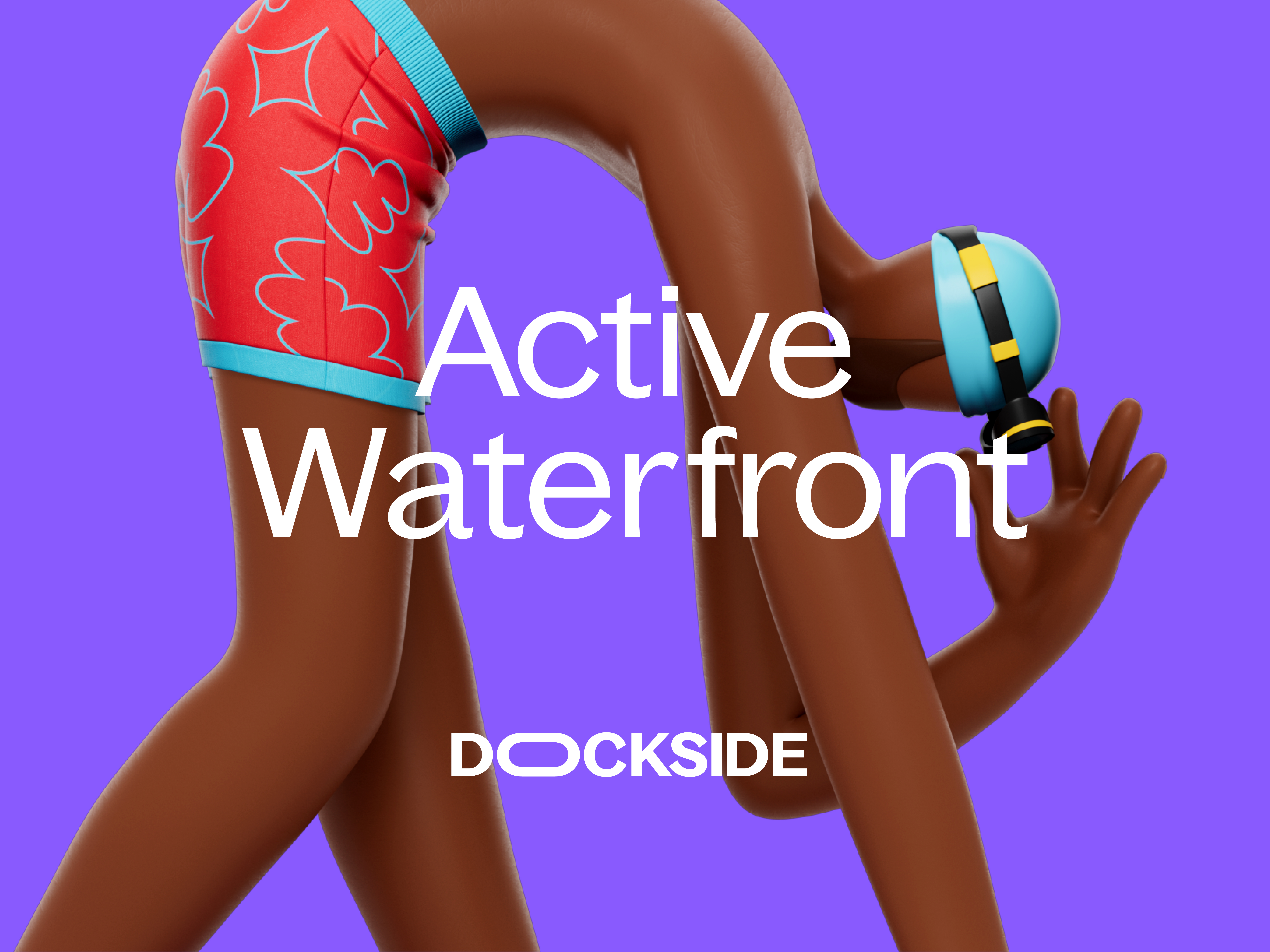
An important ethos that surrounded the project was the statement "Find yourself at Canada Water Dockside" – a notion that embraces diversity and individuality. Adding a delightfully playful element to the new identity is a series of mascots created in collaboration with Arcade Studio. The funky 3D models add a layer of personality to the project, creating a sense of community and diverse spirit.
"The variety of visual assets keep things lively and surprising," SomeOne founder Simon Manchipp tells Creative Bloq. "The idiosyncratic 'feature mascots' that look to highlight the many unusual aspects of the site. The shape shifting wordmark. They all work independently and in combination to create a branded experience that never feels repetitive," he adds.


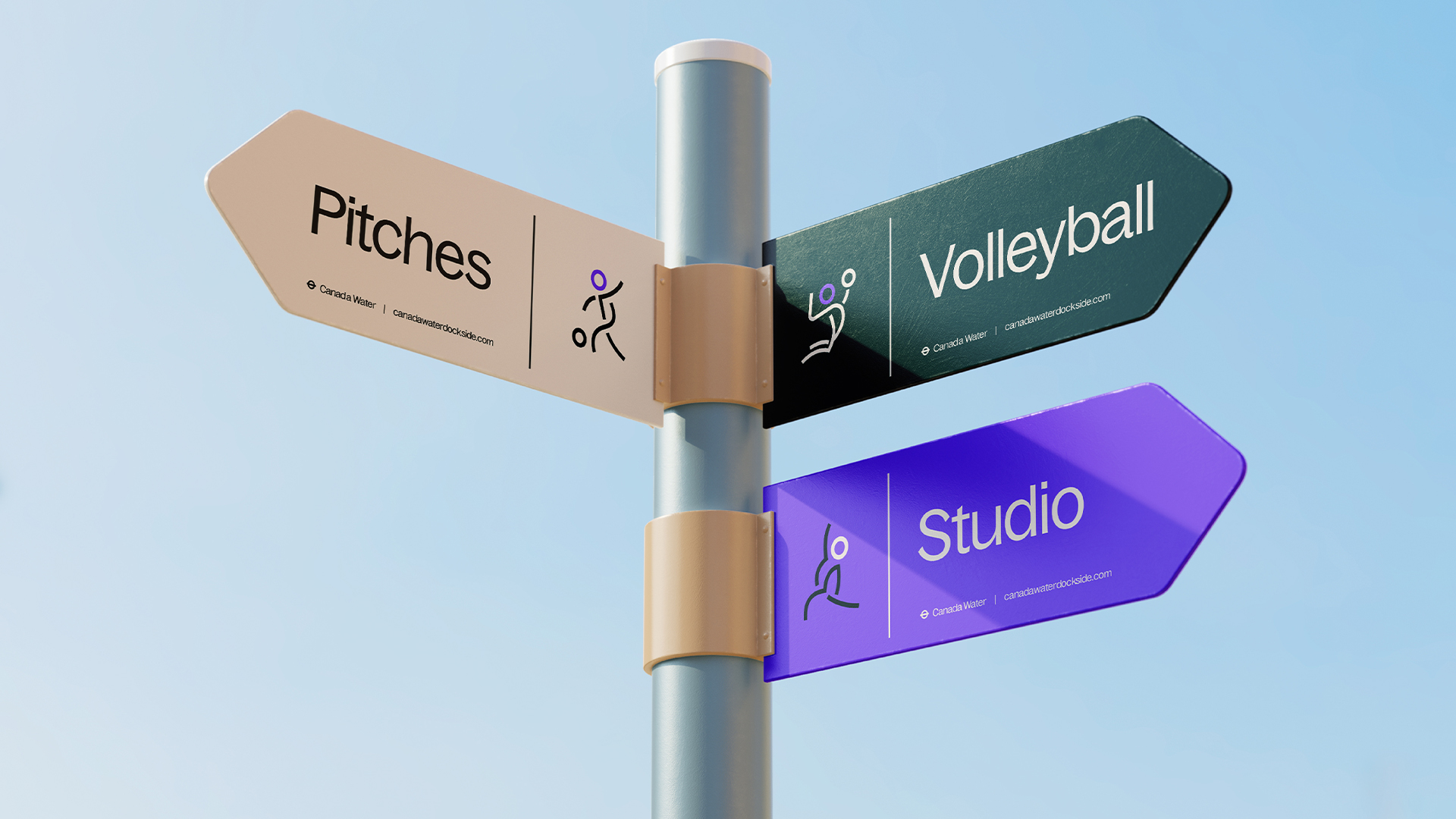
Dockside's iconography takes inspiration from the curved style of the Bagoss typeface, creating cohesion throughout the new identity in a simple, functional style. When asked about the most challenging element of the project, Simon said "It was important to avoid falling into the well trodden cliches that litter the sector." In a design sphere filled with "Endless pictures of empty buildings" and "impossibly beautiful illustrations of idealistic landscapes," Dockside's identity brings a well-needed splash of life to the sector.
SomeOne's new identity for Canada Water Dockside is one of the most refreshing design projects I've seen in some time. The effortless flow between stylish contemporary iconography and organic visuals gives the project an elevated elegance that feels charming and unpretentious. You can learn more about the project here.


For more from SomeOne, check out the design agency's rebrand for walking holiday specialist InnTravel. If you're after more design inspiration, take a look at the joyful delivery service rebrand that's bursting with character.


