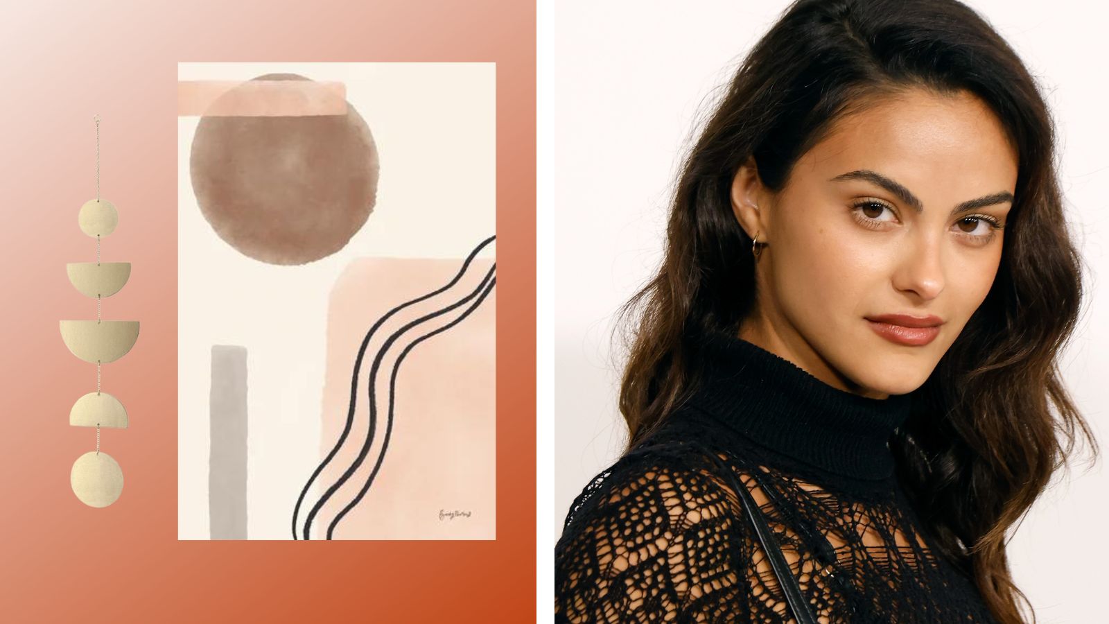
Camila Mendes' gallery wall made a recent appearance on the Upgraded actor's Instagram grid, and we were so distracted by its cute details that we barely noticed she was completely covered in a Loops face mask. Whoops!
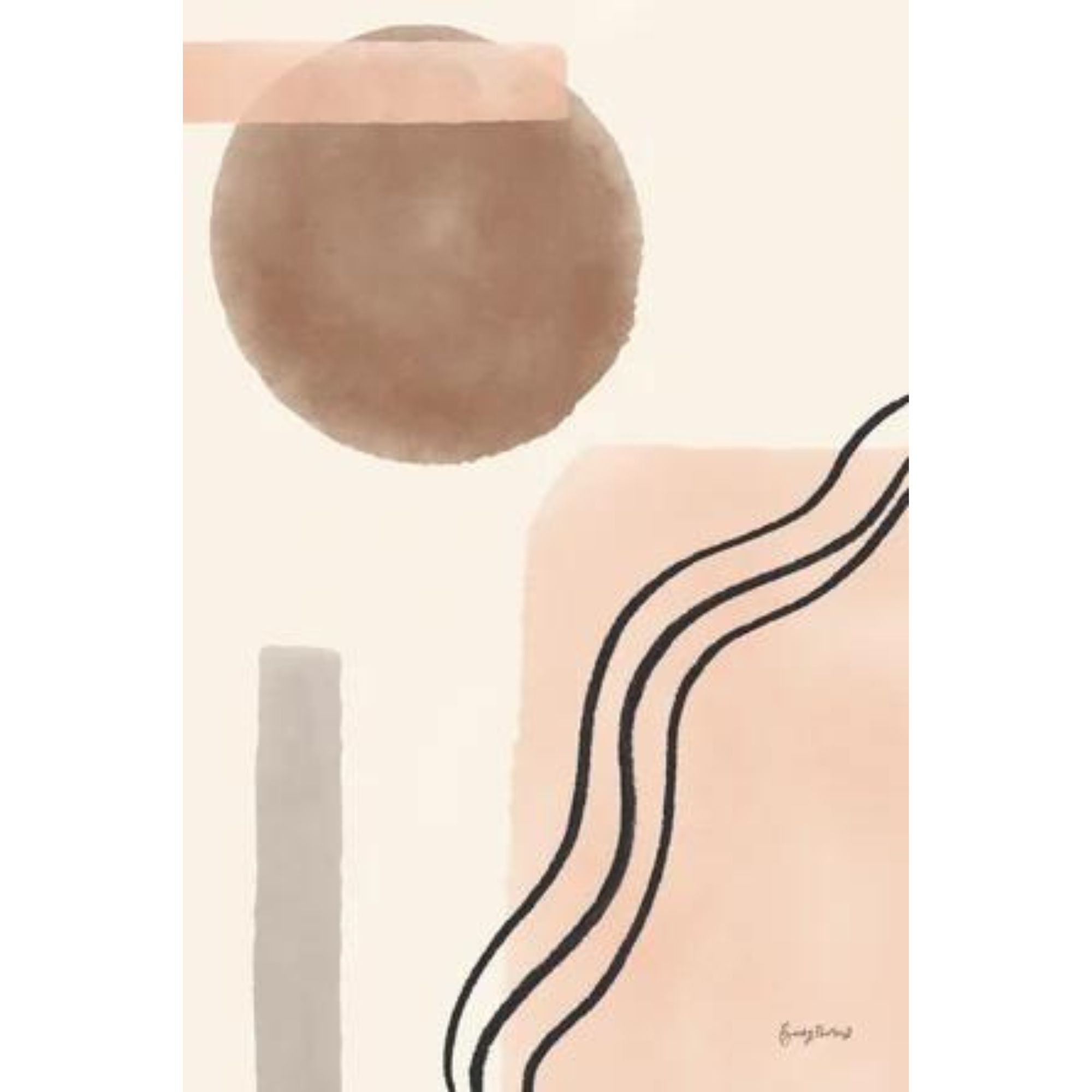
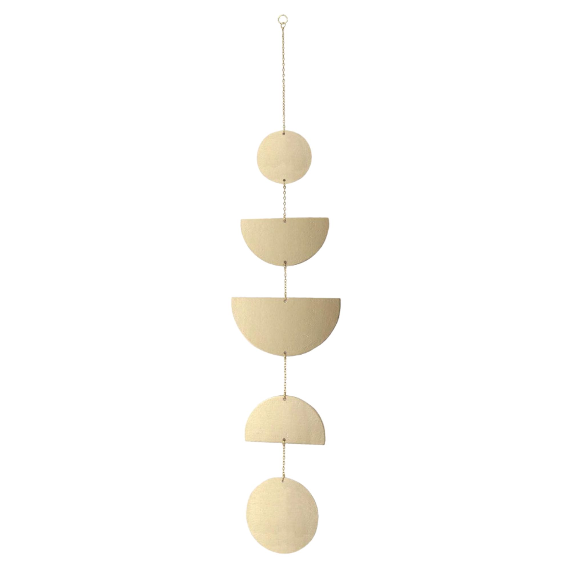
The wall display included a color-coordinated combo of photos, hanging decor, and a larger piece of art. Here's how to follow Camila's lead and create your own similar gallery wall with the help of one of our expert interior designers.
Now that we're in the zone for gallery wall ideas, this celeb-inspired one is top of our list.
Recreate Camila Mendes' gallery wall like a pro
Nicole Cullum, the founder of Color Caravan, notes that the Riverdale star chooses to mix things up by working with geometric wall art that's both two and three-dimensional, which she considers to be an "instant conversation starter."
When decorating white walls, don't assume that you're forced to stick with 2-D artwork."Mix it up," Nicole recommends. "Don’t be afraid to incorporate sculptural pieces, found items, or unusual items that you normally wouldn’t think to hang on a wall. These pieces will give a collected and eye-catching style to your arrangement."
That being said, those of us on a lease are going to have to be mindful about selecting renter-friendly wall decor so as not to damage any of the landlord's property.
We have a handy guide from the pros on how to hang things in an apartment, what types of tools to use and how to remove things hassle-free, but you're still going to want to make sure the items you've chosen are styled correctly to achieve a cohesive look like Camila.
"Space matters," Nicole says. "To make unrelated items look like they were meant to be together, hang them close to each other. Camila has left about an 1-1.5 inch space between her artwork, which adds subtle structure to the overall composition and visually unites the pieces in an interesting way rather than looking chaotic."
To recap: choose a mixture of pieces and space them out accordingly, leaning towards that 1-1.5 inch distance Nicole pinpointed.
What to shop

Price: Was $31.89, now $26.99
Dimensions (in.): H12 x W8 x D1.25

Price: $120
Dimensions (in.): 58 x 38

Price: $21.99
Dimensions (in.): L27.5
Love the star's style? We do, too. We spoke to the interior design experts about Camila Mendes' bookshelf and recreating its luxe look in your own space.


