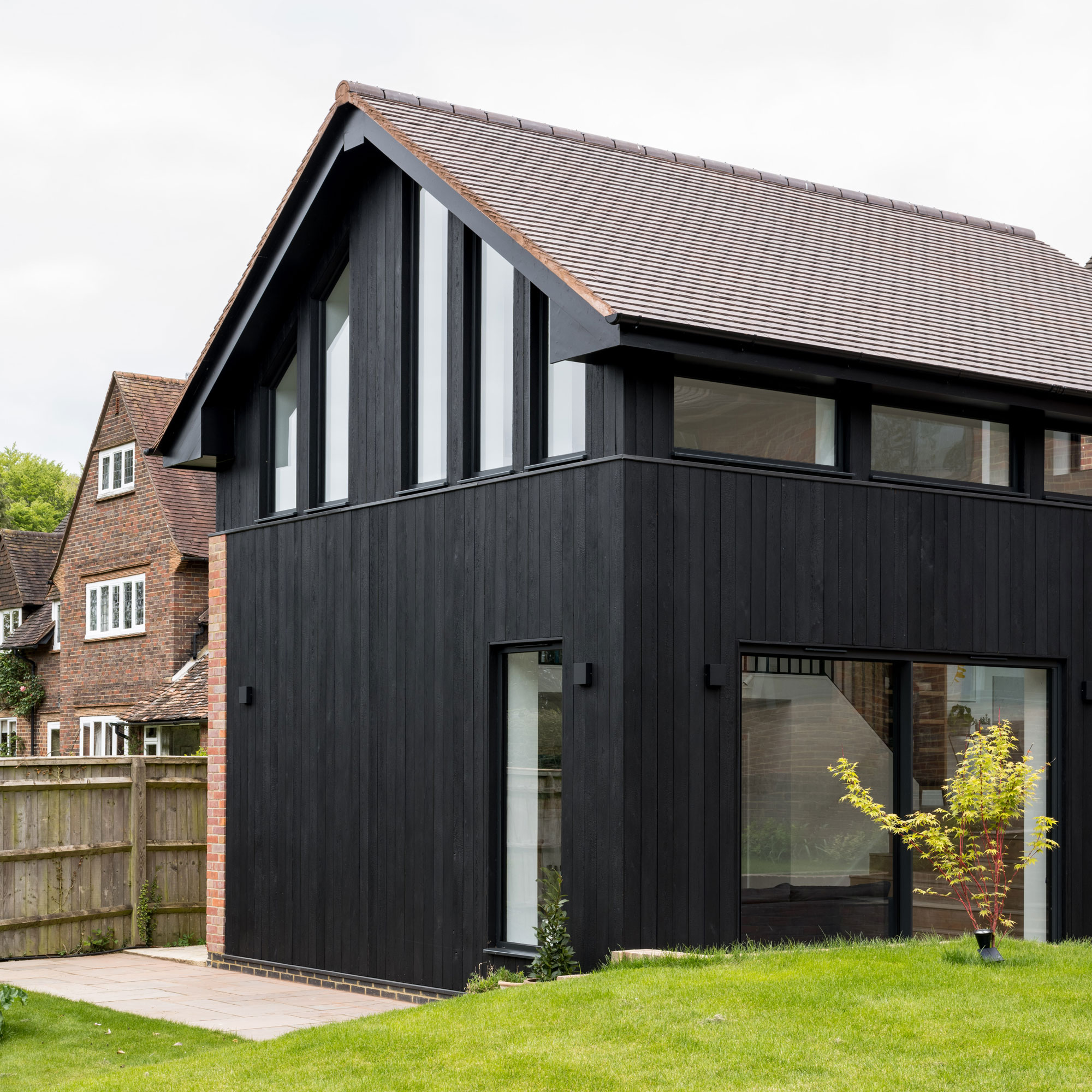
When renovating a property, sometimes the best solution is one of demolishing the old and rebuilding something new on the same spot.
Many of Britain's existing extension ideas, or indeed entire properties, have been built without a great deal of care. From tired extensions with blocky, ugly frames to old-fashioned conservatories from the 70s and 80s, these dated designs tend not to age well, especially if poor design and cheap materials have been used.
In this five bedroom, 1960s property located in Buckinghamshire, an existing conservatory was left mostly unused throughout the year. The homeowners and their three children tended to avoid it due to it either being too hot in the summer or too cold in the winter.
They enlisted the help of Alex Rider, director and co-founder of Rider Stirland Architects to help them find an alternative for the space - one that their entire family could make the most of. Here, Alex talks us though the transformation.
Rebuilding an extension - how a design rethink has transformed this home
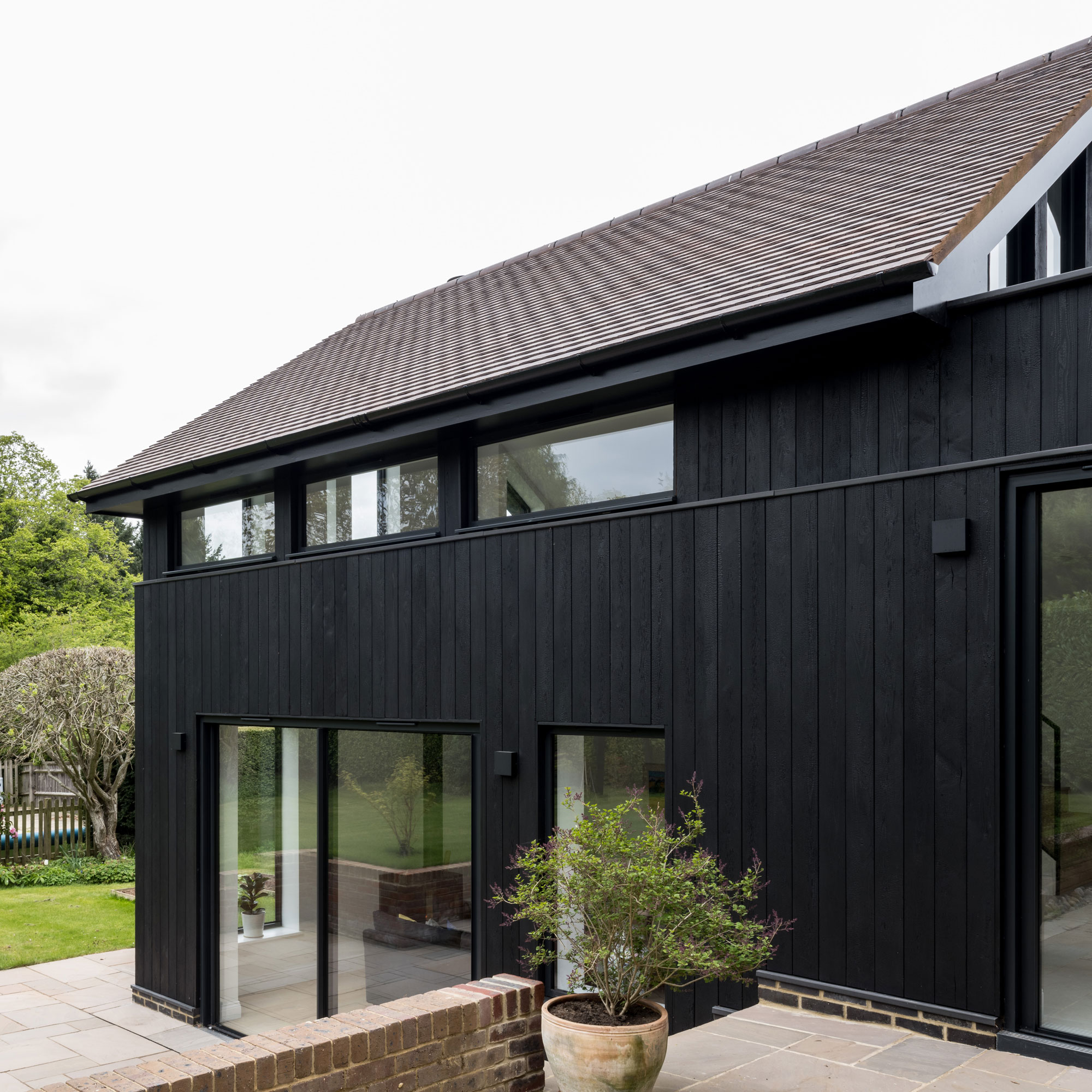
‘In order to make way for the new extension,’ explains Alex from Rider Stirland Architects, ‘we demolished the original rear conservatory. We also removed one of the existing two garages and transformed it into a utility space that now connects directly to the main building.'
'The new extension is a 10-metre long addition - this was sited perpendicular to the existing property - this way, it doesn’t actually take up much more space than the old conservatory did.’
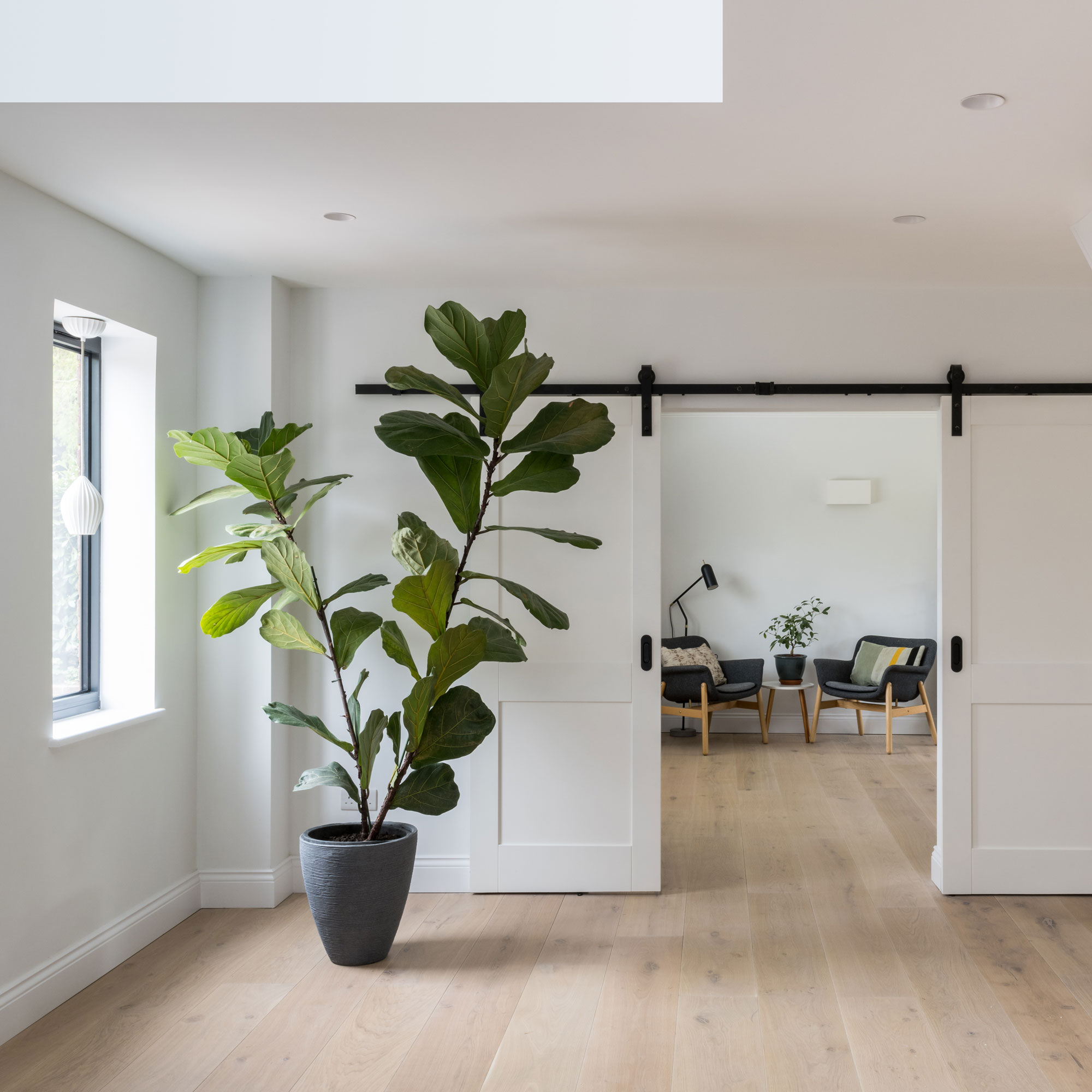
‘The new layout places the kitchen between the original house and the new extension,' explains Alex, 'acting like a bridge between the old and new.'
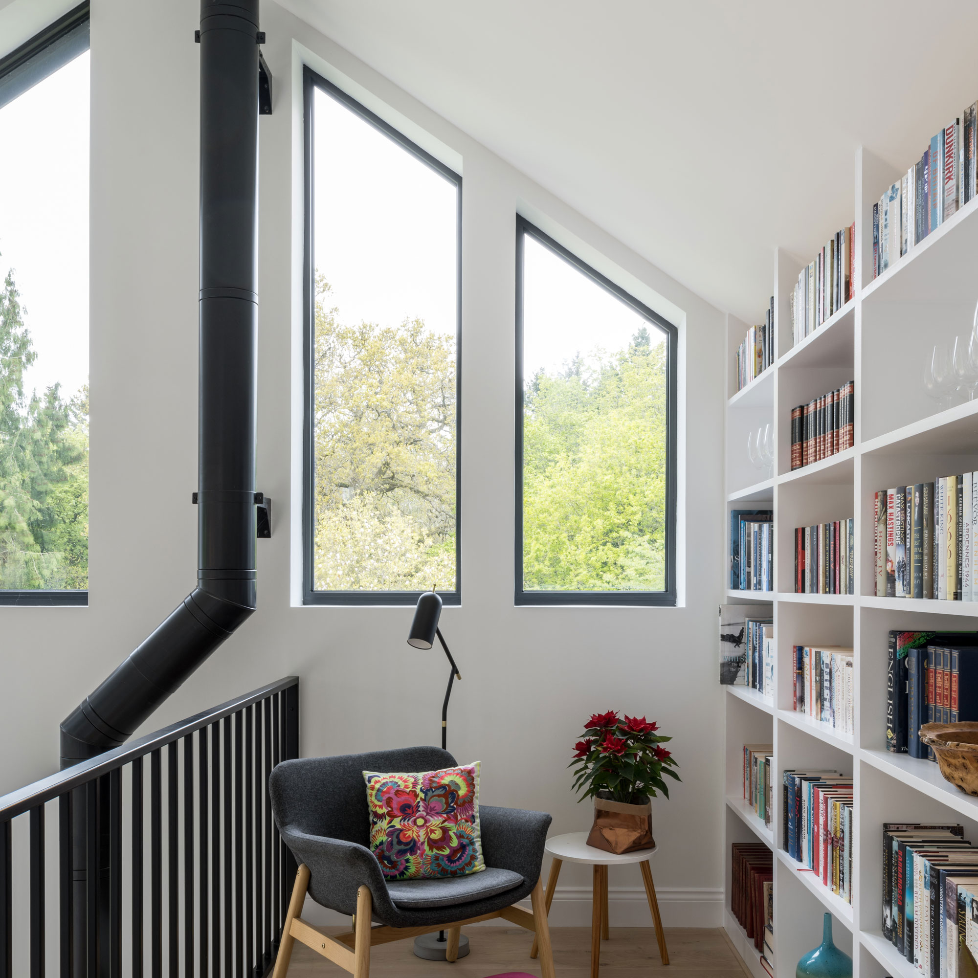
'Following the natural slope of the site,' he continues, 'we were able to make the most of the double-height space and create a library mezzanine and install a best woodburning stove, too.'
The new extension features a living room on the lower ground floor, a kitchen on the ground floor - in line with the rest of the property - and a mezzanine overlooking both, with the entire space benefitting from natural light from the wide variety of windows.
'The new configuration also means that you can access the garden from every one of the ground floor spaces,' explains Alex.
The living space
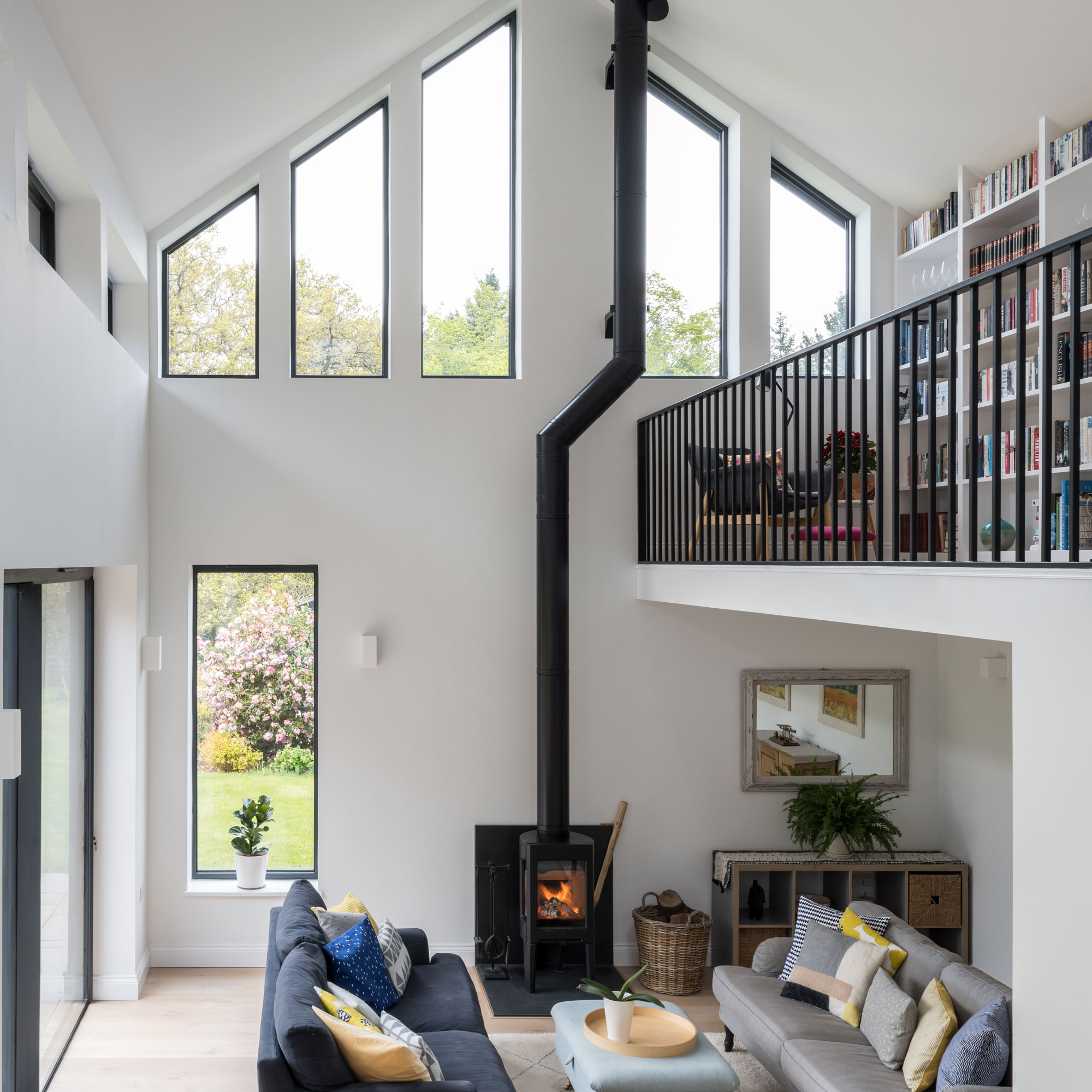
From the elevated mezzanine area, the owners can appreciate internal views of the extension and kitchen-dining area, as well as the garden outside. The height of the space allows you to see further beyond the garden out into the surrounding outstanding area of natural beauty.
The redesigned space taking up only 26 square metres, transforming the flow and access throughout the entire ground floor area. The change in floor levels has been exploited internally with the high ceilings helping to create a sense of more room.
Externally, the timber structure complements the masonry build and has been clad in charred timber that requires little to no maintenance.
Underfloor heating runs throughout the space and is supplemented by the woodburning stove, which has been placed at the rear to create a visual focal point. A single door has been placed to the rear of the extension, which is east-facing.
The living area is set on the lower terrace, but still enjoys views out to the garden. The architects ensured there would be enough height underneath the mezzanine so that it doesn’t feel too low, they also used a thin mezzanine floor structure.
The kitchen
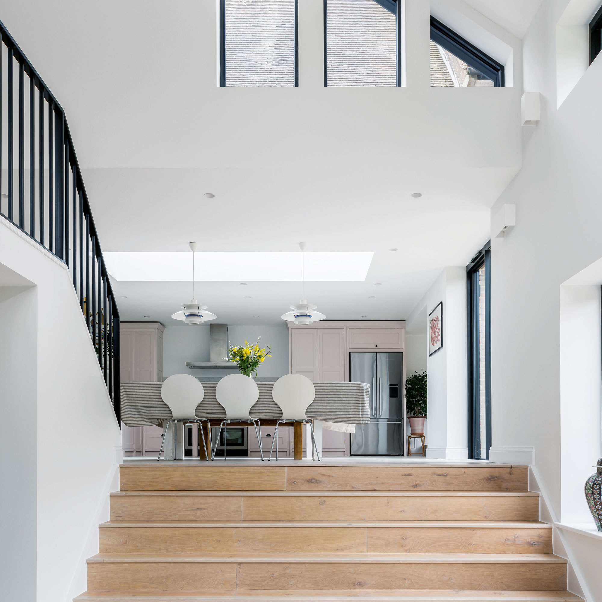
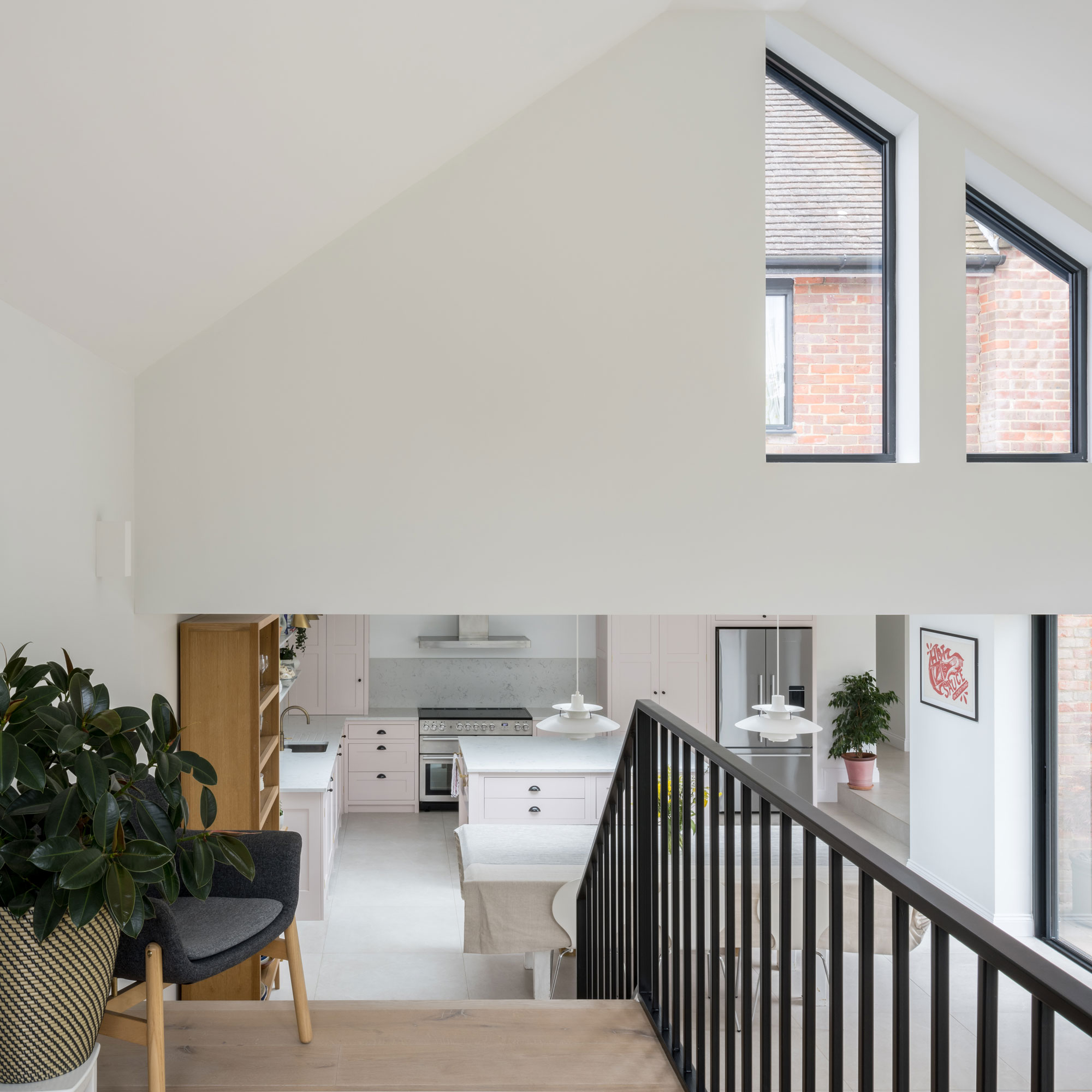
A wide new set of stairs have been introduced between the new extension and the dining and kitchen area. The flight has been strategically positioned to ensure that occupants in either space have the possibility to see and feel connected to one another.
Walking up into the kitchen from the living space on the lower ground floor, there is also a sense of connection created to the rest of the house, via a set of fixed glazing above that offers views towards the upper floors of the main building.
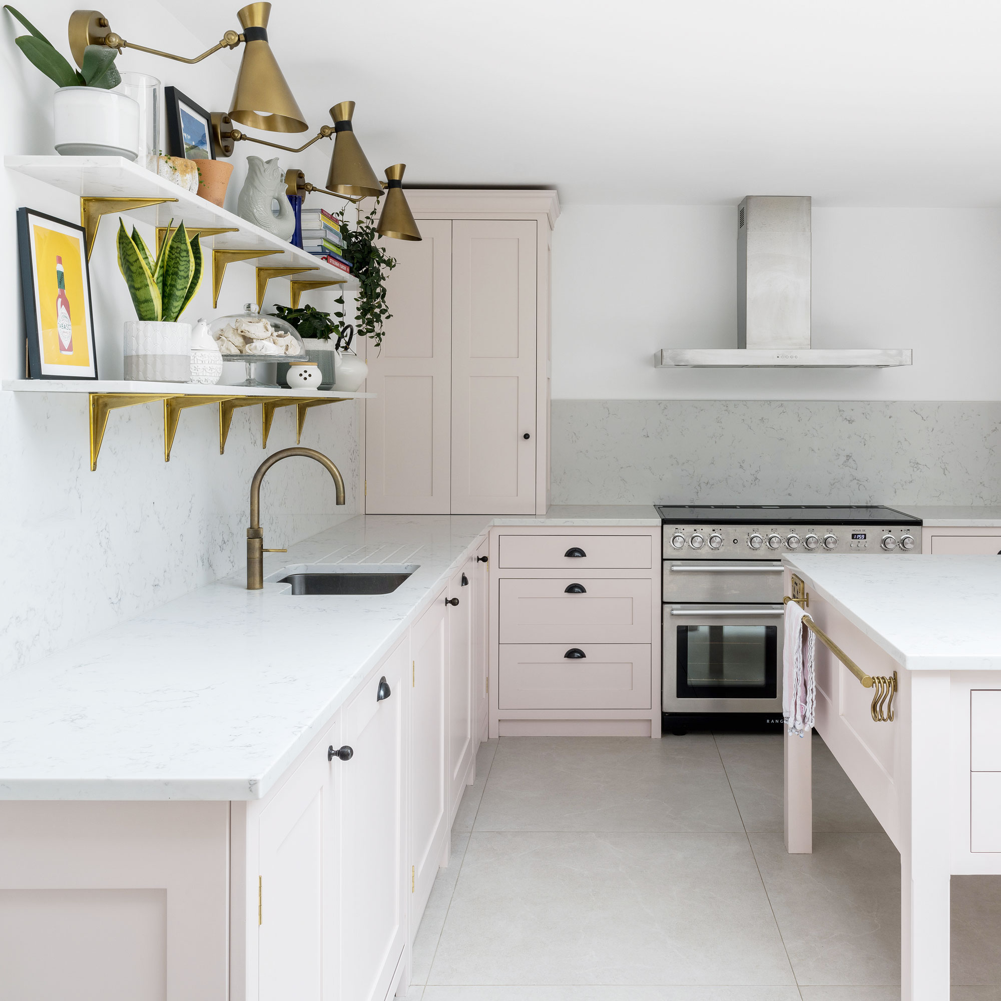
The neutral worktop pairs well with the choice of pink cabinetry and white walls, while the quartz worktop stretches onto the splashback, too.
Smart details such as the built-in island drawers and breakfast corner cabinet with bi-fold doors help make using and being in the kitchen effortless.
The floating shelves offer a space to display herbs and plants, adding colour and interest to the uncluttered scheme.
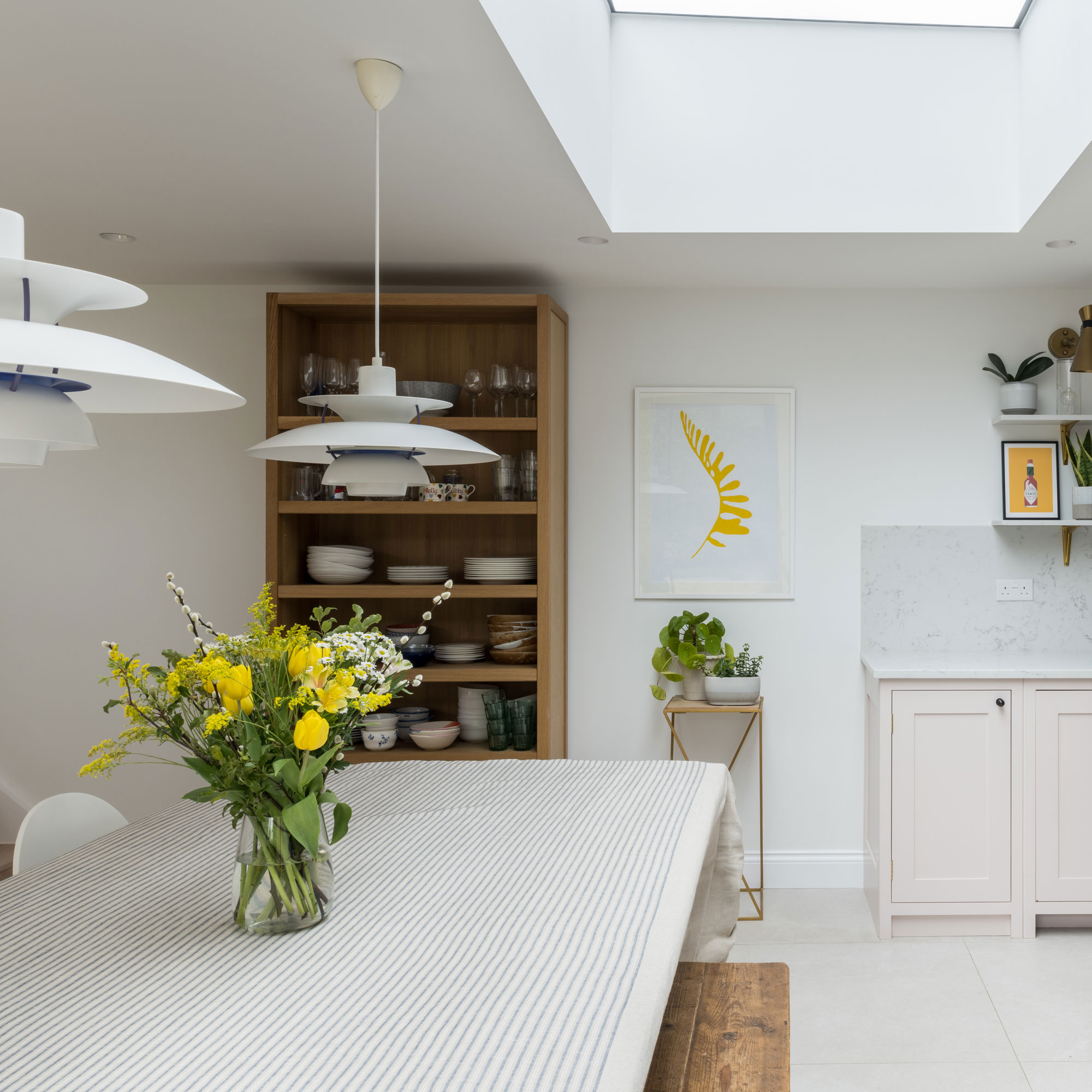
The new spacious kitchen is by Herringbone Kitchens and features open shelving units and a complementary mix of contemporary shaker cabinets in a muted pink hue.
The open-plan design features an oversized chef's table island unit and a larder, plus full height units. This floor-to-ceiling cabinetry ensures every inch of the room is maximised without it looking too busy. The room provides the perfect space for casual meals.
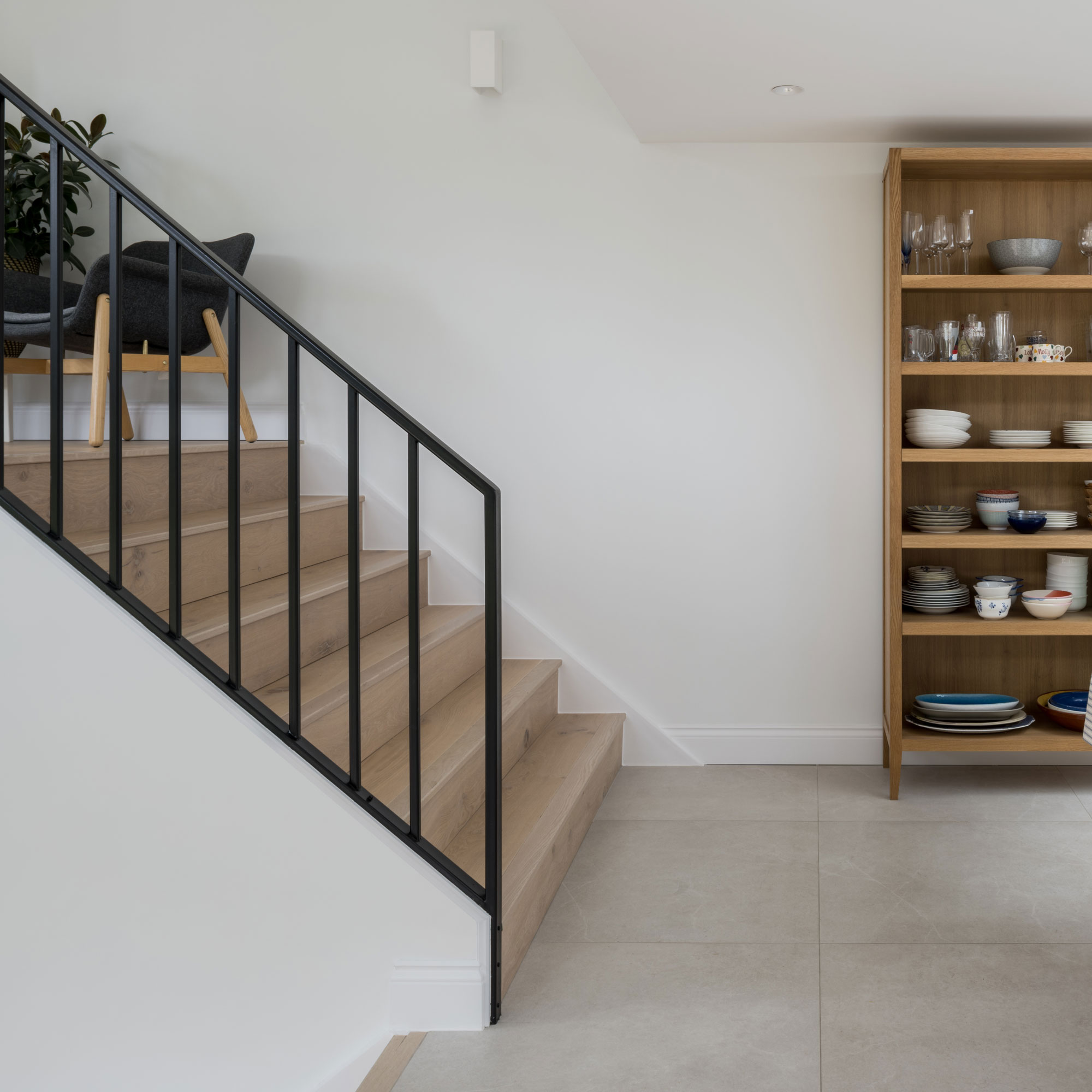
The kitchen-diner is a large, yet comfortable room that allows for intuitive movement around the space. A large dining table offers further seating for everyday meals and the space is illuminated by a grand rooflight idea.
Stairs lead up to the mezzanine area, creating a well-thought out flow between the new extension with the new communal areas and the existing property. The large format tiles also contribute to the sense of spaciousness and brightness.
The mezzanine
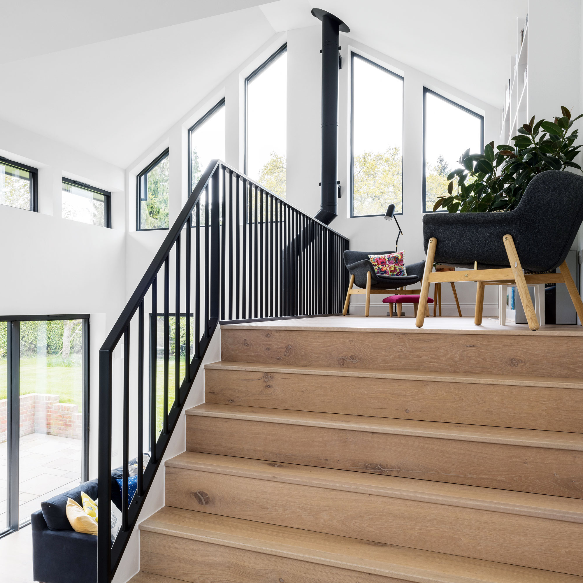
The open balustrade design allows light to filter through the space, the black colour has been chosen so that it ties in with the colour palette of black accents you can find internally, as well as externally.
The placement of the mezzanine helps celebrate the different vantage points and encourages a continual connection with the outdoors. The openings also help break up the large space while providing a route for natural light to flood in.
The mezzanine space offers a breakout area separate from the living area. This dedicated space gives the family an opportunity to display their collection of books and create a home library.
'Externally, the owners’ request for a low maintenance facade,' explains Alex, 'meant we went for a tactile, yet natural charred timber cladding. All the windows and doors to the house have been replaced with black framed units to complement the new scheme.'
'The entire timber frame extension is highly insulated and features composite glazing, as well as a clay tiled roof with black zinc detailing.’

Right from the main entryway you get glimpses through to different spaces, which benefit from plenty of natural light. A new boot room, also gained by the reconfiguration of the internal space, helps keep the circulation areas free of objects and offers storage for coats and footwear.
The black detailing of the bannisters and window frames give you a preview of what’s to come in the extension and neutral engineered timber floorboards and while walls combine to establish a fresh ambience.
So while the family had years of living in a home they weren't quite happy with, this eventually led them to really focus in on exactly what it was that they wanted in order for it to work.
‘It pays to live in a property before you start any major works,' says Alex, 'so that you can understand the particular characteristics of the property and perhaps exploit them in ways you hadn’t initially thought possible.’
The property before works began
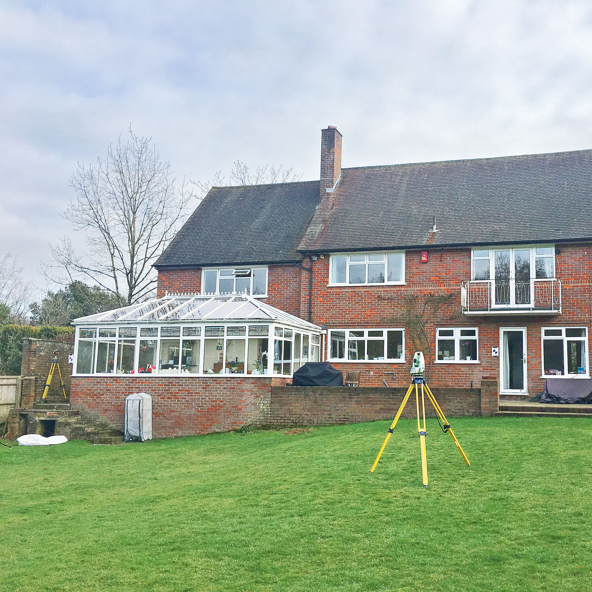
The existing home was sizable, however, the spaces didn’t communicate well and there was a natural change in levels that made the existing conservatory feel detached from the rest of the property.
The old conservatory was also poorly insulated, which made it largely inhabitable during the cooler months of the year. Externally, the property looked dated and required an overhaul to help make it more thermally efficient and aesthetically pleasing.
Focus on... Mezzanines
Alex Rider, director of Rider Stirland Architects shares his top tips and ideas
- MAX YOUR SPACE Zone a large area and create a distinctly separate space. Even a small mezzanine can help maximise the space you already have giving you a room within a room.
- USE THE HEIGHT Ensure you have enough head height within the mezzanine area itself and space for the stairs to access it.
- LIGHT IT WELL Consider how you will light the area, will you need more natural light and new window openings or will artificial illumination suffice?
- FOCUS ON USE Design with the purpose of the space in mind, a library will have different requirements to a bedroom or lounge area.
- CONSIDER THE FEATURES Make a feature of the balustrade, there are a variety of options available from metals and masonry to timber.


.jpg?w=600)


