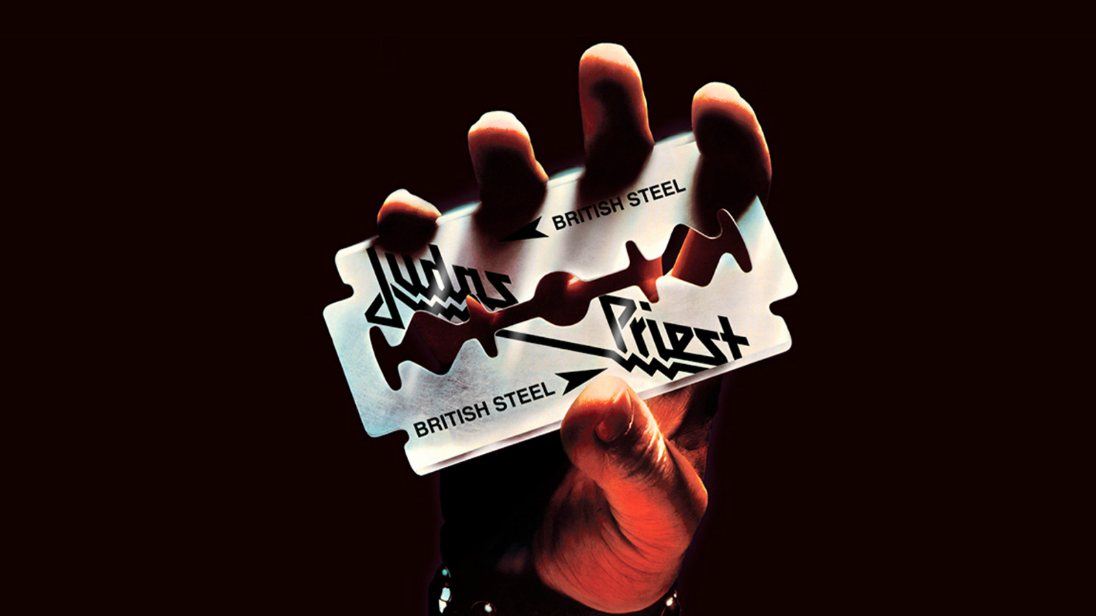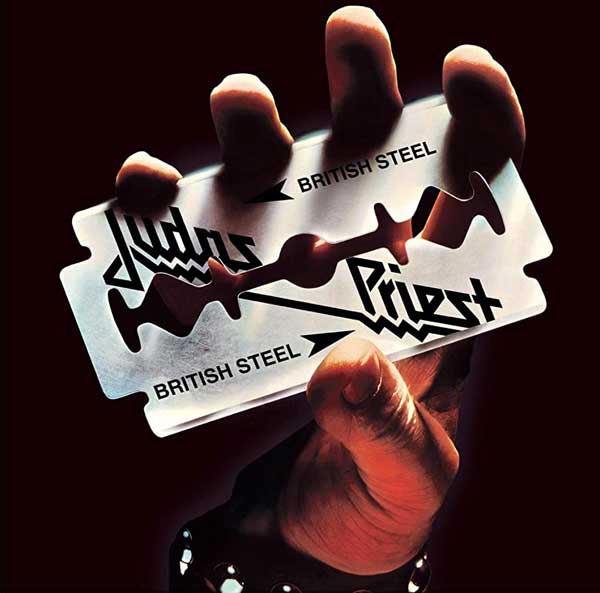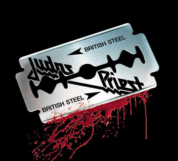
Forty-three years after its release, the cover of Judas Priest's British Steel still has the power to unnerve. Designed by Roslav Szaybo, it depicts a hand, cloaked in darkness, fingers splayed, clutching a giant razor blade so tightly that the glinting edges appear to cut into the flesh. Somehow, the absence of blood only serves to make the image more disturbing.
Judas Priest never intended the cover of their 1980 classic to be macabre. The sleeve was simply an extension of the album’s title, conceived by bassist Ian Hill as both a nod to the striking steelworkers of the time and to what the band saw as their own quintessential Britishness.
The genesis of the cover began when vocalist Rob Halford noticed that Gillette razor blades bore the legend ‘Sheffield Steel’ and pitched the concept to his bandmates. While some had their reservations (“There was a bit of a debate, because a razor blade was an emblem of punk rock,” notes Hill), the design was completed to unanimous approval.
“As soon as we saw it,” remembers former guitarist KK Downing, “we thought: ‘This is as sharp-edged as we are.’ It’s so totally fitting. Obviously, we’re aware of the symbolism behind the image. It was a popular razor blade manufacturer, and something we’d seen around since we were so high, hanging around our granddads. It just seemed so very British.

“And the way it was portrayed, with the razor blade going into the fingers, but no blood; what it’s saying is that it’s a safe thing to be into this music.”
According to metal folklore, it was British Steel that prompted late Pantera guitarist Dimebag Darrell to start wearing a razor blade necklace. Not everyone was so enthused.
“I remember, with the hand that gripped the razor blade,” says guitarist Glenn Tipton, “in some countries they thought it was offensive, because it looked like it was slicing into the fingers. So they airbrushed it so the hand was just holding the razor blade. And we were like: ‘No, we don’t like that. It’s got to have the finger-slicing!’.”
“I think if we’d put blood on it, that would’ve been over the top,” concludes Halford. “Still now, when you look at that cover, it has a tremendous impact. It has a very edgy, almost controversial feel. I think it’s just a very important piece of artwork, because from that stemmed a lot of other artistic ideas.”


