Bridging Boyd is a family home that addresses how to bring a valuable, but in-need-of-a-refresh, piece of modernist architecture into the 21st century. The home, originally named Richardson House, was designed in 1955 by renowned midcentury Australian architect Robin Boyd during his partnership with Grounds and Romberg. Situated in an inner Melbourne neighbourhood, the structure is now listed, having received a series of interventions by different past owners.
Bridging Boyd: modernism in the 21st century
Enter Melbourne-based architecture and design practice Jolson, the studio invited by the current residents to reimagine the precious home for their needs – yet still respecting Boyd's original principles and intention.
Stephen Jolson, practice founder and head, says: 'Boyd’s vision saw the limitations of the site as an opportunity to deliver a completely bespoke suburban home – a simple and clear design intent, embracing the landscape at all times. We harnessed the opportunity to pay homage to the influential design by adding a new but complementary architectural language that rehabilitates rather than compromises Boyd’s original intent.'
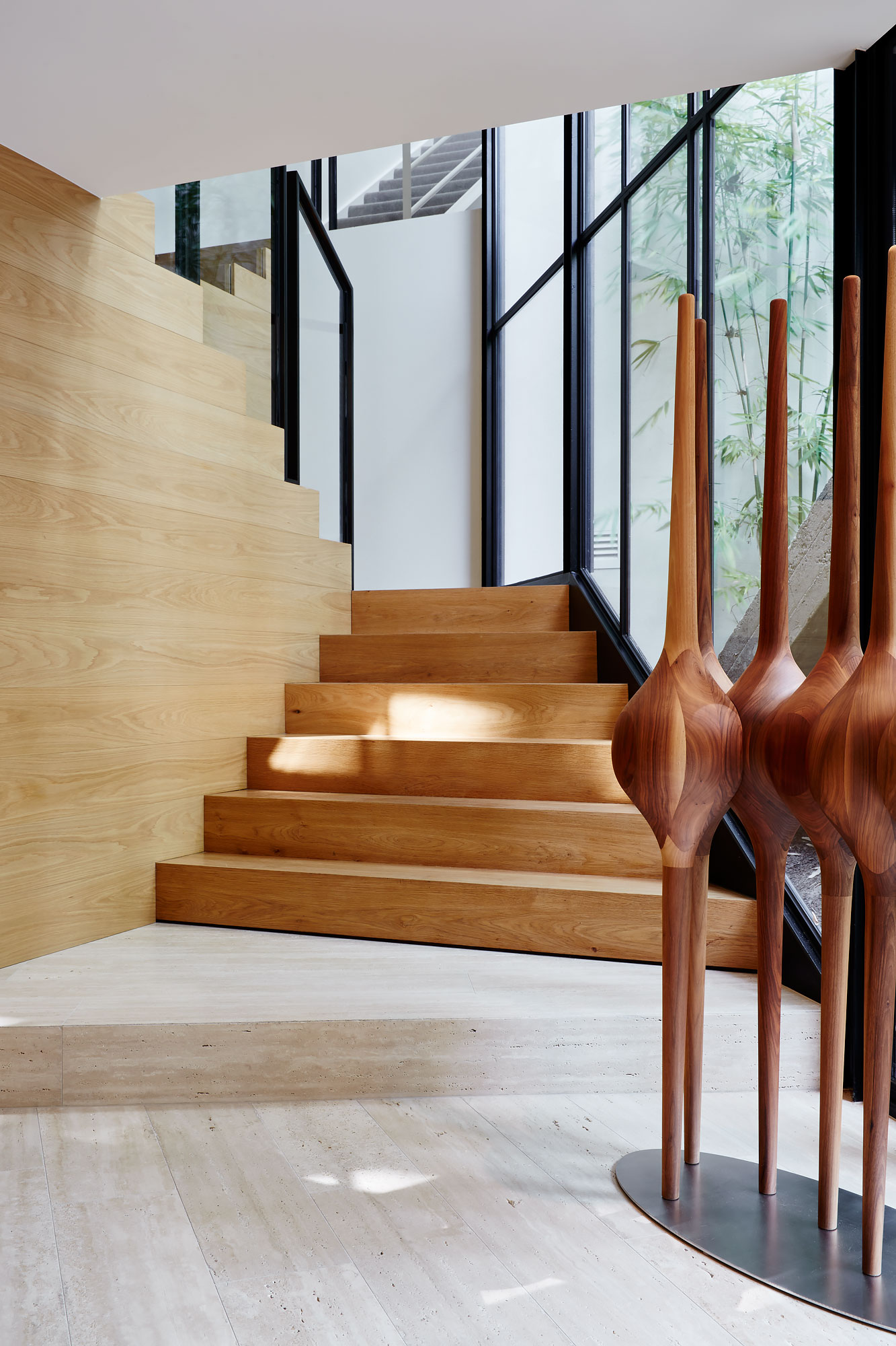
To that end, Jolson and his team looked at the existing structure, as well as Boyd's sense of simplicity, and stripped back some of the later additions that didn't work with the home's spirit – cleaning up the site to allow the property’s inherent minimalism to shine through.
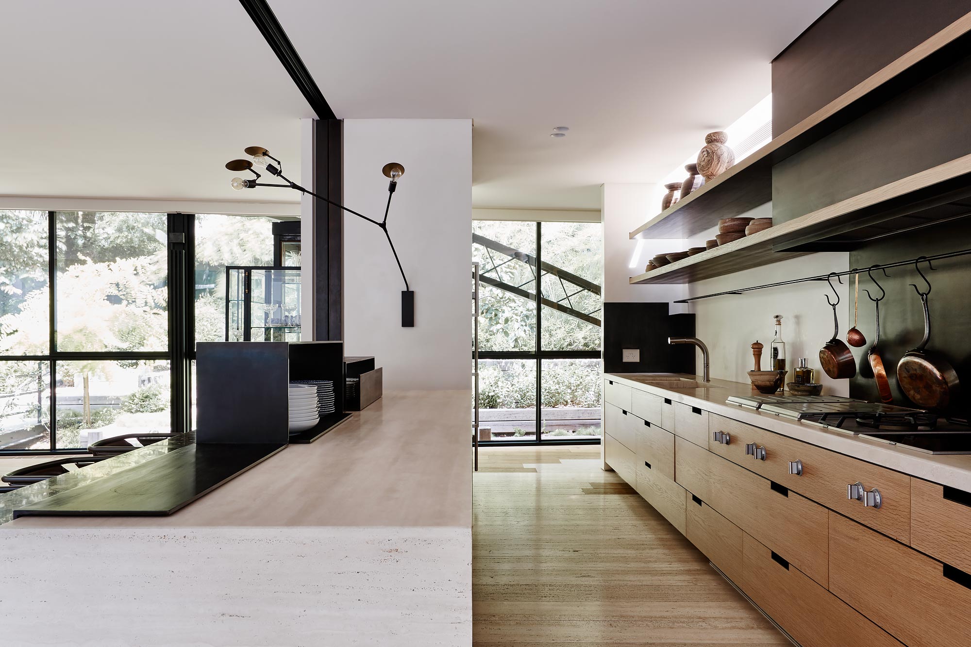
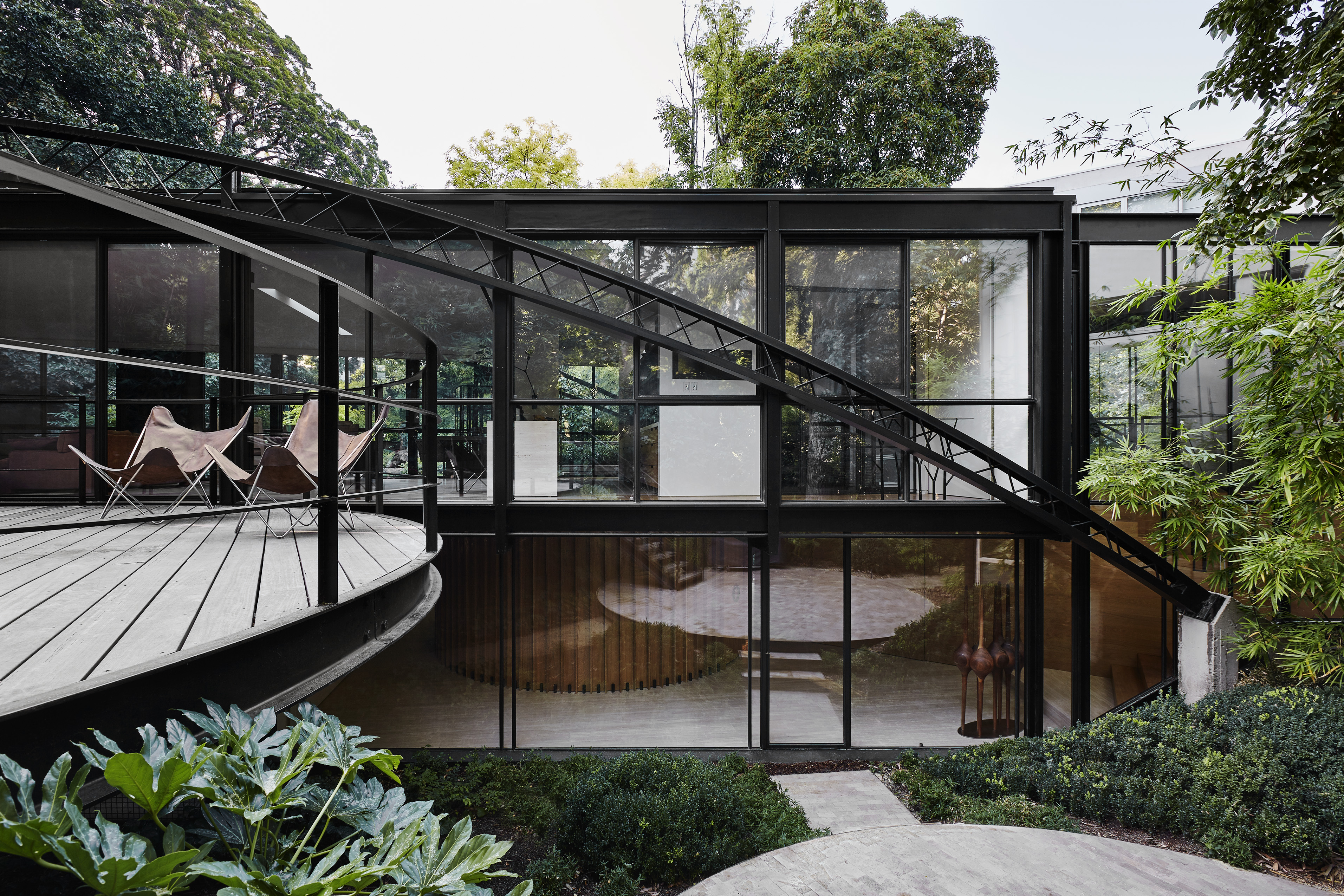
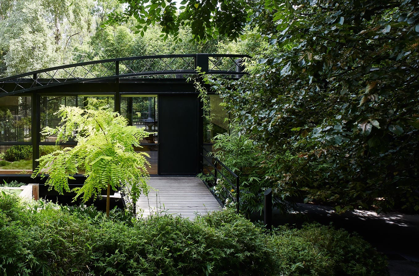
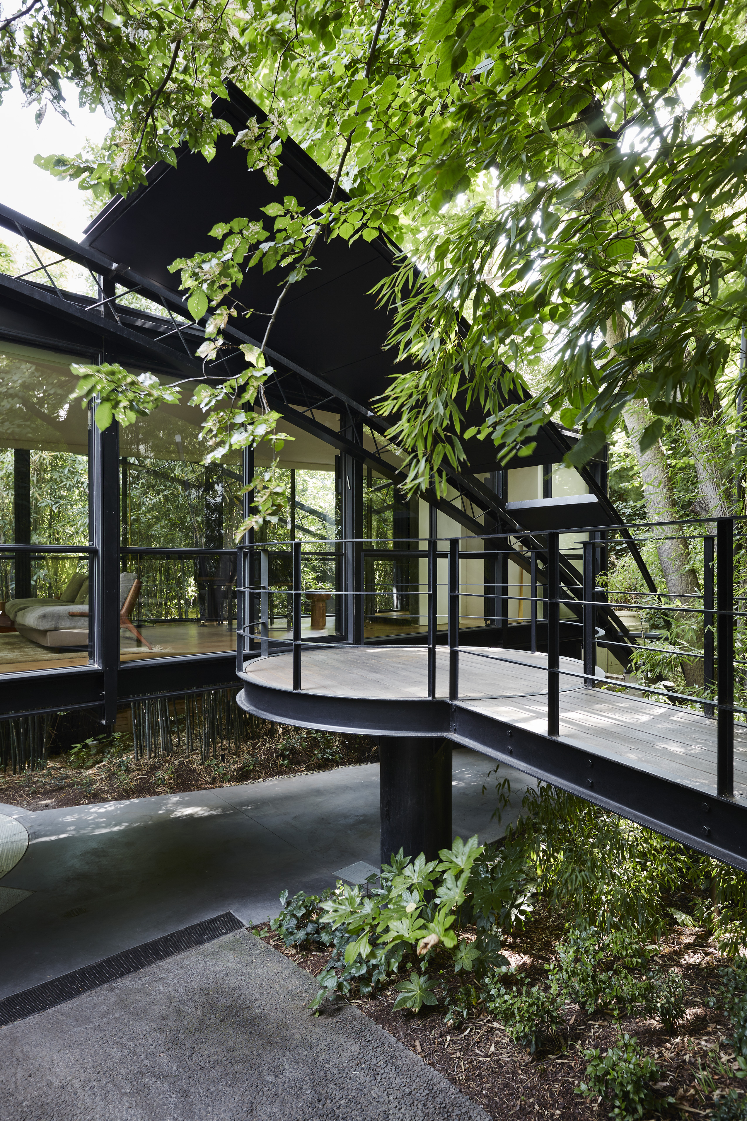
The main entrance was moved and with it, a series of suspended entry bridges, decks and an entrance canopy were created, highlighting the way into the home and guiding visitors over the threshold. These elements and their curved shapes are juxtaposed against the historical structure's straight lines and boxy nature.
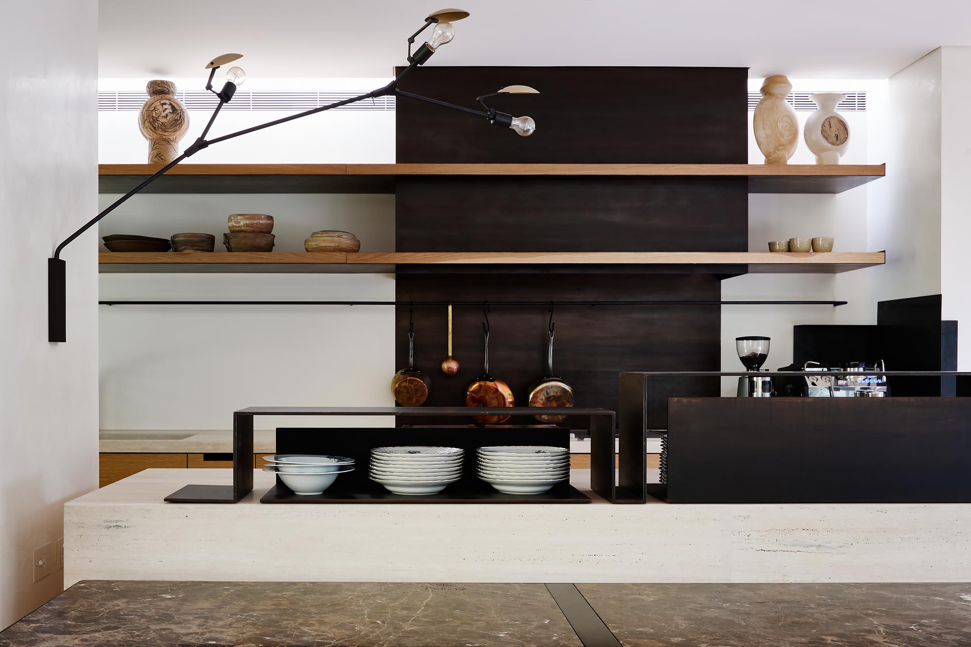
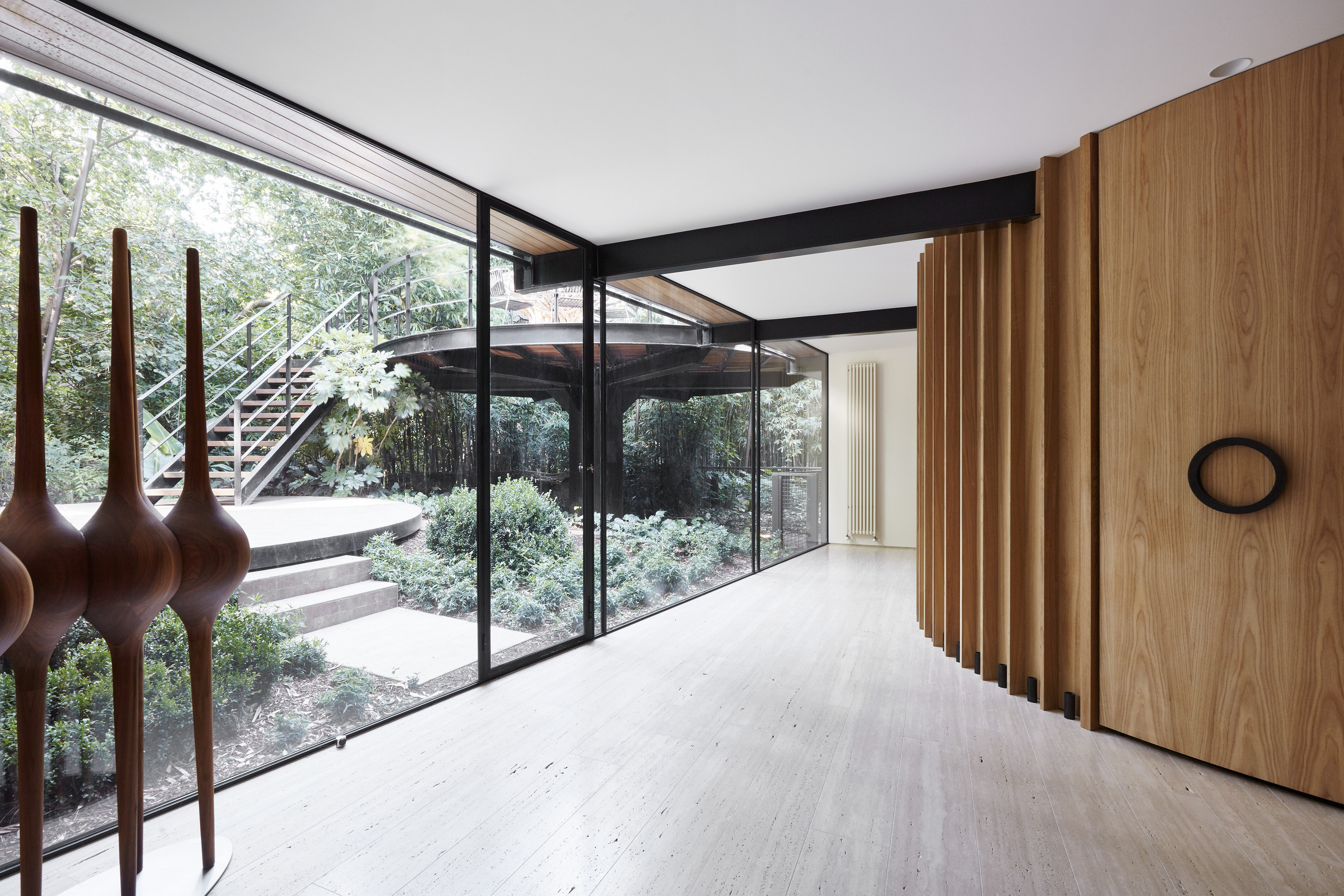
A three-storey 1982 renovation had transformed the interior, which has now been brought back closer to its original state. The large open-plan living space affords expansive views of a leafy garden through a glazed rear façade.
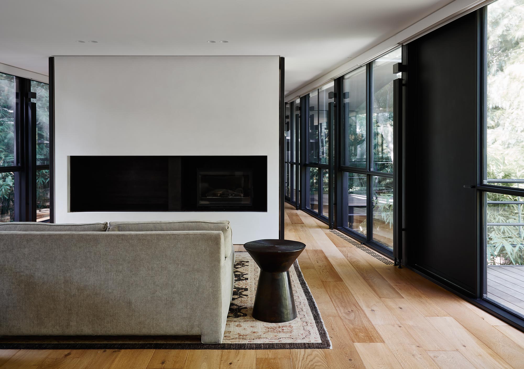
The heritage fabric was also updated. Ageing timber window frames were replaced with double-glazed, slim, steel-framed windows. Meanwhile, natural timber, stone and steel are the primary materials inside, giving a contemporary refresh to this 20th-century classic.
