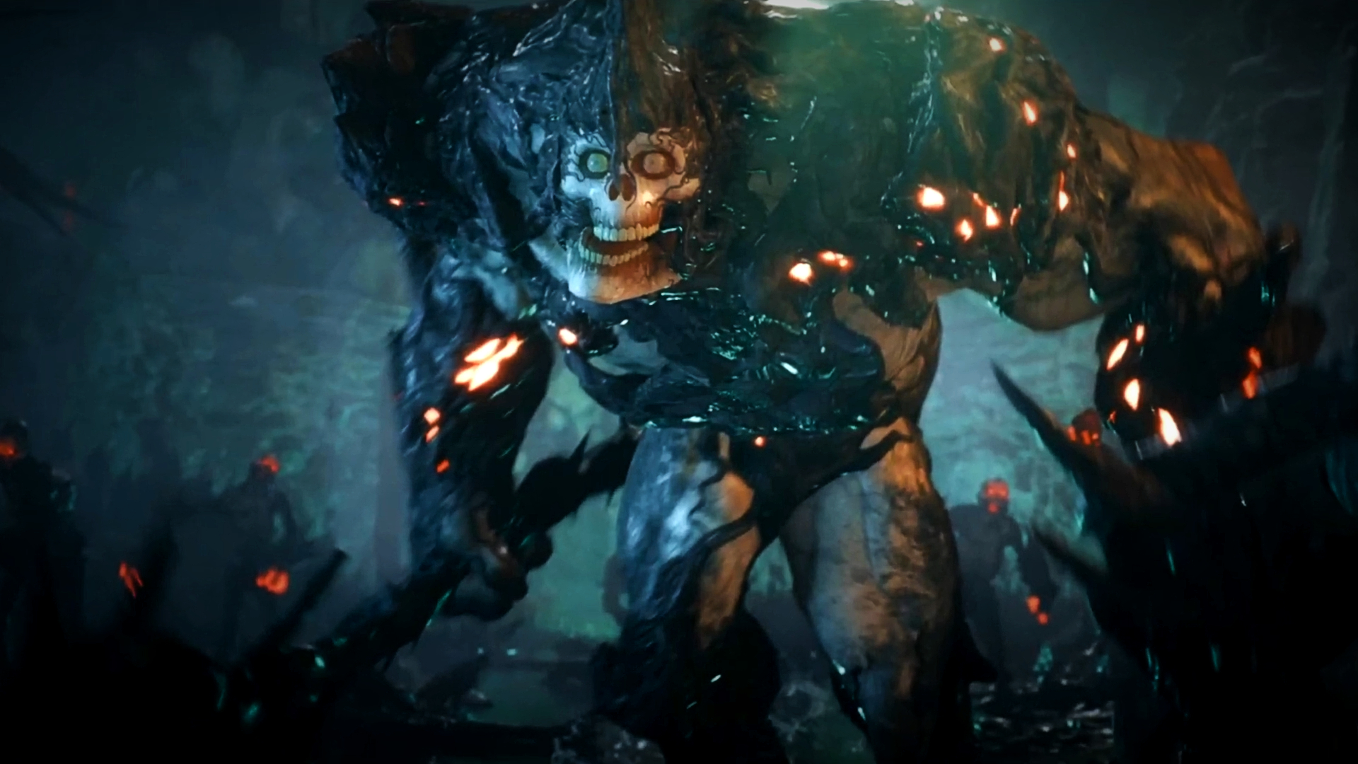
Dragon Age: The Veilguard visually differs from its predecessors, but BioWare says this wasn't its intention - in fact, the new game's art is meant to reflect the styles of all three preceding games.
The new Dragon Age game features a bold new tone, one that has sparked controversy amid longtime fans of the beloved RPG series. Fans have criticized the upcoming title for looking "too cartoony," highlighting everything from the characters to the way Darkspawn appear in The Veilguard - designs that BioWare has since described as "very intentional" reworks. Art director Matt Rhodes confirms as much himself in a recent interview with EPN.
"I've had the opportunity to work on the entire Dragon Age franchise in various capacities," he explains. "I've seen that in Origins, that was based on the idea of fantasy paintings. Dragon Age 2 is saying like Northern Renaissance paintings, Kurosawa films. Inquisition was a continuation of that, trying to finish that off … I'd call it almost like a really solid half step - with The Veilguard, we're trying to finish that step."
Rhodes continues, describing how Dragon Age's history influences its visuals: "The Dragon Age series is about people, it's about characters, it's about their struggles and successes and victories, and all that. What we wanted to do is create a visual language that made sure that technology didn't get in the way of those characters. Uncanny valley … leans its head into the screen and says, 'Hey, remember, you're in a video game.'"
According to the director, BioWare wanted to avoid that dip into the "uncanny valley" in The Veilguard. "We wanted to take a very intentional step back away from that so that the characters could shine through and you could just jump right into the world and just enjoy it." Ultimately, the team's hope is that the new game can "still portray a very wide range of the human experience," from "the grim and dark and horrific to the joyful and peaceful."


