If you’re a freelance creative, or you’re running a small business, you probably don’t need to be told that it can be tough to get noticed online. The digital high street is more crowded than it’s ever been, and even if you follow all the advice to the letter, trying to make your digital presence stand out can feel like pushing a rock uphill.
As Director of Brand Design at Squarespace, Satu Pelkonen sees plenty of different approaches to the challenge of getting digitally noticed. She’s also got plenty of experience of the challenge herself — prior to joining Squarespace in 2019, she has worked on branding, design and campaigns for a huge variety of clients, including Spotify, Nike, Google, Samsung and more. As such, she was the ideal person for us to sit down with to get a little advice on how creatives and business might put their digital real estate to better use.
If you’re looking to shake up your online portfolio, you may want to check out our guides to the best website builders for artists, and we also have a guide to the best website builders for small businesses, where we’ve ranked all the top players. For now though, it’s over to Satu.

The attention economy online is more fiercely competitive than ever, and it is difficult to stand out. How can small brands and businesses use their digital real estate to rise above the noise and reach who they’re trying to reach?
Satu Pelkonen: I think that in today's competitive attention economy, small brands and businesses have a chance to really shine by focusing on authentic storytelling, keeping their branding consistent, interacting with their audience, and creating high-quality content.
Authentic storytelling connects with audiences on a personal level, while consistent branding across all digital platforms ensures recognition and trust while making a memorable impression on your customers.
Engaging with audiences on social media, providing high-quality content, and optimising a website for search engines all contribute to better visibility and user experience. Also don't forget about analysing your site visitors' behaviour and preferences through analytics; Squarespace’s analytics tool is a goldmine for tailoring your content and improving your design choices even further as it gives you powerful insights into who is visiting your site and how they’re interacting with your content.

If we look at design specifically – I think it’s fair to say that some small businesses and brands use their digital real estate in quite a utilitarian way, and perhaps aren’t making the most of the opportunities.
What are the design strategies you think can be useful for small brands and businesses – especially those who don’t have design experience, or the budget to hire freelance?
Small businesses can really benefit from simple and clean designs that focus on their core message and call-to-action when it's done intentionally and with purpose.
By using high-quality images, sticking to a clear layout, and choosing easy-to-read fonts while keeping things consistent throughout your site, you're on the right track.
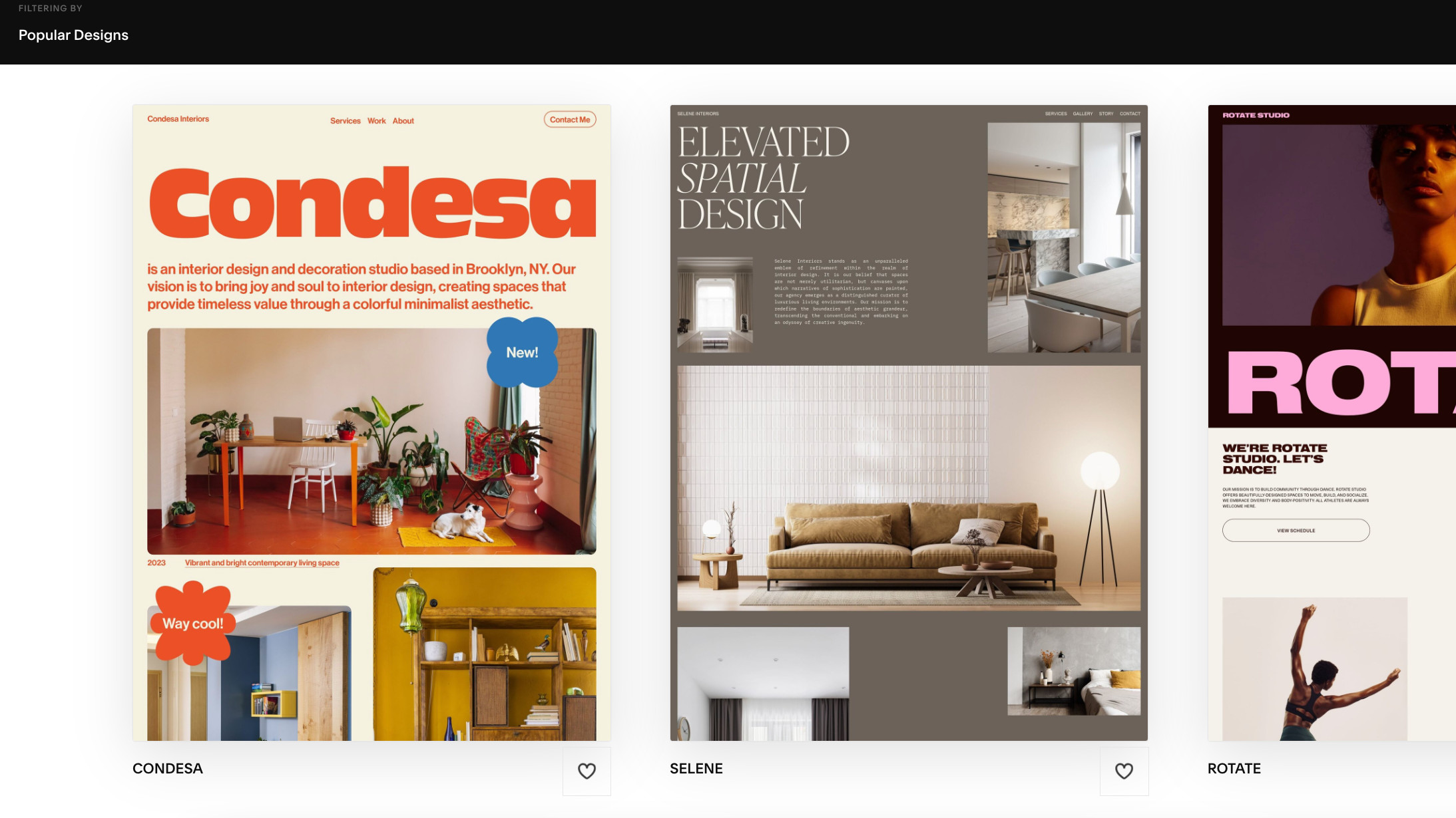
If this already sounds intimidating, our designer-made templates are all built with these principles in mind so they’re a really easy way to help you get started in achieving a professional look without needing extensive design experience. They can truly help you create a visually appealing and user-friendly website that effectively communicates your brand's value.
By using high-quality images, sticking to a clear layout, and choosing easy-to-read fonts, you're on the right track.
What are the digital design trends you’re seeing at the moment? Any examples that have particularly caught your eye?
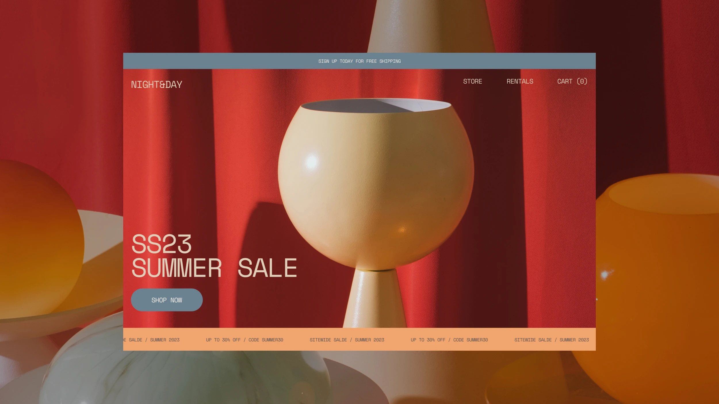
Digital design trends today include various elements that aim to improve user experience while also looking cool. Things like minimalism, micro-interactions, bold typography, and the use of 3D elements and illustrations are definitely a big hit right now.
Minimalism emphasises simplicity and functionality while micro-interactions, like those gentle animations following what users do, bring in some fun and keep users interested while also enhancing the user experience.
Big, bold typography is key to getting attention and getting messages across clearly. Incorporating 3D elements and custom illustrations can make a website more engaging and unique, making it really stand out in the busy online world.
Are there any tips or tricks for Squarespace users specifically that you’d recommend? Maybe some features or functions that are often overlooked, or that users don’t always take advantage of?
Our platform offers quite a comprehensive suite of tools for anyone to create beautifully designed websites. Some of my favourite features include video backgrounds to make your site engaging and our new pinned block feature that keeps content quite literally pinned as users scroll, improving user experience and engagement. I personally love this feature as it offers creative ways to add those micro-interactions on your site without any code while making your website dynamic and help it really stand out.
And don't forget our built-in SEO tools to boost your search engine ranking, along with analytics to understand user behaviour.
You can learn more about Satu's work at her website, satupelkonen.com.


