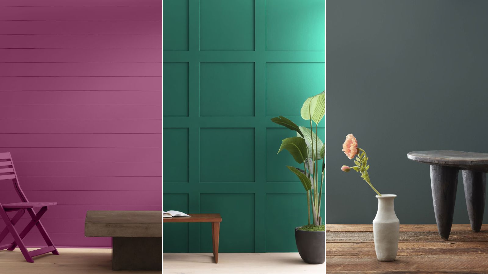
Benjamin Moore has unveiled its latest color palette, and it's all about one of this year's biggest trends: maximalist decor. Comprising six saturated hues, the Eclectic Maximalist color palette is filled with vibrant and bold shades, perfect if you're looking to make a statement and energize your home with a healthy dose of color.
'Incorporating a bold paint color is a fool-proof way to renew a room and create instant character, taking a space from sterile to stylish,' says Helen Shaw, Director of Color Marketing at Benjamin Moore.
Below, we're taking a closer look at the maximalist color palette, discussing the best ways to decorate with these shades in a bold yet liveable way.
At the lighter end of the color spectrum, the palette includes Fruit Shake 2088-60, a warm, orange-toned pink; and Peacock Feathers 724, an uplifting, mid-blue.
At the darker end, the remaining colors have a slighter moodier feel to them, including Fiddlehead Green 2041-20, a rich emerald shade; Mulberry 2075-20, a warm berry purple; Downpour Blue 2063-20, a classic navy blue; and lastly, Dark Pewter 2122-10, a dark gray-green.
These bold hues go hand-in-hand with maximalist decor, which is proving to be one of 2024's biggest interior design trends.
A maximalist color palette is all about embracing bold colors and layering the most vibrant shades for a dynamic look that's visually interesting. However, that's not to say it's always easy to incorporate such hues into the home, especially if you're new to decorating with color.
To help you on your way, Benjamin Moore's Helen Shaw shares below her recommended ways to incorporate the Eclectic Maximalist color palette into your home, embodying a bold take on color yet ensuring it isn't overwhelmed with competing colors.
How to decorate with the Eclectic Maximalist color palette
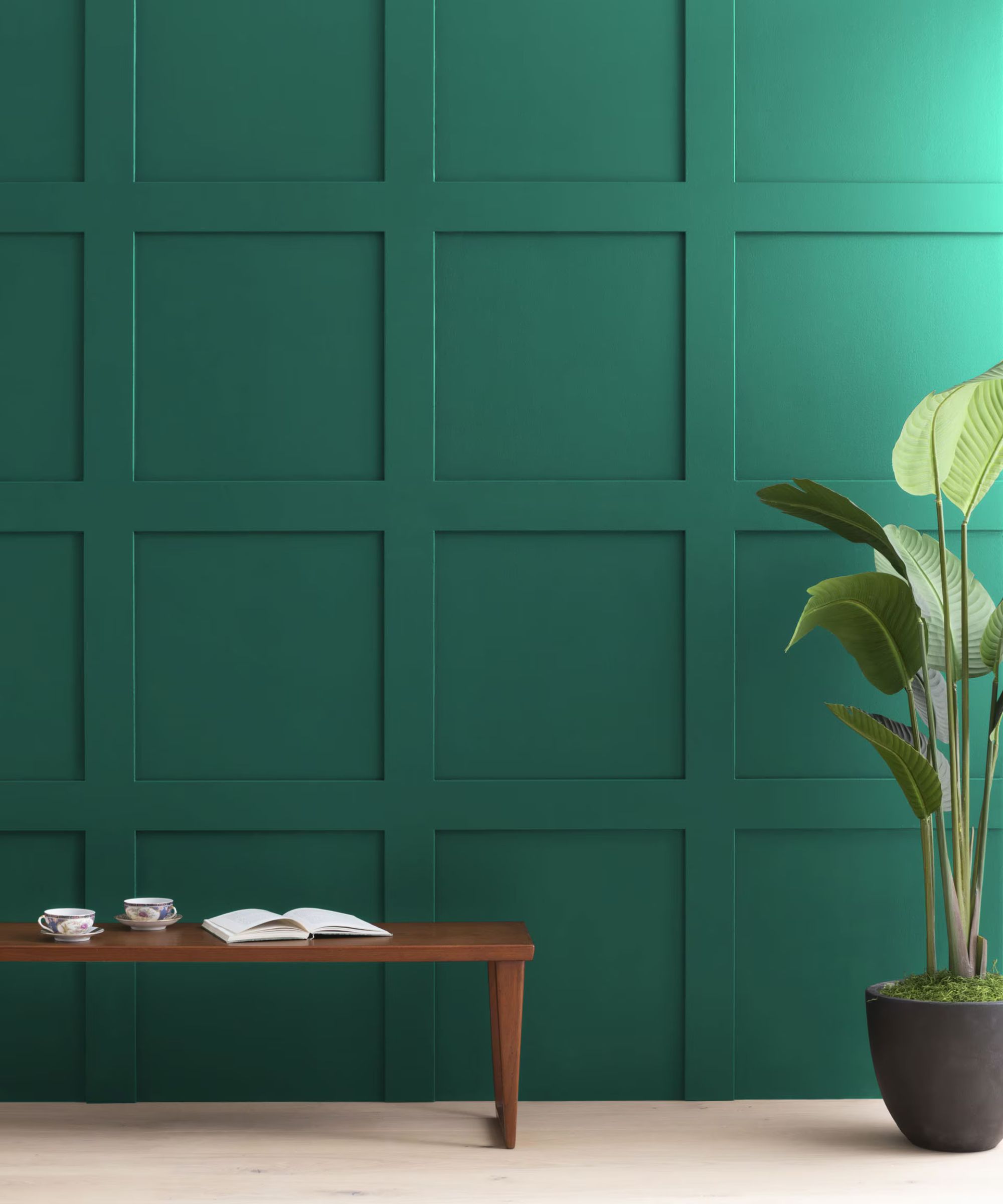
One room that Helen recommends using the maximalist color palette in is cloakrooms. Since these small rooms can often feel quite separate from a home's main social spaces, you can afford to be as experimental as you like with your color choices, and it's a fun way to create a slightly unexpected look.
'Cloakrooms are a fantastic place to be a bit more experimental with color,' explains Helen. 'As standalone spaces, they won't conflict with the existing decor scheme yet they will make a real style statement to guests.'
Colors such as Fruit Shake and Peacock Feathers in particular would work well in these small rooms if you want to lean into a playful look.
However, this color palette is just as suitable for primary rooms in the home, such as kitchens. Dark kitchen cabinets are a standout color trend this year, creating a moody, dramatic look in the heart of the home. Using colors like Dark Pewter is a great way to tap into this trend and elevate your kitchen color ideas.
'Bold colors marry well with a kitchen setting as well, as these spaces tend to be the busy and bustling heart of the home rather than a room for relaxation,' explains Helen. 'For many, kitchens are also increasingly becoming places for entertaining, meaning people are seeking a wow factor that reflects their personal style.'
Best color pairings within the palette
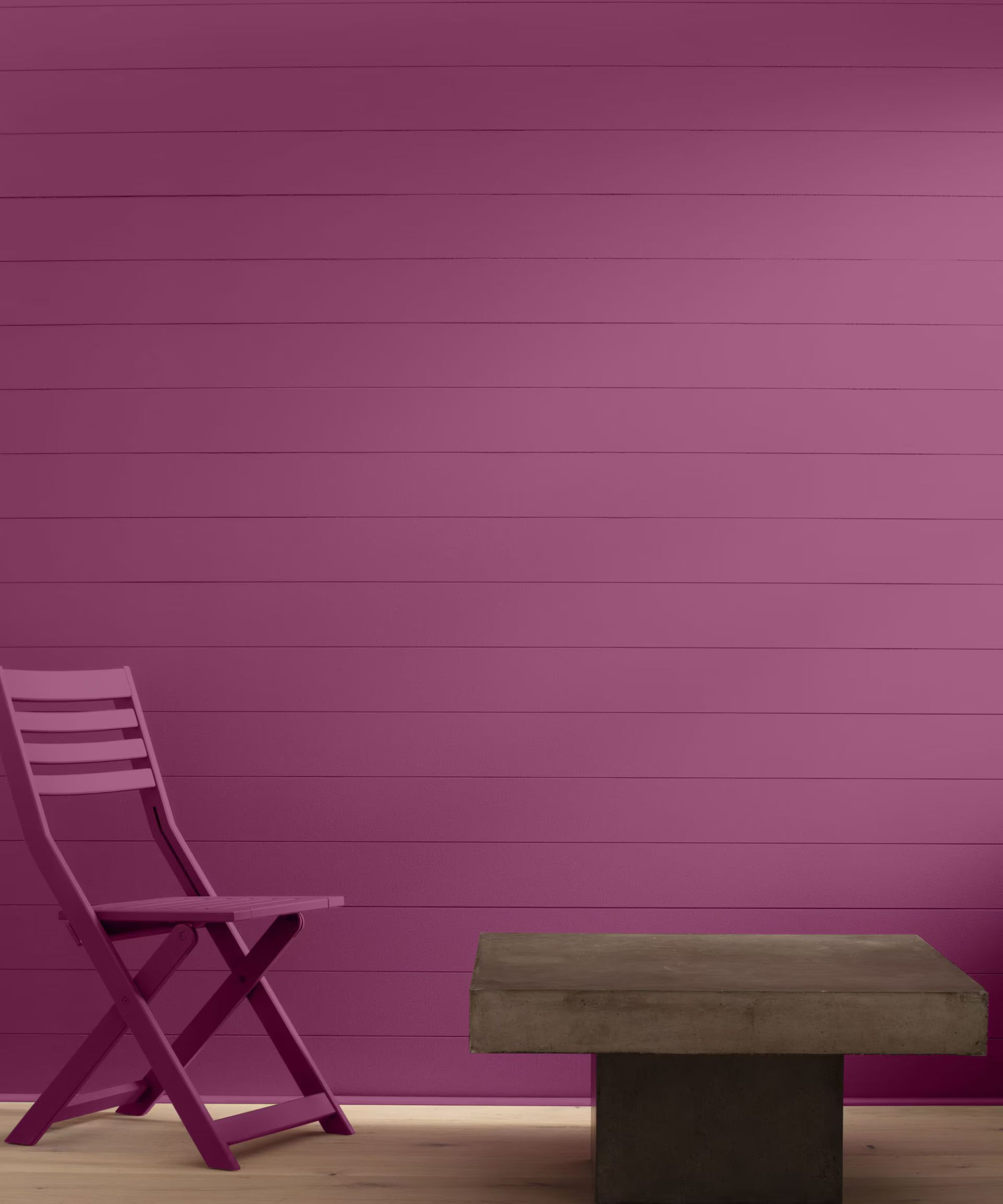
Whichever room in the home you choose to embrace this maximalist color palette, it's important to consider the best color combinations.
'Carefully curated color pairings are key to unlocking the style potential in our homes,' explains Helen. 'They simultaneously lift a space by adding energy to a scheme, whilst also changing the relationship between spaces depending on where you apply the finishes.'
Helen points to the color wheel to inform the best color pairings within the palette, considering both monochromatic and complementary colors depending on the look you want to create.
'Subtle monochromatic schemes are the most accessible and use shades of the same color to add slight contrast such as Downpour Blue and Peacock Feathers.' This is a go-to color pairing if you want one color family to dominate a room; but by using varying shades, it will ensure the space feels dynamic and layered.
By contrast, a complementary color scheme will create a more dramatic look. Helen explains that this involves colors 'taken from opposite sides of the wheel such as Fruit Shake and Fiddlehead Green' adding that it will 'deliver dramatic impact with an unexpected harmony.'
These paint colors are natural choices for a maximalist decorating style, guaranteed to make a statement in any room of your home. Always remember to test colors before fully committing to make sure it's right for your own space.

