When it comes to reinventing your home, nothing transforms a space quite like paint – but if you're feeling a little overwhelmed by the myriad of options out there or the noise of the many anointed 'Colors of the Year', this might just be your ticket to some realistic color advice.
Benjamin Moore has just revealed their most sampled colors of 2025, and the array of hues actually used in real homes is pretty telling. Sure, there's a lovely collection of neutrals, as to be expected, but a few moodier colors have also made the list, too.
From fresh, airy whites to rich, characterful shades, these best-selling Benjamin Moore paints capture a desire for both serenity and personality in every corner of the house. Here, Benjamin Moore's director of marketing, Helen Shaw, talks us through why these might have proved so popular.
Benjamin Moore's Most Sampled Paints of 2025
While white paint and decorating with neutrals have long dominated color trends, 2025 revealed a surprising shift in homeowners’ habits.
'Our 2025 most sampled paint colors showed the green color family emerging as a top choice,' says Helen. 'Shades such as Saybrook Sage HC-114 and Vintage Vogue 462 both ranked highly, highlighting a strong desire to bring a soothing and grounding, nature-inspired energy into the home.'
'These rich, layered greens with their dynamic undertones evoke a sense of calm and harmony and are particularly well-suited to traditional interiors, where they add depth and a quietly vibrant presence without overwhelming a space,' – meaning they're perfect for living room color schemes, bedroom color ideas, or even statement trims or cabinetry.
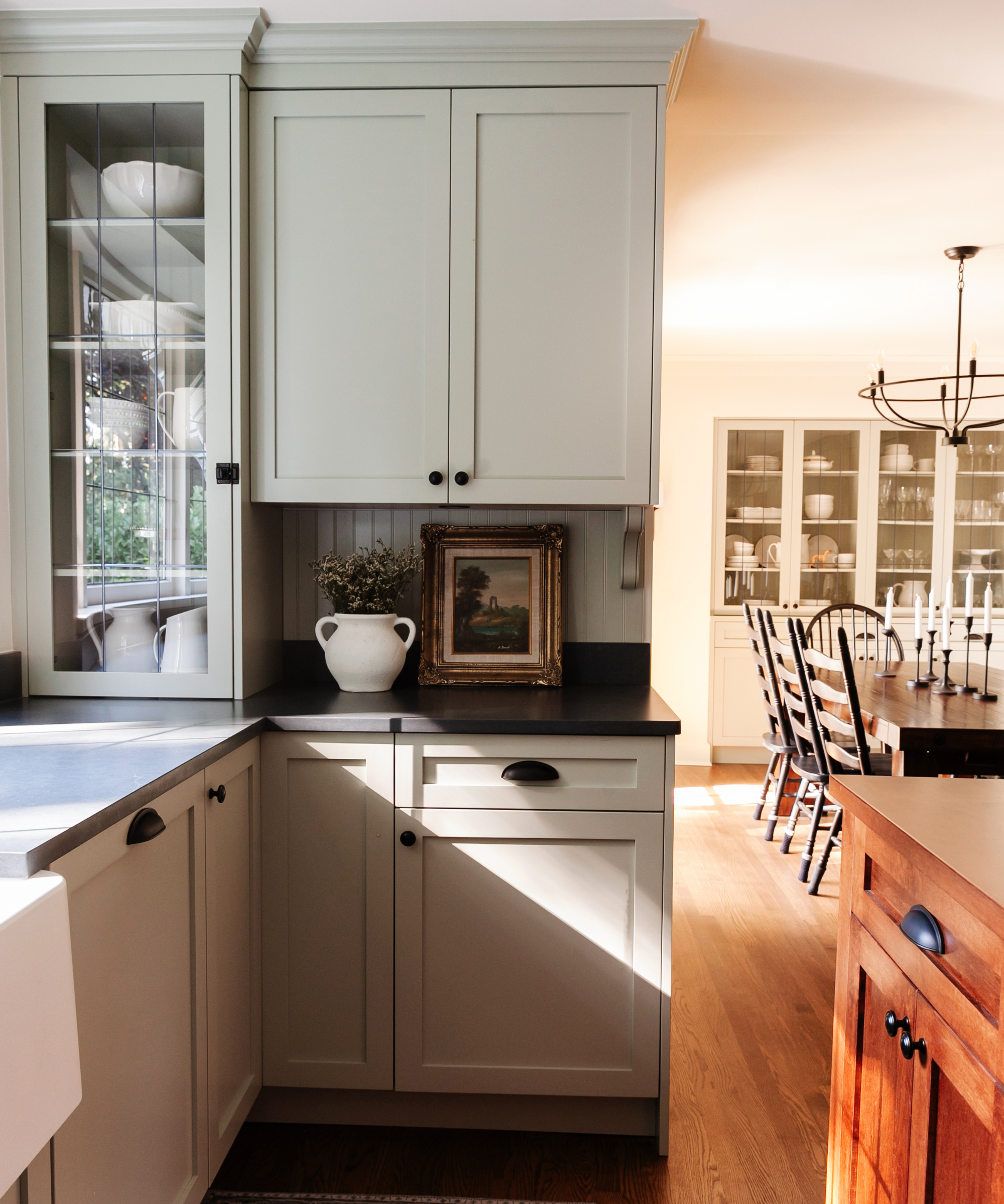
Benjamin Moore's Saybrook Sage has proved popular time and time again, with designers claiming it's one of the best sage green paints on the market. In this stylish kitchen, pictured above, Taylor Sims, lead designer and CEO of Canada-based Sims Home, used the sage shade on cabinetry to give the space a functional refresh.
'I treated it like a neutral, and I love using it to bring an organic, grounded feel to a space,' she says. 'The Saybrook Sage cabinets brought so much warmth and character, combined with light, refurbished dark wood flooring, and natural textures.'
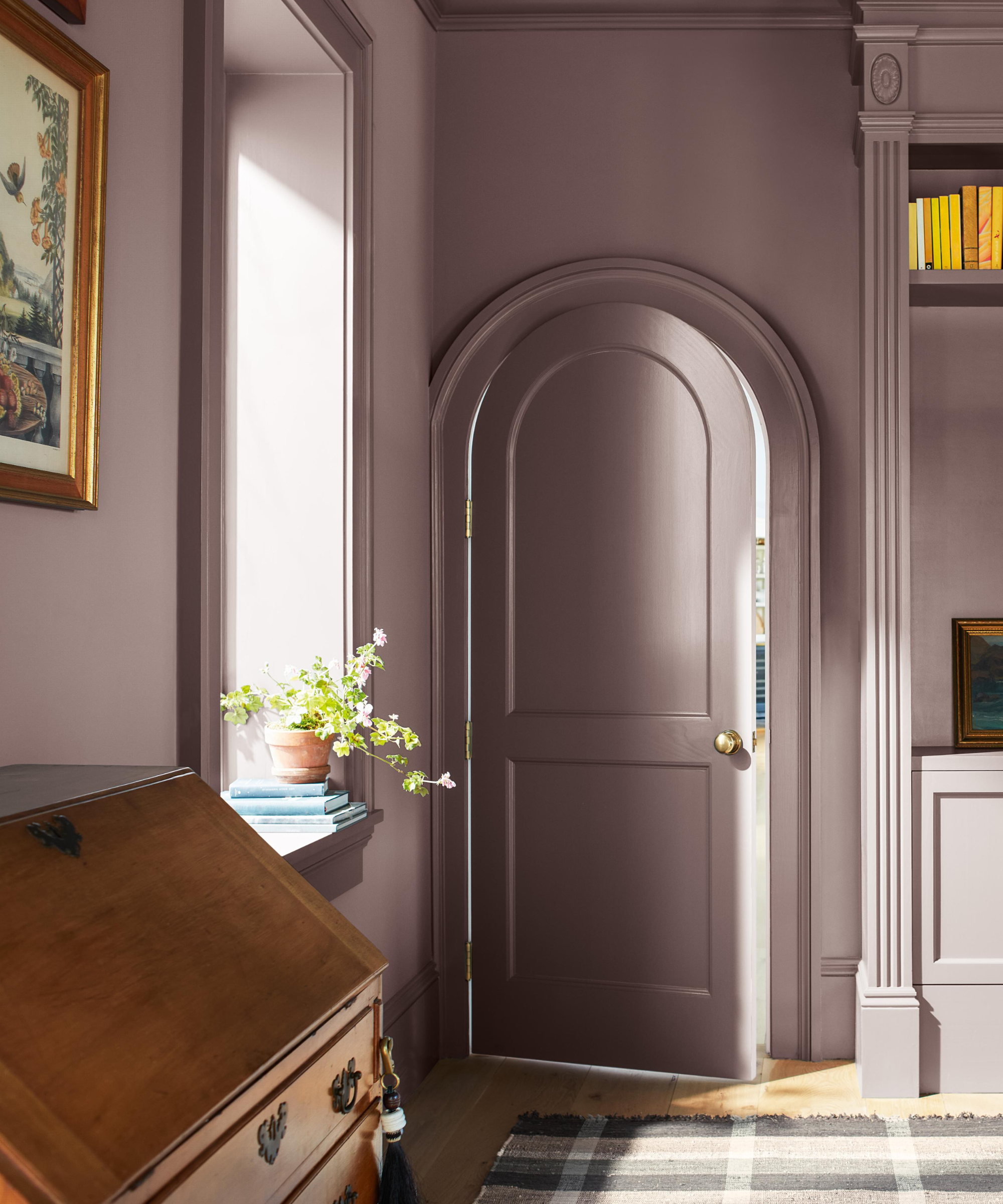
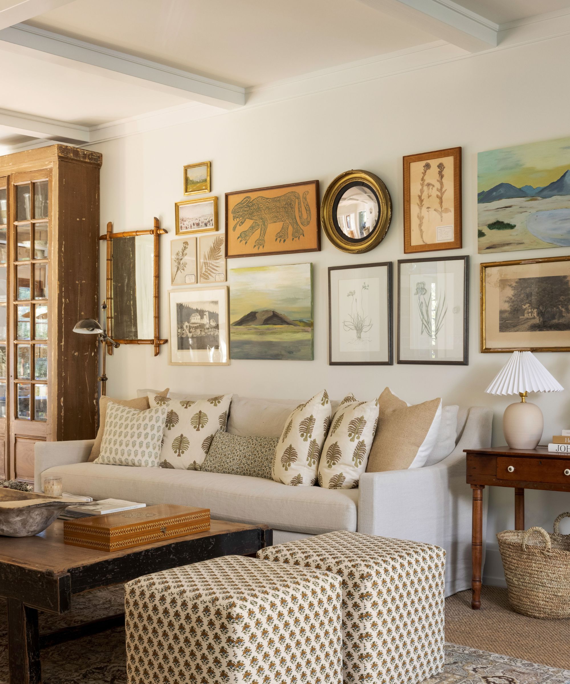
Cinnamon Slate 2113-40, named Benjamin Moore’s 2025 Color of the Year, also made the top sampled list. 'This versatile shade embodies the concept of “in-between hues,” allowing homeowners to embrace color in a subtle, muted way.'
As you can see in the heritage space above, this mauve hue is not too saturated, combining the warmth of plum with more neutral brown tones, an incredibly livable paint color. Appearing to have almost a powdery look, this color is restful, allowing you to tap into the growing purple trend without veering too dark or bold.
'Its nuanced blend of heathered plum and velvety brown creates a warm, familiar feel, making it both inviting and stylish, so it’s no wonder it has become a favorite for creating spaces that feel simultaneously contemporary and comforting,' Helen adds.
Of course, classic white and warm neutrals remained an enduring favorite among decorators in 2025 – with Simply White OC-117 at the top of the list.
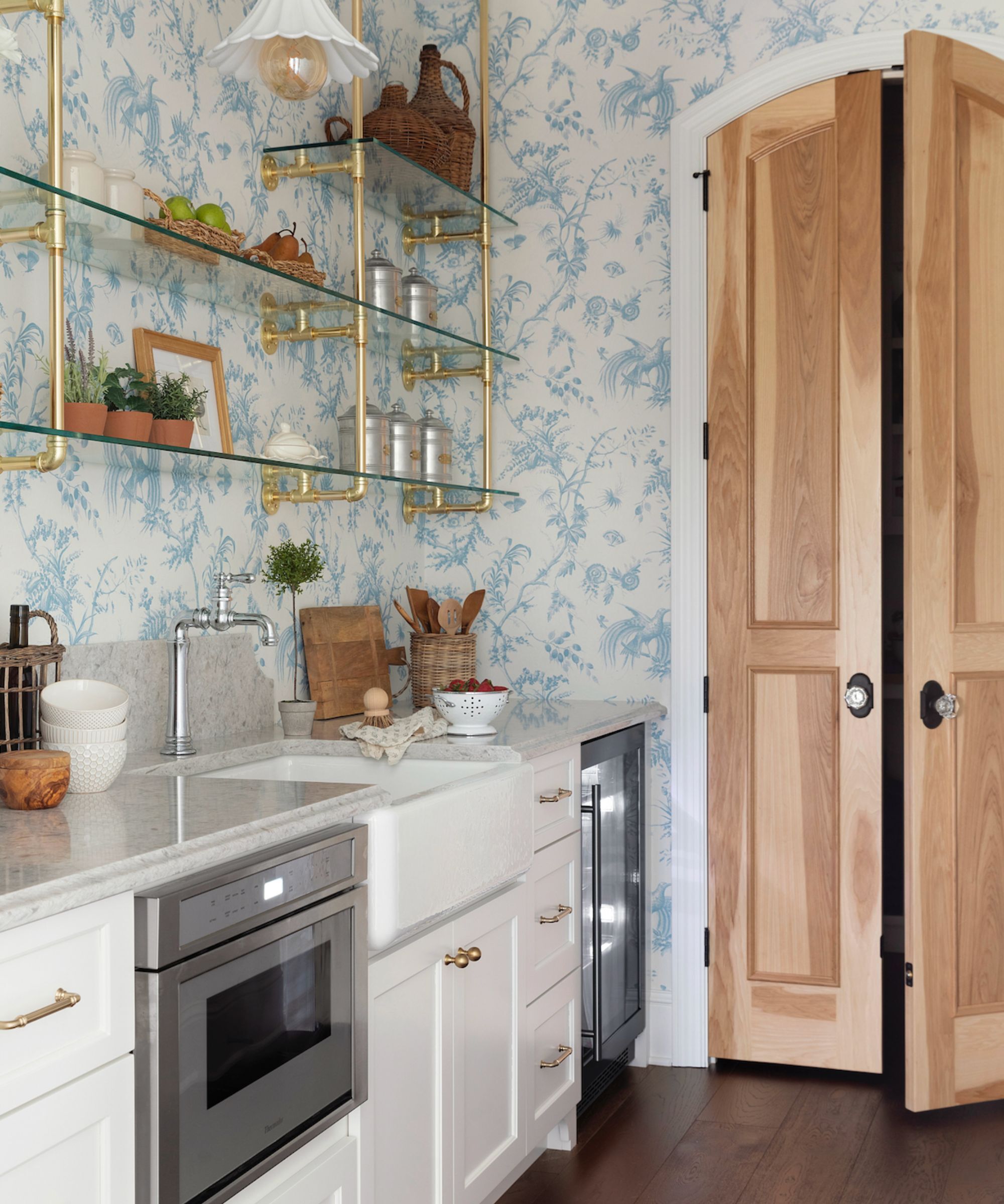
Jennifer Davis of Davis Interiors, who chose to decorate with Benjamin Moore's Simply White in this timeless blue and white kitchen, adds: 'It is clean and bright without feeling cold or sterile. There is a touch of warmth that makes it feel welcoming.'
'White also maintained its place as a perennial favourite – simple, clean and classic, it is a timeless choice that has the power to make a space feel spacious and fresh,' says Helen. 'While some might consider it plain, it has the power to create a refuge for busy minds, making it an excellent choice where a sense of calm is paramount.'
'The key here is to choose a warm white with nuanced undertones, such as Swiss Coffee OC-45 or White Dove OC-17, that doesn’t feel too stark,' she advises, noting hues in our list of the 5 best Benjamin Moore white paints.
'It’s also worth noting that while neutrals feature prominently in sampling data, they are often tested for woodwork, doors, and trim, rather than walls, which helps explain their consistent popularity.'
Designer Caitlin Flemming used Swiss Coffee throughout this modern rustic California home seen above. The warm neutral works perfectly as it doesn't feel too clinical, but you still get that freshness that lifts the traditional style of a lot of the decor, making it feel chic and modern.
'The warm hue of Benjamin Moore's Swiss Coffee creates an atmosphere of calmness and serenity while also being elevated,' explains Caitlin. 'The beauty of this particular color is the brown undertones that don’t read too yellow. It looks perfect with the William Morris wallpapers in the home.'

Looking ahead to 2026, Helen predicts that this subtle sophistication will continue to define interiors in the year ahead.
'As we enter 2026, color trends are gently shifting. While bold, highly saturated hues were popular in the early 2020s, these are now giving way to more nuanced and versatile shades,' she suggests.
'Similarly, traditional grays and beiges, although long-time design staples, are evolving as designers and homeowners explore warmer, more layered alternatives,' Helen continues. 'Rather than fleeting microtrends, the focus is now on colors and designs that have lasting appeal and flexibility over time.'
'The new direction embraces “quietly colorful” tones – subtle, comforting hues that feel fresh yet timeless,' she adds. 'Neutrals with pink and red undertones like First Crush CSP-310 are becoming increasingly popular, bringing warmth and depth to bedrooms and living spaces.'
'Plaster pinks and soft dusky rose shades like Batik AF-610 add an earthy, grounded feel while providing a perfect foundation for layered décor and evolving personal style.'
'Brown is emerging as a sophisticated alternative to black and gray,' she adds. 'Deep chocolatey tones, such as Benjamin Moore’s Color of the Year 2026, Silhouette AF-655, offer a rich and versatile option.'
'With subtle charcoal undertones, it can anchor a variety of interiors, creating depth and sophistication,' she adds. 'It works beautifully both as a backdrop for color-drenched spaces or as a contrasting element with lighter textures, balancing elegance with a relaxed, approachable feel.'
Shop Benjamin Moore's Most Sampled
A long-standing favorite for good reason, Simply White is crisp yet never cold. Its subtle warmth keeps it feeling fresh and clean without tipping into stark territory, making it an easy choice for walls, ceilings, and trim alike.
Soft, balanced, and versatile, Benjamin Moore's White Dove is the kind of white designers return to time and again. With gentle greige undertones, it feels calm and lived-in rather than clinical, making it ideal for open-plan spaces and bedrooms.
Creamy and comforting, Swiss Coffee brings warmth to a room without feeling heavy. Its subtle beige undertones make it particularly flattering in spaces with less natural light, where cooler whites can fall flat. Use it to create an inviting, relaxed atmosphere.
A quietly elegant neutral, Benjamin Moore's Pale Oak sits beautifully between beige and greige. Its soft warmth and gentle depth make it a brilliant choice for living rooms and hallways, where it adds subtle interest without overpowering the space.
Often described as a “goes-with-everything” neutral, Benjamin Moore's Revere Pewter earns its cult following. Warm yet balanced, it adapts effortlessly to changing light and pairs just as well with cool blues as it does with warm woods.
Earthy, soothing, and timeless, Saybrook Sage brings a gentle wash of nature indoors. Its muted green tones feel grounding and serene, making it ideal for kitchens, bedrooms, or airy living spaces. Rich enough to make a statement, yet soft enough to live with long-term.
Last year's hue on the year, Cinnamon Slate is a masterclass in subtle statement. Sitting between plum and brown, it adds warmth and depth without overwhelming a space. Perfect for creating cozy, characterful rooms.
Confident and classic, Benjamin Moore's Hale Navy is a deep blue that never feels too bold. Its richness makes it a popular choice for cabinetry, doors, and walls, while still reading as timeless rather than super trend-led.
Moody yet refined, Vintage Vogue is a deep green with undeniable presence. Its layered undertones give it depth and drama, making it particularly striking in traditional interiors or color-drenched spaces. Use it to add instant character.
If Benjamin Moore’s most sampled paints of 2025 tell us anything, it’s that our relationship with color has gotten way more confident. While timeless whites still anchor our schemes, there’s a growing desire for shades that bring warmth, depth, and a sense of calm. If you’re feeling inspired but unsure where to begin, our guide on how to choose paint colors breaks down everything you need to know to help you find a shade you’ll love living with long after the last coat dries.