“Poor Things” is a Frankenstein-esque fantasia about a young woman (Emma Stone) reanimated by a demented surgeon (Willem Dafoe), but the behind-the-scenes work that went into crafting the movie’s wildly warped world may be the film’s greatest act of mad science.
Though Yorgos Lanthimos’ earlier films — at least leading up to “The Favourite" — were more spare productions, “Poor Things” fuses all the tools of classic Hollywood filmmaking — grand sets, miniatures, sumptuous costumes — with subtler touches of modern technology. The movie is, itself, a Frankenstein.
Only the scars (not counting the ones on Dafoe’s elongated face) don’t show in the magpie design of “Poor Things.” The film’s style is rooted in an 1890s Victorian setting, but it expands surreally from there.
“We were looking at the Victorian era as if it had been written about in a sci-fi movie,” says Shona Heath, one of the two production designers on the film along with James Price. “We basically gave ourselves an open book to do what we wanted.”
The result is something wholly original. “Poor Things,” based on Scottish novelist Alasdair Gray’s 1992 book, conjures an elaborately demented world as seen through the childlike eyes of Bella Baxter (Stone), a woman, as Dafoe’s Dr. Godwin Baxter describes, whose mental age and body “are not quite synchronized.”
“Poor Things,” which expands in theaters Friday, is one of the most acclaimed films of the year. (It won top prize at the Venice Film Festival and was nominated for seven Golden Globes on Monday. ) And a lot of that is owed to the richness of its craftsmanship.
To understand how they tackled it, The Associated Press spoke to Lanthimos and several key collaborators — the productions designers, costume designer Holly Waddington and cinematographer Robbie Ryan — about bringing “Poor Things” to life.
BUILDING BELLA’S WORLD
“From the moment I read the novel, I always felt that we needed to build a world that Bella would inhabit,” says Lanthimos. “Like Victorian era, but tweaked.”
The sets built by Heath and Price would be the foundation of “Poor Things.” The movie begins in Baxter’s London townhouse, which houses a laboratory inspired by “Young Frankenstein." It then travels to Lisbon, Alexandria and Paris, with a steamship voyage in between. It’s a journey of self-discovery and sexual liberation for Bella, set against a delirious fairy-tale backdrop.
Lanthimos had some guiding references, including films like Francis Ford Coppola’s “Bram Stoker’s Dracula,” Luis Buñuel's “Belle du Jour” and Fellini movies. But he gave his production teams wide latitude.
“Yorgos encouraged every extremity,” says Heath. “He wanted something he hadn’t seen before.”
The designers gradually assembled a reference guide of 200 pages. Inside were everything from paintings by Hieronymus Bosch, Egon Schiele, Francis Bacon and John Singer Sargent; drawings of medical surgeries; and grotesque blob fish.
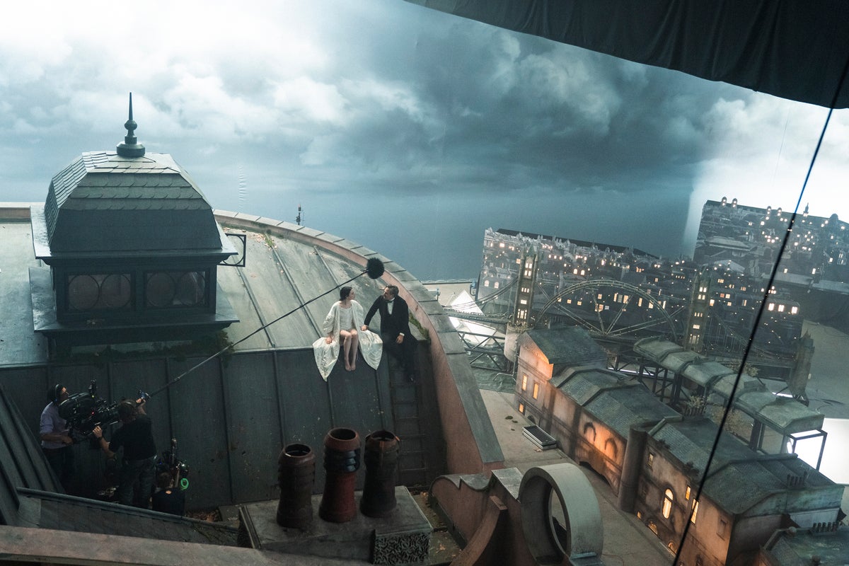
On soundstages in Budapest, the production designers built massive, immersive sets for the London townhouse, a Paris square in winter and the cruise ship. The Lisbon street scene set, 170 feet long and 60 feet tall, was so large it needed to be erected separately at nearby Korda Studios. LED screens were typically used for backdrops.
“We did 10 years worth of work in one movie, creatively,” says Price.
Price and Heath are particularly proud of the London townhouse, which was so fully built, with something down every corridor, that to some on set it seemed like an actual house. Lanthimos didn’t save anything from the production but he took pictures of the London house’s slow demolition.
Price ("Paddington 2," “Judy”) has grown accustomed to seeing his works built and destroyed.
“I find it quite cathartic that you can go from conception, the birth of an idea, to the death. It’s kind of rare as a creative. It lives on in cinema,” says Price. “I’m odd, though. Everyone else finds it tragic.”
LUNG-LIKE SLEEVES AND CONDOM COATS
Lanthimos’ guidance for Waddington was even less: a single image of some inflatable trousers. But that was enough to set her thinking about expressing Bella’s nature through her clothing. In one striking example, Bella wears a wedding dress with airy, balloon-like sleeves.
“She is a reanimated person. This idea of air and breath. That manifested itself in these sleeves that were huge and lung-like and organic,” says Waddington.
Waddington initially thought Bella’s wardrobe would be small, since she’s traveling. But as she dug more deeply into her work, Waddington began to chart Bella’s growing independence through her attire.
“I realized quickly that it would not do to do that. Her evolution is rapid, and the clothes needed to grow with her,” says Waddington.
Early on, Bella’s clothing is more doll-like and animalistic. The bustle of one dress was made of rolls of crinoline that resemble a judge’s wig or a lobster tail. To Waddington, it's a perfect combination of period and contemporary, almost like a puffer jacket.
“If you look at the late Victorian clothes, the women’s wear is full of bits of animals, bits of unborn Persian lambs – quite grotesque things,” she says. “I wanted to capture something of the animal in the clothes.”
For the Paris brothel chapter of the film, Waddington used yellow latex to create what she terms Bella’s “condom coat.” Throughout the process, she leaned into bodily shapes and textures.
“It’s partly the subject matter," she says. "All I could see was genitalia in everything I was doing.”
Yet by the time Bella is fully realizing herself and finding her professional future, her clothing grows closer to modernity. Once in medical school alongside rows of men, Bella, in a formal black top, initially seems to blend in.
“Then I wanted a subtle shift,” Waddington says. “I still wanted to subvert it, so when she got up, you would see these legs without any skirt on.”
NO BORING ANGLES
Ryan is best known as the cinematographer of naturalist filmmakers like Andrea Arnold, Ken Loach and Noah Baumbach. But beginning with “The Favourite,” Ryan and Lanthimos have found a strong collaboration.
Ryan, who operates the camera himself, found he could bring some of the same approaches to the florid design all around him.
“Ironically, we shot in a very similar way to ‘The Favourite.’ We didn’t use much lighting on set. Everything was lit from afar,” says Ryan. “We shot it in a way that didn’t feel complicated.”
Ryan and Lanthimos shot “Poor Things” on film. He was typically working with only one camera and shot as much as possible in camera, not depending on visual effects for much except things like the movie's many computer-generated hybrid creatures.
“The visual references and ideas they had were wild. I was like: ‘How are we going to do that?’” Ryan says. “We used a lot of tricks and techniques and old camera styles that were very practical in a way, and lent themselves to being more visual. That was the great ambition, to try and follow it in an old-school way of ’30s cinema. That made it easier to imagine.”
But Lanthimos is also known for his more flamboyant shooting styles that favor wide and fish-eye lenses. Having worked together on “The Favourite,” Ryan says he had learned not to suggest too simple of a shot to Lanthimos.
“He’d go, ‘That’s such a boring angle. Why would you do that?’” says Ryan, chuckling. “That’s sort the aesthetic the film was trying to achieve. With ‘Poor Things,’ you’re allowed to do that. When you watch the film, it jumps off the screen.”


