If, like us, you pay far too much attention to new kit releases every summer, then you’ll have noticed a recent trend over the past couple of years that shows no sign of going away.
Clubs from across the globe are increasingly turning to minimalist badges for their kits, whether this is by designing new crests or bringing back more simple, retro designs.
Here’s a look at why this new design craze started and some of the more prominent changes we’ve seen in recent years…
VIDEO EA FC 25 Upgrades: slip passes, dribbling, pass accuracy, professional fouls
Juventus
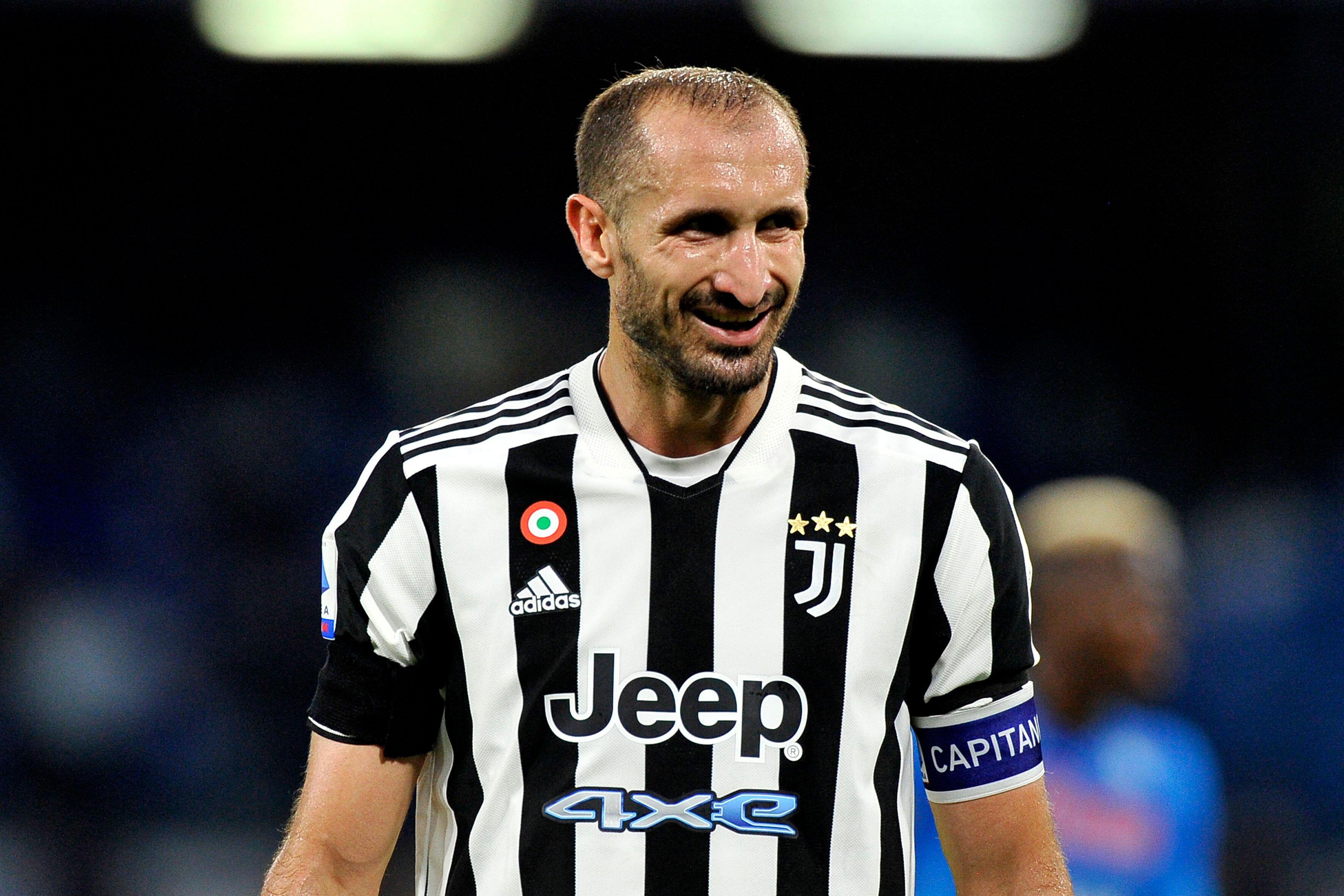
Italian giants Juventus were one of the first teams to undergo a drastic badge change in this manner when the club rebranded in order to appeal to younger generations.
The team moved away from its traditional oval-shaped logo that featured the club’s name, famous black and white strips and a dancing horse with a crown above it to a stylised, simple black and white ‘J’ design in 2017. Originally the design had the club name on top of it, but that was dropped in 2020.
The thinking was to create a design that can be used both on the club’s kits, plus more causal clothing, without looking explicitly like a football badge. Think of all those New York Yankees caps you’ll all summer being worn by people who have no idea who Derek Jeter is, and you get the idea.
This push to modernise and win over younger fans was helped by the signing of Cristiano Ronaldo in 2018 as the Italian side helped to set a trend that plenty of teams continue to follow.
Arsenal
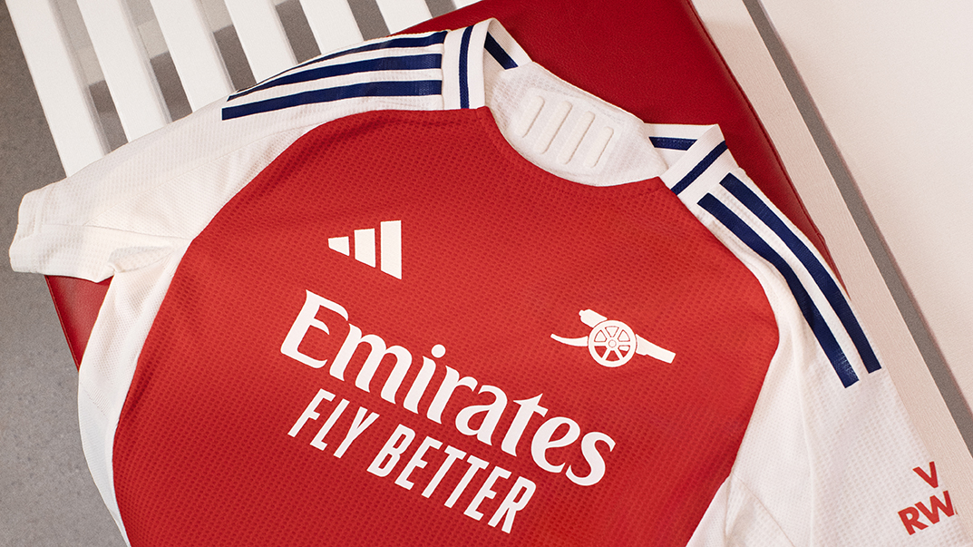
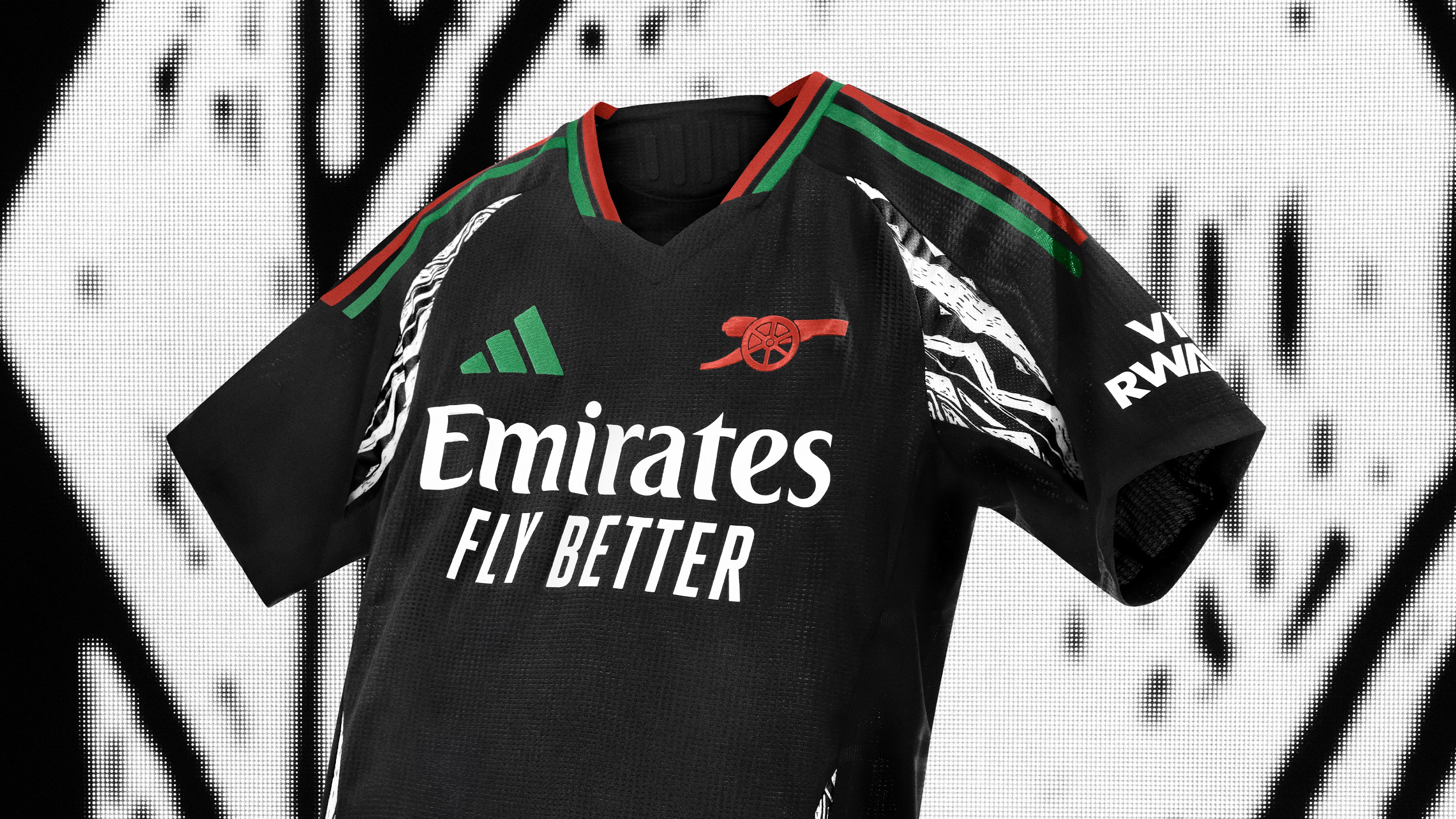
Arsenal’s last major badge change came in 2002, when they came up with a hugely simplified design from that of the George Graham days. Traditionalists bristled at the time, after dabbling with using a retro badge on one kit per season since 2021/22, all three of this season’s shirts will feature just the cannon emblem on their shirts for the upcoming campaign.
You have to go back to the 1977/78 season for the last time that the cannon was the badge on all the club’s kits, but with no Premier League rules preventing clubs from using a different logo to their traditional crest on matchday shirts, it again shows how teams are looking to serve up something different.
Manchester United

The biggest club in English football also opted for a stripped-back badge last season, when Manchester United’s third kit isolated the devil design from their main club crest and put it on their third kit.
This was the first time that the club had used just the devil on their shirt and leaked pictures of this year’s third shirt appear to show they will be doing so again in 2024/25.
Liverpool

Liverpool fans will argue that they’ve been ahead of the curve when it comes to a simplified crest on their kits.
The club’s official crest that was redesigned in 1999 has plenty going on, featuring the iconic liver bird, the Shanky gate, ribbons, torches with the memorial flame and the date they were founded, 1892.
But this design has not featured on their kits for more than a decade, with the Reds opting for a basic liver bird above the letters LFC on all of their kits since 2012.
Leeds United
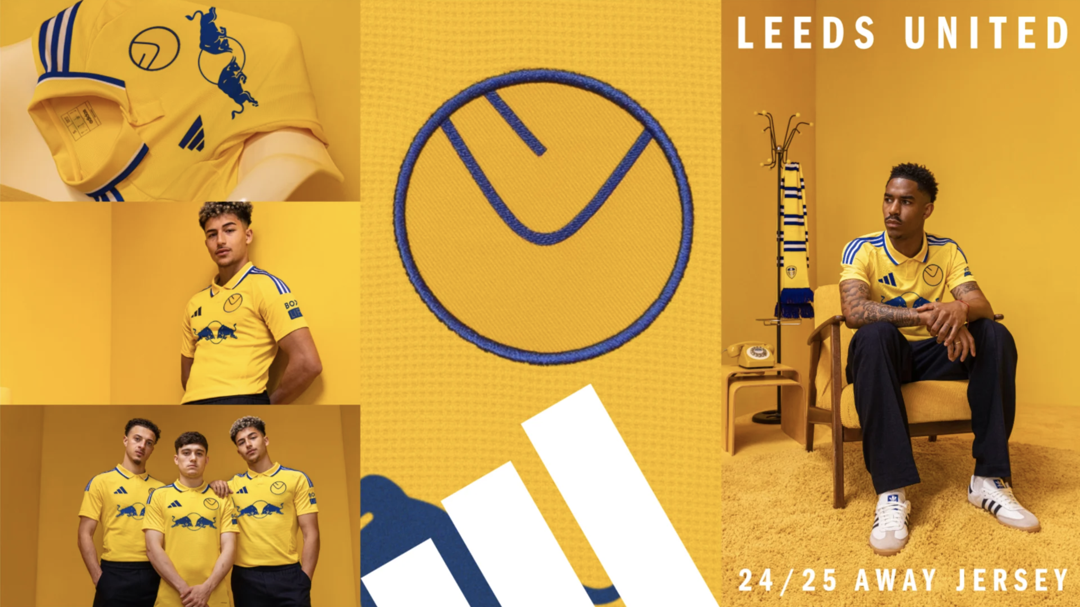
Leeds United turned heads this summer when they brought back their iconic ‘smiley’ badge, a product of the 1970s that features and the letters L and U put together to look like a smiling face.
The bold yellow kit smashed sales records at Elland Road was received a darn sight better than their disastrous 2018 ‘Leeds salute’ rebrand which saw them become football’s laughing stock for six hours before they quickly abandoned the idea.
Newcastle United

Hot on the heels of Leeds’ ‘70s-inspired release was another simple, stylish, retro offering from Newcastle United, who went back to the ‘80s for their third kit. The design features the letters NUFC, with the C curved into the bottom of the design with a magpie sitting beneath it.
Bayern Munich
The newest addition to our 2023-24 Adidas Collection: Bayern Munich Third ShirtThis design features a crest that was first used by the club in 1923. The original crest still makes an appearance, featuring on the back of the shirt#classicfootballshirts @classicshirts pic.twitter.com/C86h96J8uTAugust 24, 2023
There’s a common theme with most of these new designs and that’s the fact that Adidas are leading the way when it comes to these simple or retro badges. It should therefore be little surprise that Bayern Munich are on the bandwagon, as their third-choice kit last season featured a badge that they used until the mid-1950s, while this year’s third kit is set to feature a badge from the mid-‘60s.
Fiorentina
Anima Viola💜⚜️#forzaviola #fiorentina pic.twitter.com/rru4VBJm5TMay 16, 2024
Another notable new badge design is the Fiorentina crest which was updated in 2022, doing away with the ‘AFC’ on the badge and the gold border, in favour of a more basic red and purple design.
More kit stories
Premier League kits 2024/25: Everything we know about this season's shirts
Ranked! The 100 best football kits of all time
Leeds United’s ’smiley’ badge explained as fans heap praise on club’s retro away kit
