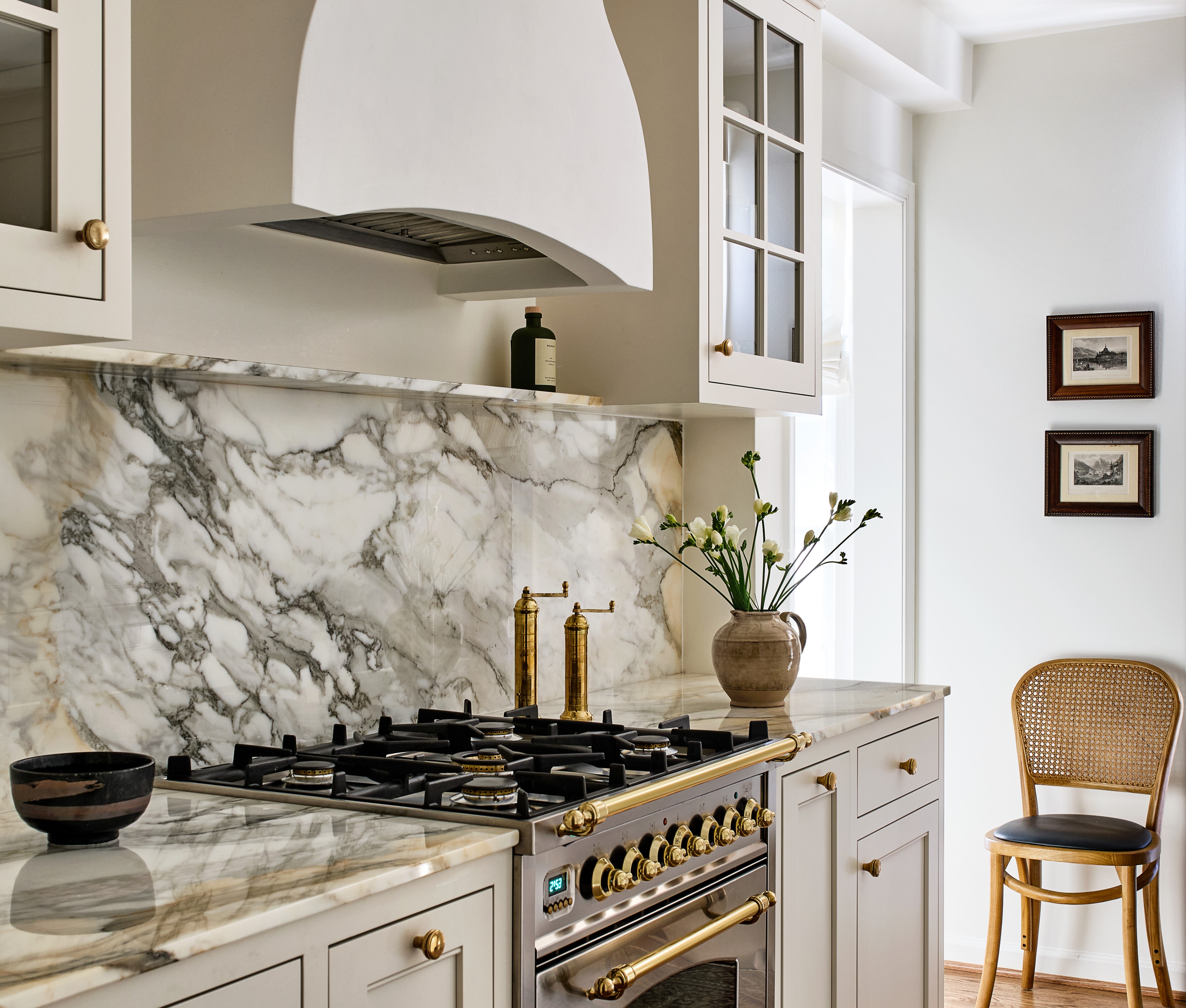
This 1900s row house located in DC's historic Georgetown's East Village is a vintage jewel. It's a home with good bones, and the crown molding, wainscoting, and original hardwood floors have stood the test of time, making most of the rooms in the home feel timeless.
There was, however, one space that stood out as particularly dated — the dark, unwelcoming galley kitchen. But for interior designer Sara Swabb of Storie Collective, it was an opportunity to revitalize the space. A fresh new palette, unique material scheme, and smart storage solutions make this small galley is now almost unrecognizable.
Created in collaboration with Tanya Smith-Shiflett of Unique Kitchens & Baths, we take a tour of the details this gorgeous kitchen makeover below.
Before
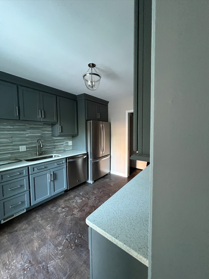
The kitchen was previously a dark space with hardwood floors and dark gray cabinets that didn't make the most of the room's limited natural light. Sara Swabb of Storie Collective decided to transform it into a modern kitchen with a lighter palette and introduced visually appealing materials and fixtures to uplift the room.
'The goal for this 1900 row house was to honor the home's historic charm while also adding modern amenities and clean lines,' says Sara. 'Careful attention was paid to preserve the home's heritage while upgrading its key elements.'
After
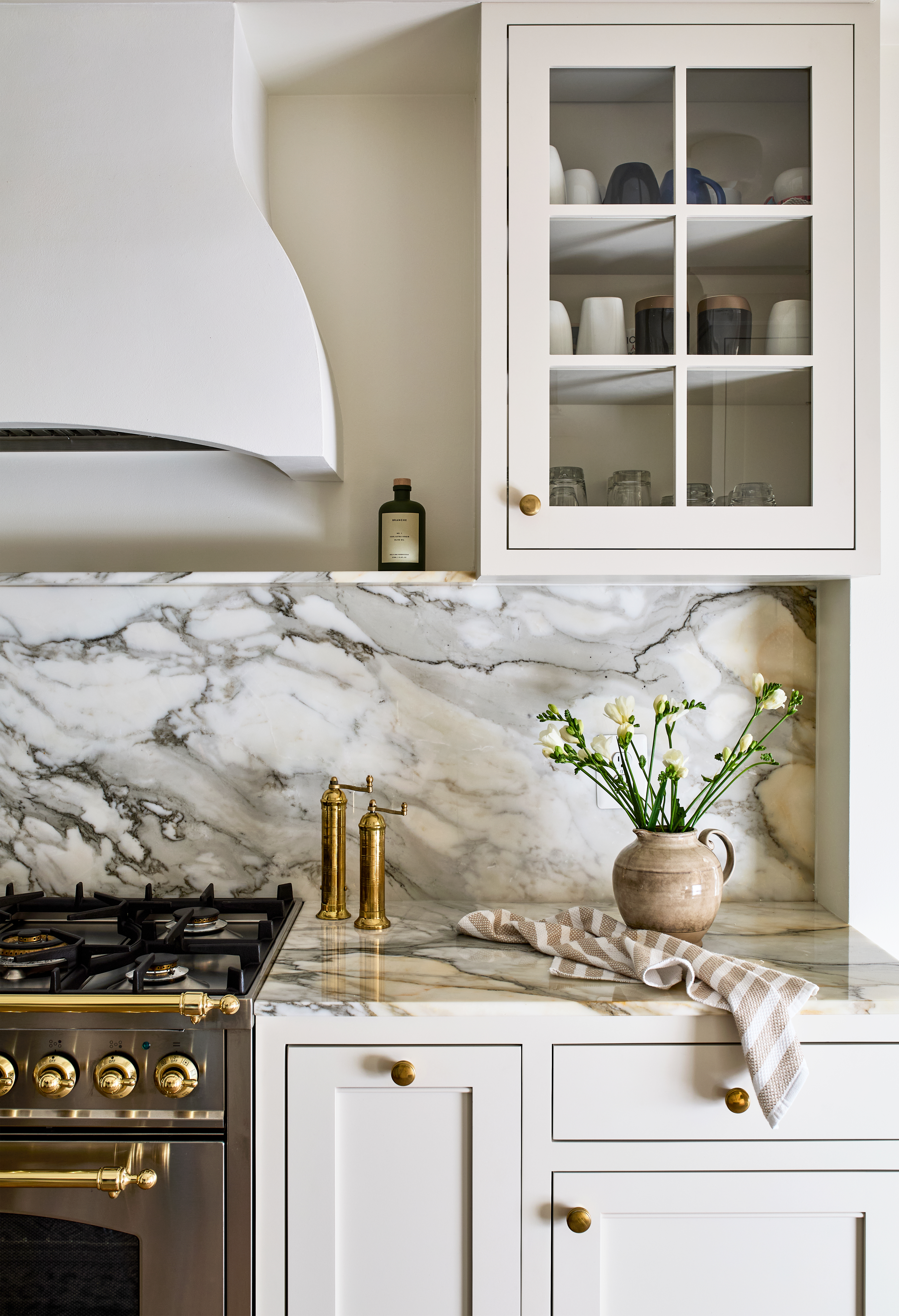
'We chose bold marble kitchen countertops and rich wood-toned selections and balanced them by a neutral paint and wallcovering palette,' says Sara. 'Cabinetry by Unique Kitchens and Baths along with heritage furnishings, including antique pieces and vintage-inspired lighting fixtures honor the historic charm.'
To give the kitchen color scheme depth, the designer chose a combination of neutrals and whites 'with Farrow & Ball Shaded White on the cabinetry and Benjamin Moore Cloud White on the walls,' shares Sara. 'We love that the combination makes the space feel warm and timeless while also ensuring the room feels larger than it is.'

The veined kitchen backsplash adds movement to the room and breaks the uniformity of white. 'We love natural materials for both the backsplash, Macchia Vecchia Marble, and sink, hammered matte nickel,' says Sara. 'Both appeal to the modern heritage style that we were striving for. The sink is especially forgiving and easy to clean and maintain.'
The antique tap and ceiling lights maintain a vintage appeal, in keeping with the home's overall vibe.
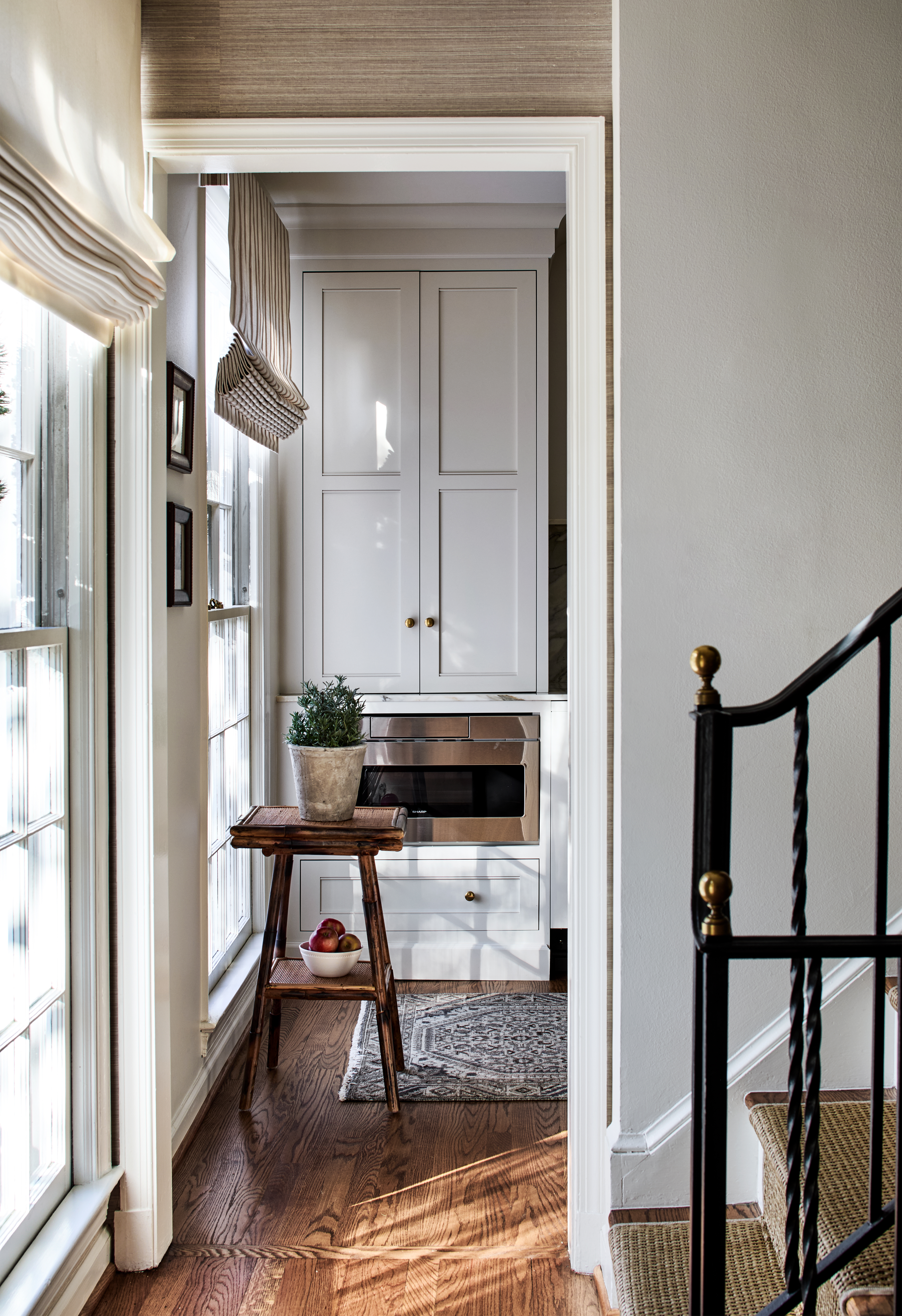
'We love that every square inch of this home was considered,' shares Sara. 'Because we never want a space to feel like a storage room or appear to be working too hard to hold things, we brought the contrast down and allowed the kitchen cabinets to blend into the walls. Even though storage is there, it does not feel like it because the cabinetry is the same color as the walls, or close to it.'
Antiqued brass handles add another transitional-style detail that ties the kitchen in with the wider home, echoing the brass finials on the staircase just outside. 'The hardware is a tarnished living brass metal,' informs Sara. 'We are in love with this option as the fabricator has already started a patina on the product and it will continue to get even more beautiful with everyday use.'
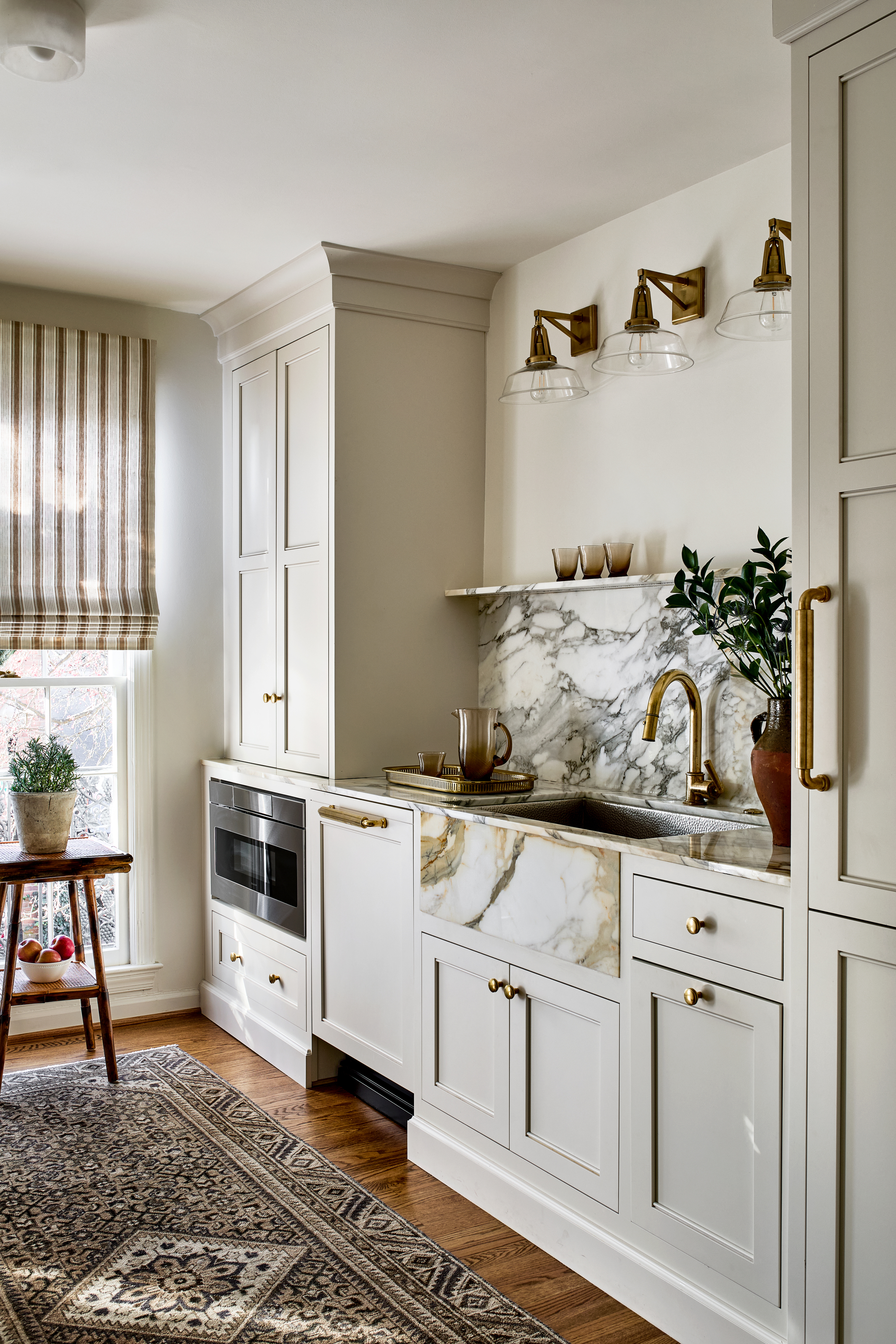
As for the kitchen wall lighting, 'we love how the lighting appeals to the historic nature of the neighborhood in which it resides,' says the designer. 'Natural brass, nickel, and oil-rubbed bronze fixtures with glass and fabric shades balance the clean-lined furnishings.'
In this beautiful showroom of materiality, hardware, and lighting, the kitchen rug adds warmth, and also a casual vibe. 'Rugs are total workhorses in a kitchen,' says Sara. 'We highly recommend wool antique rugs. They wear beautifully and are easy to clean and dry in the summer! For a little cushion and to extend the life of these already aged rugs, we recommend a rubber-backed rug pad.'


