
Located in the beautiful leafy state of Connecticut, this chic, airy home looks a far cry from what it was when James Veal and Christine Stucker, the husband and wife design-duo behind Stewart-Schafer, were enlisted to renovate it.
Setting out with an ambitious vision for the project, the interior designers aimed to blend the indoors with the outdoor surroundings, creating an inviting and stylish space in what was once a dark and lackluster home. The team drew inspiration from the era of the original home, embarking on an extensive gut renovation where they ripped out walls, integrated skylights, and elevated the entire atmosphere of the space.
The homeowners, a married couple with two children, wanted an inviting space for hosting and entertaining family and guests, with a focus on a top-tier, functional kitchen with clever, thoughtful organization throughout. Stewart-Schafer has created a very open, relaxed floor plan and the stunning modern home now feels welcoming and communal, with an enhanced sense of togetherness for friends and family to gather and connect.
The kitchen

Before James and Christine of Stewart-Schafer got to work, the kitchen felt small, cramped, and unwelcoming. 'The kitchen was a complete gut,' they say. 'There is nothing left of the original space.'
To achieve this gorgeous transformation, the duo removed several walls to open up the space to create an open-plan kitchen, and added a completely custom kitchen, with gorgeous oak millwork and custom hardware.
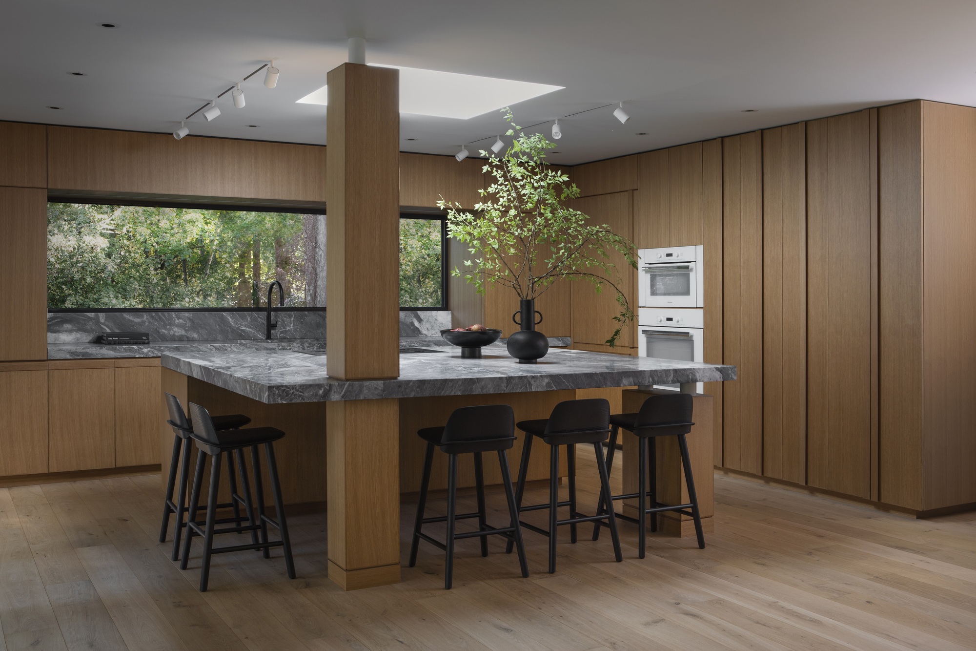
'The homeowner loves to cook and host, so we knew we wanted to create a more communal experience, which is why we made a large island with a range facing the rest of the room,' say James and Christine. 'This way, when the wife is cooking, she can still be involved with her family.'
In terms of space-saving solutions, the designers savvily integrated loads of kitchen storage and an appliance garage. 'All the appliances are panel ready, which again adds to the kitchen feeling larger, and transiting seamlessly to the rest of the space.' Now, the kitchen feels charming and relaxing, accommodating the couple's passion for cooking with stylish functionality.
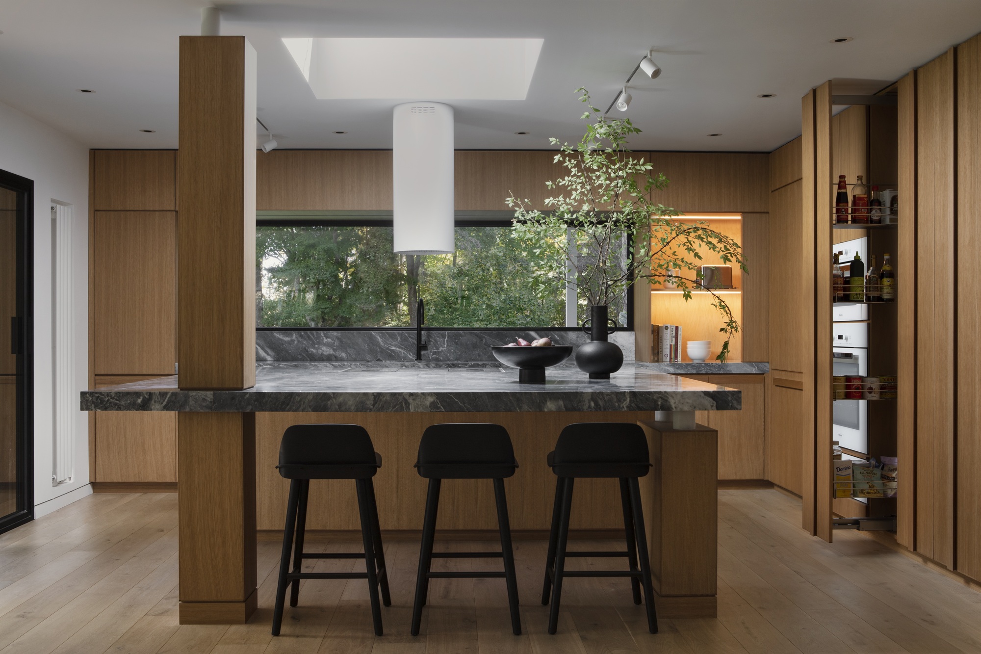
The kitchen island with stool seating becomes the heart of the home, serving as the focal point for the kitchen and emphasizing a sense of family. Strategically positioned within the kitchen space, it beckons friends and family to gather and connect.
'We included both a dining table, that seats 10, and the island,' say James and Christine. 'The homeowners have a large family and a lot of friends, so we wanted to create a large area for entertaining which can allow for many people to sit together.' To augment natural light and enhance the ambiance of the kitchen, James and Christine also integrated a skylight over the island, strategically illuminating the area and creating a sense of atmospheric brightness.
The living room

Similar to the kitchen, the living room was 'crying out for an update,' say James and Christine. It lacked character and style but had all the potential for a beautiful space. Now, though, the living room is full of light, making the space far more welcoming. The only original feature remaining is the exposed brick fireplace, as shown below, which was a request from the homeowners.
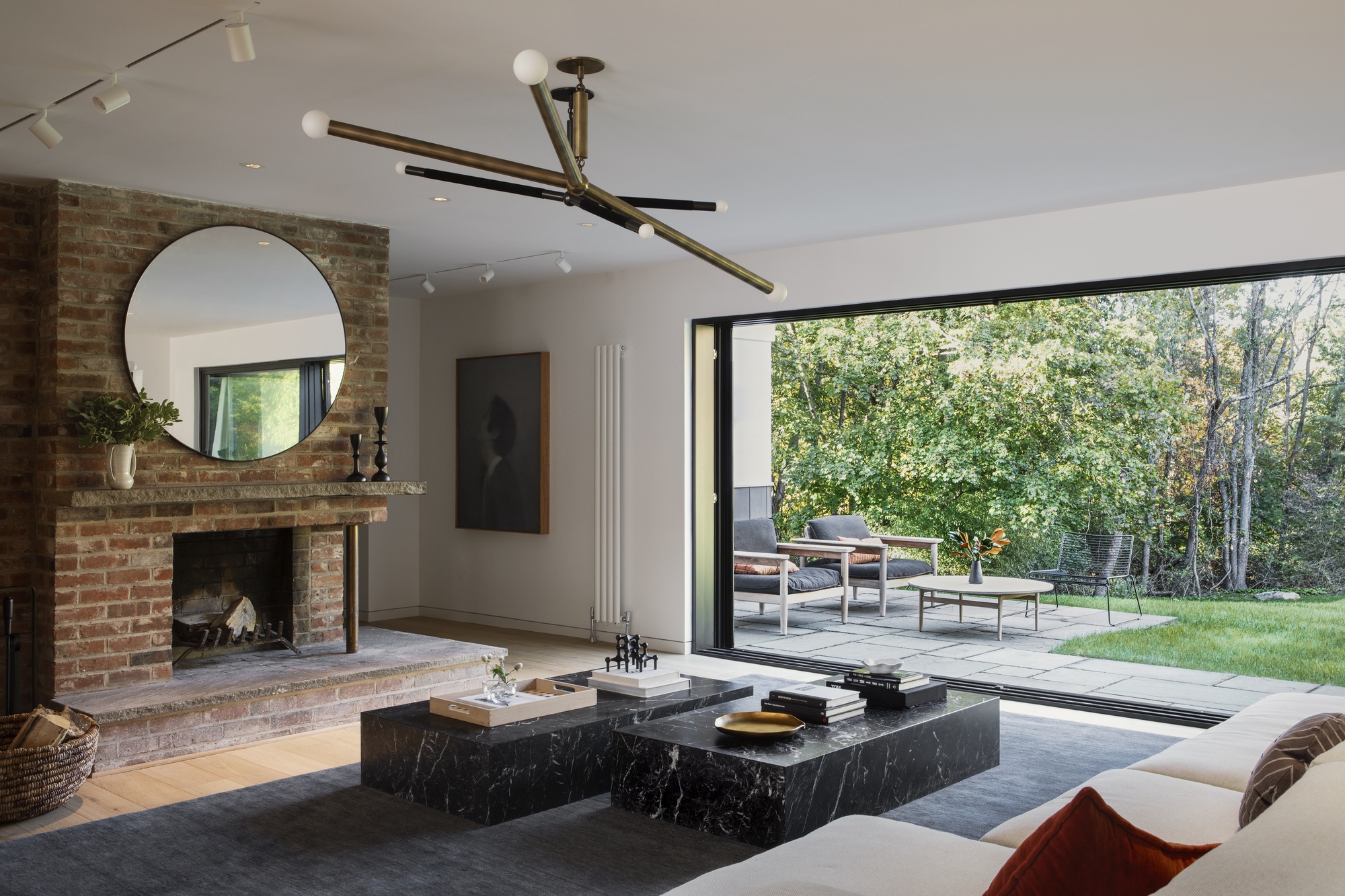
'We wanted to create a more timeless decor,' say James and Christine. 'We lean on Mid-Century but we have incorporated modern touches. This space is very large and communal, and, again, we wanted to have loads of space for entertaining. We like to create unexpected furniture layouts, and use various shapes to make a more layered environment.'
With the dual marble coffee tables, a stunning statement lighting fixture, and the original fireplace - now updated with the huge, modern mirror - the space feels cool, classy, timeless, and totally transformed.
Large windows blur the boundaries of outdoors and in
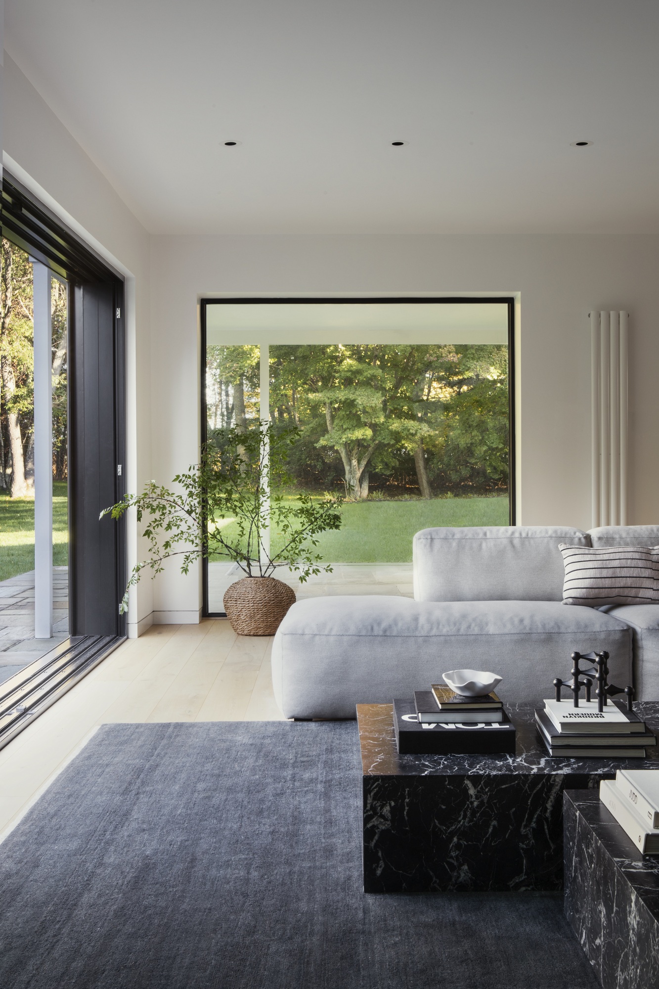
With a beautiful backyard surrounded by mature trees and a stunning pool which was built in the 60s, the design-duo wanted to maximize the blended indoor-outdoor experience.
'We created an indoor bar which is right beside the sliding doors, which creates an opportunity to open everything up and entertain guests inside and out,' says James. 'To create this inside-out feel, it was crucial to have these large custom doors, which expand the usable square footage of the home and make it feel so much more expansive. This home is sitting on a beautiful plot of land, yet it had no real views of the incredible landscape.'
'We took out the entire exterior wall which faces the pool, and replaced it with custom floor-to-ceiling glass doors that we had made in Europe,' he adds. 'They open completely, giving the interior space total access to the outdoors, which continues your line of sight to make the space feel much more grand.' The space now feels fresh, open, and breezy— perfectly uncluttered and modern, but still paying homage to the original feel of the home.
Wood Clad Walls are used to add Warmth
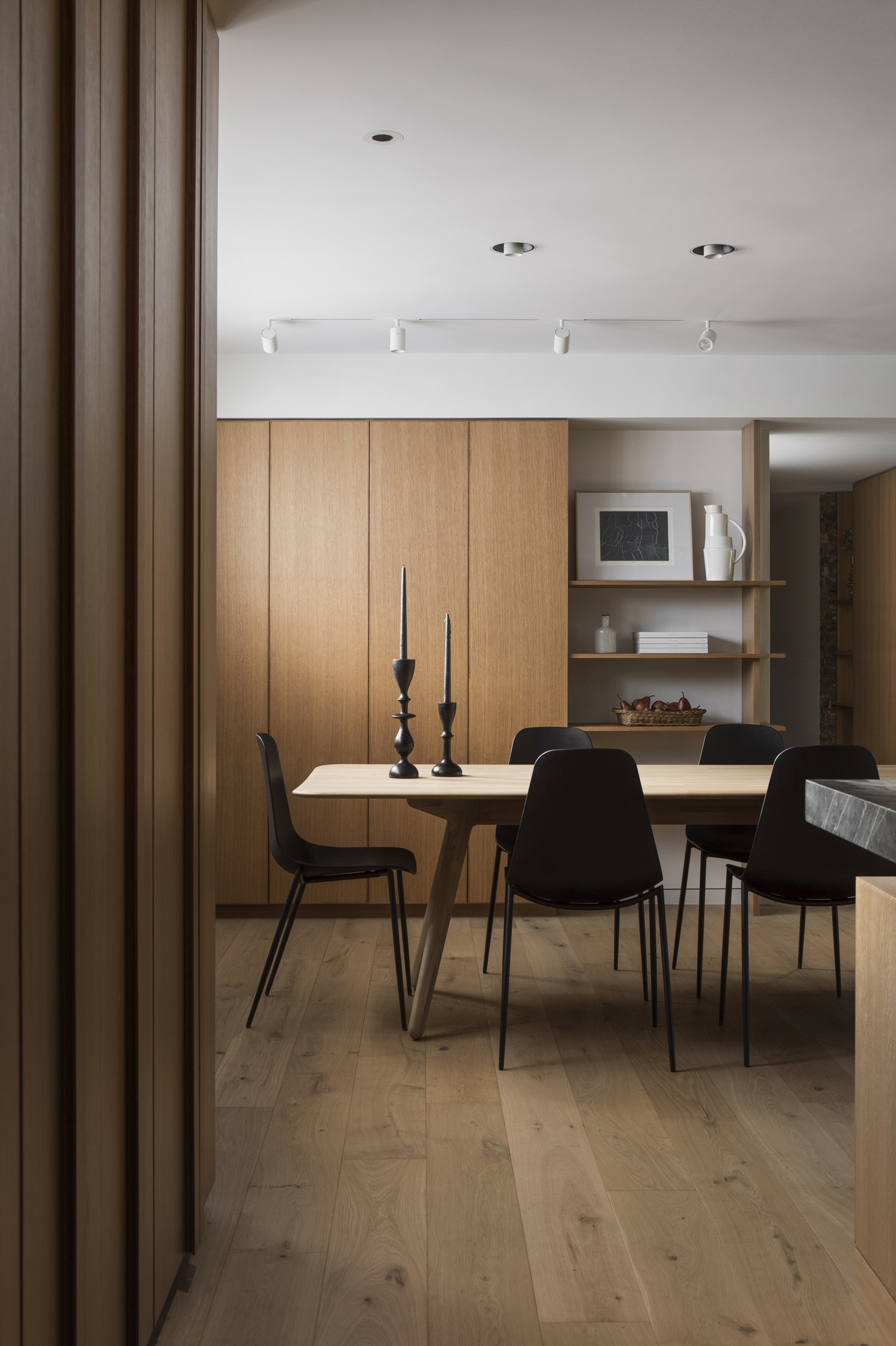
To give the home a sense of serenity, James and Christine opted for warm, wood tones throughout, with wonderful wooden walls, which feel natural and polished—without being overdone.
'We used a shiplap design to tie the renovated areas with some of the original elements in this house,' say James and Christine, creating a seamless sense of harmony. 'As for the wood tone, we like to keep it warm and natural looking, as we find this the most timeless.'
Feeling inspired?
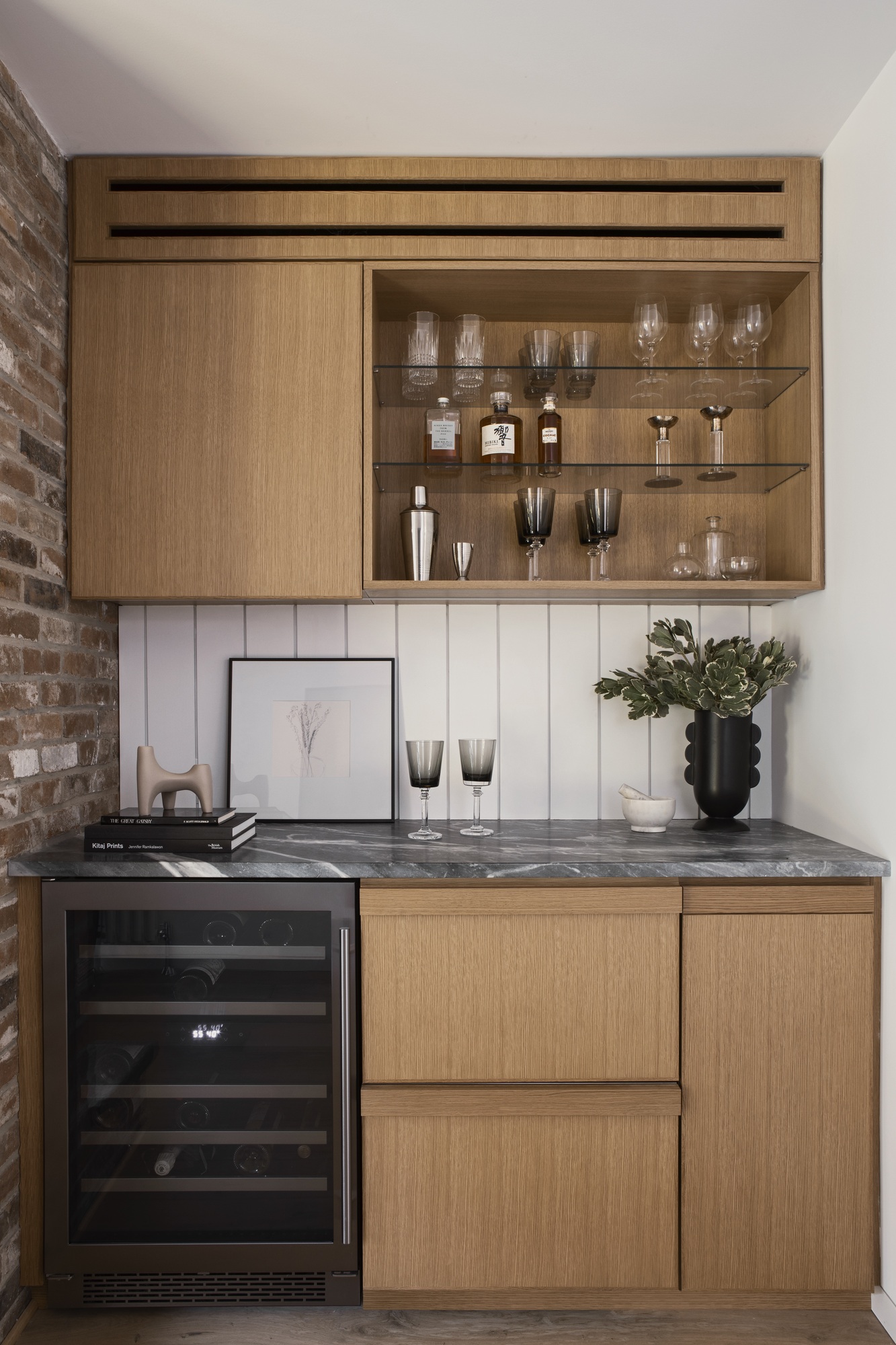
If you're feeling inspired by this totally gorgeous transformation— we can't blame you! Get the look in your own space by opting for warm wood tones, neutral walls and modern twists that feel timeless. Decorate with plants for an outside-in feel (even if you don't have the huge windows!) and use contrasting marble accents to elevate your space.


