Is there any excuse for an uninspiring kitchen. This space has quickly become the home's focal point, where cooking and socializing happens simultaneously. It deserves some love. And this was exactly the point Victoria McKenney of Enviable Designs wanted to make with this Vancouver kitchen reno. The 350 square feet (including the bar) space had a dated look and was in dire need of a renewal; one that would align with the rest of the home's design.
Inspired by Parisian interior design, the kitchen's largely muted space is full of texture and tactility. Ribbed surfaces, veined backsplash, and jewel-toned hardware come together wonderfully. 'These thoughtful design choices resolved challenges and resulted in a kitchen that seamlessly blends functionality and architectural interest,' says Victoria.
A picture of serenity and effortless style, this kitchen makeover is now inspirational. Take a look at its transformation, one picture at a time.
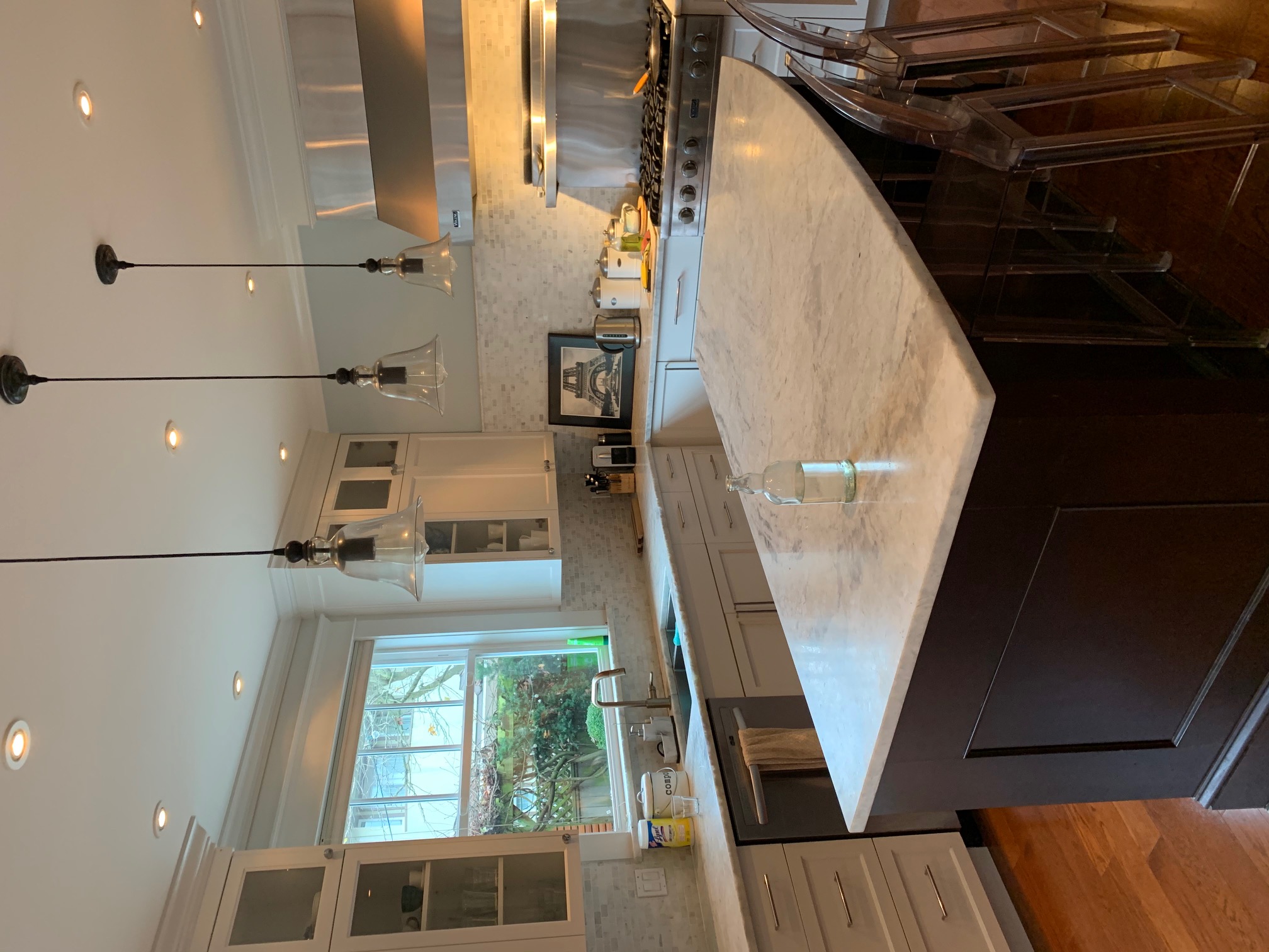
Before

The existing space housed dated floor and kitchen countertop materials and the overall layout wasn't conducive for use by all the members.
'The original design was very neutral, reminiscent of an early 90s renovation and slightly boring,' says Victoria McKenney, founder of Enviable Designs. 'We knew we wanted to create a showpiece for the new kitchen while keeping a similar layout to the existing one which meant allowing the natural materials to be given enough space to create an impact.'
'As part of the structural change, we created a larger, folding patio door to the backyard,' shares the designer. 'The original French door felt small and ill-proportioned, so we did change the footprint for a wider and taller opening to add more natural light to the space.'
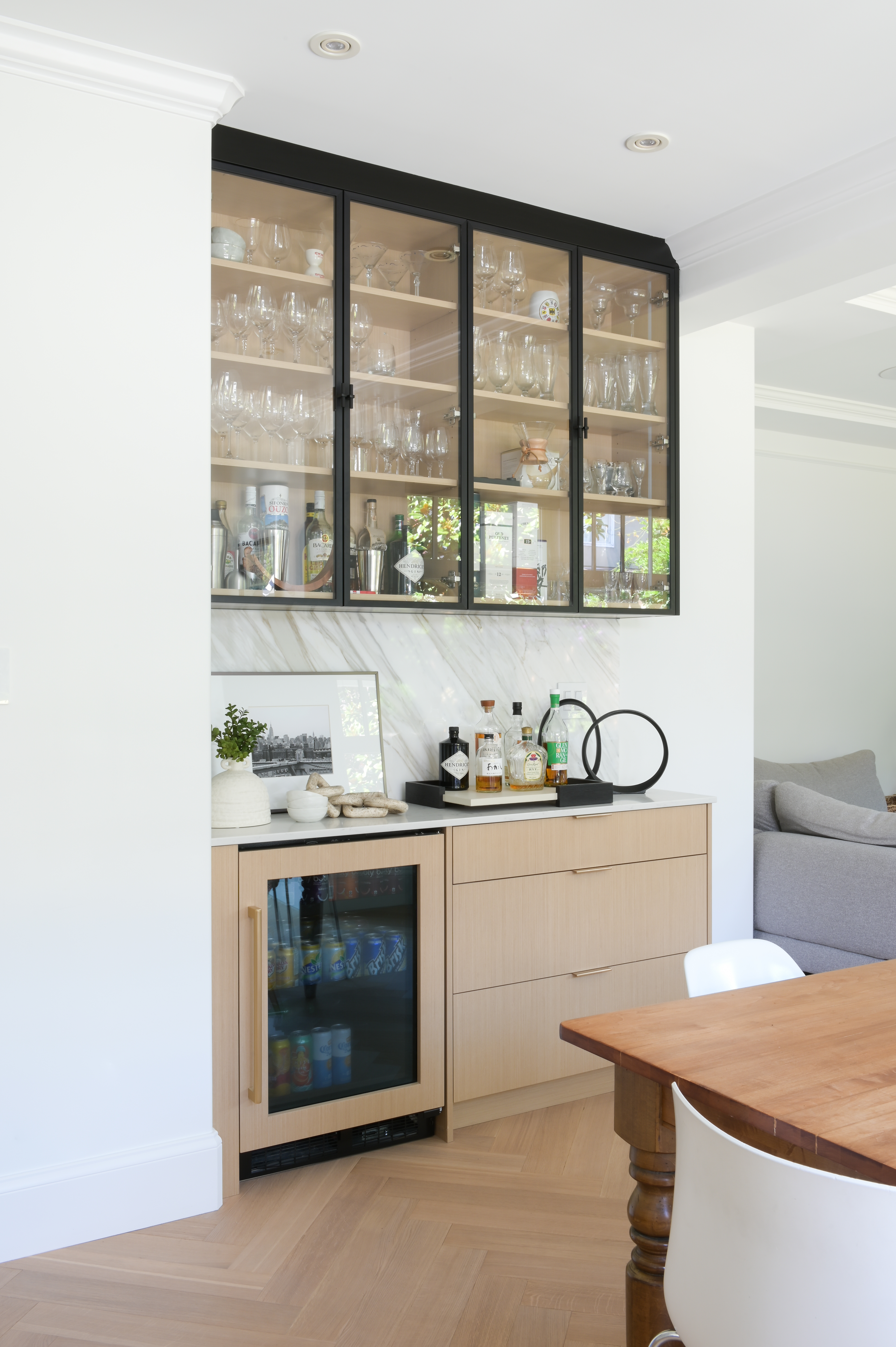
The new, custom cabinetry adds a lovely touch to the modern kitchen and provides ample kitchen storage. The integrated bar area now sports decorative shelving for display.
After

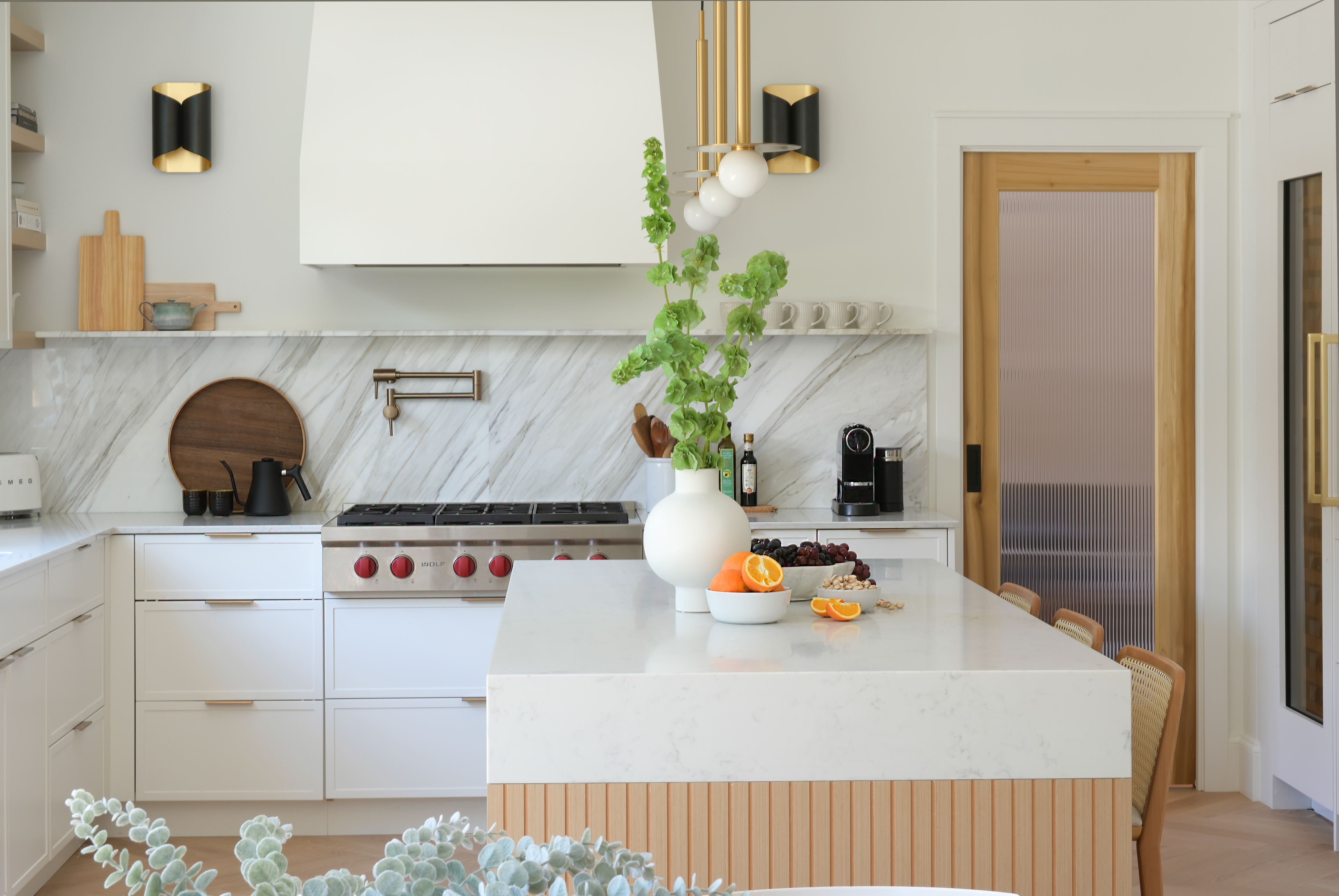
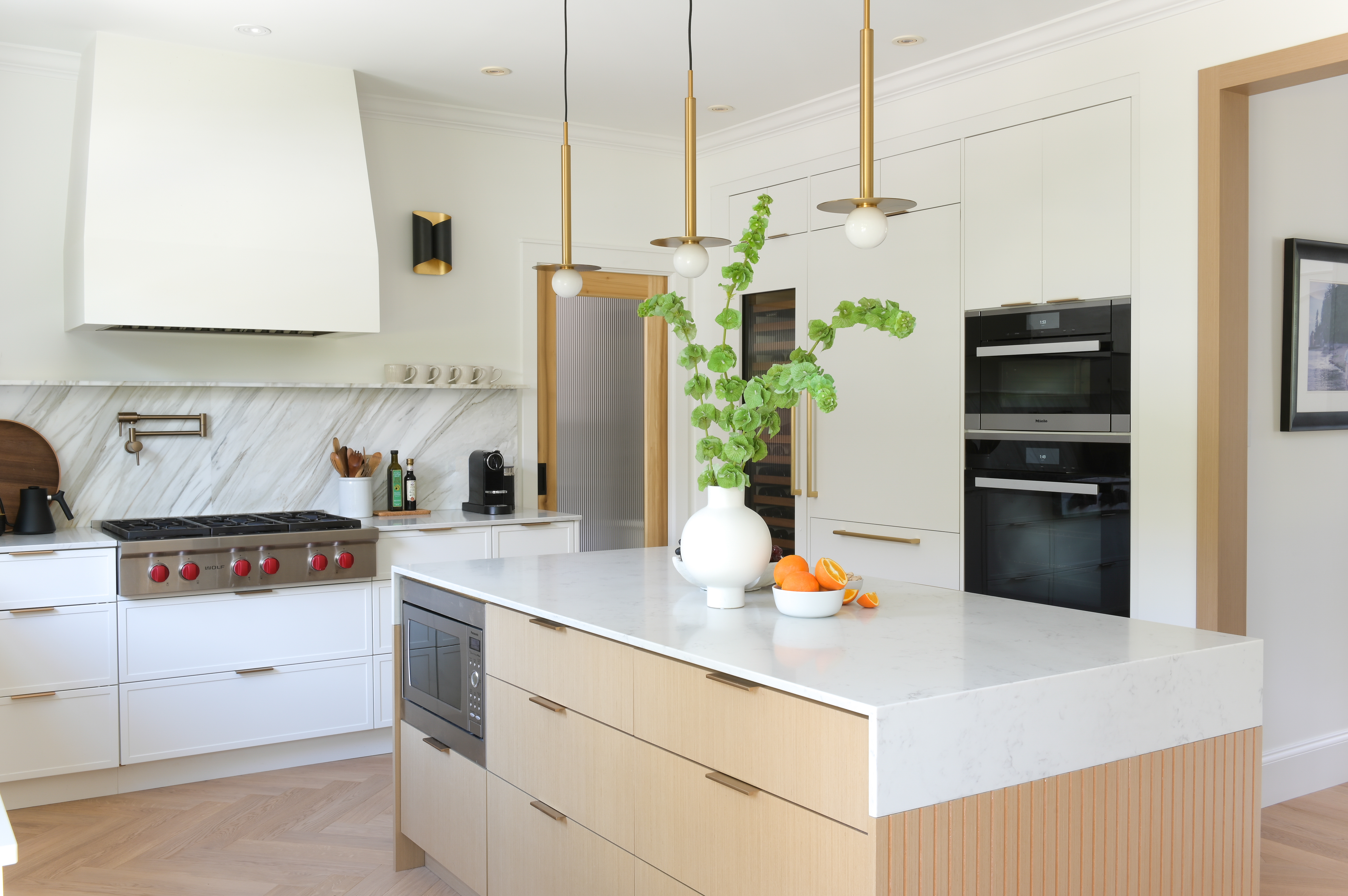
The kitchen color scheme is largely neutral — it's a soft homage to a sophisticated Parisian style.
'A warm and neutral color palette was important for our client,' says Victoria. 'By choosing white oak, Calacatta marble, and satin brass hardware, we created a space with a warm base that was still bright and airy.'
'A big consideration was creating a balance between a modern aesthetic, while also evoking a space that felt layered with a cohesive visual narrative without changing the original layout significantly,' says Victoria. 'We had to be innovative with our selection of materials to create this beautiful balance.'

The room is a study in textures and layering. Beautiful architectural elements come together cohesively, be it the fluted detailing on the kitchen island with a charmng "helmet" style waterfall countertop, the long, slender lights, marble backsplash and ledge, and herringbone white oak kitchen flooring. These thoughtful design choices resolved challenges and resulted in a kitchen that seamlessly blends functionality and architectural interest.
Victoria says: 'Our original concept began with a light wood, herringbone floor which was a beautiful base for the entire kitchen. The painted white, mini-shaker custom cabinets and white oak slab front cabinets are highlighted with the black metal doors of the bar. The island is the showpiece with a “helmet” style marble countertop overhang and fluted wood end gables. We love how all these textures create visual interest through their natural characteristics.'

As for the storage, 'because the space had limited wall space, we designed each kitchen cabinet to be as functional as possible which included specific organizers for recycling, cutlery, pots and pans etc,' says Victoria. 'Every square inch has been used in a thoughtful way so that no empty space was left underutilized, including the floating marble kitchen shelf which houses the family’s collection of mugs.'
All cabinets are enhanced with sleek brass handles, adding a touch of shine to the all-white palette.

The home bar has its own identity, designed with ample open and closed storage.
'Our clients requested a separate space to showcase their liquor,' says Victoria. 'We designed the millwork to blend seamlessly with the kitchen but also wanted to create a distinct visual zone which included integrating glass upper cabinets clad in black metal and continuing the Calacatta marble countertop and backsplash as a connection point.'


