How do you inject character and charm into an uninspiring, lackluster home? By retrofitting it with plenty of artful details and creative colors, of course. That's exactly what the design team behind this unique LA home did, turning it into a space that's brimming with personality, complete with unique vignettes around every corner.
The home, situated in LA's Atwater Village neighborhood, had been newly renovated when the owners purchased it, but it lacked any sense of individuality. Keen to create a playful space that reflected their personalities, they enlisted the help of interior designers Abby Pendergrast and Kitty Rheault to breathe new life into its bland white walls.
"Shortly after settling in, the couple realized the builder-grade lighting and finishes felt stark and had even been neglected in some areas," explains Abby. "Not only were they eager to inject their combined personality into the space, but they also needed their home to be multifunctional, as both primarily work from home."
Fortunately, Abby and Kitty reimagined the whole modern home so it not only speaks to the homeowners' style but meets these practical needs, too. Most notably, they weave bold yet cohesive color palettes through each room, tying the whole home up in a web of color that feels so fresh and unique — and it's an idea we'll certainly be replicating.
Entryway
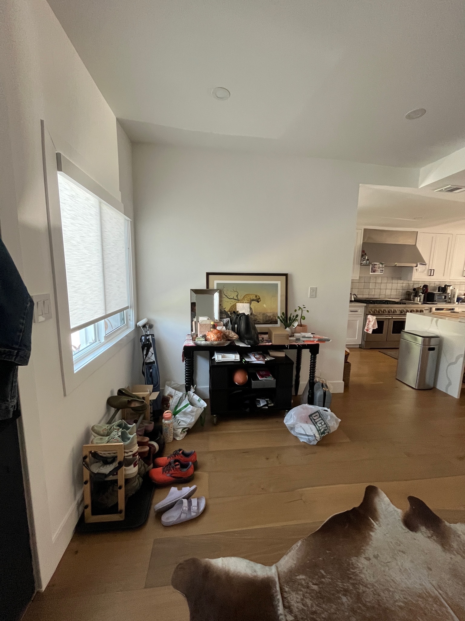
Before Abby Pendergrast and Kitty Rheault worked their magic, the open-plan home lacked any cohesion. Disorganized and cluttered spaced - like the entryway idea above - spilled over into their neighboring rooms and there was no sense of individual style anywhere.
"Although the original entryway was spacious, it felt stark and uninviting—qualities we would never use to describe the homeowners," says Abby. "Frankly, it was a waste of precious space. Homeowners Laura and Jordan are often on the go, whether heading to the gym, walking their sweet dog Penny, or meeting up with friends in the neighborhood. We wanted to create a strong first impression that would set the tone for the rest of the house while providing functional storage for their belongings and puppy accouterments."
Notably, the space was also totally devoid of color, so injecting bursts of bright shades became a priority for Laura and Jordan. "The two have very different personal styles that complement each other perfectly," says Abby. "While Laura was eager to incorporate bold color choices, Jordan’s personal photography collection added a grounded touch with its natural subjects and tones. Their combined style is vibrant, quirky, and sculptural, reflecting their appreciation for the arts, entertaining, and everyday living."
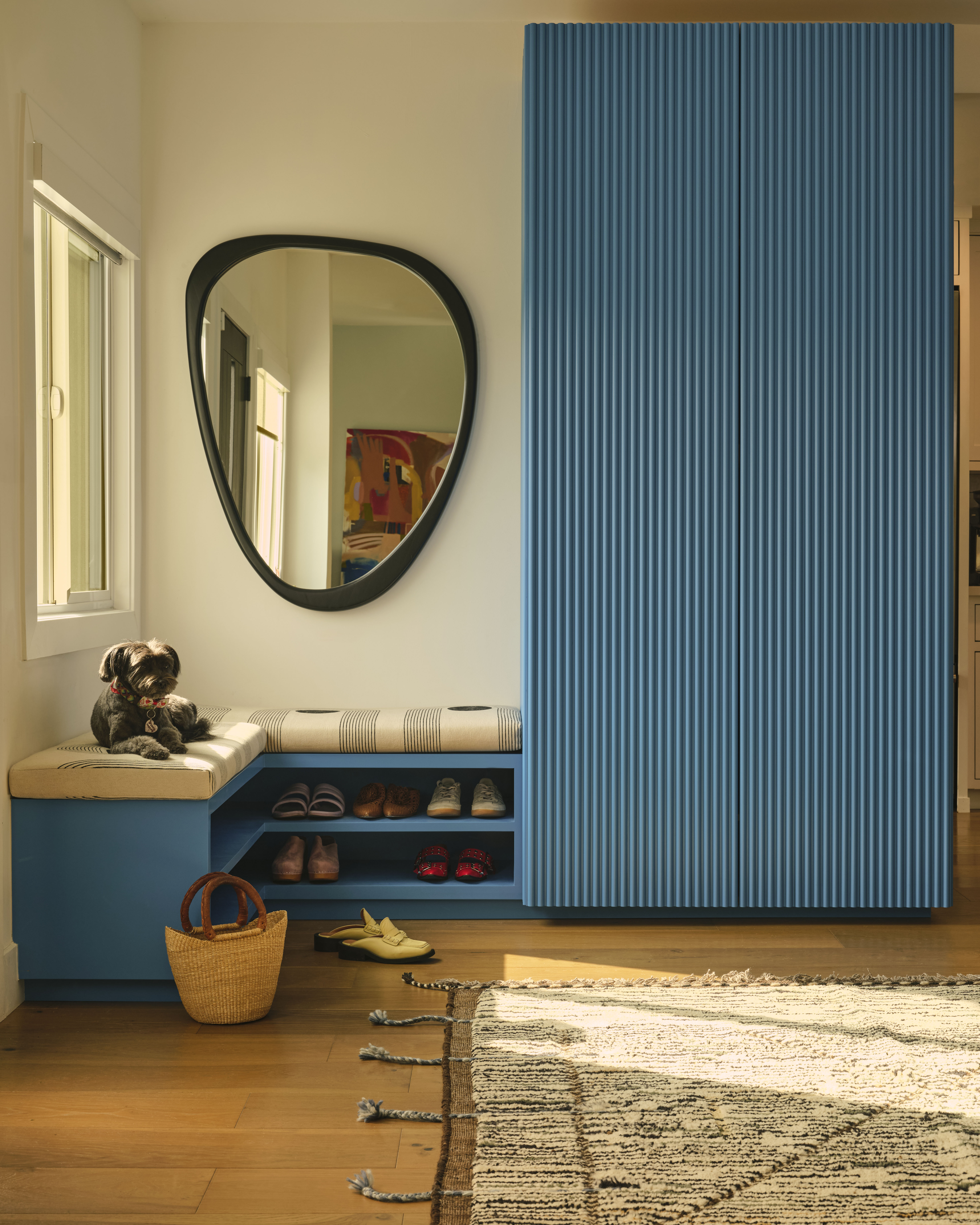
All of those preferences converge in the new entryway space that features bespoke built-in storage in a striking blue shade - a great way to make an entryway feel more welcoming. The focus here was on functionality, providing a practical space for storing shoes, coats, and other essentials that also looks good in the process.
"To address these needs, we designed a bench and closet combination, brought to life by Reason Modern " Abby explains. "The L-shaped bench, tucked into the corner to the left of the door, offers a place to slip on or off shoes and store them on the shelves beneath. The bold printed fabric from Block Shop Textiles—a nod to a favorite local business—beautifully contrasts with the Porsche Blue paint from Backdrop. The oversized closet anchors the space with its fluted doors and ample storage. We were thrilled to see this area transformed into a warm, intentional, and functional space, all while preserving its original minimalism."
Kitchen and Dining Area
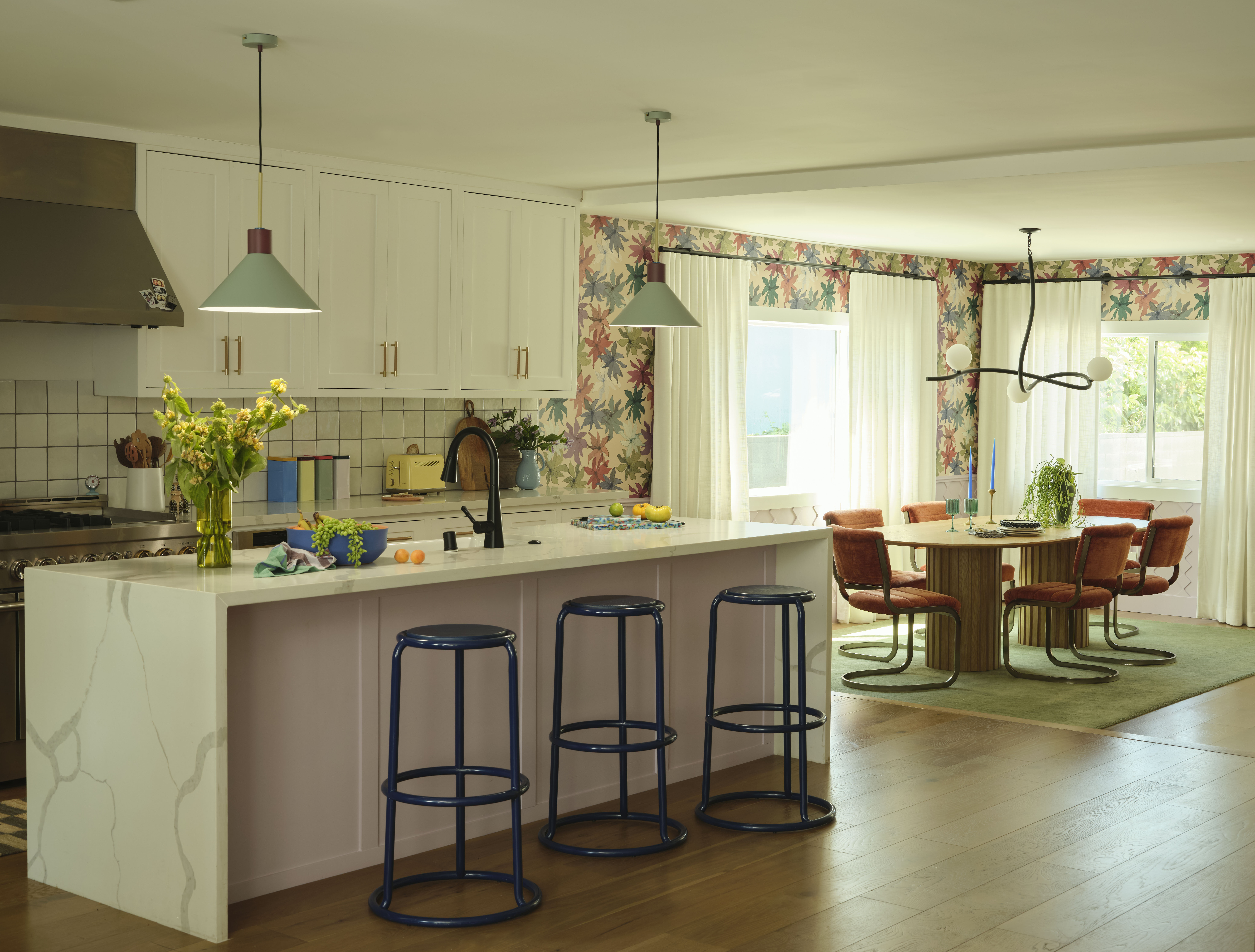
Continuing the playful theme, the kitchen is peppered with pops of color in unexpected spaces. The pastel color palette feels pretty and youthful while details like the waterfall island, white cabinetry, and retro-inspired appliances look timeless and classic. It's certainly a kitchen idea that will endure for years to come.
When it came down to the design of the space, the lighting had a huge role to play. "Neither the kitchen nor the dining room had proper lighting and because the kitchen was recently renovated, our clients preferred to utilize their budget in other areas," Abby says. "The ceiling above the busy kitchen island was the obvious first step and was just the right spot for a fun pop. We found these Danish lights by Hübsch that were the perfect complement to the nearby wallpaper. We finished by bringing the color from the dining room wainscoting onto the kitchen island and adding bold Matter Made barstools, custom leather hardware, and colorful accessories."
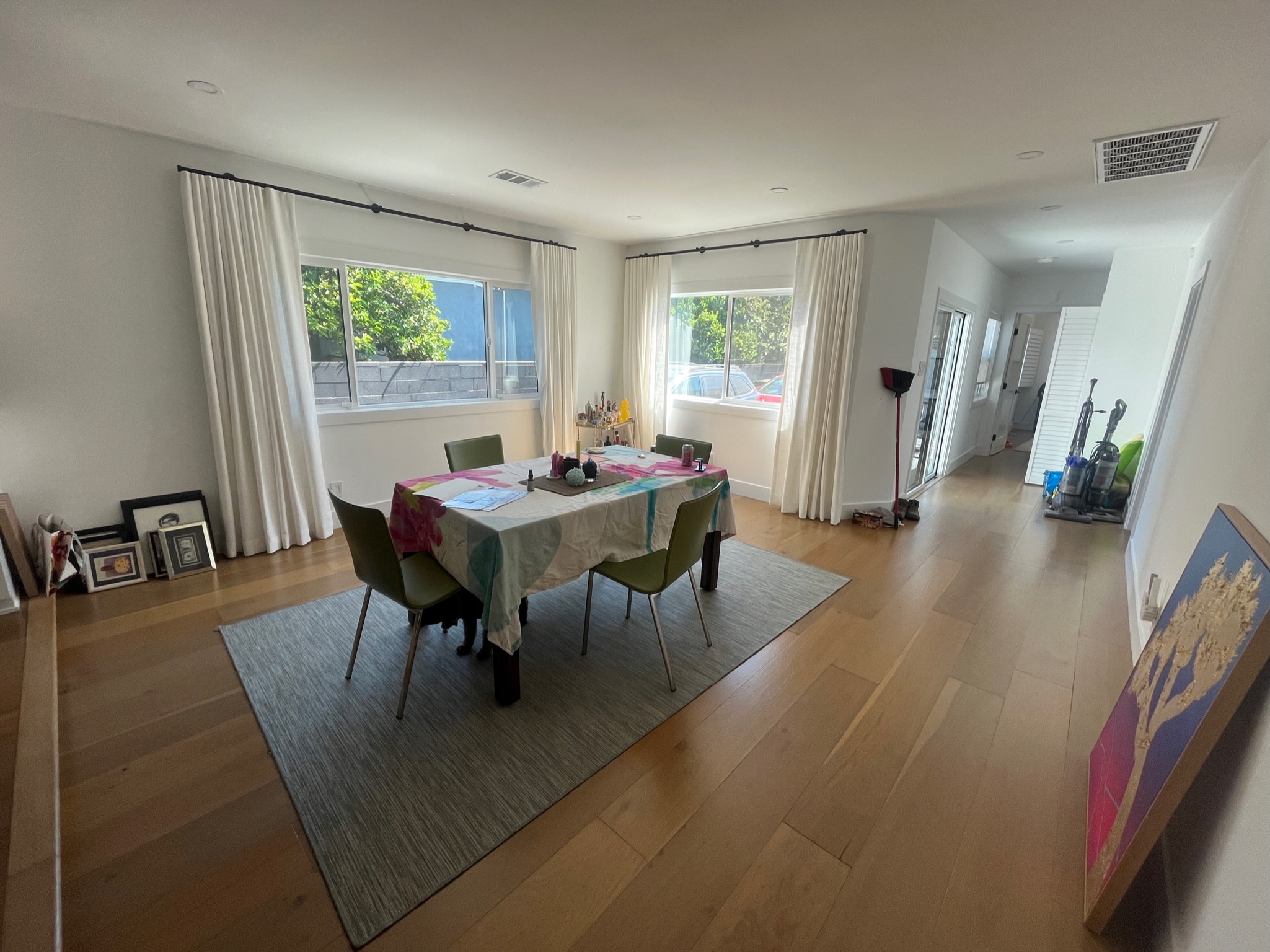
Zoning the two distinct spaces of the kitchen and dining area was also a main focus of Kitty and Abby's design. "Due to the flip, the home was transformed into an open-concept space," they explain. "While this design is often employed to make a home feel larger, it frequently leaves homeowners grappling with how to define each area as a distinct room."
Despite the challenges of an open floor plan, the design team has successfully zoned these spaces through the use of color, wallpaper, and a large area rug. The resulting dining room idea is so inviting and offers a masterclass in using color blocking to help separate spaces feel distinct.
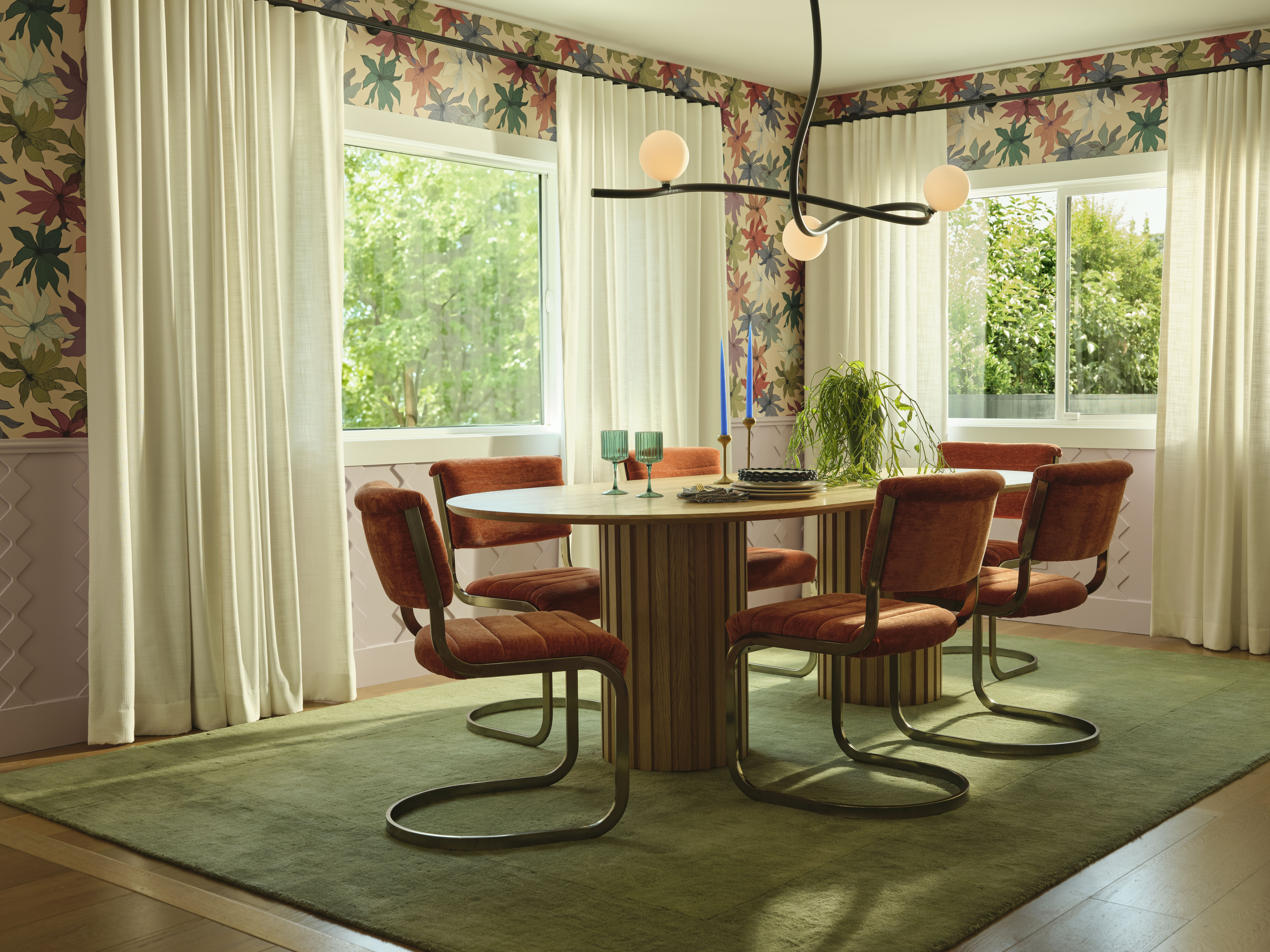
According to Abby, one of the easiest ways to execute this idea in your own home is with a dramatic wallcovering that contrasts with a plain painted wall. "In the dining room, wallpaper serves as a focal point, dramatically altering the space with its pattern and texture, and creating a unique, personalized environment," she explains. "When combined with custom wainscoting, the wallpaper effectively separates the dining area, creating the illusion of a distinct room."
Get the Look
Living room
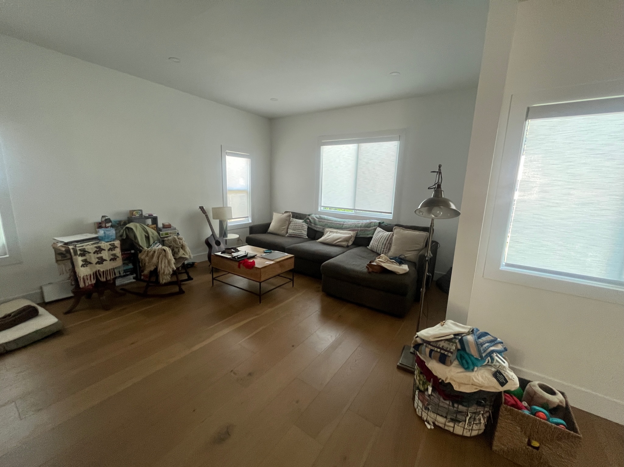
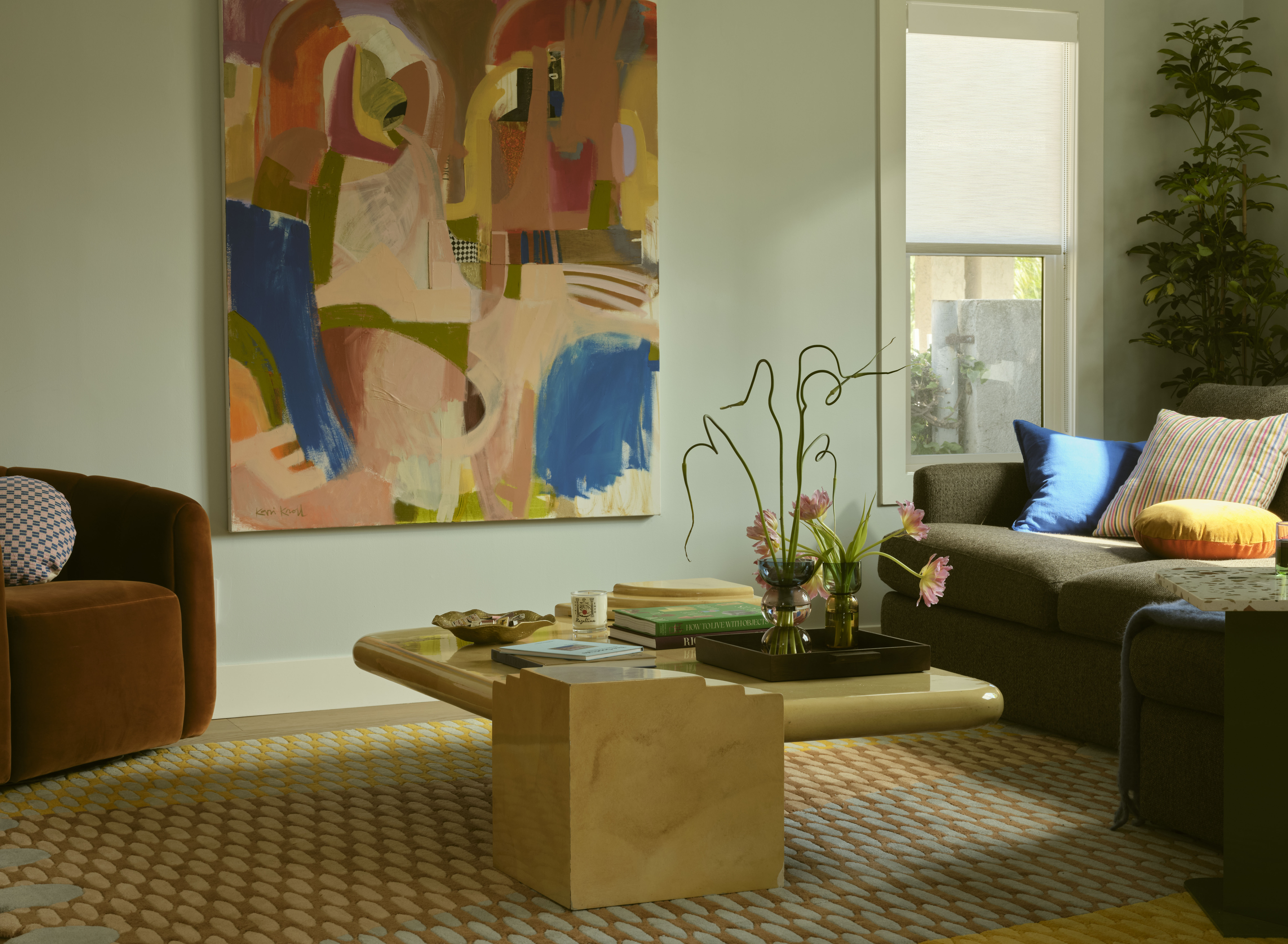
One of the most inspiring details within this home is the way distinct color palettes are used in every space. The full spectrum of color used and divergence from an overall theme might seem intimidating, but it creates a thread that ties the whole home together while still allowing for creative freedom. In the fresh living room idea, these colors combine with varied textures to create a Bauhaus-inspired space with a plethora of talking points.
"Incorporating a variety of textures and patterns gave the space depth, interest, and coziness into the otherwise blank slate," Abby notes. "The low-profile natural wood finish complements the heavily patterned, colorful rug, while the glossy yellow table reflects the softer warm velvets and plaid pillows made by Archive NYC, a close friend of the homeowners. Embracing the couple’s love for their current city, we chose a stunning large-scale painting by LA artist Kari Kroll to tie all the details together. The palette beautifully captures the essence of the space; blending whimsy, liveliness, and the perfect pops of blue to balance the entry closet, which is also visible from this area."

One of the most obvious conversation pieces (in a room flooded with them), is the structural coffee table which also harks back to Bauhaus interiors. The intriguing design features a rounded, high-gloss surface with a cubist-inspired base in a beautiful butter-yellow color.
"We sourced this oversized 1980s deco table from a local vintage vendor after being inspired by the curvy, chunky pieces by Gustaf Westman, which unfortunately would have arrived after our project deadline," Abby says. "Its dramatic size grounds the room, providing ample space for stylish items and serving as the perfect surface for friends to gather around a board game—a priority for the client. It’s safe to say that we are obsessed with its unique shape and the faux goatskin parchment texture of the buttery lacquer."
Bedroom
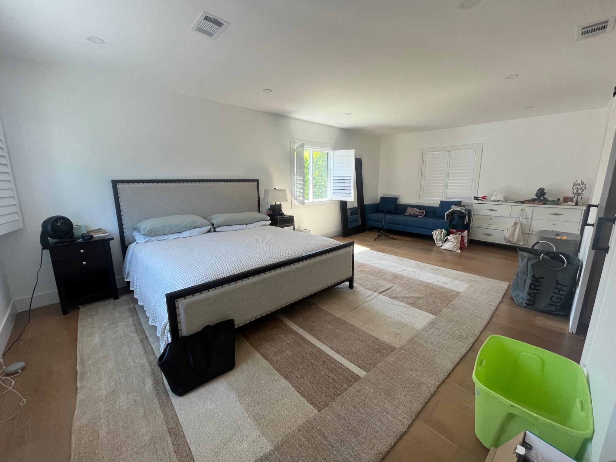
Elsewhere the use of color is stripped back to a single color pairing. This idea was used in the bedroom, a space that previously lacked any character or color at all. To transform the space in a way that would feel calming and less chaotic than other uses of color in the home, Kitty and Abby opted to cocoon the space in mid-green and a warm yellow using a "sandwich" effect by painting the ceiling. The result is a bedroom color idea that feels immediately relaxing and looks so well balanced.
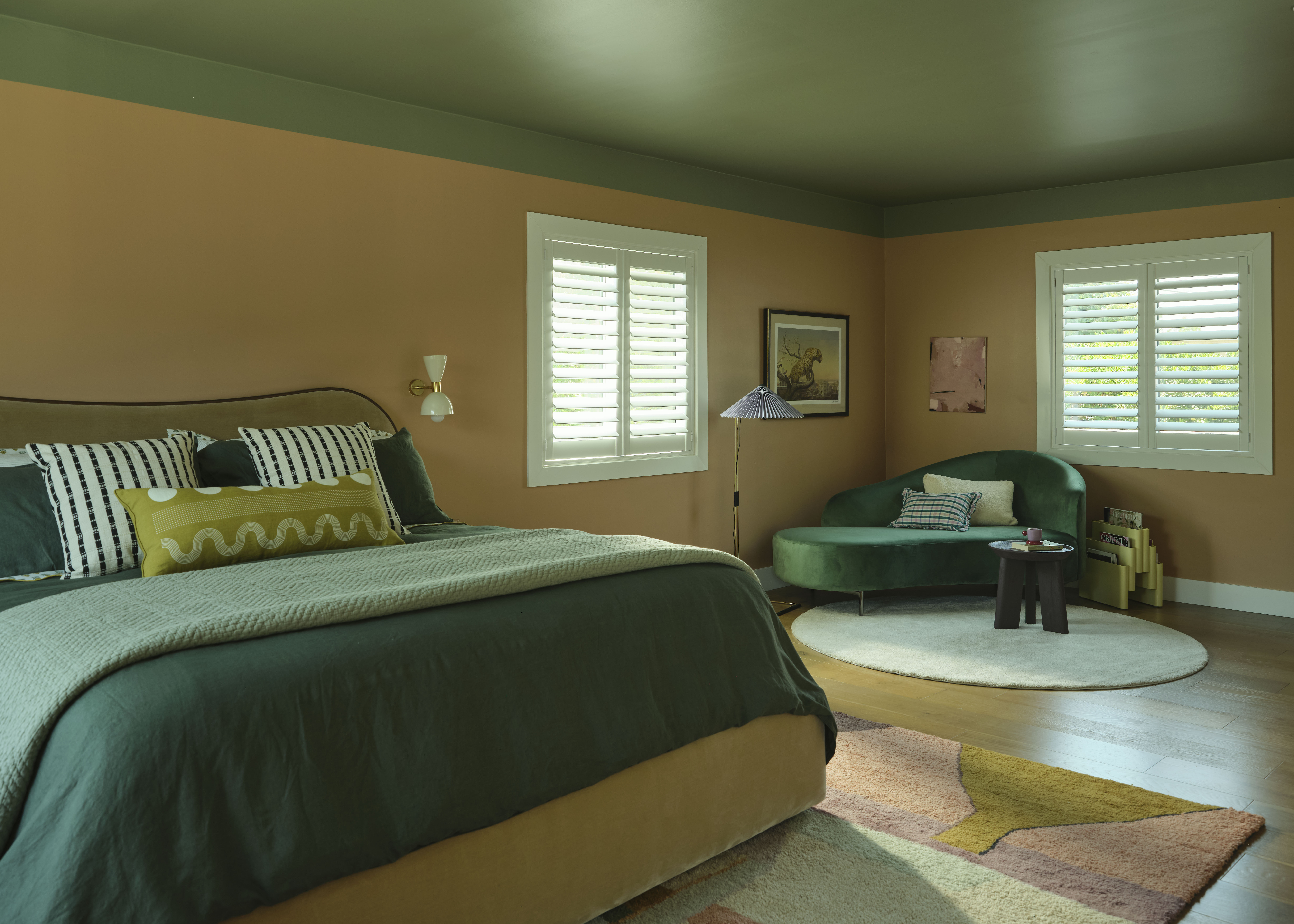
"We wanted the primary bedroom to feel like an oasis within the home, so we used a more muted variation of the palette found elsewhere," says Abby. "To add sophistication without using physical trim, we painted to mimic crown molding as a cost-effective solution. This technique enhances the room’s architecture by adding depth and elegance, and it can be particularly effective in spaces like living rooms or bedrooms. It was also important for us not to use bold patterns in this room, so we kept the furniture pieces very tonal to allow the eyes to relax and create a restful environment."
Just like the other rooms of the home, the bedroom shows the dramatic effect decorating with color can have on design. Safe to say this playful, personality-filled home will be our reference point the next time we pick up the paintbrush.


