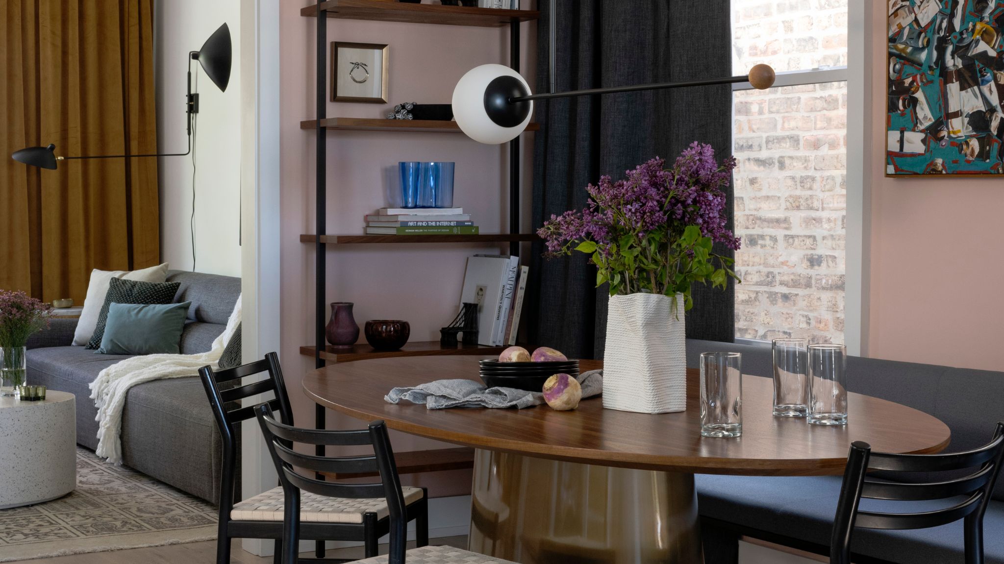
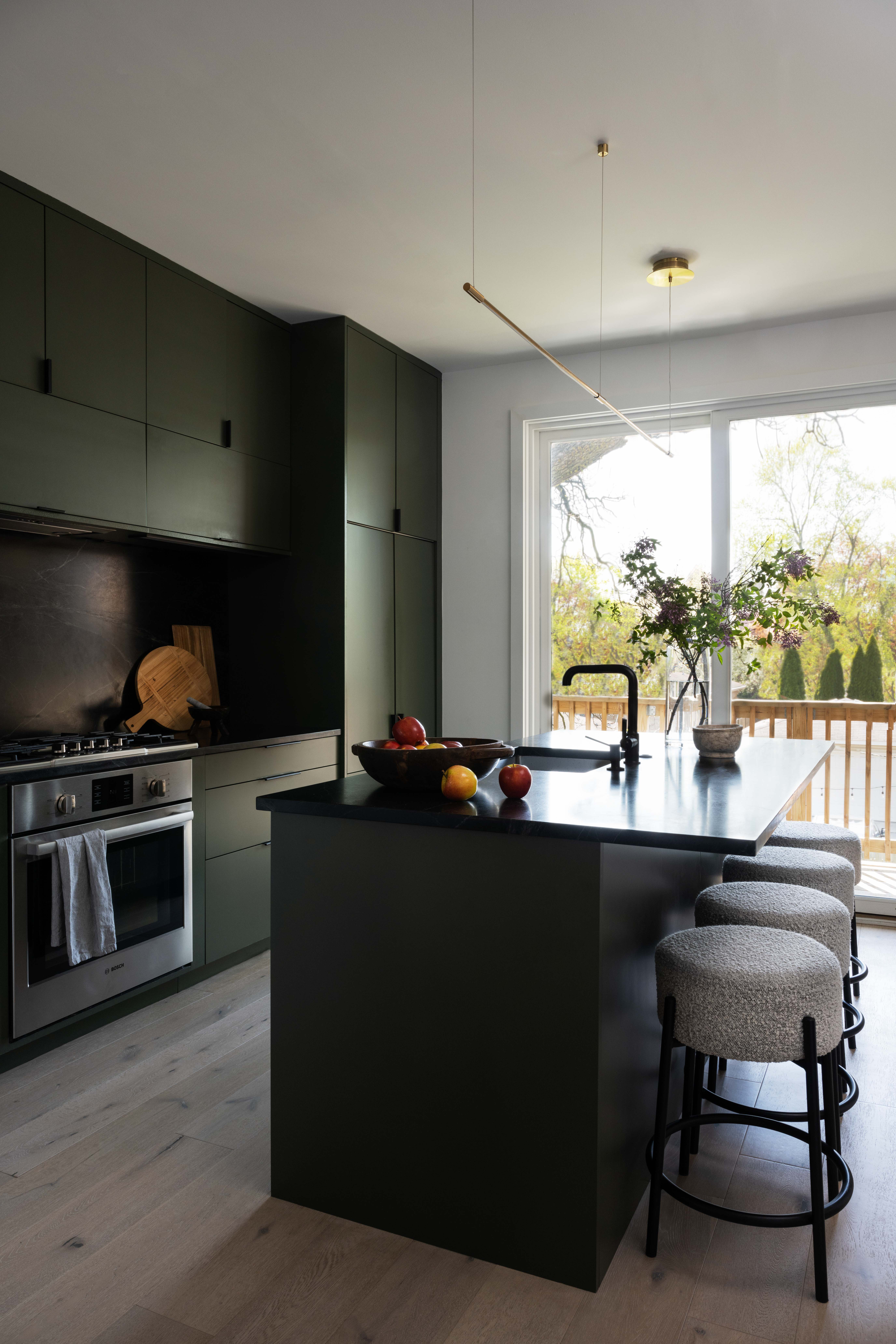
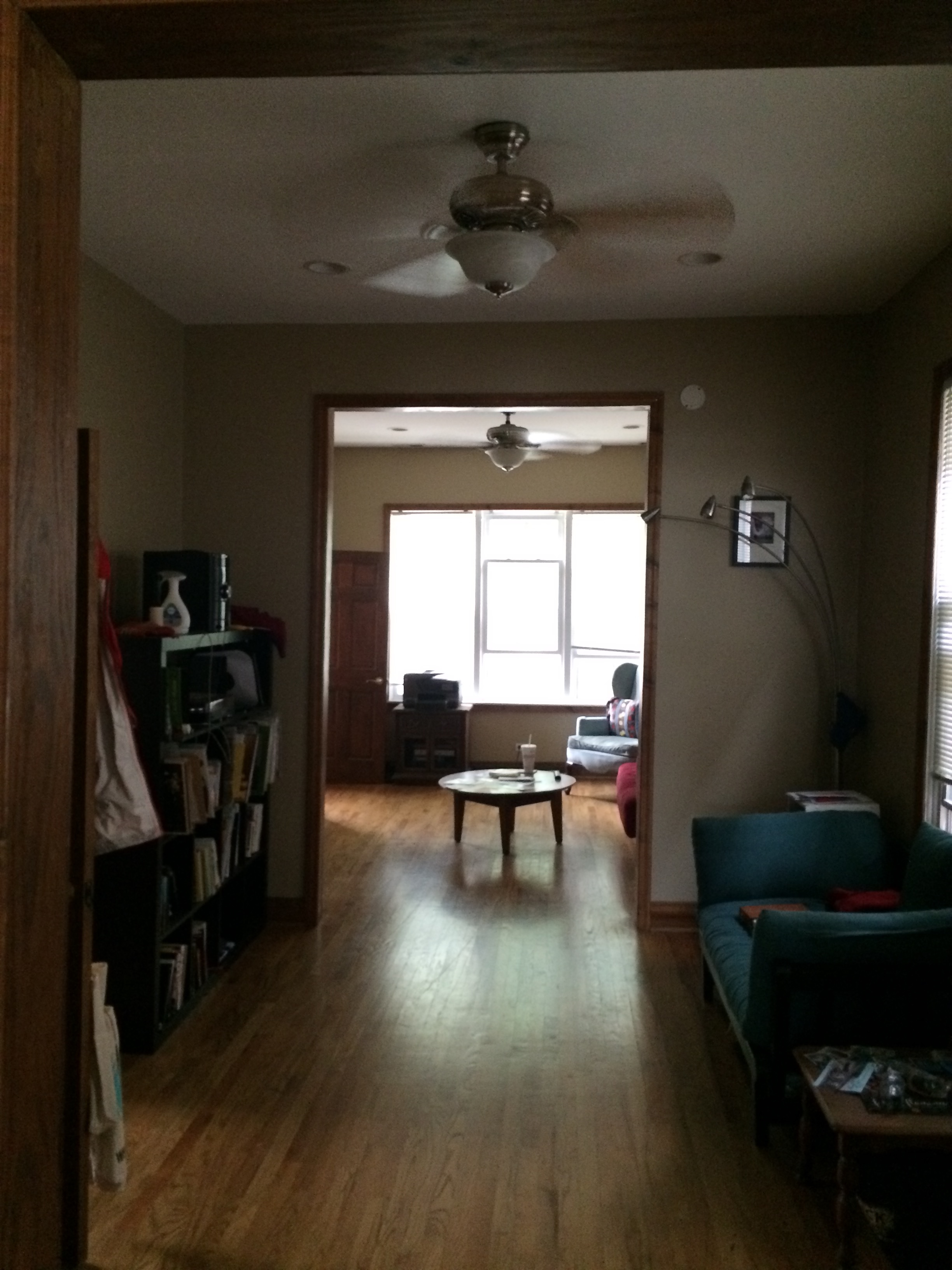
When this two-apartment unit was purchased by Lucas Goldbach, En Masse Design Director and Partner, the space looked pretty run down. It was dark, with an outdated kitchen, and the loft could barely be called usable. It’s safe to say it needed a lot of work before it could become a properly functional modern home. Something to be seen as an exciting challenge, not a deterrent for the design director who completely transformed the space for himself and his partner into a charmingly cozy and joyful residence complete with plenty of color and light.
Lucas wanted to infuse simplicity and modesty into the renovation, respecting the original proportions of the space while making it more welcoming in feel with an open kitchen, large sliding doors to the backyard, as well as wide plank white oak floors, and white walls that make the found vintage pieces and art pop. Let’s have a look at how this full refurb took a space from ‘super dated’ to ‘home to covet’.
The design brief
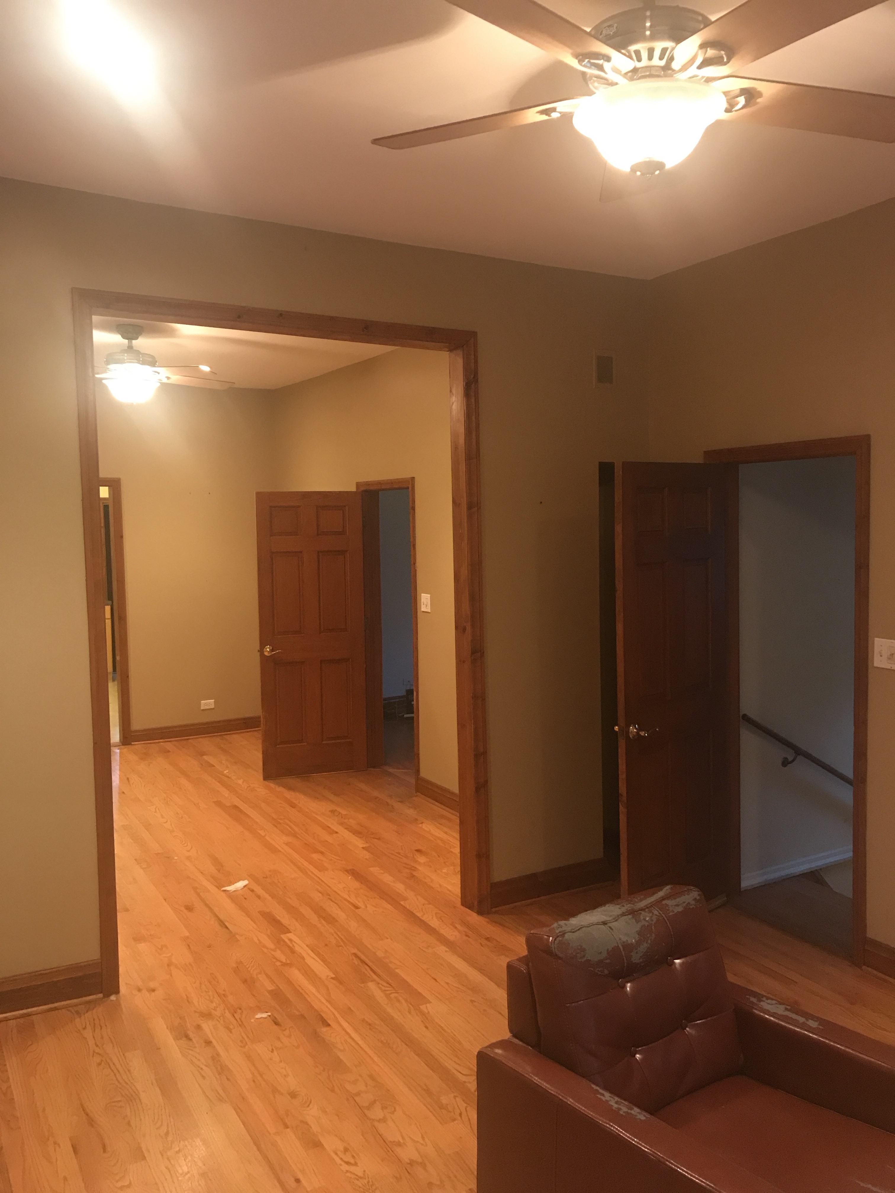
When Lucas took ownership of the property, he wanted to utilize the space that this 1890s worker cottage had available, but turn it into a home suited for modern living. Originally the space consisted of a single-level two-bedroom apartment.
The first focus of the redesign aimed to connect the attic level with the main level and repurpose the floorplan so that it accommodates two bedroom suites in the attic while dedicating the main level to entertaining spaces, a laundry room, a mudroom, and a small home office. The use of the cased openings on the main level is a brilliant way to provide discreet separation between the rooms while keeping the floor plan open.
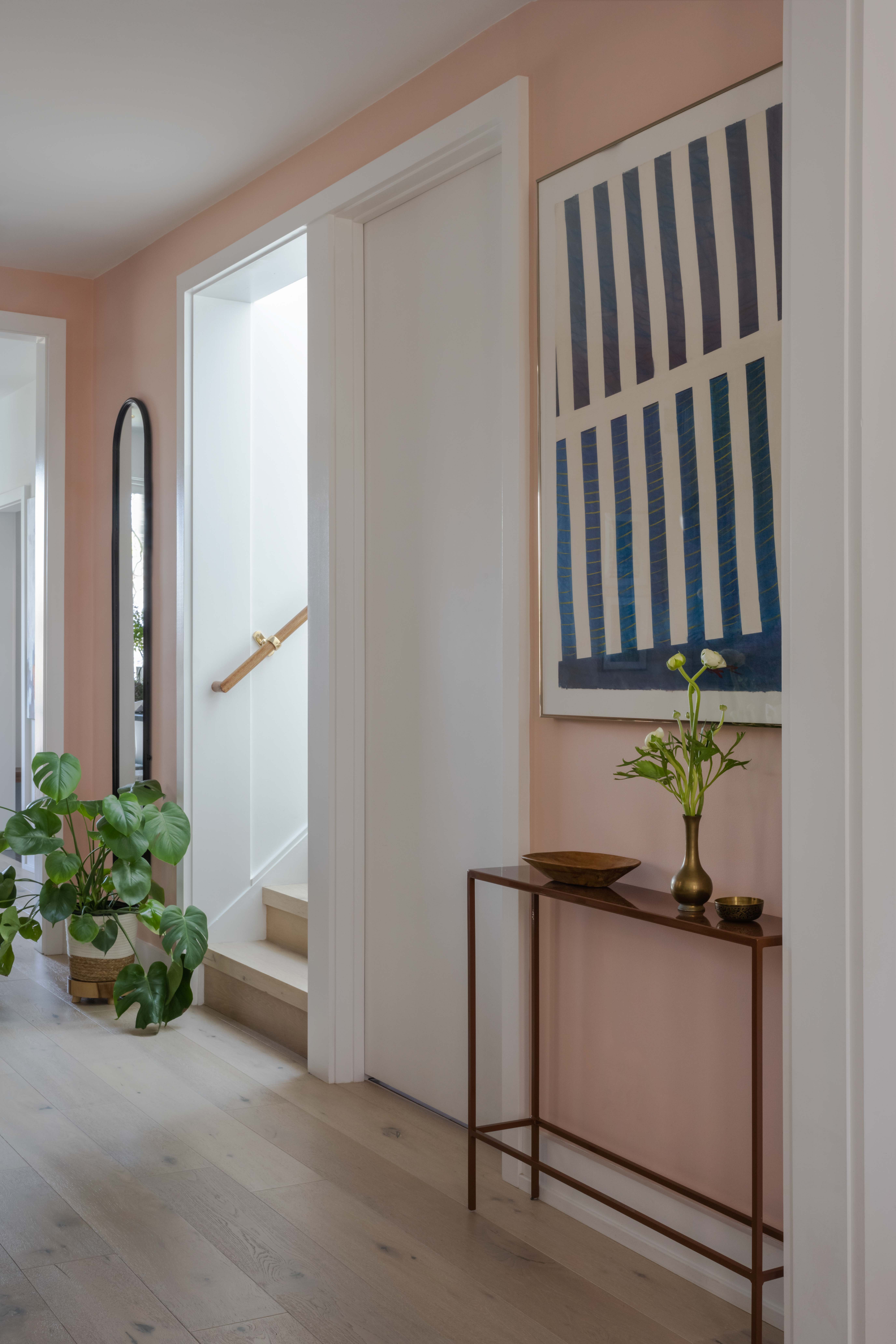
The other considerable component of the brief was to make the best possible use of natural light to brighten the space, achieved by combining the light from five skylights, together with creating a new, open plan, and the addition of oak floors that bounce light throughout. Light is brought into the centre of the space as well thanks to the new staircase with a skylight overhead.
The design process
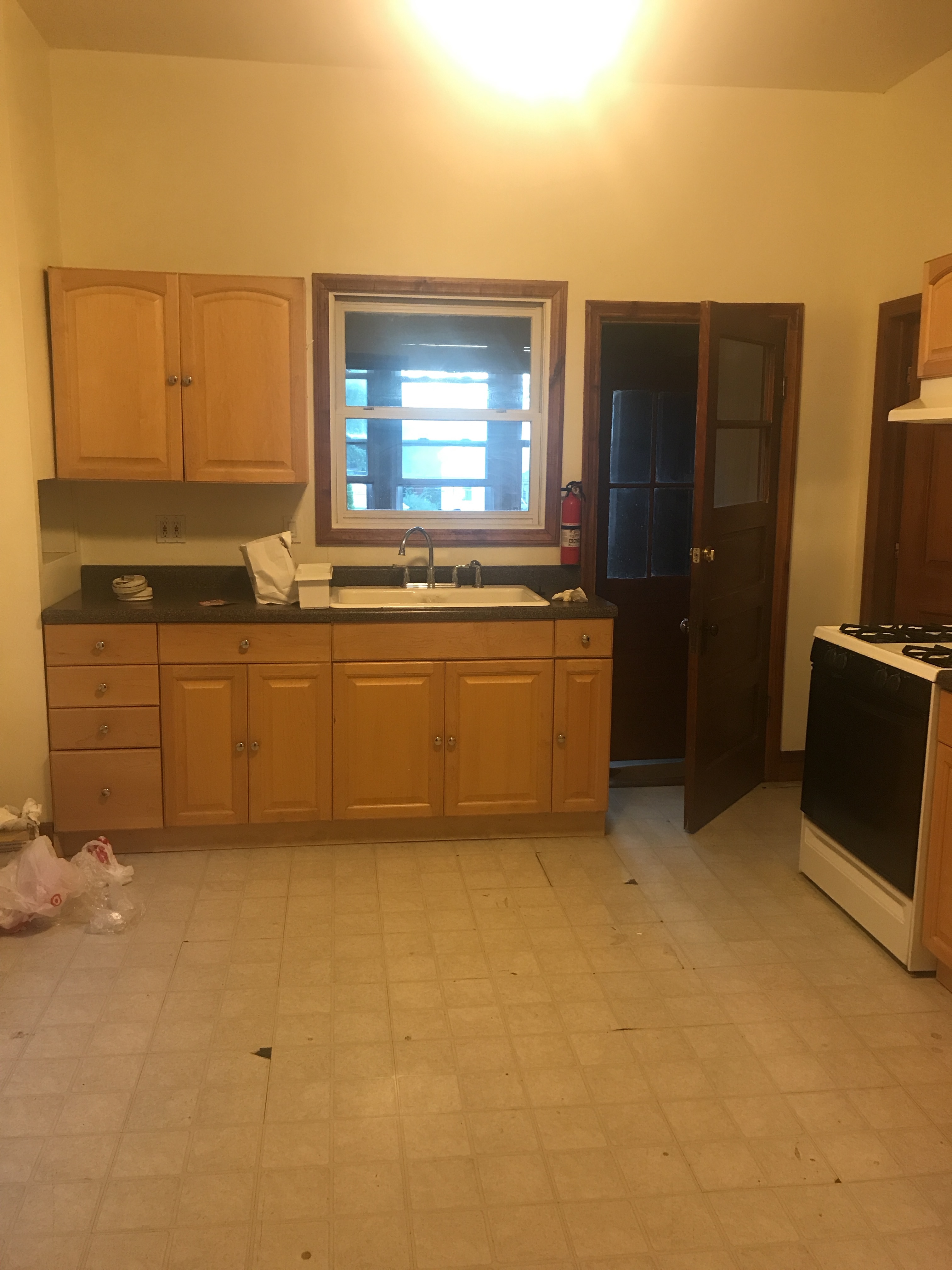
Although there had been must-haves discussed before move-in, such as connecting the attic to the main space, opening up the floorplan in the living areas, and adding the beautiful deep green kitchen to replace the very dated existing one, the interior design evolved over time. ‘The space was a white box that we lived with, got to know, and then filled with a mix of vintage and new items,’ says Lucas.
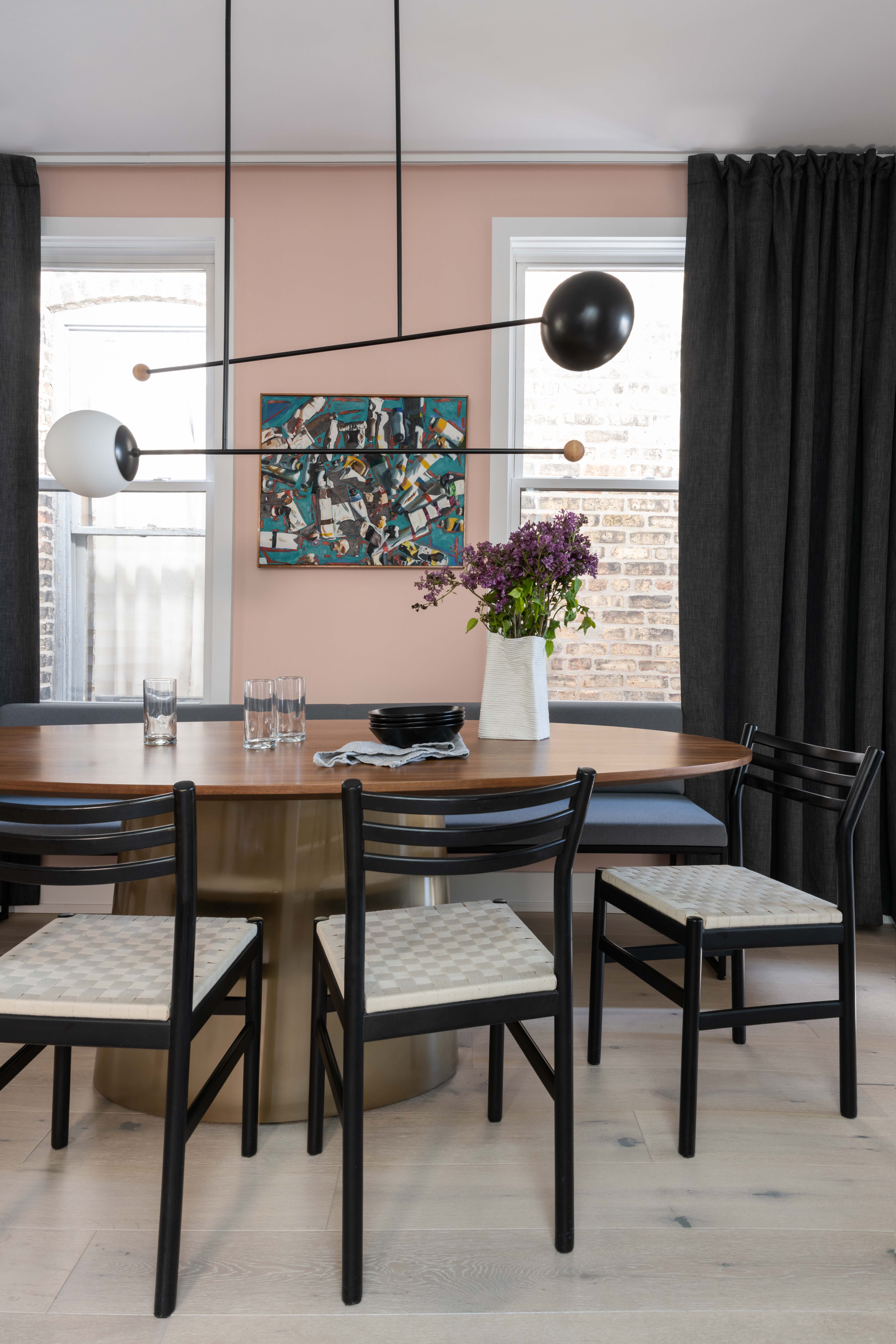
Taking their time paid off, and the white box soon enough was given a real joyful spirit through the use of a warm, 70s-inspired palette of olive green, burnt orange, peachy pink, and blues, and a collection of art, pottery, and personal objects that create a characterful lived-in feel. ‘There was a tone shift during the pandemic where we both craved more warmth and color. The central space of the house, the dining room, was painted a peachy pink that transformed the entire main level,’ explains Lucas.
The dining room needed to be a welcoming space that would accommodate the owners hosting intimate dinner parties and gatherings. The cozy yet casual look was achieved by incorporating a long banquette and smaller dining chairs around an oval-shaped table, along with an adjacent bar/pantry.
The challenges
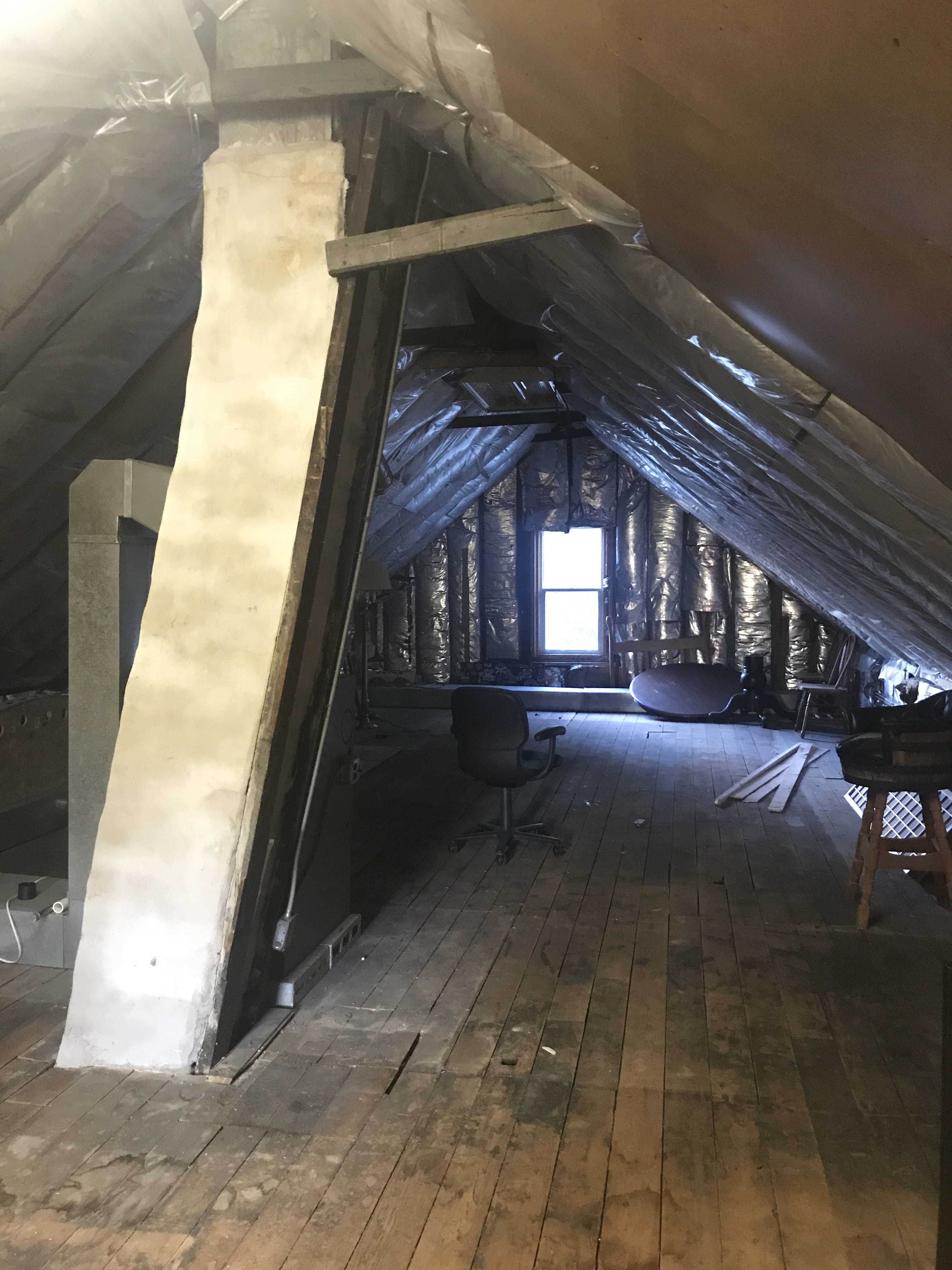
Lucas tells me that the main challenge he faced was working within the existing roof structure and not having to undertake substantial structural work. Another challenge was creating a sense of space and height in the attic area where the ceilings were sloping.
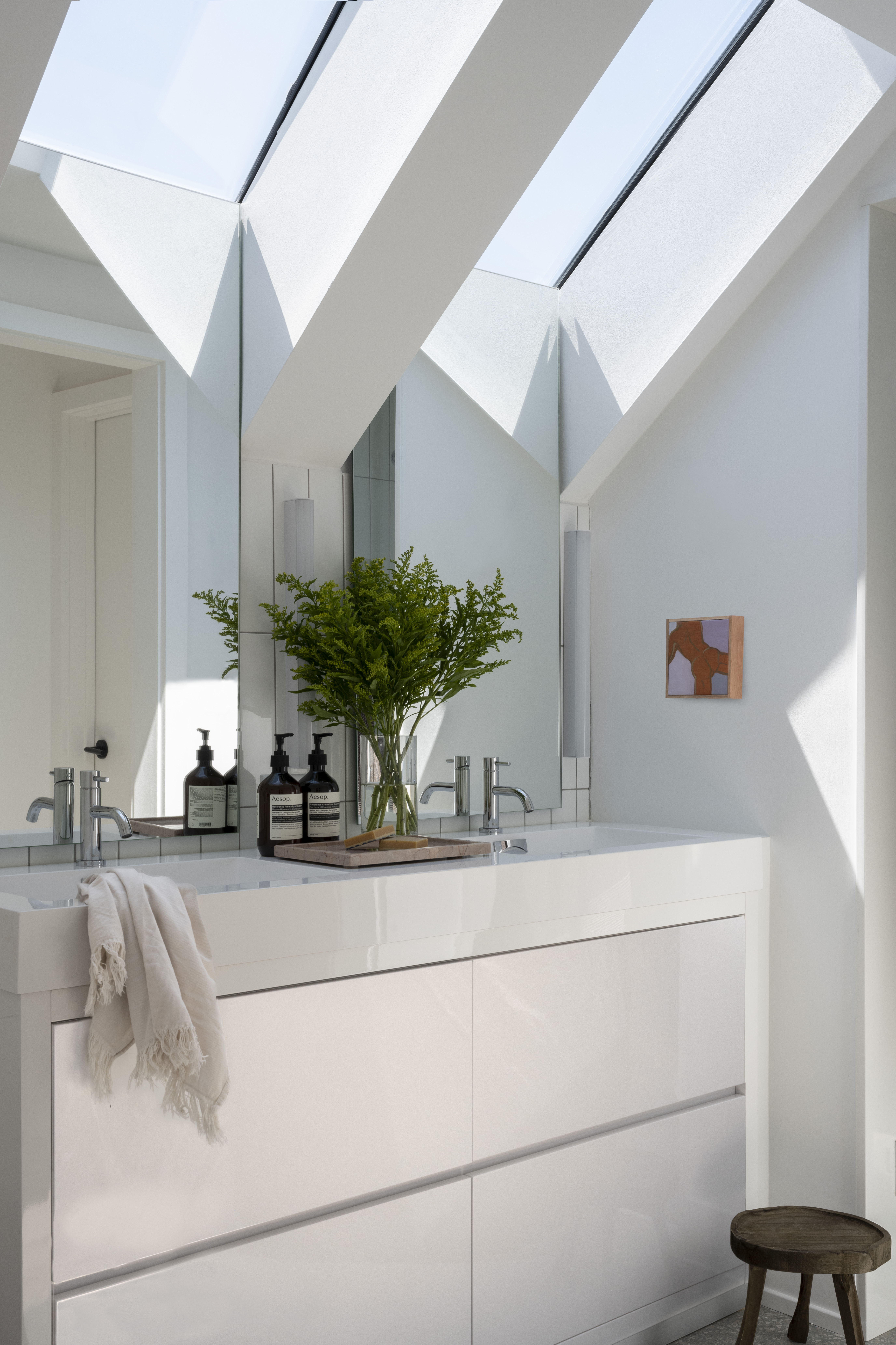
‘A central ‘spine’ hallway allows for circulation at the highest part of the roof,’ explains Lucas. To make the best use of the lower ceiling, storage was added into the eaves, while the skylights placed over the bathroom vanities provide headroom and natural light.
‘The seamless connection between the mirror and skylight brings the sky into the space and evokes the feeling of being in a treehouse. Even at 6’4” the space feels lofty and the height of the sloping ceilings was never an issue.’
The result
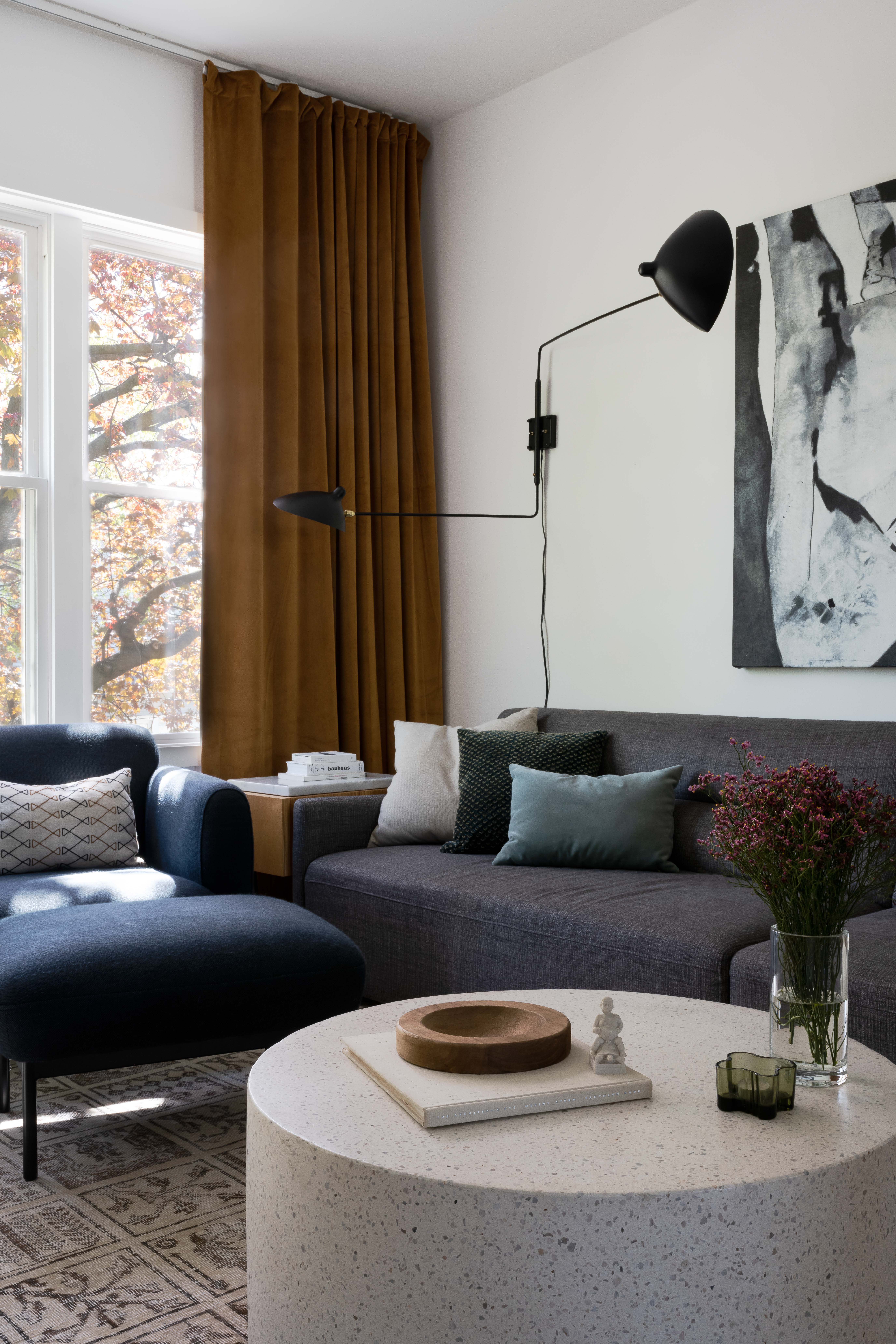
Lucas wanted to create a space that felt cozy, warm, and casual and that was definitely achieved.
‘With the dining space at the center of the house, we really love the way that hospitality was the center focus. Dimly lit meals in the warm glow of the peachy-pink dining space that last through desert and bottles of wine are the goal,’ says Lucas.
Get the look of this cozy living space
Price: $1,565
This coffee table adds a very sculptural element to your design, while the soft colors help support the warm feel of the space.


