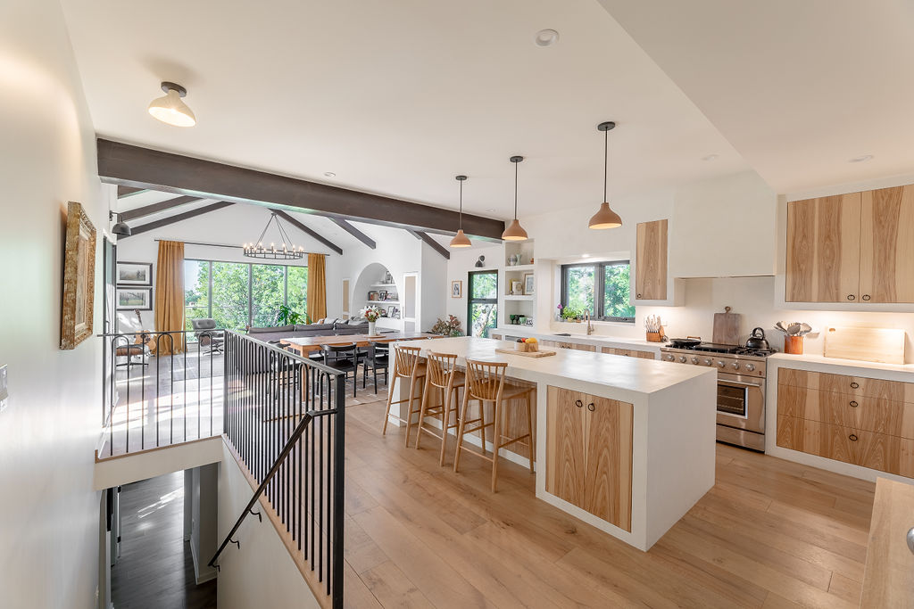
The eclectic neighborhood of Eagle Rock, Los Angeles, is full of sun-soaked homes that offer beautiful vistas of the surrounding hills, and this one is no exception. Having spent many years in disarray, local design and architecture studio Arterberry Cooke wanted to take full advantage of this property's prime location, transforming the once dark and dated home into a contemporary bohemian-inspired space fit for modern family life.
Renovations like this are no mean feat. Principal designer Barrett and her team reimagined the family home with the help of Chris Williams Construction and Brad Katz Design Construction, taking advantage of the expansive views to open up the connection to nature. The kitchen, entryway, and dining room were all reconfigured to make way for new living and dining spaces, and Barrett also created an addition to the home to further expand the kitchen. The new design offers a playful take on classic California living, with eclectic patterns, textured walls, warm woods, and airy spaces that invite light in.
'The existing house had 3 bedrooms and 2 bathrooms and the new house now has 4 bedrooms and 3.5 bathrooms,' explains Barrett Cooke of Arterberry Cooke. 'The clients love the neighborhood and land and wanted to design a space that would work for their changing needs. They both have family out of town and the need to have a dedicated space to work from home.' Here, we take a closer look at how Barrett and her team transformed this gloomy home into the laidback, boho-style modern home that it is now.
Entryway
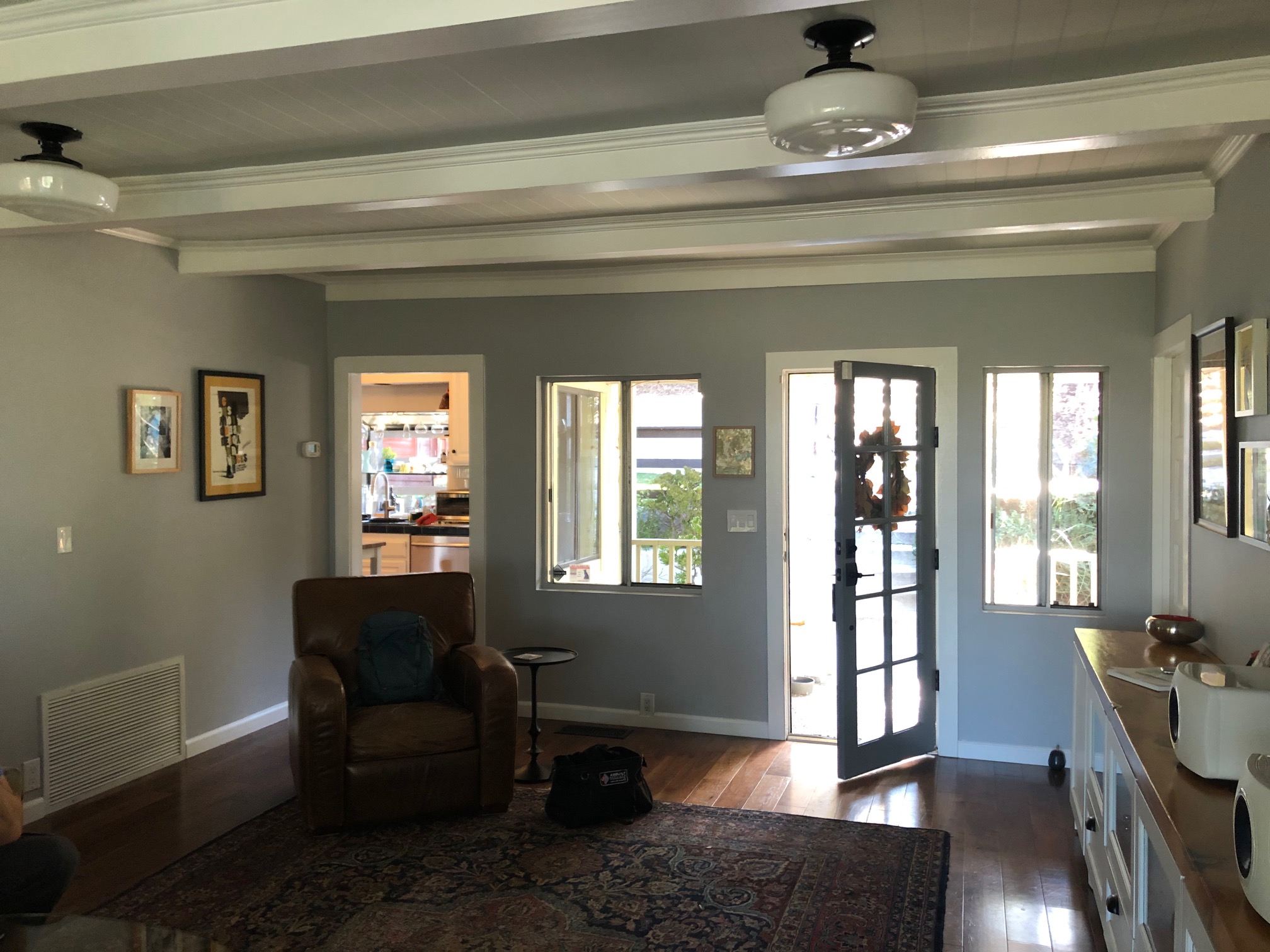
Before Barrett and her team at Arterberry Cooke worked their magic on this LA home, the closed floor plan made the rooms dark and dim. The entryway hall offered little in terms of warm welcomes so brightening up the space and inviting in more natural light became a key focus of the renovation.
'The old kitchen became the entryway which allowed us to create a really open plan for much of the house while still feeling protected and private,' says Barrett. 'In the added area we were able to vault the ceilings and create a large window wall to take advantage of the hillside vistas.'
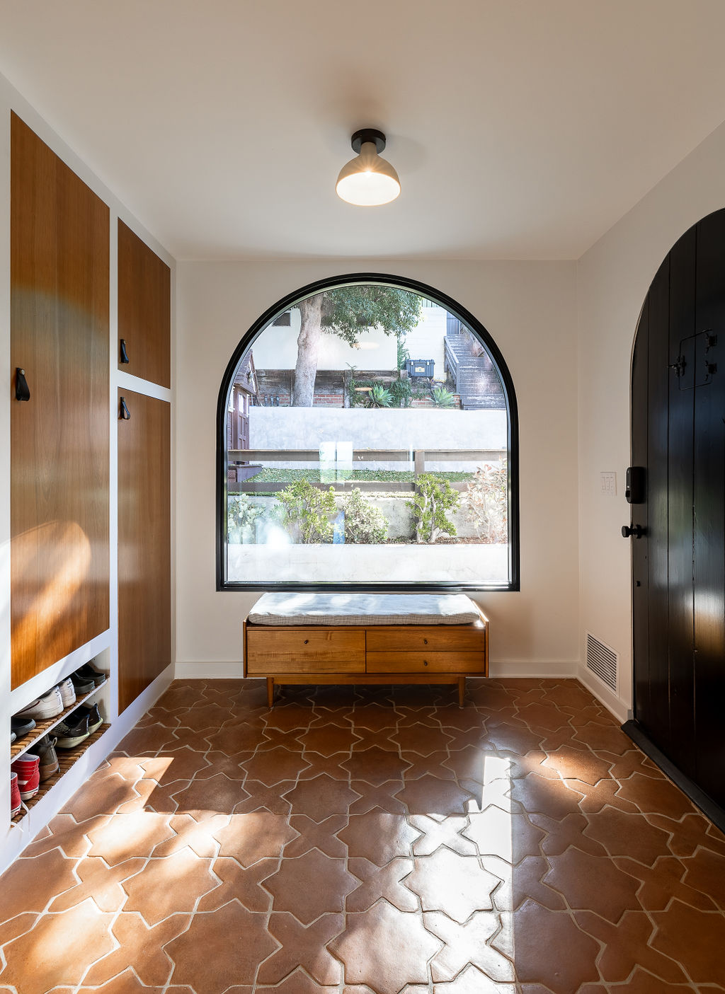
The entryway is a liminal space that bridges inside and out, so both the homeowners and designers wanted it to communicate the new architectural language they'd decided on. 'We went through a few different design directions - first modern, then modern cabin, before circling back to Spanish,' notes Barrett. 'There are many Spanish style homes in the neighborhood and the lines on the existing and the proposed addition lent itself to this style quite well.'
The terracotta-colored floor tiles in the new entryway are so inviting, especially with the intriguing configuration. Alongside the large arched window and built-in storage to hide away coats and jackets, the space is now far more welcoming.
'On the original structure you entered through a low-ceilinged covered porch straight into the living room,' Barrett goes on to explain. 'We relocated the entryway to the area where the old kitchen existed which allowed for a functional and somewhat formal foyer. The foyer allows a separation of spaces so there is a more formal living room area and a less formal kitchen/dining/family room open area. For me, it's the best of both worlds.'
Main living space
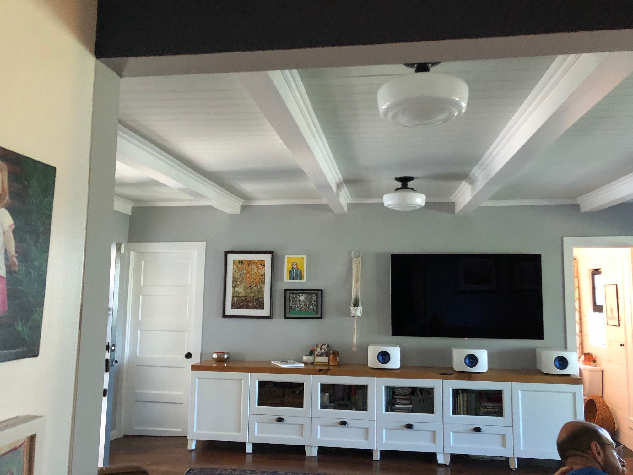
A closed floor plan meant that the previous space lacked any cohesion, with separate rooms for entertaining. Now, however, the kitchen, dining room, and family room have been merged together to form one large open space that's perfect for entertaining.
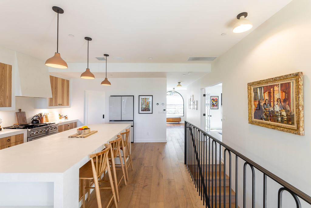
The open-plan kitchen diner area features warm woods and crisp, white surfaces for a contemporary touch. The inset kitchen cabinetry is the real eye-catcher thanks to its seamless built-in effect, and it features an exaggerated wood grain to contrast with the stark white countertops. 'We also created a very large pantry area to do some of the heavy lifting for the kitchen,' says Barrett. 'This allows the kitchen to stay clutter-free and tidy.'
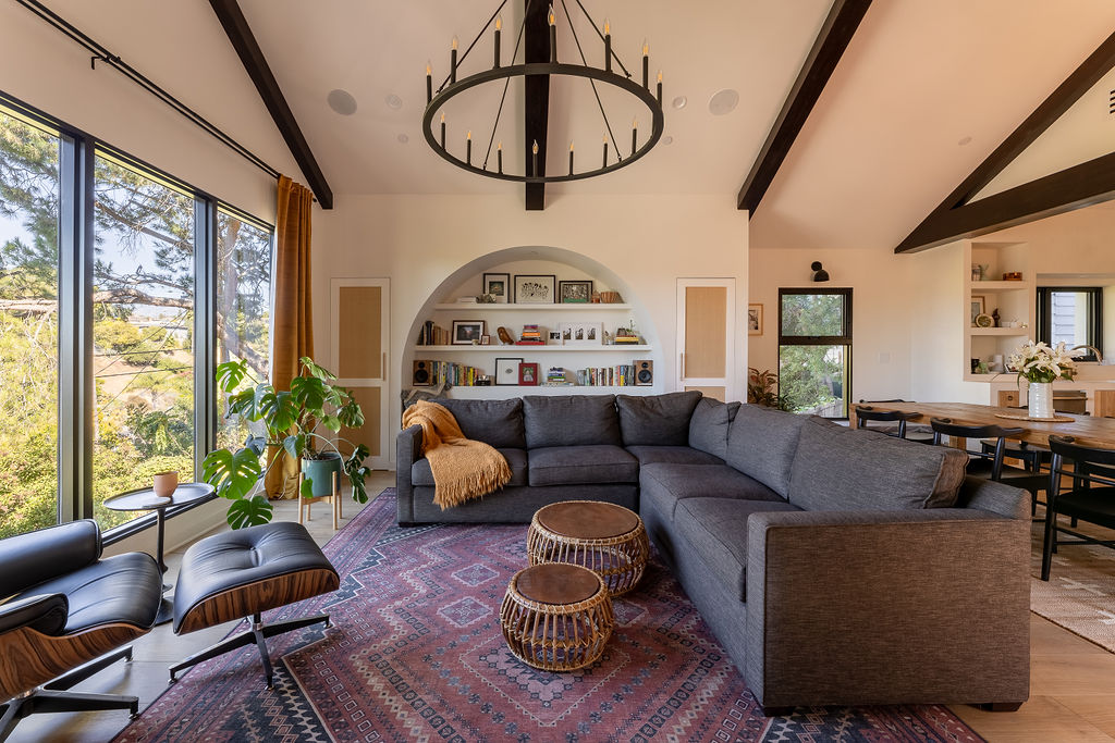
Characterful details like the arched built-in shelving and bohemian decor make this family home feel so warm and cozy while large floor-to-ceiling windows bridge the gap between outdoors and in. 'The siting of the home allowed for some really dramatic moments and engagement with the hillside and views,' explains Barrett.
The primary living room area was added as an extension, offering ample space for the parents to relax or to entertain guests in more formal settings. As Barrett explains: 'The homeowners wanted a space that felt comfortable for them to work, relax and also allowed enough space for their child and her friends to hang out without everyone being on top of each other.'
Bedrooms
Prior to the renovation, dated bedrooms suffered from a lack of storage meaning the spaces were overwhelmed with clutter. Dark walls also contributed to the dingy feel present throughout meaning the spaces were crying out for a bright and fresh paint idea.
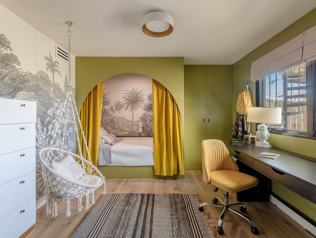
To bring brightness and joy into these sleep sanctuaries, Barrett added a primary suite to the lower level, opening up the rooms and creating larger and more functional living spaces elsewhere in the home. One of the smaller rooms features whimsical wallpaper and a macrame hanging chair for a super relaxed vibe, while the built-in closet and curtained bed help to reduce visual clutter. We love how the green bedroom idea feels bold and daring while avoiding any garishness.
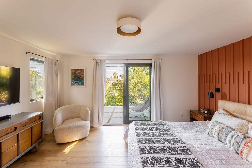
In the master bedroom, the cladded accent wall adds textural interest to the space as well as extra warmth through the burnt-red shade. Paired with the fringed throw pillows, the deep armchair, and the simple white curtains, it makes for a space that's ultra cozy and relaxing, by day as well as night. 'The homeowners love the finished design and are so happy to call it their home,' says Barrett.

