The cool, cosmopolitan vibe of California's Pacific coast owes itself to the melting pot of cultures and creatives that reside within it, and the world of design is no exception. When the owners of this home wanted to remodel the kitchen and bathroom, the design team honored the craftsman-style space while upgrading it with contemporary finishes, and the result is seriously impressive.
Nestled amidst the picturesque charm of La Mesa’s historic district, the property - first built in 1922 - stands as a testament to the rich architectural heritage of the area, once belonging to La Mesa’s very first police chief. The 1,288-square-foot, three-bedroom home has been given a modern day makeover by local studio Blythe Interiors who revived the heart of the home through the redesign of the kitchen and primary bathroom. Breezy blue cabinetry, zellige tiles, and artisanal oak shelving now make for a cool, contemporary space.
'The goal for this project was to modernize the space while optimizing functionality,' explains Jennifer Verruto, Founder and CEO of Blythe Interiors. 'For the kitchen, the clients desired a better workspace for cooking and a place to store their large coffee and tea collections. Since the clients love to cook, we needed to rework the kitchen footprint and devise a smarter use of the space, in addition to adding storage. For the primary bathroom, the clients wanted to maximize the small footprint and add a European / mid-century aesthetic.'
We caught up with Jennifer to find out exactly how her and her team bought that vision to life for a beautiful modern home that embodies everything we love about the breezy California Coastal style.

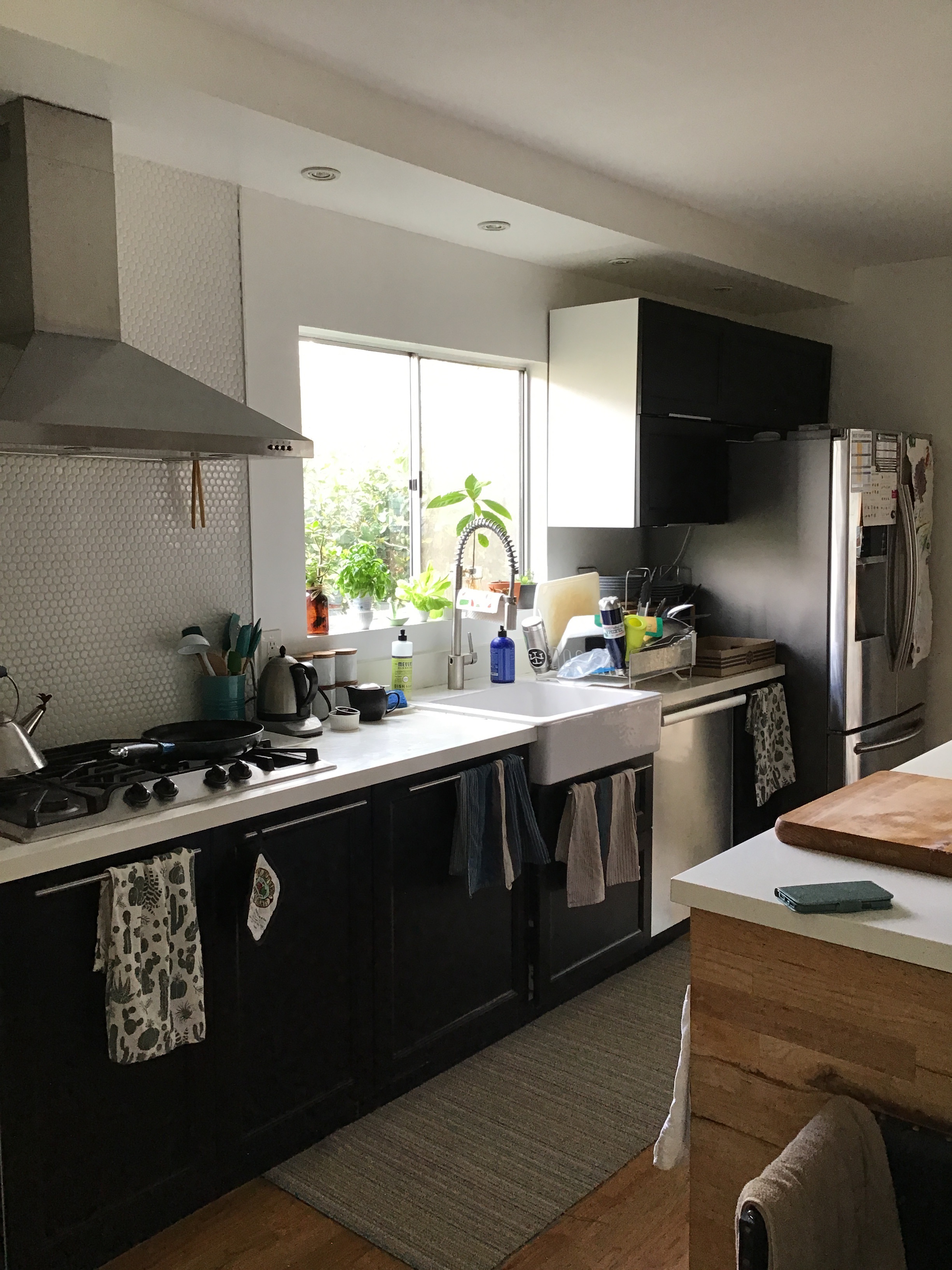
Before Jennifer and the team at Blythe Interiors worked their magic, the kitchen felt dark and cavernous. Black cabinetry and a mosaic-tiled backsplash made the space look and feel smaller than it really was, and the floorplan wasn't cohesive enough considering the owners' love for cooking.
Realizing its potential, the design team achieved a meticulous transformation that not only enhances its functionality but also celebrates the homeowners’ passion for cooking. The primary goal revolved around reworking the kitchen’s footprint to create a smarter layout while maximizing storage space.
Diamond cabinetry in a deep blue hue now lines the left wall of the kitchen, flanking a black ILVE oven with a dynamic vintage appeal and white Ferguson farmhouse sink, providing a fresh approach while honoring the historic space. In contrast, white quartz countertops and a textured ivory tile full-wall backsplash now brighten the space with light, clean finishes.

The smoky blue kitchen cabinets are a real standout, especially contrasted with the bright white of the quartz countertops. The color pairs so well with the brass hardware and, compared to the black cabinets that came before, feel far more dynamic while still conveying a sophisticated and moody feel.
'The blue cabinets bring a pop of personality that this craftsman kitchen needed,' says Jennifer. 'The deep blue color also brought a sense of warmth, as opposed to the cool starkness of the previous black cabinets. This gorgeous shade also served as a bold focal point in the kitchen and provided a gorgeous contrast paired with the lighter countertop and backsplash.'
Jennifer and her team love how rich colors create a grounded feeling in a space. 'Since we wanted to embrace the original charm of the craftsman-style home while also incorporating mid-century elements, the blue added a splash of character that ties both aesthetics together,' she adds. 'Blue cabinets are certainly having a moment but in our opinion, they’re timeless. It’s a popular choice because blue is such a versatile color that can complement a variety of design styles - we’ve used blue cabinets in modern, traditional, coastal, and beyond!'

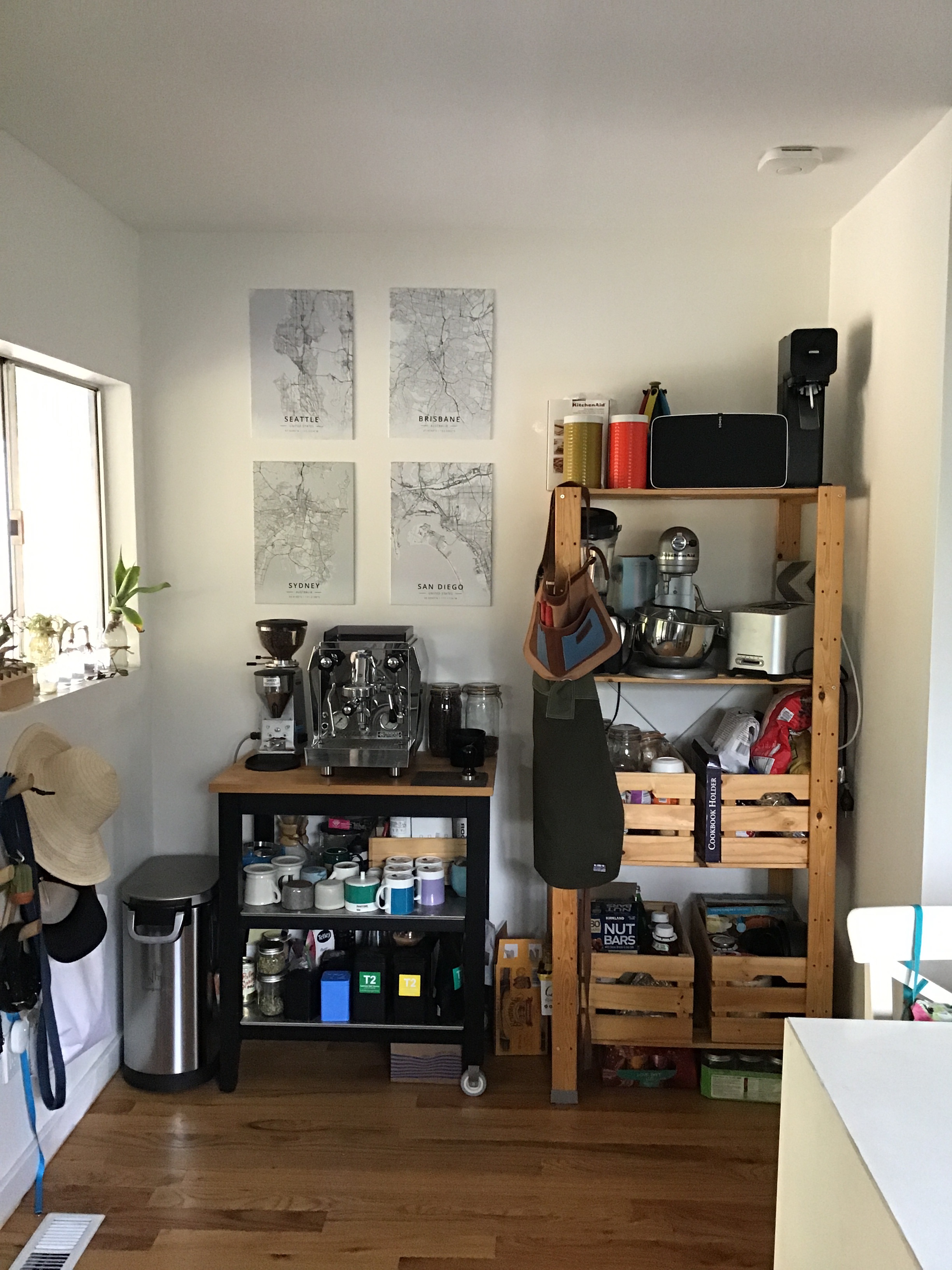
Before the renovation, a set of disorganized shelves acted as a stand-in coffee bar, but the cluttered space was far from beautiful. Recognizing a need for better kitchen storage, Jennifer decided to transform this entire corner with built-in cabinetry, and it's now virtually unrecognizable.
The new space provides an elegant touch with plenty of space for the clients’ coffee collection, with floating oak shelves offering a blend of practicality and style while also opening up the space vertically. The gold spotlighted sconce on the wall above also brings a cozy, coffee-house vibe to the coffee nook as well as some practical task lighting.
'Task lighting is super important when it comes to a design,' notes Jennifer. 'From an aesthetic standpoint, it’s a great way to bring added visual interest and another fun design element - for example, this brass fixture beautifully complements the cabinet hardware. On the practical side of things, who wants to stumble into their kitchen in the morning to pour a cup of coffee and be met with a burst of overhead lighting? Task lighting is exactly what it sounds like, focused lighting for a specific need!'

If you're debating kitchen open shelving in your own home, this space makes a real case for it. 'While wall cabinetry offers lots of storage and organization, it can take up a lot of visual space and be heavy on the eye, making a space feel tight and small,' Jennifer explains. 'On the other hand, open shelving is visually minimal and offers an airier option which can make your space feel larger. Since open shelving provides considerably less storage, by implementing lower cabinets and upper floating shelves you can get the best of both worlds.'

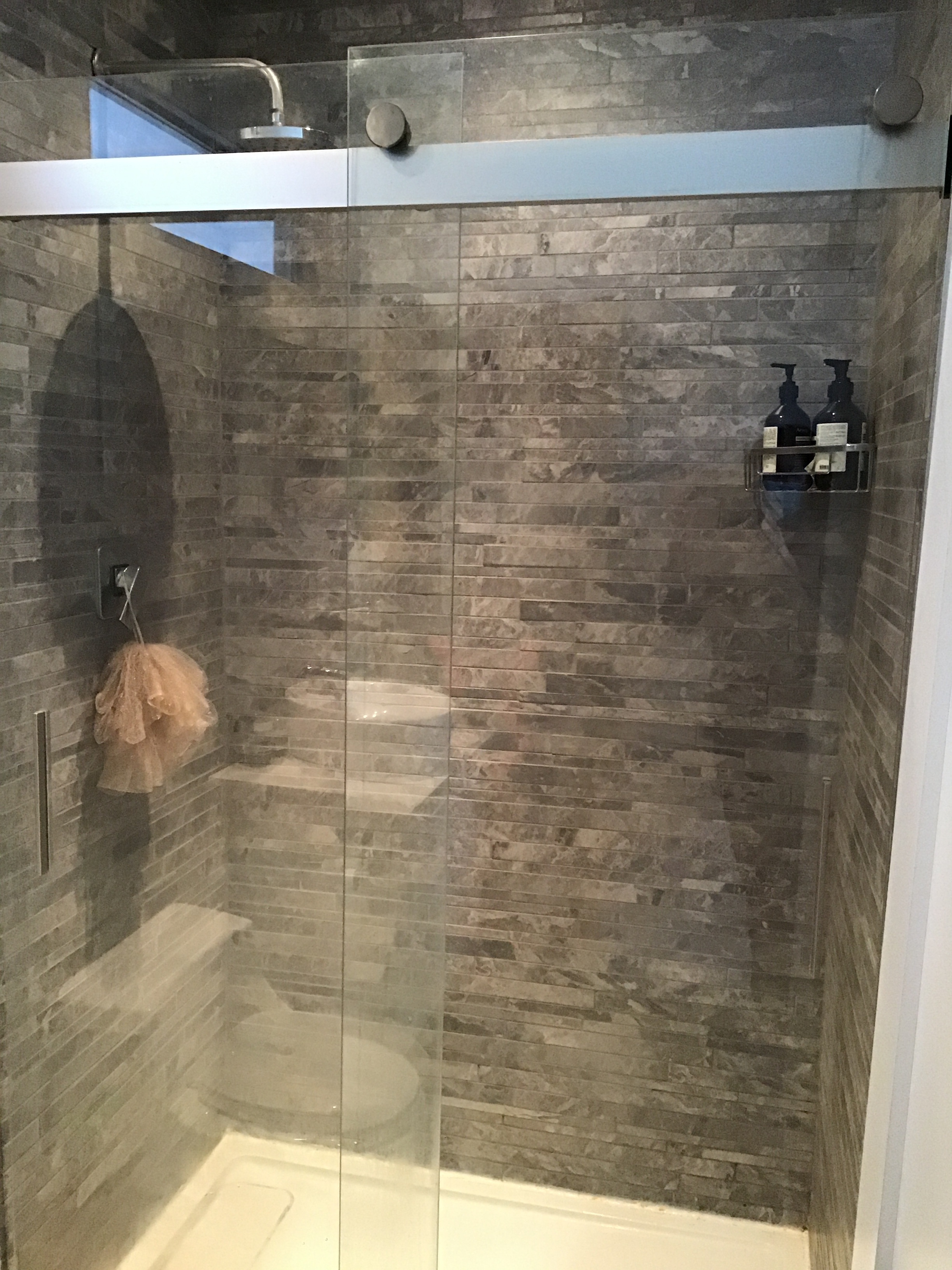
The dingy bathroom of the previous design felt dim and uninspiring. 'The bathroom had dated materials and featured a large wood-paneled wall that just didn’t fit the client’s design sensibilities,' Jennifer explains. 'Because it’s a small space, they wanted to come up with solutions to maximize the room as much as possible. We ended up moving the vanity to the left wall and added a wall-mounted toilet.'
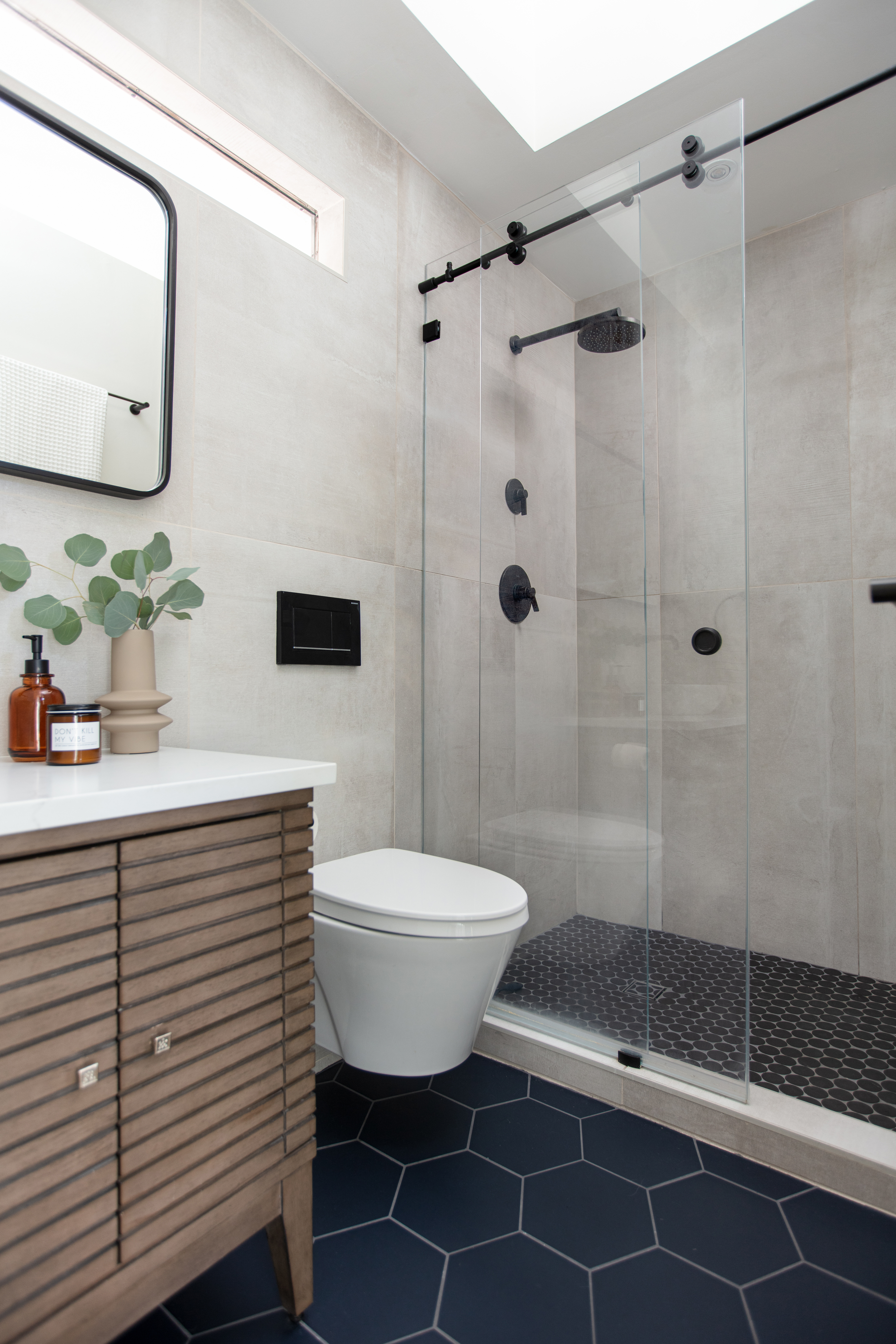
Now, the primary bathroom emanates timelessness and tranquility through mid-century and European style elements. Dark blue tiles offer continuation with the kitchen cabinets for a sense of flow while the walls are covered with a light beige tile for a calming, coastal feel.

While these two distinct spaces (bathroom and kitchen) aren’t adjacent, they feel cohesive and unified with a clear sense of flow. 'Rooms in a home should feel connected and have a common thread through every space,' notes Jennifer. 'Each room can certainly boast its own unique look but by selecting an element, even as simple as an accent color or material, to incorporate in every space, you’ll create a visually cohesive and aesthetically pleasing environment. A good flow also contributes to the overall comfort of a home and promotes a sense of unity and harmony.'
In order to maximize the modest space, the design team orchestrated a layout shift, moving the vanity to the left wall accompanied by a space-saving wall-mounted toilet. This strategic redesign not only opens up the floorspace but also contributes to a visually airy and calming ambiance, illuminated with plenty of natural light from the multitude of slim, horizontal windows. The result is a rejuvenating spa bathroom that's not only functional but imbues an atmosphere of sophistication.
Feeling inspired? If you're planning a kitchen or bathroom redesign any time soon, let the stylish space seen here be your springboard.


