Even the smallest kitchens can be dream kitchens; you just need a well-thought-out remodel plan. As these projects showcase, with the help of the right colors, window treatments, kitchen furniture, lighting, storage, and materials, a dark, tiny space can be opened to more functionality, use, and beauty. And it can become a welcoming space for family and friends.
If you are in the process of renovating your kitchen and have a good, substantial budget at hand, then these ideas would be extremely useful. Browse through these small kitchen ideas and take notes.
1. A Small LA Home's Kitchen Gets a Chic Makeover
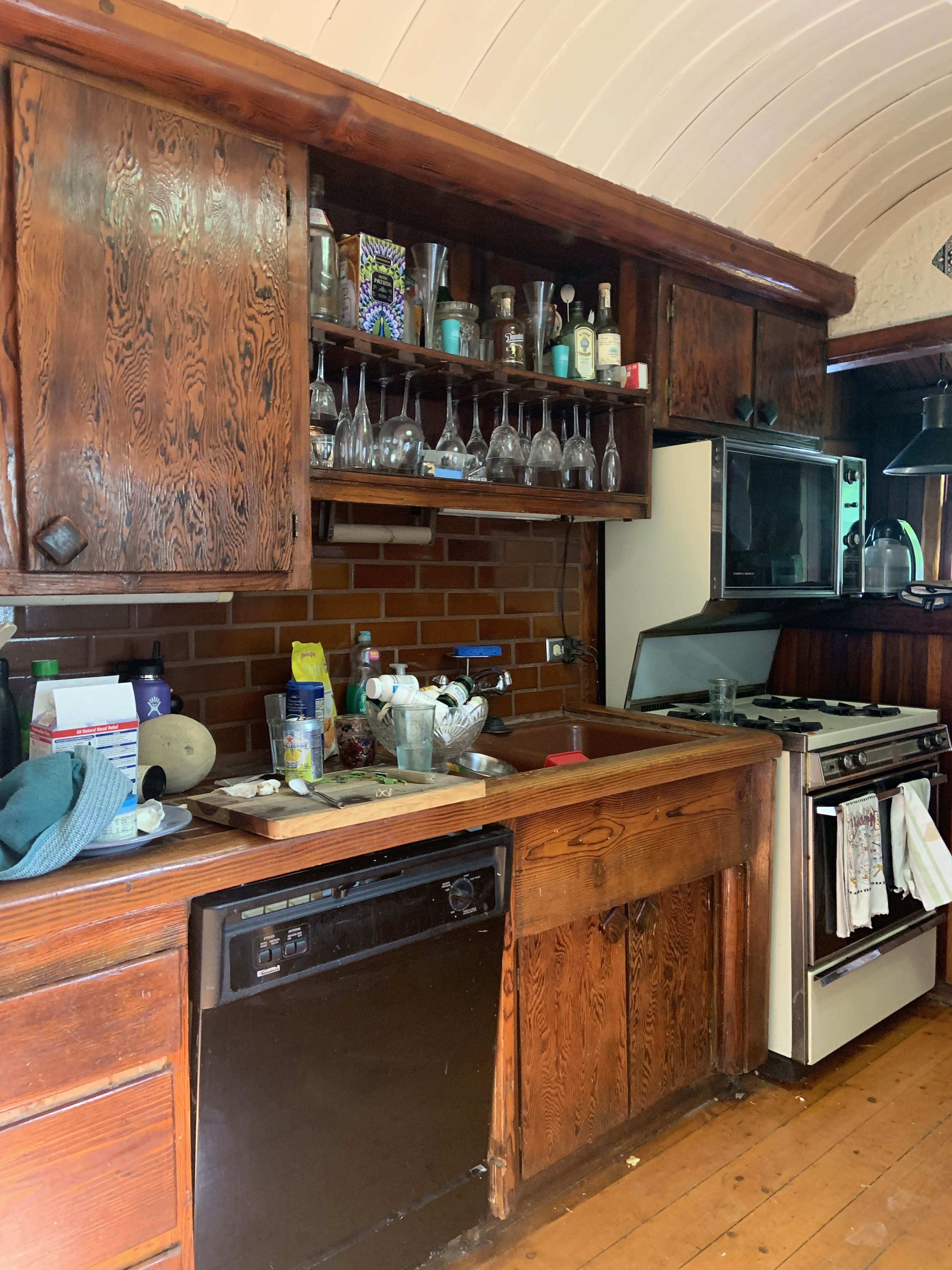
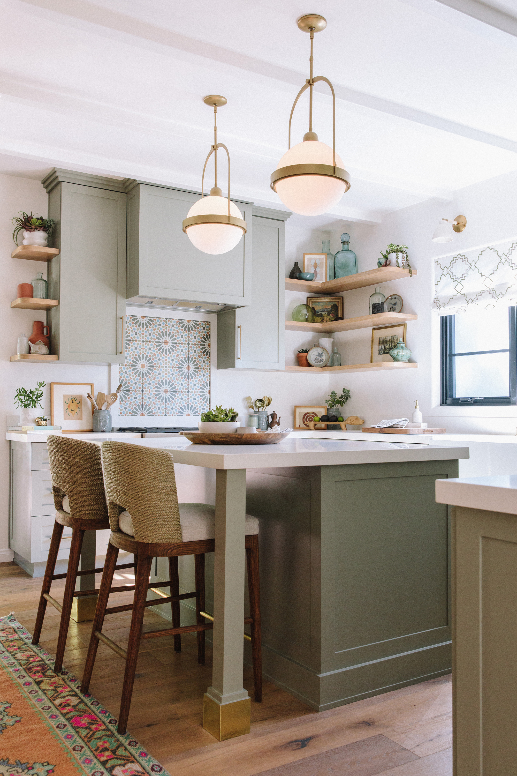
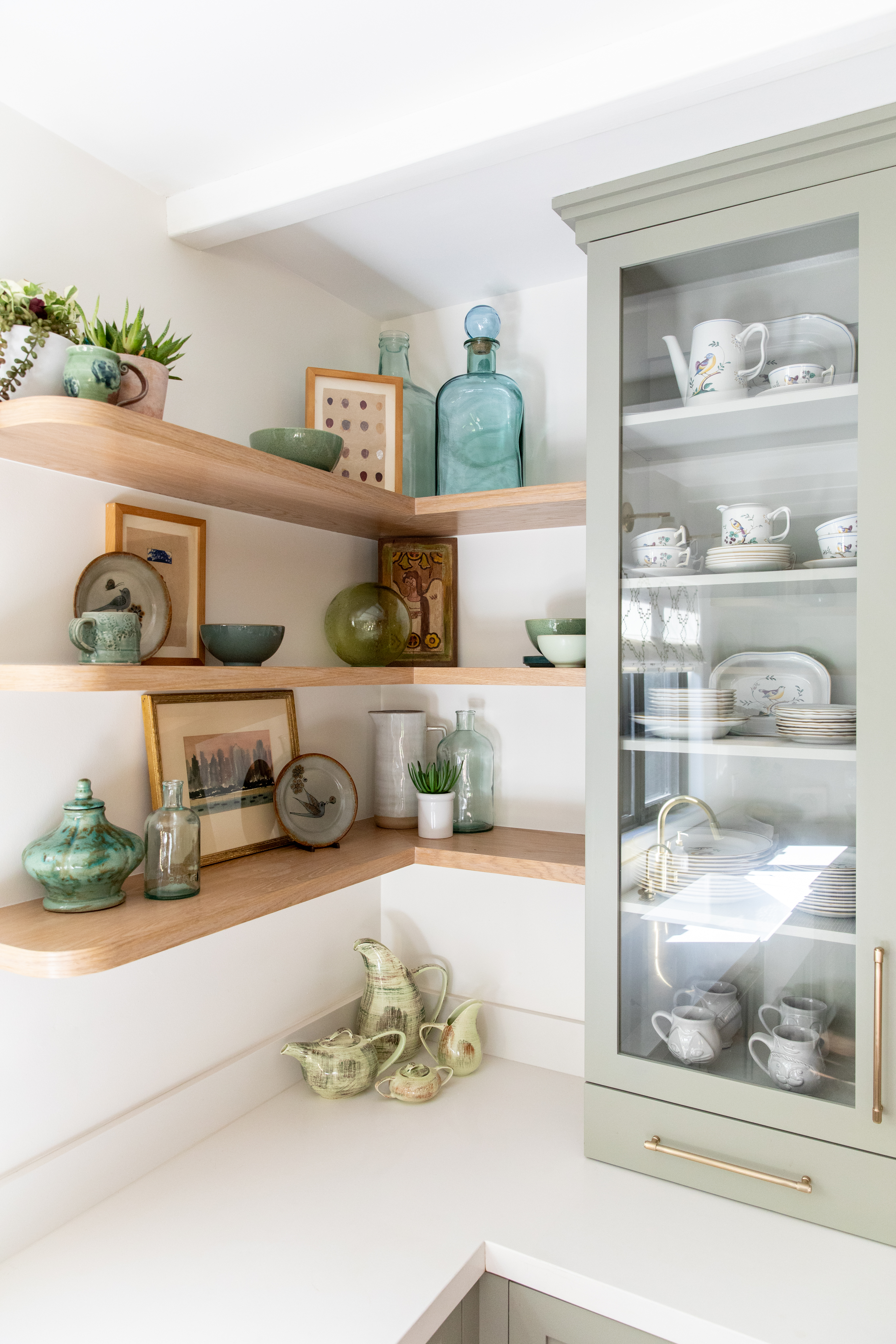
This two-bedroom home in LA featured a narrow galley kitchen with dark wooden cabinetry and limited storage. To open up the space and convert it into a functional, small kitchen, the client-couple reached out to designer Tamarra Younis of Union of Art Interiors. The aim was to expand the room's storage and invite more light. The designer planned a gut reno, where part of the backyard was added to this tiny kitchen. 'It went from being the smallest, darkest, and most overlooked area of the home to being the heart of the home,' says Tamarra.
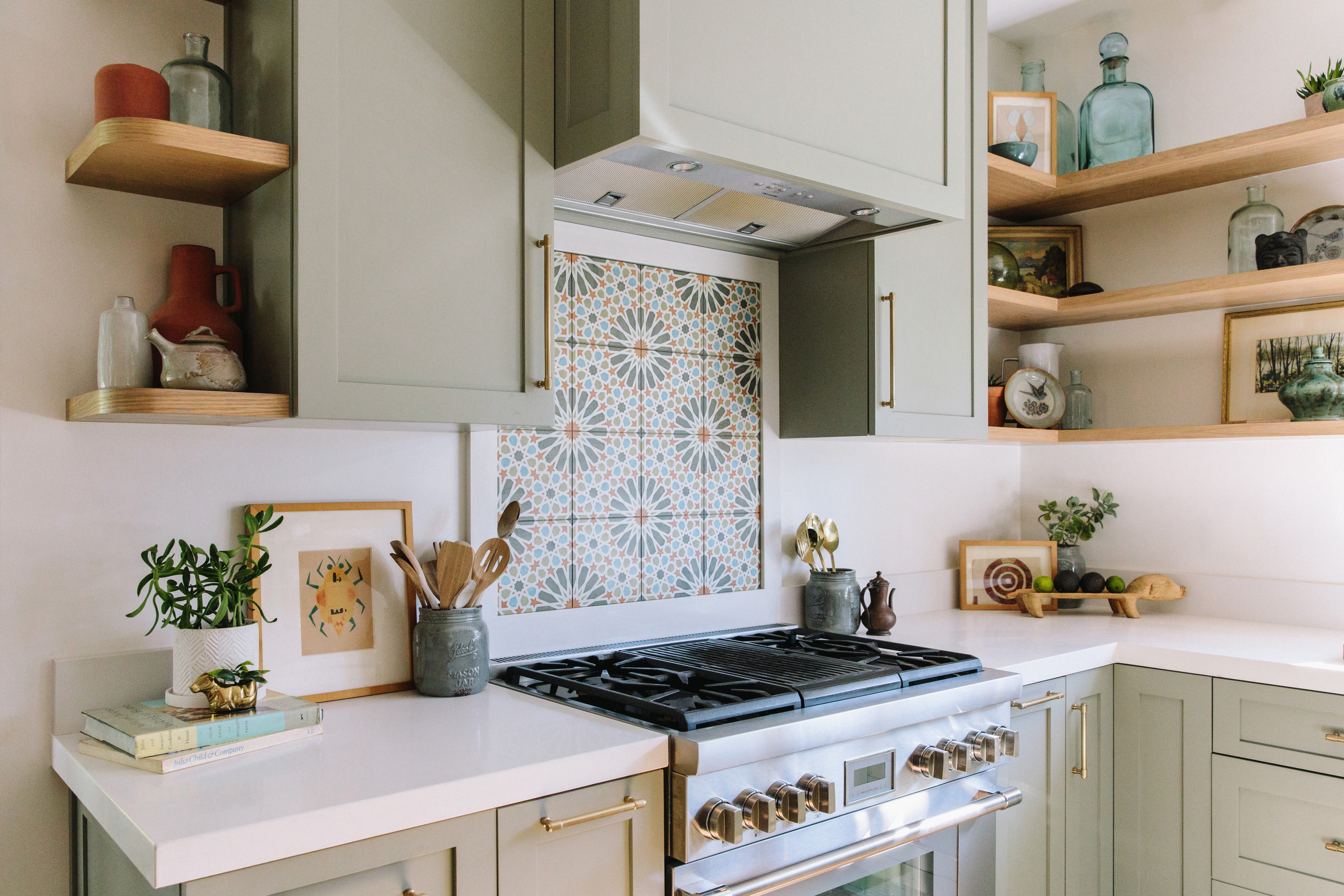
To bring in more light, the kitchen cabinets were painted a lovely sage green, and the designer mixed in Moroccan tiles to give the room a cozy, farmhouse look. As for storage, the designer chose open shelving to make the space feel more open, airy, and modern. 'We also gave them a great size kitchen island and a little seating nook so that the family can sit and enjoy a glass of wine.'
2. A Californian Kitchen Gets a Boost in Storage
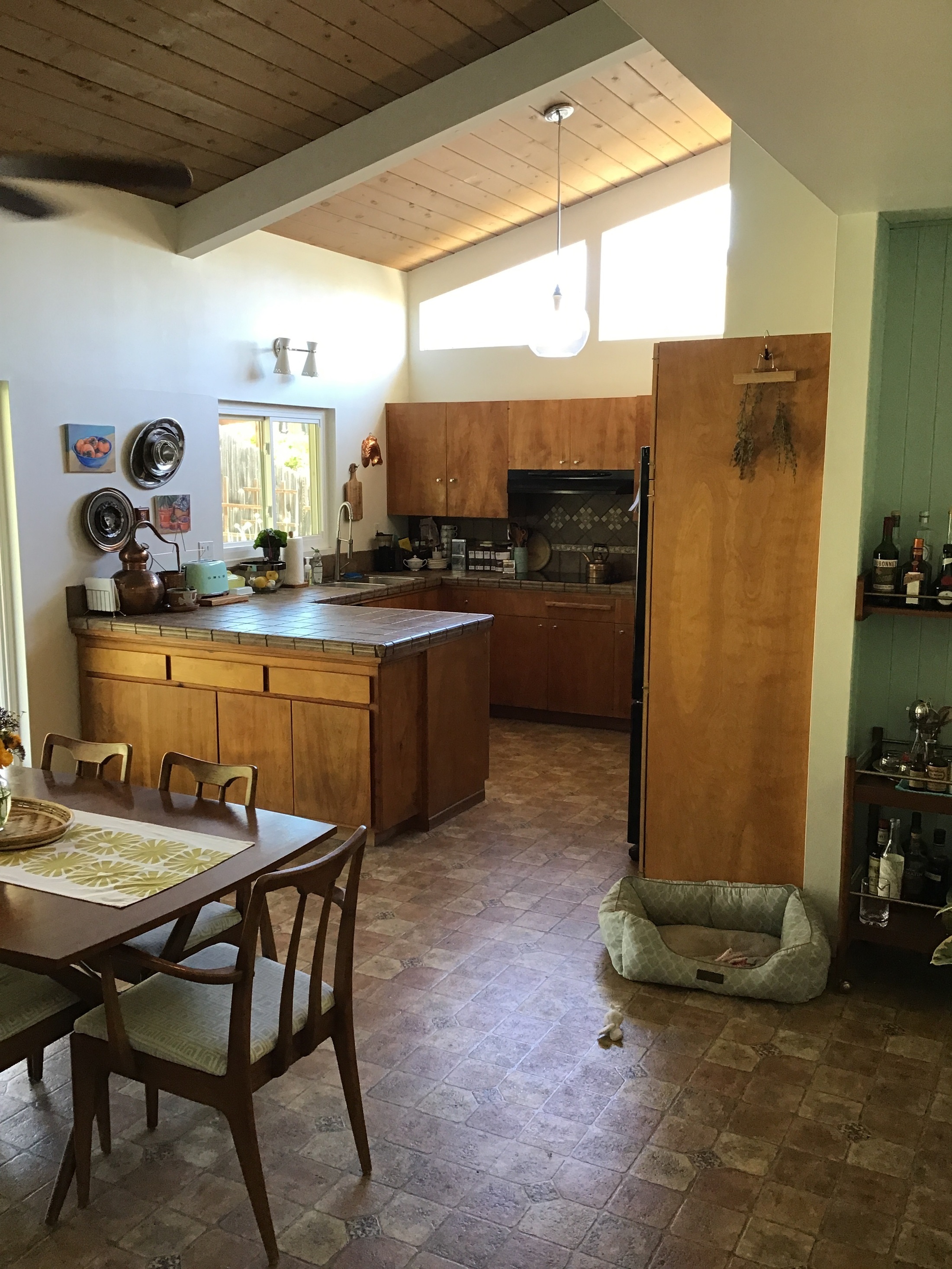
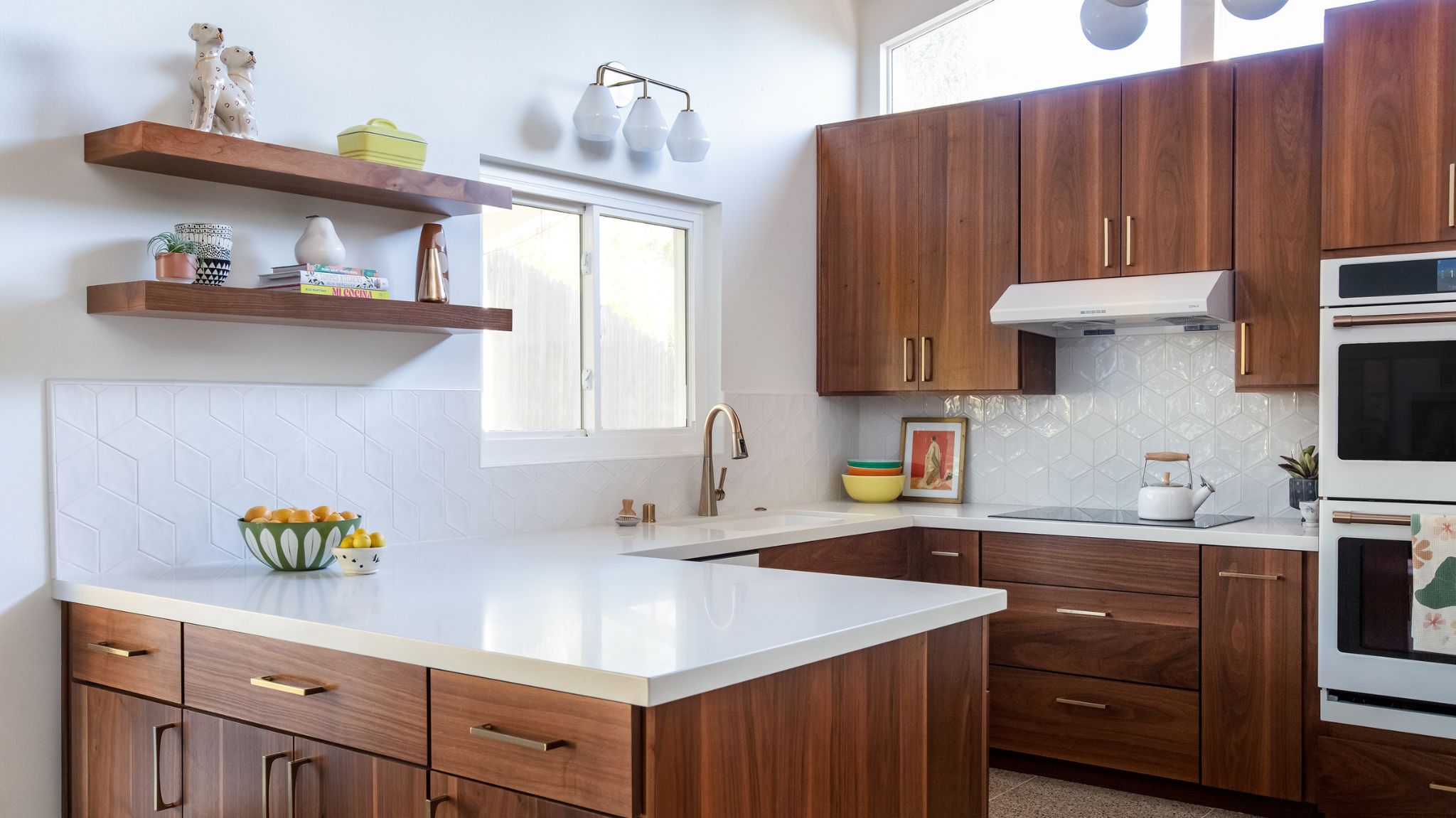
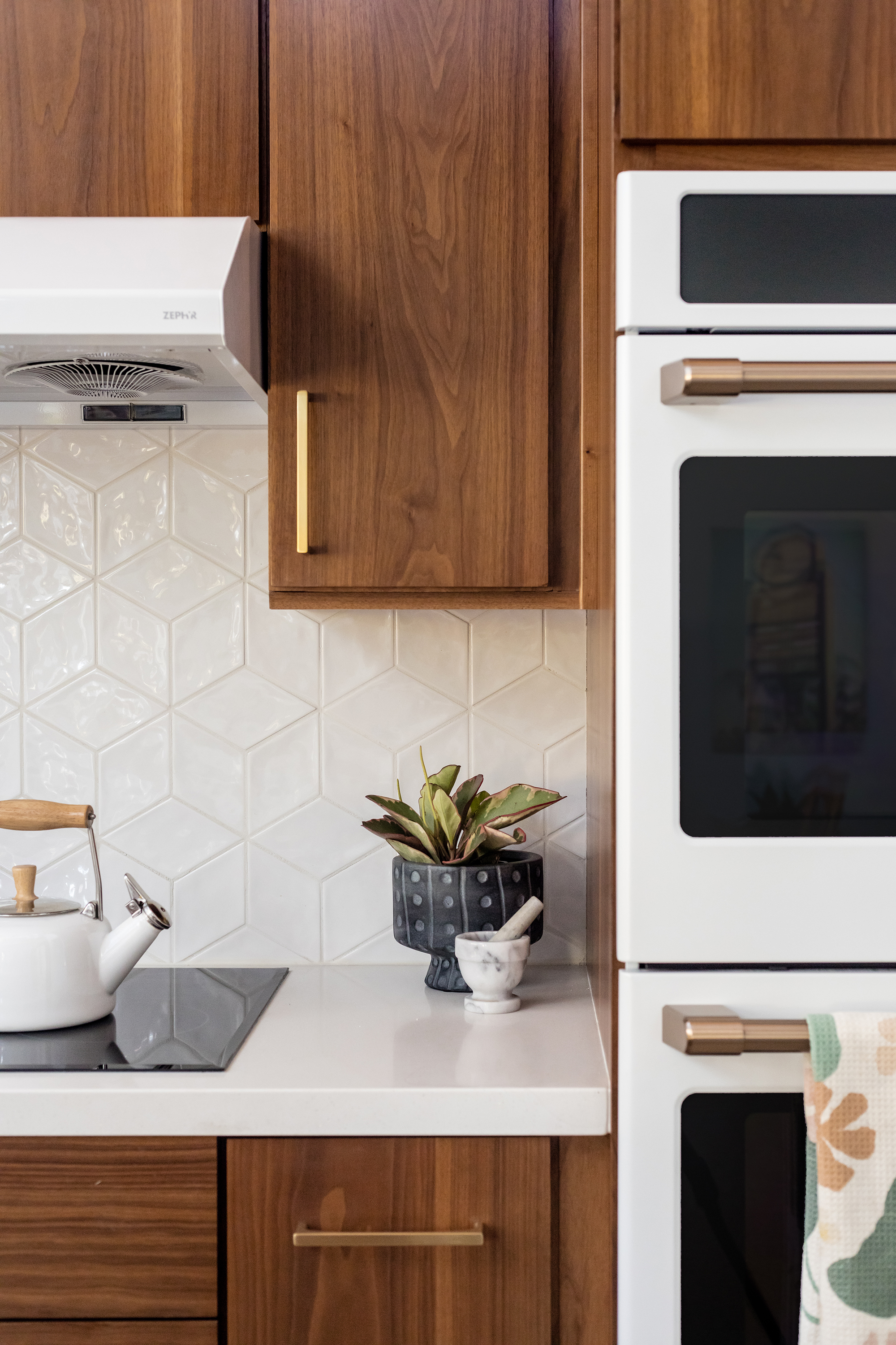
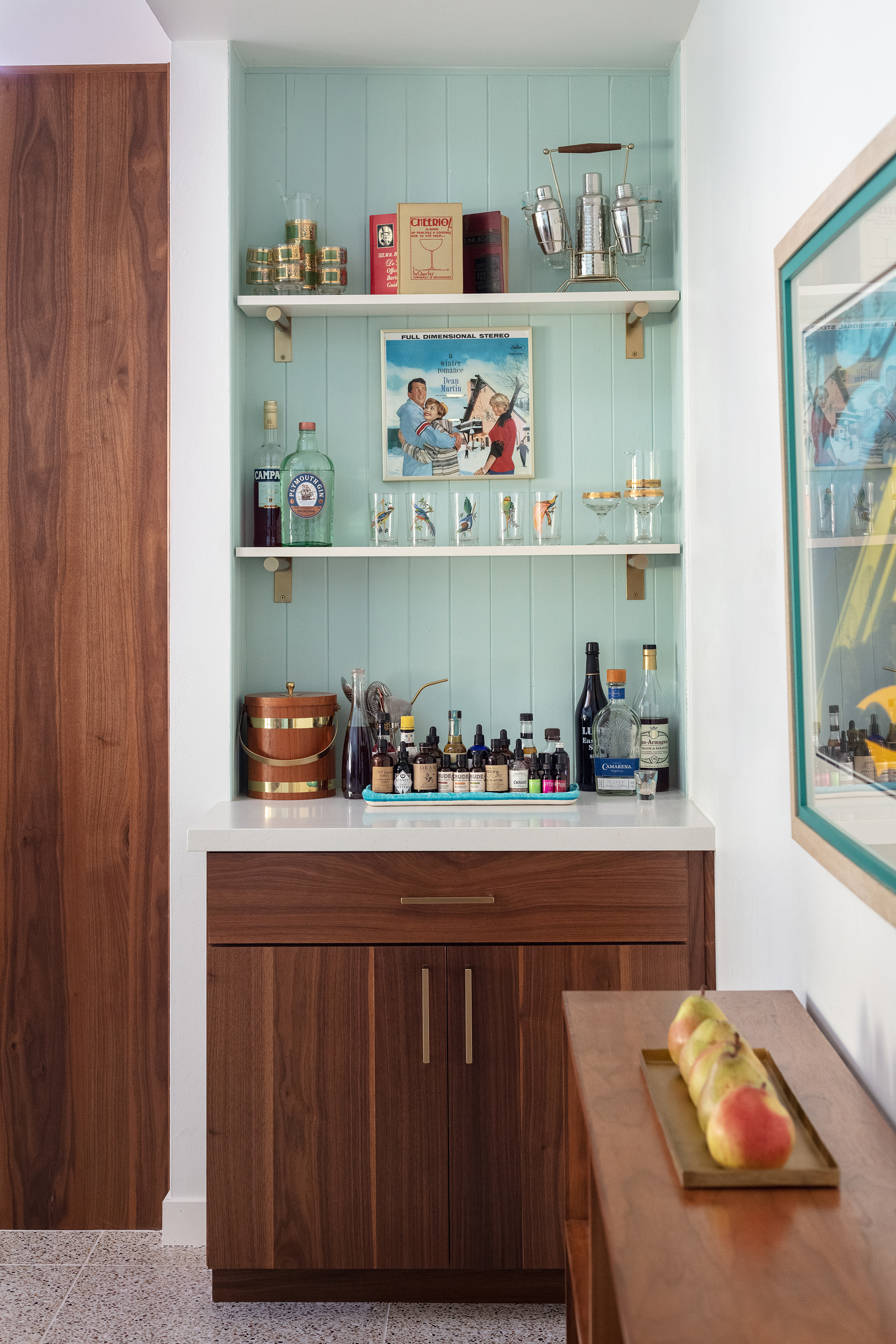
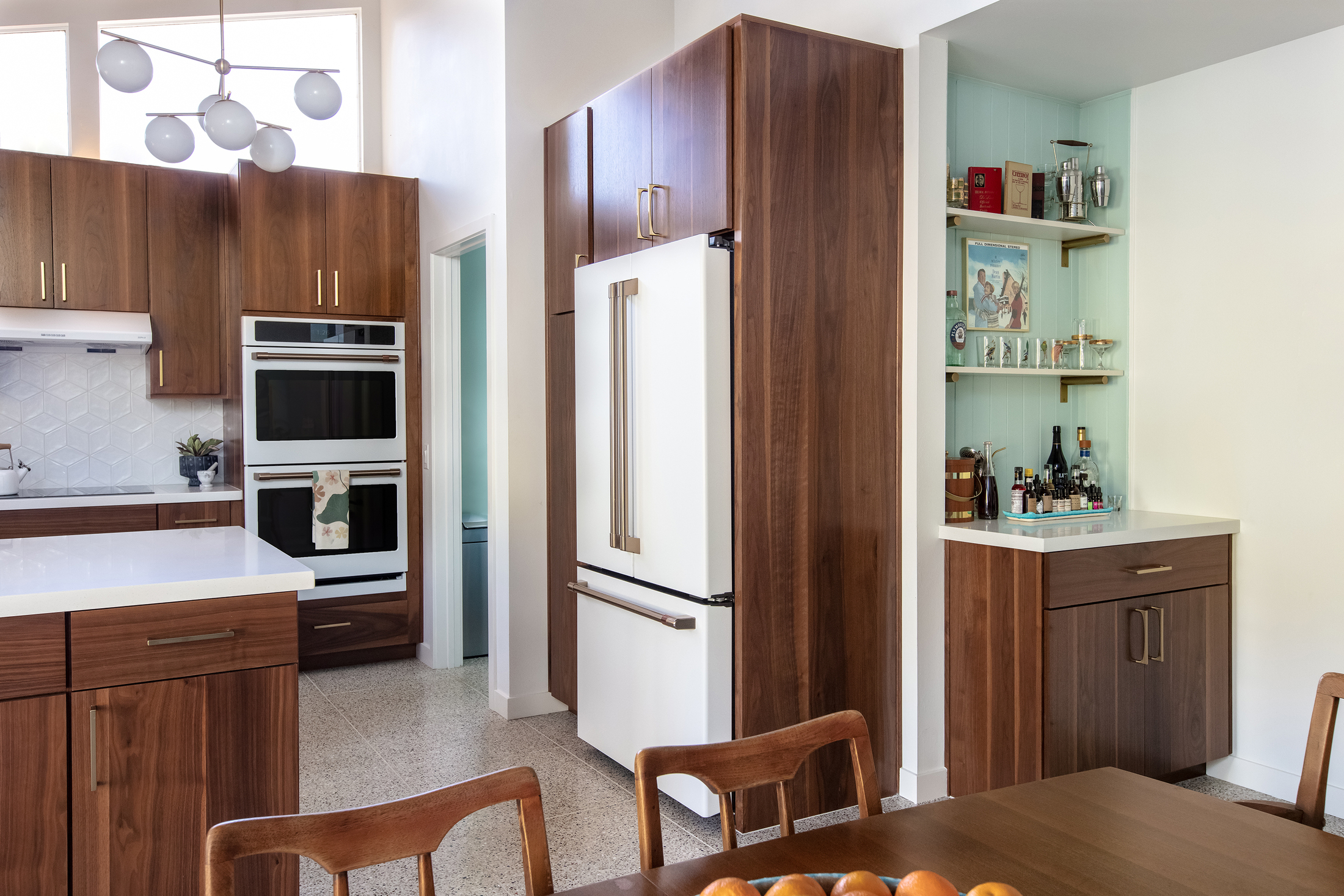
This vintage, three-bedroom home needed a reno, and many spaces, including the small kitchen needed to be optimized aesthetically and practically. Jennifer Verruto, founder and CEO of Blythe Interiors decided to make innovative and smart storage solutions the theme of this makeover. Custom inserts were added inside kitchen shelves and cabinets. The cabinets were extended and made 10” higher to meet the window line, giving the clients more space to keep their mid-century collections. 'We also added roll-out trays, storage systems for lids, pots and pans, trash pullouts, spice racks, and lazy susans for spices,' shares Jennifer.
Storage apart, the designer also updated the kitchen color, choosing to go with a refreshing Sherwin Williams Snowbound. 'To finish off the look, we also topped the walnut cabinets with solid white quartz and a playful all-white backsplash to help brighten up the space,’ adds Jennifer.
3. A Small Cali Kitchen Transformed into a Breezy Coastal Space
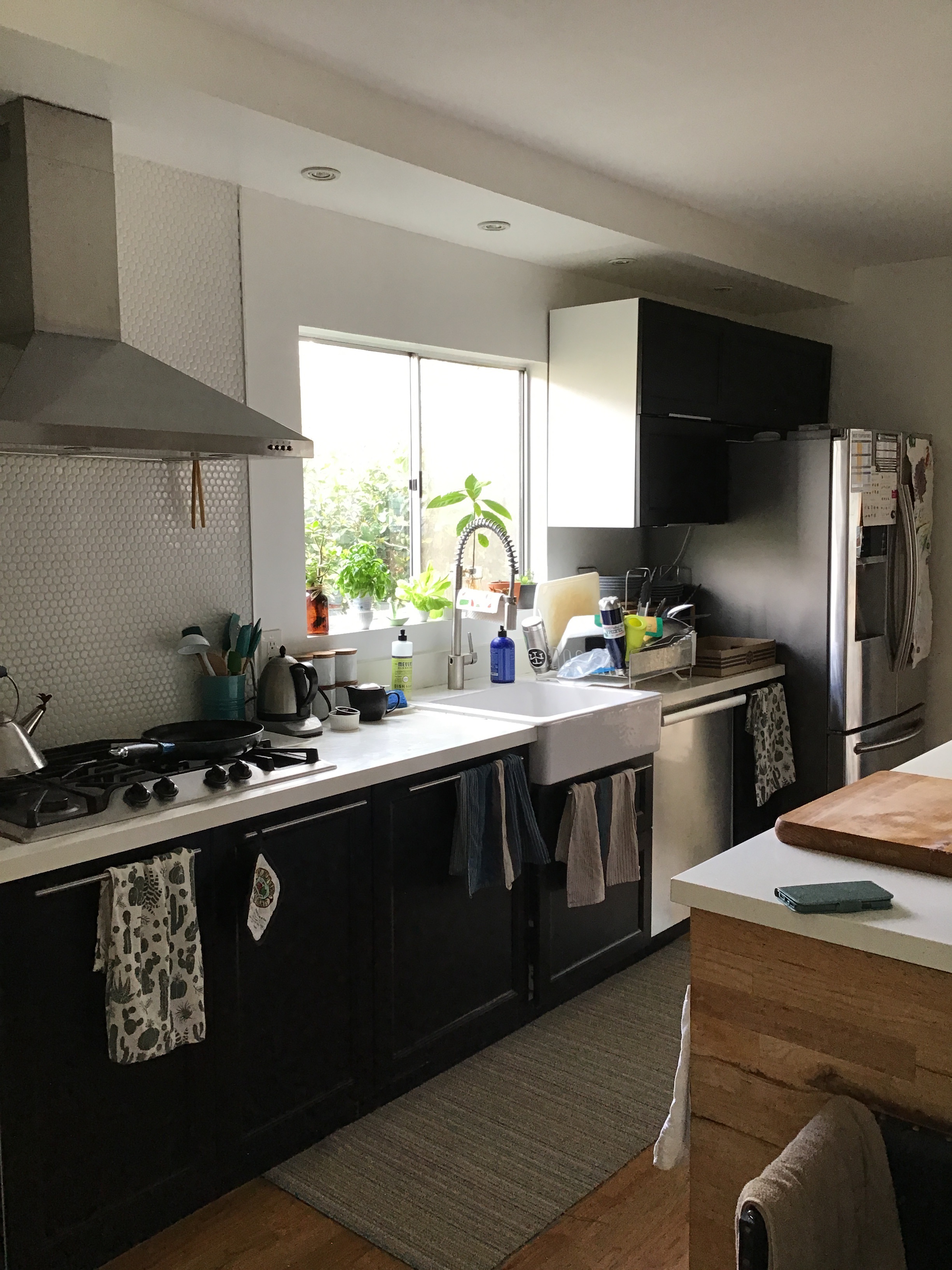


'The goal for this project was to modernize the space while optimizing functionality,' explains Jennifer Verruto, founder and CEO of Blythe Interiors. While the entire home needed a makeover, for this kitchen especially, the clients hoped for a more functional design that integrated a good workspace with the cook room. The space was originally dark and dingy, and the black interiors along with the mosaic backsplash ended up making the room feel smaller. So, to enhance the space, the designer's priority was to change the cabinetry and bestow it with a deep blue hue. The black ILVE oven with a dynamic vintage appeal and white Ferguson farmhouse sink honor the historic space yet give it a fresh character. To ensure the room doesn't feel too dark, the designer replaced the kitchen countertops with white quartz countertops and added a textured ivory kitchen backsplash.
Open shelves and kitchen lighting with gold spotlights added a practical touch. The kitchen also includes a lovely coffee corner that stores the client's wide collection of coffee.
4. This Californian Cabin Kitchen Now Feels Like a Fairytale Space
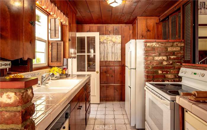

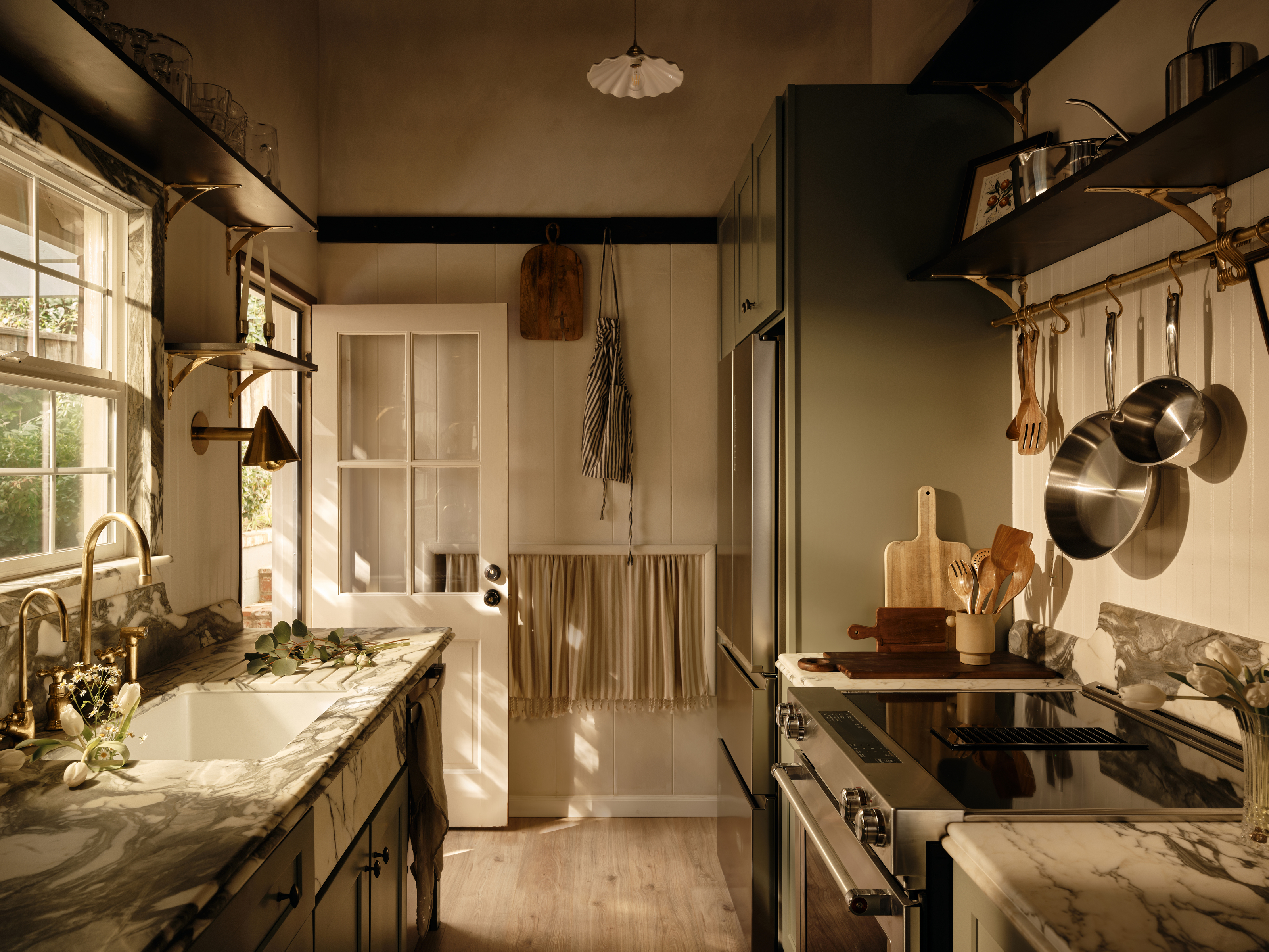
This home originally built in the 1950s had beautiful bones and original details but was bogged down by dark wood, thick old carpets, and shutters on every window. The kitchen was marked by heavy wood and brick interior and needed a contemporary redesign. To transform this farmhouse kitchen, LA-based designer Naomi Gibson of Gibson House decided to give the room a refreshing, modern touch with luxurious and unexpected touches, while still keeping its vintage look intact.
'I added a beadboard backsplash in small amounts, a peg rail at the transition from the wood paneling, and an oversized pot rail from Devol Kitchens,' she says. 'To keep it modern, I used sleek brass sconces, tiny almond cabinet knobs, and stainless steel appliances.' The rustic kitchen was transformed with sage green cabinets and dark veined marble countertops. 'The calming effect of natural materials but the movement of stone and wood just feels so good together!'
5. A Tiny Kentucky Kitchen Becomes a Pretty Jewel Box Space
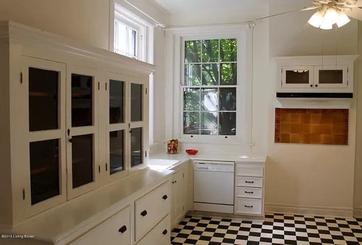
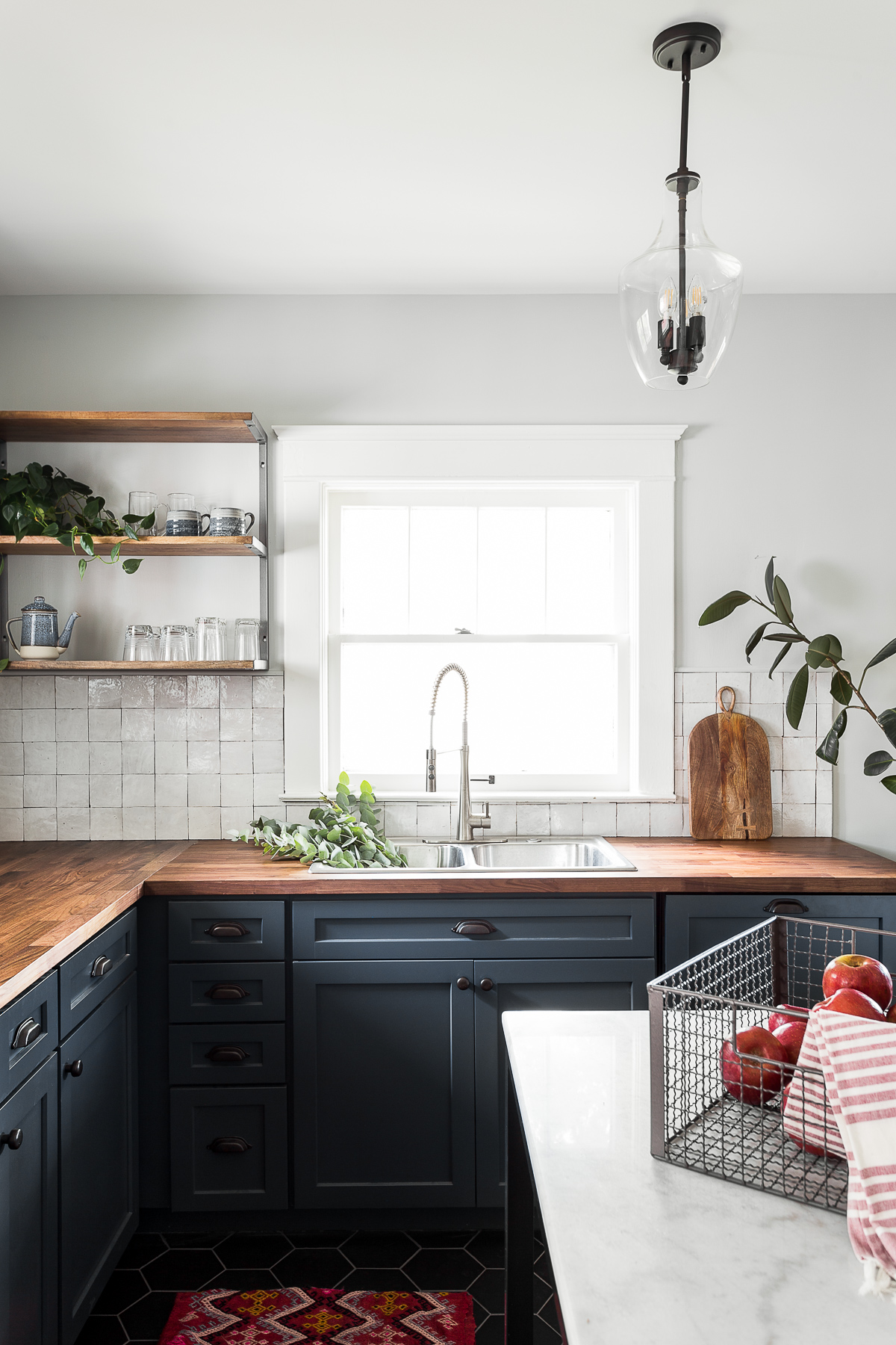
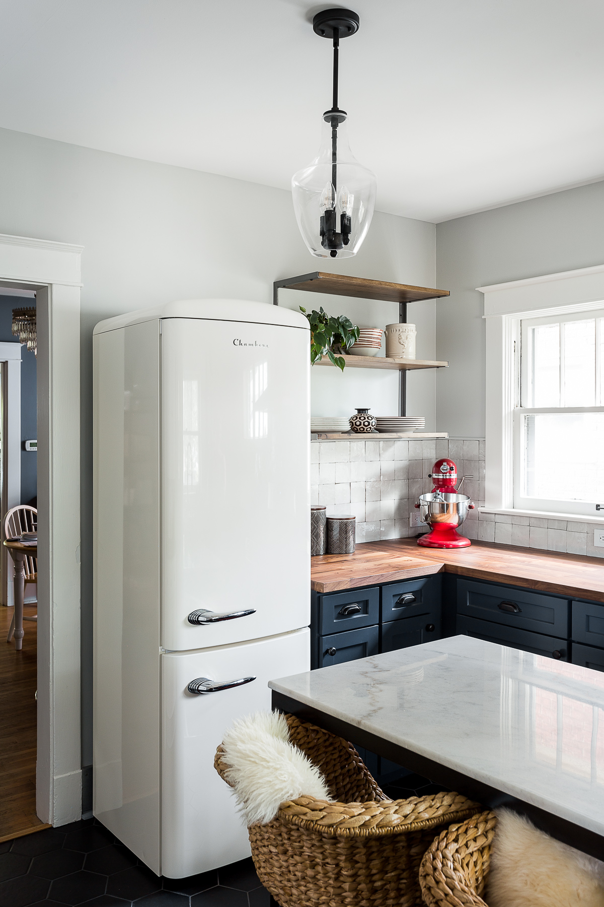
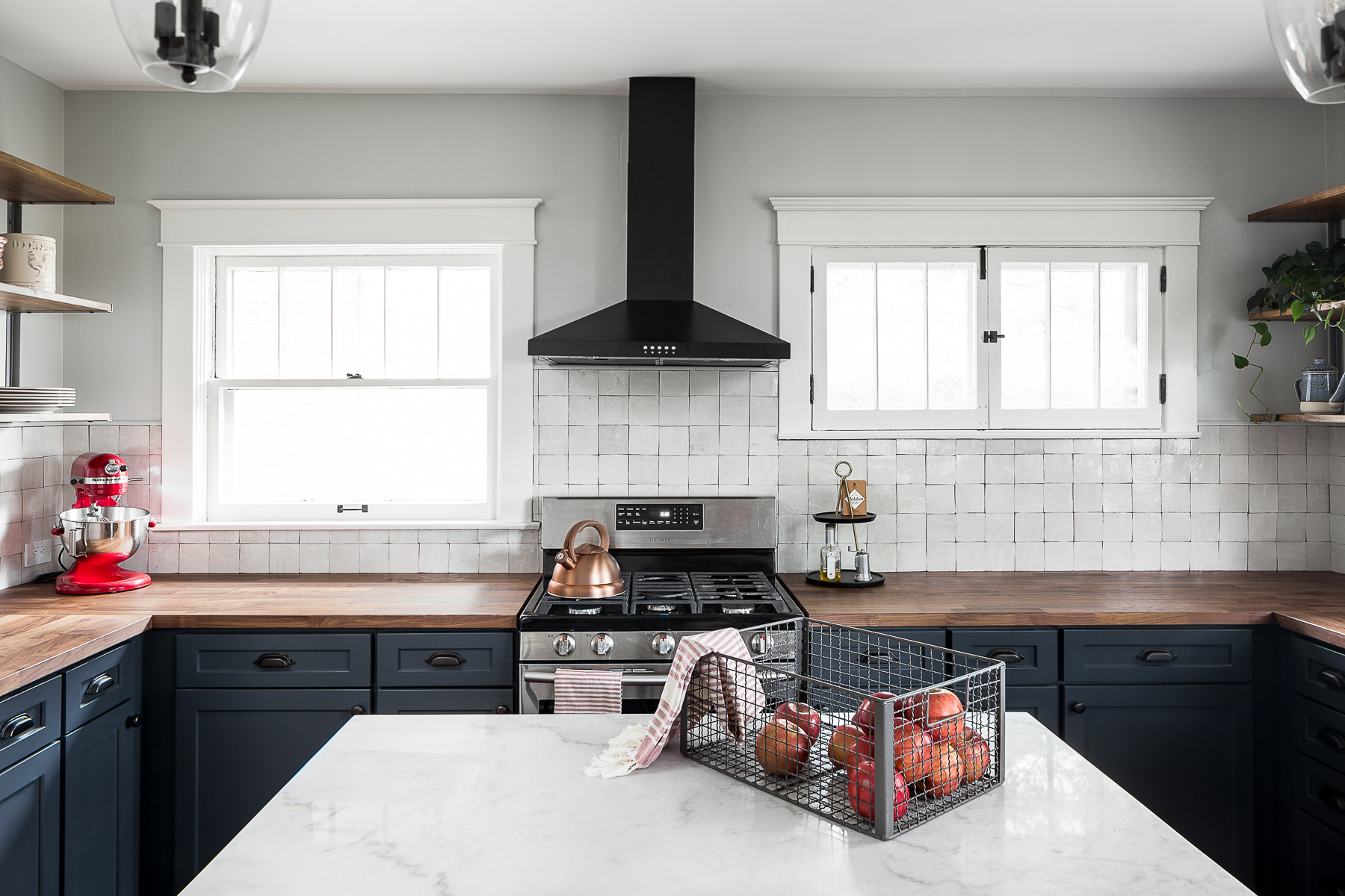
This Louisville, Kentucky kitchen was originally divided into a half breakfast nook on one side, and a kitchen on the other, and Bethany Adams of Bethany Adams Interiors was tasked with expanding its potential, both functionally and aesthetically.
The transformation was quite dramatic and opened up the space considerably. The designer chose hexagonal ceramic kitchen floor tiles for a modern feel and chose lighter tones for the countertops to create a subtle ombre effect. 'Since the space is small, we selected this prefabricated island from Crate & Barrel that is just the right size for a small space.' And for the kitchen island lighting, she went with a single pendant from Shades of Light to create a soft glow. 'We painted the walls in Benjamin Moore's Horizon OC-53,' says Bethany. 'It's a very light gray with some blue to it so it looks really lovely with the opalescent Zellige tile below,' she adds. The result is an elegant space that has a natural warmth and makes working, cooking, and socializing super easy.


